Design To Sell: 8 Useful Tips To Help Your Website Convert

Email Newsletter
Weekly tips on front-end & UX.
Trusted by 182,000+ folks.
 Register for Free
 Celebrating 10 million developers
 Custom Web Forms for Angular, React, & Vue. Your backend.

As we see more and more businesses move their services online, and even more that begin their life on the Web, a greater need arises for websites that are designed and built to sell. A great-looking website may achieve the goal of shaping and delivering a strong brand, but its good looks alone aren’t enough to sell the products or services on offer. For that, you need to introduce the element of marketing.
You may want to take a look at the following related articles:
- 7 More Useful Tips To Help Your Site Convert
- 10 Principles Of Effective Web Design
- 5 More Principles Of Effective Design
- 9 Common Usability Mistakes In Web Design
1. Subliminal Suggestion
Research shows that objects and images you see around you can prime you for certain behaviors. For example, a study on children showed that after being shown a Santa Claus cap, they were more likely to share candy with others. The cap embodied the concept of sharing and giving in their minds, and exposure to it primed them for regarding sharing more positively. The same study also exposed kids to a “Toys ‘R’ Us” logo, which had the opposite effect of the Santa Claus cap, making them less likely to share their candy.
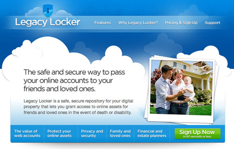 LegacyLocker features a photo of a happy family on its landing page, presumably to evoke in visitors a warm feeling for its product and a desire to care for their loved ones.
When choosing images for your website, think carefully about the message you’re trying to send. Pick images that are meaningful and that embody that message or feeling. Don’t put graphics on your website for their own sake – if they’re not doing a job, they don’t have to be there. Clichéd and overused imagery and stock photos are also dangerous because it may not send the right message in the given context, so select images that get the effect you’re after.
2. Prevent Choice Paralysis
There is a phenomenon in marketing known as “choice paralysis.” Choice paralysis happens when the user is given too many options. Choice is great, but when your customers are presented with too many options, they may be confused about where to go. Nobody wants buyer’s remorse (where a person chooses an item and decides later it’s not right for them), so many people spend more time than they should on the selection process: they become paralyzed.
In fact, according to Barry Schwatz, when customers have too many options to consider, they end up avoiding a specific service or the task in general (Paradox of Choice) – and this is exactly what we as designers need to carefully consider in our designs.
 The Highrise pricing list shows a set of monthly payment plans. The most popular one stands out visually to help you make a choice.
To remedy choice paralysis, make it easier for people to find the right product or service for them. Tell them what each option is great for, and then suggest the one they should choose. You can even use visuals to highlight the most popular product and steer potential customers towards it. If the product is not right for them, they’ll pick another, but if they’re confused, a “default” choice helps prevent choice paralysis.
3. Show The Product
When you visit a physical store, perhaps a grocery, you can look at, examine and sometimes even taste the products on sale. You make your purchasing decision based on the information you gather there. Are the tomatoes ripe enough? Are those strawberries red enough? What about the look and smell of that freshly baked bread?
When you sell services or Web apps online, you should do exactly the same thing: show the product. It’s surprising how many websites that sell software don’t actually show screenshots of their applications. Sure, these are intangible goods, digital goods that you can’t touch or smell, but they’re still goods you can see.
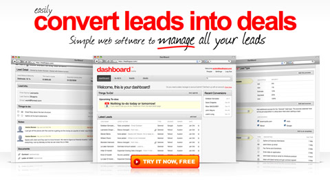 Dashboard puts large screenshots of its lead-tracking app right on the front page.
People make judgments based on what products look like. Why? Because appearance is an indicator, rightly or wrongly, of a product’s usability. This is known as the aesthetic-usability effect.
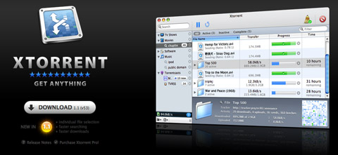 Xtorrent, a torrent download client for OS X, has a product screenshot right at the top of its minimalist landing page.
If people see a complicated and cluttered interface or, in some cases, even just an unattractive interface, they may assume it is not very usable or is hard to learn. On the other hand, if people see an attractive and simple-looking interface, they may start figuring out how it works right then and will want to give it a try. Get people to imagine using your software, and you’ll get closer to closing the sale.
4. Let People Try It
Once you start using a product, you become involved in it. Once you start entering data into it, you begin to make it your own. Every second a user spends trying out features is a second of their time invested in learning and using your product.
When that user is then presented with the question of whether to purchase or subscribe to the product or service, they will more likely say “yes” because they are already involved and have invested time in it. Of course, if the product is bad, then it may turn people off, but then your priority should really be to improve the product until it reaches a level people are happy with.
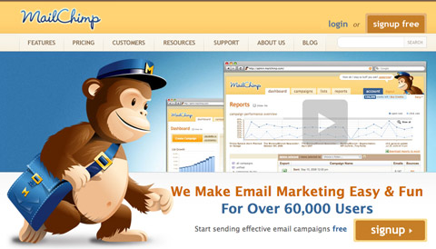 MailChimp, an email marketing service, allows you to start using the service for free with your first 100 subscribers.
In recent years, we’ve seen the emergence of the “freemium” business model. A freemium service allows people to use a portion of it free of charge, but requires a purchase to use all of its features. It gives people a taste of the full product but doesn’t limit them to a trial period. This lets them use the product for free without monetary commitment and then upgrade if they like it.
It’s a great model for many online Software-as-a-Service businesses because once somebody begins using your product, they get sucked in. They start to rely on it, and when they rely on it to do business or manage their life, they will very likely need the premium features down the line and will be happy to upgrade because they already know your service well.
Stories are very important in sales because they get potential customers to imagine what it would be like to use your product. Letting people actually try your product for free goes even further. They don’t have to imagine because they can begin using it right away at no cost. Letting people try out your product, whether through a demo, a trial period or a freemium model, is an excellent way to win customers. Now, this isn’t really a “design” element but is important to mention here because of its potential to drive conversions.
5. AIDA
AIDA is a well-known strategy in sales and stands for: Attention, Interest, Desire and Action. It is relatively simple and describes the sequence of events you should aim for to get a sale. So, first of all, you must capture the attention of your potential customer. Once you have it, you should win their interest by explaining how your product or service can help them.
Then, once they’re interested, generate a desire in them for your product. For example, a story about how this product has helped someone like your visitor can help them imagine what this product would do for them, and especially what benefits it would bring. Indeed, the benefit part is key here because benefits, not features, sell products.
Finally, you need to get people to act. This means purchasing the product or signing up for the service. If people want your product, all they may need is a button to check out. If they are interested but not yet sure, you could use a few methods to motivate them further; for example, creating a sense of urgency with a limited-time offer or limited supply.
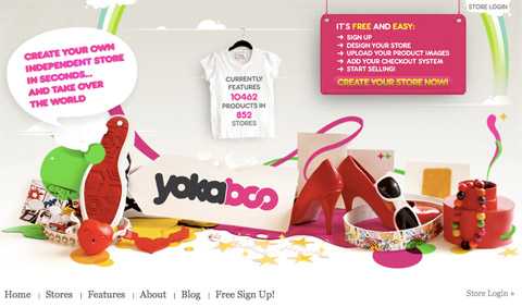 Yokaboo features large, eye-catching graphics. You’re likely to first read the short description on the left. The stats on the t-shirt then help build trust. Finally, you are presented with a call to action on the right.
Now, the AIDA approach applies more to copy – the actual marketing text on the website – than design, so what we need to do on the design side is reinforce that copy, make it stand out and ensure visitors read it. This means making sure the first thing a new visitor sees really grabs their attention. The flow of the page should then direct their focus to the items that achieve the other two goals: interest and desire. Finally, at the end of this flow, we need to convert. So, provide calls to action: “Order now,” “Sign up here.”
It’s important to understand that the design alone won’t sell: you need strong copy in place to do most of that work. The design is there to reinforce and support the copy, rather than the other way around.
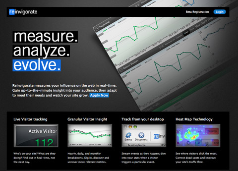 Reinvigorate captures your attention with three large words at the top: “measure. analyze. evolve.” You’re then led to a more descriptive bit of text below and a call to action link.
This means you shouldn’t design a nice website first and then fill up the space with words. Instead, think about the message you want to send out, write the copy and then construct a design that delivers that. If a delivery truck breaks down, then the package does not arrive, but if there was no package in the first place, then the delivery wouldn’t matter at all.
6. Guide attention
To benefit from something like AIDA, you have to lead your visitors through your content. You can do this by aligning items in a manner that will flow, and using images that guide the eyes. For example, if you want to focus attention somewhere, use a big arrow. Our eyes will notice the arrow and will naturally want to see where it points to.
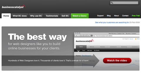 Business Catalyst uses an arrow graphic to lead the visitor’s gaze onto the “Watch the video” button.
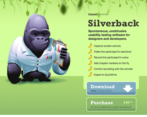 The content on the Silverback site flows down towards the download button. Additionally, the arrow on that button points towards the purchase link.
Structure your content in a way that will flow towards something. Having a bunch of scattered feature descriptions may confuse and make your visitors lost, unless of course if all of the points end in calls to action. If you want to ensure your visitors don’t miss anything, align everything in a linear structure so that the user scans along it. Make sure to end it with the ultimate call to action: that signup or download link.
7. Always Provide Next Actions
ABC: Always Be Closing. If you’re designing a website to sell something, whether a software application or Web service, you should always be thinking about how you’re closing the deal on each page. This doesn’t mean filling every page with big “Buy now” buttons; it means when the customer is ready to buy, they shouldn’t have to look around for the check-out link.
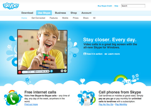 Notice how each of the three bits of text on the Skype website has a call to action after it, whether it’s a “Learn more” or a purchase link.
Always provide next-action links to keep the flow going and to ensure you don’t lose the attention of potential customers. Next-action links can direct the visitor to a page with more information about the product or to the actual page where they can make the purchase or sign up. These links could read something like: “Ready to order? Click here,” “Learn more,” “Take the tour” or “Shop now.”
Don’t leave a dead end on any page: always suggest to your visitors where they should go next.
8. The Gutenberg rule
The Gutenberg diagram (or the Gutenberg rule) is a concept that maps out something called reading gravity. Reading gravity describes a habit of reading in the western world: left to right, top to bottom. The Gutenberg diagram splits up a page into four quadrants: the “Primary Optical Area” in top left, the “Strong Fallow Area” in top right, the “Weak Fallow Area” in the bottom left and a “Terminal Area” in bottom right.
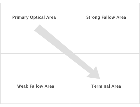 The Gutenberg diagram
It suggests that the bottom left area of the page will get least attention as our eyes scan the page from top left to bottom right and that our glance would end up in the lower right portion of the page. How can we utilize this concept? Buttons and calls to action could be placed in bottom right instead of bottom left, as this is the place where the visitor’s glance is likely to alight.
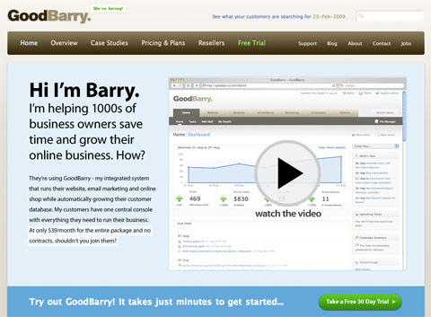 Notice how GoodBarry has the trial signup button placed at the bottom right of the above the fold area of the landing page.
Note that the Gutenberg diagram is more likely to work on pages which have more a balanced distribution of content. If parts of your page have strong highlights through high contrast and bold typography, then those areas would likely attract more attention and so will direct the way a user scans the page.


