7 More Useful Tips To Help Your Site Convert

Email Newsletter
Weekly tips on front-end & UX.
Trusted by 182,000+ folks.
 Custom Web Forms for Angular, React, & Vue. Your backend.
 Celebrating 10 million developers


Last week we presented 8 Useful Tips To Help Your Website Convert – we discussed various rules and guidelines from marketing, such as subliminal suggestion, prevention of choice paralysis, AIDA-principle, attention guide and the Gutenberg rule. The main idea was to help designers and developers create a design that would help the site to grow and become a success the financial point of view.
As we see more and more businesses move their services online, and even more that begin their life on the Web, a greater need arises for websites that are designed and built to sell. A great-looking website may achieve the goal of shaping and delivering a strong brand, but its good looks alone aren’t enough to sell the products or services on offer. For that, you need to introduce the element of marketing.
This article presents further principles and rules that will help your site convert. Among other things, we cover A/B testing, footnotes, testimonials, feature lists, the sign-up process and typography. You may be interesting in the following related posts:
- 10 Principles Of Effective Web Design
- 5 More Principles Of Effective Design
- 9 Common Usability Mistakes In Web Design
- 10 Useful Web Application Interface Techniques
1. A/B Testing
There is no reason to stop developing your website once you’ve come up with a design that you’re happy with and that you think best sells your product. Practice often differs from theory, and every market is different. Things you believe should work may not actually perform well in your context. This doesn’t mean your implementation was completely wrong; perhaps it just needs a little tweaking to achieve its full potential.
You can tweak your website using what’s called A/B testing (also known as split testing). Basically, this test pits design A against design B and determines which performs better. This simple test helps you figure out things like, Which headline works better, or Where should you place the “Buy now” button?
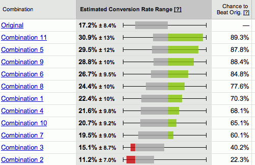
Google Website Optimizer
Google Website Optimizer is a free tool you can use to perform A/B testing, as well as multivariate testing (testing many combinations of variables), on your website. It’s relatively simple to use: all you need to do is provide Google Website Optimizer with the different assets you want to test, and it will randomly load them for your visitors and track which ones lead to better conversions.
2. Footnotes: The Good and the Bad Ones
Sometimes, when writing a description of your service or a product feature, you may need to disclose additional information about things like availability and price. This extra information can usually be placed in a footnote at the bottom of the page.
This is logical because you want to keep the copy on your main page as slim as possible to ensure people actually read it. If the copy has any extra information that is not relevant to the pitch, then it may break the flow and add needless weight. To add a footnote, just insert a reference number in the main text (using the sup-tag), and then place the accompanying explanation at the bottom of the page (the larger the font size, the better).
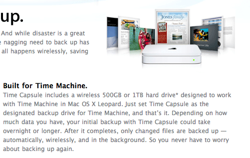
A typical feature description on Apple’s website. The little asterisk in the first line under the heading “Built for Time Machine” indicates that a technical description is in the footnote.
However, some companies use footnotes for another purpose: instead of hiding superflous technical details, they trick customers into buying something, offering services “for free” and referring with footnotes or asterisks to details of the deal. These details are almost always unreadable – because of the font size and the font color – and almost always result in misunderstandings and problems. If you or your company use footnotes for this purpose, you are definitely doing something wrong. Once your users lost trust for your company (for instance, because they purchased something that they didn’t want to buy), it will be damn hard for you to win it back.
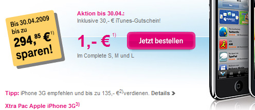
The German company T-Mobile offers the iPhone for a sensational price: 1 Euro. Of course, the customer needs to pay attention to little footnotes that explain further costs. This is hidden marketing and disrespectful behavior towards customers.
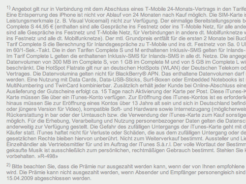
Price details in the footnotes: unreadable blocks of unscannable chunks of text with numerous numbers and traps for customers. That’s not how footnotes should be used.
Conclusion: if you care about your customers and aim to build a solid, long-term relationship with them, you better make sure you communicate with them honestly and directly – and use footnotes properly.
3. Testimonials
Testimonials are great because they tell your visitors that other people use your product and would go as far as recommend it. Testimonials help relieve some of the risk associated with purchasing a new product or service. You have little way of telling whether something is good or not until you try it, and knowing that others have tried it and liked it helps a lot in breaking down this risk barrier.
There are some formatting tricks you can use to make your testimonials more effective. For example, read the following three testimonials:
- I found Product X to be incredibly useful in my daily workflow.
- “I found Product X to be incredibly useful in my daily workflow.”
- “I found Product X to be incredibly useful in my daily workflow.” John Smith, ACME Corp, New York
The first testimonial doesn’t have anything attached to it — it’s just a sentence and so doesn’t look very believable. The third one on the other hand has speech marks around it and attribution to the source. Just adding speech marks already makes a testimonial look better. For best testimonials though make sure to add a source.
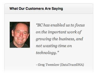
Business Catalyst formats their testimonials perfectly, with a picture of each client next to their quote.
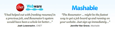
Quotes from publications on The Resumator site follow the same rules.
It’s also a good idea to provide readers with case-studies that describe the process of your work and explain how customers liked it, what were the problems and how the service can be useful to solve tasks from the daily routine.
4. Scannable Feature Lists
Your visitors don’t have a lot of patience. Why? They’re spending their time browsing your website, time that could be spent doing a myriad of other things. Time is money, and people are investing it when they navigate around your website. This means you’ve got to offer something valuable in return. You must grab their attention and not let go. If they get bored or don’t like what you offer, then they will click away and likely be gone forever.
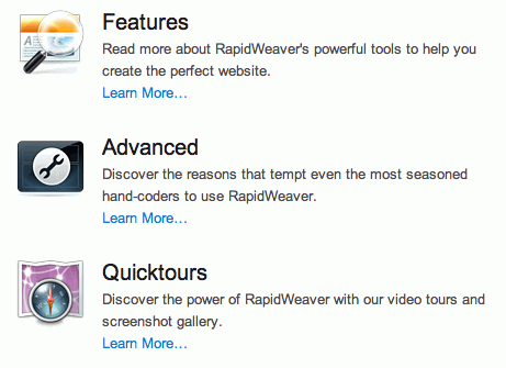
Rapidweaver makes its feature list scannable by using white space, headings and images.
To address this, present your information in a way that is easiest and quickest to digest. You’ve got to slice up your marketing pitch into bite-sized chunks that are fast to read and simple to understand. You may want to give each chunk a heading or highlight areas of the text to stand out. You can also add images, such as an icon next to each chunk of text. All of this makes the text scannable. People are then able to look over the text, pick out headings and read more detailed blurbs about the elements they like.
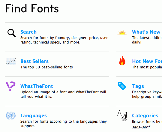
…and so does MyFonts.
5. Streamline The Sign-Up Process
Selling has a lot to do with breaking down barriers. These barriers are mainly the objections people imagine to buying your product, but these barriers can also be physical; for example, the sign-up form on your website. Users have to fill in forms, and that means a little work on their part. To ensure you don’t lose conversions at this stage, you can do a few things.
First of all, ensure the sign-up form is as short as possible. If a field is optional, it doesn’t have to be there. Users can always fill in optional fields later on their settings page. Don’t make potential customers do more work than they have to; keep the form nice and short and easy to fill in.
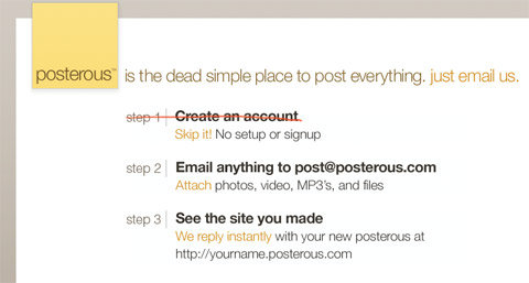
Posterous, a blog host, doesn’t even ask you to sign up to start using it: just email your first post to its address.
Secondly, to ensure users don’t make any mistakes and have to re-fill information, you can validate fields live using AJAX. You could, for example, display a green tick next to each filled-in field when it validates, or display a red cross along with a short error message if some error occurs (such as if a required field is left empty or a user name that is already taken is chosen). This allows people to see any errors as they’re filling in the form and fix them before clicking the “Submit” button.
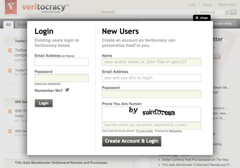
The Veritocracy sign-up form isn’t even a separate page; it’s a form that pops up as a modal window and requires only four fields to be filled in.
Lastly, you can simplify the page layout of the sign-up form by removing any irrelevant navigation elements. Your objective here is to get the visitor to sign up rather than navigate to other sections of the website, so you can remove any extra navigation to help the user focus on the task at hand.
6. White Space Is Not Lost Space
Have you ever seen those cheap ad booklets one gets in the post, all full of bright colors, big text and pictures, every millimeter used to display a latest offer or new deal. The designers try to fit everything they’ve got into the booklet and make sure no space is wasted. Cramming everything you’ve got into a limited amount of space isn’t always the best approach, though, and in most cases it’s the wrong approach online.
Perfect use of spacing and white space in a magazine-layout on Good.is. The space makes the content look clean, attractive and readable.
White space, the empty space around and between various pieces of content, is important. It gives your design air to breathe by separating elements. This separation is valuable because it allows people to focus their attention on individual areas of the page, be it the navigation, a feature description or the website’s description.
When everything is stuck together, it becomes more difficult to distinguish between its components and thus more difficult to focus on and thus less scannable. You can read more about the proper use of spacing in Liam McKay's excellent article How to Spot Quality within Web Design: Examples & Tips. ## 7. Set your type properly
The way you set your type has an effect on how well your copy performs. Good typography can give your copy the punch it needs. Use large font sizes to make headings stand out. If you’re selling to an older demographic, ensure all font sizes are large enough to read easily. Small fonts may look great, but if they’re difficult to read, they will turn people off.
Also, ensure the text and its background color have enough contrast. Black on white is a good start. Inverted color schemes (light text on dark background) do not work so well in most cases, especially if your audience is used to more traditional media (e.g. newspapers), where black on white is the standard.
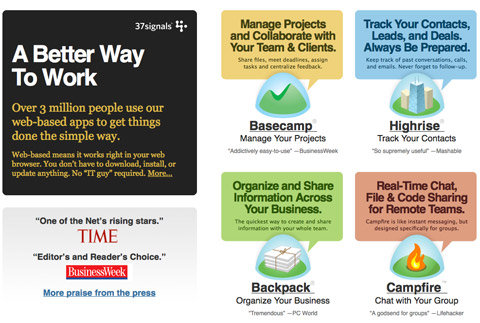
The redesigned 37signals website features eye-catching typography that takes advantage of big font sizes, varying colors and high contrast.
To focus people's attention on certain elements, you can decrease the contrast of surrounding elements by using something like dark gray on white (instead of black on white) to fade them out a little. Use stronger contrast for the stuff you want people to notice. One good technique is to use the highest contrast for a feature heading or brief description, and then a lower contrast for the detailed blurb below. The aim here is to make the page scannable: let people glance over it and settle their gaze on the text that’s most important and quickest to digest.
To Conclude
Design definitely has a role to play in selling the product or service on your website, though it's more of a support than a lead role. Design should reinforce the copy: help it stand out and be readable. Choose images that send the message you want. Ask yourself what purpose each image on your website has. If it has no purpose, why is it there? Use white space and typography to give your copy punch. At the end of the day, though, you have to make sure your content actually works, because a great design alone won't be enough to close the sale.


