Table Layouts vs. Div Layouts: From Hell to… Hell?

Email Newsletter
Weekly tips on front-end & UX.
Trusted by 182,000+ folks.

 Celebrating 10 million developers


 Custom Web Forms for Angular, React, & Vue. Your backend.
This article covers common problems with layout structure in web design. The first part goes through what table and div hells are, including lots of examples. The next section shows how to write cleaner and more readable code. The final part looks at what features await in future. Please join us on this journey from hell to heaven.
You may also be interested in the following related posts:
- Responsive Web Design: What It Is And How To Use It
- Responsive Web Design Guidelines and Tutorials
- The Mystery Of The CSS Float Property
- 8 Layout Solutions To Improve Your Designs
Table Hell
You’re in table hell when your website uses tables for design purposes. Tables generally increase the complexity of documents and make them more difficult to maintain. Also, they reduce a website’s flexibility in accommodating different media and design elements, and they limit a website’s functionality.

MAMA (Metadata Analysis and Mining Application) is a structural Web page search engine from Opera Software that crawls Web pages and returns results detailing page structures. If we look into MAMA’s key findings, we see that the average website has a table structure nested three levels deep. On the list of 10 most popular tags, table, td and tr are all there. The table element is found on over 80% of the pages whose URLs were crawled by MAMA.
Semantically speaking, the table tag is meant for listing tabular data. It is not optimized to build structure.
Ease of use
Using tables to build structure is quite intuitive. We see tabular data every day, and the concept is well known.
And the existence of table attributes makes for a rather flat learning curve because the developer doesn’t have to use a separate style sheet. With divs, the developer must use the style attribute or an external style sheet, because the div tag doesn’t have any attributes attached to it.
Also, tables don’t break when the content is too wide. Columns are not squeezed under other columns as they are in a div-based structure. This adds to the feeling that using tables is safe.
Maintainability
Table contains different tags: the table tag being the wrapper, tr for each row and td for each cell. The thead and tbody tags are not used for structural purposes because they add semantic meaning to the content. For readability, each tag is normally given its own line of code, with indention. With all of these tags for the table, several extra lines of code are added to content. The colspan and rowspan attributes make the code even more complex, and any developer maintaining that page in future has to go through a lot of code to understand its structure.
<table cellpadding="0" cellspacing="0" border="0">
    <tr>
        <td colspan="3" height="120px">....</td>
    </tr>
    <tr>
        <td class="menu" valign="top">...</td>
        <td class="content" valign="top">...</td>
        <td class="aSide" valign="top">...</td>
    </tr>
    <tr>
        <td colspan="3">...</td>
    </tr>
</table>
<div id="header">...</div>
<div id="menu">...</div>
<div id="content">...</div>
<div id="aSide">...</div>
<div id="footer">...</div>As we see from the example, the table-based layout contains more code than the div-based version. Imagine now if this difference in size stays consistent as the code base grows (by a ratio as much as 2:1). In a div-based structure, it is also possible to skip the menu div and use an unordered list (ul) as a container instead.
Nested tables are code smell that a website is stuck in table hell. The number of lines of code is endless, and the complexity is overwhelming. Tables are far from clean code and don’t bring anything semantic to the content unless you’re dealing with actual tabular data. And if you’ve happened to inherit the maintenance of a website that has poor readability, it’s a nightmare. Nested tables are a poor substitution for semantically meaningful, block-level elements.
Another drawback to tables is that they make it harder to separate content from design. The border, width, cellpadding and cellspacing tags are used in about 90% of all websites that use tables, according to MAMA. This adds code to the HTML that should instead go in the style sheet.
Excess code slows down development and raises maintenance costs. There’s a limit to how many lines of code a programmer can produce per hour, and excess code is more complicated for others to understand. Developers may not even understand their own code after a while.
More lines of code mean larger file sizes, which mean longer download times. Developers should keep in mind new media, such as mobile devices, which usually have low bandwidth. Websites will have to support media other than traditional monitors in future, and bad code limits the possibilities. A large code base has more bugs than a small one. Developers tend to produce a certain number of bugs per line of code. Because tables increase the code base, such structures likely contain more bugs than layouts with less code lines.

Flexibility with media
In an ideal world, the same markup would be used for printers, mobile devices, screens and other media. Using tables for structure provides less flexibility in moving columns around and hiding entire columns. Your user may want to put the side column at the bottom or view a printer-friendly version. With tables, this would require a separate page for each media, which means extra costs during development and higher maintenance costs compared to a div-based website that separates content and design.
Further reading:
- Why tables for layout is stupid Why tables for layout is stupid. A classic.
Websites currently in table hell:
- https://www.artsforeveryone.com/ 745 nested tables!
- https://www.amazon.com/
- https://www.walmart.com/
- https://www.craigslist.org/
Div Hell
Websites in div hell have more div tags than are necessary. This is also known as “divitis.”
The div tag is a block-level element that defines a section within a document. Divs are thus suitable for building the structure of Web pages. The div tag is also used to describe content that cannot be properly described by other more semantic tags. When developers do not understand the semantic meaning of other block-level elements, they often add more div tags than are needed.

Ease of use
Div-based structures have a much steeper learning curve than table-based structures. The developer must know CSS and understand the difference between block-level elements and inline elements, when to use floats and when to use absolute positioning and how to solve browser bugs.
The div element isn’t visual like the table element. Everyone knows what a table looks like, but divs are not as obvious. The good thing about a div, though, is that it’s only one element. It’s not wrapped in a parent element the way td tags are in tables. The container, then, is more flexible and doesn’t have the limitations of its parent tag.
Using a div for structure can make a page more fragile when content is pushing the div to its limit. It can also force columns to fall under each other. But this is usually only true for older browsers (particularly IE6); newer browsers make content flow to the next column.
Dealing with browser bugs can be a little tricky at first, but with experience developers can identify and fix them. Browser support for W3C standards is getting better and better. With the growing popularity of Firefox and Safari and the introduction of Google Chrome, we are seeing a big fight over market share, which inevitably makes for better browsers.
Maintainability
The biggest problem with div tags is that they are used too often. Divs should only be used to build structure and as placeholders for design elements when no other block-level elements can describe the content. The div tag is for logical groupings of elements.
Nesting div tags deeply is a sure path to maintenance hell, and the code will make developers think twice before touching it, simply because it’s so unreadable. True, using descriptive class and structure names makes the code more understandable, but using them for nested div tags is not always easy.
Too many div tags is code smell that content isn’t being described as it should. It means divs are being used when semantic block-level tags would better describe the content; for instance, headings should be wrapped in h1 to h5 tags. Writing semantic code usually reduces the code base; and less divs with floats helps keep browser bugs away.
hr and fieldset and shows good understanding of how to mark up content.Of course, ids and classes can carry semantic values that no other tags have. The problem is that these values are not standardized. For example, div id=“banner” could have a semantic value for software containing advanced algorithms, telling it that this is a banner. Classes and ids that have semantic values added to them will never be a substitute for tags that have semantic values built in.
Giving semantic values to classes and ids will dramatically increase the readability of code and help avoid bad class names like bigRedText. Also, search engines such as Google use complex algorithms that use the semantic information in classes and ids.
One interesting technology is microformats, which are built on the idea of semantic classes. With the help of special standardized formats, content can be automatically processed by microformat-aware software.
<div class="vcard">
 <span class="tel">
  <span class="type">home</span>:
  <span class="value">+1.415.555.1212</span>
 </span>
</div>
An example of an hCard microformat. The hCard is a format for representing people, companies, organizations and places.
The presence of the style attribute is code smell that a website is languishing in div hell, because it doesn’t have any particular rendering behavior. 53.54% of all websites indexed by MAMA contain a style attribute, and 35.40% of all websites have divs that use a style attribute. Classes and ids would help separate design and content and clean up this widespread use of the style attribute.
Classes and ids would also facilitate access to elements in the document object model (DOM) through scripts.
Semantic code helps machines understand content. While humans are capable of finding the Norwegian word for “monkey” using the Web, computers cannot do this without human direction. That’s why it’s very important to use tags that describe content properly.
Here are a couple more reasons why machines need to be able to understand website content:
- Spiders crawl websites, indexing pages for search engines. Adding semantic meaning to content probably makes websites rank higher.
- Screen readers are used by people with visual impairments. They read content out loud to the user or send it to a braille display that the user reads with his or her fingers. Also, visually impaired people use the keyboard to navigate and use a wide range of keyboard commands. They can also get lists of all headings and links on a page, and each of those lists has meta information on how many elements it contains. Setting the language attribute is also important so that screen readers read content in the correct language. The importance of semantic markup is illustrated by comparing the
strongandbtags. Thestrongtag adds semantic meaning to the content; andbtag adds only visual meaning. As a result, people using screen readers won’t get the same information from that content as people seeing it visually. Many countries have laws that prescribe accessibility support for government websites. Others will follow.

Every extra div the developer adds makes the code harder to read. More lines of code lead to longer download times, and so on. This all rings of the code smell we get from table-based layouts. Overusing div tags is as bad as having a table-based layout, except that it is more flexible with media.
To illustrate the circles of div hell, let’s look at examples:
Menu
<div id="menu">
    <div class="selected">
        <div class="graphicLeft">
            <div class="graphicRight">
                <a href="#">Home</a>
            </div>
        </div>
    </div>
    <div>
        <div class="graphicLeft">
            <div class="graphicRight">
                <a href="#">About</a>
            </div>
        </div>
    </div>
    ...
</div>
Here is a typical example of a menu with too many div tags. Using a list and setting the anchor tag to display: block in the style sheet would have made all of these divs unnecessary.
Headings
<div class="headingOne">My heading</div>
<div class="headingTwo">My heading</div>
<div class="headingThree">My heading</div>
Headings created like this add only visual effect to the content. Their semantic value is lost, and screen readers and web spiders can’t tell they’re headings. (This is the same as what we see when b is used instead of strong.)
News list
<div class="news">
    <img />
    <h2 />
    <p />
    <a />
</div>
<div class="news">
    <img />
    <h2 />
    <p />
    <a />
</div>
Developers who don’t see the potential of list elements often use divs instead. Lists save some class definitions and help screen readers know how many items there are.
Different widths for containers
Page 1
<div id="contentNormal"></div>
<div id="aSideNormal"></div>
Page 2
<div id="contentWide"></div>
<div id="aSideSmall"></div>
When every column on a website is given its own container, many unnecessary div ids are created. This can easily be rectified by adding a class to the body tag. Let each container simply inherit the class of the body tag and then give each page its own layout in the style sheet. This makes it easy to read the content and page. The improved readability of both the HTML and style sheet simplifies maintenance.
Flexibility with media
Even a website in div hell can be flexible with different media as long as the design is separated from the content and put in the style sheet. Read the excellent article “Going to Print” on A List Apart for guidelines on building a printer-friendly version of your website. This is beyond the scope of this article, but it’s important to point out that a div-based structure is more flexible in supporting different media than a table-based structure. Not having to maintain separate pages for each media saves maintenance and development costs. A div-based structure allows you to move columns around and even hide columns using display: none in the style sheet.
When a website is in div hell and has a lot of floats, finding out which floats to disable to avoid printing bugs on Gecko-based browsers like Netscape 6.x and Mozilla’s is very hard. These browsers do not print long floating elements well. If a floating element runs past the bottom of a printed page, the rest of the float effectively disappears and is not printed on the next page.
Further reading:
- https://en.wikipedia.org/wiki/Span_and_div About spans and divs.
- https://csscreator.com/?q=divitis Divitis: what it is, and how to cure it.
- https://www.alistapart.com/articles/goingtoprint/ Print style sheets.
- https://www.yourhtmlsource.com/stylesheets/cssspacing.html The box model.
Websites currently in div hell:
From Hell To Heaven

Using divs correctly
Before creating a div, the developer should consider, “Do I really need this, or can I do this with a block-level element?” Liberal use of h1 to h5 for headings and ul and dl for lists helps a lot, and don’t forget the paragraph tag. Another element that doesn’t need div wrapping is form. For more flexibility with forms, try combining the fieldset element with a list: that way, the content has semantic value, and the developer has block-level elements to design with.
Because a div element marks up only one block at a time, the code base is much smaller than that of a table-based structure. Less code is code that is more readable, easier to maintain, faster to develop, less buggy, smaller in size, you get the point. You want as little code as possible to do the job right.
When a structure is tagged correctly, more divs are needed only for graphics. When we can’t put background-color, border, background-image, etc. on a block-level element, introducing a div is okay. Clean code shouldn’t stand in the way of a good graphic design.
Tips and tricks
Let’s go through some basic examples. The examples below should inspire developers to dig deeper into the subject of clean code and ways to avoid divitis. Notice how the semantics in the code help keep the code readable.
Menu
<ul id="menu">
    <li><a href="#">Home</a></li>
    <li><a href="#">Products</a></li>
    <li><a href="#">About</a></li>
</ul>
A menu as a list is easier to use than as a div and saves many lines of codes. The li tag is a block-level element that can have background properties attached to it, as it is the anchor tag if its display attribute is set to block in the style sheet. Two block-level elements exist to contain the beginning and end of each menu item’s layout. Using a list also makes the page more accessible for people with disabilities and allows you to nest lists for sub-menus.
Headings
<h1>Main heading</h1>
<h2>Normal heading</h2>
Use headings where possible. They add semantic value to content and boost website rankings in search engines. They also help people who use screen readers access and understand content.
News list
<ul class="newsList">
    <li>
        <img />
        <h2 />
        <p />
        <a />
    </li>
    <li>
        <img />
        <h2 />
        <p />
        <a />
    </li>
</ul>
Group similar pieces of content together and put them in lists. It’s amazing how much of the web is in lists. Lists are perfect containers. They save many lines of code and make code much more understandable than it would be with tables or a mess of divs. And lists let people with screen readers know how many elements they contain. So many main pages of websites already contain lists of news.
Different widths for containers
HTML
<body class="newsShow">
    <div id="content"></div>
    <div id="aSide"></div>
</body>
CSS
/* Containers */
#content { float: left; }
#aSide { float: right; }

/* Page structures */
.newsShow #content { width: 80%; }
.newsShow #aSide { width: 20%; }

.home #content { width: 70%; }
.home #aSide { width: 30%; }

.oneColumn #content { width: 100%; }
With a class for body, there is no need for contentSmall, contentNormal, contentWider and so on. Simply refer to the container through the body parent class and then control the width in the style sheet. The style sheet will be more readable, and the developer won’t need to refer to so many bad classes. The page type (body class) will tell you which one to refer to.
List post data
<dl>
    <dt>Your name is:</dt>
    <dd>Susan Hanson</dd>
    <dt>Your address is:</dt>
    <dd>Street name 1</dd>
    <dt>You live in:</dt>
    <dd>Oslo</dd>
</dl>
Use the dl tag when listing key value pairs. Many people would probably use a table for this purpose. But using the dl tag saves code and makes it possible to float the dt and dd tags and set their widths for a nice layout. The dl tag semantically links the dd to the dt tag. Both dt and dd are block-level elements.
Simple form
<form>
<ul>
  <li>
    <fieldset>
      <legend>Person info</legend>
      <ul>
        <li>
          <label for="name">Name:</label>
          <input type="text" name="name" id="name" />
        </li>
        <li>
          <label for="age">Age:</label>
          <input type="text" name="age" id="age" />
        </li>
        ...
      </ul>
    </fieldset>
  </li>
  <li>
    <fieldset>
      <legend>Address info</legend>
      <ul>
        <li>
          <label for="address">Address:</label>
          <input type="text" name="address" id="address" />
        </li>
        <li>
          <label for="zip">Zip:</label>
          <input type="text" name="zip" id="zip" />
        </li>
        ...
      </ul>
    </fieldset>
  </li>
  ...
</ul>
</form>
This example is of a form that is semantic and has containers for the layout. Getting a nice layout with forms can often be quite messy. Nested tables are often used for this purpose. But using lists instead tells screen readers how many elements a form contains. The fieldset is a block-level element that groups related data and can be nicely designed using CSS.
Using divs to manage structure (header, menu, footer and so on) and using other block elements, like p, ul, dl and form, where appropriate would make the world a much easier place to live. Lists are already widely used and perfect as containers. And don’t forget to include a class with your body tag. When developers start coding cleanly and semantically, they never look back.
Further reading:
- https://www.alistapart.com/articles/prettyaccessibleforms A very good article on how to code forms.
- https://www.w3schools.com/tags/default.asp A list of all tags, with a short description of each.
- https://www.alistapart.com/articles/returnofthemobilestylesheet The return of the mobile style sheet.
- https://en.wikipedia.org/wiki/Semantic_Web An explanation of the semantic web.
- https://www.peachpit.com/articles/article.aspx?p=369225 Integrated Web Design: The Meaning of Semantics (Take I).
Tips on Moving From a Table- to Div-Based Structure
- Work your way from the outer table to the inner table. Remove tables one by one and replace them with proper markup that describes their content. Perhaps table aren’t even needed. Starting with the outer table will make the rest of the code more readable. If the outer tables are part of a framework, removing them may affect multiple pages. It’s also a good idea to work on the most important or popular pages first.
- Don’t introduce new tables unless they are used for tabular data.
- Separate design and content. Put layout-specific code in the style sheet, and let the markup tell the browser what kind of content it is.
- Every time someone works on a page, she or he should check if the code can improved a bit, whether by making it more semantic, more readable or cleaner.
- It would probably cost more to replace the whole system than fix it bit by bit, especially if it’s a large website.
- Don’t continue writing bad code if the website already contains bad code. Write good semantic code and remind yourself that the bad code will eventually be replaced. Writing good code saves time in the end. Make a difference now, right away by writing only clean, semantic code.
The Future
Two upcoming technologies look very interesting in how they deal with structure. HTML 5 will come with tags that have structural semantic meaning and a table-based layout for CSS. CSS 3 will come with a nice feature called multi-column layout.
HTML 5
With HTML 5, we’ll actually see semantic markup for the structure of Web pages, which mean the structure will have meaning.
This will add many possibilities for the way machines read websites:
- Search engines will have more ways to rank content, based on the structure.
- Screen readers will have more semantic markup with which to help visually impaired people.
- Markup for small-screen devices will become standardized.
Along with new structural elements, HTML 5 also introduces many new tags. Some of the most interesting elements:
- The
videoandaudiotag will bring new, semantically meaningful markup to content and allow video and audio to be streamed directly in the browser. - Forms will get new and improved semantics for text input and form validation.
- The new
canvastag will have a 2-D drawing API.
HTML 5 also contains many new APIs, such as:
- Immediate-mode 2D drawing
- Timed media playback
- Offline storage
- Editing
- Drag and drop
- Messaging/networking
- “Back” button management
- MIME and protocol handler registration
To illustrate the circles of div hell, let’s look at examples:
Menu
<div id="menu">
    <div class="selected">
        <div class="graphicLeft">
            <div class="graphicRight">
                <a href="#">Home</a>
            </div>
        </div>
    </div>
    <div>
        <div class="graphicLeft">
            <div class="graphicRight">
                <a href="#">About</a>
            </div>
        </div>
    </div>
    ...
</div>
Here is a typical example of a menu with too many div tags. Using a list and setting the anchor tag to display: block in the style sheet would have made all of these divs unnecessary.
Headings
<div class="headingOne">My heading</div>
<div class="headingTwo">My heading</div>
<div class="headingThree">My heading</div>
Headings created like this add only visual effect to the content. Their semantic value is lost, and screen readers and web spiders can’t tell they’re headings. (This is the same as what we see when b is used instead of strong.)
News list
<div class="news">
    <img />
    <h2 />
    <p />
    <a />
</div>
<div class="news">
    <img />
    <h2 />
    <p />
    <a />
</div>
Developers who don’t see the potential of list elements often use divs instead. Lists save some class definitions and help screen readers know how many items there are.
Different widths for containers
Page 1
<div id="contentNormal"></div>
<div id="aSideNormal"></div>
Page 2
<div id="contentWide"></div>
<div id="aSideSmall"></div>
When every column on a website is given its own container, many unnecessary div ids are created. This can easily be rectified by adding a class to the body tag. Let each container simply inherit the class of the body tag and then give each page its own layout in the style sheet. This makes it easy to read the content and page. The improved readability of both the HTML and style sheet simplifies maintenance.
Flexibility with media
Even a website in div hell can be flexible with different media as long as the design is separated from the content and put in the style sheet. Read the excellent article “Going to Print” on A List Apart for guidelines on building a printer-friendly version of your website. This is beyond the scope of this article, but it’s important to point out that a div-based structure is more flexible in supporting different media than a table-based structure. Not having to maintain separate pages for each media saves maintenance and development costs. A div-based structure allows you to move columns around and even hide columns using display: none in the style sheet.
When a website is in div hell and has a lot of floats, finding out which floats to disable to avoid printing bugs on Gecko-based browsers like Netscape 6.x and Mozilla’s is very hard. These browsers do not print long floating elements well. If a floating element runs past the bottom of a printed page, the rest of the float effectively disappears and is not printed on the next page.
Further reading:
- https://en.wikipedia.org/wiki/Span_and_div About spans and divs.
- https://csscreator.com/?q=divitis Divitis: what it is, and how to cure it.
- https://www.alistapart.com/articles/goingtoprint/ Print style sheets.
- https://www.yourhtmlsource.com/stylesheets/cssspacing.html The box model.
Websites currently in div hell:
From Hell To Heaven
Using divs correctly
Before creating a div, the developer should consider, “Do I really need this, or can I do this with a block-level element?” Liberal use of h1 to h5 for headings and ul and dl for lists helps a lot, and don’t forget the paragraph tag. Another element that doesn’t need div wrapping is form. For more flexibility with forms, try combining the fieldset element with a list: that way, the content has semantic value, and the developer has block-level elements to design with.
Because a div element marks up only one block at a time, the code base is much smaller than that of a table-based structure. Less code is code that is more readable, easier to maintain, faster to develop, less buggy, smaller in size, you get the point. You want as little code as possible to do the job right.
When a structure is tagged correctly, more divs are needed only for graphics. When we can’t put background-color, border, background-image, etc. on a block-level element, introducing a div is okay. Clean code shouldn’t stand in the way of a good graphic design.
Tips and tricks
Let’s go through some basic examples. The examples below should inspire developers to dig deeper into the subject of clean code and ways to avoid divitis. Notice how the semantics in the code help keep the code readable.
Menu
<ul id="menu">
    <li><a href="#">Home</a></li>
    <li><a href="#">Products</a></li>
    <li><a href="#">About</a></li>
</ul>
A menu as a list is easier to use than as a div and saves many lines of codes. The li tag is a block-level element that can have background properties attached to it, as it is the anchor tag if its display attribute is set to block in the style sheet. Two block-level elements exist to contain the beginning and end of each menu item’s layout. Using a list also makes the page more accessible for people with disabilities and allows you to nest lists for sub-menus.
Headings
<h1>Main heading</h1>
<h2>Normal heading</h2>
Use headings where possible. They add semantic value to content and boost website rankings in search engines. They also help people who use screen readers access and understand content.
News list
<ul class="newsList">
    <li>
        <img />
        <h2 />
        <p />
        <a />
    </li>
    <li>
        <img />
        <h2 />
        <p />
        <a />
    </li>
</ul>
Group similar pieces of content together and put them in lists. It’s amazing how much of the web is in lists. Lists are perfect containers. They save many lines of code and make code much more understandable than it would be with tables or a mess of divs. And lists let people with screen readers know how many elements they contain. So many main pages of websites already contain lists of news.
Different widths for containers
HTML
<body class="newsShow">
    <div id="content"></div>
    <div id="aSide"></div>
</body>
CSS
/* Containers */
#content { float: left; }
#aSide { float: right; }

/* Page structures */
.newsShow #content { width: 80%; }
.newsShow #aSide { width: 20%; }

.home #content { width: 70%; }
.home #aSide { width: 30%; }

.oneColumn #content { width: 100%; }
With a class for body, there is no need for contentSmall, contentNormal, contentWider and so on. Simply refer to the container through the body parent class and then control the width in the style sheet. The style sheet will be more readable, and the developer won’t need to refer to so many bad classes. The page type (body class) will tell you which one to refer to.
List post data
<dl>
    <dt>Your name is:</dt>
    <dd>Susan Hanson</dd>
    <dt>Your address is:</dt>
    <dd>Street name 1</dd>
    <dt>You live in:</dt>
    <dd>Oslo</dd>
</dl>
Use the dl tag when listing key value pairs. Many people would probably use a table for this purpose. But using the dl tag saves code and makes it possible to float the dt and dd tags and set their widths for a nice layout. The dl tag semantically links the dd to the dt tag. Both dt and dd are block-level elements.
Simple form
<form>
<ul>
  <li>
    <fieldset>
      <legend>Person info</legend>
      <ul>
        <li>
          <label for="name">Name:</label>
          <input type="text" name="name" id="name" />
        </li>
        <li>
          <label for="age">Age:</label>
          <input type="text" name="age" id="age" />
        </li>
        ...
      </ul>
    </fieldset>
  </li>
  <li>
    <fieldset>
      <legend>Address info</legend>
      <ul>
        <li>
          <label for="address">Address:</label>
          <input type="text" name="address" id="address" />
        </li>
        <li>
          <label for="zip">Zip:</label>
          <input type="text" name="zip" id="zip" />
        </li>
        ...
      </ul>
    </fieldset>
  </li>
  ...
</ul>
</form>
This example is of a form that is semantic and has containers for the layout. Getting a nice layout with forms can often be quite messy. Nested tables are often used for this purpose. But using lists instead tells screen readers how many elements a form contains. The fieldset is a block-level element that groups related data and can be nicely designed using CSS.
Using divs to manage structure (header, menu, footer and so on) and using other block elements, like p, ul, dl and form, where appropriate would make the world a much easier place to live. Lists are already widely used and perfect as containers. And don’t forget to include a class with your body tag. When developers start coding cleanly and semantically, they never look back.
Further reading:
- https://www.alistapart.com/articles/prettyaccessibleforms A very good article on how to code forms.
- https://www.w3schools.com/tags/default.asp A list of all tags, with a short description of each.
- https://www.alistapart.com/articles/returnofthemobilestylesheet The return of the mobile style sheet.
- https://en.wikipedia.org/wiki/Semantic_Web An explanation of the semantic web.
- https://www.peachpit.com/articles/article.aspx?p=369225 Integrated Web Design: The Meaning of Semantics (Take I).
Tips on Moving From a Table- to Div-Based Structure
- Work your way from the outer table to the inner table. Remove tables one by one and replace them with proper markup that describes their content. Perhaps table aren’t even needed. Starting with the outer table will make the rest of the code more readable. If the outer tables are part of a framework, removing them may affect multiple pages. It’s also a good idea to work on the most important or popular pages first.
- Don’t introduce new tables unless they are used for tabular data.
- Separate design and content. Put layout-specific code in the style sheet, and let the markup tell the browser what kind of content it is.
- Every time someone works on a page, she or he should check if the code can improved a bit, whether by making it more semantic, more readable or cleaner.
- It would probably cost more to replace the whole system than fix it bit by bit, especially if it’s a large website.
- Don’t continue writing bad code if the website already contains bad code. Write good semantic code and remind yourself that the bad code will eventually be replaced. Writing good code saves time in the end. Make a difference now, right away by writing only clean, semantic code.
The Future
Two upcoming technologies look very interesting in how they deal with structure. HTML 5 will come with tags that have structural semantic meaning and a table-based layout for CSS. CSS 3 will come with a nice feature called multi-column layout.
HTML 5
With HTML 5, we’ll actually see semantic markup for the structure of Web pages, which mean the structure will have meaning.
This will add many possibilities for the way machines read websites:
- Search engines will have more ways to rank content, based on the structure.
- Screen readers will have more semantic markup with which to help visually impaired people.
- Markup for small-screen devices will become standardized.
Along with new structural elements, HTML 5 also introduces many new tags. Some of the most interesting elements:
- The
videoandaudiotag will bring new, semantically meaningful markup to content and allow video and audio to be streamed directly in the browser. - Forms will get new and improved semantics for text input and form validation.
- The new
canvastag will have a 2-D drawing API.
HTML 5 also contains many new APIs, such as:
- Immediate-mode 2D drawing
- Timed media playback
- Offline storage
- Editing
- Drag and drop
- Messaging/networking
- “Back” button management
- MIME and protocol handler registration
Work on HTML 5 started in late 2003 and has the following timeline:
- First W3C Working Draft in October 2007
- Last Call Working Draft in October 2009
- Call for contributions for the test suite in 2011
- Candidate Recommendation in 2012
- First draft of test suite in 2012
- Second draft of test suite in 2015
- Final version of test suite in 2019
- Reissued Last Call Working Draft in 2020
- Proposed Recommendation in 2022
This may look ridiculous (2003 to 2022 is 19 years!), but consider the case of HTML 4, DOM2 HTML and XHTML1, the three specifications that HTML 5 is supposed to replace. The HTML 5 team wants to have a test suite with which at least two browsers completely pass before calling it a day. This doesn’t mean that developers can’t start using HTML 5 before 2022, only that the specification may change during this period. HTML 5 will probably be usable by 2012, depending on how fast browser makers implement the features and distribute their browsers to users. Some APIs and tags have even been implemented in today’s browsers.
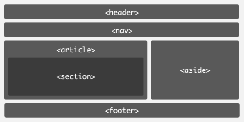
The semantic structure of HTML 5 will save developers from having to add many divs, but marking up the rest of the content correctly will still be important for having a semantic website. Last but not least, understanding the difference between block-level elements and inline elements and what every tag is for will still be very important.
Table-based layout with CSS
Another new feature will display block-level elements as tables with the help of CSS. The display attribute for the wrapper would be set to table, and the display attribute for block-level elements that are columns would be set to table-cell. Table-based layout with CSS will be more robust than the float model, in which the layout often breaks when the font size is extreme. Another positive effect is that columns will automatically be equal in height.
With the release of IE8, all three major browsers now support the styling of block-level elements as tables. It will probably be a while, though, before the majority of users actually use a browser that renders the feature as intended.
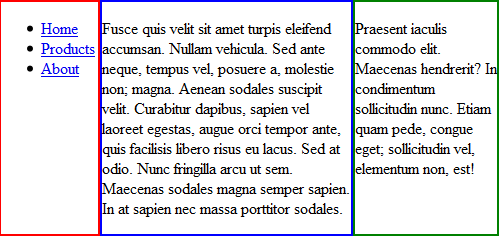
HTML
<body>
 <ul id="menu">
    <li><a href="#">Home</a></li>
    <li><a href="#">Products</a></li>
    <li><a href="#">About</a></li>
 </ul>
 <div id="content">
    <p>Fusce quis velit...</p>
 </div>
 <div id="aSide">
    <p>Praesent iaculis commodo elit...</p>
 </div>
</body>
CSS
body { display: table; table-layout: fixed;}
#menu, #content, #aSide { display: table-cell; }
#menu { width: 20%; border: 2px solid red;}
#content { width: 50%; border: 2px solid blue; }
#aSide { width: 29%; border: 2px solid green;}
The wrapper (in this example, body) is set to display as a table, and the relevant columns are set to table-cell. This even works for list elements, as the example shows (and it saves a div). This is a trimmed example; a normal structure would contain a header and footer. This would have required an extra div to contain the row with menu, content and aSide. The container that holds each row would need its display set to table-row. The container for each row is needed to get a break line after the columns.
Multi-column layout with CSS
Some CSS 3 magic will help developers arrange text in columns within an element. This will be possible in two ways: by defining either a column width or a column count.
Multi-column layout is currently supported in Mozilla and Webkit-based browsers, which prefix these properties with -moz- and -webkit-, respectively.
Column width
The number of columns displayed depends on how wide the column is set (spacing between columns is controlled by the column-gap property) and how wide the container is.
-webkit-column-width: 8em;
-webkit-column-gap: 1em;
-moz-column-width: 8em;
-moz-column-gap: 1em;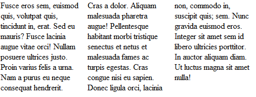
column-width on the paragraph tag and a body width set to 495px. The code is rendered in Google Chrome.Column count
The column-count property defines how many columns text is divided into. The width of the columns depends on how wide the container, column gaps and column borders are.
-webkit-column-count: 2;
-webkit-column-gap: 1em;
-webkit-column-rule: 1px solid black;
-moz-column-count: 2;
-moz-column-gap: 1em;
-moz-column-rule: 1px solid black;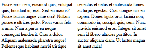
column-count on the paragraph tag and a body width set to 490px.The code is rendered in Google Chrome. (It looks the same in Firefox, aside from the column divider not showing.)Further reading:
- https://www.w3.org/TR/html5/ W3C Working Draft 10 June 2008.
- https://en.wikipedia.org/wiki/HTML_5 About HTML 5.
- https://www.w3.org/TR/html5-diff/ Differences between HTML 5 and 4.
- https://www.alistapart.com/articles/previewofhtml5 A preview of HTML 5.
- https://www.alistapart.com/articles/semanticsinhtml5 Semantics in HTML 5.
- https://www.builderau.com.au/program/html/soa/HTML-5-Editor-Ian-Hickson-discusses-features-pain-points-adoption-rate-and-more/0,339028420,339292515,00.htm HTML 5 editor Ian Hickson discusses features, pain points, adoption rate and more.
- https://www.sitepoint.com/blogs/2008/02/28/table-based-layout-is-the-next-big-thing/ Table-Based Layout Is the Next Big Thing (CSS).
- https://www.css3.info/preview/multi-column-layout/ W3C offers a new way to arrange text, “newspaper-wise,” in columns.
Knowing the difference between block-level and inline elements
A block-level element is an HTML tag (such as p, table, h1 or div) that generates a break line. A block-level element has five spacing properties: height, width, margin, border and padding. An inline element, such as a span or anchor, doesn’t generate a break line and isn’t as flexible a container as a block-level element. A block-level element is not allowed inside an inline element. Read more about this by checking out the links in the “Further Reading” sections throughout this article, because this is key for Web developers to know.
 (al)
(al)

