Optimizing Conversion Rates: Less Effort, More Customers

Email Newsletter
Weekly tips on front-end & UX.
Trusted by 182,000+ folks.


 Celebrating 10 million developers
 Custom Web Forms for Angular, React, & Vue. Your backend.
Most online store designers who want to optimize their conversion rates only concentrate on the “inner” part of the shopping process, the sales funnel. They focus on product pages, the shopping cart and check-out-process. This is good, but not necessarily sufficient. It is equally important that advertisements convert – just as the simple fact that users find the URL and that both (ads and URLs) perfectly fit the image conveyed by the landing page. Sound practices make for the most successful conversions.
You may also be interested in the following related posts:
- Optimizing Conversion Rates: It’s All About Usability
- Use Conversions To Generate More Conversions
- Design To Sell: 8 Useful Tips To Help Your Website Convert
- Conversion Rate Optimization For WordPress
There are thousands of tips and tricks for increasing conversion rates. There are various marketing techniques that aim at simplyfing the purchasing and the checkout processes. This article is the first part of our new 3-part-series “Optimizing Conversion Rates” that covers most important strategies and techniques that will help you boost your conversion rate. The second part will be published next week, and the last part will be published the week after that. The first article deals with “proper” advertising, building up trust and credibility and the handling of shipping costs.
Create Suitable Ads
Let’s look at traffic coming from an online advertising campaign. This is traffic you can directly influence by changing content, display frequency and display location.
Relevance
The key to good ad performance is relevance. And the most important key to relevance is “negative selection.” Look at the platform your ad is running on; Google, for instance. Are there users on that platform who would want nothing to do with your product? Are there keywords people would use in a search that might mislead to your website? Use negative selection to filter visitors whom your products are not targeted to. This mechanism will work as a magnet for more relevant visitors.
A good example is local content. If you have a car repair garage located in Birmingham, England, you should include this location, because users from London would be less likely to become customers. What’s more: If irrelevant users click on your ad, they will cost you PPC fees and lower your score in Google’s ranking.
Connection between a search term and an ad
A second and very important criterion is to establish a strong connection between a search term and your ad. A search term can tell you a lot about a user’s search context. And your ad has to address that context by delivering the right answers.
To start simply, divide your audience into at least two segments:
- Novices who know very little about your product, your company or even the industry. You will have to explain your product to these users.
- Experts who search for the exact differences between your and your competitors’ products.
Now analyze the keywords you have chosen. Divide them in two groups, and develop two or more variants of your ads that respond to the needs of each of these audiences.
The same applies to display advertising. The more generic the host page (whether a portal, home page or navigational page), the more basic the information your users will need. This applies as much to the content of your ad as to its graphical elements.
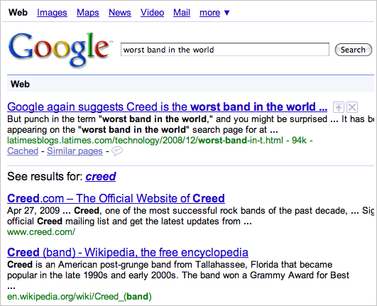
Google Search Results suggest that Creed is the “worst band in the world”. If there was a possibility to influence Google index, the band “Creed” would probably have done it.
And the ad alone mustn’t only demonstrate relevance to your visitor. Your landing page must meet users’ expectations as well. Both your landing page and ad should work as an informational unit. A not-so-savvy-novice who is looking for a solid MP3-player may be interested in the battery life and price, while an expert may want to know full technical details such as the technology used, available ports, advanced features or maybe the coolness of the design.
To sum up, relevance is probably the most important criterion for successful conversion. This separates good communication from inefficient communication. Even the location or size of your company can be relevant if users fear that their order may not be delivered on time, intact or at all. Simple page elements like a photo of your company’s building or storage depot can do a lot for credibility.
Build Up Trust And Credibility
You may already know this, but there is something deeper than just relevancy. Sales can be lost if a potential customer decides to ignore certain sellers or certain kinds of sellers. This even holds true for retailers selling on eBay or by posting ads on Google. Some people mistrust eBay sellers in general.
In a study by the Foresee Institute, researchers found out that only 49% of Internet users in the US are willing to use native online payment methods like PayPal and Google Checkout.
Consider the payment method, for instance. Most eBay sellers use prepayment, which is very convenient for the seller, but may scare away the potential customer. In a study by the Foresee Institute, researchers found out that only 49% of Internet users in the US are willing to use native online payment methods like PayPal and Google Checkout (see the section “How Satisfaction Influences Loyalty and Purchase Intent” in the Apparel & Accessories Report (pdf)).
This distrust of transmitting sensitive payment data and integrated security systems in general is a good lesson in what it takes to build trust.
Money-back guarantee
Money-back guarantees can make a purchase easier, even when mistrust or uncertainty have a significant impact on the customer’s deicision-making. Offering your customers such a guarantee, you build up the feeling of trust and comfort, making it easier for users to actually purchase a product. In Europe money-back guarantees are required by law, so many European companies use it as a sound marketing argument in their campaigns.
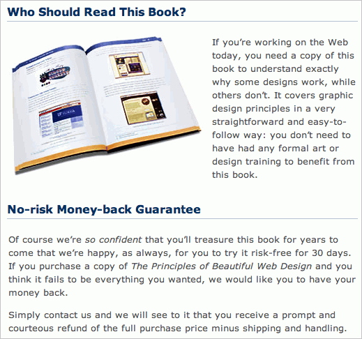
Sitepoint promises a no-risk money-back guarantee for its books. That’s fair, honest and sounds trustworthy. It may also be a good idea to add the “money-back guarantee” into the shopping cart by default, so they are packaged in warm feelings, making it a central focus of users.
These considerations may help you to build up a trustworthy environment for your customers, but they alone will not necessarily be able to make a difference. In fact, trust and credibility have a subtler, more emotional dimension.
A professional design is necessary to differentiate your business from that of amateurs and students who sell out of their grandma’s living room. How about showing photos of your team members? Tell your customers your story, create a relationship with them, show them your “human touch” by talking with them honestly. Provide your customers with e-mail addresses of the team, phone numbers, and, of course, e-mails – that’s another sign of confidence. And, of course, if you have excellent user recommendations on eBay, LinkedIn or any other price comparison websites, you can display those, too. And you should!
Don’t Push The Customer Away With Shipping Costs
This is almost the same point as the one about money-back guarantees, but a bit more nuanced. Too many sellers have abused their customers trust by hiding shipping costs to generate extra revenue. This has now become obvious to most users. It’s not just about the added costs; it’s about fooling customers.
The aforementioned Foresee study analyzed 10,500 shopping transactions in 30 online stores. By far the most important feature that significantly improved the conversion rate was the simple fact that a seller didn’t charge any shipping costs; it was the decisive factor for 34% of all users.
There are two reasons for this. First, when shipping charges aren’t added later, users will know the final price of their order early in the shopping process, maybe even when they see the online ad. For you as a seller it means that you remove the barrier between user’s decision to buy a product for a given price and his confusion about the “final” price during the checkout procedure.
Secondly, the price is more “transparent” and users can easier decide if they are interested or not; besides, they can also easier compare a product with other products. The customer not only compares online stores but also compares online stores to the “real” ones. Purchasing from a real store can sometimes be faster than doing it online, and no shipping costs can certainly compensate for that.
Sometimes, particularly if the seller is shipping worldwide, delivery costs can not be avoided. In these situations make sure that the available shipping options are clear, transparent and easy to understand. The customer came to you to purchase a product, not to spend minutes on decrypting the complex costs matrix. Consider the following two examples (screenshots below). The more complicated a shipping costs table is, the more likely a user is to cancel the checkout process and look for alternatives. Even a tiny doubt or confusion can completely change customers’ decision, so you better do a good job of making it easier for them to finish the checkout process.
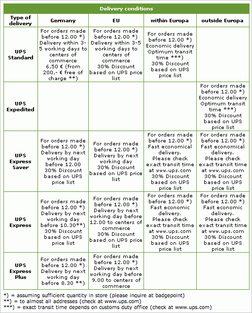
This isn’t helpful for customers: a complex overview of shipping terms and costs on Badgepoint.
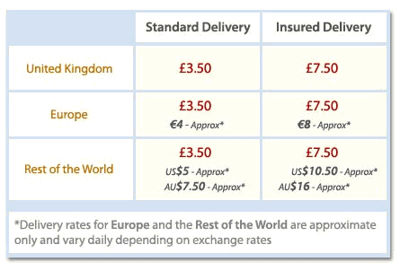
A simple overview of shipping costs on Selectspecs.com.
However, if free shipping is a viable option in your business, you may want to try it out, since it may significantly boost your conversion rate. Of course, free shipping is not really “free shipping,” at least not for the retailer. But there are some strategies that can be adopted: a minimum order price or value, for example. But do not block the user from ordering if this minimum is not reached. Add a shipping cost and call it a “Small-order fee.” Inform the user clearly how much more they will need to purchase to qualify for free shipping.
Another idea: how about offering users free shipping on their first transaction? You could look at it as an investment to gather their registration data. Or specify a certain time frame in which customers can redeem the free shipping offer and state it on the ad. The technique is similar to issuing coupons for in-store shopping, and it puts more pressure on the customer – but in a positive, money-saving way.
You simply have to calculate how much more overall revenue you can generate by dropping shipping costs. Try it out – you won’t be disappointedt!
Stay Tuned
This article is the first part of our new 3-part-series “Optimizing Conversion Rates”. The second part will be published next week, and the last part will be published the week after that.


