12 Tips For Designing an Excellent Checkout Process

Email Newsletter
Weekly tips on front-end & UX.
Trusted by 182,000+ folks.
 Custom Web Forms for Angular, React, & Vue. Your backend.


 Celebrating 10 million developers
Shopping online can be a great experience. You don’t have to leave the comfort of your home and you can quickly compare and read about all the competing products in order to pick the best one for you. But it can also be a little frustrating if the process isn’t designed correctly.
Looking around for that checkout link, having to fill out registration forms and then being told the product is out of stock isn’t going to make your day. Spend a little bit of time fine tuning your checkout process and polishing off the user experience and you’ll be rewarded with happier customers and more sales. Here are 12 useful tips to help you do just that.
You may be interested in the following related posts:
- Shopping Carts: Examples And Best Practices
- Design To Sell: 8 Useful Tips To Help Your Website Convert
- 7 More Useful Tips To Help Your Site Convert
- Optimizing Conversion Rates: Less Effort, More Customers
1. Don’t require registration to shop
Your customers are here to shop, not fill out forms. Make sure that the registration is done during the checkout process and not before — and certainly not before a visitor places goods into their shopping basket. Sign-up forms are barriers because they take effort and time to fill in.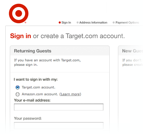
By moving these barriers further down the line you increase the chance of your visitors becoming paying customers. This is because they’ve already spent time shopping so they’re less likely to stop now and waste that initial involvement. If that barrier is placed right at the beginning however, they might just walk away. Think of it as holding the door to your store open for your customers to come in.
2. Inform customers if the item is available
Be clear about the availability of the items and inform your customers about the stock levels. If an item isn’t available, don’t take your potential customer through several steps just for them to discover that they can’t actually buy it right away. Don’t just display stock levels on product pages either, show them right on the search results page.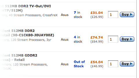
Additionally, if an item is out of stock right but will be available at a later date, offer a pre-order option so those people who aren’t worried about getting it right away can still make the purchase.
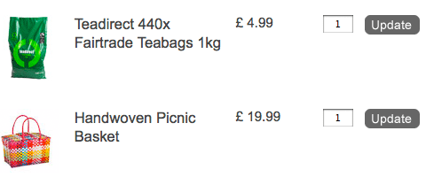
3. Allow your customers to easily modify the order
Everyone makes mistakes. People put the wrong goods into their shopping basket or change their mind. Make sure you don’t frustrate your potential customers during the checkout process by making things easy to modify.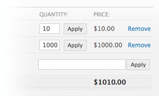
If someone wants to remove an item or items from their cart, don’t force them to enter the zero amount; instead, provide a “remove” link that will delete a product from the cart and ensure order modification is quick and easy.
4. Provide users with real-time-support
Since the checkout process requires user’s input, it is very likely to assume that many users might experience problems – caused by any misunderstandings or some particular needs or interests that can not be easily defined using the available web-interface. In these situations it may be crucial to provide users with professional, personal assistance instead of sending them to large help- or FAQ-pages that may not have the solution to user’s problem. And, of course, if users don’t get the help they need and have doubts about the whole thing, they are very likely to cancel the checkout process.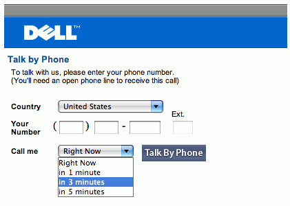
Therefore it’s a good idea to add a chat- or telephone-assistance for the checkout process. Not every company can afford it, but middle and larger companies may want to consider this option, particularly if the checkout process is more involved.
5. Keep the ‘Back’ button fully functional
The back button is one of the most used buttons in a web browser, so you can be sure some people are going to employ it during the checkout process on your site. Some sites disable the functionality of the Back button through automatic redirects or error messages, which is sure to negatively effect the visitor’s experience.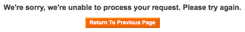
Not only should the back button lead to the previous page without encountering any errors, you should also save the user’s data so that it is displayed again if it’s a form. This allows people to make adjustments and carry on without having to re-fill the whole form. Yes, sometimes it’s too late to go back, like after clicking that last ‘Complete order’ button, but by ensuring that all the other pages get along with the Back button you can deliver a better user experience to your customers by saving them time and frustration.
6. Provide photos, specifications and links for the items in the basket
Your customers will need to review their basket before clicking that final button that will complete their order to ensure they’ve actually got what they came here for. Item titles alone aren’t the best method for helping your visitors to quickly scan over the basket, so make sure to add pictures and product specifications — e.g. size, color, hardback or paperback.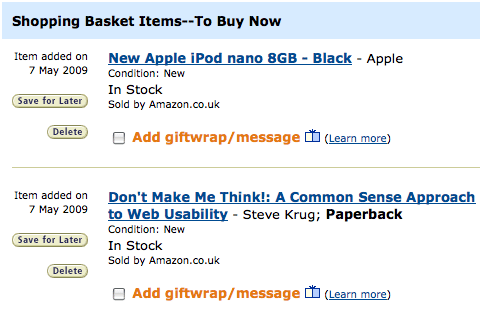
Additionally, you should link these items to their product pages just in case the customer wants to verify that it is indeed the right item.
7. Provide a progress indicator
Checking out is usually a multi-step process. This means the customer will have to navigate several pages before the order is complete. To make this process usable be sure to add a progress indicator that says exactly at what stage of the checkout process the customer is right now and how long there is left to go — i.e. list all the steps.
Knowing where you are in the topography of the site or process will give your users a sense of control, which is important from a usability perspective. Also, knowing what stages are yet to come will eliminate any confusion — i.e. they will know when they get to the last step. This will makes it easier to click through as you know you can still modify or cancel the order at any of the stages before that.
8. Keep the checkout interface simple
The checkout process is different to the rest of the browsing experience on your site. During this process your customers aren’t shopping — they’re making the purchase. This means all the browsing controls are redundant here and would only distract your customers from the task at hand. Eliminate these unnecessary elements — e.g. product category links, top products, latest offers, and so on — to keep the interface simple.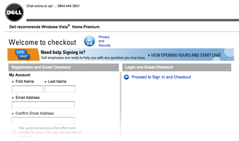
Provide a “return to shopping” link in case the customer wants to go back and buy something else. Additionally, ensure all the buttons that point to the next step in the process are large and prominent so they’re not missed.
9. Don’t take the user out of the checkout process
It’s essential that the checkout process isn’t disrupted, for example, but taking the customer to a different page. Taking the user out of the process can cause two problems: 1) they might get confused about where they are and even lose the checkout page by closing the tab or window. 2) they may get distracted and fail to complete the process.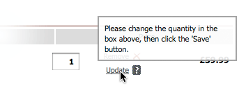
To remedy this, we really need to find a way to show all of the necessary information on the checkout pages themselves. If you need to provide some help or information that doesn’t fit on the current page, use floating windows or, as a last resort, a pop-up window to display this. This allows you to present new material to the user without taking them out of the checkout process.
10. Inform the users about delivery times
Shopping online has one big disadvantage to shopping in your standard ‘brick and mortar’ store: you have to wait to get your stuff. To address this be sure to tell your customers when they can expect to receive their products.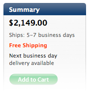
This is essential for a couple of reasons. Firstly, your customers may need to make sure there is somebody at home to receive the delivery; and secondly, you’ll set an expectation so they won’t need to keep guessing. Make sure these dates are shown as early as possible, preferably on the product pages themselves, so that your potential customers can judge whether or not they’ll get the item fast enough for their needs.
11. Tell the customers what happens next
Okay, your customers have completed the order and clicked that last button — so what happens next? Finalize the order with a “Thank you” note. This is just being polite and your customers are sure to appreciate the kind words.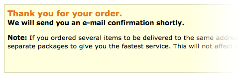
Also, make sure to tell your customers what will happen next — i.e. a message informing them that they’ll receive a confirmation email when the goods are shipped. This will clear up any uncertainties about their order and set the right expectations.
12. Send out a confirmation email
Your customer may have checked out and placed their order, but the process isn’t yet complete. Send out a confirmation email with the details of their order and a delivery estimate. The order details will be helpful as they’ll allow your customers to verify that they’ve ordered the right things.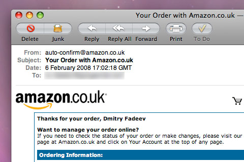
If there’s a mistake, they should be able to log back in and modify their order before it has been shipped. Simple mistakes like choosing the wrong size or color will happen, so make the shopping experience easy and supportive for your customers.
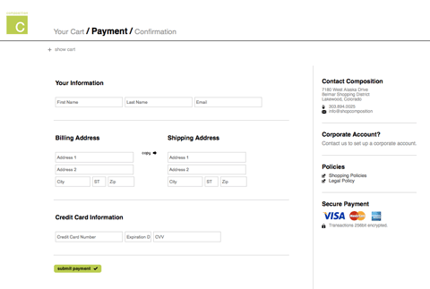
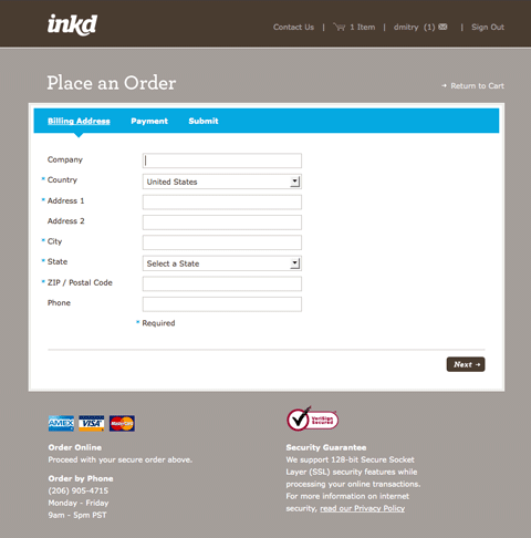
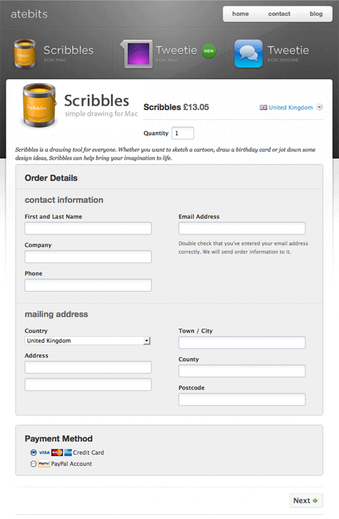
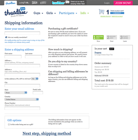
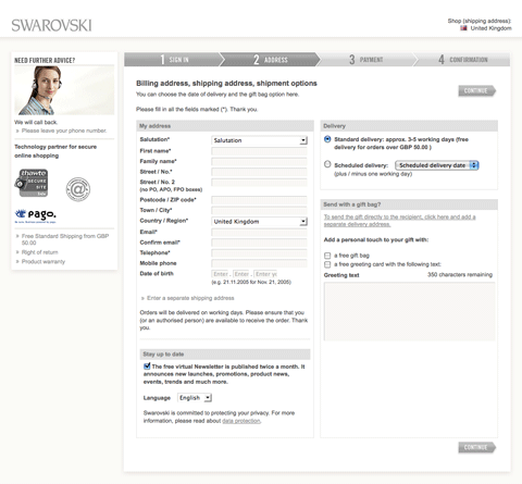
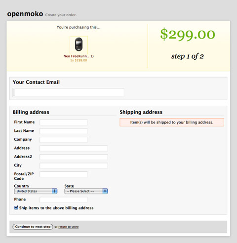
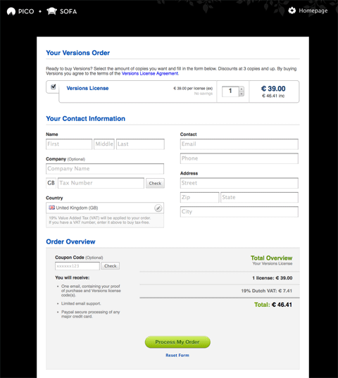
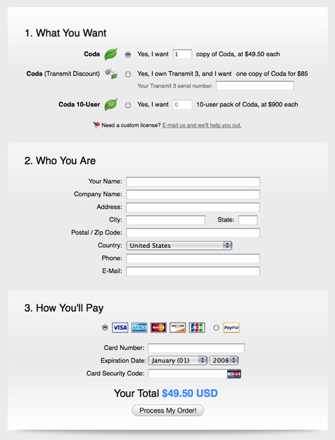
Checkout pages gallery
To Conclude…
Building a good checkout experience is about several things. It’s about eliminating distractions to help the user focus at the task at hand. It’s about providing all the necessary information and help so that the customer understands all the stages of the process. Most important, it’s about making it easy, because after all, the quicker a customer can check out, the happier they will be and the quicker you’ll close the sale.
Related posts
You may be interested in the following related posts:


