Modal Windows In Modern Web Design

Email Newsletter
Weekly tips on front-end & UX.
Trusted by 182,000+ folks.


 Celebrating 10 million developers
 Custom Web Forms for Angular, React, & Vue. Your backend.
Web design is essentially the organization of information into a readable, usable, functional and accessible format. Good organization of content is crucial, and you need a strong layout that you can build a website upon. You can use numerous interface elements and structures to organize content, such as jQuery-based content sliders and modal windows, which are basically windows that float above the page.
The modal window has many advantages. For example, when a modal window contains a smaller element, the user doesn’t need to load an entirely new page just to access it (another way to achieve the same effect is e.g. by using AJAX-based tabs). By providing modal windows, you improve the usability of your website. Having to load pages over and over will annoy most users, so avoiding that is definitely a good thing. Modal windows also allow you to save space by getting rid of large elements that don’t need to be on the main page. For example, rather than putting a full video on a page, you can just provide a link, thumbnail or button of some sort.
In this article, we’ll go over best practices and trends for working with and building modal windows. We’ll also provide numerous examples of well-constructed modal windows and a few scripts to get you started with building them.
You may be interested in the following related posts:
- 30 Scripts For Galleries, Slideshows and Lightboxes
- How To Use Help Elements To Improve Your Designs
- 8 Layout Solutions To Improve Your Designs
- Designing Drop-Down-Menus: Examples and Best Practices
- Breadcrumbs in Web Design
When to Use Modal Windows
Modal windows are an excellent structural element, but they don’t work for every type of content or media. Here are few elements for which you should consider using modal windows.
Lightbox for Images/Videos
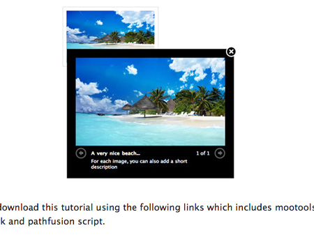
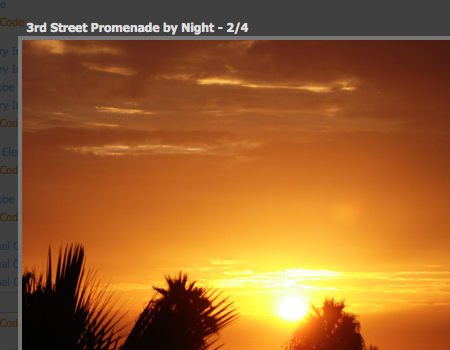
The most obvious use of modal windows is for the lightbox, which showcases images and video in a clean and usable fashion. By using a lightbox for images, users don’t have to load a new page just to view a single image or video. Modal windows also save space in the content layout by allowing you to show only the thumbnail of an image or video, which opens the modal window when clicked. By using a thumbnail instead of the entire element, you take up much less space and the layout looks more organized.
Furthermore, you would usually blur or fade out the background behind a modal window, putting the focus on the image or video itself, thus creating an excellent environment in which site visitors can view the media. For details on fading and blurring out the background of a modal window, see the styling practices outlined below.
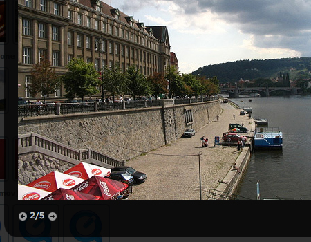
When using a lightbox for an image gallery, be sure to link every image to the same lightbox, providing “Next” and “Previous” buttons to allow users to navigate the image set with ease. The user then does not have to close and re-open the modal window to view each image in the gallery.
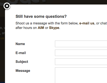
Contact Forms
One often sees contact forms contained in modal windows. Modal windows work well for this purpose because you don’t have to create a full page for the function. In terms of usability, it is important for contact forms to be immediately available and easy to find. By using a floating window, contact forms are easily accessible on each and every page. Contact forms are generally small, so they will fit quite nicely in these windows.
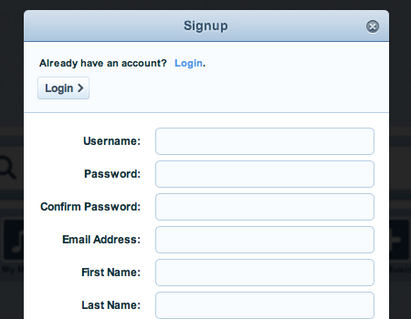
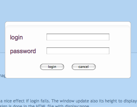
Sign-Up/Log-In Forms
Instead of creating a separate page for users to log in to and sign up for your website, you can use a modal window, which is actually often used for this purpose. This approach makes the form available on each page for easier access. You can include a link to the log-in window in the header of the website.
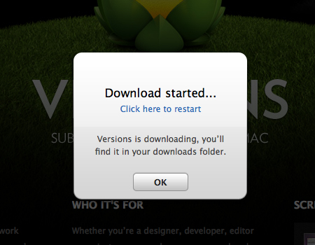
Alerts/Notices
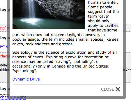
When you want to alert users of a critical function or an action taking place, the best way to do so is through a modal window. When a modal window opens on a page, the user cannot ignore it because it will appear directly in the middle of the screen, right where the user is looking. Furthermore, the rest of the content will be faded out and disabled, so the user can’t do anything else until they look at the window and click to close it. In the screenshot below, you can see a modal window being used to alert users to a download.
Please notice that you should not use modal window as an alternative pop-up-approach. Please make sure to alert your visitors only in case something cruical to the current browsing session has taken place. In many situations, a simple faded block in the layout would work better than a modal window.
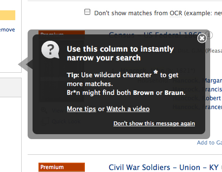
Help Elements/Tips
Additional help elements and tips aren’t essential to the functionality and navigation of a website, so you don’t want them to take up space and get in the way of content. Not all users want to use them anyway. However, they need to be conveniently located for those who do want to use them, so it seems reasonable to show help elements and tips in modal windows. Users can easily open and close them, without them getting in the way of content and functionality.
Here below is a good example of a help element in a floating window. This window is much smaller than the other ones we’ve seen; but it contains similar functions. For example, a semi-transparent border for visual separation and an “exit” (close-) button in the top-right corner.
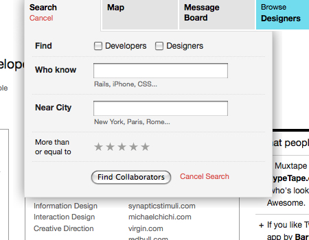
Search Boxes
This is a less common practice, but you will occasionally see modal windows containing search boxes. Advanced search functionality can take up quite a bit of room, so to prevent a large search box from taking space away from the content, you can put it in a floating window. You can see this in practice in the screenshot below.
Embedding PDFs
Sometimes you need to embed files on your website, such as a PDF of your résumé. Instead of providing a link that users can click on to download the PDF to their computer or embedding the PDF some other way, you can use a modal window for the same purpose. This way, the PDF can be easily viewed without disrupting the user’s experience of the website. By blurring the background, you also bring focus to the PDF, which improves usability.
Usability and Styling Practices
The following is a list of usability and styling practices and trends to keep in mind when building your modal windows.
Blur and Fade Out Background of Window
Foremost in importance for usability and styling is fading out the page behind a floating window. You will see this practiced nearly everywhere, most often with lightboxes for media. By fading out the page, you bring all of the user’s attention to the floating window. If the background doesn’t fade, the user may not even realize right away that the window is “floating” above the page and is not a part of the main layout. The appearance of a window physically floating above the page also gives your website dimension. It looks cleaner and eliminates confusion. Overall, the fading provides much needed separation between the window and the page, improving functionality and usability.
Make sure the fade is heavy, but leave a slight opacity, so that the user knows the page hasn’t disappeared. For example, a black fade with about 75% opacity would work well. But for websites with a white background, fade the page with white with a slight opacity, and use a drop-shadow.
Sometimes you will see a modal window that doesn’t fade out the entire page but instead has a strong drop-shadow below it to add dimension. This creates the same effect and provides a similar visual separation. You can see this technique used perfectly in the screenshot below.
Exit Strategy: Button, Click Outside Window, Escape Key
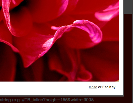
To improve functionality, always provide an exit button in an upper corner of the window. It is standard practice to use a simple circular button with an “x” graphic, which is clean and quite obvious for the user. In the lightbox shown below, you can clearly see the exit button.
Other methods of allowing users to close modal windows is to let them click outside the window on the page behind, to click on the displayed element in the modal window or to hit the Escape key once.
Disable All Other Page Functions
Disable all functionality of the page behind the window. It should be focused out, and no buttons should be able to be clicked when the modal window is open. The floating window should be separated from the rest of the content, so disabling the page below creates a better separation. Keeping page scrolling functionality is a good idea, though, so that users have at least some freedom to refer back to the page if needed.
Using Transition Effects
Transition effects are small details that look very nice if done correctly. One good transition effect for modal windows is fading in and out. But don’t overdo it to the point of annoying users. Keep the fade brief but slightly noticeable.
In the example below, the blurred gray backdrop fades in and out, creating a great effect.
Scripts, Tools and Plug-Ins For Lightboxes and Modal Windows
When you start the process of integrating modal windows, you’ll probably want something to build off of. Here are 11 excellent jQuery scripts and plug-ins on which to base your modal windows. Each has its own unique features and functions, so check them all out.
Fancy Lightbox This is one of the better lightbox jQuery plug-ins. It’s well styled and very functional. It has clean styling, labeling features and website integration, and it works with AJAX.
Lightbox 2 This is the original lightbox script, built only for images. It’s simply styled and supports image set viewing.

Facebook Image/Content Viewer Here is an excellent script, based on Facebook’s floating window. This one supports images and content and is styled similar to Facebook’s well-known window.
Woork Mootools Lightbox This excellent tutorial from Woork shows you how to create a simple lightbox script. The script includes image set functions and label features.
nyroModal jQuery Plug-In This simple window plug-in supports all types of media and file scripts, including AJAX. It also has some great show/hide effects.
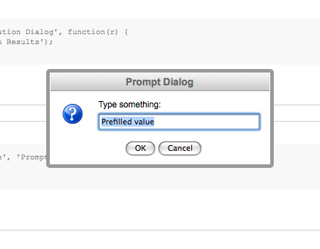
jQuery Alert Dialog This jQuery plug-in is for alert and dialog boxes. It has numerous functions and works very nicely for sending messages to users.
LightWindow Here is a comprehensive lightbox script with many features, such as PDF embedding, multiple image gallery support, SWF implementation and more.
Prototype Window Class Another in-depth set of scripts with different functions, such as dialog boxes, log-in windows, AJAX content windows, image lightboxes and more.
ThickBox 3.1 One of the more popular lightbox tools, ThickBox. It works with images, inline content and AJAX.
prettyPhoto A well-styled image lightbox that works nicely with image sets.
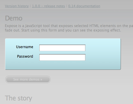
jQuery Expose This is a little different than a modal window script. This one exposes selected HTML elements. When you click a specific element, the rest of the page fades out. This is an excellent alternative to the modal window: it still fades out the page to bring focus to an element.
Showcase of Modal Windows
Grooveshark Grooveshark is a well-constructed and well-styled application, and the modal windows are no exception. A modal window, with the page faded out, is used for the log-in and sign-up functions.
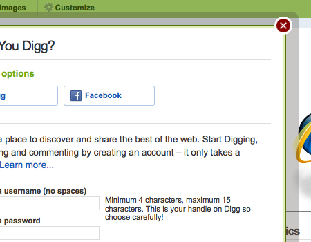
Digg Digg is another user-generated website with log-in and sign-up functions in a floating window. The log-in link is in the header of the website. Notice that a semi-transparent border is used instead of a fade and drop-shadow. The border provides more visual separation.
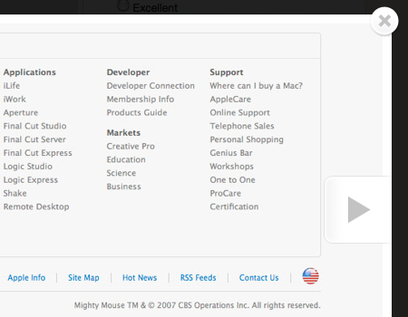
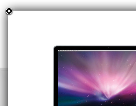
Apple Movie Trailers Apple uses modal windows in many places. Here you can see a window used for viewing movie trailers. The window is built just right so that large video files don’t impact the performance of the window.

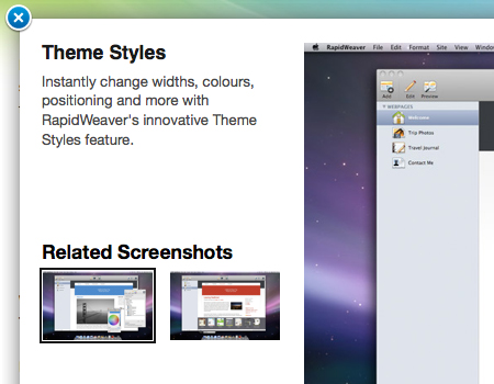
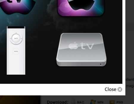
Apple iMac: Design Gallery Another example of modal windows on Apple’s website. These have a clean, simple style with a strong drop-shadow for visual separation.
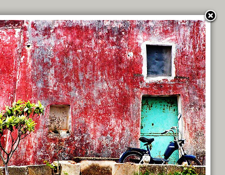
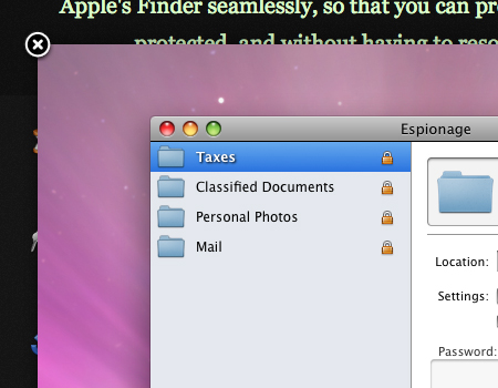
Espionage Another good example of an image lightbox. In this one, the image extends to the edge of the window, and the exit button is overlaid directly on the image. No border is necessary here because of the strong color contrast.
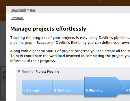
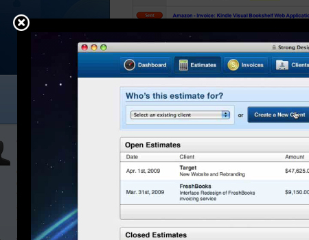
Daylite 3 A good example of a window with the background faded out. Multiple pages of content are integrated here in a single modal window.
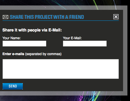
Behance Another contact form, this one with the familiar “Send to a friend” element, which is usually put in a modal window. Because the website has a mostly dark background, a light semi-transparent border is used for separation.
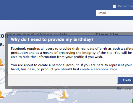
Facebook Facebook’s very recognizable modal window. This one contains information linked to a help element in the sign-up form. Again, a strong semi-transparent border.
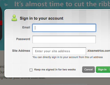
KISSmetrics Here is an excellent log-in form in a modal window. The form is well styled and contains help elements to improve usability: just because the log-in function is in a modal window doesn’t mean you can neglect usability.
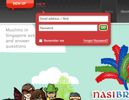
Nasi Briyani Lounge Another log-in form, this one a little different. Instead of a full modal window, this is just a simple pop-up window with a small form.
Pixelight Creative A lightbox on a freelancer’s portfolio website. When you click one of the portfolio items, a larger view opens in a lightbox.
![]()
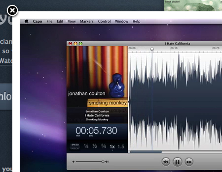
Capo Another well-styled window, this one a video featuring a tour of the software, which is a common practice. This one also contains a simple border with a slight drop-shadow.
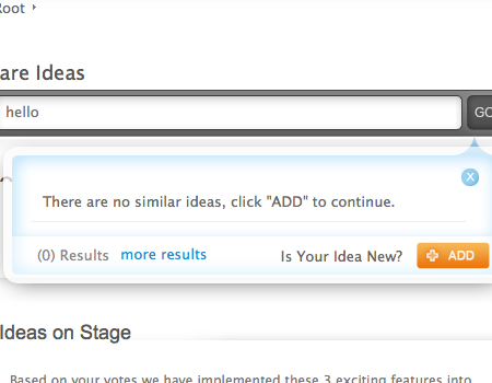
Accept-Ideas This floating window is attached to the search box. When you type a query, the results show up in the modal window itself. The window has basic functionality, including an exit button and border.
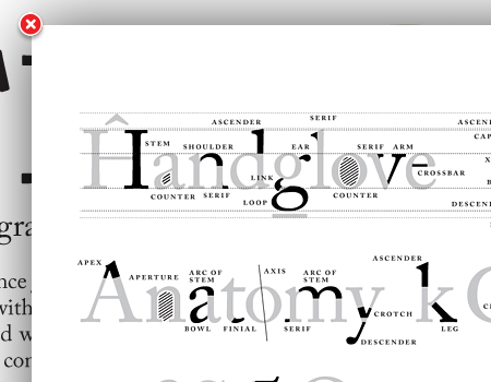
The Typographic Desk Reference A very simple modal window with a strong shadow that adds a lot of depth.
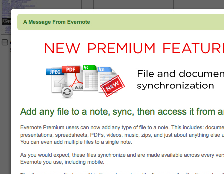
Evernote Web Application This screenshot shows an alert that you get when you open Evernote’s Web application. Notice how the page fades out strongly, which puts all of the focus on the window’s content.
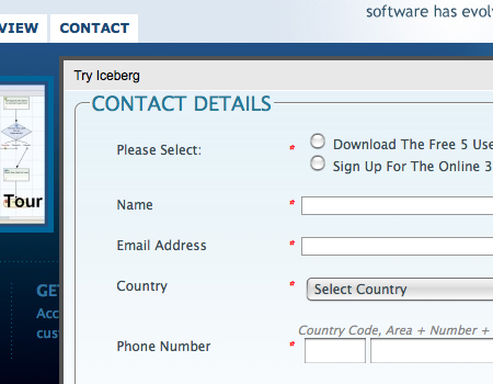
Iceberg Another sign-up form in a floating window. This one doesn’t have a fade or shadow but does have a border for separation.
Viewzi Corporate A beautifully styled modal window. Notice the large clean exit button in the upper corner, the generous padding in the window and the semi-transparent background.
Mail Chimp This lightbox has a semi-transparent border, and the page fades out.
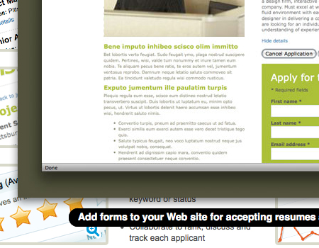
The Resumator Notice in this one how strongly the background of the image contrasts with the page background. A label is used here but not attached to the window, creating a very nice look.
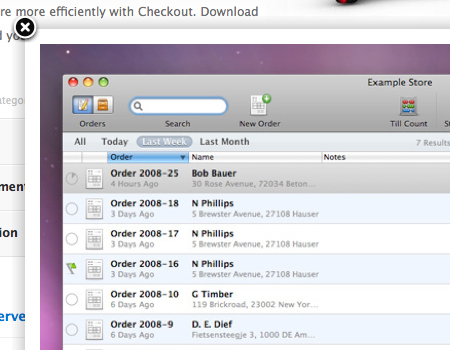
Checkout App A well-styled image modal window. This window has a slight drop-shadow to add depth and a solid border to provide more separation and frame the image.
Pixelmator Another example of a nice download alert. This alert pops up immediately once the download starts. Notice the excellent styling, such as the slight opacity of the window.
![]()
Ballpark Here is a modal window for a video, common for corporate and software websites such as this one. You most often see QuickTime and SWF videos in modals, but this one embeds a video from Vimeo. A great fade in and out transition, too.
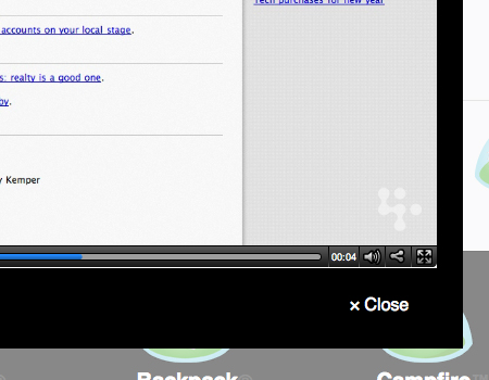
Backpack Another window with a video. Notice again how the page fades to a lighter rather than darker color.
Guifx An image lightbox for a portfolio, always a great idea if you want to include larger images to show details of your work.
Further Resources
You may be interested in the following related posts:
- 30 Scripts For Galleries, Slideshows and Lightboxes
- How To Use Help Elements To Improve Your Designs
- 8 Layout Solutions To Improve Your Designs
- Designing Drop-Down-Menus: Examples and Best Practices
- Breadcrumbs in Web Design


