Optimizing Conversion Rates: It’s All About Usability

Email Newsletter
Weekly tips on front-end & UX.
Trusted by 182,000+ folks.
 Celebrating 10 million developers


 Custom Web Forms for Angular, React, & Vue. Your backend.
In this article you’ll learn what to consider when preparing a perfect landing page for your product, how to focus user’s attention on the most important parts of your sites and also how you can use videos and user ratings to improve your conversion rates.
Professional Design Builds Trust
The most important rule for website usability is to keep it simple. Make your links speak for themselves. Make the structure of your website predictable. Provide clear and visible feedback. Comfort your visitors and make it hard for them to do serious mistakes.
However, while these (quite obvious) guidelines may help your readers to get a solid understanding of how your site works, they will not necessarily lead to more sales. Besides, you may have some goals that conflict with this paradigm of simplicity, the most important of which are probably up-selling and cross-selling.
Build Trust and Credibility
When it comes to building customer’s trust in your company, a professional, trustworthy design becomes crucial. In the Web, people are very likely to mistrust online-business, so you better make sure that you appear credible and serious. Inkd.com does just that with a professional look, a solid grid-based layout and following classic usability conventions.
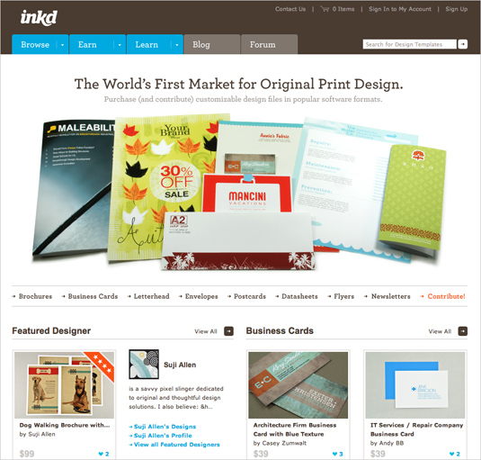
Inkd
For everything you do on your website, keep in mind that the user always has to be in control of what’s happening. This holds true for expert users, who will use your internal search to quickly access products they are interested in. They may want to be able to filter search results in a certain way. And it holds equally true for the users-newbies, who wants to see proof of the teasers on your home page and will likely use your primary menu to navigate.
When a user is attracted to the advertising campaign of a product, you have no alternative but to lead that user directly to the product page itself. The next click after that should lead the user directly to the purchase page. By the way, why should you use a shopping cart in this case, if the user wants to buy only one product? The cart becomes totally useless and creates more steps in the sales process. With each additional step, the risk of cart abandonment increases.
The rule of thumbs: if a user finds a product through your internal search engine, he or she shouldn’t have to click more than twice to find essential information about the product.
Deliver the right information at the right time
Speaking of good information, another important rule for leaving users in control is delivering the right information at the right time, whether the information is related to the product, shipping, credit card security risks, privacy or what have you. Because of the large amount of information you can deliver to the user, you need to sort it by priority.
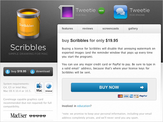
Delivering the right information at the right time is important. Scribbles: before users type in any data, the site informs them about payment methods, privacy and purchase opportunities for educational purposes. However, both privacy data and the “education”-link could be given more visual weight on the page.
The user will have certain questions at each stage of the shopping process; focus on the answers to these questions, and make them the most prominent on the page at that time. Additional useful information can be “hidden” behind a hyperlink (as the “education” link in the Scribble-example above).
Don’t advertise, lead the users
Be careful about using graphic elements to prioritize information; don’t make them look like advertisements. People tend to overlook page elements that look like ads. Of course, you can illustrate the advantages of your products with big pictures — really big pictures. Jakob Nielsen even recommends using full-screen-sized views: “If I click on a product image on a product page, I am certainly asking for a bigger version of that image. And as I intentionally clicked, I’m able to wait for the really great picture. I’m not only able to but I even expect to wait for some loading delay.”
The paradigm of simplicity means that store designers have to be very careful experimenting with new techniques such as AJAX and rich Internet applications based on Flash. If you use these, you will have to run usability tests. New studies show that many people are still unfamiliar with functions like dragging and dropping and do not know what words like “tagging” mean.
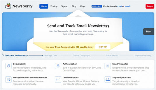
Newsberry
Newsberry uses a beautiful layout with attracitve design elements. However, it fails to attract readers to sign up for the service immediately – users need time to find the obscure, modest “sign up”-button. How much time do you need to find it? Probably making the button stand out would work better in this case.
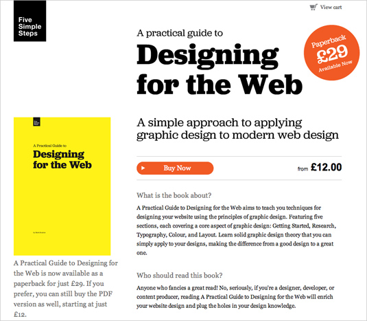
Be careful about using visual elements to prioritize information; don’t make them look like advertisements. Good example: Five Simple Steps
Mark Boulton’s Five Simple Steps does a good job of focusing users’ attention to purchasing options while not making them look like advertisements. Clear visual design and layout reinforce the sales funnel effect.
Getting back to the questions that customers pose, one of their big questions on landing pages is, “What next?” Take a look around the Web. You’ll find tons of stores that hide their order buttons or label them with ambiguous terms. For example, the German store Werbemittelguide includes the terms “Order or ask for an offer” on a single button. While distinguishing between direct orders and solicited offers gives users more control, placing these two different ideas on one button is confusing. In this particular case, clicking on the button does nothing other than put the product in your cart. And the cart is positioned in the bottom-left corner: a clear violation of user expectations.
Highlight What’s Important And Use Proper Wording
Go to the website guut, look for a second and then close your eyes. Open them again for a second and then close again. What did you notice? The big product picture on the left? The countdown? The huge orange order button? The label on the button says “Order now” — a couple of years ago, a lot of Web designers would have regarded that as outrageous, outdated design. Today, it’s state of the art.
“Tell people clearly what they should do next,” says US e-commerce expert Peter Blackshaw. What works with online shopping also holds true for online communication, downloading a PDF brochure or any other form of conversion. Make the most important option the biggest. Links to “More information,” “Details” and “Technical data” are also important, but less important than the conversion itself. They should be displayed in a smaller font or in less aggressive colors.
The US agency MarketingExperiments learned first-hand how strongly wording can influence conversion rates. It tested its own campaign, which aims to convert readers to paid subscribers. Every single element of the email campaign was tested. The button that triggered conversions was labeled “Continue here,” which at first glance would seem to work perfectly. The outcome of the test surprised even experienced experts. A new button labeled “Continue to article” converted 3.3% better than the first; and a third version, labeled “Click to continue,” convinced almost 10% more users.
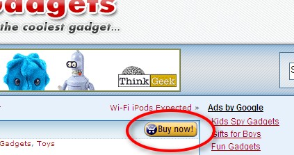
After inserting an Amazon-style order button, Al Carlton doubled sales on his website.
Video Is Often A Silver Bullet
It is becoming common sense for product descriptions and product pages to include videos that show the products in action. In Germany, almost 60% of all retailers surveyed by the BVDW indicated that they planned to increase their efforts with video.
The bike retailer Fahrrad.de invited sales agents from all brands to its new studio, which was built solely for producing videos for its website. The sales agents were advised to explain why their products were better than others. And most brands sent not only sales people but also cross-country world champions to stand in front of the camera. Some retailers might argue that their products are not suited to online video. By now, though, we can quickly find many products that are being advertised with online videos.
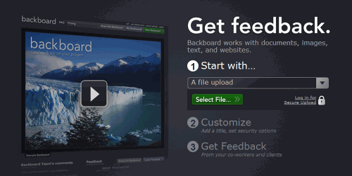
Both Getbackboard.com…
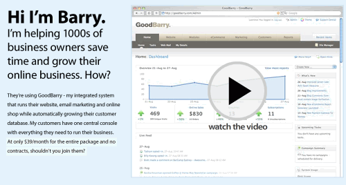
…and GoodBarry used prominent video blocks on their start pages. Videos are often used to quickly explain what the product is all about and what advantages it can bring to the customers.
What is very important to understand is that the videos don’t have to be full-throttle studio productions with enormous budgets. In many cases a hand-made personal video will do. It may even perform better than a traditional advertising video because it’s more honest. Websites that push new concepts, like eBags.com, try to build community websites around their product videos, and users can vote on which video they like best.
A very nice idea was used by Pleo, a company that sells a kind of robot pet that looks like a dinosaur. Pleo hit the sidewalks in certain cities, put the dinosaurs on the ground and shot people’s reactions. You could hardly advertise with more authenticity.
And don’t let anyone fool you, there is only one format for online video these days: Flash. Only Flash allows video to be seamlessly embedded onto a Web page and integrated with other elements on the page. Because of YouTube’s success, most users are able to play back Flash video. And producing video is really not expensive, even if it is farmed out to an agency.
Don’t Underestimate The Importance Of User Ratings And Customers Reviews
This may be one of the most important topics of all these days. In tourism, about 60% of all travellers base their decisions on online research. They visit ratings websites to find the best destinations and hotels, free from the marketing overtures of the companies themselves. Similar websites can be found in the electronics and other industries.
This leads us to two questions:
- Should store owners build their own ratings system?
- How should one deal with criticism?
The first answer is pretty simple. In most cases the answer is, “No.” And there are a lot of reasons for that. The most important reason is that no retailer is trustworthy in this way. People would know that commercial interests are behind any recommendation; the cost and effort to maintain such systems are immense; and only the biggest websites attract enough users to build a valuable rating system. If a website owner decides to build his own system, he must provide the ratings right in the spot where users expect it: beside the products.
Take Thomas Cook Travel an example. After a lot of research, it built its own user ratings system, which is now one major filter in its internal search. An external system like Idealo.de (or PriceGrabber.com) might be a better alternative. Idealo gathers ratings from a lot of platforms and aggregates them with tests and reviews from websites and magazines. The plattform itself is neutral because individual retailers cannot influence the content.
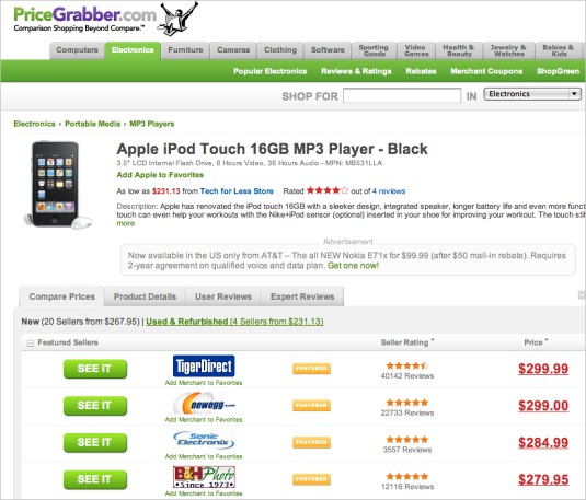 PriceGrabber
The second question is also easily answered, but the consequences are significant. When criticism comes its way, a company would do well to leave it on its system, as long as it isn’t obscene and doesn’t violate laws. This is what experts recommend. It is a very sensitive issue for retailers, their suppliers, the producers and brands, all of whom are trying to cooperate for mutual benefit. If you face this kind of criticism, forward it to the relevant partner and allow them to respond.
Stay Tuned
This article is the second part of our 3-part-series “Optimizing Conversion Rates”.


