Brand = User Experience: The Interface Of A Cheeseburger

Email Newsletter
Weekly tips on front-end & UX.
Trusted by 182,000+ folks.


 Celebrating 10 million developers
 Custom Web Forms for Angular, React, & Vue. Your backend.
In the first part of a series on the UX = Brand, the adventure of a web designer starts in a McDonald’s, where he discovers that there is a worm hole between the world of Branding and User Experience Design. Years later he learns that it is the Interface that connects both worlds. This is the first part in a series.
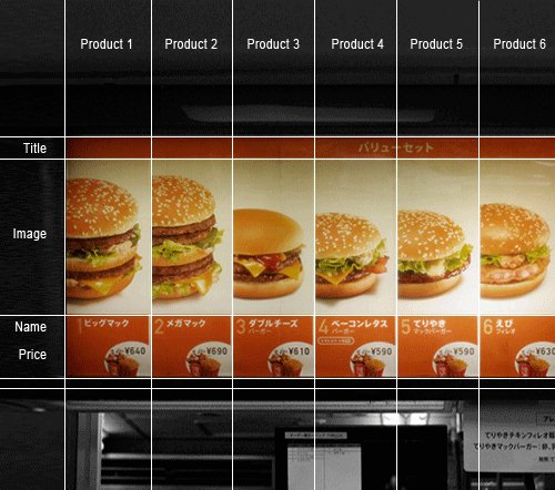
Waiting for his order, he examines the wireframe of the display on the cash register, the mechanical logic of the deep fat fryers, the input/output logic of the ice cream dispenser. Coming late from work, with his mind still in design mode, he starts tracing the restaurant’s interaction model, drawing arrows from the entrance to the counter to the tables to the trash cans; seeing how the conveyor-belt kitchen, the trays with the paper liners, the bolted down seats and the meals comprise a single, complete customer interface. “They must have run usability tests,” he thinks, taking his tray to the table.
Hungry For Food = Hungry For Words
When we are hungry for food, we follow similar patterns as when we are hungry for information. Similar, infantile patterns. At both times, we fall into a mode of dull impatient demand. We want everything immediately with as little interaction as possible. We want exactly what we expect in the way we are used to get it. When hungry, the last thing we fancy is thinking or making difficult decisions. Because, well, that’s how our body works. And that’s why after a hard day of work we often sleepwalk to McDonald’s.
When we are hungry for knowledge, we inevitably become mentally passive and use all our energies to receive information. Because that’s how our brain works. And that’s why we blindly return to Google search when looking for data.
McDonald’s = Google
McDonald’s is designed for you to switch off your brain as soon as you enter the door. Buying and consuming a Cheeseburger is an automated routine — simple and mindless, like tying shoelaces or riding a bicycle. You don’t need to analyze, guess, evaluate or make difficult decisions because McDonald’s is built in a way that minimizes conscious action. Once learned, the transitions between each step of the ordering process are automatic and seamless. Moreover, in any of its franchises anywhere in the world, McDonald’s provides one consistent user experience. Once learned, ordering, buying and eating becomes an easy routine. It’s just like Google: blunt, focused and clear.
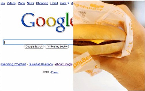
Both McDonalds and Google have a lot in common: both are designed for you to switch off your brain as soon as you enter the “door”.
McDonald’s was driving “user centred design” to the extreme before interaction designers even thought of the notion. From its logo to its tables, from its hamburgers to its trash cans, it’s all designed to be practical and useful rather than aesthetically pleasing.
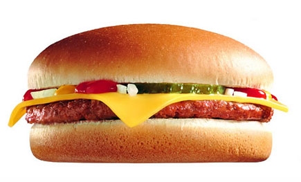
This functional approach is applied all the way down to the cheeseburger. Standardized in shape, taste, and consistency, it has an identity that is clearly distinct from that of the sandwich. There’s no need for a knife, fork or spoon, plate or pair of chopsticks. In fact, it has a simple hand-to-mouth interaction model not unlike that of baby to breast.
Fast Food Epiphany
The look, feel and taste of McDonald’s food is as branded as its logo. The design of the cheeseburger is a core component of McDonald’s corporate design, just like Ronald McDonald’s and the ketchup and mustard colors of its packaging. Its interface is its brand; its brand is its interface. But so what? Of course, everything at McDonald’s is designed and standardized. Of course, everything is calculated and controlled in a huge global franchise.
My epiphany that night was not that McDonald’s success is based on cold calculation. It was the realization that McDonald’s apparent lack of culinary and aesthetic taste is the result of ‘cold’ user interaction design. McDonald’s design is as user-focused as a high-traffic website. It’s designed so well that it makes us blind like sucklings. Just like Google’s search interface, its beauty is in the interactive experience and not in the object.
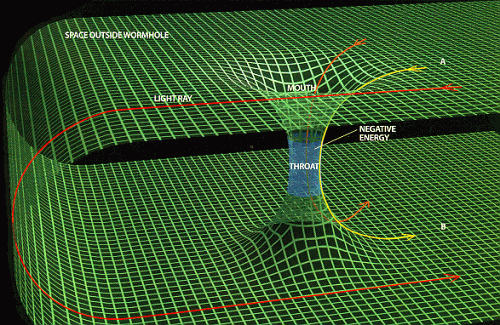
A Worm Hole Between Branding And UX
In my experience old school branders and interaction designers fundamentally misunderstood and hated each other. They lived in parallel worlds. In one world the designer controlled everything, in the other the user was in charge. What confused me was that the longer I studied McDonald’s frameset, the less I was able to tell whether I was looking at a brand or at an interface. Is this branding or is it user experience design?
I had found what Astronomers call a ‘worm hole.’ A shortcut through space and time that acts like a magic elevator between different realities. McDonald’s seemed to lay at a critical point: the gravitational center of branding, where everything slants into a funnel that leads to a parallel world of user experience design. And back again. Ironically, worm holes have two so called mouths that are connected with a throat:
After discovering that this fascinating indeterminacy between brand and user experience applied to most of the recently successful brands — be it the iPhone, the Wii or Star Bucks — I decided to investigate it by thinking about it and writing about it.
Learning From Babies
Just by watching my baby grow and interact with its world, I learned more about interfaces than I could have possibly imagined. Most of what babies do is learning to interface with their surrounding. Observing the baby drinking its milk, I noticed that the interfacing does not happen on the nipple. It happens more generally between the mother and the child. In other words: The nipple is not an interface; it’s just one touch point. The interface is in the whole experience a child makes during breast feeding. The interface is the way they connect. And this experience defines the brand “Mama” in the beginning.
By studying breast feeding (the blueprint of user interaction) live, I was more and more certain that the correct equation was Brand = User Experience. Translated back into theory: The Interface was in the equals sign, not on the other side of the equation. The interface is what connects the worlds of Branding and User Experience Design. It’s the tunnel. The elevator. The wormhole. The throat.
Make sure you don’t miss the second part of the series on Brand = UX. In the next part we’ll look at the tricky question “What is an Interface? And can it be intuitive?”
You may want to take a look at the following related posts:


