iPhone Apps Design Mistakes: Disregard Of Context

Email Newsletter
Weekly tips on front-end & UX.
Trusted by 182,000+ folks.


 Celebrating 10 million developers
 Custom Web Forms for Angular, React, & Vue. Your backend.
To better understand the context of these design challenges, we’ll highlight several levels of human and environmental factors.
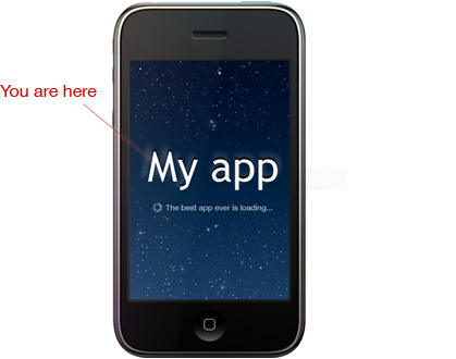
Level 1: You Are Here. To Create An App That Customers Love, Zoom Out
Level 1: The app itself.
This is how many developers view their apps. As a developer, you have a vision of what your product should look like and why customers will turn their attention to it. However, if you observe your product so closely, you may put it in the wrong context and design it for the wrong purposes and for the wrong users. This is why you need to zoom out.
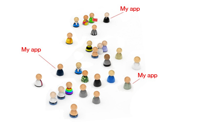
Level 2: A person is using this app.
That person has specific goals and challenges. In the section below we’ll start by exploring some of the most prominent – and most ignored – human factors pertaining to the iPhone. We’ll discuss basic physical ergonomics, visual limitations and common design mistakes.

Level 3: That person is using this app in a specific environment.
Step back and you’ll see that the app is a part of a complex social environment. It plays but a relatively small role in communication between people and helping people accomplish bigger goals. This is where the social components comes into play: networking, community, social-driven websites and applications and many other things create the environment – or the context — in which the application will be used.
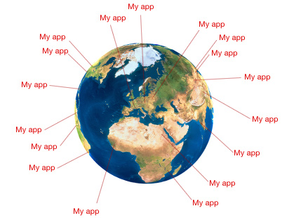
Level 4: The environment is part of a greater culture.
Your ability to address the unique needs of different cultures will affect the success of your product. Ignoring them is too expensive, especially if your app sells worldwide. Here it is important to understand that the environment is a part of global networking. You need to be aware of cultural differences, traditions and metaphors in order to create an application that will not only gain popularity in certain local circles, but will also have a global success.
Level 2: Understand The Person’s Needs And Limitations

“Measure twice and cut once”: an effective strategy indeed. For you, the iPhone app developer, this means that you have to step back and answer these questions before you start coding:
- Who will be using your application?
- What are the capabilities of that person?
- What are the limitations of that person?
Answering these questions will broaden your perspective and prepare you to address your customer’s needs. A whole Human Factors profession is dedicated to just that.
Basic Physical Ergonomics
Here are a couple of the most important physical-, cognitive- and ergonomic-related truths about the iPhone.
1. Our fingers are not mouse pointers.
Remember this property of our fingertips: their surface area is not equal to one pixel. In many applications, tappable objects are way too small, making the interface frustrating to use. Here’s one example: in iFitness, different muscle groups are indicated with red pins. Tapping a pin brings up the name of that muscle. And if you tap the name, you get a list of exercises that develop that muscle.
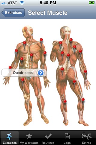
The pins are twice as small as those used in the Google Maps app. Tapping the pin you want is very hard, because the surface of your fingertip covers an area of three or more pins. You end up tapping repeatedly on the area, enabling random pins, wishing you could sharpen your finger. After more than a few tries, you get lucky and hit the right one.
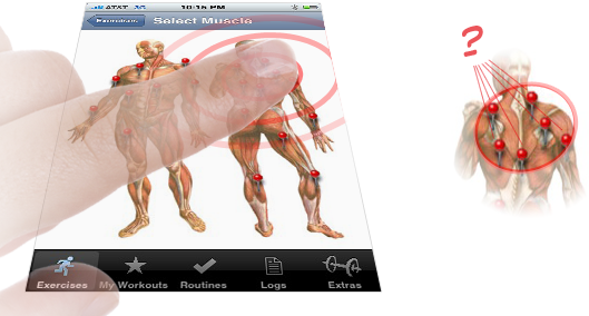
Which of these pins will be activated when you tap on it?
Here are some ways to solve these ergonomic challenges:
- Make buttons and other tappable objects bigger.
- If making a button bigger is impossible, then enlarge the clickable area to be bigger then the button itself.
- Reduce the number of options on each screen, and make the selection process sequential (e.g. Arm Muscles → Biceps).
- Implement multi-touch gestures within the interface. For example, selecting a muscle group in iFitness would be made easier by introducing a two-finger zoom feature.
2. We’re not superheroes, unfortunately.
App designers need to take vision limitations into account. Mobile phones tend to be used in places with worse lighting conditions than computers. Think about those people who will be using your app on a bumpy bus or train or walking down a sunny street. Even if the technology is useful and perfectly executed, people will be reluctant to use the app if they find it hard to see what’s going on. Here are a few examples of potentially useful apps that do not account for vision limitations.
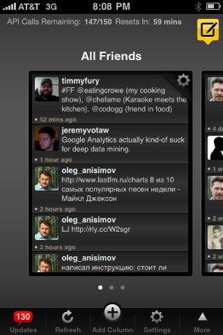
TweetDeck
Fish-tycoon

Here are some ways to avoid these mistakes:
- Choose only the elements that are absolutely necessary. Make them bigger, and get rid of everything else. If needed, create additional screens with fewer options.
- Remember that pixel dimensions on the iPhone are smaller than those on your computer screen. So, screenshots viewed on your computer’s iPhone emulator look larger than they would on the iPhone itself, even though the resolution is the same.
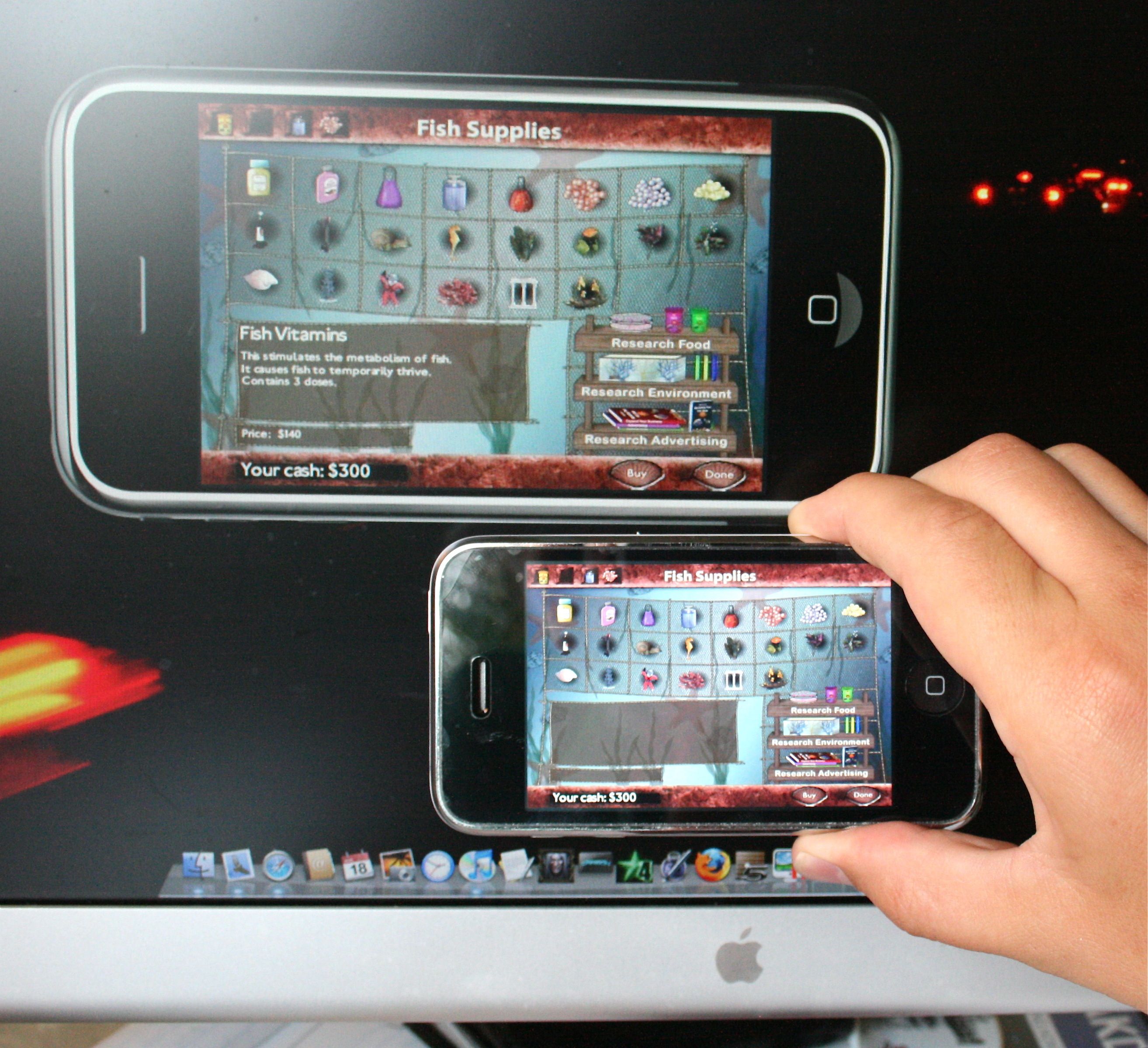
The author holds an iPhone (163 ppi) in front of Apple Cinema’s 30-inch display (~100 ppi). Your iPhone screen layout may look fine on a computer emulator, but don’t be fooled: it will appear much smaller on the iPhone because of its smaller pixel dimensions.
Level 3: Understand The Challenges Specific To The User’s Environment
Goals and Environment
Your app will usually play a relatively small role in helping the user achieve a bigger goal. The better you understand what goals people have and what they need to achieve them, the better you can design your app to satisfy those needs. Mobile phones are often used in loud, distracting environments. A simple stroll through town brings plenty of noisy distractions (cars, dogs, mail carriers, etc.). Consider the following examples. Which voice memo app would do a better job?
 | 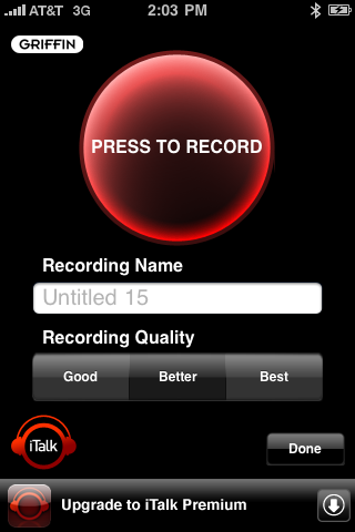 | |
| Apple Voice Memos | vs. | iTalk |
Although Apple Voice Memos looks nice, iTalk addresses the average user’s goals and environment much better. Think about it: why would someone prefer to record a voice memo over writing a note? The audio format has fewer advantages than simple text. You can’t scan, edit or enhance audio files as easily as you can text. In most scenarios, text is a much more convenient format in which to exchange information.
So, why and, more importantly, when would people use voice memos? When they are not able to type. The most common time is probably while driving.
According to the New York Times’ summary of the Virginia Tech Transportation Institute’s findings, drivers who text have a 23-times greater risk of a collision than drivers who don’t text. Which application would be easier to use in this case? The one with the big shiny mic and the record button that is small and hard to reach (especially for right-handed people)? Or the one with the red record button half the size of the screen? Certainly the latter.
Confirming for the user that the recorder is activated is important, too. Which interface communicates the device’s status more clearly? Where do you tap when you’re done?
 | 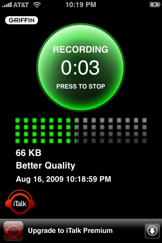 | |
| Apple Voice Memos | vs. | iTalk |
Based on which design works better overall, iTalk wins. Apple Voice Memo looks great when you’re checking it out on a friend’s phone but performs poorly in a real-world context.
Mobile Phones, Networking and Community
The mobile phone is, without a doubt, a social tool. The greater the number of people involved, the more engaging the experience is. Think about it: if you were the only one with a phone, it wouldn’t be very useful. YouTube, Facebook and Twitter are driven by the understanding that we are social beings – we want to share! Imagine how dramatically designs that foster greater social interaction could change the mobile world.
With the seemingly endless ways to capture and share information, many people feel overwhelmed with information. To help them cope, designers must exploit the iPhone’s platform to make their applications as efficient as possible. Here are some inspiring examples:
Bump
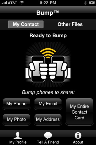
“Bump makes swapping contact information and photos as simple as bumping two phones together. No typing, no searching a list for the right person, no mistakes.” (iTunes Store description)
Mover
“Ever wished you could send something to the iPhone right next to you? Do it with style with Mover.”
Loopt
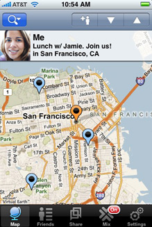
“Loopt transforms your mobile phone into a social compass to discover and navigate the world around you. Use Loopt to see who’s around, what to do, and where to go.”
How Loopt works (video):
Level 4: The Environment Is Part Of A Greater Culture.
Your ability to address the unique needs of different cultures will affect the success of your product. Ignoring them is too expensive, especially if your app sells worldwide. Design should adapt to regional challenges. Jacob Nielsen, a leading usability expert, gives us an illustration of this:
“In Sweden, the Automatic Teller Machines have very large buttons. I hadn't noticed this particular design element on previous visits, which have usually been in warmer months. In 1996 I was in Stockholm in February and immediately realized why the ATM buttons are so big: you can press them wearing thick gloves.”
Such insights are gained only by understanding the product in its real-world context. Here is the graphic designer’s point of view:
"... Understanding the object in context moves graphic design from a purely formal arena to a social and political one."
—Steven Heller and Karen Pomeroy in "Design Literacy," Allworth Press, New York, 1997.
More wisdom from Nielsen:
“A system must match the user's cultural characteristics. This goes beyond simply avoiding offensive icons; it must accommodate the way business is conducted and the way people communicate in various countries.”
Apple studied American users and addressed their goals. That’s why the iPhone is so popular in US. But it hasn’t succeeded in Japan. The handset is selling so poorly there that they are giving them away for free.
Conclusion: Excellence Comes From Hard Work
Designing a great app isn’t a simple task. Jacob Nielsen recently asserted that “the mobile user experience is still miserable.” Extracting user insights from testing is a challenge. People have difficulty telling you what they want; they usually only know it when they see it. But developers don’t have to tackle user research alone. Interaction designers are trained to find relevant user groups, talk to customers and read between the lines. They understand how real-world context affects an application’s design.
It takes a lot of leg work, but your efforts to understand user needs will be rewarded. The forefront of mobile technology is an exciting place to be.
Related posts
Please consider our related articles:
- iPhone design mistakes: Over-Design
- iPhone App Design Trends
- How to Create Your First iPhone Application
Special thanks to Larissa Itomlenskis.


