Email Newsletter Design: Guidelines And Examples

Email Newsletter
Weekly tips on front-end & UX.
Trusted by 182,000+ folks.
 Register for Free
 Celebrating 10 million developers
 Custom Web Forms for Angular, React, & Vue. Your backend.


The fundamental rule for creating an email newsletter is to give it interesting, relevant and up-to-date information that is enjoyable to read. Users sign up for newsletters hoping be informed about things that they would not otherwise be able to find out about. In this article, we’ll discuss some guidelines for designing and distributing email newsletters. Each point will be accompanied by both good and bad examples.
Please notice: in this post we features both good and bad examples of newsletter design, so you can get a better understanding of the problems to avoid and good design decisions to make.
Further Reading on SmashingMag:
- Design and Build Email Newsletters Without Losing Your Mind (and Soul)
- Typographic Patterns In HTML Email Newsletter Design
- What 22 Billion Newsletters Tell Us About Designing For Mobile Email
- Useful Web Design E-Mail Newsletters
Signing Up For A Newsletter
This is an important step in convincing users that your newsletters are interesting and that they would benefit from signing up.
Tell Users What They Will Get
Before asking users for their details, tell them what they will receive, and identify the benefits of signing up. If you mention that the newsletters will include exclusive offers and deals, make sure to keep the promise. In addition, let users know how often they will receive the newsletter: weekly or monthly.
On the Mulberry sign-up page, the company promises to send users exclusive updates and offers. The Marie Claire UK subscription page clearly states that its newsletters include news, beauty buys, competitions and offers.
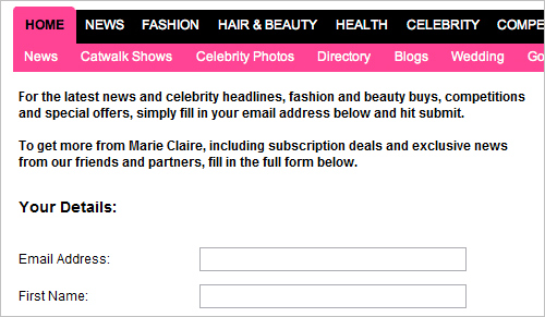
Marie Claire UK subscription page
Reward Users for Signing Up
You may want to consider giving some reward to users for signing up; for example, a free gift, voucher or discount. To encourage users to sign up for his newsletter, Jamie Oliver offers a free £25 wine voucher that can be claimed after subscribing (on the condition that users spend £64.99 or more on the wine).
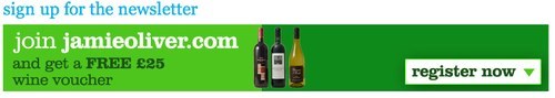
Jamie Oliver sign-up page
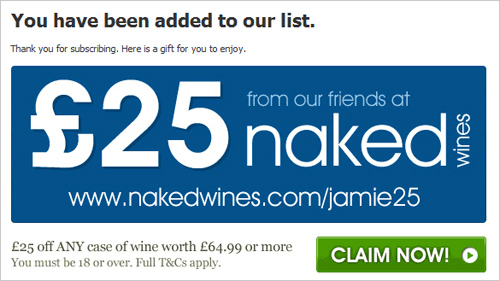
Jamie Oliver reward page
If you will give rewards, let users know as soon as possible in the process. James Perse gives users who subscribe to its newsletter a $15 online gift card. However, the reward is not mentioned on the subscription page, and the promotion code is sent via a confirmation email only after the subscription has been received. You would not have known that until you subscribed. The company is clearly missing a great opportunity to get people to sign up for its newsletters.
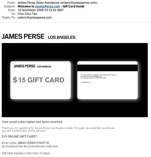
James Perse subscription confirmation email
Preview Your Newsletter
One way to let users know what they will get is to give them a preview of your newsletter. Hershey’s Kitchens has two different newsletters, and it offers examples of both types. The company even gives each newsletter a name and clearly indicates how often it will be sent out.
Hershey’s Kitchen sign-up page
Keep Questions Short and Simple
Users avoid filling out forms and submitting their details if possible. For a newsletter sign-ups, all you need is their email address.
Hersey’s Kitchens has 10 mandatory fields. MarieClaire.com has 8 fields, but only the email field is required. We have found from our studies, though, that people often miss the asterisk or do not know what it means. Users who are reluctant to fill in many details may well refuse to sign up in this case.
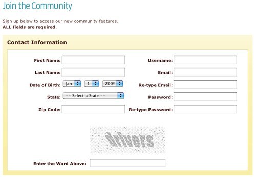
Hershey’s Kitchen sign-up page
Content Of Newsletter
Based on our user testing, we found that people look at three things when they receive a newsletter:
- The sender, to see if it is from someone they know.
- The subject line, to see if it is of interest to them.
- The date, to see if the communication is up to date.
Write an Attractive Subject Line
One way to encourage users to open your newsletter is to write a subject line that grabs their attention.
If you are offering some sort of deal in your newsletter, try to avoid generic appeals in your subject line (for instance, Game July newsletter subject line: “Sizzling Summer Deals”). Instead, mention specific offers, such as Dorothy Perkins November Issue: “25% Off Just for You”. Also, be realistic about your offers, and avoid making them sound too good to be true. Users are skeptical about subject lines like “Get 1000 Extra Points” because they know they will often have to spend a lot to get those points.
Provide Useful and Well-Written Content
A newsletter should contain information that users would not normally research on their own. Users take seconds to scan for topics of interest to them before deciding whether to spend more time reading the newsletter. If your newsletter, like Forrester’s, shows only one or two topics, users would less likely to find something of interest to them.
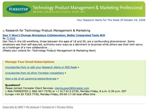
Forrester newsletter
Furthermore, including links to your website in the newsletter is crucial.
Make Content Relevant to Your Readers
Make your newsletter’s content as relevant to your readers as possible, whether through offers, products or images. Superfluous content will add no value and simply be ignored. You could also provide customized content. Personalization can be done in one of two ways:
- Asking users for more (optional) information when they sign up.
- Implicitly recording what they buy and view on your website.
For example, Amazon sends newsletter with recommendations based on what its users have purchased. Recommendation-based newsletters can be highly useful, provided that your analytics are accurate.
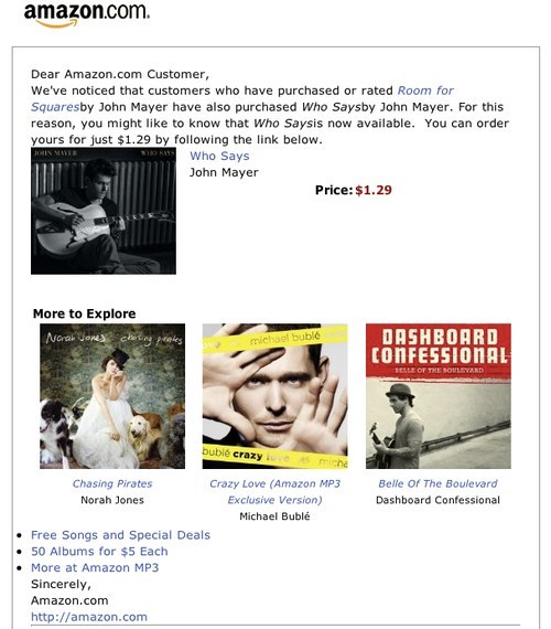
Amazon’s customized newsletter
Offer Exclusive Deals
You could always offer subscribers special deals or freebies. There are a few ways to go about this. H&M and Photobox ask users to present their newsletters at the point of purchase in stores to receive discounts. Clinique and Airparks include a promotion code in their newsletters that users can redeem when checking out online.
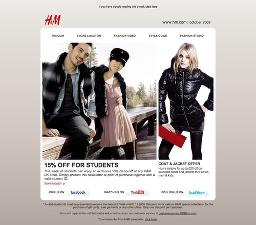
H&M newsletter
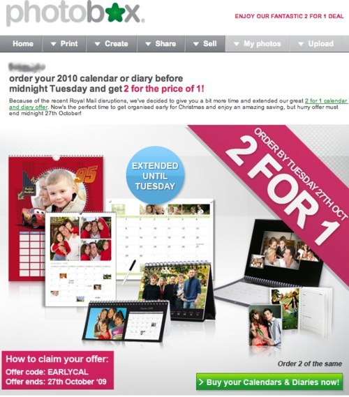 Photobox newsletter
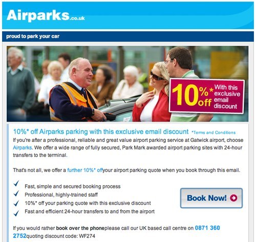
Airparks newsletter
Avoid putting these benefits so deep in the newsletter that users miss them. For instance, Clinique (above) puts its code at the bottom of the page, whereas Airparks puts its at the very top of the page.
In addition, make sure the rewards are relevant to your product and target audience. Take Inkclub, which gives out a free blusher to customers who shop via its newsletter. Not only does this item have little relevance to Inkclub’s product line, but it may not be very attractive to the company’s target users.
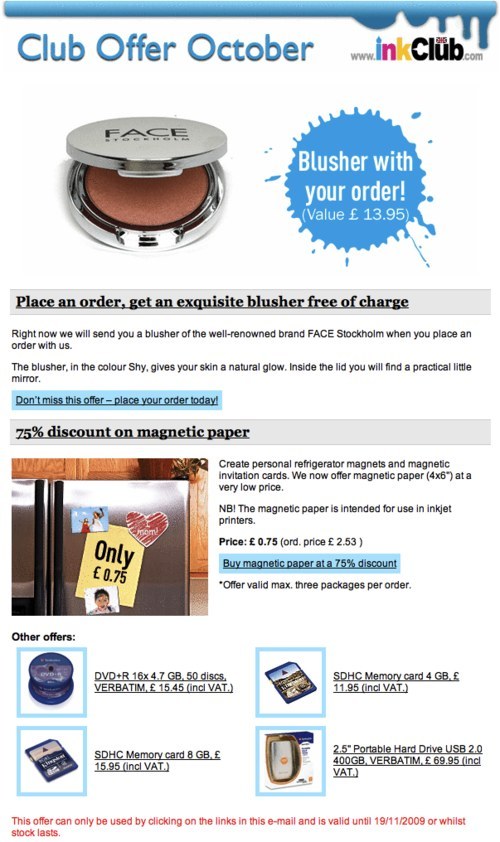
Inkclub newsletter
Newsletter Design
Design your newsletter to suit its chief purpose. If the main objective is to announce a new product or promote a particular service, you may want to focus the newsletter entirely on this product or service. Good examples are Apple in promoting its new iPhone 3GS.
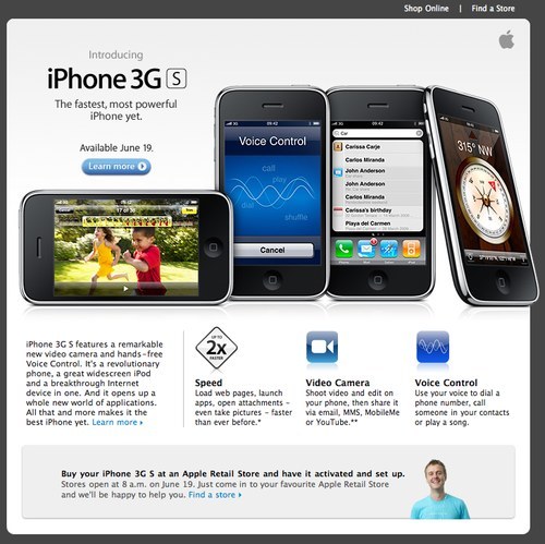
Apple newsletter promoting its new iPhone 3GS.
To promote its latest exclusive offers, Ted Baker takes an easy and rather lazy approach: the whole newsletter consists merely of one big banner showing offers of 50% off, in the hope that users will click to the website to find out more. By contrast, Dabs.com showcases a number of its latest deals in its newsletter, giving users a rough idea of its product line and sale prices.
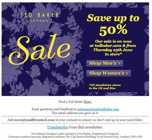
Ted Baker newsletter
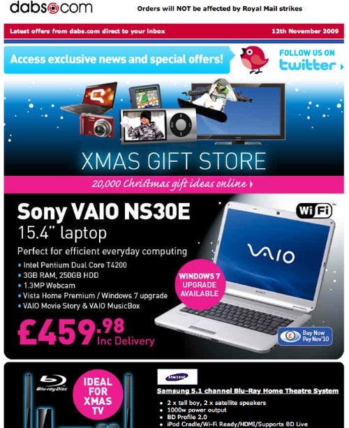
Dabs newsletter
You could also adopt a catalogue style, like IKEA, or create a summary of your e-commerce website, like Audible, which teases users to visit its website with prices and a clear call-to-action button.
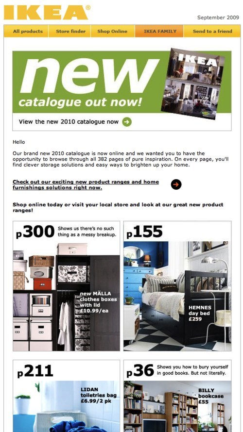
IKEA newsletter
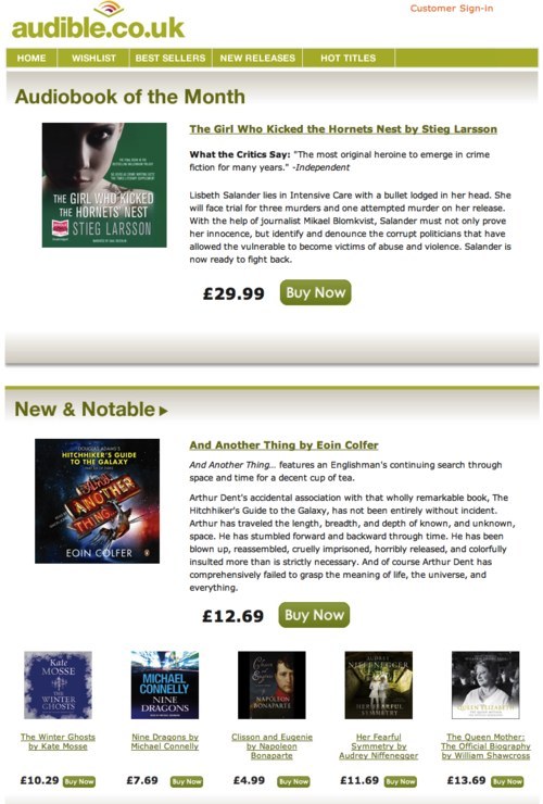
Audible newsletter
Keep it Simple and Straightforward
As reported by the Nielsen Norman Group in its Email Newsletter Usability Report, the average reader skims a newsletter for 51 seconds. People never read: they scan for content that is of interest to them. So, don’t overwhelm them by squeezing too much information on the page. Make sure your content gets straight to the point, and write short paragraphs and bullet points.
The main purpose of Flybe’s newsletter is to present an exclusive offer on family trips to Disneyland. The value of this deal is lost among the long paragraphs. The message could be conveyed more effectively in bullet points for quick scanning.
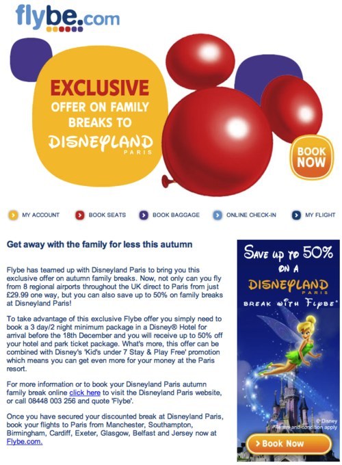
Flybe newsletter
Make Good Use of Images, Numbers and Colors
Users are drawn first to elements that are visually simulating, such as graphics. Use images to guide users to the most important content and messages.
Numbers also grab attention. Users tend to associate them with prices and savings. Use percentages and dollar values to show concrete offers. For example, Pixmania newsletter has a big “49% off,” showing how much savings are available: clear and appealing.
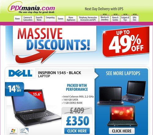
Pixmania newsletter
Color adds interest, too. But be careful, because inappropriate use makes for a messy, confusing newsletter. Take Rimmel London’s newsletter.
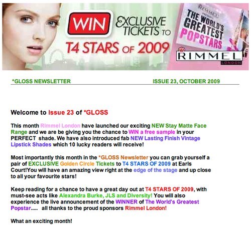
Rimmel London newsletter
Tailor the Layout to the Content
A newsletter can be designed in a one-column or multi-column layout or a mixture of both. A one-column grid is easier to skim but might take up more space and increase the length of the newsletter. While people do skim email newsletters, that’s no reason to make them overly lengthy. However, some exceptions are the Design Hotels newsletter, which is long but well organized. Hotels are shown based on location, with attractive photos and deals.
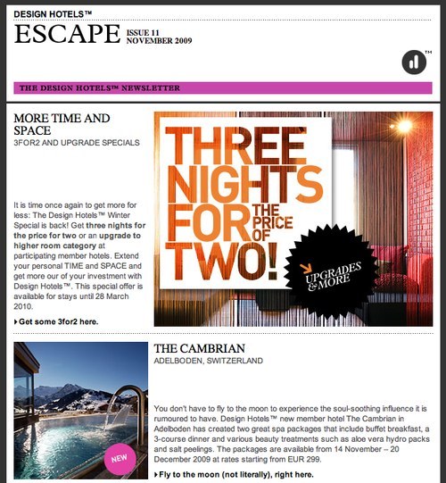
Design Hotels newsletter
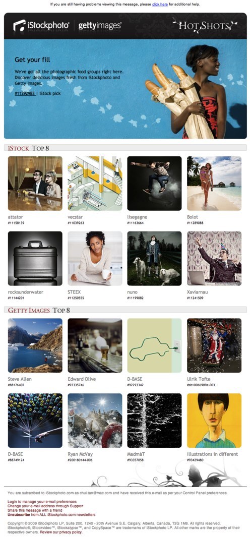
A two-column layout is common for newsletters. Narrower columns is usually used for the table of contents and upcoming events, while the main content is given a wider column. Etsy uses a two-column design for its newsletter, but both columns contain photos and links, and the sections have no prominent divisions. The design makes the page look messy and it lacks focus, making it hard to figure out where to look on the page. By contrast, iStockphoto’s clear division between sections and grid design help guide the user’s attention to the left or right column.
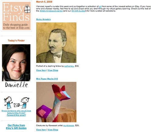
Etsy newsletter
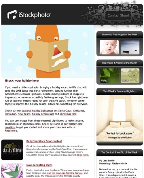
iStockphoto newsletter
Be Creative
Creativity in a newsletter is always welcome. Both First Great Western and Southern present their content using fictional characters, Bob and Loco respectively, who users can easily relate to.
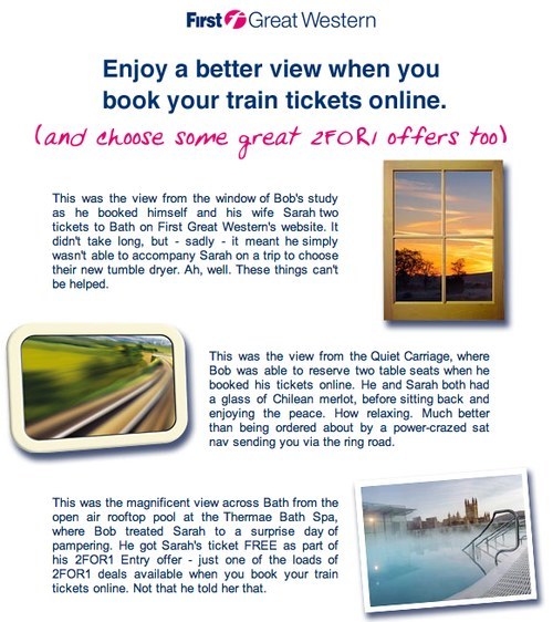
First Great Western newsletter
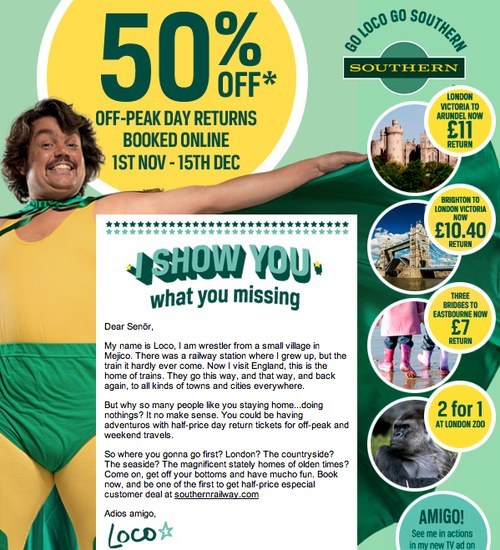
Southern newsletter
Giving each edition of your newsletter a different layout or design is okay as long users can easily recognize your brand. Despite STA Travel using various styles for its weekly newsletter, certain elements follow their branding guidelines, allowing users to quickly identify it.
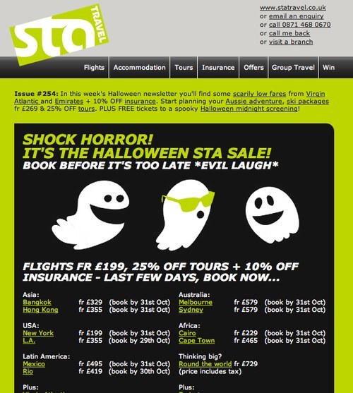
STA newsletter, issue #254
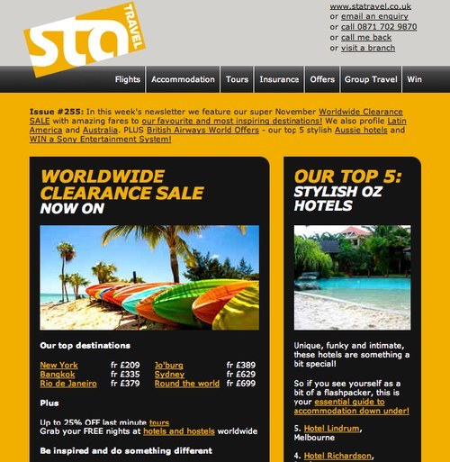
STA newsletter, issue #255
Unlike the rather uninspiring Tripadvisor newsletter, Top Gear gets creative with its hand-sketched design, which makes the newsletter fun to read and explore.
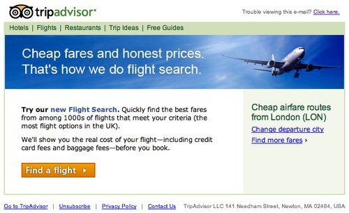
Tripadvisor newsletter
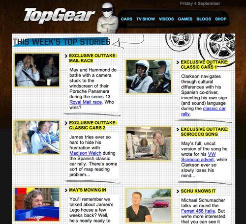
Top Gear newsletter
Be Wary of Table of Contents
Some newsletters include a table of contents at the top of the page, which can help users quickly scan for items of interest. A table of contents can be especially helpful in lengthy newsletters that have a lot of content, such as the one from MoneySavingExpert.
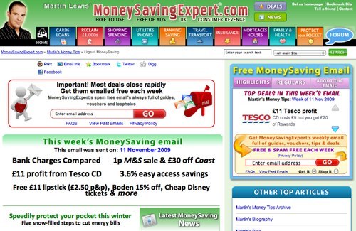
MoneySavingExpert newsletter
Previous experience tells us, though, that some users do not understand that the links in the table of contents navigate within the newsletter. Assuming that the links take them to a website, they avoid clicking them altogether. One solution is to avoid placing the links in the left or right columns, as Foodepedia does, which is where external links and ads are often found.
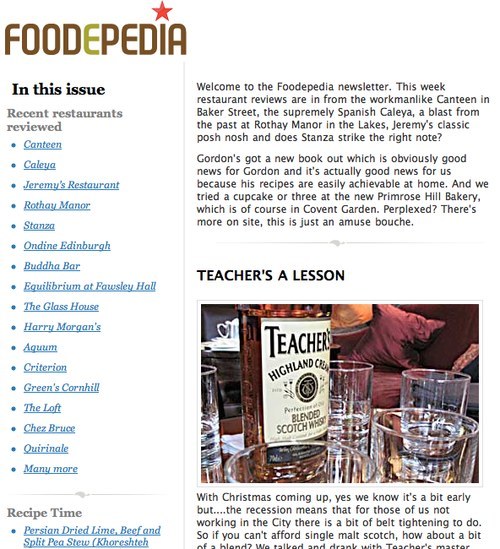
Foodepedia newsletter
Be Wary of Ads
If you have to include ads in your newsletter, make sure they blend in with the content. A good example of this is Lastminute.com, and a bad example is PCMag.com which merely copies Google AdSense code directly into its newsletter, making the page look messy and the content unconvincing.
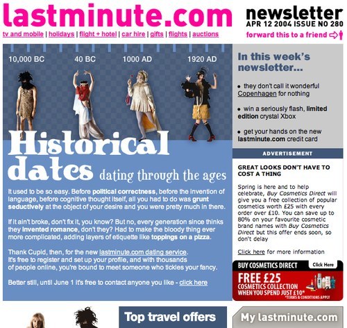
Lastminute.com newsletter
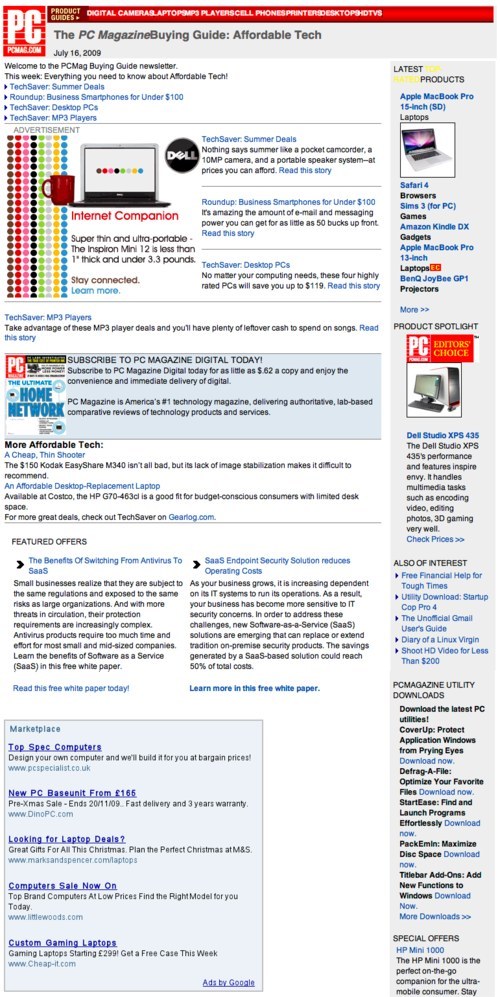
PCMag.com newsletter
Tools And Features
Make it easy for users to unsubscribe, but don’t remind them how to all the time. Also, tell users how they can change their email address, view the newsletter in a Web browser and quickly share the newsletter with their friends. Other useful features include: “Follow us on Twitter,” “Be Our Fan on Facebook” and “Watch Us on YouTube.”
After Sending Out The Newsletter
After sending out your newsletter, use an email marketing tool and list manager to track, monitor and measure the performance of your campaigns. Many email service providers are out there, such as MailChimp, iContact, Mailvivo, Mailing Manager and Atomic Email Tracker. The majority of them also provide templates to help you create your newsletter if you don’t want to get your hands dirty.
Showcase
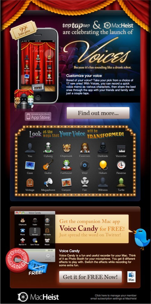
MacHeist’s Directorate newsletter grabs its readers’ attention with the price of its iPhone apps (£0.99). Then, it tells them what MacHeist does in a short paragraph and presents its features in a clear and appealing way via icons. Simple, interesting and effective.
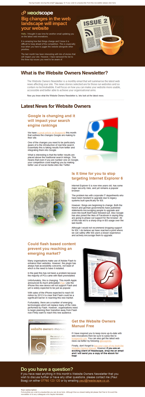
Headscape’s newsletter with large headlines and nice illustrations.
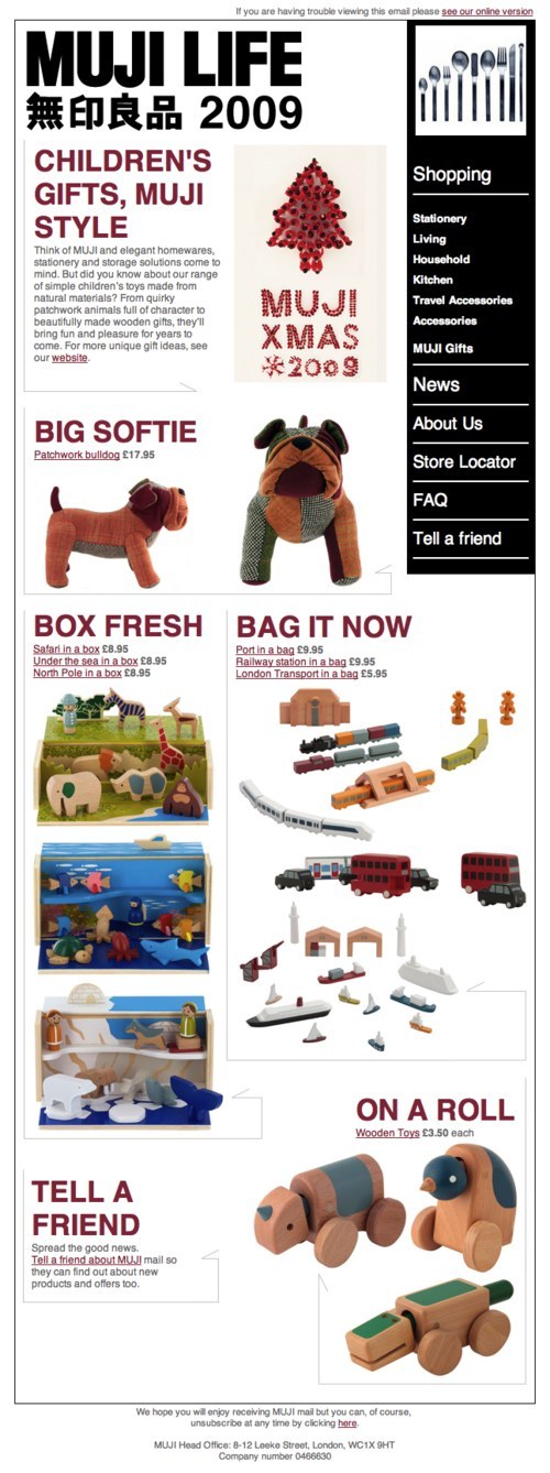
Muji’s newsletter has a tidy layout that allows for quick scanning. Each section is accompanied by nice product images and prices.
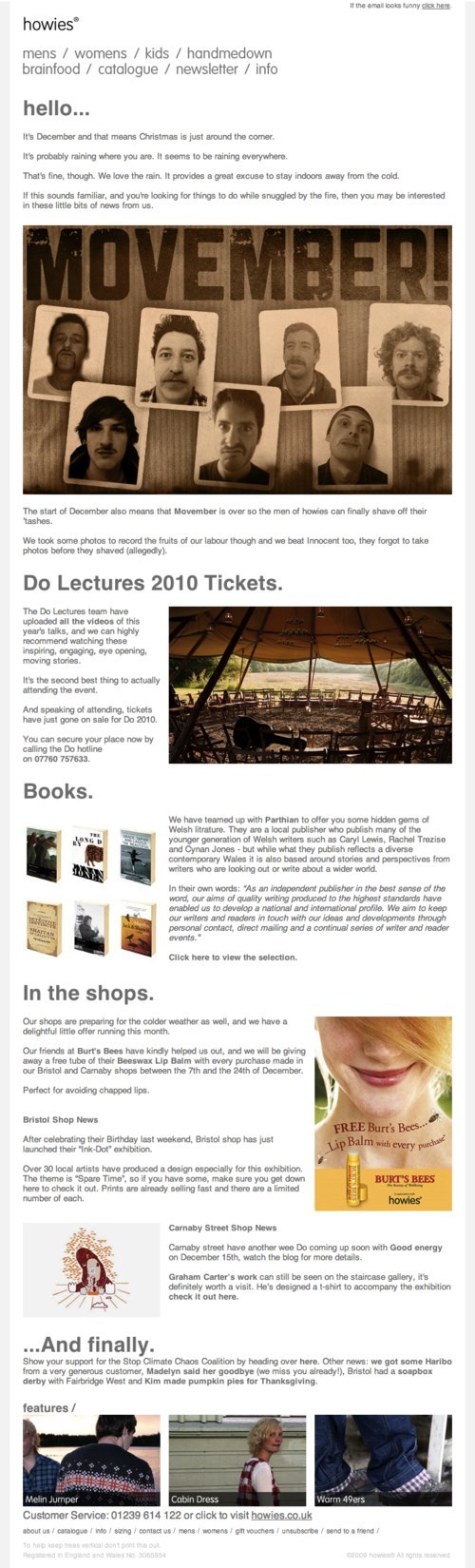
Howies might have a bit too much text in its newsletter. However, it organizes the content into different sections with big clear headings.
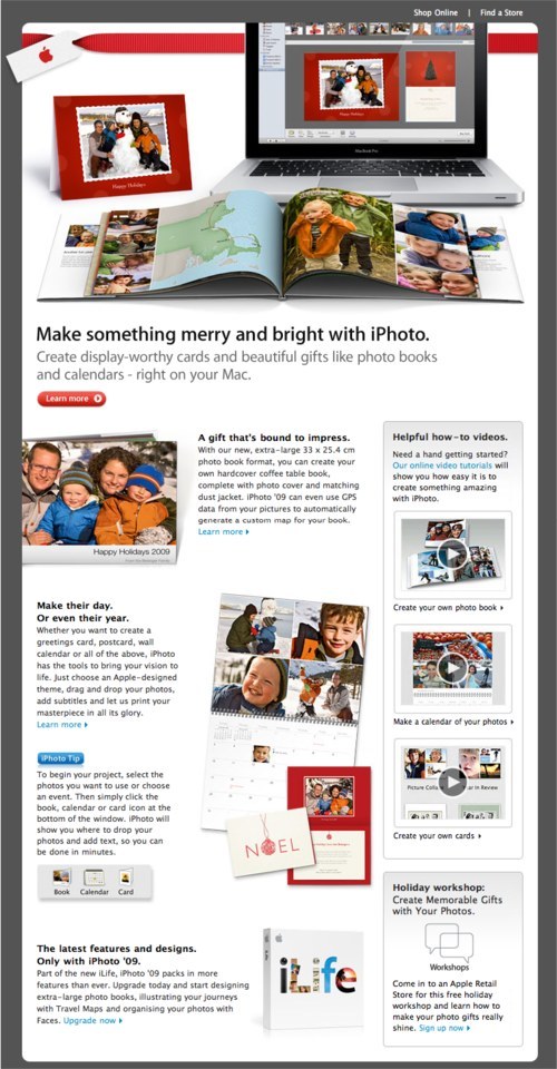
Apple’s Christmas newsletter has a photo-related theme promoting its digital photo organizer software, iPhoto, and its photo books and calendar printing service.
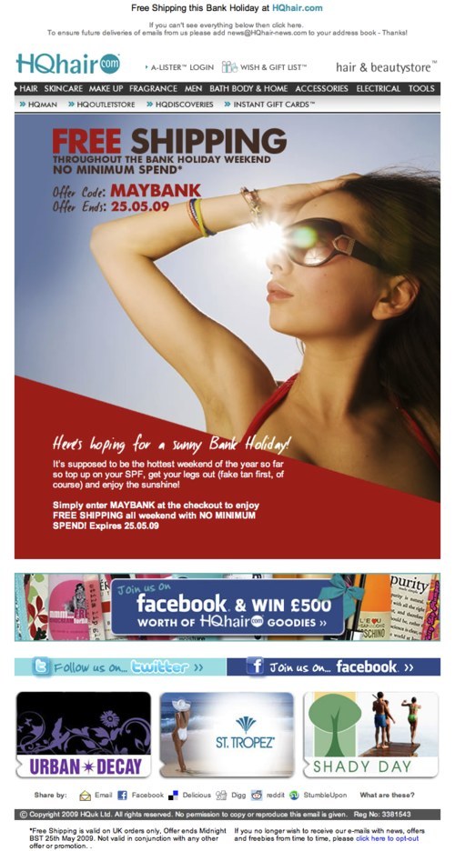
HQhair.com gives its users an exclusive offer with a code. It not only emphasizes the word “FREE” but makes good use of the model to draw attention to the offer.
MoneySavingExpert newsletter
Previous experience tells us, though, that some users do not understand that the links in the table of contents navigate within the newsletter. Assuming that the links take them to a website, they avoid clicking them altogether. One solution is to avoid placing the links in the left or right columns, as Foodepedia does, which is where external links and ads are often found.
Foodepedia newsletter
Be Wary of Ads
If you have to include ads in your newsletter, make sure they blend in with the content. A good example of this is Lastminute.com, and a bad example is PCMag.com which merely copies Google AdSense code directly into its newsletter, making the page look messy and the content unconvincing.
Lastminute.com newsletter
PCMag.com newsletter
Tools And Features
Make it easy for users to unsubscribe, but don’t remind them how to all the time. Also, tell users how they can change their email address, view the newsletter in a Web browser and quickly share the newsletter with their friends. Other useful features include: “Follow us on Twitter,” “Be Our Fan on Facebook” and “Watch Us on YouTube.”
After Sending Out The Newsletter
After sending out your newsletter, use an email marketing tool and list manager to track, monitor and measure the performance of your campaigns. Many email service providers are out there, such as MailChimp, iContact, Mailvivo, Mailing Manager and Atomic Email Tracker. The majority of them also provide templates to help you create your newsletter if you don’t want to get your hands dirty.
Showcase
MacHeist’s Directorate newsletter grabs its readers’ attention with the price of its iPhone apps (£0.99). Then, it tells them what MacHeist does in a short paragraph and presents its features in a clear and appealing way via icons. Simple, interesting and effective.
Headscape’s newsletter with large headlines and nice illustrations.
Muji’s newsletter has a tidy layout that allows for quick scanning. Each section is accompanied by nice product images and prices.
Howies might have a bit too much text in its newsletter. However, it organizes the content into different sections with big clear headings.
Apple’s Christmas newsletter has a photo-related theme promoting its digital photo organizer software, iPhoto, and its photo books and calendar printing service.
HQhair.com gives its users an exclusive offer with a code. It not only emphasizes the word “FREE” but makes good use of the model to draw attention to the offer.
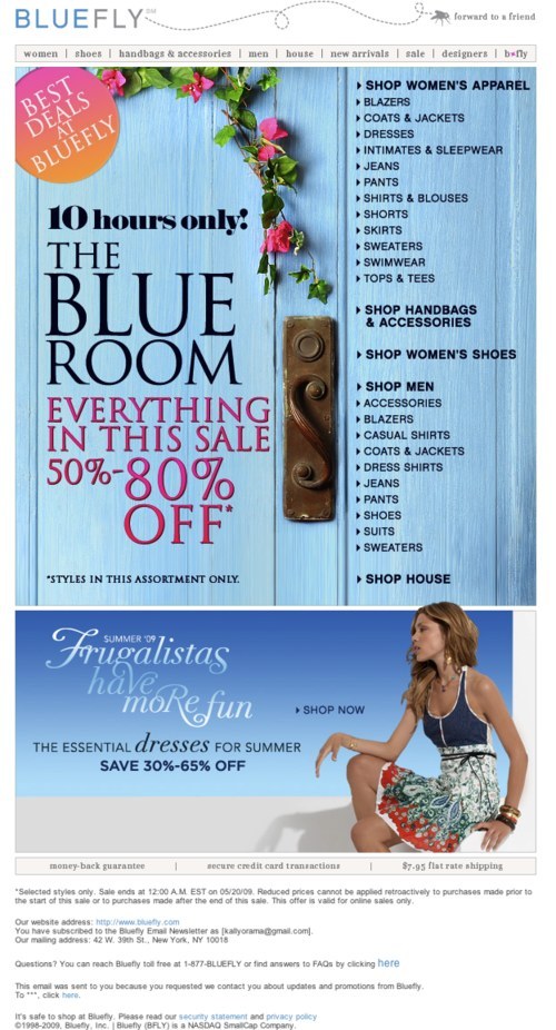
Bluefly cleverly divides its newsletter into two sections: “Offers” (the main section) and the right navigation section, using beautiful imagery in the process. Also, notice how it emphasizes the 80% offer and word “OFF” (in large font).
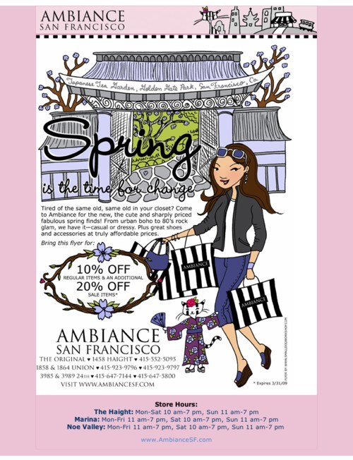
Ambiance San Francisco takes a creative drawing-based approach to encourage users to shop with it.
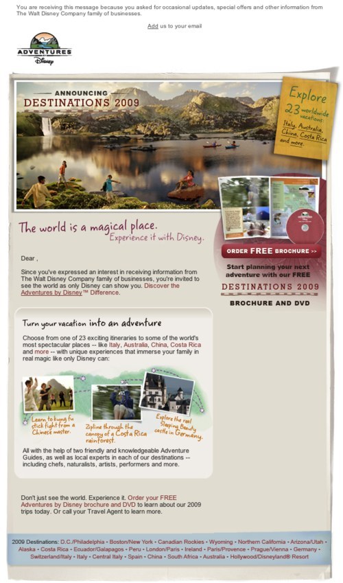
Disney Adventures’ newsletter is another good example. Its beautiful picture gives users that holiday feeling.
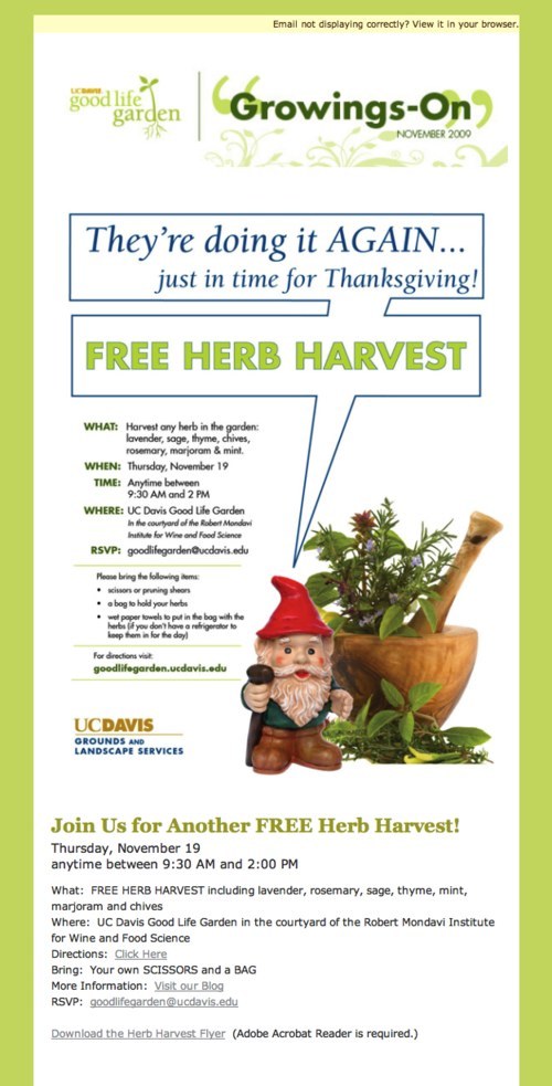
Good Life Garden’s newsletter effectively uses the word “Free” to grab the user’s attention. The design is simple yet visually pleasing. Unfortunately, the content is repeated in the same newsletter.
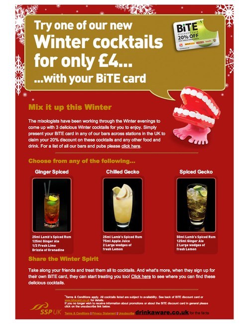
Bite Card’s newsletter has festive background imagery to evoke the winter season. It is simple, with a big banner at the top showing the product price, followed by cocktail choices and ingredients.
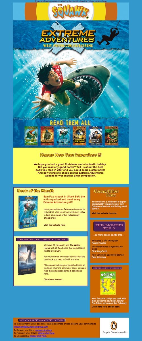
The Squawk’s newsletter attracts users with the beautiful book cover on promotion for that month.
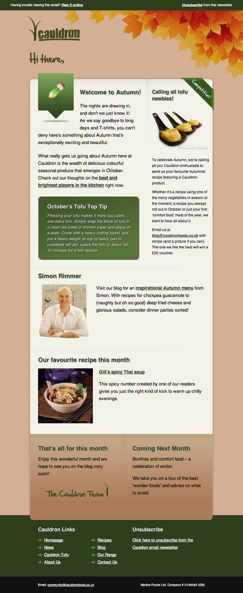
Cauldron’s newsletter also has a tidy layout and clearly defines the purpose of each section. It tells users the subject of its next issue in the “Coming Next Month” section at the bottom, a nice tease.
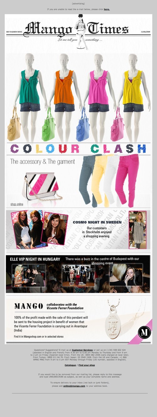
Mango’s newsletter makes good use of bright, attractive colors.
iStockphoto’s uses a gallery to present its top eight photos of the month: neat and easy to scan.
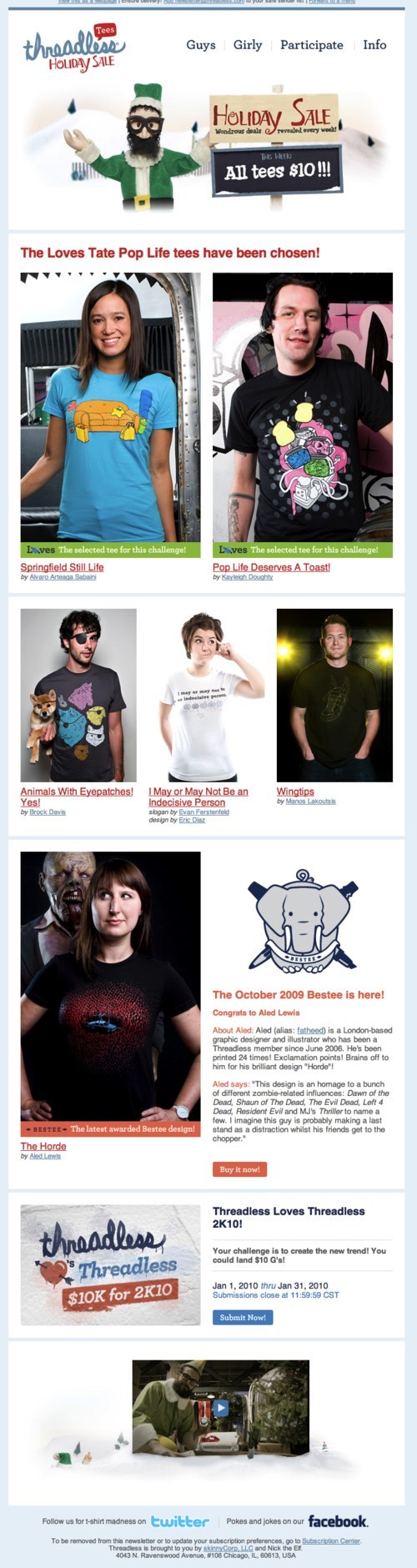
Threadless’ newsletter offers “$10 per tee” in big clear type at the top of the page.