How to Drastically Improve Your Designs

Email Newsletter
Weekly tips on front-end & UX.
Trusted by 182,000+ folks.


 Custom Web Forms for Angular, React, & Vue. Your backend.
 Celebrating 10 million developers
Design is everywhere. We see it in on billboards as we drive down the street. When we go to a restaurant and look at the menus, we see it. When we sit down on our couch and watch television, it’s visible on the commercials, advertisements, and even the movies and TV shows.
It is all around us and it stimulates and motivates much of our decisions subconsciously every day. The encyclopedia refers to graphic design as,
“the process of communicating visually using text and images to present information. Graphic design practice embraces a range of cognitive skills, aesthetics and crafts, including typography, visual arts and page layout. Like other forms of design, graphic design often refers to both the process (designing) by which the communication is created and the products (designs) which are generated.”
What is design?
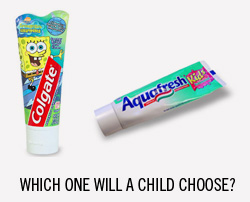
What is design? To design is much more than assembling, ordering, or editing. To design is to add value and meaning to something, whether it be a menu or a magazine cover. It simplifies, emphasizes, influences, and even impacts. Design is both a verb and noun. It is an integral part of everyday life, especially in America. Almost everything we do is impacted by design. Let me illustrate my point. When most Americans go to the supermarket to buy toothpaste, they typically buy the package that has the most eye-catching and appealing design. Why is that? It is because the design of the product inspired and motivated them to buy the item. This is why design is such a crucial part of advertising. Here’s a great article on AIGA about what is graphic design.
Further Reading on SmashingMag:
- Improve Your Designs With The Principles Of Similarity And Proximity
- 10 Useful Techniques To Improve Your User Interface Designs
- 8 Simple Ways to Improve Typography In Your Designs
What is a graphic designer?
Now that we know about the basic definition of design, I would like to talk about graphic designers now. A graphic designer is basically a communicator. Just like a motivational speaker communicates his message to his audience, the job of the graphic designer is also to communicate and send the message to the buyer or to the viewer.
A graphic designer is not only a communicator, but he is also a translator. He translates the idea into a picture that allows people to see and understand the message. For example, if a magazine was just all text, it would not be as interesting and the message that it conveys would not really interest the reader.
We have talked about the concept of design and what is a graphic designer. I will now give you six pointers on how to improve your designs drastically. By the way, these are all alliterated and they all start with the letter “C” so they are easy to remember.
Concept
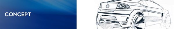
When you start off in Photoshop, you already need to have a concept of what you are going to create. The best artists always have that in mind. Does that stifle your creativity? NO! It definitely helps to have a plan of attack when using your software. Instead of wasting your time creating a concept, why don’t you have one before you even start designing? If there is no concept, message, no idea, no story behind a design, then it is not graphic design. Good design stirs the reader to action. By the way, that is what good design is all about. When I create a flyer or a brochure, I want the person who receives it to not simply put it in the trash when he gets it from the mail, but I want him to look at it, read it, and respond to it. That should be your goal as well.
By the way, I would recommend to start off with a pencil and paper. Some people might say that it’s old-fashioned, but it definitely works. I’ve interview some great designers and every time I have asked them about where designs start, they say that it starts with a concept and that concept starts on a piece of paper. You don’t have to be great at sketching and drawing as this is just the first step. Drawing is simply a means to an end. It helps you to quickly visualize your ideas without wasting too much time on the details.
Communicate - Don’t Just Decorate

“Designers can create normalcy out of chaos; they can clearly communicate ideas through the organising and manipulating of words and pictures.” — Jeffrey Veen
Some people think that graphic design is just throwing pictures and words on a digital canvas and making it look good. These people are ignorant and they completely miss the mark when it comes to good design. A graphic designer must not use an element in his design if it has no purpose. A real graphic designer would be able to explain, if asked, the purpose of everything that he has done in his artwork. This area is where most amateur designers fail and show their lack of knowledge in the field of design.
There is a simple design rule that I have learned over the years; just because you learn how to recreate or to make a certain effect (such as gradients, shadows, etc.), that does not mean that you have to try to impress everyone by applying those effects to all your designs. In most cases, the simpler the design, the better it is visually and the more it attracts readers. If you will learn to be conservative and creative with your designs, you will experience greater results.
“You cannot not communicate.” — Paul Watzlawik
Choose Fonts Wisely

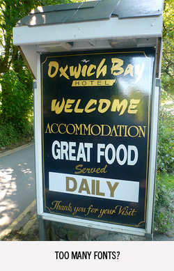
Nothing is more annoying than a page filled with 30 different fonts. Most people would not even read a page that has too much going on. I personally look at different pieces of junk mail and it’s amazing how unprofessional some of the designs are. If you are going to spend money advertising, you might as well get it right. Hire the right designer. Make sure that he understands typography and fonts.
There are many factors that come into play when choosing fonts. I’m not going to go into too much details, but I’ve included a great list of articles below that you can read to expound more on the subject.
- How to Choose a Font
- Things to Consider When Choosing Font for your Website
- What Font Should I Use? 5 Principles for Choosing and Using Typefaces
- Choosing Fonts
Colors - On Purpose
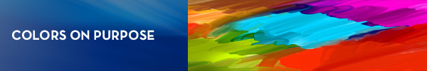
Don’t just grab some color out of the air. You need to know what the colors will do when you combine them and you also need to know what these colors will mean to the audience. For example, I would never use the color pink to design a flyer for a Law Enforcement Agency. Why? Because when people see that color, they typically associate it with being effeminate, soft, and girly. Certain colors like red usually attract readers and that is why that color is used for advertising reduced prices. If you have ever paid attention to the signage in the supermarket, you will never see a for sale sign that is in the color of blue. This is because blue is a calm color and it does not visually draw the eyes of the by-passer. Is it a coincidence that the cars that are stolen the most in the United States are red? I don’t think so. Color is very important when it comes to design and a good designer needs to realize this.
Are you having trouble with choosing color? I’ve also included a list of essential resources for you to further your knowledge about colors.
- Color Theory for Designers, Part 1: The Meaning of Color
- Color Theory For Designers, Part 2: Understanding Concepts And Terminology
- Using Color in Graphic Design
- Anatomy of Colors in Web Design: Blue and the Cool Look
- Anatomy of Colors in Web Design: Green and Environmental Concept
Contrast

Using contrast in your designs can have a great impact. Contrast is one the main principles of design. Contrast is defined as:
“A difference, especially a strong dissimilarity, between entities or objects compared.”
Well, how is this useful in design? Contrast can be used to distinguish the important parts of the design from the regular information. Four of the most used ways of contrast are size, alignment, color, and type. Using contrast is very effective and you can see this design principle used not only in print design but in web design as well. Here’s a short excerpt about contrast from this great article.
“Contrast adds interest to the page and provides a means of emphasizing what is important or directing the reader’s eye. On a page without contrast, the reader doesn’t know where to look first or what is important. Contrast makes a page more interesting so the reader is more apt to pay attention to what is on the page. Contrast aids in readability by making headlines and subheadings stand out. Contrast shows what is important by making smaller or lighter elements recede on the page to allow other elements to take center stage.”
Extra resources:
- The Principle of Contrast in Web Design
- Create Contrast by Creating Obvious Differences
- The Brads – Learning About Contrast in Design
- Principles Of Design: Contrast
Create Negative Space
Create negative space and don’t just fill it up. Negative space is often referred as ‘white space.’ Many designers claim that the white space is usually more important than the stuff that is in it. The content that is within the negative space always calls for people’s attention. This white space separates the unimportant objects to the focal point of the design. By the way, when a designer tries to fill up all the negative space, the design becomes too strong visually and it tends to push people away. Just like we don’t like to look at a page that is all text, most people also don’t like looking at designs where there are too many focal points and we can’t tell what to look at. Here are some articles that further explain negative space.
In conclusion, I would like to quote April Greiman, a famous graphic design artist. She said,“If a design does not feel good in your heart, what the mind thinks doesn’t matter.”
Even though I mentioned those pointers to you, they are not really what graphic design is all about. Aside from graphic design being able to look good to the viewers, the design must also look good to the creator. Remember that the pointers that I gave you are just general guidelines to help you in your design, and not to hamper your creativity. I hope that reading this article has inspired and challenged you to be a better designer. I sincerely wish that you would apply the tips that I gave you.


