Usability Review of Charity Websites Taking the Lead

Email Newsletter
Weekly tips on front-end & UX.
Trusted by 182,000+ folks.


 Celebrating 10 million developers
 Custom Web Forms for Angular, React, & Vue. Your backend.

It has become a recent trend for charities to look at their online identities and branding; spending money on creating user experiences which suit their user base, and over time getting people involved with their campaigns and messages.
You may also be interested in the following related posts:
- Non Profit Website Design: Examples and Best Practices
- Web Design Showcases From Various Industries
- Global Web Design Showcases
Below we look at charity websites which have successfully developed their online brand using modern and creative ideas. We will also discuss how each charity website can be improved because, as we all know, not every website is perfect. There are always improvements to the design or usability that may have been overlooked by management, designers, or developers.
1. Red Nose Day
Red Nose Day is a fundraising event dedicated to raising money for Comic Relief.
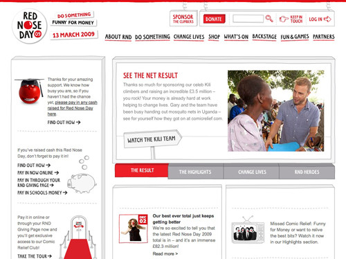
As you can see above, the Red Nose Day website design combines many different techniques to achieve a highly-minimalist and playful design. Throughout the website you can find non-web-based font headings implemented using sIFR, feature panels built in Flash and a striking navigation, built using CSS Sprites.
The design uses a simplistic colour scheme of white, black and red. Using red along with black and white has a high impact on the user, and of course reinforces the “Red” in “Red Nose Day”. The red is predominantly used on call-to-action areas since it is effective in drawing the user’s eye.
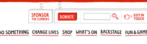 Donate button featured in Red Nose Day’s header
Because the Red Nose Day campaign reaches such a wide audience, the website design achieves the perfect balance between comical elements and factual information. Satisfying the requirements of such different audiences — the younger generation and more mature users — is a tough job and Comic Relief have managed it effectively and impressively.
Improvements
Nowadays, making content accessible should be a routine part of any site’s development. Unfortunately, the Red Nose Day design makes heavy use of light grey text on a white background. This lack of contrast can prove difficult for users with poor eyesight. A way to improve this would be to use a much darker grey or black in order to increase the contrast between the text and background. Alternatively, they could offer this option through user-controlled accessibility website tools.
As mentioned above, the purpose of the Red Nose Day event is to raise money for Comic Relief. As a visitor to the site, I would be interested to know the progress of the fundraising efforts. While a counter is included on some of the content pages, it would be more beneficial to the user if it was also displayed on the home page. This demonstrates to the user that the charity is currently active. Of course, they may have their reasons for excluding it from the home page that we’re not aware of.
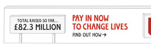 Fund raising total featured on Red Nose Day content pages
2. Give Us A Lift
The Give us a lift campaign website, run by WRVS is aimed at raising awareness of how older people struggle to get to the places they need to on a daily basis without the support of community transport.
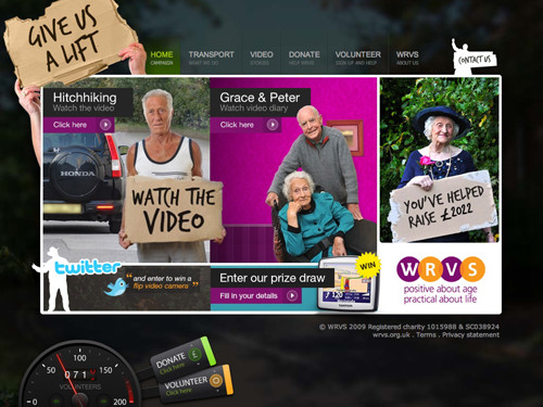
The design makes use of a large background image and cardboard cutouts to portray the theme of hitchhiking. Along with a striking colour scheme of a dark background with contrasting pink, green and blue elements, the design makes a big first impression on the user. These contrasting colours are carried through onto the content pages and, in the sidebar, two main call-to-action links in purple and green ask the user to either donate or volunteer.
A speedometer Flash element is positioned to the base of the page counting the number of volunteers. Due to this unique idea and design, the user’s eye is drawn down to the bottom of the page where another two call-to-action links can be found.
This campaign website makes heavy use of Flash elements in order to display donation totals, volunteer totals (in the speedometer), and the winners to the campaign’s Twitter competition. It is unusual to see such creative elements within a charity design and it’s refreshing to see a website that understands the content that needs to be communicated — but doesn’t sacrifice engaging creativity.
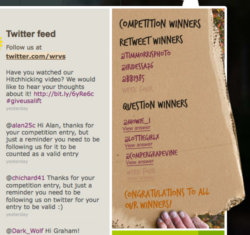 Twitter winners from the Give us a lift campaign website
Though the high impact design would have a stronger response from a younger audience, the website also caters for the older generation with attention to accessibility. On all content pages, a button can be found to increase the content’s font size using jQuery. Also, a dark font colour is used to add high contrast between the text and background.
Improvements
As mentioned above, the Give Us A Lift campaign website makes heavy use of JavaScript and Flash to display its contents. These elements could become unusable for the older user base as they may not have Flash installed, or have disabled JavaScript — making the video section impossible to use. The heavy use of Flash elements also increases page-load times. When implementing these elements, it is important to optimise the Flash and cater for circumstances where Flash may not be installed or JavaScript is disabled.
While the designer of the website has obviously tried to pay much attention to all of the details, with many elements popping out to the user, the main navigation seems to be lost and this can cause a problem for the user if they cannot instantly recognise the main source of navigation. This may be because the navigation not being featured within the main layout container; also, the lack of background colour makes it blend into the dark background image and the user could find it difficult to read the grey text on black. Brightening these elements and making them stand out more would make this design more polished and create a much happier user experience.
The Twitter page on the campaign website features a stripped-down version of Twitter’s feed widget. Though it is great to see this integration of social media into the website, the lack of creativity and separation between tweets creates an element that resembles Google Ads. This would obviously cause problems since the majority would most likely ignore this part of the page.
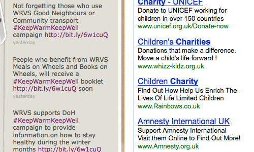 Comparison of Twitter Feed with Google Ads
3. ChildLine
ChildLine is a charity set up to aid children with a variety of problems ranging from helping with sexual and physical abuse to answering questions about concerns for parents and other family members.
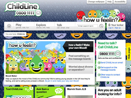
The target audience of the ChildLine website is of a younger age, therefore the design reflects a very animated theme with cartoon characters repeated in the background, large font sizes and a bright colour scheme. The cartoon characters are also a representation of what the child might be feeling when visiting the website — a subliminal message that ChildLine understands what they are feeling, and can offer help.
Throughout the website, a yellow tab is fixed to the left side of the page and acts as a panic button for the user to click if they wish to quickly hide the website by sending the user to the Google home page. This implementation is similar to the “Feedback” button that popular sites use as part of the Get Satisfaction service.
 Hide page tab from ChildLine website
Children are always looking to customise anything they can: desktop backgrounds, icons, Myspace layouts, etc. So ChildLine have made use of the MooTools JavaScript framework in order to allow the user to change the background colour and image of the website. After clicking the ‘Change Wallpaper’ tab at the top of the page, a white panel slides down for the user to customise the wallpaper of the site. These slide-down panels are used on many websites to display hidden forms and content.
A question is raised as to whether it is appropriate to allow this level of customisation on this kind of website. From a child’s perspective, however, this can create a fun user experience and a safe environment that they enjoy visiting. This creates trust between the child and the charity, which is an invaluable benefit. This sense of fun and trust will also mean the child is more likely return to the site.
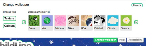 Change wallpaper panel from ChildLine website
Improvements
An important part of the ChildLine website is to offer help and protection to children in need. The “Hide Page” tab discussed above is an invaluable part of this website, helping children navigate away quickly if the need arises. A similar offering is a footer link labeled “Cover Your Tracks”. This gives the child information on clearing traces of their website visit from their computer.
Though the pull-down panel is great for small amounts of content (for example, the wallpaper customisation), large amounts of content can disrupt the page flow. At the top of the ChildLine design, “Accessibility” and “Help” tabs are used to display large amounts of text on the relevant topic. This heavy amount of content pushes the main content of the page down below the fold and can cause confusion. A way to improve the usability of these sections would be to take the user to a new content page where headings, white space and imagery can help break up the lengthy content.
Earlier we spoke about the bold repeating background that’s heavily featured in the design. When scrolling down a long content page, this repeating background can disrupt the user’s flow and be quite harsh on the eyes. Making the background image fixed (by simply adding background-attachment: fixed; to the CSS), the user will find reading down the page a lot easier and not be distracted by the moving background when scrolling.
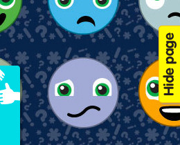
The yellow “Hide Page” tab can for some users be easily lost in the bright colour scheme and bold background. Due to the idea of emergency and panic behind this button, perhaps swapping the yellow for a red could provoke an automatic user response. The use of red would also mean that this tab would be harder to lose in the colors.
4. WWF
WWF is the world leading charity in the conservation of wildlife.
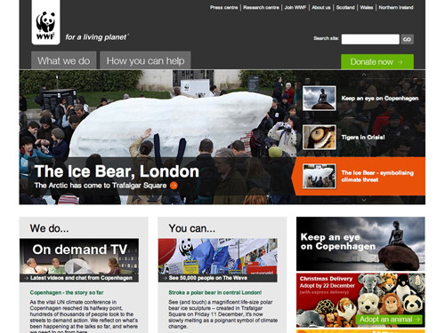
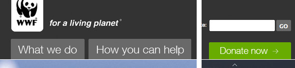
The design for the WWF website is very different from the other three charity websites we’ve considered. The layout is very clean, grid-based, and focuses heavily on high-quality imagery to add a polished finish. By using a clean, organised layout and relying on eye-catching photography, the user is drawn to focus on what is important to the charity: its content and purpose. The WWF’s user base would be a more sophisticated and older generation than that of, say, ChildLine, so the user may be less daunted or afraid to read the content.
The features panel on the home page uses jQuery to rotate through different stories, latest news, and call-to-action buttons. Though the jQuery was custom written, it is possible to replicate using jQuery plugins or following tutorials such as Creating a Slick Auto-Playing Featured Content Slider on CSS-Tricks.
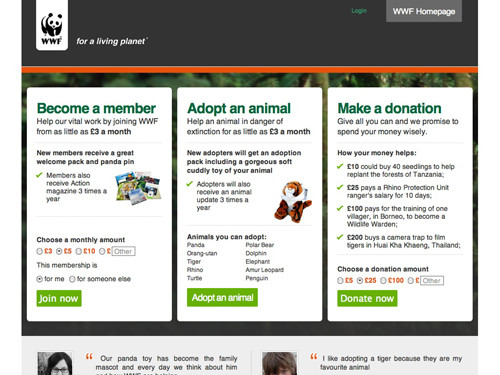
A neutral colour scheme of white, black, and grey is used to make any important call-to-action buttons more visible. These buttons have a striking green or orange background. When the user moves into the donate section of the charity website, the design is cut down to the bare minimum, again allowing the user to focus on the core messages. All navigation and unnecessary buttons are removed.
 WWF donate now section
Improvements
In contrast to the other charity websites, it would seem that the primary objective of the WWF website is to teach users their purpose and goals. A lot of the content and call-to-action links are aimed at making the user read about the charity and what they can achieve. The “What We Do”, “How You can Help” and “Donate Now” buttons in the header vary in size, the former two being larger than the latter. This difference in size reaffirms that the charity feels that an understanding of their goals is important prior to donating. Users rank the importance of elements by their difference in size. If the charity wished to push more donations in the future, it would be effective to swap the sizes between these call-to-action buttons in the header, giving the ‘Donate Now’ call-to-action a higher importance to the user.
 Varying call-to-action sizes in WWF design header
As part of the WWF design, a description of what a £10 donation could purchase, or how it could help the charity, is featured within a panel. However, when within the donation section of the website, a £10 radio button is not offered to the user, potentially causing confusion. The user is then left with the options of £5.00, £25.00 or entering their own value. There is quite a large leap between the two default amounts, and the user may be inclined to opt for the £5.00 option. Contradictory to the prior emphasis placed on the importance of £10.00 as a donation value, it would be interesting to know how many users opted for £5.00 but perhaps would’ve been willing to donate £10. Perhaps including this as a middle-ground default donation amount would be a nice addition.
5. Macmillan
The Macmillan Cancer Support charity offers help to those living with cancer and their families.
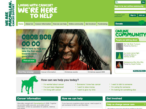
When the Macmillan Cancer Support website initially loads, the user may feel overwhelmed by the amount of information and links on the page. However, this portrays to the user that the website and charity have much advice and support to offer. A way in which the design tries to break down the information, is by compartmentalising everything into panels which can be closed and re-opened via jQuery as the user sees fit.
An improvement on this, and in effect making the initial page load less daunting for the user, would be to have some the panels already collapsed. Therefore the user can expand only those they wish to read more about.
 Collapsible panels on Macmillan Cancer Support home page
These panels on the home page use block headings with strong background colours to make defining sections and sub-sections easier for the user. Dark green headings are used to define a new section, whereas a lighter green heading is used to define a new sub-section. By making these headings so definitive the user can break the content down into more readable chunks.
The bright colour scheme used in this design can create an emotional response from the user. The user may be made to feel more light-hearted and hopeful through the use of warm earth colours.
Improvements
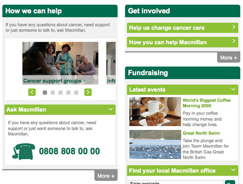
The Macmillan design makes use of a lot of call-to-action buttons with distinct background colours. Unfortunately these links are left as inline elements, meaning that only the text is clickable. It would be more user friendly if these were block-level elements where the click area of the link would include these strong background colours. By increasing the clickable area, the chances of a successful click from the user is heavily increased.
The charity’s name and tag-line are displayed in the top left, as is customary. These elements, however, are not clickable, so this could cause brief confusion when the user is looking for a link to the home page.
 Unclickable Macmillan title and tag-line in header
A large usability error on the Macmillan sign-in form is the lack of labels within or next to the appropriate fields. The user is left confused and must guess what information to put in which field. Though users are used to entering two pieces of information (user name and password), it is not clear whether the site requires a username or email address. As internet users, we have a long list of websites which we hold accounts for, all with varying requirements for a successful login. On the “Online Community” page, the same form uses labels within the fields (JavaScript is used to remove these labels when the user focuses on the field). To improve the consistency of the website and allow for a more user-friendly form, these labels should be applied across the website.
 Sign-In Form without appropriate labels on Macmillan website
6. DogsTrust
DogsTrust is a charity that aims at finding homes for stray and abandoned dogs.
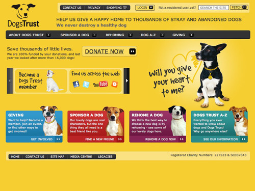
The DogsTrust design uses a high-impact colour scheme mainly consisting of yellow, black and white. The yellow immediately catches the user’s attention, and can be interpreted as a positive, happy colour.
The main site navigation features many commonly-used techniques such as rounded corners, gradients, and a subtle 1px white line across the top. These elements, combined with the black create a visually effective navigation. The navigation only consists of five links, therefore giving users fewer choice, and creating a more focused user journey.
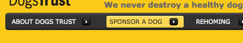 DogsTrust website’s main site navigation
The home page design consists of minimal content and uses effective white space to allow everything to appear above the fold without looking cluttered. The users of the DogsTrust website are highly likely to be dog lovers and therefore the use of dog imagery on the four main call-to-action areas would certainly draw the user’s attention. These areas also feature four varying colours which contrast well with the yellow and black.
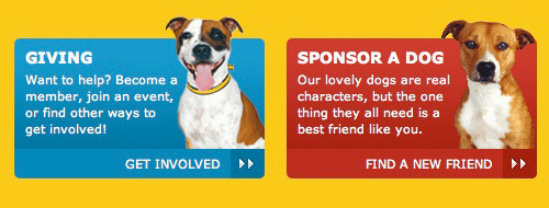 Call-to-action areas with dog imagery and contrasting colours
Improvements
Though we briefly discussed above that the home page uses whitespace effectively to reduce clutter, the header contains many links and words; the user could get easily confused. With login, register, contact, privacy and shopping links, a search form, and two taglines, the user is given too much choice, so this section could be improved.
While going through the process of donating, there are certain fields that cause the page to refresh and brings the user back to the top of the page again. The user is then required to scroll back down the page to continue filling out the form. During this process, this page refresh occurs 3 times, which can be rather annoying. It would be beneficial to develop the form using alternatives technologies, such as Ajax, which would remove the need for page refreshes.
The imagery on the DogsTrust website features happy, healthy dogs that need re-homing. It is assumed that this use of imagery is successful in receiving donations or re-homing dogs. However, similar charities make use of imagery where the dogs appear unhealthy and unhappy. It could prove useful for the organisers of DogsTrust to try out this type of imagery alongside the current images through A/B testing, therefore seeing which type of image is more effective in converting website users into contributors.
7. Shelter
Shelter is a housing and homelessness charity providing advice, information, and advocacy to people in housing need.
The logo featured in Shelter’s design is simple and effective. While being easy to read, the typography of the “h” is suggestive of the charity’s purpose. By using the colour red, the user is given a sense of urgency. The audience of the Shelter website varies a lot from a younger to an older generation, therefore the design is very refrained and simplistic. This allows the message to be portrayed through the content rather than through heavily-designed elements.
Throughout the design you will notice use of solid horizontal borders and lines which give a sense of structure and organisation. The lines allow the user to break the content up and be more easily read, but can also be interpreted as a symbol of shelter.
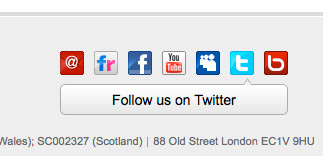
The footer features links to social media profiles such as Twitter, Facebook, and YouTube. This suggests to the user that the charity is up to date with the latest trends and advertising techniques. Users may be intrigued to click these icons and discover more content.
These social media icons also use jQuery to create a nice rollover effect which highlights and changes the text underneath to a descriptive caption of the icon.
 Rollover effect on Shelter’s social media icons
Improvements
When browsing the Shelter website, the user can find themselves clicking through a lot of links until they find the page they want. This can be due to the large amount of call-to-action buttons and lack of whitespace on certain pages. By increasing the whitespace between elements, an easier user experience can be created and also makes content easier to break down and consume.
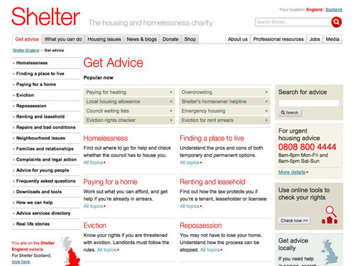 Example page with large amounts of links where whitespace can be improved
Again, while browsing the child pages of the Shelter charity website, links to the donate section are easily lost among all the call-to-action areas, pictures, and content. Perhaps by making the background of the “Donate” tab in the top navigation red, utilising the red from the existing colour scheme, this may draw the user’s eye. The user would spend less time trying to locate the donate section.
8. Sponsor Lee
Though not a charity website, Sponsor Lee is a microsite intended to raise money for Action for Kids charity.
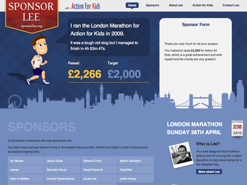
Using a cool colour scheme of blue, silver, and white, along with friendly vector illustrations, gives the user a professional impression. This is important because the user wants to believe they are giving money to a good cause and not being ripped off. Lee Munroe, the designer of the site has been clever with his use of the fold as all important information is displayed at the top. Though users are not afraid to scroll, they do not have to look too hard to find the information they need.
Included in the header is a progress total and aim for the sponsorship. By including this in the design, the campaign is made to feel more realistic and the user can then identify with how much of a difference they, themselves, can make. Now the campaign has finished, users can see how well Lee has done against his target. By putting this total in yellow, the number stands out and the user can see immediately that Lee beat his target.
Improvements
The Sponsor Lee website displays a lot of creativity from the colour scheme to illustrations in the header. Unfortunately towards the bottom of the design, it comes across that parts are unfinished or broken, for example the social media links and footer. This can give an impression of lack of commitment or a rushed process.
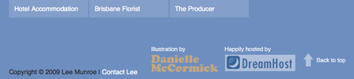 Sponsor Lee website footer
9. ShelterBox
ShelterBox is a charity that helps communities recover from natural disasters. This includes providing “emergency shelter, warmth and dignity to people affected by disaster”.
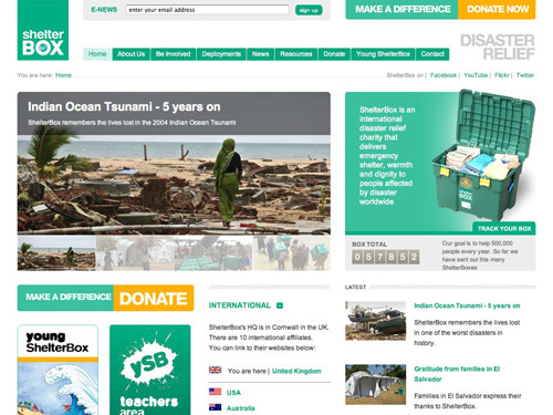
Like many of the charity websites we have already discussed, the ShelterBox design uses a very neutral base colour scheme of grey and white combined with a high contrast green. Main call-to-action buttons are then given a yellow background to effectively stand out to the user. On the right of the home page, the design depicts to the user exactly what ShelterBox as a charity provide along with a counter-style number showing the number of boxes distributed so far by the charity.
By showing the counter and including additional zeroes at the beginning of the total, the user understands that this is an ever-increasing number and therefore, an active campaign.
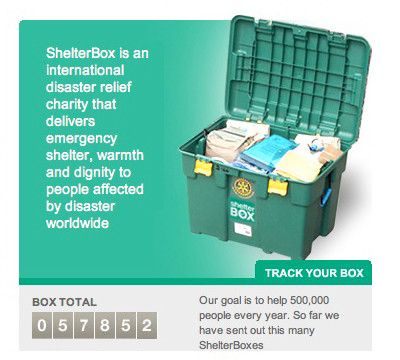 ShelterBox panel featuring box shot and box counter total
Adjacent to this panel, an auto-rotating image gallery is displayed using the jQuery Cycle Plugin. This acts as a call-to-action for the user to find out more, but also shows the user the charity’s work first-hand. This makes the user feel directly involved and may want to do more to help. Overlaying the image, a caption with a slightly transparent background that describes the content of the image is displayed. This method is currently very popular in image galleries.
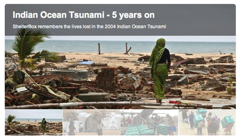 Auto-rotating image gallery on ShelterBox home page
Improvements
Important elements of the website are lost due to the lack of creative design such as the “Latest Deployments” and “International” sites lists on the home page. The charity should style important elements such as these so that they stand out more. This can be achieved perhaps by adding background colours and making them bigger. By increasing the size of elements, the user will recognize these as more important.
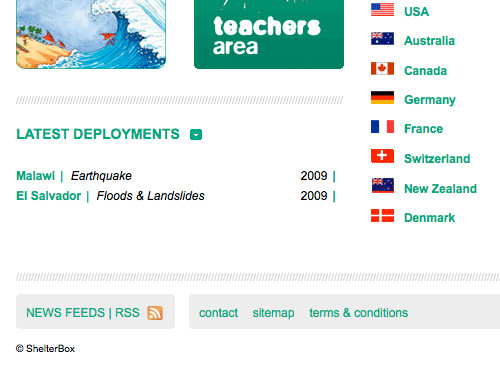 Latest Deployments section on home page
The design lacks a sense of containment — the content of the website seems to bleed into the white background of some pages, making reading content difficult. Perhaps by making the background of the body a light grey and keeping the main container background white, a barrier can be created between the content and the rest of the page.
10. Action for Children
Action for Children is a children’s charity that offers support to vulnerable children in the UK.
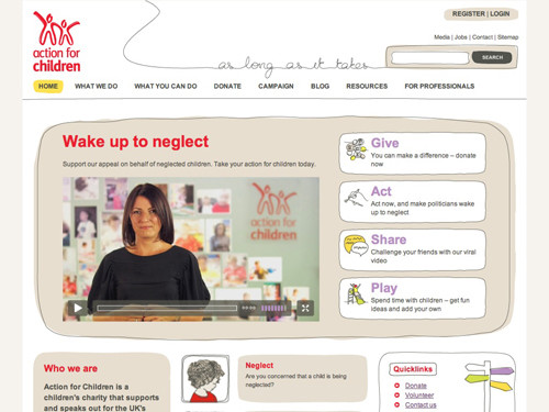
The Action for Children website design is similar to that of Red Nose Day, using a very neutral colour scheme consisting of cream, white, and a contrasting red. Elements of the design are constructed of sketch-like lines to resemble a children’s drawing.
Elements of high importance are given a light cream background to help them stand out against the other sections that have a white background. The user can therefore easily detect which sections to pay more attention to.
When browsing the Shelter website, the user can find themselves clicking through a lot of links until they find the page they want. This can be due to the large amount of call-to-action buttons and lack of whitespace on certain pages. By increasing the whitespace between elements, an easier user experience can be created and also makes content easier to break down and consume.
Example page with large amounts of links where whitespace can be improved
Again, while browsing the child pages of the Shelter charity website, links to the donate section are easily lost among all the call-to-action areas, pictures, and content. Perhaps by making the background of the “Donate” tab in the top navigation red, utilising the red from the existing colour scheme, this may draw the user’s eye. The user would spend less time trying to locate the donate section.
8. Sponsor Lee
Though not a charity website, Sponsor Lee is a microsite intended to raise money for Action for Kids charity.
Using a cool colour scheme of blue, silver, and white, along with friendly vector illustrations, gives the user a professional impression. This is important because the user wants to believe they are giving money to a good cause and not being ripped off. Lee Munroe, the designer of the site has been clever with his use of the fold as all important information is displayed at the top. Though users are not afraid to scroll, they do not have to look too hard to find the information they need.
Included in the header is a progress total and aim for the sponsorship. By including this in the design, the campaign is made to feel more realistic and the user can then identify with how much of a difference they, themselves, can make. Now the campaign has finished, users can see how well Lee has done against his target. By putting this total in yellow, the number stands out and the user can see immediately that Lee beat his target.
Improvements
The Sponsor Lee website displays a lot of creativity from the colour scheme to illustrations in the header. Unfortunately towards the bottom of the design, it comes across that parts are unfinished or broken, for example the social media links and footer. This can give an impression of lack of commitment or a rushed process.
Sponsor Lee website footer
9. ShelterBox
ShelterBox is a charity that helps communities recover from natural disasters. This includes providing “emergency shelter, warmth and dignity to people affected by disaster”.
Like many of the charity websites we have already discussed, the ShelterBox design uses a very neutral base colour scheme of grey and white combined with a high contrast green. Main call-to-action buttons are then given a yellow background to effectively stand out to the user. On the right of the home page, the design depicts to the user exactly what ShelterBox as a charity provide along with a counter-style number showing the number of boxes distributed so far by the charity.
By showing the counter and including additional zeroes at the beginning of the total, the user understands that this is an ever-increasing number and therefore, an active campaign.
ShelterBox panel featuring box shot and box counter total
Adjacent to this panel, an auto-rotating image gallery is displayed using the jQuery Cycle Plugin. This acts as a call-to-action for the user to find out more, but also shows the user the charity’s work first-hand. This makes the user feel directly involved and may want to do more to help. Overlaying the image, a caption with a slightly transparent background that describes the content of the image is displayed. This method is currently very popular in image galleries.
Auto-rotating image gallery on ShelterBox home page
Improvements
Important elements of the website are lost due to the lack of creative design such as the “Latest Deployments” and “International” sites lists on the home page. The charity should style important elements such as these so that they stand out more. This can be achieved perhaps by adding background colours and making them bigger. By increasing the size of elements, the user will recognize these as more important.
Latest Deployments section on home page
The design lacks a sense of containment — the content of the website seems to bleed into the white background of some pages, making reading content difficult. Perhaps by making the background of the body a light grey and keeping the main container background white, a barrier can be created between the content and the rest of the page.
10. Action for Children
Action for Children is a children’s charity that offers support to vulnerable children in the UK.
The Action for Children website design is similar to that of Red Nose Day, using a very neutral colour scheme consisting of cream, white, and a contrasting red. Elements of the design are constructed of sketch-like lines to resemble a children’s drawing.
Elements of high importance are given a light cream background to help them stand out against the other sections that have a white background. The user can therefore easily detect which sections to pay more attention to.
Embedded on the home page is a video of British actress Davina McCall. By having a frozen shot of a celebrity on the home page, the user is reassured of the charity’s success and credibility. The effect being potential donations from a user who is feeling confident that the charity is well supported and perhaps inclined to become involved because of celebrity associations.
Once the user’s eye is drawn to the celebrity viral, they will notice four call-to-action areas displayed on the right. The wording of these are very snappy and simple to suggest to the user that these actions are easy, but meaningful. Alongside the wording, hand-drawn illustrations are used to add interest and creativity.
Improvements
When viewing the sitemap of the Action for Children website, there is a bug in the CSS of the columns. Columns are too wide to fit the intended number in a row, meaning columns are misplaced below others on the right and breaks the flow of the page. This can be fixed by either making the content area wider on this page (as there is no sidebar), or adding a clearing element after each row. Making the columns easier to read allows the user to find the page they’re looking for quicker.
Another bug is the functionality of the inline popup windows that appear after clicking the “Send Page”, “Feedback”, and “Share Page” links. The windows are cut off underneath the title, making the forms unusable.
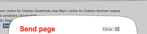 Example of inline popup window bug on Action for Children website
Support Needed: Stand With Haiti
As many are aware, Haiti recently suffered a major earthquake which devastated the country. Stand With Haiti is a campaign website set up by Partners In Health who, even prior to the earthquake, have been providing medical care in Haiti for over 20 years.
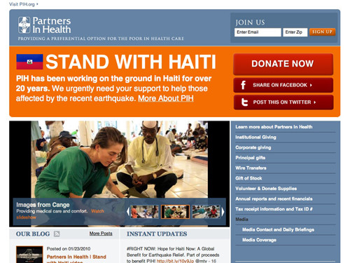
The first thing you notice about the Stand With Haiti campaign website is the colour scheme. The blue is both soothing and in keeping with the Partners In Health branding. In contrast with the blue, orange and deep reds are used on call-to-action buttons and on important pieces of information that portray a sense of urgency and high importance.
Consistency with the deep red is used so the user can easily recognise buttons and links — meaning an action is required from the user. Through the use of page structure, size, and order, a user visiting the Stand With Haiti website is clearly provided with an order of priority for certain aspects of the website. The first being to Donate using the large red “Donate” button found at the top of the page within the main header. This element is one of the first things the user’s eye is attracted to when landing on the website.
Directly underneath this large “Donate” button are two smaller, slightly darker red buttons. The purpose of these is to help users share the site on popular social media websites, with the goal of increasing the number of visitors and donations.
Finally, the user is left to browse and read the site’s content at their own leisure. Being a current crisis, it was an obvious choice to give higher importance to donations and spreading the word. By prioritising areas of the website, a simpler and more effective user experience is created.
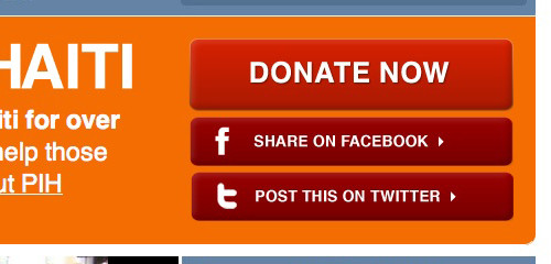 Prioritised buttons featured in Stand With Haiti header
While acting as a medium for receiving donations, the home page of the Stand With Haiti website acts as a news hub for the latest pictures and information. This is crucial for users who wish to be kept up to date with the crisis and know how their donations are helping.
A jQuery-built image gallery, similar to ShelterBox, is used to display images of the crisis. Underneath there is a list of recent blog posts and instant updates from the charity’s Twitter feed.
Improvements
As we discussed above, the design features a lot of orange and red buttons. However, none of these buttons have hover or visited states. Adding these to the links and buttons would increase the usability of the website, showing the user clickable areas more prominently and helping them recognize where they’ve already been.
Donations being one of the main purposes of the Stand With Haiti website, it is important that the donate form is usable. Unfortunately, at first glance the donate form looks cluttered.
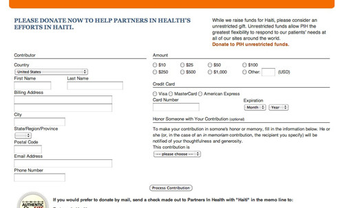 Stand With Haiti donate form
The form would be much more usable and readable with better use of whitespace. It could also improve if the form labels were clickable to their appropriate input field. While this provides easy-to-select fields, it also ensures that people with screen readers and auto-fill functions can use the form.
After adding effective white space and increasing the usability of the form fields, a button similar to those used on the home page of the site can be used for the “Process Contribution” button. This should also be repositioned as users expect submit buttons of this kind to either be on the left or right. Few forms, especially this wide, place their submit buttons in the middle.
Useful Resources
Many of the methods mentioned above can easily be achieved yourself:


