Designing The “World Of Programming” Infographic

Email Newsletter
Weekly tips on front-end & UX.
Trusted by 182,000+ folks.
 Celebrating 10 million developers


 Custom Web Forms for Angular, React, & Vue. Your backend.
What the Infographic Shows
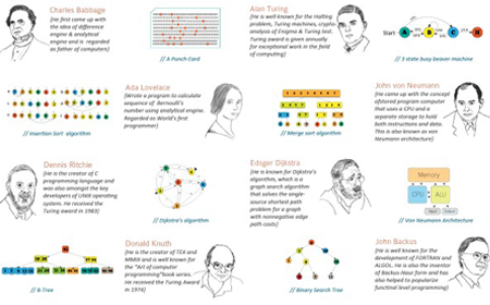
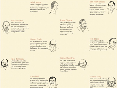
This infographic exhibits pioneers in the field of programming, along with the history and current statistics of various programming languages. Also included are some random facts and algorithm diagrams to make the infographic more visually appealing. Click on the image to enlarge.
- Large resolution view (.jpg, 2 Mb)
Fewness Of Words
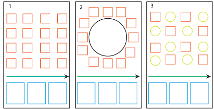
All of the pioneers in this infographic have had a big impact on the field of programming. Still, this list is in no way comprehensive. Programming languages like C, C++ and Java have shaped the programming world, and so including their creators here was essential. The same goes for pioneers such as Ken Thompson, Richard Stallman and Linus Torvalds, who have each made significant contributions to the open-source world.
You might also notice that some important algorithms — such as dynamic programming, brute force and hash tables — are missing. The reason is that explaining these algorithms in a single diagram is difficult. Hence, they were replaced with ones like insertion sort and merge sort, which are relatively simpler to explain. Eight Queens and N-puzzle have often been used as illustrative problems for various programming techniques, and so they, too, are included here.
Designing The Infographic
Infographics are visual representations of information, data and knowledge. So, layout, color and typography are critical to user comprehension. Let’s consider each of these in turn.
Layout
Given the available information, I decided to divide the infographic into three major sections:
- The most important people in the history of programming,
- A timeline of the history of programming,
- Statistics on programming languages.
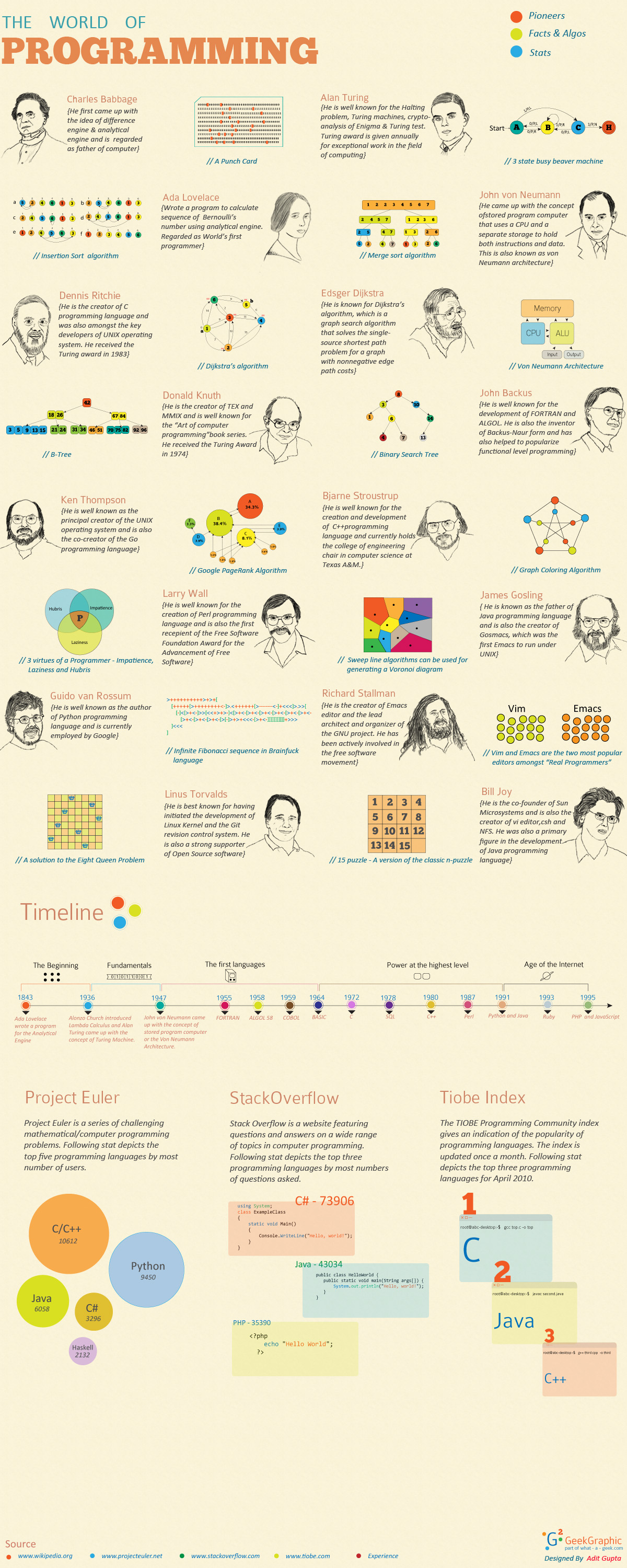
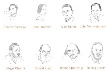
The goal was to make the infographic simple yet beautiful. I came up with the following possible layouts to display the information:
The red squares denote illustrations, the arrows denote timelines, and the blue rectangles denote statistics on programming languages. In the third layout, the green circles denote random facts and algorithm diagrams.
This first layout is simple but lacks the attractiveness of a good infographic. So, I decided to abandon it.
In the second layout, the illustrations are arranged in a circle. But including the relevant information for each illustration consistently would have been difficult. So, I abandoned it, too.
I decided on a layout that combines the sine wave with golden rectangles, two properties that I discuss in an earlier article. I put random facts and diagrams of algorithms in the remaining golden rectangles to make the infographic more attractive.
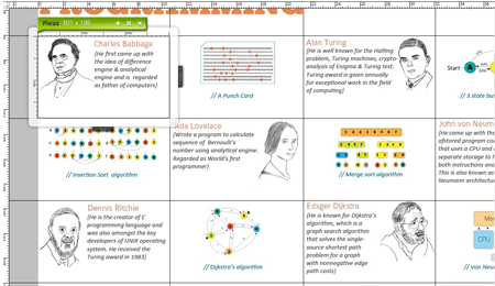
I used Pixus to create the golden rectangle grid for this infographic. It comes in handy when you have multiple golden rectangles in a design.
Color
Colors present themselves in continuous flux, constantly related to changing neighbours and changing conditions. — Josef Albers
Picking the right colors is one of the most important things in graphic design. Color affects visual hierarchy and legibility of type, so it’s important to choose the right colors, and not just the expected ones. In an infographic, the background should blend perfectly with the illustrations. In this case, the illustrations looked dull against a white background and looked ugly against a dark background.
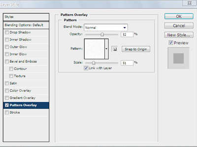
I chose a light shade of gold (#f9ebb3) for the background. Then, I applied a granular pattern to the background layer and scaled it down to 51%. I also reduced the opacity to about 52%. The illustrations now look good against this background.
I opted for “academic” colors for the typography because they blend well with the background and the illustrations. We all know that contrast is king, and so I used mostly primary colors for the illustrations because they contrast well with the text blocks.

You can always get help from Adobe Kuler if you have trouble choosing colors for your design.
Typography
The typographer's one essential task is to interpret and communicate the text: its tone, its tempo, its logical structure, its physical size, all determine the possibilities of its typographic form. The typographer is to the text as the theatrical director is to the script and the musician is to the score. — Robert Bringhurst
Use two or a maximum of three font types in a design. I chose Colaboarte Light for the programmers’ names and Calibri Italic for their descriptions. Both are sans-serif.
Within a single typeface family, variations in weight, width and style can vary the rhythm substantially, thus affecting communication. To control this, I italicized Calibri to a font size of 15 and kept the programmers’ names at 21. Alignment is flush-left. I also used Calibri for the descriptions of illustrations but gave it a different color to distinguish it from the descriptions of programmers. I chose the ChunkFive font for the numerical values in the illustrations.
Displaying Stats
To envision information — and what bright and splendid visions can result — is to work at the intersection of image, word, number, art. The instruments are those of writing and typography, of managing large data sets and statistical analysis, of line and layout and color. — Edward Tufte, Envisioning Information
For years, we have been displaying information in bars graphs and pie charts. In fact, Edward Tufte coined the term “chartjunk” to refer to useless, uninformative or information-obscuring elements in quantitative displays. But this trend has shifted in recent times with the rise of infographics.
I opted for three different ways to display the statistics on programming languages. The Project Euler statistics are displayed in circles of different radii. The project is based on mathematical problems, and so displaying the statistics in geometric shapes was apt. The StackOverflow statistics are displayed as appearing in text editors of various sizes and colors, while the Tiobe Index statistics are displayed in terminals of various sizes and colors.
Final Thoughts
An infographic is all about displaying information in creative ways. The process of designing infographics can help us understand and implement certain graphic design principles much better than by designing for the Web alone. It’s all about applying the fundamental principles of design; we’ll always come up with better results if we can do that well.
Useful Links and Resources
- The Do’s And Don’ts Of Infographic Design: Revisited
- Data Visualization and Infographics
- Data Visualization and Infographics Resources


