Designing and Producing Creative Business Cards: Techniques and Details
Plenty of creative business card showcases are available out there. Many of these are beautifully done and well thought out, and they serve as inspiration for those who would like their business card to be more than the standard rectangular piece of paper. Yet little explanation accompanies these examples, and figuring out just how to bring your idea to life can be overwhelming, to say the least. This guide is meant to help you decide which technique is right for you, how to correctly prepare the files and what to look for in a printer.
Further Reading on SmashingMag:
- The Basics of Business Card Design
- Business Card Design Starter Kit: Showcase, Tutorials, Templates
- Business Card Design: Better Than A Plain Ol’ Business Card
- The Ultimate Round-Up of Print Design Tutorials
General Advice
Content Goes First
I never tire of repeating this to anyone who will listen. Don’t base your business card design on the fact that your printer has a special limited-time offer on round corners or metallic inks.
Think in terms of what the design will add to your message. Tempted to use rounded corners just because the cool kids are doing it? Maybe your card would stand out more by not using this technique.
Why do you want metallic ink? Do you think your name would really stand out in gold, even though your message is all about technology and recent code developments? You may want to rethink that. Or do you sell hand-crafted jewelry and want a design that reflects your latest silver creation? Then the silver ink might be the perfect solution for you after all.
The back of a business card is often ignored, but it can be a great place for extras that make your card even more memorable. Make it relevant to what you do, and make it useful if you can. You could include tips or a quick how-to guide relevant to your product, offer a free consultation, add a reminder for a date when you will offer discounts, or invite loyal customers to collect a stamp every time they purchase from you. Think of something that would make them want to hang onto your business card and consult it often. If you think the back should be reserved for note-taking, why not mark a few dotted lines, titled “Notes,” rather than leave it blank?
Talk to Your Printer
No one knows more about the techniques and materials available—and new ones come out all the time. Generally, printers are more than happy to give you all the industry news and advise you on techniques and materials. (If yours isn’t, you might want to look for a new printer.) If you learn a little about how they operate, they will appreciate it and be even more willing to help.
Size
While this article focuses on custom shapes and sizes, keep in mind standard sizes, too. Card holders are made to fit standard size cards, and I have often heard comments like, “If a business card doesn’t fit in my wallet, I don’t care how beautiful it is, it’s going in the trash.”
The standard sizes are 3.5 x 2 inches in the US and Canada, 85 x 55 mm in the European Union and 90 x 55 mm in Australia, New Zealand and Scandinavia. Or you could use a standard credit card as a reference, which about 85 x 54 mm or 3.34 x 2.25 inches.
Unless you have some other use for your cards in mind (for example, a bookstore’s card that doubles as a bookmark), you’ll want to stay within those dimensions. Smaller is okay, but anything too big won’t fit in most pockets, so consider going bigger only if you have reason to believe your cards will not be stored in wallets or holders.
Do you have the perfect idea but don’t know what to do with it? Maybe you’ve heard about die-cutting, varnishes, metallic inks, letterpressing and special materials but are unsure what they are exactly or which one is for you? Let’s jump into the different techniques!
Die-Cutting
Any card (or any printed material for that matter) that isn’t a standard rectangle or that has holes in it is created by a technique known as die-cutting. A metal template is prepared and is used to cut the paper in the given shape. The easiest way to think about this is to picture a giant hole-puncher, except that the holes are not necessarily round, but rather whatever shape you want them to be.
This means that, in addition to the artwork, you will need to provide the printer with a custom shape to “punch out” your cards.
The result can be as simple a round hole in the center of your card or as complex as a three-dimensional pop-out.
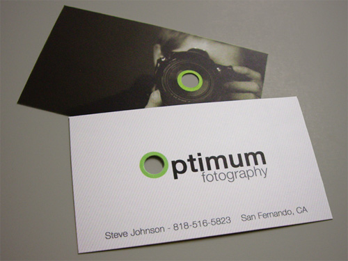
This simple and effective design makes use of the round hole on both sides of the card.
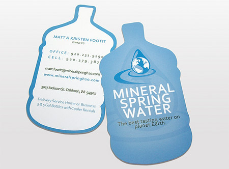
This card takes the shape of the product. Instant recognition!
Preparing the File
I’ll use die-cutting as an example, but most of these guidelines apply to the other finishes as well. The main differences are cited in the respective sections below, and I will provide links to help you read about the techniques in more detail. The guidelines below should give you a good starting point.
The best applications to prepare files for any special print finishes are the industry-standard Adobe Illustrator and InDesign. Photoshop is not suitable because it does not have the precision necessary for this kind of project.
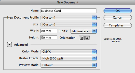
As with any other print document, set up your file to the printed dimensions (i.e. whatever size you want your card to be, whether rectangular or a non-standard size), at 300 PPI resolution, using CMYK as the color space for all the elements of the artwork.
There seems to be a bit of confusion about DPI, PPI, CMYK and RGB. Preparing a file for printing with either Illustrator or InDesign is actually very simple.
In Illustrator, when creating a new document, click on the “Advanced” options tab (in some versions this is already visible). This brings up the options for both the resolution and color space. Set the resolution to 300 PPI and the color mode to CMYK.
Note that PPI, or pixels per inch, is often confused with DPI, or dots per inch. The latter refers strictly to printer hardware and its capability to reproduce dots on paper. When preparing files for printing, don’t worry too much about the DPI. 300 PPI is the magic number. Remember that and you’ll be golden. If you would like to learn more about DPI and PPI, see the link at the end for an article that explains it in much more depth.
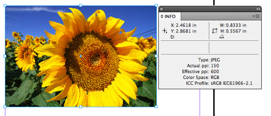
InDesign documents are automatically created at 300 PPI. The only thing to make sure of is that the elements you insert in the document (such as photographs) are also at 300 PPI and use CMYK. Check this by selecting your image and bringing up the info window (hit F8).
For example, the image below uses the RGB color space; it should be changed to CMYK:
Even though you can use RGB images, it doesn’t mean you should. Yes, both InDesign and Illustrator are perfectly capable of converting the output to CMYK when you export a file as PDF, but if you ever have to submit your source files to someone or use the images for something else, this extra step could save you hassles.
And please-double check the resolution. Print out the card to check for pixelation. I know this sounds like a no-brainer, but so many people forget to check the printed result. What you see on the screen is not what you will see in print.
Another thing to check is your black text and line art, if you are converting any of them from RGB. They should be 100% K in CMYK color mode to avoid a muddy effect and color halos.
When your artwork is ready, create a new layer above the artwork. Call the layer something like “dieline.” You could be even more specific and name it “Dieline - DO NOT PRINT,” which would be especially helpful if you are not able to speak with the printer before submitting the file (say, if you are using a Web order form or your client is the point person for the printer.)
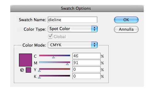
Now, create the guidelines for how your card should be cut. Make sure your outline for the die-cut uses a custom spot color, not CMYK; this allows the printer to extract the die-cut template when printing separations. To create a custom color, click on the little arrow in the swatches palette, and click to make a new swatch. In the dialog box that appears, choose any color that will stand out in your artwork, and then select “Spot color” from the drop-down menu next to “Color type.” The color can be anything you want. 100% magenta is quite popular because it usually stands out, but saving it as a spot color is important.
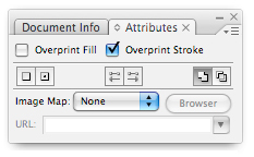
Also, remember to set the stroke (if it’s a custom crop shape) and/or fill (if you are cutting out holes) to “Overprint” to avoid knocking out the art below. You can bring up the options for Overprinting in InDesign by going to Window → Attributes, or in Illustrator by pressing F11 to bring up the “Attributes” window.
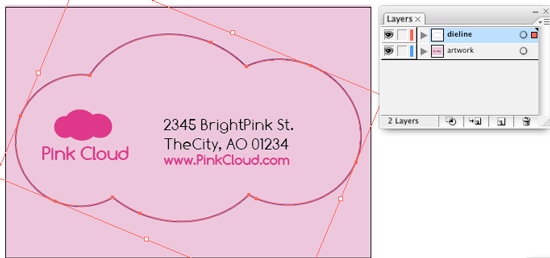
Let’s say your logo is a cloud, and you want the card to be cut in a cloud shape (not a very creative example but easy to explain). Your file in Illustrator would look something like this:
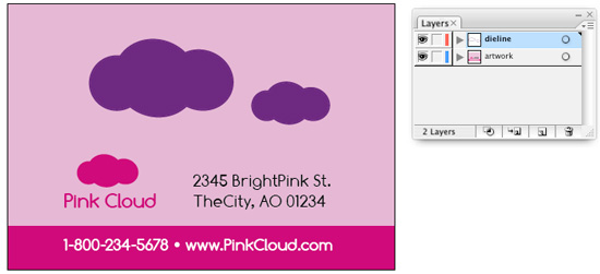
And your finished card would look like this:
If you wanted to cut out the cloud shape, it would look like this:
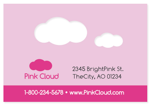
And the finished card would look like this:
Notice how the logo has moved from the artwork layer to the dieline layer and is now also filled with the custom spot color.
Make sure your artwork has enough bleed (i.e. it extends well past the edge of the document if the shape is regular or past the die-cut guidelines if custom). Usually 0.125 inch, or about 3 mm, is enough, but I tend to add more to be safe. Both InDesign and Illustrator allow you to add bleed in the “Document setup” options.
I won’t go into too much detail here, because bleed is a rather complex subject that deserves its own guide. For those of you interested in learning more, a couple of links are at the end of this article that explain it more thoroughly.
On the same note, do not put any important elements (such as logo or text) too close to the edge. Leave a buffer margin (again, about 0.125 inch or 3 mm) around the dieline or document, to avoid the risk of something getting cropped.
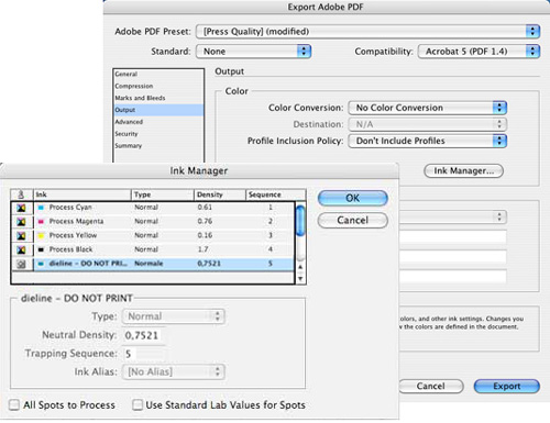
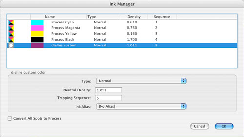
Usually, either a native file (AI, INDD, EPS) or high-resolution PDF is acceptable as the final file for printing. (Always check with the printer before preparing the final file.) If you prepare a PDF, make sure your custom fifth color is kept as a spot color and is not converted to CMYK. You can check it in the “Ink Manager” window (Export as PDF → Output → Ink Manager):
You can double-check that it appears in the Ink Manager list in the PDF itself (Acrobat Pro) by clicking Advanced → Print Production → Ink Manager:
Printing It
Most big print shops have die-cutting equipment. Check first if you are printing locally. The best way to make sure everything goes according to plan is to ask questions, explain your requirements and look over the proofs in person. Small printers outsource die-cut jobs. If you want more control, look for one that does it in-house.
If you are unable to print locally (for example, because your client is remote), you have two options. One is to find a printer local to your client. Usually, the client will already have one lined up, but I strongly recommend you get in touch with that printer yourself, rather than just pass the files to the client and let them handle it. Ask questions, send over mock-ups, get a proof sent back to you—do what you can to make certain that the job prints the way it should.
Alternatively, you could find an online print shop that offers die-cutting. Again, get in touch with them personally, rather than just submit the file via an online form, and make sure all your questions and concerns are addressed.
Printer Checklist
Need help choosing a print shop and communicating with it? Here are some things to keep in mind.
- Before you do anything else, get their phone number or email address and get in touch. Tell them about your project, and ask about technical specifications and any other questions you may have. (This is a good time to request a cost estimate as well.) If you have more than one candidate, rinse and repeat.
- Ask to see samples of similar pieces they have printed. Examine them. This could lead to more questions—or inspiration to make your project even better.
- The main criteria I use in choosing a printer is how responsive and knowledgeable they are. You want someone who will actually check your file and contact you if there are any problems or questions; because no matter how great a printing deal you find, if your file has an error, that’s money thrown down the drain.
- To save some money, you can often do this by asking the printer for advice. Would making the file layout slightly smaller allow them to fit more cards on one sheet? Could you adjust the shape so that there is less wasted paper? How about using fewer colors? Your printer should know the options; just ask!
- In my experience, PDF is one of the safest options for prepress. Native Illustrator files work well too, but be sure to check which versions of Illustrator your printer accepts. Always check which versions of any Adobe software your printer uses if submitting native files.
- Ask the printer if they have .joboptions files. These files can be imported into Adobe applications and will give you presets for exporting to PDF or EPS. This is the easiest way to make sure that your final files are exactly the way your printer needs them. If they don’t have these files, both InDesign and Illustrator have presets for saving in PDF. Just make the necessary adjustments; for example, you will have to add the bleed to these presets manually (see the links at the end for step-by-step instructions).
- If you are not able to speak with the printer, add an email message or a file with instructions. Don’t forget to include your contact information so that they can call or email you if they have any questions!
You’ve probably noticed that most of these tips emphasize the importance of communicating with your printer. I cannot stress this enough: every project is different, and communication is the key to getting the best result possible.
How Much Will It Cost?
While pricing depends on many factors, there is usually a set-up fee when using a die-cut or other special finishing technique. (Remember the giant hole-puncher mentioned above? They need to make one of those, just for you.)
The fee will be the same whether you print 50 or 500,000 cards, so printing larger quantities is much more cost-effective.
This may not be the case with certain popular formats (for example, rounded-corners business cards) because the printer would reuse the same template for multiple jobs, hence the special offers.
Special Finishes
I’ve devoted a big portion of this article to die-cutting because the file preparation and printing process described here is similar to many other techniques. But let’s look at some of them.
Spot UV Coating
This special finish is achieved by applying a clear varnish to an area of the card defined by you. The effect is a slightly raised design element, with a glossy, matte or satin finish. The example below shows a glossy finish:
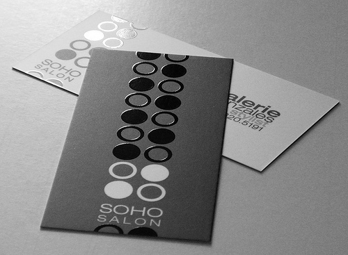
File preparation is done the same way as for die-cutting, but instead of specifying a stroke, you specify a shape or area to apply the varnish to. This is still done by filling it with a spot color and, in this case, setting the fill to overprint.
Letterpressing
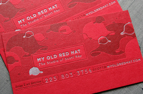
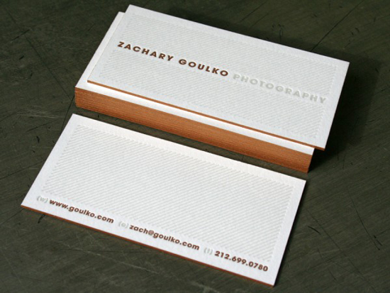
Letterpressing is done by inking a raised surface and then pressing it into the paper, giving the design both color and depth. This technique is suitable for vector images and text, using solid Pantone inks. An article linked to at the end of this article provides more technical detail. Here is an example of a business card done with this technique:
Embossing
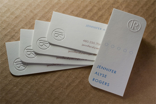
Similar to die-cutting, a die is used to press the paper up, creating a three-dimensional raised effect.
Foil stamping
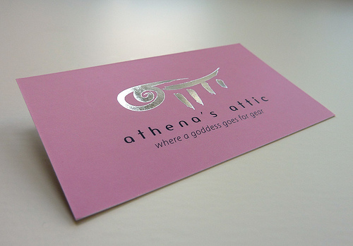
With this technique, a layer of thin foil is applied to an area of the card you specify.
File Preparation for Special Finishes
File preparation for all of these effects is similar to that of die-cutting: you have to define the area to be coated, embossed or whatever the effect is. But you might need to submit two files: one with the artwork, and another with the area to apply the effect to.
Make absolutely certain these two files line up perfectly. The easiest way to do this is to use a file with separate layers: one or more for the artwork, and another for the special finish guidelines (as described for the die-cutting file preparation above). Then, simply save them as separate files by first hiding one layer and then the other.
When using photos for a special finish, create a clipping path in Photoshop before placing the photo in Illustrator or InDesign. Then you can use this same clipping path as the mask for your effect either by choosing to export the clipping paths to Illustrator or by right-clicking (PC) or Control-clicking (Mac) on the clipping path in InDesign and converting it to frame. (You might want to check the options first if it isn’t showing by going to Object → Clipping Paths → Options.)
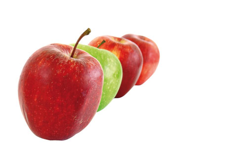
For example, you can use different masks with this image:
This mask will apply the effect to the entire photo:
While this one will apply it only to the foremost apple:
Special Inks
Additional inks can be used to make your card stand out even more. Metallic, pearlized and fluorescent inks can produce interesting effects. (To better preserve metallic inks, consider putting a varnish on top.) The even more common Pantone colors give a different and more solid effect than their process equivalents because they are opaque.
This one is simple: just find a custom color you like by looking at the Pantone swatches, and add it to your document. Prepare your artwork as you normally would, but make absolutely certain that your output does not convert to CMYK if you are preparing a PDF (as described above).
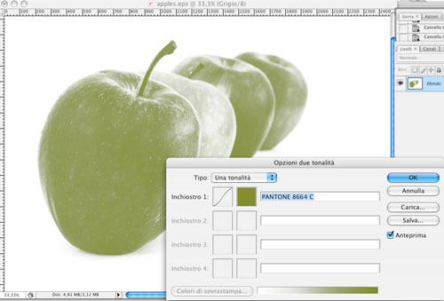
Note: the easiest way to prepare photos with a special ink is to convert your image in Photoshop first to grayscale and then to duotone. Choose your ink(s) from the Pantone library, and tweak your settings as necessary. (Working with color channels is a complex way to get more control over the result, but I don’t recommend this to Photoshop beginners, and Photoshop experts probably already know how to do this.)
Duplexing and Triplexing
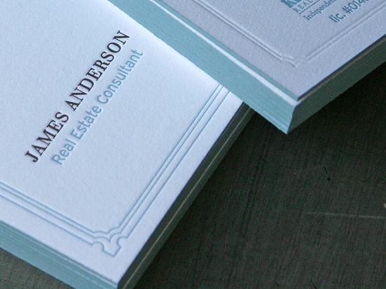
This technique is about using two or more sheets of paper glued together. The effect achieved is commonly referred to as edge-painting or edge-tipping, because a different-colored sheet of paper that is inserted between the two main ones produces colored edges “inside” the card (triplexing), as seen here:
Using only two sheets (duplexing) gives a two-color edge—one on the front and one on the back:
It adds a touch of elegance and makes your card thicker than the standard stock. Combining this technique with die-cutting—budget permitting—gives an even more interesting result.
Scented Inks
You won’t find many examples of this technique on the Internet because it doesn’t exactly translate as a photo. Still, it is an interesting way to make your business card jump out.
Available scents range from chocolate to mildew. If that is not enough (and money is no object), you can create a custom scent for an extra fee.
Special Material
This is a vast subject because the options are countless. We will only touch on this topic. To see and feel the different kinds of material available, visit your printer!
Paper and Cardboard
There are so many varieties that I wonder why most people still use the same white or off-white cardboard stock for their business cards. From soft-as-cloth finishes to cold-pressed textured paper, there are enough options for everyone’s needs. The options are rather hard to describe; I recommend you make a trip to the printer (and give yourself an hour or so to ponder the choices)
File preparation is no different; except with colored paper stock, keep in mind that the colors will not display the same way in your software. To simulate the effect, use a layer of a similar color below the artwork, and set the artwork layer to multiply; or to about 70% opacity with darker color stocks.
Plastic
Transparent, frosted, stretchy—there are plenty of options for a plastic stock.
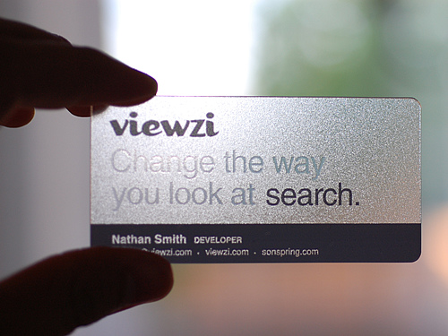
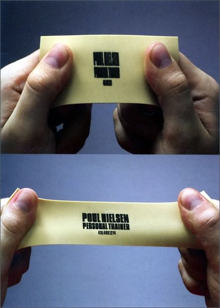
Plastic is usually printed with a different process, such as screen printing. Check with your printer to see what colors you can use. Special printing processes usually require that you use Pantone inks. Remember to account for any special effects, such as transparency and stretch. Giving general advice on this one is hard, because each material has its own requirements.
Metal
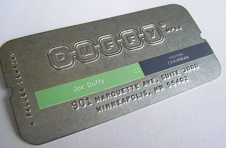
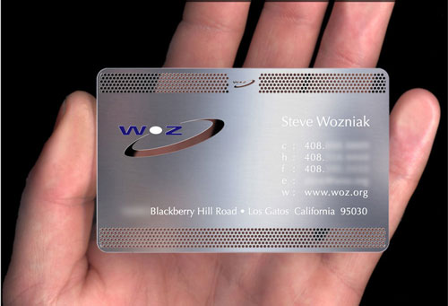
If your service or product is related to a metal, you might want to consider using metal as a material. You could simulate a credit card or computer. Keep the design minimal for a more striking effect.
Again, check with the printer before preparing your artwork to find out what process they use to print on metal and which colors you can safely use.
Other Material
Other options are wood, plexiglass, cloth. You could combine these and use a special finish as well. Hopefully this article has given you some ideas, and you will know how to start researching: by speaking with your printer.
Customizing by Hand
Sometimes, printing a highly customized card is simply not worth it, especially if you need only a small quantity. Does that mean you should dismiss your creative idea and stick with a standard solution? Not necessarily.
All you need is some imagination and a lot of patience. An appetite for crafts or having crafty friends or relatives can be a big plus, too.
You could print a standard card as the base of your idea and then customize smaller quantities by hand. I recommend doing this with fewer than 500 cards, or you will be overwhelmed. If you have crafty friends or relatives who are willing to help, you could tackle more.
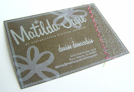
Again, keep it relevant to the content. For example, colorful hand-stitching to underline a key phrase or “stitching” your design would be fun for a textile or fashion business:
Gluing on an element would work for crafts stores. Or you could glue a piece of fabric or something else that characterizes your service:
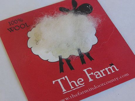
Incorporating something relevant to what you sell is a great idea, and there are plenty of ways to do this. Here is an excellent example:
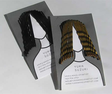
A paper clip would work for a business supply store or even a business consultant, while a dried or plastic flower would work for a flower or gift shopt. Just about any kind of business can find something relevant to add on.
You could even invite the recipient to customize the card themselves; for example, by including cut and fold lines that transform your card into a unique shape. Simple examples are a paper doll for a children’s store or origami for a stationery store. Just make sure it’s relevant and fun, otherwise your recipients are unlikely to go through the trouble of cutting out and folding the card.
Hopefully this article offers enough information and inspiration for you to make business cards that are as creative as your imagination allows, and on any budget.
Want To Know More?
Here are a few articles that go into more detail on some of the topics covered:
- Living in a Die-Cut World An in-depth article on die-cutting from GoMediaZine.
- Display, Printing, DPI and PPI If you are really curious about the differences between DPI and PPI, this article by Photo.Net is for you.
- Brand Spanking New Colors: Making Custom Spot Colors in Illustrator A step-by-step guide with screenshots.
- Page Bleed: What Is It, How Much Is Needed and How to Fix It An easy-to-understand explanation of why bleed is needed and how much you need.
- Adobe InDesign Tips Tips on setting up bleed and exporting to PDF in InDesign.
- Illustrator Tips Tips Tips on setting up bleed and exporting to PDF in Illustrator.
- TheStandard: Prepress A very thorough guide from TheStandard on preparing your artwork for printing.
- PDF Basics: The File Format and Its Use in Prepress. Everything you need to know about preparing PDFs for prepress.
- How to Choose a Printer or Prepress Specialist Excellent tips from the printers themselves, put together by BoDo.
- New Uses for Old Clipping Paths A detailed explanation from Adobe on using clipping paths as frames in InDesign.
- Combining Metallic Inks With Color Useful tips on using metallic inks.
- Creative Business Cards: Uses of Various Shapes and Materials A showcase of different techniques and materials.


 Claim Your Free Spot!


 Register Free Now
 Celebrating 10 million developers
