Designing for iPhone 4 Retina Display: Techniques and Workflow

Email Newsletter
Weekly tips on front-end & UX.
Trusted by 182,000+ folks.


 Celebrating 10 million developers
 Custom Web Forms for Angular, React, & Vue. Your backend.
The iPhone 4 features a vastly superior display resolution (614400 pixels) over previous iPhone models, containing quadruple the 153600-pixel display of the iPhone 3GS. The screen is the same physical size, so those extra dots are used for additional detail — twice the detail horizontally, and twice vertically. For developers only using Apple’s user interface elements, most of the work is already done for you.
For those with highly custom, image-based interfaces, a fair amount of work will be required in scaling up elements to take full advantage of the iPhone 4 Retina display. Scaling user interfaces for higher detail displays — or increasing size on the same display — isn’t a new problem. Interfaces that can scale are said to have resolution independence.
Further Reading on SmashingMag:
- A Better Way To Design For Retina In Photoshop
- Towards A Retina Web
- Ready For Retina HD: Create Pixel-Perfect Assets For Multiple Scale Factors
- Beautiful iPhone And iPad Retina Wallpapers
In a recent article, Neven Mrgan described resolution independence: “RI [resolution independence] is really a goal, not a technique. It means having resources which will look great at different sizes.” If it’s a goal, not a specific technique, then what techniques exist? How has Apple solved the problem in iOS?
Fluid Layouts
While apps that take advantage of Apple’s native user interface elements require a lot less work when designing for the Retina display, we’re here to talk about highly custom, graphic-driven apps that need a fair amount of work to take full advantage of the Retina display.
While not strictly a resolution-independent technique, using a fluid layout can help an app grow to take advantage of a larger window or screen by adding padding or by changing the layout dynamically. A lot of Mac, Windows and Linux apps use this method, as do some websites.
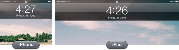
This is partially how Apple handled the difference in resolution from iPhone to iPad — a lot of UI elements are the same pixel size, but padded to make use of the extra screen real estate. The status bar is a good example of this. It works because the pixel densities of the iPhone 3GS and iPad are similar (163 ppi vs 132 ppi).
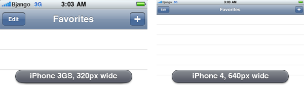
Fluid layouts work when the change in density is minor, but aren’t any help with the iOS non-Retina to Retina display transition (163 ppi to 326 ppi). The image below demonstrates what would happen if an iPhone app was simply padded to cater for the higher resolution display of the iPhone 4. Buttons and tap areas would be the same size in pixels, but half the physical size due to the higher pixel density, making things harder to read and to tap.
Just-in-time Resolution Independence
Another approach to handling widely different resolutions and pixel densities is to draw everything using code or vector-based images (like PDFs) at runtime. Without trying to stereotype anyone, it’s usually the approach engineering-types like. It’s clean, simple and elegant. It lets you design or code once, and display at any resolution, even at fractional scales.
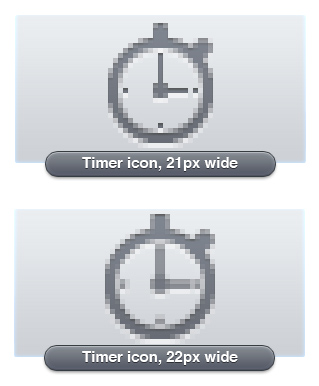
Unfortunately, using vector-based images tends to be more resource-hungry and lacks pixel level control. The increase in resources may not be an issue for a desktop OS, but it is a considerable problem for a mobile OS. The lack of pixel level control is a very real problem for smaller elements. Change an icon’s size by one pixel, and you will lose clarity.
Neven emphasizes in his article that:
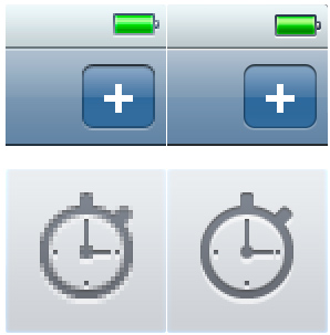
“…it is simply not possible to create excellent, detailed icons which can be arbitrarily scaled to very small dimensions while preserving clarity. Small icons are caricatures: they exaggerate some features, drop others and align shapes to a sharp grid. Even if all icons could be executed as vectors, the largest size would never scale down well.”
Although here he is talking exclusively about icons, his description is apt for most UI elements. The decisions involved in scaling are creative, not mechanical. Vector-based elements aren’t suitable for all resolutions, if you value quality.
Ahead-of-time Resolution Independence
The best quality results — and the method Apple chose for the iPhone 3GS to iPhone 4 transition — comes from pre-rendered images, built for specific devices, at specific resolutions: bespoke designs for each required size, if you will. It’s more work, but pre-rendering images ensures everything always looks as good as possible.
Apple chose to exactly double the resolution from the iPhone 3GS to the iPhone 4, making scaling even easier (different from the approach of Google and Microsoft — notice that this article is not relevant to the latest version of Microsoft’s mobile OS — proving yet again that controlling the entire stack has huge advantages).
Currently, there are three iOS resolutions:
- 320 × 480 (iPhone/iPod touch)
- 640 × 960 (iPhone 4 and iPod with Retina display)
- 768 × 1024 / 1024 × 768 (iPad)
In a few years, it seems highly likely that the line-up will be:
- 640 × 960 (iPhone/iPod touch with Retina display)
- 1536 × 2048 / 2048 × 1536 (iPad with Retina display)
- Some kind of iOS desktop iMac-sized device with a Retina display
There are significant differences between designing iPhone and iPad apps, so completely reworking app layouts seems necessary anyway — you can’t just scale up or pad your iPhone app, and expect it to work well or look good on an iPad. The difference in screen size and form factor means each device should be treated separately. The iPad’s size makes it possible to show more information on the one screen, while iPhone apps generally need to be deeper, with less shown at once.
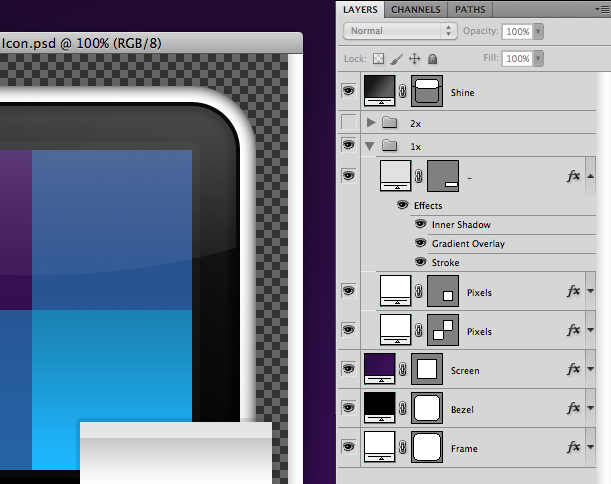
Building Designs That Scale
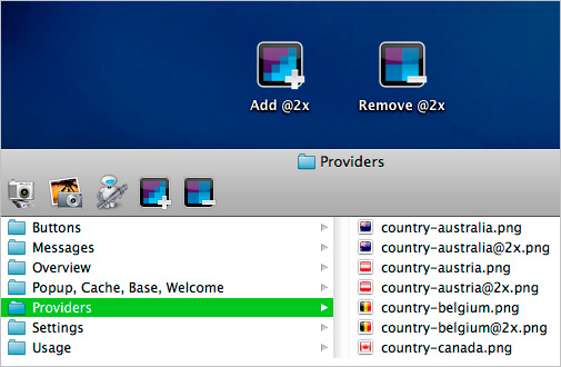
Building apps for the iPhone 4 Retina display involves creating two sets of images — one at 163 ppi and another at 326 ppi. The 326 ppi images include @2x at the end of their filename, to denote that they’re double the resolution.
When it comes to building UI elements that scale easily in Adobe Photoshop, bitmaps are your enemy because they pixelate or become blurry when scaled. The solution is to create solid color, pattern or gradient layers with vector masks (just make sure you have “snap to pixel” turned on, where possible). While a little awkward at times, switching to all vectors does have significant advantages.
Before anyone mentions it, I’m not suggesting any of the methods are new; I’m willing to bet that most icon designers have been working this way for years. I’ve been using vector shapes for ages too, but the Retina display has changed my practice from using vector shapes only when I could be bothered, to building entire designs exclusively with vector shapes.
I usually draw simple elements directly in Photoshop using the Rectangle or Rounded Rectangle Tool. Draw circles using the Rounded Rectangle Tool with a large corner radius, because the ellipse tool can’t snap to pixel. Layer groups can have vector masks too, which is handy for complex compositing (option-drag a mask from another layer to create a group mask).
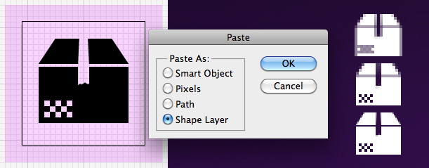
More complex objects get drawn in Adobe Illustrator to the exact pixel size, and then pasted into Photoshop as a shape layer. Be careful when pasting into Photoshop, as the result doesn’t always align as it should — it’s often half a pixel out on the x-axis, y-axis or both. The workaround is to zoom in, scroll around the document with the Hand Tool, and paste again. Repeat until everything aligns. Yes, it’s maddening, but the method works after a few attempts. Another option is to zoom in to 200%, select the path with the Direct Selection Tool, and nudge once, which will move everything exactly 0.5px.
Even more complex objects requiring multiple colors get drawn in Illustrator to the exact pixel size, and then pasted into Photoshop as a Smart Object. It is a last resort, though — gradients aren’t dithered, and editing later is more difficult.
If you need to use a bitmap for a texture, there are three options: use a pattern layer, a pattern layer style, or build a bitmap layer at the 2× size and turn it into a Smart Object. I prefer to use pattern layer styles in most cases, but be warned: patterns are scaled using bicubic interpolation when you scale the entire document, so they become “softer.” The solution is to create two versions of each pattern, then to manually change pattern layer styles to the correct pattern after scaling — a little tedious, but totally do-able approach.
Scaling Up
At this point, your document should be able to scale to exactly double the size, without a hitch.
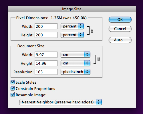
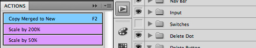
I have a Photoshop Action set up that takes a History Snapshot, then scales to 200%. That means, previewing at the Retina display’s resolution is only a click away. If you’re feeling confident you’ve built everything well, you should be able to scale up, edit, then scale down and continue editing without degradation. If you run into trouble, a Snapshot is there to take you back. Using one document for both resolutions, means not having to keep two documents in sync — a huge advantage.
A word of warning: layer styles can only contain integer values. If you edit a drop shadow offset to be 1 px with the document at 2× size, and then scale it down, the value will end up as 1 px because it can’t be 0.5 px (a non-integer value). If you do require specific changes to the 2× version of the Photoshop file, you’ll have to save that version as a separate file.
Exporting, Exporting, Exporting
Now for some bad news: exporting all the images to build an app can be extremely tedious, and I don’t have much advice here to assist you. As my documents act as full screen mockups, they’re not set up in a way that Photoshop’s Slice feature is any use. Layer comps don’t help either — I already have folders for each app state or screen, so switching things off and on is easy.
The best export method seems to be: enable the layers you’d like visible, make a marquee selection of the element, then use Copy Merged and paste the selection into a new document — not much fun when you have hundreds of images to export.
The problem is amplified when saving for the Retina display, where there are twice as many images and the 1× images must match the 2× images precisely.
The best solution I’ve come up with so far:
- Build your design at 1×
- Use Copy Merged to save all the 1× images
- Duplicate the entire folder containing the 1× images
- Use Automator to add @2x to all the filenames
- Open each @2x image and run the “Scale by 200%” Photoshop action. This gives you a file with the correct filename and size, but with upscaled content
- Scale your main Photoshop design document by 200%
- Use Copy Merged to paste the higher quality elements into each @2x document, turn off the lower quality layer, then save for the Web, overwriting the file.
In some cases, Photoshop’s “Export Layers To Files” can help. The script can be found under the File menu.
Mac Actions and Workflows
All the Actions and Workflows that I use myself can be downloaded from the blog post link below. The Automator Workflows can be placed in your Finder Toolbar for quick access from any Finder window, without taking up any space in your Dock.
Download: Retina Actions and Workflows.zip
Fortunately, Apple chose to exactly double the resolution for the iPhone 4, and for using ahead-of-time resolution independence. As complex as the process is now, things would have been far worse if they had chosen a fractional scale for the display. (rs) (ik) (vf)


