Compositing in Photoshop: Time-Saving Tips

Email Newsletter
Weekly tips on front-end & UX.
Trusted by 182,000+ folks.

 Celebrating 10 million developers


 Custom Web Forms for Angular, React, & Vue. Your backend.
Compositing is a skill and process that spans the entire spectrum of creative industries. At the high end, compositing boasts its own specialized profession in film and television post production and visual effects. Dedicated software such as NUKE and Shake have taken the craft to powerful levels of its own, leaving behind the relatively basic compositing toolset of Adobe Photoshop. [Updated June/14/2017]
However, for many graphics practitioners compositing is a vital everyday process — and as with all pixel-pushing endeavors, Photoshop remains the entry point and hub to learning and ultimately mastering the fundamentals of this important skill.
Further Reading on SmashingMag:
- Useful Photoshop Tools and Techniques For Your Workflow
- Photoshop Performance – 10 Simple Steps
- Photo Retouching Tips And Tricks In Photoshop
In this article, I’ll share some of my own time-saving tips for compositing in Photoshop. Tips such as these should never replace a solid understanding of your craft; however, being able to adapt a technique to make it work for you is part of being a creative professional. I encourage you to share your own creative compositing tips in the comments to this article, and think about how you have adapted existing techniques to work for you.
Tip 1: Matching Tones, Channel by Channel
One of the challenges we face when compositing is matching the colors and tones of various images to produce a realistic and convincing composite. This method aims to save you from spending time fiddling around with color balances and layers upon layers of adjustments, by showing you a systematic approach that should become second nature and enhance your compositing skill set.

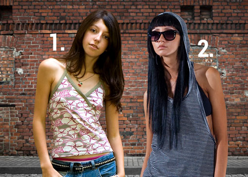
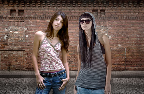
These are the two images we will composite together
In the following example, we will composite two people into one shot and address the differences in lighting, tone and color balance. I use this technique most often as a way of quickly grouping my subjects into a similar tonal range for further global color adjustments.
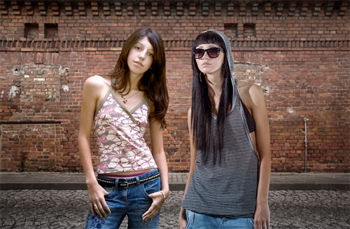
Masked images placed on background
In the above image, I have masked out the images and placed them together on a background. (Read on for some time-saving tips on masking.)
The key to this technique is selecting one of the images as your target, and then matching other images to the tone and lighting of this target. Out of the two images, I like the colors, tones and contrast in figure 2 the most, so I’ve chosen it as our target.
Throughout this article, you will see that I am using Smart Objects. This is an excellent habit to get into when starting any Photoshop workflow. Smart Objects allow us to perform non-destructive transformations on a layer, as well as non-destructive filtering.
Visual Evaluation
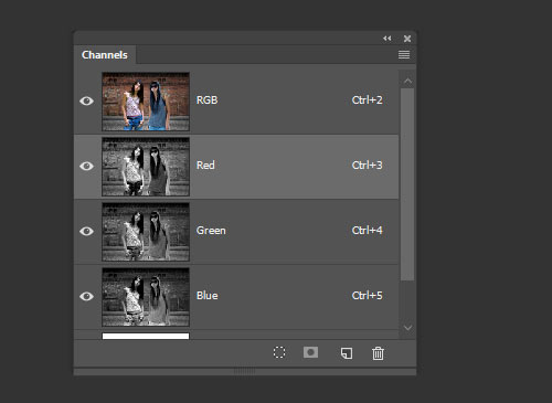
We are now entering the exciting world of greyscale tonal evaluation, deep inside the channels of our RGB image — the bare bones of bitmap imaging. We are going to go through each channel of the image and simply try to match the greyscale luminence levels to the target layer:
1. In the Channels palette, solo the red channel by either clicking the channel or using the keyboard shortcut Cmd/Ctrl + 3. You should see the entire image in greyscale, representing the luminance values of red.
2. Select the layer for figure 2 and add a Curves adjustment layer just above it. Make this adjustment layer a clipping mask by Alt/Opt clicking between the two layers in the layer palette. You could also select the adjustment layer and use the keyboard shortcut Cmd/Ctrl + Alt/Opt + G. Now select the red channel inside Curves.
3. Now make a quick, overall visual evaluation of the two images: make a point right in the middle of your curve. If the mid-tones in your target layer (figure 1) look darker than your current layer (figure 2), move the midpoint down to darken the layer to better match your target. If the tones in the target appear lighter than your current layer, move the midpoint up to lighten the layer and better match your target. Use small increments, and continuously use your eyes to evaluate the changes.
If things don’t look quite right still, locate the lightest shade of grey (but not white, as this could be a specular highlight — not something you want to factor in much, with compositing) on the target image, and do the same with figure 2. With your eyes darting between these two greyscale shades, move the white slider on the Curves dialog box until the shades visually match. Next, do exactly the same process with the darkest part of the image, moving the black slider in the Curves dialog.
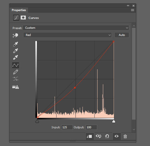
Curves adjustments for the red channel
4. Swap over to the blue channel, by either clicking the channel in the Channels palette or using the keyboard shortcut Cmd/Ctrl + 4. Select the blue channel within the Curves dialog box. Perform the same adjustment, starting by creating a center point on the curve, and dragging until the mid-tones in your image match those in the target.
5. Repeat these adjustments for the green channel. Click the green channel in the Channels palette or use the keyboard shortcut Cmd/Ctrl + 5.
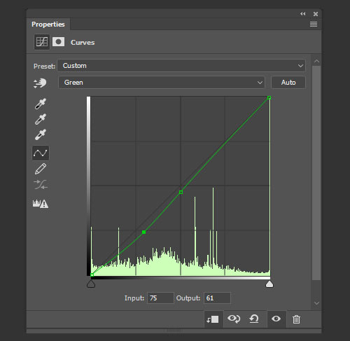
Curves adjustments for the green channel
6. You can now revert back to your RGB composite image by selecting the RGB channel in the Channels palette, or by using the keyboard shortcut Cmd/Ctrl + 2, and review the changes you have made. It is sometimes necessary to reduce the opacity of the adjustment layer if the change has been too drastic. Toggle the visibility of the adjustment layer to see a “before” and “after” for your adjustment. As we are using adjustment layers, our changes are non-destructive, so it is always possible to go back into the channels and curves to make further adjustments at any time.
“before” and “after” adjustments to figure 2
The registered changes make an excellent starting point to a compositing task, providing the perfect platform for further color corrections and adjustments. It is very rare that the image will be perfect at this stage, but the images will be more homogeneous and in a better relative condition to each other than before.
As you get more comfortable with this technique, start adding additional points to your curves by sampling tones from your image using the Curves sampler tool.
Tip 2: Gradient Map with Soft Light
Although this is not essentially a compositing technique, it is an especially useful adjustment to perform on a composited image, where the colors and tones often require this type of homogeneous tweaking and subtle realignment. This technique works well as a final adjustment to an image. It has the effect of bringing all colors and tones slightly closer together, whilst still retaining their independence and relevance to the whole image.
1. Add a new Gradient Map Adjustment layer on top of all other layers. You will want to make sure that the layer thumbnail is selected, and not the layer mask thumbnail which is usually selected as default.
2. Next, turn off the visibility of the gradient map layer by deselecting either the eyeball next to the layer, or the eyeball at the bottom of the Gradient Map Adjustment panel.
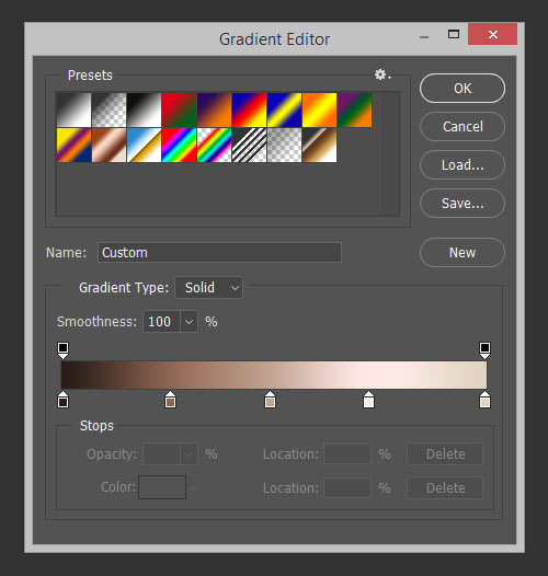
Open a Gradient Map Adjustment layer, turning off visibility
3. Click on the gradient bar in the gradient map dialog box to open up the gradient editor. As default the gradient map is set to a black to white gradient — not particularly useful for this technique, but actually quite handy at giving us an initial idea of the direction the dark to light tones we will select, should be going in.
We are going to set ten points on the gradient bar — with colors picked directly from our image — going from darkest to lightest. First, click on the black point of the gradient and hover over the image; you should see the Eyedropper tool. Locate the very darkest point of your image and click; if it is black or very close to black, you won’t see much change in your gradient map. Now click just below the gradient bar, a small space away from the gradient point you just changed, to add a new gradient point.
Don’t worry about the distance between the points at this stage; we can change this at the end. Hover over your image again, select the next darkest area, and click. Continue with this process, adding progressively lighter points to the gradient bar all the way down to the white point, changing that to the lightest color in your image. You should aim to have ten points in total, although a few more or less is fine. Try to space out the points evenly before pressing OK.
4. Turn on the visibility of the gradient map layer once more. You will probably see a frightening rendering of your carefully composited image, and you may be wondering now what you have just gone and done. Don’t worry; this is to be expected. Change the gradient map layer’s blending mode to Soft Light and reduce the opacity until you are happy with the image once more. Check the change by toggling the adjustment layer visibility on and off.
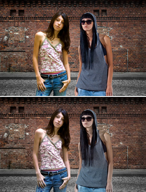
Tip 3: Black & White Overlay
This is a great, quick trick for compositing that is perfect for those times when simply closing the job is a priority. The effect applies a stylized adjustment which tempers the colors in the image and increases contrast, especially useful in stylized shots such as sports imagery. The effect of the adjustment immediately makes the images more congruent, and this is what compositing is about.
1. Add a new Black & White adjustment layer above all layers you want to affect, and set the adjustment layer’s blending mode to Overlay.
Add the Black & White adjustment layer
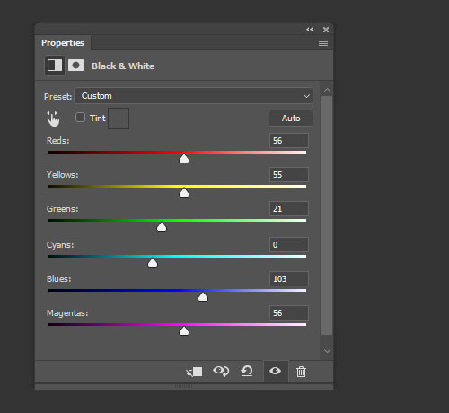
2. The great thing about the Black & White adjustment layer is the amount of control it gives you over the desaturation effect you have made. Adjust the color balances in the adjustment panel, and finally reduce the opacity of the layer to an effect you are happy with.
Final image with Black & White adjustment layer (set to overlay)
Tip 4: Lighting Direction
Often, one of the most difficult aspects of compositing is dealing with the direction light is coming from. Different images may be lit with the same intensity, with the same coloring and within the same tonal range, yet if the direction of the light is different, it can be fatal to the realism of the image.

The images above will be composited into one shot with an efficient, non-destructive way of addressing light directionality.

Masked images placed on background
Once masked and placed on the background, we can see that the light on the two buildings is coming from opposite directions. We could flip one of the buildings horizontally, but this is often not an option in cases where we need to preserve the original angle and direction of an image.
Painting Shadows and Highlights
We will choose the light direction we wish to maintain, out of the two, and only work on the layer which we need to change. There are a multitude of methods for painting in shadows, so my main piece of advice is: do it non-destructively. Try this method:
1. Add a new Curves adjustment layer above the layer you wish to affect. Make this adjustment layer a clipping mask by Alt/Opt clicking the line beneath the layer in the layer palette. You could also select the adjustment layer, and use the keyboard shortcut Cmd/Ctrl + Alt/Opt + G.
2. Make a point on the middle of the curve and move downwards to darken the layer. Fill the adjustment layer’s mask with black, and paint with a soft white brush into the layer mask to add shadow.

Shadow added to building
3. Reduce the opacity until you are happy with the effect. You can always paint back into the layer, or use lower-opacity brushes, to get the effect just right.
4. To neutralize the shadow which exists on the wrong side of this same building, repeat the process by adding another Curves adjustment layer and setting it as a clipping mask. Add a mid point to your curve and move the curve upward to lighten the image. Fill the adjustment layer mask with black, and paint with a white brush over the shadow you wish to remove. Reduce the opacity quite a lot, until the shadow is no longer prevalent.
Of course the composited image is still nowhere near perfect, but that change in lighting has made a difference which now lets us imagine these images could exist in the same world; that’s a great starting point for a compositing task.

Shadow is neutralized
Tip 5: Super-quick Previewing Using Blending Modes
Blending modes and tools offer a really powerful set of compositing features which can be used to speed up a lot of tasks. The following is a very simple trick which many people know about, but often forget.
Here is the scenario: you need to composite an image of a glass of milk on an image of a table.


Sourced images for compositing
You have sourced the images you think would work together, and you need to check if the glass will sit realistically on the table, if the angles will line up and if the perspective will be convincing. However, you are so squeezed for time that even a rough trace of the glass would take too long. Luckily for you, the glass of milk has a black background.
Removing Black or White
Photoshop offers ready-made blending modes for removing black and white from one layer placed on top of another. The Multiply blending mode will render white pixels transparent, while the Screen mode does the same with black pixels. Both blending modes will also affect how other tones in your layer interact with the layer below, so unless this effect is something you are going for, this technique is usually best used to preview images which are on solid black or white backgrounds. This is massively time saving, and is a great way of ensuring you are happy with the image before you commit to masking it out.
This can also help you when sourcing images for a time-sensitive task; knowing that solid black or white backgrounds can be so easily removed for previewing will help you identify the images most appropriate for your use.

Preview of how the elements fit, using only blending modes
Tip 6: Masking
Masking out an image is key to almost all compositing workflows, and is often the most time-consuming, tedious part. You have two main areas of masking to choose from when an image needs to be isolated from its surroundings. Manual masking is the preferred method of most top graphics professionals: usually this means using the pen tool, brushing in Quick Mask mode, or using the images channels to create an Alpha Channel mask. Alternatively, automatic masking can be effected from an ever-increasing range of tools and third-party plug-ins within Photoshop. Which method you choose will often be determined by how much time you have, the complexity of the task and the intended use of the image.
Rather than going through every masking technique (there are plenty of resources out there, if you want to learn about how each tool works), here is a quick run down of some time savers.
Quick Mask for Web Imagery
It might sound obvious as a time-saving trick, but when you need to mask an image in super-quick time, the Quick Mask really can be a life saver. I use it for Web imagery, as the edge details will then not be so apparent at the fixed pixel view the user will have. It is also important to choose an image with decent contrast between your masking subject and its background, or the Quick Selection tool will not do a great job with really tough selections.

Quick Mask tool
Know Your Background Color
You can often save a lot of time masking, if you know and bear in mind what background your masked image will be composited on. Keep you goal in mind; when you need to get the job done, release your mind from the constraints of perfect masking and do the bare minimum!
Refine Edge
The Refine Edge tool set is a very powerful, non-destructive set of tools to help you refine any selection that is currently active. It can save you time, in fixing problem edges you may have encountered with other selection tools. The values in the Refine Edge dialog box remain constant from one adjustment to the next, meaning this tool can also be great for ensuring the edges of composited images have the same level of softness, smoothing and contrast.
For Photoshop CS5 only: Photoshop CS5 has a time- and frustration-saving tool lodged inside its Refine Edge feature which can yield outstanding results. When it comes to masking fine details, every designer will tell you that hair is the most challenging. The Edge Detection tool allows you to identify the unwanted colors in your image while intelligently masking edge details; it can effectively identify the finest hair details and mask them out in a non-destructive dialog box, with minimal work on your part, and do a very convincing job.

Refine Edge dialog box
Pen Tool
One thing I always do with the Pen tool, is keep a finger hovered over the Alt key; this is really useful as at any point, you can hold it down to move just one handle, and to freeze the corresponding handle in place. You can also Alt-click any point on your path to toggle between a corner point and a smooth point.
Conclusion
There is no shortcut to becoming proficient on your chosen tool or in your chosen craft, be it Photoshop or anything else; but once you have mastered a tool and understand its power, it is then up to you to do what you do best: be creative with it. This means looking at those everyday tasks you do, the time limitations you are faced with and your ability to improvise. Look under the hood once in a while, and be creative and inventive with everything you do!
Further reading
- Compositing Using the New Photoshop CS5 Edge Detection Features
- Tutorial: Seamless Compositing (compositing tricks from Jericó Santander)
- Creative Compositing (Chris Orwig offers a comprehensive course at Lynda.com)
(wcp) (vf)


