Designing For The Future Web

Email Newsletter
Weekly tips on front-end & UX.
Trusted by 182,000+ folks.

 Celebrating 10 million developers
 Custom Web Forms for Angular, React, & Vue. Your backend.

Designing for the future Web. That’s a big subject. Where do we start when we’re talking about something that isn’t here yet?
In this article, we’ll look at what the future Web might look like and how we can adapt our current skills to this new environment, as well as how to create fluid websites that are built around a consistent core and that adapt to the limitations and features of the device on which they are viewed. We’ll also look at how our conceptual approach to designing websites should evolve: designing from the simplest design upwards, and not from the richest website down.
Further Reading on SmashingMag:
- Holistic Web Browsing: Trends Of The Future
- Does The Future Of The Internet Have Room For Web Designers?
- Breakpoints And The Future Of Websites
- React To The Future With Isomorphic Apps
But before we get to that, let’s start with a question. What do we mean by the “future Web”?
What Is The Future Web?
Back in the old days: analogous Google queries would have taken 30 days. Image: dullhunk
The one word that I hear more than any other at the moment is mobile. Mobile websites, mobile devices, mobile apps: the list seems to go on and on. In fact, a large swell of opinion says that the future Web is mobile.
But despite all this, focusing just on mobile isn’t the answer.
The way we access the Internet is changing, of that we can be certain. And in the short term, this does mean more mobile devices. But in the long term, we have to look a little wider. Thomas Husson, senior analyst for Forrester, summed it up nicely in his 2011 Mobile Trends report when he said, “The term mobile will mean a lot more than mobile phones.” In the long term, the word we should use instead of mobile is portable.
Why Portable? How Has the Internet Changed to Make It So?
First, the physical infrastructure of the Internet is spreading rapidly, so that our ability to access the Internet wherever we are grows daily. In the last 10 years, the number of Internet users has grown by 444.8% and now includes 28.7% of the population. That’s nearly 2 billion people, the majority of whom are in Asia. This growth is fuelled by investment in the underlying hardware that gives us access to the Internet: millions and millions of computers, millions of miles of cables, hundreds of thousands of wireless hotspots and, on top of all this, growing 3G coverage around the globe (around 21% by the end of 2010 according to Morgan Stanley).
Secondly, the way we use the Internet is changing. We are increasingly orienting our online experience around services rather than search engines. Services such as Facebook, Twitter and LinkedIn are becoming the hub for our online life, and we are blending them to create our own unique Web of content: Facebook for our social life, LinkedIn for our professional life, Spotify for music, Netflix for television and film. We’re seeing a very different form of information consumption here, one in which we expect information to be pushed to us through our social circle, the people whom we trust. We’re moving away from the old paradigm of information retrieval, in which we are expected to seek information using search engines and links.
Some of these services are tied to a single device, but increasingly they are available across multiple platforms, including the desktop, mobile apps, Internet-enabled TVs and others. Only last month, Samsung created the first tweeting refrigerator. Okay, that might not be the greatest use of an Internet connection, but it is an example of how these services are starting to spread out, away from the desktop and into our everyday lives. Evrythng, a start-up currently in beta, is working on a platform that would give any physical object an online presence, effectively making the Internet an ubiquitous entity containing data that can be consumed anywhere and by anything.
Given these changes, it’s important that we not be overly rigid in our approach to creating new Web content; we mustn’t allow ourselves to think in terms of devices. Right now, we are producing mobile apps and standard websites to deliver our services, but in a few years’ time, we may be looking at a completely different landscape, one where knowing exactly where and how our content is being viewed is impossible. Our content must be portable in the sense that it can be displayed anywhere. Media marketers have responded to the increasing use of mobile media. (Image: birgerking)
We may also find ourselves having to decide whether to concentrate on particular devices and channels at the expense of audience numbers or to take a less tailored approach and serve the widest spectrum possible.
Regardless of the route we take, the ability to deliver a consistent experience across all channels is paramount, and our ability as designers and developers to understand the options and deliver this consistency to our clients will be crucial.
So, this is the future Web, a mish-mash of devices and channels. Sounds good, doesn’t it? Let’s go back to the key word, portability.
How Do We Design For The Portable Web?
Ask yourself, how would your latest project cope in the following scenarios:
- The user is watching House on their new Internet TV. Hugh Laurie’s not on screen, so the user decides to check their email. A friend has sent a link to your website, which the user opens in a sidebar and views simultaneously with the program.
- The user is on a train back from work, probably delayed somewhere, accessing your website via 3G on an iPad
- The user is on a client’s website. They need to access your website to read an article, but they have only a company-supplied Sony Ericsson with Opera Mini installed.
Each of these scenarios presents us with a different problem to solve: (1) an odd aspect-ratio and browser combination, (2) a good display area but slow connection and (3) a very small display area. And they are all very possible scenarios. The first Internet TVs by big brands are now available from the big retailers. Opera Mini has over 85.5 million users and is the dominant browser in many areas of the world; in fact, in Asia, Opera and Nokia (with their combined 66.33% market share) are way ahead of the third-place browser (which is BlackBerry, with a 9.81% share). And Deloitte has predicted that 2011 will be the year of the tablet and that 50% of the “computing devices” sold will not be PCs.
Chances are that, unless you’ve really thought about it (and if you have, then you probably don’t need to read this article), your website won’t work in all of those cases.
When designing for the portable Web, we need to be aware of three things: design, content and integration. Approached in the right way, we can create websites that are accessible across the widest user base and that provide a consistent experience regardless of access method.
Consistent? How?
When faced with a multitude of devices to design for, all with varying specifications, the last goal that might come to mind is consistency, and with good reason. And yet we should be striving to achieve consistency. Not in design but in experience.
Conceptually, we should be thinking about our design in two layers: the core content or service, and then the display layer. The core of our website should not change from device to device, and it should deliver a consistent experience. As we shall see shortly, this means that we must ensure that elements such as the content and the navigation patterns work the same way always. The web’s future consists of vast possibilities, considering them all is virtually impossible. That is why we need consistency! Image: Juhan Sonin
Let’s say our user is at work and is browsing our website on an iPad. They work through the carefully designed navigation hierarchy to get to the piece of content that they want to read, but they are interrupted by a phone call and have to stop browsing. Later, on the train home, they access the website again, this time via their phone. The visual elements of the design will be different—by necessity—but crucially, the routes they took to find the content should be exactly the same, as should the content they read when they got there.
This consistency of experience is what will allow us to create great websites for the portable Web and a complete user experience.
Where Do I Start? And How Will I Know When I Get There?
If a single consistent experience is our goal, this begs the question, should we create a mobile website that scales up or a desktop website that degrades?
The answer is neither. We should try to create a single design that can be used across all devices without alteration. But in practice, at least for the moment, we should start with the simplest website and work up.
Why? Let’s go back to the introduction. On the portable Web, we have no control over how our content will be used or viewed, and as such we must throw out the idea that we are designing for a particular device or device size. We must approach the design of our website in a different way, one in which we create the core content or service first. After all, this will define our website in the end, not the visual elements. This may seem difficult initially, but as we shall see, many of the best practices for desktop website development hold true for the portable Web, especially with regard to content structure.
To recap, here are the key rules to bear in mind when working through a design for the portable Web:
- The website should be available to as wide an audience as possible;
- The website should contain the same content wherever it is viewed, where feasible;
- The website’s structure should be the same wherever it is viewed;
- The content should be displayed in a manner that is appropriate to its environment.
A website that meets all of these criteria would fit snugly in the future portable Web. But how do we go about making our websites do this?
Designing For The Portable Web
Design Using Web Standards: That Means HTML5
 The good news is that the two most common browser engines on mobile, Webkit and Opera, both support HTML5 very well; Webkit has supported HTML5 at least partially since November 2007.
Using standard and descriptive mark-up throughout our websites will have the benefit of delivering consistent output across most devices. And the extended capabilities of HTML5 to deliver media, animation and local storage make it a great choice for mobile applications.
These three abilities allow HTML5 websites to reproduce behaviours usually associated with native mobile applications, closing the experience gap between the two. Video can now be played natively through HTML5 using the video tag, while animations can be played using the HTML5 canvas. Finally, local storage allows a website to store database-like information on the device, allowing for fully functional offline use of the website.
YouTube, Netflix and Gmail all have HTML5 versions of their websites that are designed for the mobile experience and that take advantage of the new capabilities of HTML5. They’re a great starting point for any developer who wants to see what can be achieved.
HTML5 is now ready to be used for development, and there’s no reason why you can’t start right away. Many excellent resources and tutorials are available to help you get started:
- Dive into HTML5 An overview of the HTML5 standard and a great starting point.
- HTML5 Demos and Examples A series of demonstrations showing the capabilities of HTML5, with source code.
- HTML5 Gallery A showcase of websites created in HTML5.
To get started using HTML5 in your projects, you can take advantage of any one of the number of development environments that support it. The most complete implementation is through Adobe’s Dreamweaver CS5; an HTML5 support pack can be downloaded that extends the built-in editor. Aptana also supports HTML5 in its beta of Aptana Studio 3. Links are provided at the end of this article.
Start Simple, Work Up
Thinking portable means thinking clean and simple. The wide variation in screen sizes—from a 40-inch LCD running at 1920 × 1080 pixels to a portrait-orientation mobile screen at 320 × 240 pixels—means that we must create designs that are scalable and adaptive. We must also be aware that someone may be interacting via a remote control or a fat stubby finger on a touchscreen. The simpler the design, the more adaptable it will be.
Bottom up conceptualizing males sense. Concentrate on the basic elements and let the context evolve around them. Image: Andrei Bocan
Create your basic website structure first and add only your core styles, the ones that are applicable to all devices and layouts. Starting simple gives us a great base on which to build. Essentially, we are starting from the most basic experience, available on even the smallest mobile device, and working our way up to the more capable desktop browsers.
Using @media queries in the CSS will enable your website to recognize the additional capabilities of desktop browsers and scale up for these environments, presenting a fuller and more interactive experience where possible.
A word of caution and a reason why we don’t work the other way around by degrading a desktop website to a mobile one: @media queries are not supported by every mobile device. Rachel Andrews provides a good overview of @media queries here on Smashing Magazine, albeit working from desktop to mobile, rather than the other way round.
Forget About Proprietary
Whatever you do, stay away from the proprietary technologies, because that’s the one way to guarantee an inconsistent experience. Flash and Silverlight as development platforms are living on borrowed time. Microsoft has already indicated that it will discontinue Silverlight development to concentrate on HTML5, while Flash is being used mainly as a game development platform and video-delivery mechanism. If we are going to create truly cross-platform websites that display consistently across all devices, then Flash and Silverlight are not wise choices because we cannot be certain that they will be installed on the user’s device. Not to say that Flash doesn’t have its place; as a platform for Web-based games, it is currently unrivalled. It’s about choosing the best technologies for the job at hand.
Be Wary of JavaScript… for the Time Being
The bad news is that we may have to sacrifice some of the things we take for granted now. We must learn to design for unknown screen sizes and ratios and allow content to flow as required. Think less about design structure and page layout and more about content structure.
We may have to forgo using JavaScript and AJAX (both staples of desktop development) to create more involving user experiences, because some lower-end devices will not have the hardware muscle to deal with complex libraries. Trimming page weight will also be a priority because we cannot be certain that end users will have broadband-speed access to the Internet, so large libraries will be unacceptable overhead.
This is particularly important in light of the recent “hash bang” trend, started with Gawker Media’s controversial redesign of its websites. The websites (including Gizmodo, Lifehacker and Gawker) present a more application-like experience to users, but do so by relying on JavaScript for content delivery. In effect, the websites consist of a single page that is loaded with dynamic content on request, instead of the multiple pages that they consisted of previously. Any users whose browsers cannot process the JavaScript, for whatever reason, will be unable to browse the website; they are greeted with only a blank page.
However, a number of libraries are being developed to be lightweight and usable on portable devices. jQuery has an alpha of its mobile library available for testing. The project has the backing of industry players such as BlackBerry, Mozilla and Adobe, so it is worth keeping an eye on.
JavaScript support will mature as devices worldwide move onto more modern platforms and as older devices are taken out of service. But for the time being, a conservative approach to its use will mean a wider potential audience for your work.
Test, Test, Then Test Again
On the portable Web, there’s a good chance we won’t be able to test against every possible platform on which our content will be viewed. But that doesn’t take away the need to test. And test we must.
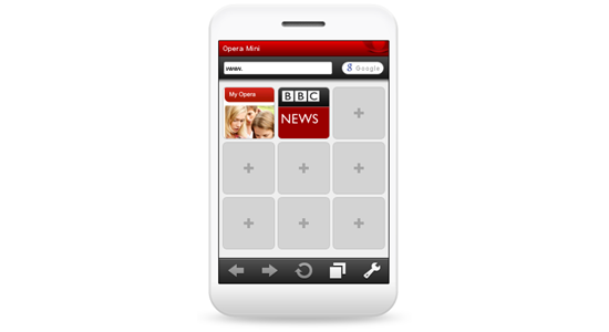
Opera Mini’s emulator lets you test your website in a virtual browser.
Buying a device from each platform would be prohibitive for the majority of designers. But alternatives are available. For most of the main platforms, device emulators are available that simulate the browsing experience. See the resources section at the end of this article for links.
At the other end of the scale, a paid service is available from DeviceAnywhere, which enables you to test your website on over 2000 handsets.
Unfortunately, there are no Internet TV emulators so far, but Google has released a guide to designing for Google TV.
Finally, of course, we mustn’t forget to test on our desktop browsers, too. The aim of designing for the portable Web is to create a single experience across as wide a set of devices as possible. Just because users are able to browse the Web in many ways doesn’t mean they will stop using their desktop, laptop or netbook. Use this to your advantage when testing simply by resizing your browser to ensure that your design scales and flows appropriately. The emulators will provide you with an exact rendering of your website on other devices.
The Ugly Duckling?
So, does the portable Web defy beauty and kick sand in the face of outstanding design? Of course not. Great design is not only about visual imagery, but about presenting information clearly, which involves hierarchy and importance through innovative and well-thought out typography, layouts and navigation. Which brings us to…
Content For The Portable Web
Content is once again king. The rise of Quora should be enough to convince anyone of that; it is a service based solely on content. On the portable Web, this is doubly true. By paring down the design elements, you leave even more focus on the content.
Understand What’s Important
Identifying what is most critical to users should be your first task when developing a portable website. There may not be room for complex navigation, especially on smaller screens, so keep it simple. Compare the mobile and desktop versions of YouTube’s start page:
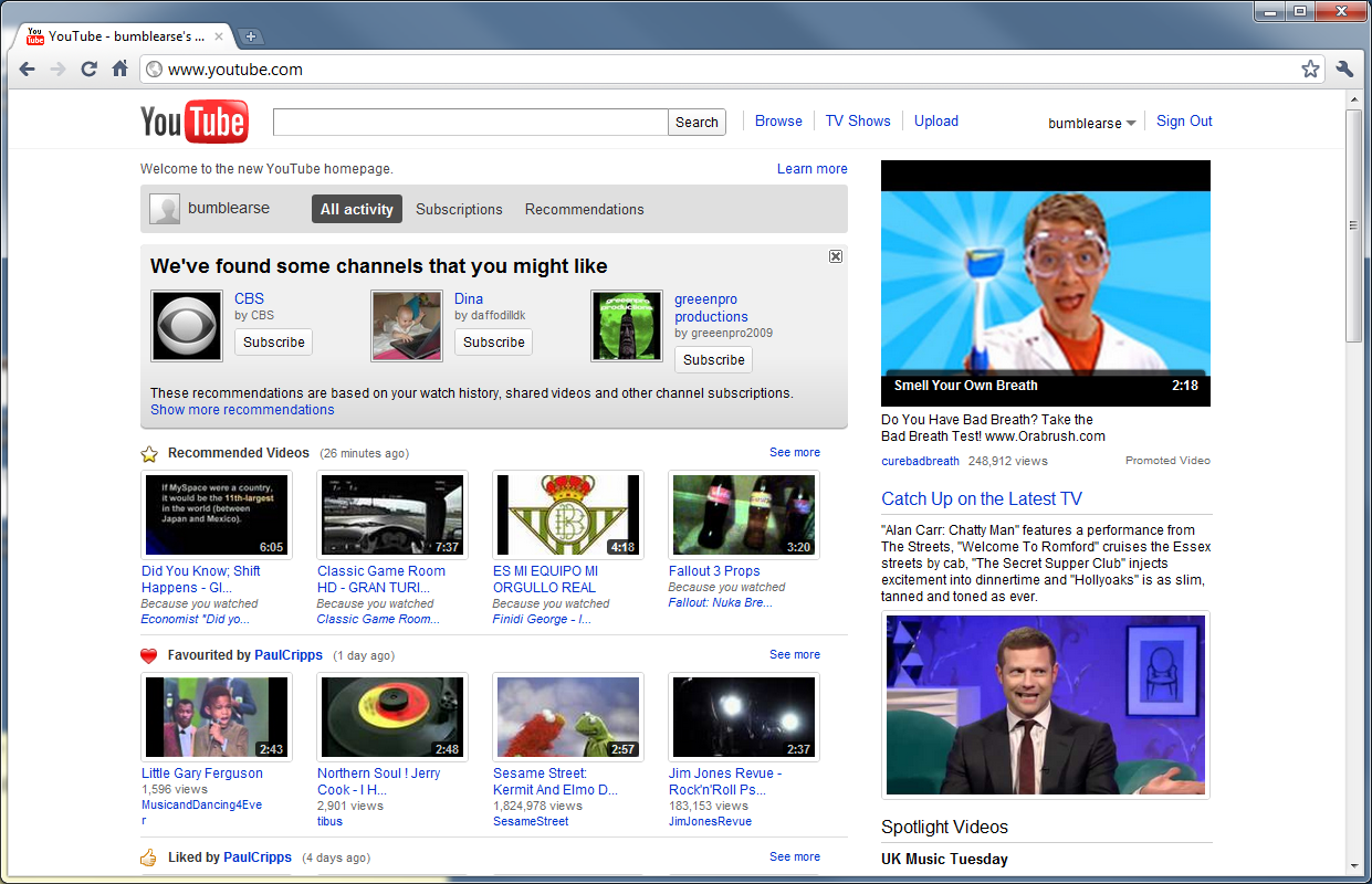
YouTube’s standard home page.
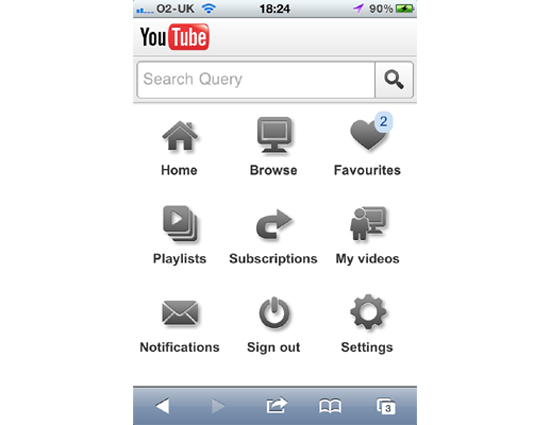
YouTube’s HTML5-based home page works brilliantly on small screens.
Create a Solid Information Hierarchy
Structuring our content is important, for both readability and SEO. Understanding the content that we are presenting is essential to creating clear information hierarchies that guide users through it.
Map the user’s possible journeys through your content. There should be a clear route to every piece of content, starting with the top-level information categories and getting more granular with each click.
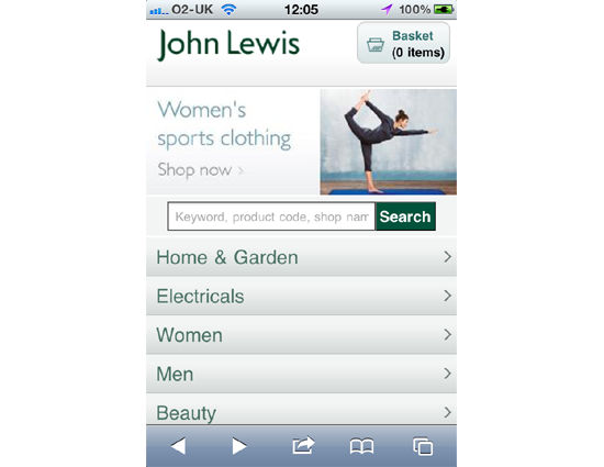
John Lewis’ mobile website has a clear information hierarchy to aid navigation.
A good example of this is the mobile website of John Lewis, a UK-based department store. From the home page, you can easily drill down to each department, and from there to individual products. It’s simple, and it also means that the amount of information on any given page is not overwhelming and that you know exactly where you are in the hierarchy at all times.
Keep Content Available
Even if users aren’t on a desktop, don’t treat them as second-class citizens. Provide as much content as is feasible. And for what content there is, present it appropriately. Remove the following:
- Superfluous images. If an image isn’t essential to the content, get rid of it.
- Unsupported file formats. Don’t include Flash or even the Flash placeholder if the file likely can’t be played.
- Unnecessary text. Good desktop copy doesn’t necessarily make for good portable copy. Is that second customer testimonial absolutely necessary? If not, remove it.
While we want to remove unnecessary content, we don’t want to remove too much. In the example below, we have a simple accessible website, but one that has no depth. The first level of information is presented well, but the headings for the company’s services at the bottom of the page should link to the next level of information. The way it is, if I want to find out more, I’m forced to visit the non-optimized website. This is a poor user experience, because it makes finding what I need more difficult.
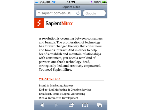
Sapient Nitro’s mobile website displays really well but cuts a lot of information from the full website.
Integration And The Portable Web
If services are to become the new hub of the Internet, keeping our websites linked to these services becomes paramount.
Keep It Modular
Services will come and go (although the main ones will certainly remain for a long time yet… yes, I’m looking at you, Facebook), so keep your design modular. Being able to integrate with new services as they come online and to prune away those that have fallen by the wayside will ensure that your content is available to the widest possible audience.
The goal is to make it easy to push your content across multiple services and thus integrate your content into the fabric of the Web. Primarily, this will be through search engine optimization and social sharing.
Make Your Content Search-Engine Friendly
While the way people access content is becoming more social and less search-based, search engines are still a massive source of traffic. Keeping your content formatted for easy retrieval is a must. Quora has done this extremely well, leading to high rankings across the major search engines and generating traffic for its next-generation Q&A service. SEO may be old hat for some, but as quality of content becomes increasingly important, it will gain new life.

Quora plays nice with search engines, with great results.
Make Sharing Easy
SEO is important, but so are direct connections to other services through OAuth, OpenGraph and OpenID. If this isn’t an option for you, then at the very least give users some way to share your content. Services like AddThis and ShareThis make it simple to add sharing capabilities; take advantage of them. A single tweet can generate a lot of activity. Of course, modern development and content platforms such as WordPress have this functionality built in.
Bringing these three elements together will create websites that are discoverable, consistent and usable. Just one question now is raising its ugly head…
What About Apps? Aren’t They The Way Forward?
 Apps are big business. Gartner forecasts that mobile app store revenue will top $15 billion in 2011. It’s no surprise that Google, Microsoft, Nokia and others are trying to get in on the act. But just because app stores are commercially successful, does it mean they should be our first point of call when designing for the future Web?
Let’s look at why one might want to create an app:
- Easy to purchase, install, use and throw away. Apps are so usable that even your granny could use them. Installing them on a smartphone is a smooth process that requires minimal involvement from the user. And when you’ve had enough, you simply delete it and no trace of the app remains. This is a great user experience, period. That’s why Apple is now pushing the same concept for full-blown Mac apps through the Mac App Store. Apps also provide, in most cases, a good user experience, with their native controls and design patterns.
- Brand association and lock-in. Apps are designed to do one thing and do it well. The most successful apps are exercises in brand association: “I want to search the Web, so I’ll use the Google app,” or “I want to check up on my friends, so I’ll use the Facebook app.” You experience the brand through the app. I could easily use the Safari browser on the iPhone to access both Facebook and Google, but the apps make it easy for me. I’m locked into the experience, which is great for the companies because their brands get planted square in the middle of my home screen; in this case, a big F and a big G.
- Money. The most attractive thing about apps to many companies is the profit. Apple’s App Store has shown that monetizing content is possible. Even for independent developers, making a lot of money in a relatively short period of time is possible.
What’s remarkable about all of these points is that they have nothing to do with information consumption. They are all about brand and user experience. However, there are also reasons why you should think twice:
- Apps are information silos: Apps do what they do well. But they don’t do a good job of bringing in the wider Web. Want to follow a link? You might be able to view the page in app, but you’re just as likely to get thrown out into the browser. That’s not a good user experience. You also lose control of the user’s actions and their focus on your content.
- Apps are platform-specific: Writing an app automatically ties you to the platform you are writing it for. This immediately limits your potential audience. Smartphone penetration is growing but is still a small segment of the overall Internet-enabled phone market. To take the US market as an example, even though 31% of the population have smartphones, only 6% of the population have iPhones. That’s 19 million out 307 million. If you released an iOS-only app in the US, you would immediately lose 76.17 million potential users.
- Apps work best for big brands and services: Regardless of how good the app is, you have to find a way to get it discovered among the tidal wave of apps that are released into app stores every day. Big brands can push their apps through their existing Web presence, but that’s a lot more difficult for smaller brands. And unless you can generate a lot of relevant content regularly, as the major services do, your app will be consigned to the trash very quickly. Research by Pinch Media (now Flurry) shows that free apps are used primarily in the first 10 days following installation, and then rapidly trail off to around 2% of the installation base after 70 days. Paid application usage drops off even more quickly.
- Mobile users prefer browsers over apps: A study by Keynote Systems in October 2010 shows that users prefer mobile websites for nearly all types of Web content. The only categories in which apps came out on top were social networking, music and games, which makes sense because these apps usually take full advantage of a native platform’s capabilities.
So, if we want to create something with more permanence, that can evolve at a speed that suits us and our clients, then we need to look away from mobile apps and towards the mobile Web. We must execute good design, thoughtful content and solid integration to tie our portable websites into the social infrastructure of the Web.
Conclusion
The fully portable Web may not be here right now, but it will be before we know it. As it was with the browser wars, developers and designers must re-educate themselves to become the driving force behind these changes and be brave enough to let go of current design thinking and work to set new standards. Understanding how to create online presences that take full advantage of all platforms and preparing for the future shape of the Web will position us not just as technicians, but as people who can provide real value to our clients.
Resources
The Ugly Duckling?
So, does the portable Web defy beauty and kick sand in the face of outstanding design? Of course not. Great design is not only about visual imagery, but about presenting information clearly, which involves hierarchy and importance through innovative and well-thought out typography, layouts and navigation. Which brings us to…
Content For The Portable Web
Content is once again king. The rise of Quora should be enough to convince anyone of that; it is a service based solely on content. On the portable Web, this is doubly true. By paring down the design elements, you leave even more focus on the content.
Understand What’s Important
Identifying what is most critical to users should be your first task when developing a portable website. There may not be room for complex navigation, especially on smaller screens, so keep it simple. Compare the mobile and desktop versions of YouTube’s start page:
YouTube’s standard home page.
YouTube’s HTML5-based home page works brilliantly on small screens.
Create a Solid Information Hierarchy
Structuring our content is important, for both readability and SEO. Understanding the content that we are presenting is essential to creating clear information hierarchies that guide users through it.
Map the user’s possible journeys through your content. There should be a clear route to every piece of content, starting with the top-level information categories and getting more granular with each click.
John Lewis’ mobile website has a clear information hierarchy to aid navigation.
A good example of this is the mobile website of John Lewis, a UK-based department store. From the home page, you can easily drill down to each department, and from there to individual products. It’s simple, and it also means that the amount of information on any given page is not overwhelming and that you know exactly where you are in the hierarchy at all times.
Keep Content Available
Even if users aren’t on a desktop, don’t treat them as second-class citizens. Provide as much content as is feasible. And for what content there is, present it appropriately. Remove the following:
- Superfluous images. If an image isn’t essential to the content, get rid of it.
- Unsupported file formats. Don’t include Flash or even the Flash placeholder if the file likely can’t be played.
- Unnecessary text. Good desktop copy doesn’t necessarily make for good portable copy. Is that second customer testimonial absolutely necessary? If not, remove it.
While we want to remove unnecessary content, we don’t want to remove too much. In the example below, we have a simple accessible website, but one that has no depth. The first level of information is presented well, but the headings for the company’s services at the bottom of the page should link to the next level of information. The way it is, if I want to find out more, I’m forced to visit the non-optimized website. This is a poor user experience, because it makes finding what I need more difficult.
Sapient Nitro’s mobile website displays really well but cuts a lot of information from the full website.
Integration And The Portable Web
If services are to become the new hub of the Internet, keeping our websites linked to these services becomes paramount.
Keep It Modular
Services will come and go (although the main ones will certainly remain for a long time yet… yes, I’m looking at you, Facebook), so keep your design modular. Being able to integrate with new services as they come online and to prune away those that have fallen by the wayside will ensure that your content is available to the widest possible audience.
The goal is to make it easy to push your content across multiple services and thus integrate your content into the fabric of the Web. Primarily, this will be through search engine optimization and social sharing.
Make Your Content Search-Engine Friendly
While the way people access content is becoming more social and less search-based, search engines are still a massive source of traffic. Keeping your content formatted for easy retrieval is a must. Quora has done this extremely well, leading to high rankings across the major search engines and generating traffic for its next-generation Q&A service. SEO may be old hat for some, but as quality of content becomes increasingly important, it will gain new life.
Quora plays nice with search engines, with great results.
Make Sharing Easy
SEO is important, but so are direct connections to other services through OAuth, OpenGraph and OpenID. If this isn’t an option for you, then at the very least give users some way to share your content. Services like AddThis and ShareThis make it simple to add sharing capabilities; take advantage of them. A single tweet can generate a lot of activity. Of course, modern development and content platforms such as WordPress have this functionality built in.
Bringing these three elements together will create websites that are discoverable, consistent and usable. Just one question now is raising its ugly head…
What About Apps? Aren’t They The Way Forward?
Apps are big business. Gartner forecasts that mobile app store revenue will top $15 billion in 2011. It’s no surprise that Google, Microsoft, Nokia and others are trying to get in on the act. But just because app stores are commercially successful, does it mean they should be our first point of call when designing for the future Web?
Let’s look at why one might want to create an app:
- Easy to purchase, install, use and throw away. Apps are so usable that even your granny could use them. Installing them on a smartphone is a smooth process that requires minimal involvement from the user. And when you’ve had enough, you simply delete it and no trace of the app remains. This is a great user experience, period. That’s why Apple is now pushing the same concept for full-blown Mac apps through the Mac App Store. Apps also provide, in most cases, a good user experience, with their native controls and design patterns.
- Brand association and lock-in. Apps are designed to do one thing and do it well. The most successful apps are exercises in brand association: “I want to search the Web, so I’ll use the Google app,” or “I want to check up on my friends, so I’ll use the Facebook app.” You experience the brand through the app. I could easily use the Safari browser on the iPhone to access both Facebook and Google, but the apps make it easy for me. I’m locked into the experience, which is great for the companies because their brands get planted square in the middle of my home screen; in this case, a big F and a big G.
- Money. The most attractive thing about apps to many companies is the profit. Apple’s App Store has shown that monetizing content is possible. Even for independent developers, making a lot of money in a relatively short period of time is possible.
What’s remarkable about all of these points is that they have nothing to do with information consumption. They are all about brand and user experience. However, there are also reasons why you should think twice:
- Apps are information silos: Apps do what they do well. But they don’t do a good job of bringing in the wider Web. Want to follow a link? You might be able to view the page in app, but you’re just as likely to get thrown out into the browser. That’s not a good user experience. You also lose control of the user’s actions and their focus on your content.
- Apps are platform-specific: Writing an app automatically ties you to the platform you are writing it for. This immediately limits your potential audience. Smartphone penetration is growing but is still a small segment of the overall Internet-enabled phone market. To take the US market as an example, even though 31% of the population have smartphones, only 6% of the population have iPhones. That’s 19 million out 307 million. If you released an iOS-only app in the US, you would immediately lose 76.17 million potential users.
- Apps work best for big brands and services: Regardless of how good the app is, you have to find a way to get it discovered among the tidal wave of apps that are released into app stores every day. Big brands can push their apps through their existing Web presence, but that’s a lot more difficult for smaller brands. And unless you can generate a lot of relevant content regularly, as the major services do, your app will be consigned to the trash very quickly. Research by Pinch Media (now Flurry) shows that free apps are used primarily in the first 10 days following installation, and then rapidly trail off to around 2% of the installation base after 70 days. Paid application usage drops off even more quickly.
- Mobile users prefer browsers over apps: A study by Keynote Systems in October 2010 shows that users prefer mobile websites for nearly all types of Web content. The only categories in which apps came out on top were social networking, music and games, which makes sense because these apps usually take full advantage of a native platform’s capabilities.
So, if we want to create something with more permanence, that can evolve at a speed that suits us and our clients, then we need to look away from mobile apps and towards the mobile Web. We must execute good design, thoughtful content and solid integration to tie our portable websites into the social infrastructure of the Web.
Conclusion
The fully portable Web may not be here right now, but it will be before we know it. As it was with the browser wars, developers and designers must re-educate themselves to become the driving force behind these changes and be brave enough to let go of current design thinking and work to set new standards. Understanding how to create online presences that take full advantage of all platforms and preparing for the future shape of the Web will position us not just as technicians, but as people who can provide real value to our clients.
Resources
The HTML5 editors and device emulators mentioned above can be downloaded from the following websites.
HTML5 development environments:
- CS5 HTML5 Support Pack (part of the CS5 11.0.3 Updater), plus tutorial
- Aptana 3 beta
Device emulators:
- Android
- Opera Mini
- Apple iPhone (via iOS SDK)
- Windows Mobile (look for the latest Windows Phone Developer Tools)
- BlackBerry
- Nokia Mobile Browser
(al) (ik)


