Styling Elements With Glyphs, Sprites and Pseudo-Elements

Email Newsletter
Weekly tips on front-end & UX.
Trusted by 182,000+ folks.


 Custom Web Forms for Angular, React, & Vue. Your backend.

 Celebrating 10 million developers
Today, on the shoulders of giants, we’ll try to push the envelope. We’ll discuss how you can style elements with no extra markup and using a bidi-friendly high-contrast proof CSS sprite technique. The technique will work in Internet Explorer 6⁄7 as well.
Starting with special characters
There is a plethora of glyphs out there that we could use instead of images to create custom markers. This should improve:
- performance (there is no HTTP request)
- usability (these characters will grow or shrink according to user’s settings)
- maintenance (no sprite to create, no asset to deal with)
- accessibility (see further below).
Example:
The markers (♠, ♣, ♥, ♦) in the list above are created via the following rules:
HTML:
<ul class="glyphs">
    <li class="one">performance</li>
    <li class="two">usability</li>
    <li class="three red">maintenance </li>
    <li class="four red">accessibility</li>
</ul>
CSS:
.glyphs {
  list-style-type: none;
}

.glyphs li:before,
.glyphs b {
  display: inline-block;
  width: 1.5em;
  font-size: 1.5em;
  text-align: center;
}

.one {
        background-image: expression(this.runtimeStyle.backgroundImage="none",this.innerHTML = '♠'+this.innerHTML);
}
.one:before {
        content: "2660"; /* ♠ */
}
.two {
        background-image: expression(this.runtimeStyle.backgroundImage="none",this.innerHTML = '♣'+this.innerHTML);
}
.two:before {
        content: "2663"; /* ♣ */
}
.three {
        background-image: expression(this.runtimeStyle.backgroundImage="none",this.innerHTML = '♥'+this.innerHTML);
}
.three:before {
        content: "2665"; /* ♥ */
}
.four {
        background-image: expression(this.runtimeStyle.backgroundImage="none",this.innerHTML = '♦'+this.innerHTML);
}
.four:before {
        content: "2666"; /* ♦ */
}

.red b,
.red:before {
  color: red;
}
How does this work?
- The value of the content property must be an escaped reference to the hexadecimal Unicode character”) value (for IE, we use HTML entities).
- Internet Explorer 6⁄7 do not support
::beforenor:before, so the characters are plugged via CSS expressions. - IE8 does not support
::before, but does support the single colon notation - Please notice that putting aside browser support, “there’s no difference between
:beforeand::before, or between:afterand::after. The single colon syntax (e.g.:beforeor:first-child) is the syntax used for both pseudo-classes and pseudo-selectors in all versions of CSS prior to CSS3. With the introduction of CSS3, in order to make a differentiation between pseudo-classes and pseudo-elements, in CSS3 all pseudo-elements must use the double-colon syntax, and all pseudo-classes must use the single-colon syntax.” - In IE, characters are wrapped in
<b>elements, so we have a means to target and style them (you may rather want to rely on a class name for that).
Note that the CSS expressions we use here are not as bad as the ones generally used to mimic min-width and the like. These are only evaluated once, which should result in a small performance hit.
Displaying Images Via Pseudo-Elements
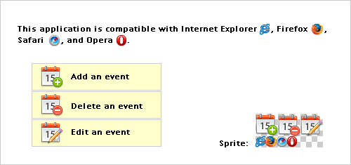
The main advantage of using a pseudo-element for the sole purpose of displaying an image is that it allows designers to crop a sprite. Actually, this is nothing new, and many websites are already using extra (aka “junk”) markup to achieve this. For example, Yahoo! Search uses empty <s> and Facebook uses empty <i> tags for this purpose. Going this route allows for the creation of compact CSS sprites, without empty space between the images within the sprite.
The two examples below do not use extra markup and they both share the same sprite:
The two images below — which are the second icon in the sprite — are generated using each technique, respectively.
Nicolas Gallagher’s method
- Styling the pseudo-element with a background image:
#first:before {
    content: "";
    float: left;
    width: 15px;
    height: 15px;
    margin: 4px 5px 0 0;
    background: url(sprite.png) -15px 0;
}
### The new url() / clip method- Using the
contentproperty to insert the sprite which is then cropped withclip: #second { position: relative; padding-left: 20px; background-image: expression(this.runtimeStyle.backgroundImage="none",this.innerHTML = '<img alt="" src="sprite.png">'+this.innerHTML); } #second:before, #second img { content: url(sprite.png); position: absolute; top: 3px; clip: rect(0 30px 15px 15px); left: -15px; /* to offset the clip value */ _left: -35px; /* some massaging for IE 6 */ }
In case you wonder why I use position: absolute in the above rule, it is because the clip property only applies to absolutely positioned elements.
The New Technique: How Does It Work?
- Instead of styling the pseudo-element with a background, we use it to insert an image (via
content). - Using the
clipproperty, we crop this image to only display the part we want to show. It means that there is no need to add empty space in the image to avoid other parts to show as well (usually used as background image of larger elements). - We offset
clipvalues by using theleftand/ortopproperties.
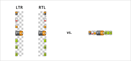
With a non-cropping technique, images in sprites would have to start from the right hand side or left hand side to accommodate RTL/LTR contexts (background-position: [left]|[right] [vertical value]). Another limitation is creating sprites with images showing next to each other (because other images could be displayed as well). But when cropping sprites, these issues are not in play, so all images can be tucked together.
For an example, see figure below:
Advantages of this method over existing techniques
Styled to print
Unlike background images, these images are printed with the document (they are sent to the printer).
Styled to be accessible
Unlike background images, these images will not disappear in MS Windows’ high contrast mode or with high-contrast styles sheets.
Styled to work in IE lt 8
This method works in Internet Explorer 6 and 7 as well.
Note that data URI scheme could be used to avoid the HTTP request. IE6/7 do not support data URI scheme, but we can use MHTML for IE6/7 to make IE7 and older browsers understand it as well.
Styling links with pseudo-elements
Nicolas Gallager shows plenty of cool stuff one can do with pseudo-elements. The only thing I’d add here is the use of ::after to style links à la “read more” and the like, for example:
CSS:
.more:after {
        white-space:nowrap;
        content: " 0BB"; /* » */
}
.more {
        white-space:nowrap;
        background-image: expression(this.runtimeStyle.backgroundImage="none",this.innerHTML = this.innerHTML+' »');
}
A word about accessibility
You should assume that generated content is read by screen-readers, and since there is no mechanism to offer alternative text for images plugged via the content property, we should make sure those images are purely decorative because screen-reader users would not have access to that information.
Further reading
You might want to take a look at the following related resources:
- CSS3 module: Lists - The ::marker pseudo-element
- Generated content, automatic numbering, and lists
- The clip property
- Colour Contrast and CSS Sprite Maps
- High Contrast Proof CSS Sprites
_Credits: Icons by FatCow Web Hosting [CC-BY-3.0-us], via Wikimedia Commons_
dt{ font-weight: bold; }
.glyphs {list-style-type:none;}
.glyphs li:before,
.glyphs b {display:inline-block;width:1.5em;font-size:1.5em;text-align:center;}
/* advantage of grouping these: the rule will show in Firebug :) /
.one,
.one:before {
content: “2660”; / ? /
background-image: expression(this.runtimeStyle.backgroundImage=“none”,this.innerHTML = ‘♠’+this.innerHTML);
}
.two,
.two:before {
content: “2663”; / ? /
background-image: expression(this.runtimeStyle.backgroundImage=“none”,this.innerHTML = ‘♣’+this.innerHTML);
}
.three,
.three:before {
content: “2665”; / ? /
background-image: expression(this.runtimeStyle.backgroundImage=“none”,this.innerHTML = ‘♥’+this.innerHTML);
}
.four,
.four:before {
content: “2666”; / ? /
background-image: expression(this.runtimeStyle.backgroundImage=“none”,this.innerHTML = ‘♦’+this.innerHTML);
}
.red b,
.red:before {color:red;}
.one:hover:before,
.two:hover:before,
.three:hover:before,
.four:hover:before {color:teal;}
#first:before {
content:“”;
float:left;
width:15px;
height:15px;
margin:4px 5px 0 0;
background:url(https://archive.smashing.media/assets/344dbf88-fdf9-42bb-adb4-46f01eedd629/7b539238-47cc-4737-82e3-15749b706d3a/sprite.png) -15px 0;
}
#second {
position:relative;
padding-left:20px;
background-image: expression(this.runtimeStyle.backgroundImage=“none”,this.innerHTML = ‘’+this.innerHTML);
}
#second:before,
#second img {
content:url(https://archive.smashing.media/assets/344dbf88-fdf9-42bb-adb4-46f01eedd629/7b539238-47cc-4737-82e3-15749b706d3a/sprite.png);
position:absolute;
clip:rect(0 30px 15px 15px);
top:3px;
left:-15px; / to offset the clip value /
_left:-35px; / some massaging for IE 6 /
}
.more,
.more:after {
white-space:nowrap;
content: “ 0BB”; / » */
background-image: expression(this.runtimeStyle.backgroundImage=“none”,this.innerHTML = this.innerHTML+’ »’);
}


