How To Optimize Email Newsletters With CSS

Email Newsletter
Weekly tips on front-end & UX.
Trusted by 182,000+ folks.

 Celebrating 10 million developers

 Custom Web Forms for Angular, React, & Vue. Your backend.
HTML email has a reputation for being a particularly tough design medium. So tough, in fact, that many designers regard coding and testing even the simplest email design to be almost as bad as fixing display quirks in Internet Explorer 6, and only slightly better than a tooth extraction. So, it’s with much courage that I tell you today about using CSS in email newsletters: what works, where it’s going and what you should do next.
After reading this article, you will hopefully come away with a few ideas on how to start coding email designs with improved readability and usability when viewed in Web, mobile and email desktop clients alike. Also included are a variety of resources to get you on the right path with using CSS in email.
Then again, the shaky state of email standards today may convince you that plain-text email is the way to go. The choice is yours.
CSS In HTML Email: The Good, The Bad And The Mobile-Ready
If you’re about to embark on your first HTML email coding job, then you probably come from a Web background and are keen to flex a little CSS3 muscle, get a little JavaScript action happening, drop those shadows…
Not so fast. As any old hat to the email game can tell you, what works on the Web and what works in email are about as far apart as Sydney and Stockholm. For the most part, this is because pretty much every email client has its own way of doing things; while there are perhaps half a dozen browsers to test against when coding a Web page, there are literally dozens of email clients, many of which feature radically different CSS implementations.
But before you give up hope, here’s some advice to get you through the night:
- A lot of CSS properties (such as
font,colorandborder) work fine across many of the most popular email clients. Once you know which ones they are, you can tailor your designs accordingly. - When a CSS property doesn’t work so well, there are often workarounds (such as using
cellpaddingin tables instead ofpadding). - When workarounds don’t exist, focus on graceful degradation.
- Your design will never look exactly the same across all email clients, no matter how you use CSS. Once you (and your clients) make peace with this, I guarantee you will sleep better at night.
- Keep it simple. The less complicated your design and layout, the less likely something will go wrong. Favor table layouts over divs, and make sure your message is readable (which means text, not images).
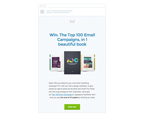
At this point, you may be saying to yourself, “Well, this all just sounds too hard.” So, perhaps I should remind you how beautiful an HTML email can look, with just a sprinkling of CSS:
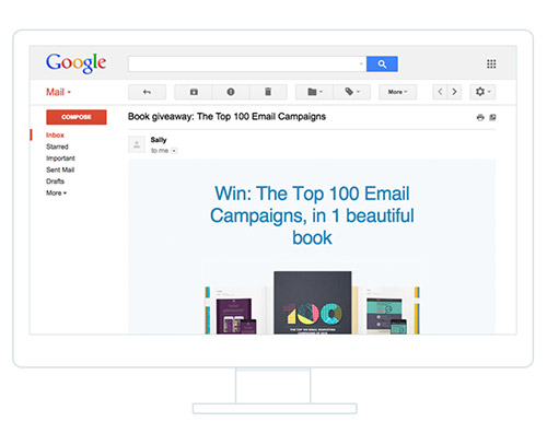
For a more realistic view of what this design will look like in the inbox, here’s the same email in Gmail, a notoriously tricky email clients to work with:
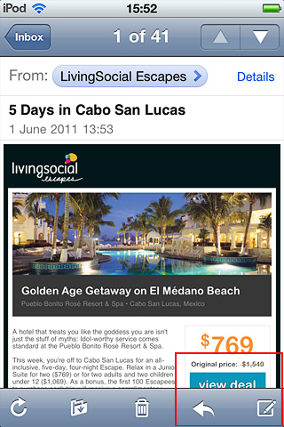
See? Ain’t so bad after all. But what’s more exciting is how you can use CSS to adapt an HTML email for optimal display on mobile devices. Here’s the same newsletter as viewed on a smartphone:
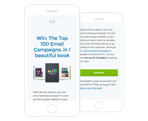
Applying a mobile-specific style sheet has improved the readability of the email considerably, allowing us to remove unnecessary whitespace that would have taken up valuable real estate on a small screen.
So, we’ve gone from an email layout that may have required a lot of pinching and zooming, to one that can be easily read with a linear scrolling motion, using CSS alone. We’ll look at how you can apply similar improvements to your email campaigns in a moment. But first, let’s start with some of the fundamentals of using CSS in your HTML email designs.
The State Of CSS Support In Email Today
When I mentioned that a lot of CSS properties out there work fine in many email clients, I wasn’t trying to be vague. Thankfully, the research into what works and what doesn’t has already been done. You need only skim this guide to CSS support in email clients to see what properties are within and off limits. Or just know that most of your CSS rendering troubles will come from Outlook 2010, Lotus Notes and Gmail, due to their refusal to do anything useful with CSS style sheets.
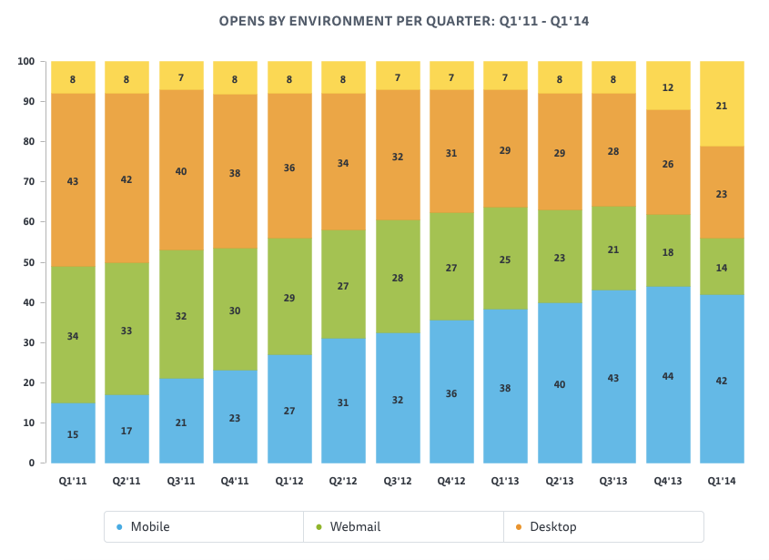
These issues are nothing new. Indeed, the battle for market share between email clients that play nice with CSS versus those that don’t has been pitched for years now. But progress is being made. Looking at the data from over 4 billion emails sent, we found that mobile email clients have gained ground dramatically, with 42% of emails now opened on a mobile device. Here is how desktop, Web and mobile email clients have fared comparatively over the last five years:

Mobile’s ascent is great news for email designers everywhere for one reason: nearly 90% of mobile email is read on an iOS device. iOS devices use the WebKit rendering engine, which means they can display really nice-looking HTML emails.
Our friends at Panic (the creators of such popular Mac titles as Coda) were well aware of this when they got started on their email announcements. As purveyors of Mac software, they can pretty much always count on their emails being read in Webkit-powered email clients like Apple Mail and the iPhone. As a result, they’ve been able to pull a lot of CSS3 trickery out of the toolbox, including web fonts and SVG masks:
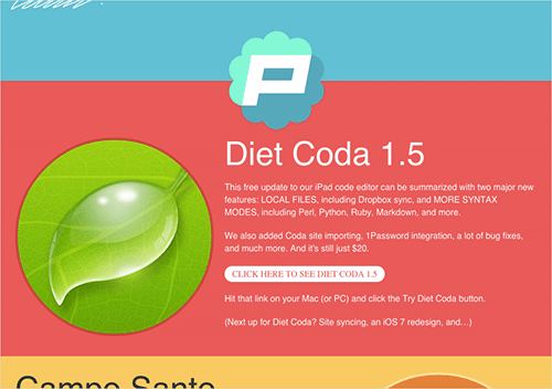
But what really impressed me was their use of CSS3 animation. Here’s the code they used to achieve the “Ken Burns” zoom effect:
@-webkit-keyframes kennethburns {
from { -webkit-transform: scale(1.5) }
to { -webkit-transform: scale(1) }
}
And you thought HTML email was a boring medium? Well, to temper things a bit, CSS3 still has very limited support beyond a handful of Webkit-powered email clients, so use it with discretion.
Inside An HTML Email Builder’s Toolkit
Before we go charging in and dropping @media queries by the dozen, let’s make sure we have the tools for the job. We’ll need the following:
- An email marketing service like MailChimp or Campaign Monitor to send HTML email campaigns (you can’t do this from desktop or Web email clients like Gmail — sorry);
- Code editing software, such as Coda or Sublime Text;
- A mobile device to test on (like an iPhone or Android device);
- A variety of Web and desktop email accounts to test, either set up individually or automated via a service such as Litmus;
- An intermediate-level understanding of HTML and CSS;
- A lot of patience.
In addition, you’ll need a way to move your CSS inline, for the benefit of clients like Gmail, which strip out the head section of HTML email code. Many email marketing apps can do this automatically when you import your campaign, but if yours doesn’t, then you can use a service like inliner.cm for the job.
Now that you’re armed and dangerous, let’s launch into the theory and code behind mobile email design.
Using CSS To Optimize Your Email For Mobile Devices
If you’ve created mobile style sheets for the Web or have read into responsive design, then you probably know a bit about @media queries. If not, then here’s the skinny: they allow you to provide targeted CSS style sheets that are triggered when a device’s capabilities match specific criteria. For example, you could use a media query to specify that a couple of lines of CSS be applied exclusively to devices with a display width of up to 480 pixels, in order to make your website or email easier to read on these screens.
The following is a snippet of code from the earlier newsletter, telling mobile email clients and browsers to scale down the width of the email layout to 300⁄325 pixels wide, so that it fits comfortably on displays that are no wider than 480 pixels (i.e. the width of an iPhone 5 in landscape mode):
@media only screen and (max-device-width: 480px) {
   …
   table[class=table], td[class=cell] { width: 300px !important; }
   table[class=promotable], td[class=promocell] { width: 325px !important; }
   …
}
Note how we’re using attribute selectors here. This is to prevent Yahoo! Mail from accidentally calling this style sheet.
One thing to note at this point is that, while you can shrink the dimensions of a design (or hide bits, as we’ll do later) using an @media query, the user will still be downloading all of the content. Adding mobile-specific styles shouldn’t be confused with providing a slimmer or faster-loading version of your content. Mobile-specific styles just make the content easier to read.
The great news is that mobile email clients such as iOS Mail and Android’s default mail client follow @media queries to the letter. So, for example, you could pop one into a style sheet in the head of your HTML email code to transform the design into an easily readable, mobile-friendly layout like the one pictured above. You can also do things like shrink the dimensions of images, and use display: none to hide visual elements that don’t work on small screens.
For a more hands-on look at mobile email design, I highly recommend the Guide to Responsive Email Design, which includes both the fundamentals and some advanced techniques like progressive disclosure.
What’s Next For HTML Email Designers?
So, while CSS-unfriendly email clients like Outlook will always be here to rain on our parade, the good news is that the rise of mobile email has meant that we may soon be at liberty to create more Web-like email experiences. It has also meant that optimizing your newsletters for handheld and touch displays has gone from being a “nice thing to have” to a given. This doesn’t just affect email newsletters at the code level, but it also changes the way we display design elements. For example, in the following two mobile designs, which do you think is the more effective call-to-action (CTA) button?
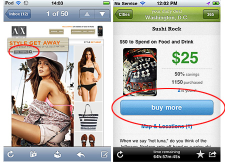
Or consider the CTA in the following mobile-friendly email. If it’s not visible “above the fold,” as they say, then will it be seen at all? Or worse, will recipients end up accidentally tapping the toolbar instead?
If designers aren’t asking these questions, they sure will be soon. You need only visit Style Campaign’s blog (which provided the examples above) or read up on “Optimizing for Touch Across Devices” to grasp the importance designing good experiences for mobile.
Here are a few other important things to consider when designing adaptive layouts:
- Single-column layouts that are no wider than 500 to 600 pixels work best on mobile devices. They’re easier to read, and if they fall apart, they’ll do so more gracefully.
- Links and buttons should have a minimum target area of 44 × 44 pixels, as per Apple guidelines. Nothing sucks more than clouds of tiny links on touchscreen devices.
- The minimum font size displayed on iPhones is 13 pixels. Keep this in mind when styling text, because anything smaller will be upscaled and could break your layout. Alternatively, you could override this behavior in your style sheet.
- More than ever, keep your message concise, and place all important design elements in the upper portion of the email, if possible. Scrolling for miles is much harder on a touchscreen than with a mouse.
Now it’s your turn to design wicked HTML email newsletters that, with a dash of CSS, look just as effective on the small screen as they do in your Web browser or desktop inbox. I have no doubt that your readers will appreciate the effort.
Resources To Help You Make The Most Of CSS In Email
With funky CSS support and coding practices from circa 1994, designing HTML emails might seem like rocket science. Thankfully, quite a bit of solid documentation exists on effective HTML email design, so below is my recommended reading list if you want to take your newsletters to the next level.
Getting Started with HTML Email
- “Creating a Simple Responsive HTML Email”
- “5 top email designers share the tools they can’t live without”
- “Coding your Emails” — An excellent starter tutorial
- Inliner.cm — For moving CSS inline
HTML and CSS in Email Clients
Mobile Email Design
- Guide to Responsive Email Design
- Style Campaign blog
- “CSS3 animation, SVG masks, web fonts and more in Panic’s newsletter”
- “How We Create and Send a Newsletter to 175,000 Subscribers”
- “Responsive Navigation: Optimizing for Touch Across Devices” — for those interested in mobile UX
- “Make your HTML Email 5× More Mobile Friendly”
Email Design Inspiration And Templates
- Campaign Monitor’s template builder
- ThemeForest’s email template marketplace
- MailChimp’s free templates
- Campaign Monitor’s email design gallery
- Beautiful Email Newsletters design gallery
Further Reading
- Design and Build Email Newsletters Without Losing Your Mind
- Email Newsletter Design: Guidelines And Examples
- Typographic Patterns In HTML Email Newsletter Design
 (al, il, mrn)

