Mind Your En And Em Dashes: Typographic Etiquette

Email Newsletter
Weekly tips on front-end & UX.
Trusted by 182,000+ folks.

 Custom Web Forms for Angular, React, & Vue. Your backend.

 Celebrating 10 million developers
An understanding of typographic etiquette separates the master designers from the novices. A well-trained designer can tell within moments of viewing a design whether its creator knows how to work with typography. Typographic details aren’t just inside jokes among designers.
They have been built up from thousands of years of written language, and applying them holds in place long-established principles that enable typography to communicate with efficiency and beauty.
Handling these typographic details on the Web brings new challenges and restrictions that need to be considered. Below are a few rules of thumb that will have you using typography more lucidly than ever before.
Setting Body Copy
Good typography comes down to communicating information, and the basis of information is good old-fashioned body copy – simple blocks of text. Here are a few ways to make your blocks of text nice and clean.
Indentation Or Space After A Paragraph?
When signalling the end of a paragraph and the beginning of another, you can generally either indent or insert a space between the paragraphs. Doing both is redundant and creates awkward, irregular chunks of white space.
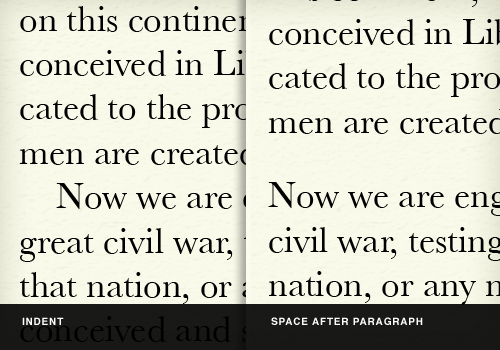
Indentation
Indent the first line of a new paragraph about 1 em (if your font size is 12px, then that would amount to 12 pixels). Indenting the opening paragraph of a new section would be redundant, because that paragraph would be the first in that page or section anyway.
Space after paragraph
A full line break of 1 em (like when you hit the “Return” key twice) is generally more than enough to signal a new paragraph. About 0.8 ems is sufficient.
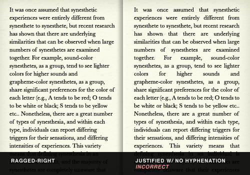
Flush left (ragged-right)
In text set flush left, the lines will break naturally, resulting in a “ragged” right side of the column. This is generally considered easier to read because the eye can better distinguish one line from the next, because of the different line lengths. Additionally, studies have shown that readers score higher in comprehension and recall when text is flush left. Hyphenation should not be used with text that is flush left, because that would defeat the whole point of a ragged right.
Avoid justified type on the Web
Justified text is spaced out so that each line is of the same length. Because all lines have to be set at the same length, some variation in letter spacing (i.e. the space between letters), and word spacing (the space between words) is done to lengthen and shorten lines. This changes the overall texture of the body copy, making it less even.
High-end desktop publishing applications (such as Adobe InDesign) have sophisticated systems for justifying type so that it doesn’t produce “rivers” (large gaps in the text from too much word spacing). They use a combination of letter spacing, word spacing, hyphenation and glyph scaling (i.e. very slightly adjusting the width of individual letters) to produce an even texture in the body copy.
But there is no hyphenation control in CSS. Beyond JavaScript libraries that handle hyphenation and CSS3’s text-justify property, browsers don’t have very sophisticated measures for maintaining an even texture in blocks of text. This makes justified text on the Web highly susceptible to big holes and rivers in the body text.
Avoiding justified type on the Web is generally a good idea. At the optimal line length for reading (about 50 to 80 characters or 8 to 15 words), making lines of text all the same length, without hyphenation or subtle letter spacing, nearly always results in rivers.
One Space After A Period. Not Two.
Very few typographic debates match the intensity of whether there should be one or two spaces after a sentence.
This practice is a holdover from typographers of the Victorian era. The practice began when typewriters were introduced. Because early typewriters used monospaced fonts (meaning that the spaces between letters were always the same length), typists used two spaces to mimic the slightly wider spaces that typesetters were using after periods. Now that computers (and the fonts on them) are equipped with proportionally spaced (rather than monospaced) fonts, this practice is outdated, and it creates awkward breaks in the body text.
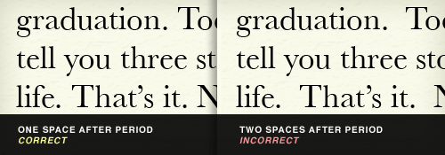
For those who are still skeptical, consider this: the beginning of a new sentence is already indicated by a period, a full space and a capital letter. Adding yet another space merely pokes a hole in the body text and interrupts the flow of reading.
The typist may wish to continue using two spaces after a period, but the typographer should not.
Use Dashes Dashingly
Most fonts are equipped with at least two dashes: an en dash (–, –, which is the width of a lowercase “n”) and an em dash (—, —, which is the width of a lowercase “m”). Don’t confuse these with the hyphen (-), which isn’t a dash at all but a punctuation mark.
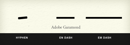
The Hyphen
Hyphens and dashes are confused to the point that they are now used almost interchangeably by some. Some fonts, such as Adobe Garamond Pro, retain hyphens in their original form; those hyphens look more like the diagonal stroke of a calligrapher’s pen than a straight horizontal line. You’ll also often see hyphens used as a replacement for a minus sign; however, a longer character is available in some fonts for this purpose.
Although the hyphen does look quite a bit like a dash or minus sign, it is a punctuation mark. It should be used primarily to hyphenate words in justified type. On the Web, this isn’t much of a concern because, as mentioned, there is no standard hyphenation control in browsers. The hyphen should also be used in compound modifiers (such as “fine-tuned”), to join digits in phone numbers, and in a few other rare cases (covered in detail on Wikipedia).
The En Dash And The Em Dash
In The Elements of Typographic Style – which is the unofficial bible of the modern typographer – Robert Bringhurst recommends that dashes in text should be the en dash flanked by two spaces. This is much less visually disruptive than using the em dash with no space—which is recommended in editorial style books such as The Chicago Manual of Style — because there is less tension between the dash and the characters on either side of it.
Why go against The Chicago Manual of Style in this case? The reason is that style manuals are concerned mostly with punctuation, not typography. An en dash surrounded by spaces achieves the same effect as an em dash with no spaces, but typographically it is less disruptive. This was a big debate between my editor and me when I was writing my book.
The practice of using two hyphens for a dash is a holdover from the days of typewriters. Besides being visually disruptive to smooth blocks of text, it is now unnecessary with the richer character sets that are available to typographers.
The en dash is also used to indicate ranges of numbers (such as “7–10 days”), although it isn’t flanked by spaces in this case.
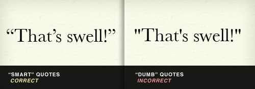
Use Smart Quotes, Dummy
The quotation mark that is produced when you type ” on your computer is not a true quotation mark (unless your word processing or page layout program has automatic formatting). True quotes are sometimes called “smart quotes,” and the right one must be used according to whether you are opening or closing a quotation. To open a quotation, use “ (“), and to close a quotation, use ” (”). For opening single quotes, use ‘ (‘), and for closing single quotes and apostrophes, use ’ (’). CMS’ such as WordPress usually either convert dumb quotes to smart quotes automatically or have plug-ins for the job.
Smart Quotes in Action
CNN uses dumb quotes, which look clunky and lifeless, while The New York Times uses smart quotes, which look clean and sophisticated:

Smart quotes are so sexy that their sinuous forms can be used as ornamentation, such as in this pull quote on Jason Santa Maria’s blog, which features smart quotes only in shadow form:

Quotation Marks Don’t Measure Up
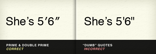
The “ and ’ on your keyboard are also often used to designate feet and inches (Steve Jobs is 6’ 2”). This, too, is technically incorrect. For feet, you should use ′ (′), and for inches, ″ (″). (Steve Jobs is, in fact, 6′ 2″.)
Note that many desktop publishing programs are so advanced that they automatically (and incorrectly) insert “smart” apostrophes and quotation marks in all of these situations. This can be changed in the program’s settings, but the quickest way around this is simply to copy and paste the correct mark from a “less sophisticated” text editor.
+1 For Proper Math Symbols
Sometimes in our haste, we use the wrong marks for math symbols. For example, as we learned above, a hyphen is not a minus sign (−, −). Additionally (no pun intended), neither an x nor an asterisk (*) is a multiplication symbol (×, ×).
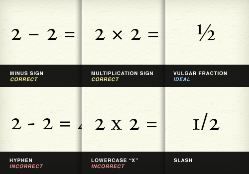
Proper fractions not only add elegance to typography, but are more readily recognizable. Using a slash in your fractions (1⁄3) is not ½ (½) as cool as using the proper vulgar fraction (as it’s called).
Certain other symbols are harder to substitute with common characters, such as when you write 98¢ (¢) and 104° F (°). You might be tempted to just type these out as “cents” and “degrees.”
There’s Always More With Ellipses
Sometimes, there’s more than meets the eye. Most of us type the ellipsis as three periods (…), but most fonts come equipped with their own character (…, …) that is slightly more spaced out. The Chicago Manual of Style would have you think that the proper ellipsis consists of periods separated by spaces (…), but any typographer knows that is too disruptive to body text. Some typographers prefer to set their own ellipses by using thin spaces ( ) between periods (…). But your judgment is best; pick the ellipsis treatment that makes your text block look most consistent (which will never be with full spaces between periods.)
Accent Marks And Other Diacritics Aren’t Passé
Sure, in the US you can work on your resume while sitting in a cafe, and it wouldn’t be much different than if you were working on your résumé in a café in France. No matter how naïve you are, sometimes using the proper diacritical mark is… critical. A diacritic is a mark placed near (usually above or below) a letter to change its sound. The most common diacritic in English is the acute (´) accent, which is used in a number of words borrowed from other languages and which is sometimes very important, such as for the sake of declaring your passion for saké.

The acute accent is often confused with the grave accent (`), which leans to the left and is readily available on US keyboards below the tilde (~). The grave accent is actually much less common in English than the acute accent. If you ever see one again, you might think you were having a déjà vu.
To insert an acute accent on Mac OS X, hold down Option while typing “e,” and then type the letter that you want to appear below the accent (so, if you want “é,” you’d be typing “e” twice). Play around with Option + u, i and ~, and a whole world of diacritics will open for you.
Ligatures Bring Letters Together
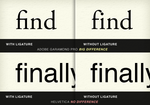
In the early days of printing, when type was set in lead, the lead slugs on which characters were set made it difficult to set certain character pairs close enough. For example, in the letter combination “fi,” the top terminal of the “f” stuck out so far that the letter couldn’t be set close enough to the “i” because of the dot on the “i.” Thus, many fonts (usually the classic ones, such as Adobe Garamond) have ligatures for certain pairings that actually meld the letterforms together. Some modern fonts, such as Helvetica, also have ligatures, but their effect is negligible.
Below, you can see that ligatures are needed in some fonts more than others. Notice how an “fi” ligature is more critical to clean typography in Adobe Garamond than it is in Helvetica. Because of this, different fonts come with different ligatures.
In addition to “fi,” ligatures are most commonly needed for the groupings “fl,” “ff,” “ffi” and “ffl.” Below you can see that Apple makes beautiful use of the “ffl” ligature in the type treatment of “iPod shuffle.”

Using Ligatures Practically
Obviously, typing in ligatures every time you need them is impractical. Even if you did, your content might not ultimately be displayed in a font that is equipped with the appropriate characters. Fortunately, plug-ins such as jQuery’s Ligature.js will automatically insert the most commonly supported ligatures where appropriate.
But, be careful: even if the proper characters are available, you might make it difficult for users to search for text on the page. Currently, Internet Explorer and WebKit-based browsers such as Chrome and Safari match ligatures to their corresponding letter pairs when the search command is used (for example, when a user searches for “fig” on the page), whereas Firefox does not.
CSS3′s font-variant-ligatures Property
CSS3’s font-variant-ligatures property displays the proper ligatures without interfering with the actual HTML code of the page, thus preserving full functionality of the search command in all browsers. In this case, while Internet Explorer, Chrome and Safari do not currently support this property, Firefox does.
So, if you apply ligatures at the content level, then your Firefox users won’t be able to use the search command for them. And if you use font-variant-ligatures, only your Firefox users will see the ligatures. Because of the spotty browser support for ligatures, ignoring ligatures altogether in the body copy would not be unreasonable. A lack of ligatures in big headlines and headings might be more obvious, though, so picking your preferred method of support there might be worthwhile.
Being Reasonable
Obviously, keeping track of and implementing some of these typographic details might seem pretty tedious. Fortunately, most Web frameworks and CMS’ have plug-ins that take care of them for you, and some of CSS3’s typography controls are at least beginning to be supported in browsers.
But as with all matters of design and production, economy comes into play. You may decide that implementing some of these details just isn’t worth the trouble. What’s important is at least knowing typographic etiquette, so that you can rely on it when it matters and make wise decisions that are appropriate for your project.
Other Resources
You may be interested in the following articles and related resources:
- How to Type Learn how to actually type these characters on your computer.
- The Elements of Typographic Style, Robert Bringhurst The Amazon ordering page for the unofficial bible of modern typographers. This book is full of great advice on any typographic detail you can imagine.
- The Elements of Typographic Style Applied to the Web An adaptation of Robert Bringhurst’s classic book for the Web.
This post is based upon a chapter from David’s upcoming book, Design for Hackers: Reverse-Engineering Beauty, which will be published in September 2011.
Further Reading
- Macrotypography For A More Readable Web Page
- How To Choose A Typeface — A Step-By-Step Guide!
- Respect Thy Typography
- Typography Keyboard Layout [Free Download]


