Elements Of A Viral Launch Page

Email Newsletter
Weekly tips on front-end & UX.
Trusted by 182,000+ folks.


 Custom Web Forms for Angular, React, & Vue. Your backend.
 Celebrating 10 million developers
Google+, Hipster, Connect.me and Instagram! They all hit a gazillion users in no time at all — and you can even read all about it in everyday media today.
This is every product creator’s dream. Ok, granted, Google already had their users well before the launch of its social extension. But how did the other ones succeed in building such a strong fellowship in a few months (or even days).
Turns out that many of these services’ creators were very busy bees and made small details about their product’s launch addictive. It even turns out that many start-ups were indeed able to launch to a strong following (not much unlike Google+) through collecting interested users, email addresses, Twitter followers in any way they could well ahead of their public appearance using a combination of very common and old marketing strategies with clever launch pages.
In this article, we’ll outline some best practices and examples of successful viral launch pages. Let’s define a viral launch page not only as a “Coming soon” landing page, but also as a usable beta page or even in some cases a finished product page.
Fundamentals Of The Viral Launch Or Landing Page
The first rule of viral is of course that you must build something that other people would actually be interested in for one reason or another. Let’s emphasize this, using the words of Robert Scoble: “The best launch is if you have a product that other people like using so much that they tell other people about it.” The users you target need to know at least one bit of information in advance that will make them care. Then, only then, can you move on to the next step, which is to facilitate and encourage sharing.
Normally, you’ll want to (1) let visitors know what you’re doing, and then (2) spark some interest. Then you should (3) make use of that interest by giving them a chance to subscribe to your news updates, doing so with a bright call-to-action button. Lately, so-called stealth start-ups have become quite popular because of the interest they are able to generate. They typically won’t tell you what they’re doing, which means they’re ignoring step (1), but somehow they still manage to grab your attention.
Here are the basic elements a launch page should have:
- A clear value proposition that interests people. (What problem will you be solving?)
- If your strategy is stealth, then why should people care? (For example, are you Jack Dorsey?)
- A notification form, with a bright call-to-action button.
Examples of Basic Launch Pages That Spark Interest
Even very basic launch pages can do a great job of advertising the product if they are memorable, viral in some way or desirable to visitors (or all of the above). You can read more about these characteristics in the recent Smashing Magazine article “Building An Effective ‘Coming Soon’ Page for Your Product.”
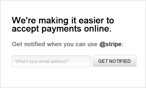
Stripe
Stripe has a simple landing page ready for visitors, with one concise sentence: “We’re making it easier to accept payments online.” This is followed by a simple call to action: “Get notified when you can use @stripe”. The app’s name is also the company’s Twitter handle, so you can opt to subscribe to updates through Twitter. This implementation is very minimalist and suggests that the service does one thing very well. Who wouldn’t want an easier way to accept payments online?
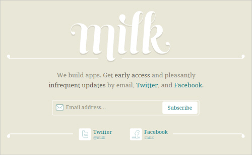
Milk
Milk doesn’t tell you what exactly it’s building, but it makes sure the team can reach you once it has something to say. What makes this landing page so successful? It’s the new venture of Kevin Rose (Digg’s founder). Also note the subtle “pleasantly infrequent updates” for email, Facebook and Twitter, which puts us much more at ease with subscribing.
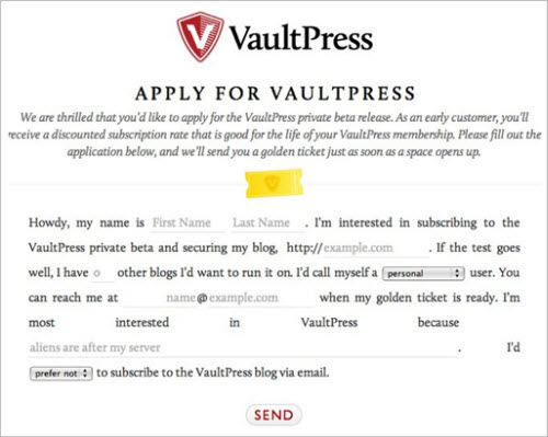
VaultPress
You may need to give more information up front in order to get the message across. Here is how Automattic launched VaultPress, a back-up service to give WordPress bloggers peace of mind. The text does three things:
- It sets your expectations of what VaultPress will do (which is to keep your blog and server safe).
- It collects data from those who fill out the sign-up form (data that will validate their idea).
- It creates a sense of exclusivity, because not everyone can join immediately.
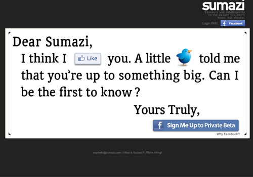
Sumazi
Instead of focusing on the product itself, Sumazi tries to get you to follow it on its social profiles and to share the news with your contacts. Registration is done through Facebook. It’s a first attempt to add a small viral loop to the launch page.
Let’s see how other start-ups have used the viral loop, and how this effect has sparked real enthusiasm for start-up launch pages.
Additional Elements That Can Make A Launch Page Go Viral
In addition to the basic elements covered above, start-ups have recently been using some of the following elements to make their landing pages more enticing:
- Viral loop,
- Exclusivity and scarcity,
- Glimpses of the beta,
- Social proof,
- Viral content.
You will find all of these in the examples below. Many of the elements are often combined in meaningful ways.
Adding A Viral Loop
The viral loop is a kind of “sharing cycle” or “multiplier effect” that is built into the launch page. It’s an incentive for people to share news of the start-up and to share the sign-up form with their friends and followers. Forkly’s landing page was one of the first to successfully tap into this effect .
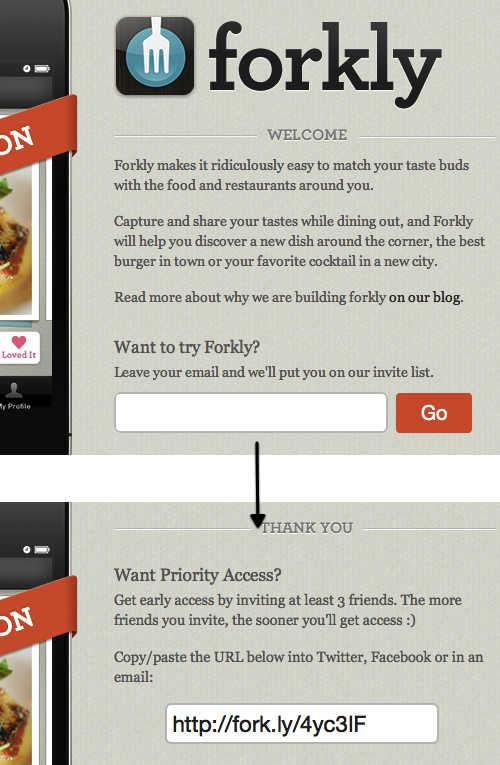
Forkly
Forkly is an innovator in this popular viral invitation system. If you want to be notified of Forkly’s launch, you can leave an email address in the form on the landing page. Once you hit the “Go” button, the page reloads and gives you a personalized link that you can share with friends and followers. If at least three of your friends join, then you will get early access to the service. And the more friends who join, the earlier your access will be (Update: they’ve just launched their app to the public) .
Add An Incentive To The Sign-Up Process
Forkly’s incentive to share is a strong one: you’ve signed up to use the service anyway, so why not share it with a few friends so that you can gain access even earlier. This was a smart move and has been copied repeatedly since. But there are countless other ways to incentivize sharing.
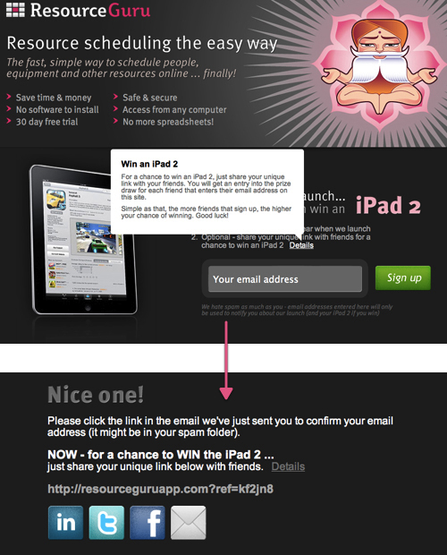
ResourceGuru
ResourceGuru is giving away an iPad 2 to one of the people who share its link. Who doesn’t want an iPad 2 these days? Think about it: would you subscribe to ResourceGuru if it had only used Forkly’s strategy? Would you subscribe if an iPad was (potentially) waiting for you? These incentives are most effective when the item has an aspect of exclusivity. That’s why you see so many give-aways close to the launch dates of Apple gear, when no one yet possesses the gadget.
Alternative Ways To Subscribe
In some cases, you might want to offer other ways to subscribe to your news, particularly if your users are mainly on Facebook, Twitter or Tumblr and like to consume news in ways other than through email.
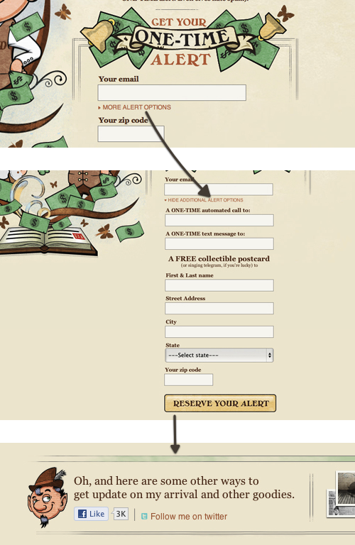
RumpelDealSkin
RumpelDealSkin offers various ways to get the inside scoop: email, phone, text message, postcard. Additionally, there are links to its social profiles.
Stealth Start-Ups
Lately, the “stealth start-up” method has been quite popular, due to some spectacular successes (including Hipster, Connect.me and Kohort). It’s a way of making something publicly known without actually letting people in on what you’re doing. This could elicit another level of interest in your start-up, but let’s face it: it’s a tough ride. Are you able to leak as little info as possible but still make people genuinely excited?
Hipster
Hipster is a good example of a stealth start-up. Hipster managed to gather 10,000 addresses in just two days after its public marketing launch. And it happened before anyone knew what it does. The cool name and slogan (“Something cool is coming to San Francisco”) turned out to be the perfect marketing mix. The story was picked up widely and quickly by bloggers and media alike. People wanted to know what it is, and they left their email addresses in bulk and shared the links happily with their friends (Hipster used the Forkly approach) to be among the first to see the service.
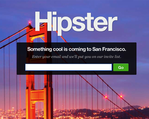
Notice the value proposition that complements the name. Then there’s the simple call to action button, and the background that would appeal to San Francisco residents and others. (Wouldn’t you want to know what you’re missing out on?) This happened in January 2011; as of this writing, Hipster is still building its service which will be some kind of local Q&A. But take a moment to check out the hiring page to see how it’s still using its name to tell a story.
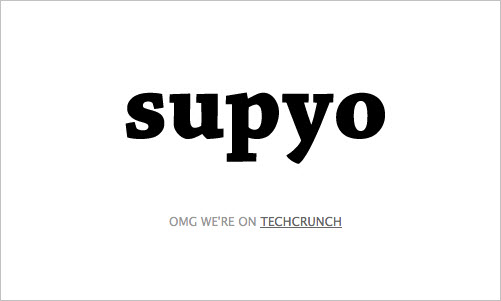
Supyo
Supyo has received a lot of attention as a result of its founders, long-time collaborators Shawn Fanning and Sean Parker. They have set up nothing but a splash page for now, which means they cannot collect addresses. (Update: they’ve just added an email notification form.) Shawn Fanning and Sean Parker will create buzz even if only for their Web celebrity status.
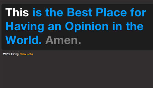
Amen
The same is true for Amen. Their landing page doesn’t sport anything but a cryptic (and interesting) message of what it is going to be: “The best place for having an opinion in the World”. Rumors of what the service will be and the fact that Ashton Kutcher and Madonna’s manager invested here keep the interest alive (also the first Twitter engineer Florian Weber is a co-founder).
Allow People To Reserve User Names And Integrate With Social Networks
Connect.me
Connect.me is another stealth start-up with an incredibly viral sign-up page. Apart from its memorable domain and brand name, it communicated almost no information on what it’s about; an “About connect.me” link appeared in the bottom-right corner, but it didn’t really explain what the app would do.
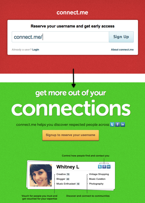
Unlike the services mentioned above, Connect.me did not ask you to leave an email address. You could only register through Twitter or Facebook. Also, did you notice that instead of something like, “Invite friends to get early access,” the copy says, “Reserve your username to get early access”? This makes it clear that early adopters will have dibs on vanity URLs. This can be very effective with people like me, who have common names and want to register a good URL.
If you went through with the registration, the app would automatically tweet or post a simple message on Facebook: “Reserve your Connect.me username [link].”
This simple approach generated roughly 20,000 sign-ups in a short span of time and even provoked fears of a scam in the blogosphere shortly after. When you visit the website now, you’ll find a landing page (in green) telling you exactly what the service does. The “Reserve your username” is still there, but it has been turned into a central call-to-action button.
The success of strategies like those used by Forkly, Hipster and Connect.me have even led to the creation of a start-up that takes care of the sign-up process for you. LaunchRock does all the heavy lifting, leaving you to concentrate on building the actual software.
LaunchRock
Once you’ve submitted your email address, you’re immediately given the option to do a few things with your link: tweet it, share it on Facebook or email it to friends. The tweet is pre-written and contains a lot of important elements:
- Your brand name, and an announcement that you will be launching soon;
- Social proof: “Follow me! I’m first in line.”
- Your personal link;
- Your brand’s Twitter handle.
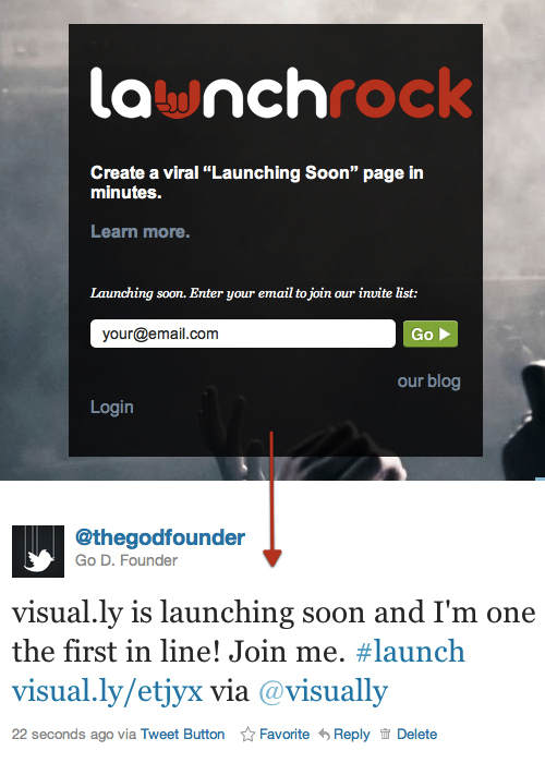
Even if you don’t use LaunchRock as a service to launch your product, it still has a lot to be inspired by. I would even argue that now with so many newly unveiled LaunchRock sites you would do your launch a disfavor for looking like another me-too. LaunchRock’s blog provides a good analysis of the viral “Coming soon” page.
Especially Twitter Integration
Many services that succeed in generating some idea or product that people want to share on Twitter (and Facebook) experience a hell of a growth rate. This was the case with Threewords.me and Turntable.fm, which recently became the most shared music start-up on Twitter, because people love to announce what they’re doing at a given moment (check out the real-time search results of Turntable.fm’s hash tag). Let’s look at two examples:
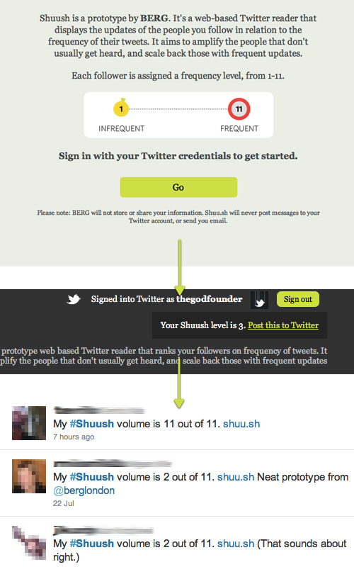
Shuush
Shuush is a Twitter reader that scales back users who tweet too often and amplifies people who don’t tweet as much. As a byproduct, users are assigned Shuush levels that they can tweet out. Users like to share facts about themselves, which we’re seeing over and over again.
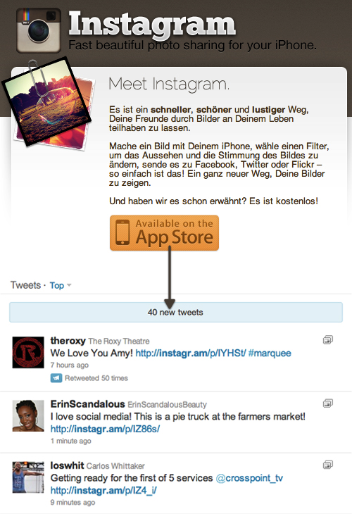
Instagram
Instagram has no conventional landing page (and didn’t have a conventional viral launch page when it launched). Rather, its viral circulation comes from people sharing their images on social channels, mainly Twitter. You can instantly recognize these images by the branded URLs, like of this image by Justin Bieber, , which made the service literally explode on July 21st.
Sell A Half-Baked Product For Half the Price
Minecraft
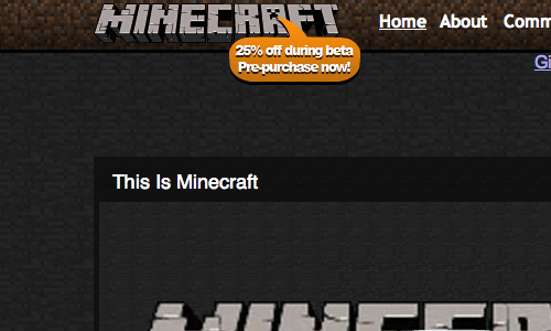
Minecraft is an online gaming phenomenon, and its adoption has been mind-blowing, with 2,932,884 licenses sold in the beta phase. People are willing to sign up early, especially if a discount is offered because the product is not yet ready. When Minecraft is finished, it will sell for €20.00. Right now, at 25% off, you can get it for €14.95. Discounts for early adopters are a no-brainer.
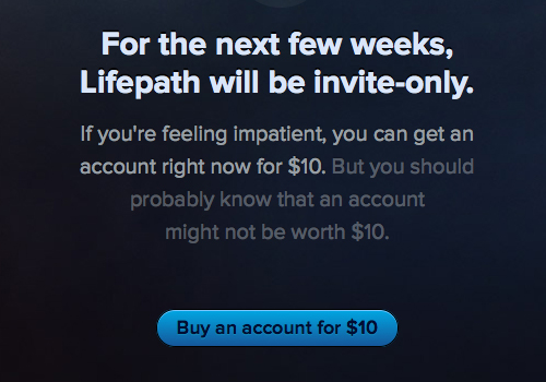
Lifepath
Lifepath turns this approach on its head. The service is invite-only, and because people might very well want to use it, the company invites visitors to buy an “entrance ticket”. The closer the service gets to completion, the lower the entrance fee gets. Note that registrations fared better when the fee was $10 than when it dropped to $3 . This is an interesting insight that the creator Dustin Curtis shared on Twitter.
Exclusivity
Exclusivity can be a powerful way to convince people to join. Facebook, which started out as private to one university, now has the biggest following of them all.
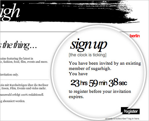
Sugarhigh
When you receive an invitation to this invite-only newsletter, you’re redirected to the landing page, where a counter displays the time you have left to register.
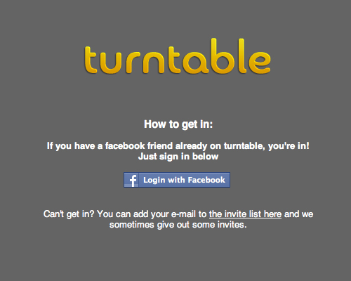
Turntable
Turntable is the red-hot music start-up that allows you to join rooms and DJ along with other people, mainly friends. The landing page says, “If you have a Facebook friend already on Turntable, you’re in!” This enables the company to grow the service organically, making sure that only like-minded people join and slowly adjusting and scaling up its servers. If you know no one on the service, you can leave your email address.
Tell A Story, Add Personality
Telling a story is a powerful way to interact and tell people about your product (and has a clear psychological aspect). Stories can captivate an audience, which is exactly what you want for your launch page.
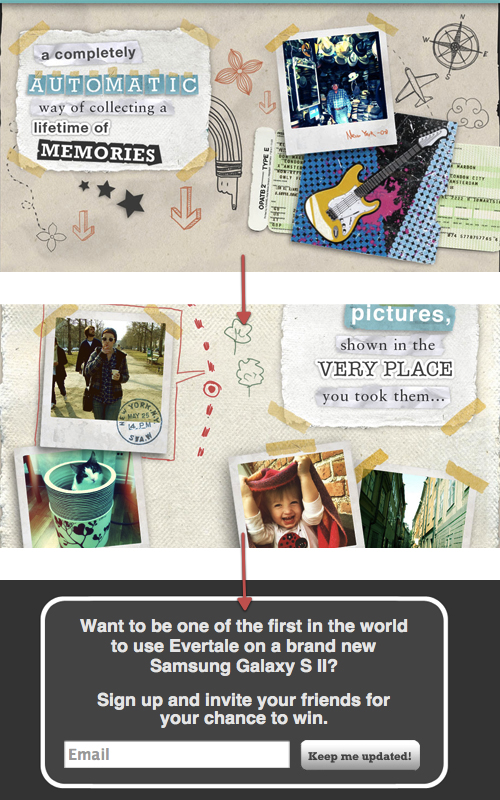
Evertale
Evertale is an Android app that automatically scrapbooks your life. The creators explain this very visually as you scroll down the page. Your path is marked on a map, and when you reach the bottom you’ll see a call to action, where you can leave your details.
It turns out that scrolling is a useful technique for making information engaging and telling a story. Check out these other services with slightly alternative approaches:
- Ben the Bodyguard
A Frenchman protecting your secrets is the theme of the viral launch page for this iPhone app. - Nizo
Another launch page for an iPhone app. Notice how the page elements move around. - Kaleidoscope
The landing page for a Mac OS app. Each major feature is given its own section. - Ala
The landing page for a Swiss illustration and interface design studio.
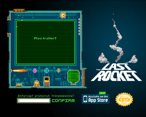
The Last Rocket
Telling a story has a lot to do with authenticity and staying true to one’s purpose. The Last Rocket is 8-bit at heart and conveys it well on its launch page.
Social Proof
Social proof (one of six “weapons of influence,” according to Robert Cialdini) can be a powerful and compelling way to get people to sign up for your service (or at least for the launch news). In a nutshell, the concept states that people will do what they see other people doing. We have seen this demonstrated with the viral invitation system used by Forkly and the social network-only system used by Connect.me. A complementary feature would be to showcase your sign-ups or Likes front and center on the home page.
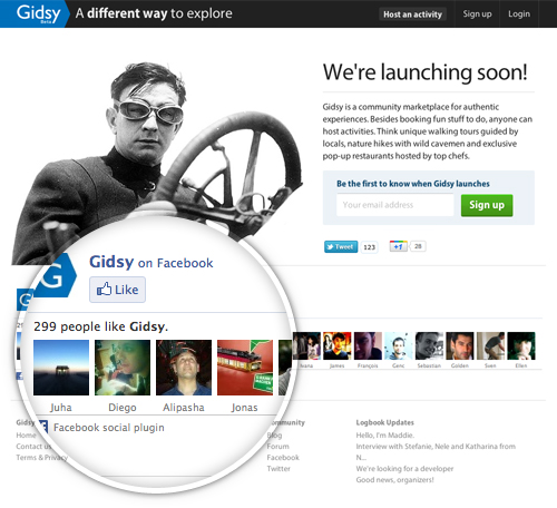
Gidsy
Gidsy is an online marketplace, and as such it needs the trust of the community. Therefore, the company shows the love it’s gotten from real users on its home page, along with two key elements: a few explanatory words, and a sign-up form with a call-to-action button. You’ll find a button labelled “Host an activity” in the header, although the service is not yet fully operational. By checking it out, however, a lot of people will be convinced to come back once it’s ready to go.
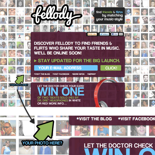
Fellody
Fellody has taken quite an interesting approach with social proof and exposure. If you’ve signed up and uploaded an image to your profile, the picture could be included in the background of the home page.
Fellody is a music social network with dating elements, so showing off its members to prospective users makes sense.
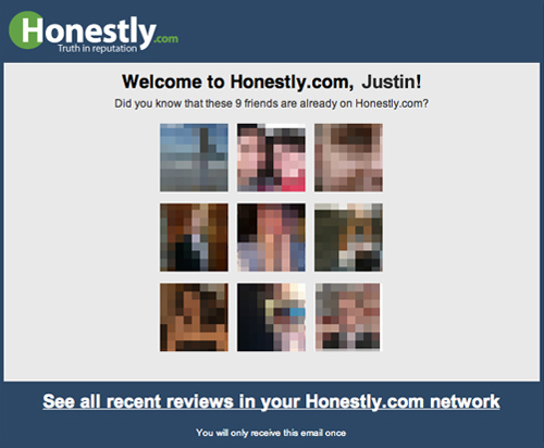
Honestly.com
Right after you sign up (through Facebook), Honestly.com sends you an email showing your friends who have already signed up. It establishes trust in those few moments after sign-up, while helping you find people you know on the service.
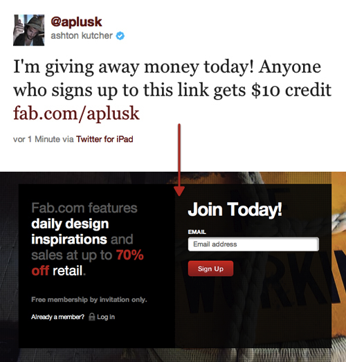
Fab
We saw earlier with Justin Bieber on Instagram how social proof from celebrities can create an instant surge in traffic and sign-ups. Ashton Kutcher, who actively invests in start-ups, knows this well. Whichever start-ups he invests in get not only funding but an instant push in visibility. Fab is a start-up that recently pivoted from Fabulis and has gotten funding from Kutcher among others. TechCrunch even did a celebrity endorsement face-off between him and Kevin Rose.
Sharable (i.e. Viral) Content
Another strategy for gaining traction ahead of launch is to create sharable or viral content. This could be anything that people want to consume and that solves a problem they have. (KISSmetrics covers the topic in depth on its blog.)
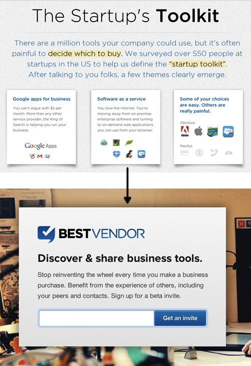
BestVendor
BestVendor shared a statistical document on its blog (“The Startup’s Toolkit”) that was picked up widely in the blogosphere and start-up world, which is exactly the market it is targeting. Its launch page, however, is a simple sign-up form for collecting email addresses.
Visual.ly
Visual.ly spread around its video explaining what its service is about, along with its “Coming soon” page. The video was well done and for that reason was shared by others.
A good video is enough to get attention.
Fake Readiness And Skip “Coming Soon” Altogether
Recently, doubt has been cast on the effectiveness of these viral launch strategies. Some of the criticism questions how much a sign-up is worth if people don’t really know what they’re signing up for. Turning someone who has signed up into a user after launch could prove very hard. So, you could skip the “Coming soon” approach entirely and make it look like you’re ready for users to sign up. Make the launch page look like an actual landing page for your product.
By skipping the “Coming soon” page, you can test your idea on visitors directly. The goal is still to get as many sign-ups as possible, but in the process you are gaining validated insights into your start-up. Is your page ready, but no one is giving you their address? That’s a good sign that you need to clarify your vision.
Joel Gascoigne, who launched his start-up Buffer that way, has this to say:
“Treat your idea as a hypothesis that needs rigorous testing, and treat the emails as people who are happy for you to get in touch to discuss your product idea further in order to validate that it would solve a real problem for them and that they might actually pay. I don’t think the idea of having a conversation with the people who give you their email comes into the minds of new start-up founders enough.”
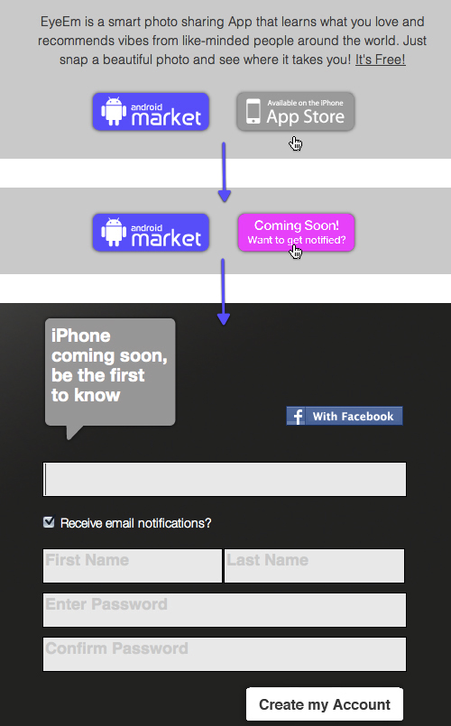
EyeEm
EyeEm currently has an Android app out in the wild. And if you browse the company’s landing page, you might assume that the iPhone app is ready to download, too. But if you hover over the iTunes button, it lets you know that it’s “Coming soon,” and then you can leave your email address on the dedicated iPhone launch page. You sign up for an email notification by setting up an account, so once the app is out, you’re already registered and ready to use the product (you will no longer see this, since the launch has now been done).
The OpenFeint Bluff
The developers behind OpenFeint, the social gaming network for iPhone, started with a bluff. They sent a press release to TechCrunch and got the blog to cover the story, which claimed that they were almost done and would be releasing the product soon. Only after many people signed up did they decide that building out the concept was worthwhile; till then, they had not written a single line of code. So, they worked away at it for 45 days straight. The company later sold for $104 million.
Websites That Respond To Visitors
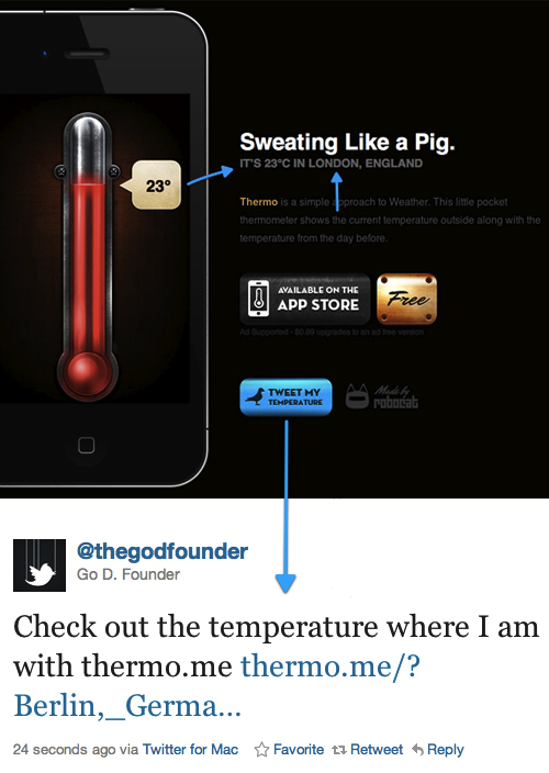
Thermo
Thermo, the landing page for an iPhone “pocket thermometer,” does a great job of telling you what the app does and being responsive to you. It tracks your location, fetches the temperature there and then displays it in a graphic on the left. Moreover, the developers allow you to tweet the results (not unlike what Shuush does), thus gaining even more exposure.
Sign-Ups As A Qualifier
Joel Gascoine proposes taking the conversation with prospective users to the logical next step. Whenever someone signs up or tries to sign up, you could give them a few questions to answer. There’s a thin line, though, between annoying visitors (and thus driving them away) and making them feel valued.
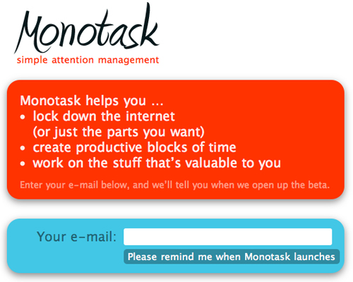
Monotask
Monotask asks subscribers key questions that will immediately inform its product decisions before launch.
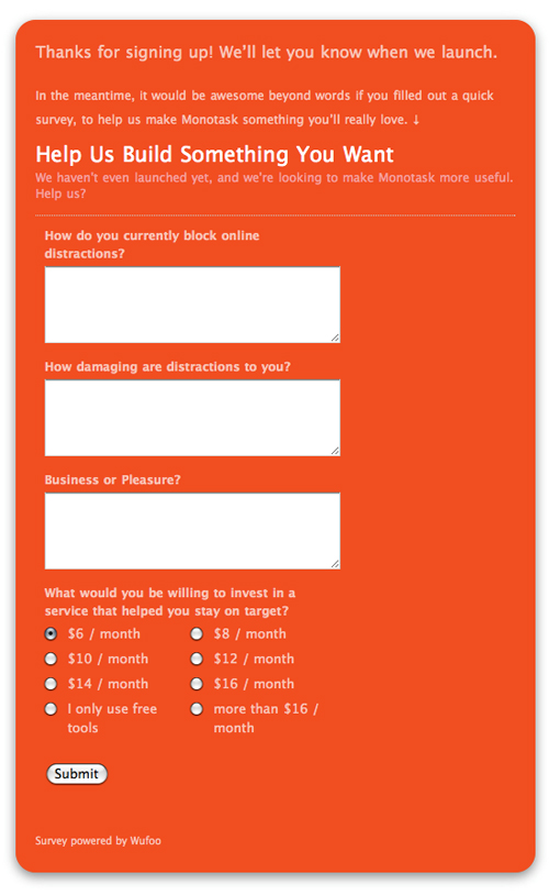
Joshua Porter analyzes Monotask’s implementation more in depth in this article “Using Your Sign-Up Form as a Qualifier.”
Make It Easy For People To Love You
The last and simplest advice is this: make it easy for people to love you. This love could be for any number of things: your design, your ideas, your approach. Or perhaps they just love that you make their lives easier in some way. Visitors will always reward you for that.
Akismet
One detail on Akismet’s home page is a good example of making people’s lives easier. When you right-click its logo, a window opens that asks you, “Looking for the Akismet logo?,” followed by links to download it. How many bloggers and journalists try to copy logos into their articles? I don’t know how many, but everyone will love you for such attention to detail and for making their life a little easier.
Conclusion
The strategies listed above provide a glimpse of how launch pages could be made more intriguing and shareable. Many of the start-ups we’ve analyzed have made use of various strategies to grow their numbers. Most importantly they built a service that people were interested in and they managed to share their vision among the right people making use of the viral loop.
But the list is by no means exhaustive and certainly the launch page was not the only reason the services took off. A well thought out placement in blogs, social media and among friends is often a necessary accompanying move. However: the launch page is always the first thing a potential user sees of a new idea and it would be wise to cater for the best possible conversion right there.
And Now It’s Your Turn…
Which launch pages have you recently given up your email address for? Are there other tools you use to launch your web projects that you have not seen in this article? Feel free to share your thoughts with the community in the comments section below!
Articles and Galleries
- Designing ‘Coming Soon’ Pages
Tips on designing a good “Coming Soon” page. - Beta List
A list of websites in beta. - StartupLi.st
A list of early-stage start-ups. - TheGodfounder
Blog with many examples of viral mechanisms - “I’ve Noticed a Major Flaw With Viral Coming Soon Pages,”
Takara Swoopes With follow-up discussion on Hacker News: 1, 2, 3. - “How I Grew a Waiting List of 20,000+ at Mint.com,” Noah Kagan
- “What’s the Best Launch Strategy for a Web Startup?,” Quora
- “What Are Some Good Ways to Drive Traffic to the Email Sign-up Landing Page Before Launch?,” Quora
- “Which Are the Best Startup Home Pages?,” Quora
- “Viral Marketing: This Always Works,” Andy Sernovitz
- “Why Social Proof Matters to Your Startup,” Dan Shipper
Tools
- Prefinery, KickoffLabs
Outsource your beta and “Launching soon” process. - Launchlist
Launchlist helps designers and developers check their work before exposing it to the world. - Launch Effect
A slick WordPress launch theme mimicking many of LaunchRock’s features. - LaunchPad (for “domain parking”), Placeholder, Holding Pattern, Apz (for mobile apps)
WordPress themes for tweaking your launch page.
Disclaimer: I know two of the mentioned start-ups’ founders personally.
Further Reading
- Strategies For Effective Mobile Landing Pages
- Key Ingredients To Make Your App Go Viral
- Smart, Effective Strategies To Design Marketing Campaigns


