A Fun Approach To Creating More Successful Websites
But one goal we have for all of our projects is that we want them to make an impression on people — we want the websites that we create to be memorable.
A fun experience is often an enjoyable one and an enjoyable experience is usually a memorable one. Therefore, it stands to reason that one of the ways to create a memorable experience is to make it a fun experience. In this article, we’ll take a look at how adding a bit of “fun” into the mix can help us produce more engaging, and hopefully more successful, websites.
Further Reading on SmashingMag:
- Strategic Design: 6 Steps For Building Successful Websites
- 10 Steps To The Perfect Portfolio Website
- 10 Harsh Truths About Corporate Websites
- Why Transitions Are Important
The Fun Theory
Some time ago, I was sent a link to a Volkswagen sponsored project called The Fun Theory. This website featured a contest where users could redesign or rethink something they encounter in everyday life — adding some “fun’” into it. The purpose was to see if they could get more people to use it simply because it was enjoyable to do so.
While there are a number of great videos on the site, the one that I love the most is called Piano Staircase. In this video, an experiment takes place with a flight of stairs in a subway station. Beside the stairs is an escalator. As I am sure you can guess, far more people would use the escalator, rather than the stairs, during their daily commute.
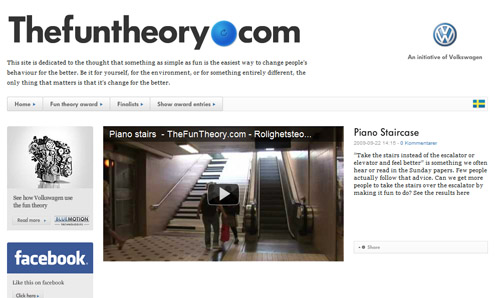
Volkswagen’s “The Fun Theory” website challenges people to redesign something they encounter in everyday life by adding “fun” into it, and to see if more people will then use it.
One evening, while the station was closed, the steps were turned into giant piano keys that would make a sound when they were stepped on. As commuters exited the station the next day, they were greeted with this giant piano staircase and many of them opted to try it instead of using the escalator. In fact, 66% more people than normal used the stairs while the installation was in place — an amazing increase by anyone’s standards.
Adding Fun To Our Websites
When I saw this video, the first thing I thought about was how applicable the lesson of adding fun is to the work we do as Web professionals.
By using fun to create an enjoyable user experience, we can offer people a delightful experience that they will not only remember, but one that they may tell others about as well.
Let’s Define “Fun”
Perhaps I should back up a bit and explain what I mean by fun. I am not suggesting you turn your client’s website into a circus production (unless, of course, your client is a circus). I am simply suggesting that changes and additions that add a bit of fun into the interactions or elements of a design can go a long way in helping the websites you develop become more enjoyable to use, and more memorable overall.
“Fun” is not the same as “silly”. You can add a layer of delight and enjoyment to the user experience without making your client seem childish or unprofessional. The trick is knowing how much fun to add, where best to add it, and when to recognize that you’ve gone too far.
Let’s look at some examples of websites that do a great job of using fun to create both enjoyable and memorable experiences for their users.
Improving On The Ordinary
There are many pages common to almost all websites. By taking a typical website page or experience (such as the “about us” page, or contact form), and making it fun and memorable, you can set that website apart by improving on the ordinary.
Take that aforementioned “about us” page, a fixture on pretty much any website. Mutant Labs, a UK based design and development firm, do a great job of adding a sense of fun and personality to what too often becomes nothing more than a boring company bio page.
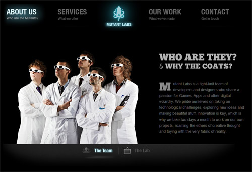
Mutant Labs adds a fun sense of personality to the typical “about us” page. Scroll over the team members to see even more fun!
The website for Get Satisfaction does a wonderful job of turning the typical “case studies” page into an interactive experience with their “Wheel of Satisfaction.”
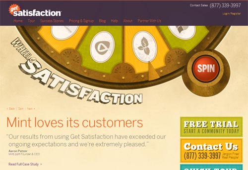
The “Wheel of Satisfaction” is a fun twist on the typical case studies page.
How about the “contact us’” page? When was the last time you built a site that didn’t have one of those? English Workshop, “an organisation which provides English language learning opportunities”, styles their simple contact form to look like a machine’s control panel, tying it in nicely to the website’s “workshop” theme.
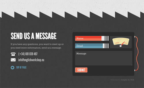
English Workshop’s “contact us” form works great alongside the rest of the design elements from the website’s workshop theme.
Smashing Magazine’s own contact page is also an example of a fun approach. The page is fun from top to bottom, with a lighthearted, informal tone for the page’s greeting (“Hello. Let’s talk.”) as well as questions, and cartoon representations of Smashing’s management team.
By taking the common pages of a website, and finding ways to add fun to what would otherwise be a typical experience, you can instead create a unique and memorable impression upon your sites’ visitors.
Frustration = Fun?
Another page typical to most websites is the “404 error” page. By adding something new to this page and showing some personality, you can help diffuse an otherwise frustrating situation. You can see some great examples of humorous and effective 404 error pages in a previous Smashing Magazine article.
In addition to a humorous, frustration-diffusing message, a good 404 error page can also include links to key pages of the website that users are most likely looking for. Done correctly, you can make your user smile, and help them find their way back to the content they will find valuable.
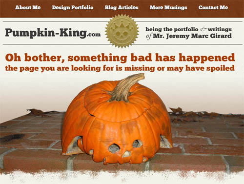
Practicing what I preach with a fun 404 error page on my personal website.
Searching For Fun
While Google may be best known for their search results, the fun that they often have in delivering those results is an important part of the Google experience.
First, you have the whimsical Google “doodles” that appear in place of the company logo on specific days. These doodles range from simple graphics to fully interactive experiences, such as a playable Pac Man game, or the tribute to guitar legend Les Paul. There are also a host of hidden gems that can be found on Google by searching for specific phrases or terms. Search for the word “askew” in a browser that supports the feature (Chrome, Safari, Firefox) and the screen will literally skew itself for you. Using Google Maps, you can search for walking directions from “The Shire” to “Mordor” to get a funny little warning that “one simply does not walk into Mordor.” There are dozens of hidden gems like this baked right into Google.
The reason Google is so effective in the fun they add is because they make that fun unobtrusive to the rest of the experience. Google puts the fun out there for you if you want it, but access to the service itself is never compromised. This is a critical key to successfully adding fun to a project — make sure it does not interfere with the normal features or purpose of the site itself.
An Over-The-Top Approach To Using Fun
One of the challenges with adding fun to websites is knowing when to stop. The right amount of fun can create a memorable experience, but too much can have the opposite effect, driving users away due to an over-the-top approach. Still, there are times when “too much” is the right amount, and when an over-the-top approach really works for both the brand and the website.
CaptainDash.com uses fun illustrations and interactions throughout their website, including a comic book-like layout for their “What We Solve” section. The experience is enjoyable and unique, and the website screams personality. But even after exploring their website for a few minutes, I found it hard to explain exactly what the company does with any kind of certainty. This is one of the potential pitfalls of going all out with a fun experience — your website still needs to quickly answer the fundamental user question of “what does this company do?”.
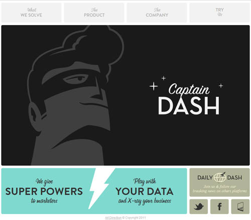
“Captain Dash” features a fun experience, but the purpose of the company is tough to uncover with all that personality.
Meomi.com is another site that goes all out in adding fun to their website experience. The website’s entire design is filled with fun characters that move and respond as you scroll over them. The overall experience is one filled with discovery and delight as you explore. I am especially fond of the website’s footer and what lurks behind those trees (go and see for yourself). I also love the fact that as busy as the site is, I quickly knew what it was about due to the tagline placed towards the top of the page — “A little design studio dedicated to play, delight, and goodliness.” Mission accomplished!
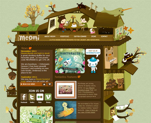
The experience on Meomi.com is filled with delightful surprises for you to uncover as you explore the interface.
Another great example of a website that is from top-to-bottom fun (while still making it easy to discover what the website is all about) is Two Giraffes. On the website’s home page, a sign hangs upon a wall that reads: “We design fresh interfaces backed by serious code”, clearly stating the company’s offerings while staying true to the fun environment they have created for the entire website.
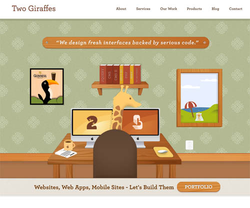
“Two Giraffes” does a great job of clearly stating what the company does while staying true to the fun environment that spans the entire website.
Using an over-the-top approach on a website can have it’s risks, but if done correctly, it can also have its rewards — creating an experience that is enjoyable and memorable from start to finish.
Making Your Message Memorable
The design of a great website will support that website’s overall message or purpose. Therefore, we can strive to use a fun approach to create not only a memorable experience, but a memorable message.
The website for the Converge conference boasts that it will “peel back the layers and examine the intersection between design, development and marketing.” The website’s design is immediately striking with its use of a cyborg Tyrannosaurus Rex, but the fun really begins when you scroll down the page; the dinosaur remains, but building on the website’s “peel back” theme, you begin to get to the meat of the content — literally!
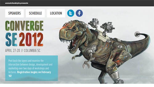
Scroll down the page for the Converge conference’s website to get to the meat of the content — literally!
Seamco’s website states that they build “efficient bottling and packaging lines for liquid products.” The website reinforces this message by integrating a wonderful animation of bottling line efficiency. From the top of the website’s design (where the bottling begins) all the way to the bottom (where a delivery truck makes frequent trips to deliver cases of the product being added to it), the entire website is both fun and memorable in service of the website’s main message.
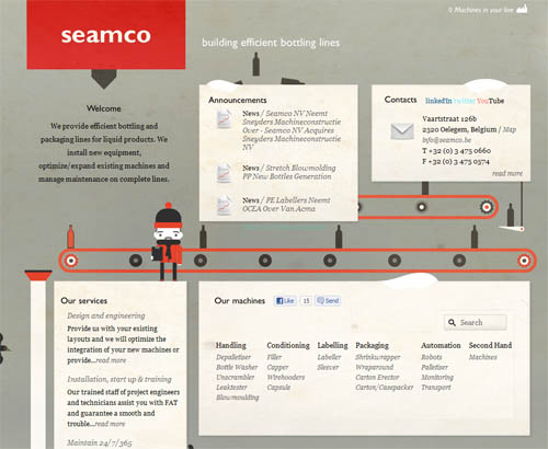
Seamco’s website reinforces their main message through a fun animation that spans the entire design.
Storytelling And Fun
Another way to get a website’s message across is through storytelling — and a fun approach can help ensure that the story you tell is a memorable one.
The website for the Combine conference uses the location of “America’s heartland” in Indiana to tell a fun story that transpires as you start to scroll from the top of the website… a farm machine works in a field as a giant ear of corn is being pumped full of radioactivity, into the middle of the page — where the radioactive corn begins a rampage of destruction, to the… well, I don’t want to ruin the fun. Visit the website and see the story for yourself!
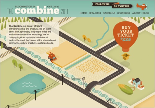
The website for the Combine conference uses storytelling to tell the tale of a rampaging, radioactive ear of corn.
Another great website that uses storytelling is one that details the Bright Future of Car Sharing. Presented with vertical navigation, you can use your keyboards’ arrow keys to “drive” through the website’s scenery and learn more about car sharing. Along the way, there are dozens of elements that you can scroll over or click on to learn more about, accessing extra content, while the website’s message is told in an engaging and interactive way.
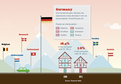
“The Bright Future of Car Sharing” as told through a fun, interactive website experience.
Some Websites Cannot Be Fun… Or Can They?
When I talk to fellow Web designers about the benefits of adding fun to the websites they are creating, the argument I most often get against this practice is that the projects they are working on have no place for fun.
Yes, it’s true that there are projects where adding “fun” is a tough sell, but sometimes even websites that don’t instantly lend themselves to a fun approach can be made more effective by using the same principals covered in this articles’ previous examples.
SlaveryFootprint.org is a website that “allows consumers to visualize how their consumption habits are linked to modern day slavery”. It definitely doesn’t sound like a place where “fun” would work, but if you visit the website and select the red “what?” arrow, the experience begins. Scroll down the page and illustrations of colorful, cartoonish hands add pieces of content to the page one block at a time as the website’s message is told. That message ends with a prompt to “take the survey”, and the same methods used for that initial message — cartoonish illustrations, a sense of anticipation, and fun interactivity — turn what would’ve been a simple Web form into a memorable and powerful experience.
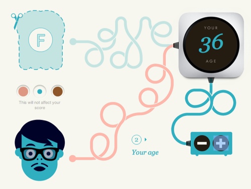
“Slavery Footprint” uses illustrations and fun interactions to make a point about a very serious topic.
Another good example of a serious topic presented online is the Dangers of Fracking. It uses many of these same techniques and principals, including the “storytelling” approach, that was previously highlighted. The website uses illustrations and storytelling to detail the process and effect of hydraulic fracturing — essentially creating an interactive infographic in the process. The result is an experience that delivers this message in a much more effective way than any simple paragraphs or static graphics could ever do.
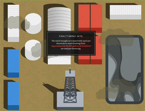
By creating an interactive infographic, the “Dangers of Fracking” uses illustration and storytelling to get their message out in a memorable way.
There are certainly websites whose sensitive subject matter will make it difficult to add fun into the mix. But as these next two examples show, you can use many of the same solutions that other “fun” websites use to create a memorable experience without jeopardizing the seriousness or importance of your message.
Designing For Emotion
In his excellent book Designing for Emotion, Aarron Walter illustrates the benefits (and potential pitfalls) of emotional design. The book covers designing for a range of emotions; including trust, hope, surprise, delight — even love. And many of the examples offered use a bit of fun to elicit these emotions.
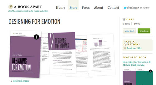
Many of the examples in Aarron Walter’s “Designing for Emotion” use a bit of fun to elicit the appropriate emotional response.
A selection from early on in the book provides an excellent call to action for using emotional design in the Web experiences we create:
“We’ve been designing usable interfaces, which is like a chef cooking edible food. Certainly we all want to eat edible foods with nutritional value, but we also crave flavor. Why do we settle for usable when we can make interfaces both usable and pleasurable?”
Designing The Memorable
A Web experience that is simply “usable” is no more memorable than a meal that is merely edible. Just like a master chef strives to create a menu that is truly exceptional, so should we, as Web professionals — endeavor to design and develop experiences and interfaces that are unforgettable. Hopefully this article has shown that one of the ways this can be achieved is by adding a bit of fun to the projects we are designing.
Whether you are firing up Photoshop to work on that new design, or building website templates with HTML and CSS, I encourage you to consider the examples and lessons shown in this article. You want to create amazing and memorable experiences? Try following a simple piece of advice:
Have some fun.


 Claim Your Free Spot!

 Celebrating 10 million developers
 SurveyJS: White-Label Survey Solution for Your JS App


