Respect Thy Typography

Email Newsletter
Weekly tips on front-end & UX.
Trusted by 182,000+ folks.


 Celebrating 10 million developers

 Custom Web Forms for Angular, React, & Vue. Your backend.
Good typography shouldn’t have to rely on ornamental crutches to stand tall. Yet despite all the tools and knowledge available to us, we readily embrace a flourishing, decorative typography, with cheap tricks used in a misguided attempt to make it “pop”. This ancient art may rapidly be gaining popularity, but are we paying it the respect it deserves?
Take a snapshot of the visual culture that surrounds you—magazines, movie posters, packaging, websites—how much of it relies on typography? How much of the typography around you is actually well considered? Chances are you’ll find a handful of beautifully crafted typographical designs competing with an avalanche of visually “rich”, image-heavy creations. Typography is then relegated to the role of “necessary evil” in order to display text, or ill-considered typographic pieces, where the meaning of MS WordArt has been interpreted a smidgen too literally… Why?
Further Reading on SmashingMag:
- Why Subtle Typographic Choices Make All The Difference
- Understanding The Difference Between Type And Lettering
- Mind Your En And Em Dashes: Typographic Etiquette
- Writing Systems And Calligraphy Of The World
Looking Back
It’s fair to say that the global webdesign community is experiencing a typographical renaissance. Revolutionary technologies like Typekit, Fontdeck, the introduction of the @font-face tag, and online licensing for professional typefaces are all encouraging type enthusiasts around the Web to transcend the shackles of common type. Furthermore, clever use of CSS and JavaScript are allowing us to mimic a range of typesetting techniques (though admittedly some basic typographical controls are still frustratingly infantile).
But with such power comes great responsibility. And even though modern tools give us the opportunity to do so many things, doing a great deal of these things isn’t always a recipe for beautiful design. Just because we have many options opening up to us doesn’t mean we need to employ every single one of them in the hope of developing a design that stands out—and most likely for all the wrong reasons.
That’s not to say typographic design can’t be ornamental, complex or even illustrative. But centuries of working with movable type has left us with principles on which to base our typography, and it’s our duty as designers to understand them (at least if we’re aiming to break them). A good place to start is to look at what those who came before us have done—even the briefest throwback into the annals of typography and design history will help.
Consider Milton Glaser’s “I love New York” logo from 1977, commissioned as part of a marketing campaign by the New York State Department of Commerce. Glaser, who did the work pro-bono, wisely avoided skylines, figures of people holding hands, or flowery ornaments by using only a simple heart shape to represent the key word of the mark: love. We all know the subsequent success of the logo, as it has been brandished on millions of white t-shirts, inspiring countless knock-offs since its inception.
And if the heart-symbol of Glaser’s work seems too pictorial in this context, how about Robert Indiana’s “Love” sculpture? Originally created for a Museum of Modern Art Christmas card in 1964, this iconic piece of type shuns imagery altogether, relying only on the power of letterforms (arguably based on Clarendon) to ignite our compassion.
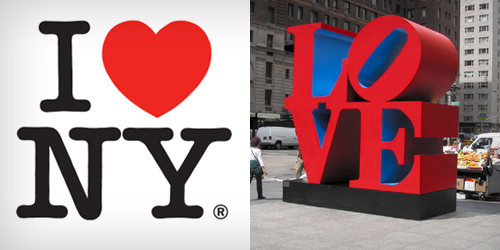
Lovely examples of modern typographic icons.

Milton Glaser’s post-9⁄11 update of his own masterpiece.
Of course, this kind of admiration for type didn’t just start with 60’s advertising. Typography is a craft going back thousands of years—to the birth of writing, if you wished to go deep enough—and has evolved and developed a great deal since that time. Theories have been postulated and developed as to how to best communicate through letterforms, especially when an idea needs to be transmitted as easily as possible. As Bringhurst explains while introducing the first chapter of his timeless “The Elements of Typographic Style”: Typography exists to honor content.
Beatrice Warde’s well known essay “The Crystal Goblet” beautifully explains the role of the typographer and his or her type, and she reinforced this point during an address given in 1930 to the British Typographers Guild in London. Advocating the idea that type was not there to be admired, or even noticed, that it existed only with the purpose of communicating an idea, she proclaimed; “I have a book at home of which I have no visual recollection whatever as far as its typography goes; when I think of it, all I see is the Three Musketeers and their comrades swaggering up and down the streets of Paris.” I wonder how many us have the same consideration for content when we browse through MyFonts or Typekit in search of the perfect typeface.
One of the many great designers who echoed Warde’s ethos was Jan Tschichold. His most well-known work is found in the legacy he created during his time working for Penguin (1947-1949), refining and redesigning the former book covers and creating the rulebook for the Penguin covers that followed him.
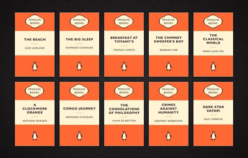
Notice the absence of decorative elements in this series of Penguin covers by Tschichold.
Looking at these covers one will see that the focus is unequivocally on the communication of a book’s title and author, and the result is truly magnificent. The covers are not beautiful because of particular ornaments or images, or even the individual shapes of the letters, but for their clarity of message. It’s not by accident that a clarity of (and focus on) typography has stuck with Penguin until the present day, which is beautifully demonstrated by David Pearson’s designs for the “Great Ideas” series from 2004, 2005 and 2008.

Though the style may be different, the focus on typography still embodies the spirit of Tschichold.
Challenging The Rules
The approach advocated by modernist typographers is one of clarity and legibility. Scientific methods (let’s call it early “A/B testing”) were utilized in the quest to find the perfect typeface—not in terms of aesthetic, but rather efficiency for communicating—and rigid systems were developed to achieve ideal reading conditions. In the strictest sense, typographic beauty is not to be gained from the letters or ornaments themselves, but should come as a natural result from an “invisible” type that unselfishly honors the words and content.
However, movements of any kind invariably inspire counter-movements, and the modernist ethos was to be thoroughly challenged towards the end of the last century, most notably by David Carson (b. 1954), Peter Saville (b. 1955) and Neville Brody (b. 1957). While earlier designers sought to communicate the messages they were setting as clearly and cleanly as possible, these young contenders wished to push the boundaries of legibility and normality, so that the emotion and idea wasn’t delivered via what the words represented, but how the words were seen as objects separated from their meaning.
These three designers were to shape the face of contemporary typography with their groundbreaking work spanning magazines, newspapers, film titles (Carson and Brody) and record sleeves (Saville). They helped pioneer experimental typesetting in the 80’s and 90s’, throwing the modernist rulebook out the window, yet retaining the communicative authority for letters and words.
Nowadays it’s easy to argue that their use of type did indeed include a great deal of flourish and extras. But seen in the context of the post-modern era, it’s clear that this was not simply an attempt to “beautify” their work. On the contrary, the disrespect for clarity and to embrace “grunge” were design statements opposing the impersonal coldness of the modernist designers… they were adding emotion to the words they were communicating, which also reflected the cultural movement of the time.
Jan Tschichold might have turned in his grave at brash expressions such as these, but the power of typography seemed stronger than ever. Their work showed that there is an infinite number of ways that typography can be used to communicate a message.
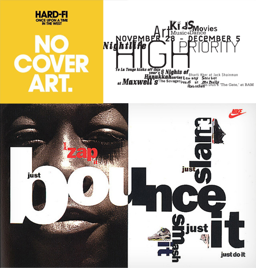
Clockwise from top left: Saville’s cover for Hard-Fi: Once Upon a Time in the West, Carson’s High Priority spread for NY magazine, Nike ad by Neville Brody.
The conscious tenet arising from such examples is an appreciation, by the designer, of how typography can be emotionally valuable. Each of the above examples evoke something—whether heartfelt, or slightly adrenalin pumping, it can be concluded that this is often the role of illustrative typography: to move the heart, and not just yell at the mind.
From Movable Type To Type That Moves
Regardless of the word count, the typographic experience can be as emotional as any pictorial masterpiece. This notion is beautifully exemplified by the “Coming Together” campaign for FontAid by The Society of Typographic Aficionados (SOTA) in support of relief efforts following the 2010 disaster in Haiti. The project—a font consisting of hundreds of ampersands designed by contemporary typographers—showed that despite the common saying that “a picture speaks a thousand words”, sometimes all you need is a handful of letters… or indeed, just a single character.
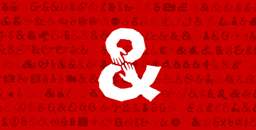
The “Coming Together” typeface shows us the power of a single character.
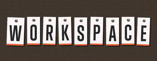
Other, less sentimental examples of moving (literal as well as metaphorical) type are masterfully displayed on the blog of Trent Walton, a true magician in terms of utilizing modern technologies to add depth to his typography. When spelling out the title Workspace, a particularly illustrative typographic treatment conjures up images of your very own—or perhaps your dad’s very own—workspace, complete with holes in the wall for hanging up indispensable tools (“I really needed that magnetic stud finder”).
In another example, Unitasking, the “I” in the headline doubles as an illuminated “1” when it is interacted with, emphasizing the message of the article. Granted, neither example can be described as “pure” typography. But note how the extensive use of technology with typographic tricks can be used to illustrate the message, infusing it with added emotion, rather than for decorative purposes.
Movable, interactive typography with nostalgic undertones.

Laborious use of CSS trickery adds value to the message.
Stefan Sagmeister is another designer (actually, another legend) fascinated by the concept of emotional typography and how design can touch our fellow human beings, and he’s unafraid to use unconventional means of communication. For a 1999 AIGA lecture poster he literally carved all the copy into his own body using a razor blade (well, his studio mate did the carving) before photographing himself, the result being so disturbingly powerful that it’s difficult to look away.
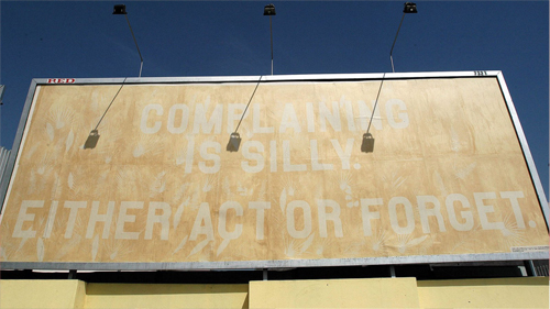
But it’s not all gore, of course. As part of his “Things I have learned” series he created a type-only billboard for Experimenta Lisbon, spelling out his message in capital letters: “Complaining is silly. Either act or forget”. Simple enough, right? Not quite. Using no ink what so ever, Sagmeister and his team created a gigantic stencil and exposed huge sheets of newsprint to the scorching sun over a period of weeks.
The letters (covered by the stencil) would remain white as the newsprint yellowed, and by the time the billboard went up the statement was easily read by onlookers. The subsequent effect was, as you may have deduced by now, that the letters would slowly fade away as the previously non-exposed newsprint would yellow to the same color as the background. Thus the message to “act or forget” was emotionally strengthened with every passing day.

Sometimes typography can be effective without trying to be beautiful.
Using the sun’s ultraviolet rays to slowly fade away the message.
At this point we’ve come a long way from the clear, simple typography of Tschichold. I’m sure many of you are questioning whether the latter examples, in comparison, rely too much on visual tricks to get their messages across. Indeed, I opened this article by challenging the over-use of ornaments and decoration in order to enhance our typography, and yet aren’t Walton’s and Sagmeister’s work examples of just that? Not quite.
Despite heavy use of non-typographic elements, there are no unnecessary flourishes to be found, nor are there any signs of unrelated decoration (though, to be pedantic, Walton’s use of surface textures may be superfluous). In truth, both designers are adding value by choosing techniques and expressions that purposefully match the content and create an emotional frame in which to deliver the message, thus highlighting it’s impact.
Contemporary experimentalists like Walton and Sagmeister might contradict traditional typographic principles, yet they play an important role in the global, ongoing design conversation by constantly discovering new and unconventional means for typographic expression.
Spread The Word. Literally.
In all honesty, type is not just movable, it has the power to move—and it’s up to us to carry this legacy forward and into the digital frontier, that is inevitably our future. By learning from past examples of excellence, we can challenge the status quo of mediocre typography and misplaced stock photography, and start to push things forward. We don’t always need to do too much (well written copy is, after all, your very best friend), and we certainly don’t have to use all the tools in our drawer every time.
But we can continuously look for new ways to add value, as long as we make sure our typography doesn’t communicate anything other than the intended message. Sometimes that means heavy use of CSS, making creative use of sunshine, or experimenting with size and position. Other times—perhaps most times—it means keeping things simple, letting the words do the talking and letting the typography work itself gently into the background.
Remember, despite the plethora of typographical tools we now have at our immediate disposal, we’re the latest chapter of a long history of typographic craftsmanship—typographers painstakingly arranged letters by hand for centuries before the computer (or even phototypesetting) came along. We should honor the hard work that has been put in by those who came before us. We can do this by recognizing typography as an essential part of our work (be it for Web or print), learn about the principles (especially if you’re aiming to break them) and consider all the factors that make for great communication through letterforms.
If right now you are thinking “but my boss will never let me do what Sagmeister does!“—don’t sweat it, most projects don’t allow for typographic experimentation. But that doesn’t mean you can’t hone your skills—there’s plenty to be gained from taking pride in the small things, and making sure you get the details right. If your brief dictates uninspiring imagery, put your effort and pride into perfecting the accompanying typography. Is the line-length appropriate? What about font-size, line-height, and hierarchical contrast? Does the typeface echo the sentiments of the message? Maybe if you get all the small things right, the bigger things will come easier once that suitable project comes your way.
So roll up those sleeves, consider the meaning of the words you’re setting, and pay some respect to the centuries of evolution behind the typeface you’re using today, and just as importantly, the craft of typography as a means of expression. By all means use images, but just remember that you don’t always have to—typography can be just as meaningful by itself, even without the alluring magic of word-art.
(jvb) (il)
A Thank You to our fabulous Typography editor, Alexander Charchar, for preparing this article.


