Not Just Pretty: Building Emotion Into Your Websites

Email Newsletter
Weekly tips on front-end & UX.
Trusted by 182,000+ folks.
 Register for Free
 Celebrating 10 million developers

 Custom Web Forms for Angular, React, & Vue. Your backend.

Emotional design has become a powerful tool in creating exceptional user experiences for websites. However, emotions did not use to play such an important role on the Web. Actually, they did not use to play any role at all; rather, they were drowned by a flood of rational functionality and efficiency.
We were so busy trying to adapt to the World Wide Web as a new medium that we lost sight of its full potential. Instead of using the Internet on our terms, we adapted to its technical and, at first, impersonal nature. If it wasn’t for visionary contemporaries such as Don Norman or Aarron Walter, we might still be focusing on improving processes, neglecting the potential of emotional design.
Further Reading on SmashingMag:
- The Personality Layer
- Redesigning With Personality
- Designing For Emotion With Hover Effects
- Give Your Website Soul With Emotionally Intelligent Interactions
In his book Emotional Design, Norman describes why “attractive things work better.” He explains how attractive products trigger our creativity and ultimately expand our mental processes, making us more tolerant of minor difficulties. What he is saying is that attractive products make problem-solving easier, which makes them absolutely essential. Emotional Design is Norman’s reaction to critics who said that if they followed his rules, their designs would be only functional but ugly. So, he conducted the necessary research and came up with three levels of visual design that all need to be considered in order for a design to be both usable and pretty.
User experience designer Aarron Walter contributed another great book to this new era of design: Designing for Emotion. In this book, he defines emotions as the “lingua franca of humanity,” the native tongue that every human is born with. He describes how important emotional experiences are because they make a profound imprint on our long-term memory and create “an experience for users that makes them feel like there’s a person, not a machine, at the other end of the connection”.
Norman and Walter have recognized that emotions are key to the full potential of contemporary Web design. Let’s follow their example and learn how we can contribute to a more personal, more targeted and more emotional World Wide Web.
In this article, we’ll recap the foundation of a good design, take a look at Norman’s three levels of visual design and introduce practical ways to build emotion into a website.

(Image credits: perpetualplum. and geishaboy500)
Foundation Of Good Design
A couple of things form the foundation of any good design, whether the design is emotional or not. Why are we talking about the foundation of a design here? Think of the construction of a house. First, you need a solid foundation; then, you can start to plan the division of space and build walls. In Web design it’s the same; you need to know your internal design goals, who your users are and in what context they will use your website. Once this groundwork is done, you can get started on the design.
Internal Design Goals
Before you get started on anything, ask yourself what your own goals are. This does not mean you should put yourself at the center of attention for the rest of the process, but it is important to know what image you want to communicate, what your values and visions are, and how you want others to see you. With this knowledge at hand, you are armed to be very clear and consistent not only in your actions, but also in your appearance. A certain amount of continuity and predictability adds to your reliability, which is important for getting people to commit to a relationship with you.
Prospective Users
Know who you are designing for. Your future users will be the people who purchase and use your product or website, so make sure you know what they want. General demographics will give you a rough picture of who you are targeting. By drawing a clear picture of their goals, how they are going to use your website, and what matters and doesn’t matter to them, you will learn how to target your users. Without knowing your prospective users, designing something relevant that is both usable and pleasurable will be quite tricky.
Context of Use
Finally, think about the context of use. Knowing the situations and circumstances in which users will be visiting your website is valuable. Consider possible emotions that might be involved, and find out which role you and your users play. Be aware that knowing the context of use will make it easier for you to understand your users the moment they visit your website. It will help you reach out to your customers and to communicate with them more effectively.
Norman’s Three Levels Of Visual Design
Norman has identified three levels of visual design that designers can apply to build emotions into their products. These three levels are based on the way our brains function and can be seen as guide to a more appealing, effective, pleasurable and memorable design.
In a study on emotion that Norman conducted together with two colleagues from Northwestern University, they were able to show that different levels in our brain result in very specific and advanced human attributes. Those levels are the reason why we are able to accomplish and create things; why we can be artists, musicians and writers; why we have culture with language, art, humor and music; why we are conscious of our role in the world, a consciousness that enables us to reflect on our experiences. The three cognitive levels Norman has defined and applied to visual design are the visceral, behavioral and reflective levels. Let’s look at them one by one.
Visceral Level
The first and also lowest level is visceral. This is the level of preconsciousness, where emotional signals from our environment get interpreted automatically. The visceral level works instinctively, and both our personality and cultural values can influence how we perceive something. Impressions at this level have an immediate emotional impact on us. Norman calls activities that are initiated from the visceral level “bottom-up behavior.”
For a visual design, this means that the visceral level has to do with the initial impact of the appearance, touch and feel. The visceral quality of a design can be studied by observing people’s first impression. A good visceral design makes us feel at least something, hopefully making us happy and ideally getting us excited.
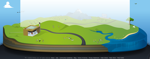
Vimeo has an appealing footer. The design has no other function than to catch people’s attention. (Image: mattyschreck)
Behavioral Level
The behavioral level is all about how things work and how we use and experience them. What matters on this level is function, performance and the physical feel of something.
A visual design would need to feature relevant functions that fulfill actual needs. Behavioral design needs to be understandable and usable. While confusion and frustration lead to negative emotions, fun, ease of use and effectiveness trigger positive emotions. To ensure a good behavioral design, you have to really know your user’s needs — for example, by observing how they interact with the design in the field.
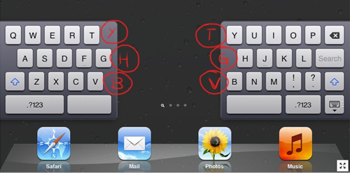
The iPad’s split keyboard has phantom buttons. This way, if you are used to typing the letter Y with your left hand, you can still do it. (Image: Finer Things in iOS)
Reflective Level
The reflective level represents the highest level of our cognitive thought processes. Norman calls activities that come from this level “top-down behavior.” This level is conscious and capable of a high level of feelings, emotions and cognition. On the reflective level, we interpret and understand things, we reason about the world, and we reflect on ourselves. The reflective level sets in after having been exercised, and it dominates the other two levels, which means that through extensive reasoning, we can overrule both automated behavior and emotional impact.
In visual design, expertise enables us to respond differently to a design than if we had no idea what we are looking at. The reflective design defines our overall impression of a product, since we reflect on all aspects of it: messages sent, cultural aspects, the meaning of the product and whether it’s worth remembering.
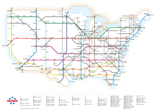
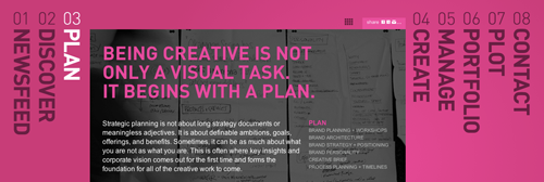
US highways mapped like a subway system. This infographic has a great reflective design. (Image: Cameron Booth).
In every good design, all three levels work together. The need not be equally weighted, but because we perceive a visual design on all three cognitive levels, they should all at least be addressed. These different levels of visual design might conflict, though. For example, our opinion of a design after having thought about it might diverge from our initial impression of it. Also, people interpret designs differently and have different preferences for the visceral, behavioral and reflective qualities of a design.
So, the appearance of a design makes up only one level of visual design — the visceral design. The behavioral level relates to how the product works, and the reflective level relates to the long-term impact of the design. Combining these three levels in the right way, you can make a design…
- Appealing. Grab the user’s attention and influence their perception.
- Effective. Guide the user’s attention and make sure they find what they are looking for.
- Pleasurable. Allow the user to appreciate your website and have fun.
- Memorable. Build a relationship with the user and ensure a positive memory of you.
Implement Emotion In Your Visual Design
How can Web designers apply this knowledge? And how can we build emotions into our designs? A website usually includes several elements that can make a design more personal and that can be regarded as “emotion carriers.” Some of these are obvious, such as colors, images and shapes. Others are not so obvious, such as humor, recognition, dissonance, tone of voice and engagement. Let’s look at the less obvious ones.
Humor
Humor is an effective way to connect with people. A good laugh or even a little smile can break the ice and make people feel comfortable, whether it’s on the street, in the company of friends or on your website. However, humor is also a delicate matter because it is extremely difficult to generalize. What’s hilarious for one person might be ridiculous, embarrassing or even insulting to someone else.
When using humor on your website, think a couple of things through before launching. The foundation of design that was discussed earlier is important here. Knowing your users and the context of use will help you determine whether people will actually share your sense of funny. Also, keep in mind that you will probably not manage to make everyone smile, but avoid making people feel uncomfortable and especially offending them by any means. And don’t forget that the extent of humor on your website will influence the way users perceive you.
In Designing for Emotion Walter discusses an illustrative example of humor on the Web: Freddie von Chimpenheimer, the cartoon mascot of MailChimp. Walter describes Freddie as a friendly mascot who “welcomes users and makes them feel at home.” Freddie perfectly mirrors the brand’s traits, such as trustworthiness, simplicity and informality, without making the whole website look goofy. The mascot works because Freddie cracks jokes that “you can share with your mama,” but at the same time he never gets in the way of your workflow. This is important. Humor can get people involved, but it should never annoy visitors.

Freddie, the cartoon mascot of MailChimp, is a great emotion carrier for humor.
Recognition
By nature, we constantly seek emotional connections with others. That’s why we like to see images of faces on websites, and why we appreciate somehow recognizing ourselves. When we see a face, we are automatically triggered to feel something or to empathize with that person. If we recognize content on a website — such as a problem, dilemma, habit or whatever else — we feel connected and understood.
Walter explains in his book that we know ourselves so well that we try to relate everything we see to ourselves. We can even relate to a Web design that does not directly show human features. The recognition of our body’s proportions in a design is enough for us to perceive the design as being familiar and harmonic. This reason for this is the golden ratio, which helps us feel connected to a design because we link the abstract concept of proportion to our own body.
By recognizing ourselves in a design, we sense that there is more than just a screen with a bunch of code and images. We perceive human presence, which makes us feel comfortable and connected. Walter describes the personality of a website as the key to making a design more human.
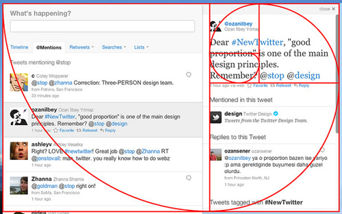
Twitter based its redesign entirely on the golden ratio. (Image: Doug Bowman)
Dissonance
Another trait that characterizes us as humans is that we try to fit the world into patterns. Patterns help us understand and learn how things work, and they give us an idea of what to expect — and we love to know what to expect, because it makes us feel comfortable. In his article “Brains Agree: The Case for Website Usability Guidelines,” Todd Follansbee offers a great explanation of why we love patterns so much and of how we look for them on the Web just like everywhere else.
Usability guidelines are based on a deep understanding of how information is processed in our brains. Following these guidelines in Web design helps us offer users a consistent structure that they can fit into their mental models. As long as users recognize patterns on a website and find that everything matches their expectations, they can focus on the content and quickly achieve their goals.
However, if we build a website that doesn’t fit these patterns, we can expect two things to happen. Either users will become irritated because they can’t find what they are looking for; this might lead to frustration, which you want to avoid by any means. Or else users won’t mind being pulled out of their habits and would welcome some distraction; they might see the dissonance with their expectations as a positive or fun experience.
Again, how people react depends strongly on who they are and the context in which they use your website. If you know that visitors intend to find certain information, make sure to meet their expectations and stick with patterns they are familiar with. If you expect users to have the time and desire to explore, you can definitely play with some dissonance to get their attention and get them involved.
The branding firm Subplot has a clear layout for its website, but the navigation is fun and out of the ordinary; it engages people, while still being easy to use.
Tone of Voice
The tone of voice you use on your website is an important emotional factor. How you communicate with users says a lot about your relationship with them. While you communicate certain messages through words, your tone of voice reveals what you think of them and also what you want them to think of you. The psychologist Friedemann Schulz von Thun illustrated these different layers of a message in his “four-sides” model of communication.
Your tone of voice strongly determines your first impression. If you wrap a serious message in a humorous story, users might not take you seriously. On the other hand, if you try to sell something fun and your tone of voice is too serious, users might not take you seriously either.
For your own website, know what you are selling, who is buying it and the context in which you are delivering the message.
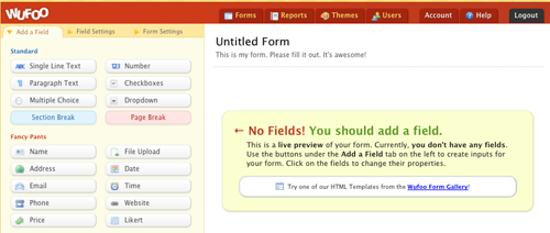
Wufoo creates a distinctive environment for conducting surveys through its tone of voice.
Engagement
A perfectly usable and accessible website could still have a high bounce rate, a low number of sign-ups, or no characteristics worth remembering. In his presentation on “The Art and Science of Seductive Interactions,” Stephen Anderson shows how engaging people helps us build relationships and positive user experiences. The World Wide Web has been around long enough that we take it for granted; we don’t notice good usability, and we are hardly surprised to find the content we are looking for.
Now is the time for something more than passive consumption of the expected. We want to be engaged, have fun and be entertained. This engagement could take the form of playing, interaction or personalization of content. We love customizing things; we can spend hours playing social games online; and we welcome any entertaining video that crosses our path, right?
Of course, as with all of the above, your users and their context should determine how you engage them. If users are simply looking for the most efficient way to interact with your website, then make that interaction as straightforward as possible. The more time your users have and the more curious they are, the more you will be able to draw them in.
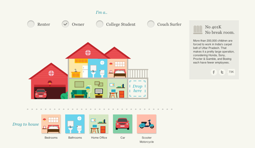
On Slavery Footprint, users can learn about their impact on slavery in an interactive and engaging way.
Conclusion
Emotional design turns casual users into fanatics, ready to tell others about their positive experience. – Aarron Walter
Emotional design has many qualities. We become more creative if we are confronted with something attractive. This creativity helps us solve problems more easily. Emotions also give us positive experiences, making us happier and giving us better recall. Norman came up with three levels of visual design based on different levels of our cognitive processing: the visceral level (appearance), the behavioral level (usability), and the reflective level (personal satisfaction, self-image and remembrance). Internal design goals as well as the needs, expectations and context of users will determine how the designer should balance those three levels and what to emphasize in order to get the most out of the design.
Recommended Reading
- Emotional Design, Don Norman
- Designing for Emotion, Aarron Walter


