Font Wars: A Story On Rivalry Between Type Foundries

Email Newsletter
Weekly tips on front-end & UX.
Trusted by 182,000+ folks.
 Custom Web Forms for Angular, React, & Vue. Your backend.


 Celebrating 10 million developers
I had thought of terms like “intellectual property” or “intellectual theft” as being of fairly recent provenance, so my eye was caught by the latter’s use in a headline of a 1930 edition of the American trade journal The American Printer.
The article it fronted proved to be equally intriguing, a response by the president of American Type Founders to a June 1929 article in the German journal Gebrauchsgraphik by the designer Rudolf Koch calling ATF a “highway robber of German intellectual property”. The issue was a typeface marketed by ATF earlier in 1929 called Rivoli.
Further Reading on SmashingMag:
- Dear Web Font Providers
- Review of Popular Web Font Embedding Services
- Understanding The Difference Between Type And Lettering
- An Interview With Type Designer Akira Kobayashi
Koch and the German typefoundry Klingspor asserted that Rivoli was no more than a copy of Koch’s 1922 design Koch Antiqua, also later known as Locarno, and released in America as Eve. Klingspor had already taken legal action for piracy against the Viennese foundry Karl Brendler und Sohne for their lookalike Radio Antiqua, but with no success.
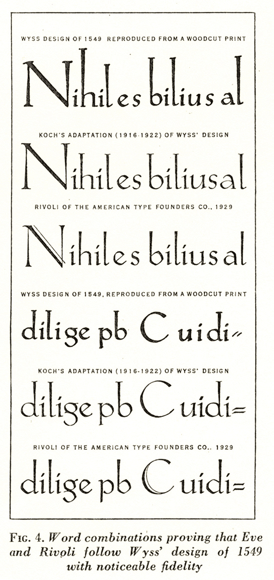
Wyss: Part of the sample of Wyss’ script offered by ATF to back their claim that Koch Antiqua was not its designer’s intellectual property. Neither of the two styles of ‘g’ resemble Koch’s however — to take just one example.
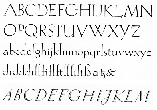
Koch Antiqua: Koch Antiqua, and uppercase letters of the italic.
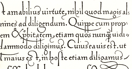
Klingspor lost that case, argued ATF, because far from Koch Antiqua being Koch’s or German intellectual property, both it and the Austrian face were based on the Lombardic penmanship of the Swiss calligrapher Urbanus Wyss, in particular from his 1549 book Libellus Valde Doctus. Klingspor could not claim theft of a design that was not theirs to begin with.
Whatever the truth of this, the most striking part of ATF’s broadside was their free admission that the similarity between Rivoli and Koch Antiqua/Eve, far from being accidental, was quite deliberate, Rivoli having been created and released both as a spoiler for the popular Eve but also as a “reprisal” face. Klingspor was partially owned by Stempel, whose 1925 catalogue contained what ATF claimed were “confessedly” fourteen type series of American origin, including what they deemed pirated versions of their own designs.
Comparison: ATF’s comparison of the faces which accompanied their article, but not the truth, says David Pankow. What purported to be Wyss’ script was in fact Brendler and Sohne’s Radio Antiqua, printed heavily onto soft paper.
The ATF/Koch/Stempel “face-off” (for the full story see David Pankow, “A face by any other name is still my face: a tale of type piracy” Printing History 37, New York, 1998) was part of a savage turf war, fought by a company to defend its commercial position with arguably, only a decade after a world war, some national antagonism thrown in. ATF remained relatively conservative in its designs, whereas on their own doorstep the New York-based Continental Typefounders’ Association was importing type in which was enshrined the latest European stylistic developments. The acerbity of the language on both sides is unrestrained, while exacerbated by ATF’s suspicions that Continental were involved too, stoking the fires of the argument.
Type design is a business that has long been bedevilled by piracy and plagiarism, conscious or unconscious, licensing issues and scant or no legal protection for intellectual property. Some of the problems stem from the nature of the craft itself. Although in theory the number of ways you can position the points of say, a capital A, are myriad, the demands of legibility, style and fashion radically reduce the options, and alphabet designs are all using the same raw material.
As designer Dave Farey has described himself, facetiously but with an undercurrent of truth: “Nothing I have done is original, it’s all based on the 26 letters of the alphabet and the Arabic numerals.” Add to this revivals and redrawings of classic faces, and similarities are unavoidable. Type design is an art that is constantly echoing and alluding. Most people working in the graphic arts are, in a big part of their design psyche, fans. We will probably have been inspired to get started in the first place by seeing other people’s work that we absolutely love. It’s unavoidable that some of that DNA will crop up or be used consciously in our own work. In the area of type revivals you can at least credit your source in the type name; as designer Nick Shinn says on Typophile, “plagiarism means copying without recognition of the source.”
In today’s digital environment, do any of the attitudes and practices that marked the ATF quarrel persist? I asked Phil Garnham of London’s Fontsmith if he regarded other font companies as rivals:
“I think there is definitely a healthy and friendly rivalry between today’s independent digital foundries. Over the past few years, as designers have become more aware of the power of type in branding, particularly the possibilities of bespoke type and with the boom in type design education at Reading University and Type Media at the Hague, fresh competition is popping up on a monthly basis, which is a great thing for type design. It keeps us all on our toes and looking for new possibilities within our beloved alphabets.”
And spoilers? Phil feels the tactic might still be out there, but for his own part, like musicians who consciously don’t listen to other people’s music when writing and recording, he tries not to look too much at other work: “I think that it keeps me detached from other people’s ideas, and allows me to pursue mine, free from any subconscious involvement.”
But even then you can find that what you’ve done looks like something else: “Arguably, I think there are many designers tripping up in this way, even with the best intentions. I’ve been in this awkward position myself. You have to explore new proportions and alternative letterforms so you can bring something new to the market.”
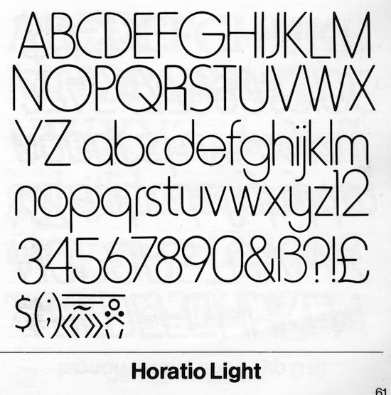
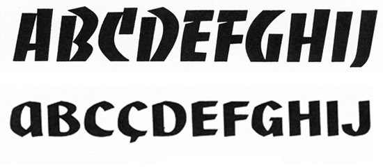
Square leg — Horatio with its restyled ‘R’ in the Letraset catalogue, available in three weights.
How close have people steered, consciously? Dave Farey recalls from his time working for Letraset how, among one selection of faces presented to the committee for inclusion in the dry transfer giant’s range was Harry, a design owned by the Visual Graphics Corporation. The committee loved it, but unfortunately permission hadn’t yet been obtained, and VGC refused. So Letraset produced Horatio: “I think the only thing we changed was the leg of the uppercase R,” Dave recalls, adding candidly, “Ours was worse.”
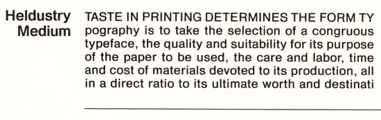
Heldustry: From the 1983 Compugraphic Type catalogue.
Clues could even be given in the font names — or not. Customers requesting Helvetica of 1980s photosetting companies which used the Compugraphic type library might be told: “We don’t have Helvetica but we do have Heldustry” — which looked, well, similar. The catalogue which digital company Bitstream produced at the start of the 1990s was helpful to customers unable to find familiar names: their Staccato 222, for instance, was the “Bitstream version of Mistral”, “Lapidary 333 is the Bitstream version of Perpetua”, Venetian 301 the “Bitstream version of Centaur”.
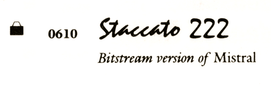
Staccato: From the Bitstream catalogue, early 1990s.
Some More “Face-Offs”
Memphis and Stymie
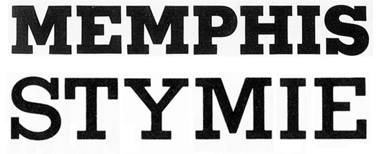
Memphis: Memphis seen here in extra bold weight, and Stymie Bold.
1931 saw ATF squaring up to Stempel again, countering their Memphis slab serif with Stymie, the name being golf-talk for blocking your opponent’s line of play. ATF’s prolific Morris Fuller Benton based Stymie on his own Rockwell Antique, basically a repackaging of Litho Antique, whose owner the Inland Type Foundry had been taken over by ATF. According to Patricia Cost in her book The Bentons, Monotype then copied Rockwell Antique and called it, confusingly, Stymie Bold.
Jacno and Banco
Rather than stealing the design, Excoffon exercised squatter’s rights in the territory — with style (above). The names were near anagrams, probably no coincidence.
French type legend Roger Excoffon’s employers, Fonderie Olive, were such rivals with Parisian foundry Deberny and Peignot that Excoffon examined with a magnifying glass a picture of their designer Marcel Jacno at work on his new self-named type. “Then I rapidly made some sketches for a few letters in a commercial type, not identical, but of the same family… The rest is a success story. Banco was used throughout the world… It’s the most shameful thing I ever did in my career.” (From Roger Excoffon et la Fonderie Olive, Sandra Chamaret, Julien Gineste and Sébastien Morlighem, Ypsilon Editeur, Paris, 2010.)
Starling Burgess vs. Stanley Morison
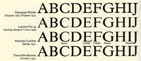
A comparison of Starling Burgess’ design (Lanston no.54) and Stanley Morison and Victor Lardent’s work on Times, as it appeared in Printing History 31⁄32 (1994).
According to a 1994 article by Mike Parker which appeared in Printing History, Times New Roman was an extremely close reproduction of a typeface designed years earlier by maverick genius boat and car designer Starling Burgess, which lay unpaid for and abandoned at Lanston Monotype until the design of the new face for The Times newspaper became problematic. Although Morison had the reputation among some for being a slippery operator, the story as presented seems hard to credit. Font Bureau offer a Mike Parker design called Starling.
Futura and Twentieth Century
No cigar, but close, Twentieth Century (above), Lanston Monotype’s response to Futura (below).
Buffalo, NY-based foundry P22 have in their Lanston Type Company collection Twentieth Century, “Monotype’s answer to Futura”. They describe Sol Hess’ redrawing as “close”; as an attractive optional extra they have included digital recreations of some of Paul Renner’s original experimental characters for Futura.
Comic Sans and Chalkboard
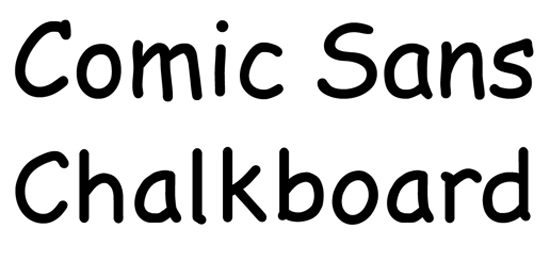
Comic and Chalkboard: Both ideal for warning notices.
Apple’s OS X doesn’t supply you with the world’s favourite, Comic Sans, but you do get Chalkboard, which inhabits pretty much the same terrain.
Helvetica and Arial
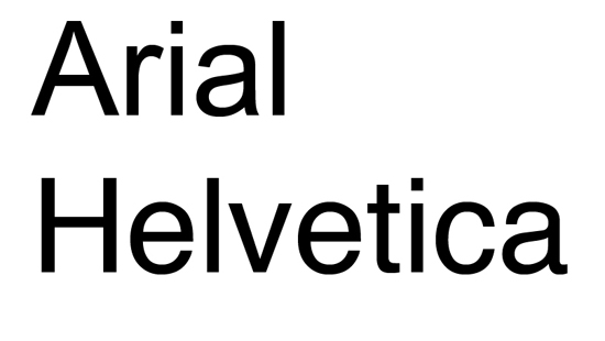
Hard to actually love perhaps, but Arial has certainly been well used, if only by default setting.
Arial, designed in 1982 by Robin Nicholas and Patricia Saunders, seems to attract a certain amount of online ill-feeling in “font hate” blogs these days on the grounds of being Microsoft’s Helvetica lookalike.
Does It Really Matter?
For the user, does any of this matter? If you like a font and it fits your purpose, then its provenance is irrelevant. And if it’s a new or recent design, then it comes with little or no backstory. But it’s always useful in terms of design rationale to investigate the background to your choice. Who designed it? When, and for whom — for a specific project in the first instance or for a company? If for a particular project, would those associations jar with how you’re planning to use it now, and does that matter? If it was designed originally for Monotype, is the one you’re planning to buy a Monotype font, or from someone else? What do Monotype offer as their version, and how does it compare? Stempel Garamond versus Simoncini Garamond, or Garamont?
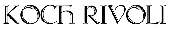
Koch Rivoli: Channelling the spirit of Rudolf Koch and Willard T Sniffin.
And how has history served those original battling typefaces? Sebastian Carter in Twentieth Century Type Designers says of Koch Antiqua: “One of the most successful advertising faces of the inter-war period, still often used to suggest the vanishing luxury of ocean liners.” Though some of that usage might have been in reality Rivoli, Koch’s reputation as a type designer endures.
As does the name Rivoli, although its creator or draughtsman, the magnificently-named Willard T Sniffin, is less remembered. But urbanfonts.com for one offers as a free font Koch Rivoli (a pairing of names that would have the German designer spinning in the proverbial grave), an uppercase-only design that takes inspiration from the thick-thin double stroke of Koch’s italic uppercase — and Rivoli’s.


