How To Apply Macrotypography For A More Readable Web Page
Any application of typography can be divided into two arenas: micro and macro. Understanding the difference between the two is especially useful when crafting a reading experience, because it allows the designer to know when to focus on legibility and when to focus on readability.
This article focuses mostly on a few simple macrotypographic techniques—with a dash of micro—and on how to combine them all to build a more harmonious, adaptable and, most importantly, readable Web page.
Further Reading on SmashingMag:
- 10 Principles For Readable Web Typography
- 16 Pixels: For Body Copy. Anything Less Is A Costly Mistake
- Designing For The Reading Experience
- Using White Space For Readability In HTML And CSS
First, some definitions. Microtypography has to do with the details; setting the right glyph, getting the appropriate kerning and tracking, and making stylistic choices such as when to use small-caps. Micro techniques have received a lot of attention recently, as browser makers adopt new CSS attributes that allow for finer control over Web type. Microtypography deals mainly with legibility and can be thought of as the design of letters and words.
Macrotypography focuses on how type is arranged on the page. Most macro techniques have been achievable through CSS for quite some time, but because our understanding of the Web page is changing, the way we use these techniques must adapt. Macrotypography deals mainly with readability and can be thought of as the design of paragraphs and the page.
The Importance Of Readability
For the designer’s purpose, readability refers to the ease with which a body of text can be consumed, and it correlates closely to the reader’s eye strain. This should not be confused with legibility, which refers to the degree to which individual glyphs in text can be discerned. The techniques for creating a great reading experience are complementary to those for creating a great user experience (UX), and vice versa. They also both share the same symptoms of failure. Poor readability on a website can lead to confusion, frustration and ultimately abandonment, while a great reading experience is invisible, supportive and engaging.
As with UX design, every website design would benefit from some measure of concern for readability. For example, text-heavy websites—such as blogs, newspapers and magazines—should uphold readability as a priority, while websites for events and e-commerce might just need to tweak line heights and font sizes. Whatever level of importance you place on readability, you should undertake a continual process of refinement towards an effortless reading experience.
Techniques For Improving Readability
The foundation of great reading experiences on the Web lies in the study of book design. After all, books are where readable typography was honed. Personally, I hold The Form of the Book by Jan Tschichold as the ultimate resource for good taste in book design, and I am certainly not alone.
Many of the techniques we’ll cover here have been adapted for the Web page from lessons introduced in this book. Sadly, the book has been out of print for about 20 years (at least in the US), and a copy can cost around $150 on Amazon’s marketplace. I have created a digest of it, but if you want to read the full text, you could always try your local library or university (which is how I finally got my hands on it).
Now, let’s look at the various macro techniques—and a few micro techniques—to make your website’s content more readable. I have chosen an article that is typical of the kinds of reading experiences users encounter. I have removed the header and some branding elements, but it remains mostly as I found it.
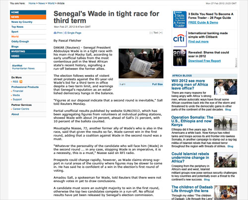
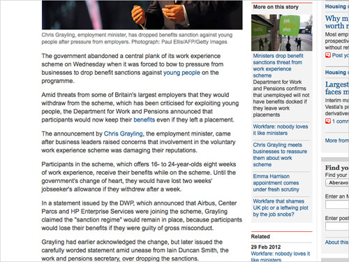
In our example, important content (navigation, advertising, related links) lies on either side of the reading area. For optimum readability, a less obtrusive placement of these elements would be best, but this is not always possible. We will, therefore, not rearrange the layout, but work within it. Here is what we are starting with:
As we learn about each technique, we will apply it to our example. But keep in mind that this exercise is to improve only the reading experience, not the overall design.
Command Your Margins
Margins give the eye room to maneuver. They provide a buffer between the main content and ancillary elements—such as related links and ads—allowing the reader to focus on the text. Beyond this purely functional purpose, margins can also bring deeper harmony to the layout.
Margins comprise negative space; they afford the designer an opportunity to build a relationship between a body of text (the figure) and its surroundings (the ground). As Tschichold tells us, “Harmony between page size and the type area is achieved when both have the same proportions.” Now, the proportions of a page in a book are much different than those of most digital displays (especially ones in landscape orientation), so to adapt this concept to the Web, we can work towards a harmony between our text and its immediate visual container.
In Practice
On our example page, the margins are not very generous. Also, the main content is crammed in between two very loud columns. First, we can add more space to the right of the text, giving the reader room to go from the end of one line to the beginning of the next without being distracted by the secondary content on the right. And adding more margin to the left of the text allows the reader to easily find the start of the next line and to scan the article for topics they are interested in.
Margins can be set intuitively by increasing the amount on each side until the content feels comfortable. Applying this to our article element is easily achieved by adding padding in our CSS (rather than margin, in this case). For now, we will just double the padding on the left and right:
article {
   padding-left: 20px;
   padding-right: 40px;
}
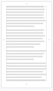
In our adjustment of the margins, we can create still greater harmony between the copy and its surroundings, but first we must visualize an invisible container around the content. This will be our “page” with which to build harmony in the reading area:
The way to create harmonious proportion between text and its container is to give them the same shape. The content should have the same proportions—only smaller—as its containing element. Tschichold surveyed a mountain of book proportions and concluded that the most harmonious proportions for margins are roughly 2:3:4:6 (top:right:bottom:left) for the left-facing page (recto) of a book. Given that we do not have facing pages on the Web, we can make the margins symmetrical and adjust the ratio to 2:3:4:3 by shaving off a bit of the left margin. Web text does not need as much side margins as book text because Web pages do not need to accommodate the reader’s thumbs.
Though they may seem the obvious unit of measure, percentages for padding will only measure in relation to the width of our article element’s container, skewing our top, bottom and side proportions to an inappropriate degree. Therefore it’s best work with padding in ems or pixels until the reading area has the same proportions as its container. To keep things simple, let’s start with 2em for the top padding in our example. After applying our adjusted ratio from above, our article’s padding can be written as 2em 3em 4em 3em or 2em 3em 4em in CSS shorthand. Given the fluid nature of content on the Web, this is just an approximation of Tschichold’s proportions. For a typical body of text on the web—which is taller than it is wide—the margin should be generally less on top, even on the sides, and most at the bottom:
article {
   padding: 2em 3em 4em;
}
We can also move the lead image to the right. This allows the body copy to hold its shape better and allows for even easier scanning of the article. We can break this principle to draw attention to images and figures, of course, but for our example the image is too distracting on the left when placed early in the article.
If we want, we can bring the text forward on the z axis, putting even more focus on our copy and de-emphasizing the ancillary content by creating a visible container for our text. This is a tactic we can easily use in Web design that books do not need:
body {
   background: #fcfcfc;
}

article {
   background: #fff;
   border: 1px solid #eee;
   padding: 2em 3em 4em;
}
Our page already feels more balanced and less intimidating, but we can use more techniques in the body of the text to further enhance readability.
Choose Readable Fonts
Font selection is a micro concern, but it has a tremendous impact on the macro appearance. In Detail in Typography, Jost Hochuli best outlines this interdependence: “In typography, details can never be considered in isolation.”
The font for the body copy should be chosen for its on-screen readability, before any concern for style. The headings and pull quotes are perfect opportunities to flex your typographic creativity, but leave the long runs of copy to dependably readable workhorses such as Georgia, Arial and Myriad, which were all designed for optimal reading on a back-lit screen.
Fonts that are more readable on digital screens typically exhibit the following attributes:
- Tall x-height;
- Slightly wider em width, but not condensed or extended;
- Mostly devoid of style;
- Serifs for larger type, and sans-serif for smaller type.
All of these rules have exceptions, but they should be your guiding principles when choosing a font for the body copy. Here are some font stacks that I find give some flavor of style, provide appropriate fallbacks and are all highly readable:
"[Proxima Nova Regular](https://typekit.com/fonts/proxima-nova "Proxima Nova on Typekit")", "Helvetica Neue", Arial, Helvetica, sans-serif;(As used right here on Smashing Magazine)"[Myriad Pro](https://typekit.com/fonts/myriad-pro "Myriad Pro on Typekit")", Arial, Helvetica, sans-serif;(As used on my website)"[Fanwood Text"](https://www.google.com/webfonts/specimen/Fanwood+Text "Fanwood Text on Google Fonts")", Georgia, Times, "Times New Roman", serif;"[PT Sans](https://www.google.com/webfonts/specimen/PT+Sans "PT Sans on Google Fonts")", "Trebuchet MS", Arial, sans-serif;
In Practice
Let’s apply Myriad Pro to the body text on our page:
article {
   background: #fff;
   border: 1px solid #eee;
   font-family: "Myriad Pro", Arial, Helvetica, sans-serif;
   padding: 2em 3em 4em;
}
Keep It Measured
In setting any block of text, we must consider its measure. Measure is defined by either the number of characters per line or the number of words. I use words because they are easier to count, and I try to follow Tshichold’s suggestion of 8 to 12 words per line. If you base your measure on characters, then 45 to 85 characters per line is ideal. Once the margins and widths have been set, proper measure can be achieved through two attributes in the CSS, font-size and word-spacing.
When deciding on a size, strike a balance between making the font small enough that the reader is not too distracted when jumping to the next line, but big enough that they do not have to lean in to read the text on the screen. For most fonts, 16 pixels works well. Other factors might lead you to making it larger or smaller, but 16 pixels is a great place to begin. As for word spacing, most browsers do a decent job of setting this for you, but if you are having trouble getting an appropriate measure, cheating this attribute slightly either way can be handy.
In Practice
On our page, let’s add a 16-pixel font size, and cheat the word spacing in just a tiny bit to achieve a proper measure (word-spacing is supported in all major browsers). You might instead want to use ems or rems here so that the layout remains flexible whatever the font size set by the user as their default.
Until we set a new line height, our page will look like a jumbled mess, so let’s just look at the code at this point:
article {
   background: #fff;
   border: 1px solid #eee;
   font-family: "Myriad Pro", Arial, Helvetica, sans-serif;
   font-size: 16px;
   padding: 2em 3em 4em;
   word-spacing: -0.05em;
}
Set An Appropriate Line Height
Once the font size is set, you can determine the appropriate line height. On the Web, we work in terms of line height, which by default is an equal amount of space above and below text on a line. Not to be confused with leading in print design, which generally refers to the amount of space below a line of text. The governing rule for line height (and leading) is, the longer the line length, the taller the line height should be. And vice versa: the shorter the line length, the shorter the line height.
Find an appropriate line height by first determining the point at which the ascenders and descenders of the lines of text do not touch, yet the lines are close enough that the reader requires no effort to find the next line. Then adjust until the height feels balanced with the line length. Some may leave the line-height attribute to the browser’s default, while some may set a global line-height on the body element. Both approaches make sense because the line height would then stay proportional to the element’s font size; but both also assume that the line width of the content will stay consistent, which could lead to situations that violate our governing rule.
In Practice
Let’s add a line height of 1.3 ems to our example, using ems so that our line height stays proportional to the font size, and see how the font size and line height work together:
article {
   background: #fff;
   border: 1px solid #eee;
   font-family: "Myriad Pro", Arial, Helvetica, sans-serif;
   font-size: 16px;
   line-height: 1.3em;
   padding: 2em 3em 4em;
   word-spacing: -0.05em;
}
It is important to note that readable line heights can be especially tricky to keep consistent in responsive layouts, as line lengths will vary based on device widths. To solve this issue, Tim Brown has proposed an idea he calls “Molten Leading,” which would allow line heights to increase proportionally based on the screen width. His post links through to a couple of Javascript implementations of this idea. In lieu of Javascript intervention, you can also manually find the screen widths at which the line heights become uncomfortable, use a media query to target that width, and set a more readable line-height in the CSS.
Find The Proper Paragraph Styles
We need to figure out which paragraph style best fits the content. Jon Tan has done a fantastic job of outlining various styles and how to craft them with CSS. The appropriate style for a piece of content varies based on the flavor of the content and the rhythm of the paragraphs. I have written about my preference for using indents, rather than line breaks, when setting long-form text. This helps to keep the flow between ideas, but it can be distracting when the paragraphs are short or the line length is long. Deciding what constitutes the perfect paragraph for your content is up to you.
In Practice
Our page is a news article, where the flow between paragraphs is dictated more by chronology than by ideas, so line breaks are still appropriate. We could easily apply indents, if appropriate, to the paragraphs with one simple CSS rule:
article p + p {
   text-indent: 2em;
}
We specify p + p rather than just applying the rule to all p tags because we want to indent only those paragraphs that follow other paragraphs. Ones that follow headings, images and so on should not be indented.
Instead of indenting, though, we just want to shrink the line breaks a bit so that each paragraph is not so disconnected from the last. For our page, let’s use half of the line height:
article p {
   margin-bottom: 0.5em;
}
Balance The Text’s Contrast
One final consideration for content is text color. Contrast is a major contributing factor in eye strain and so greatly impacts readability. Low contrast between text and background causes more squinting and blinking among readers, a sure sign of strain. Black on yellow has the highest contrast, but we have been conditioned to view this as a sign of warning or alarm, thus increasing anxiety among readers. Black on white is high in contrast, too, but too harsh for extended reading on back-lit screens. For long-form text, I have found dark-gray text (around #333) on a white or light-gray background (no darker than #EEE) to be optimal. This is a gross simplification of color theory to suit the purposes of this article. To learn more about color, Mark Boulton has written a great primer on color theory for the Web; you can also find many great examples in Smashing Magazine’s series on color.
In Practice
Our article already has a white background (serving as a boundary for the margins), set against a wider light-gray background. We should probably keep the white, and lessen the darkness of the text to #444. We can then use #000 on the headings to give them slightly more emphasis:
article p {
   margin-bottom: 0.5em;
   color: #444;
}

article h1 {
   color: #000;
}
The Result
We now have a much more readable page that invites users into the content. We could employ many more techniques across the entire website, but we have focused here on the main content block. Harry Roberts has written a great overview of these techniques and more for Smashing Magazine, which will give you a deeper understanding of everything covered here.
With a clean reading experience, people will better absorb the ideas being presented and will undoubtedly come back for more—that is, if your content is worth reading… but I can’t help you there.
Excellent Reading Experiences On The Web
Readability is not a new concept, of course. If you are just discovering what makes for a good reading experience, then congratulations, and welcome to all the discomforts of recognizing cramped and neglected type on the Web. It’s not all pain, though. Plenty of well-considered blocks of content are to be found. Let’s look at a few great ones and a couple that could be great with slight tweaks.
Please note: In the interest of showcasing only the reading experience, we have cropped each page to a scrolled view of the main content.
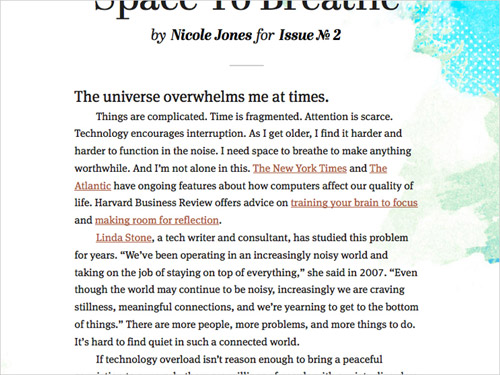
24 Ways The reading experience on 24 Ways is quite nice. The text contrast is well balanced, the measure is not too long, and the font size is generous. At all responsive breakpoints, the design is a perfect example of a page with sufficient and balanced margins around the main reading area.
Desktop view
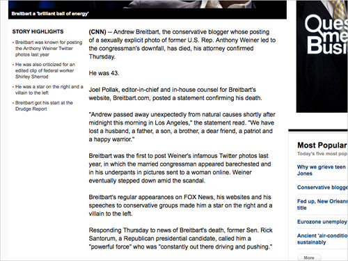
CNN Long-form articles on CNN are good examples of how readability can work well on news websites. The layout does not show a visible container for the article—which in this case might have been distracting on a page already laden with so much content—but the margins are generous. Also, the line breaks for the paragraph styles are completely appropriate, because most online news stories are collated and updated from many sources and are not linear ideas. The font size (currently 14 pixels for the body copy) could stand to be a bit bigger, though.
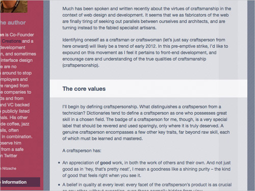
Contents The tablet view of Contents magazine is a wonderful experience all around. The measure is perfect, the line height and font size play together nicely, and the paragraph styles are perfectly suited to the content. The measure does get too long at desktop sizes, but with all of the other factors working so well, the effect on overall readability is negligible.
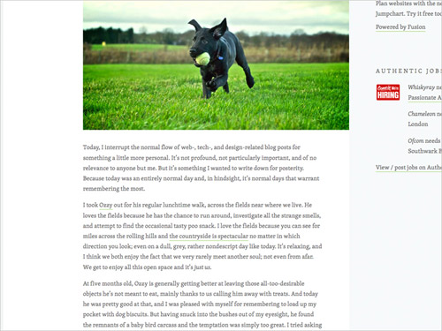
Elliot Jay Stocks Elliot does quite a few things well on his website. The measure is right, the font (Skolar) is very readable and set at a comfortable size (16 pixels), and the line height is just tall enough to accommodate the link style. Generous margins create harmony between the main content and its container, while the side margins are uneven, making the page look like the recto of a book and giving the layout a unique character.
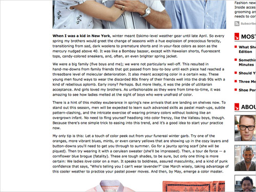
Esquire Most articles on Esquire are great, but the reading experience is merely good. The margins are ample, the font is readable, and the contrast is high. All of these go a long way towards establishing good readability, but a few simple tweaks would make it great. Increasing the right padding would shorten the measure, which is a bit too long as it is. The font size could also be increased by a couple of pixels. And given that most Esquire articles are a linear progression of ideas, I would suggest paragraph indents rather than line breaks.
The Guardian The design team over at The Guardian pays attention to crafting great all-around experiences. Readability is no exception. Measure, contrast and paragraph styles all work together to create a focused and comfortable reading experience in the midst of what could be an overwhelming amount of content.
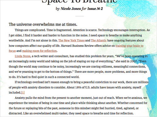
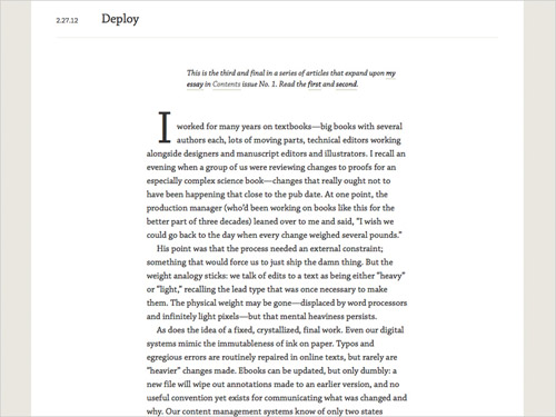
A Working Library A Working Library is one of the best reading experiences on the Web. Every aspect of readability discussed in this article has been well considered and executed. The harmony between text and its container is pitch perfect.
Refining Towards The Ideal
With the examples above, we have tried to show how readability can excel in a few different digital environments: blogs, news websites and online magazines. Some of these website do not have many of the constraints (such as ads and related content) of more commercial websites, so it could be argued that these designs exist in a vacuum, without pragmatic application or real-world pressures. We need these shining examples, though, to help us find the ideal reading experience for each project; and once we know that ideal, we should do our best to reach it.
In a recent talk on “What Is Reading For?” the famous typographer and poet Robert Bringhurst stated, “Books are and have to be utilitarian objects. They have to be used.” The same could be said of Web pages. Ideal reading experiences create better user experiences. Our job as designers is to refine the aesthetic qualities of the Web’s content in order to speed the process of consumption, thereby facilitating deeper understanding. Tired eyes all over the Web are counting on us.


 Claim Your Free Spot!

 SurveyJS: White-Label Survey Solution for Your JS App
 Register Free Now
 Celebrating 10 million developers

