Creating A Lasting Impression

Email Newsletter
Weekly tips on front-end & UX.
Trusted by 182,000+ folks.
 Register for Free


 Custom Web Forms for Angular, React, & Vue. Your backend.
 Celebrating 10 million developers
We can all agree that the work we do should inform, should be appropriate to the client and their audience and should, of course, look good. But there’s a fourth attribute worth aiming for: creating a lasting impression.
Visual memory is fascinating — we often use it without realizing. If, for example, you ask someone how many rooms they have in their home, before answering, most will walk through each room in their mind’s eye (possibly even with their eyes closed to aid concentration), adding up as they go. If graphic designers can tap into the benefits of this phenomenon, providing visual triggers to keep the subject matter of their work fresh in the audience’s memories, they will surely enjoy advantages.
Categorically describing what makes a design memorable is almost impossible. As with many other aspects of graphics and typography, general principles rather than absolute rules apply. However, aspects of dynamism and the unusual and unexpected more often than not play a significant role in memorable designs. Not all visual mnemonics can be described as being aesthetically pleasing; some designs might be deliberately shocking or provocative in order to be talked about and remembered.
A wide range of variables can affect the probability of a lasting impression, although very often luck, coincidence or timing helps. Striking color combinations, arresting images and clever use of typography and language can be helpful, too, but what captures an audience’s imagination and stays with them is frequently more complicated and possibly linked to the element of surprise. This article brings together a collection of memorable projects and try to identify how designers have made them unforgettable.
Creating Basic Memories
Professor Bruce Brown of the University of Brighton in the UK is an expert in visual memory. He describes letterforms as “meaningless signs, specifically designed to help us construct permanent memories for otherwise meaningless sounds so being the simplest and most powerful mnemonic system devised.” For most of us, learning the alphabet is part of our early lives and helps us to establish communication skills; in our early years, we work on the connection between signs, symbols and sounds until they are secured in our memory to be retrieved at will and in any order.
We become experts in using these tools to help recover ideas from our memories, bringing them together to create meaning. The importance of this phenomena must not be underestimated, and Professor Brown puts it well when he says:
“Without the ability to create memories we would perceive no more than each disjointed second of our isolated existences; we would have no language, no alphabet, no discourse, no identity and no culture.”
Witty And Shocking Designs That Leave A Lasting Impression
There’s no doubt that information wrapped in a witty or shocking package is hard to forget, and the following examples are typical. Not only does the memory of them linger, but they’re often so powerful that you’ll want to share them with friends.
“All Eyes On You” by Britzpetermann

About this project:
Schau, a series of interactive window displays by Britzpetermann, includes a window packed with large roving eyeballs. Each eye follows passers by in a strangely spooky manner that is not easily forgotten.
Why is this design memorable?
Eyes have a powerful significance, which always draw the viewer strongly into an image. So, being confronted by an array of giant eyeballs that seem to be dismembered and floating in space will certainly be very memorable. However, when the eyes appear to make active contact with you personally, following your every move, as if responding not only to your actions but perhaps to your every thought, then they become truly unforgettable.
“Hand Made Type” By Tien-Min Liao
About this project:
“Hand Made Type” is an animated project that shows hand-drawn uppercase letters painted on hands, speedily and subtly converting to their lowercase equivalents in fluid movements.
Why is this design memorable?
This project has such an unusual concept and is fascinating to watch. Looking at the detail in these clever animations, we find ourselves flexing our fingers and trying to mimic Tien-Min Liao’s careful movements. We are all able to use our hands in very expressive ways, and the combination of type and hands together is extremely powerful and, therefore, difficult to forget. We are also left wanting to know more: Where did this amazing idea come from, and how long did it take to achieve these marvellous results?
“Chaumont Poster” By Sagmeister


About this project:
This poster by Stefan Sagmeister (the “king” of highly mnemonic design) contains a number of disturbing images that are very hard to forget. Letterforms that appear to have been extruded from human flesh, people with intertwined body parts, and teeth that appear to have been cut into letters and numbers — all of these create shock responses.
Why is this design memorable?
We defy anyone to look at Sagmeister’s typographic front teeth and not run their tongue over their own teeth to check that they are all still complete.
There is something innately fascinating about the human body. We are all very familiar with the curves, creases, surfaces and details of our own physique, but being presented with surprising, even shocking, close-up detail of some of the hidden areas of another person’s anatomy can be irresistibly captivating.
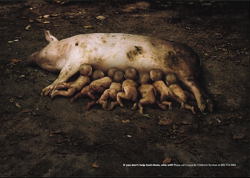
Ad For “Concordia Children’s Services”
About this project:
In this ad by Young and Rubicam for Concordia Children’s Services in the Philippines, the question is asked, “If you don’t help feed them, who will?” The advertisement shows babies feeding from a sow like piglets and is intended to shock its audience into appreciating the dreadful plight of the many abandoned babies in Manila.
Why is this design memorable?
Seeing numerous babies in the extraordinary situation of feeding from a pig is initially very arresting and shocking; but for us, the totally unhygienic environment is what really makes us squirm. In most societies, whether rich or poor, babies are treasured, cosseted, loved and kept distant from grime and germs; in this image, the newborns are shown fending for themselves. They are pictured grovelling in the mud and competing with each to feed. We defy anyone not to have a physical response to this ad and hold it in their mind’s eye for a long time.
When Movement And Interaction Make Designs Addictive
The designs showcased in this section have a compulsive quality about them. The imagery is fascinating and appealing, but the interactive nature of each example makes it hard to resist and highly memorable.
“Karlo Jurina Selbstgespräche” By Britzpetermann

About this project:
Interaction and movement in response to outside stimuli are two aspects that can make Web design really memorable and enjoyable. This album visualization for Karlo Jurina Selbstgespräche by Britzpetermann is truly breathtaking.
Why is this design memorable?
Throughout each of the 15 tracks, a precise movement of carefully positioned, colorful symbols highlights every individual note, causing you to almost believe that you could be, or are, playing every stunning note yourself. The melodies of Jurina’s beautiful acoustic guitar will resonate from your computer, while the arrangement of over 300 bright, individual and precisely ordered marks will seem to breath from your screen in response to the rhythm of the composition.
The idea of the personal response to the subtleties of sound and rhythm is what comes to the fore with this project, leaving you not only with a strong yet surprisingly subtle visual interpretation of music, but also the strangely satisfying idea that your own personal responses and movements could play a role in creating this wonderful sound.
“Hidden Heroes” By Grimm Gallun Holtappels


About this project:
Who has not at some point looked down at one of the myriad of products that make everyday life easier and thought, “Wow, that’s clever. What a simple memorable design.” The Hidden Heroes online exhibit, designed by Grimm Gallun Holtappels, pays homage to the zipper, the paperclip and many other such items.
Why is this design memorable?
Interaction with the exhibit is highly pleasurable because it stimulates several of the five senses. The design is beautiful and colorfully pleasing to the eye, while every action of the mouse creates a satisfying response and amusingly memorable sound that transports you right back to personal memories of using a particular Hidden Hero. Our favorite is the Flipflop, designed by Bernd D. Hummel around 1960; great noise — it transports us to sunny days and sand between our toes!
You can experience your own Hidden Hero, too!
Website of “Grimm Gallun Holtappels”


About this project:
Grimm Gallun Holtappels has created an almost addictive experience on its own website. By showing us around its office space, we are allowed to shuffle through a trail of files that fly through bright white rooms, giving off pleasingly subtle page-turning noises. Each file selected then speedily transports us to a new workspace and converts to a two-part three-dimensional box that can be rotated in different directions to reveal different details.
Why is this design memorable?
Experiencing the pleasures of moving through this online 3-D environment is very personal and mnemonic. Looking at the office space, we are aware of the depth of field and of other rooms existing in the distance. The ability to turn and twist the three-dimensional boxes, revealing different planes and detail, is very reminiscent of experiencing and interacting with the intriguing puzzles and other captivating games of our childhood. For us, one of the most memorable and subtle aspects of this design is the constant gentle movement of the website, seeming to rise and fall as if in time with our breath, emphasizing the personal and sensory nature of this viewing experience.
Enjoy your interaction on the Grimm Gallun Holtappels website.
When Use Of Unexpected Materials Takes Your Breath Away
In this section, we highlight design examples that involve totally unexpected materials, plus extraordinary dexterity and commitment on the part of the designers. It is impossible not to be amazed by the workmanship that went into these venerable pieces, and one cannot help but get a lasting impression.
“Banana Wall” By Sagmeister


About this project:
Certain examples of highly memorable design not only stay with us, but make us think, “I wish I had thought of that.” It is amazing to consider the dexterity needed to produce this huge design spectacle, in which the designer selected unusual materials for their capacity to ripen and change color. Green fruit is used to create border patterns, rules and letterforms that spell out “self confidence produces fine results” while yellow bananas create a contrasting background.
Why is this design memorable?
This project confronts us with piles of fast-ripening bananas, and the slightly infuriating fast-ripening aspect of this popular fruit is used to amazing affect by Stefan Sagmeister. All of us have experienced bananas ripening more quickly than we would like, but how many of us have thought to use the change in color of 10,000 pieces of fruit to creative affect? It’s a great example of pushing something so common to the extreme, and it creates a memorable and unique experience. The clever, meaningful link between Sagmeister’s quote and the color change is also a powerful metaphor. As Stefan Sagmeister says:
“After a number of days, the green bananas turned yellow, too, and the type disappeared. When the yellow background bananas turned brown, the type (and the self-confidence) appeared again, only to go away when all bananas turned brown.”
“Obsessions Make My Life Worse And Work Better” By Sagmeister


About this project:
The subject of this piece by Stefan Sagmeister perhaps helps to explain the attention to detail in his other designs in this section. “Obsessions make my life worse and work better” at first glance appears to be a typographic design involving copper-colored letterforms that are elaborately embellished with floral decoration. However, upon closer inspection, this project makes highly unexpected and mnemonic use of materials. This time, small coins have been carefully and precisely arranged across a paving-slab grid structure.
Why is this design memorable?
As with the other designs in this section, the dexterity and patience necessary to produce this result is breathtaking. The vulnerability of this design is also plainly evident. The work is executed outside in a public space and is open to being disturbed by the weather and visitors. In fact, during the first night after completion, a local resident spotted passers by removing a souvenir coin or two and called the police. Unfortunately, the authorities responded quite dramatically, sweeping up all of the coins into black bin bags — supposedly to secure the work! We can hardly believe what it must have felt like to discover the blank space, and a part of remembering this piece is being able to identify with this experience.
“The Comedy Carpet” In Blackpool, UK


About this project:
Many of the other mnemonic works in this section are made of materials that give them a fragility and vulnerability that make them mind-blowing, almost literally. However, The Comedy Carpet by Gordon Young and Why Not Associates involves the memorable and amazing use of materials in a different way.
The carpet, a typographic work on an extraordinary scale, is a celebration of comedy, and it references more than 1000 comedians and comedy writers. The design itself takes its inspiration from traditional music-hall posters; it features songs, jokes and catchphrases in granite letters, carefully embedded in a concrete layer and displayed in carpet form in front of Blackpool Tower on England’s northwest coast. Described by its creators as “A remarkable homage to those who have made the nation laugh, it’s also a stage for popular entertainment that celebrates entertainment itself.”
Why is this design memorable?
The answer to this question is the mixture of high-quality design, amazing manufacture, grandness of scale and outdoor setting.
The making of this extraordinary carpet certainly helps make the product itself so memorable. At first sight, the letterforms seem painted, but each of the 16,000 30-millimeter characters were cut by the carpet team in a workshop specially established for this project. For us, having the chance to walk on this beautifully constructed carpet of type makes for an unforgettable experience.
Executing this typographic detail at such a momentous scale in a famous outdoor environment is quite remarkable. Of course, those who understand English and recognize the comedians will enjoy another highly memorable feature: humor. Like the other works in this section, the Comedy Carpet turns the ordinary into the extraordinary, making it larger than life and totally immersive.
Using Color And Composition As Visual Triggers
Cleverly chosen colors and careful composition have the power to make a design distinctive and striking. The works in this section demonstrate a number of ways in which color and composition can have great impact and linger in the mind.
“Elephant Magazine” By Studio8 Design


About this project:
Elephant magazine by Studio 8 without a doubt uses color, image and composition to effect, but the London-based design company’s skill with composition is what prompted us to focus on this magazine.
Why is this design memorable?
Elegant typography, including text with a lightness of touch, is carefully arranged on pages, with letterforms headings used in unexpected ways to create beautiful imagery and dynamic spaces. Careful and precise alignment helps to bring the details together, fixing your attention on what is important, while leaving a pleasurable lasting impression that is sure to have you looking out for other issues.
“Maps” By Paula Scher


About this project:
In the 1990s, Pentagram’s Paula Scher began painting colorful maps with incredible layered detail. Her creations use hand-painted type to show countries, cities, oceans and districts, as well as cultural connections, in compelling patterns.
Maps is published by Princeton Architectural Press and highlights 39 of Scher’s captivating works in great detail. Many sections are shown in full size, and the cover features a 3 × 2-foot poster of “World Trade” painted in 2010.
Why is this design memorable?
Compositions are packed with a huge amount of colored hand-lettering that overlays and interacts in an exciting way. Even without reading the words, the imagery is unforgettable, as the incredible detail, layering, color, composition and subject matter draw you into the depths of each work. As with many of the other designs in this article, the question springs to mind, “How did she do it?”
Conclusion
No doubt, many other examples could have been highlighted in this article, and hopefully you have been stimulated to recall favorites of your own. The dictionary says that a mnemonic design is intended to aid or improve the memory, which suggests that designers can never be sure of the impact their work will have.
Although we have categorized the works in order to tease out a number of common design decisions, an integral part of remembering a work involves such things as our personal experiences, culture and history and significant moments in our life. Designers can do their best to create fantastic designs and provide triggers that unlock memories, but having total control over whether an impression is lasting is impossible.
Related Links
- “Posters,” Sagmeister and Walsh See more of Sagmeister’s Chaumont poster.
- “Concordia Children’s Services: Piglets,” I Believe in Advertising
- Portfolio: Schau!, Britzpetermann See more of Britzpetermann’s work
- “Hand Made Type,” Tien-Min Liao Taiwanese designer and illustrator
- Karlo Jurina Experience Britzpetermann’s design for Karlo Jurina.
- “A Look Behind” A look behind the project “Selbstgesprache” by Karlo Jurina and Britzpetermann.
- Hidden Heroes An online exhibit designed by Grimm Gallun Holtappels.
- Grimm Gallun Holtappels
- Banana wall, Sagmeister
- “Obsessions Make My Life Worse and Work Better,” Stefan Sagmeister
- The Comedy Carpet Gordon Young and Why Not Associates
- Elephant Magazine: Issue 1, Studio8 Design
- Maps, Paula Scher, Pentagram
- “Author Q&A With Paula Scher: Maps,” Designers and Books
Further Reading
- The Creative Way To Maximize Design Ideas With Type
- Tips For A Finely Crafted Website
- The “Wow” Factor in Web Design
- Examining The Design Process: Clichés And Idea Generation


