The Designer Will Make It Pretty

Email Newsletter
Weekly tips on front-end & UX.
Trusted by 182,000+ folks.


 Custom Web Forms for Angular, React, & Vue. Your backend.
 Celebrating 10 million developers

I am sure that my day job as a designer has a lot of similarities to that of the entire Smashing community. I create wireframes, mockups and concepts. I craft HTML and CSS using methods that I hope are fluid and adaptive. At the same time, my coworkers and I serve over 100 clients and 13 million users on a single platform.
Each client has the ability to design their website as they see fit, but we have an unbalanced ratio of designers to clients. I do not have the luxury in my day-to-day work of spending months working through a design process as part of a client’s implementation. However, this scenario of limited time hardly strikes me as rare among my design peers.
Because of these constraints, I hear a phrase quite often that many designers would compare to nails on a chalkboard. The people I work with who do not handle the design side of our platform will often tell clients, “The designer will make it look pretty.” Now, “it” could refer to a lot of things: a log-in form, maybe a simple button, or the entire website. When content is raw, unformatted or confusing to the user, it gets sent to the design department so that it can come out the other end “pretty.”

Web designers hate this perspective. We consider what we do to be far more important than decorating sloppy content and returning it in a timely fashion. Many of us would argue that our real job is to make content accessible, flexible, easy to use and easy to work with. The real value in design comes from what you can’t see or what you don’t appreciate; it comes from all of the trouble that you don’t have because we fixed it ahead of time. Thank goodness we know better: if we just made things pretty, all of our work would be in vain.
Why Designers Hate “Pretty” Design
Professional designers don’t make things pretty because it’s beneath us. Your visual acceptance of our work is the result of careful decision-making built around grid systems, perfect ratios, color theory, typography and—no, I won’t make your logo bigger—white space. The practice of simply decorating is something we used to do when we were just getting started down this career path. We used to make pretty things in Photoshop to kill time in class or to tinker with a new tool or technique. We have since moved on to bigger and better things.

Yes, the design community has graduated from the pretty principle to less visual but supposedly more impactful measures. The technology of the present enables us to reach a higher plateau, and we are a bunch of people who refuse to settle for good being good enough, and that includes making something pretty. Right?
Embrace The Pretty
Anyone who feels they have left pretty and supposedly meaningless things behind is wrong. Leaving behind the idea of making your work appealing to the eye is to leave behind real value. Aesthetics are no petty trick for the uninspired. Quite the opposite, really.
Our great human minds come preprogrammed with many incredible default behaviors that automate complex decision processes. One such behavior is to be drawn to attractive things. Of course, this isn’t news. We prefer to spend our lives with companions who we are attracted to, we want pretty spaces to live and work in, and we invest our time and money into these things to make them look good. However, this hidden pattern in our behavior can account for much more than these obvious attraction-driven actions.
Attraction works surprisingly well not just by direct preference but by association, too. Take, for example, something that we see on a daily basis. The process of selling products with attractive models or celebrities may come across as a lazy method of advertising, perhaps by a marketing team that is slacking off. But despite its transparency, this method remains an effective way to pass attributes that we generally associate with attractive people onto a completely unrelated product.
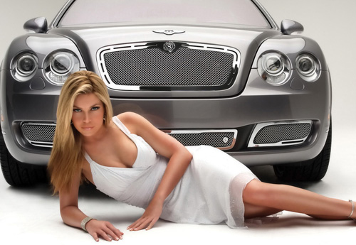
This comes to light in a study performed on two groups of males who were shown the same car advertisement, the only difference being the inclusion of a pretty woman alongside the car. The group that was shown the car with the woman not only rated the car as faster, better designed and more valuable, but when they were confronted about the influence of the attractive woman, nearly all of the subjects denied that it played a role in their judgment of the car.
How does all of this relate to Web design? Like so many things, it comes back to the content. Content is the most important element of a website, and how a user reacts to that content or recalls it later can be heavily influenced by its surrounding. The most obvious example is our judgment of credible information.

In the example above, you can see an article surrounded by distracting advertisements on the right. Crushed into leftover space or given no regard for good typography seems less important or even less factual to us than one that excels in all of these categories—even if the words are exactly the same. To the reader, it is clear that the time spent crafting an article into a beautiful experience indicates that it has higher value and more legitimacy. But the benefits don’t stop at the paragraph level. The entire experience of a website can be enhanced with an eye for beauty. I’ll even show you how.
The Laws Of Attraction
The process of booking a place to stay on vacation or a trip has been completely transformed by the Internet. To be completely honest, I’m in my 20s, so I don’t really know what people did to book places to stay before the Internet, but it had to be terrible. Today we have dozens of options for finding deals on hotels, resorts, apartments and beyond. From the variety of choices out there, patterns have emerged in the process of finding places to stay. Every website out there starts with the basics: destination, arrival and departure dates, and guests. This is a good pattern, and it generally serves our best interests, but oh, the difference that design can make.

Airbnb has established an impressive level of popularity in a short time among travelers looking for an experience outside of the standard hotel room. This is in no small part due to the emphasis it has placed on design. When you visit the Airbnb website, its entire mission is revealed to you in an instant. Large vibrant images bleed through the background, showing some hand-picked potential destinations.
These careful selections serve several purposes. First, it becomes immediately clear that we are dealing with something beyond the drab hotel experience. Secondly, it’s no coincidence that the destinations that enter and leave your peripheral vision are so gorgeous. Let’s take a moment to compare this experience to another website that offers a similar set of features.

Vacation Rentals By Owner (VRBO) helps you accomplish a goal similar to that of Airbnb’s users, which is to book destinations with individual owners. Honestly, VRBO does not make this process difficult, and its inclusion here is not meant to imply “Never do this.” The steps are the same (destination, arrival and departure dates, guests, etc.), and its design does not hinder the user from completing this process. However, the difference in experience between the two websites is drastic.
The primary difference is that Airbnb has done a wonderful job of presenting its primary content (the places) beautifully. The large pictures of the very pretty places gets us excited about our trip and about the sort of unique residences we could stay in. Because of the pretty things we immediately see on Airbnb’s home page, our entire experience is enhanced. Even if the process of booking a place to stay is no harder or easier on Airbnb, more people are likely to come back or share this resource with their friends because of the positive and memorable influence of the pretty images and interface. The unique style of Airbnb translates into measurable results in the form of a noticeably lower reliance on search traffic and a higher percentage of direct and repeat traffic.
The Industrial Age Is Over
There was a time when design was a secondary consideration for the products we used and the services we enjoyed. This mostly came about during the Industrial Revolution, and it could be argued that we relived a similar mentality through the Information Age. Both of these eras share a common theme of production on a large and affordable scale. We found ourselves constantly inventing a new mouse trap, except that it didn’t have to be a better mouse trap if it could be a cheaper one. So long as your table, automobile, computer software or thermostat had a utility and was affordable, it was good enough.

If you have the pleasure of living in a developed country, it should be obvious to you that times have changed and this no longer applies. Why did the Nest thermostat make such a huge splash online? Because finally we have a device that can automatically control the temperature in our home? For years we have longed for something that allows us to regulate the temperature where we live! Sorry, but we’ve had these things. In fact, hundreds of these things exist. But that’s precisely why Nest took off: it was the same thing done again but with real design this time.
Sure, it’s important that the Nest makes it easy to program the temperature in your house, which is an element of “good design” in the sense that designers love. The controls are simple, and it’s super-easy to understand, read and use. I would argue, though, that all of this is secondary to the fact that the Nest looks really cool. Perhaps you would scoff at the statement that looking cool is more important than being easy to use. But the fact is that this thermostat will spend most of its life not being touched and not being interacted with in any way. It’s a thermostat, so what will people do with it almost 100% of the time? They’ll look at it.
We see this in industries beyond home décor. It wasn’t long ago that the US automotive industry was in a nose dive for the crapper. This shouldn’t have been much of a surprise because the industry was built on Henry Ford’s principle of mass production on a cheap, repeating, large scale. As the world moved away from affordable necessities to desirable luxuries, the car industry needed to move with it or go broke. In the early 2000s, automotive juggernaut General Motors rehired Robert Lutz, the man who would rewrite the script on how GM made cars. Lutz ditched the industrial mentality of GM and started to imbue his own opinion of cars, saying, “I believe very deeply in the automobile as an art form.” Since then, GM has transitioned from manufacturing cars to designing them.
Looking around, you can see that making things pretty is going from being an afterthought to being an integral part of our lives. We have reached the point where making something affordable yet high in quality is second-nature. Look no further than the content we curate in our social media profiles today to get a prime example of the difference design makes.
The Internet is becoming a culture of hoarding; with Pinterest, Instagram, Facebook, Twitter and websites like Dribbble and 500px, a premium has been put on building a digital collection of things. We share the food we eat, the places we go, the clothes we want to buy and the gadgets we love. Often the primary requirement for sharing these things with our social networks is that they stand out visually. They need to be unique, stylish and well designed… they need to be pretty. As discussed earlier, all of these qualities build a connection between who we are and the products we love. In order to create a product or website of extraordinary value to the millions of digital curators out there, we need to invest in aesthetics that reflect well on those same users.
Put Pretty Into Practice
The landscape of the Web is not so different from that of thermostats or cars. If anything, its resources are over-abundant. Any task you might want to accomplish online either has been done thousands of times or can be easily duplicated after the fact. When users have limitless options and limited time, design is the deciding factor in what makes one experience more worthwhile than another. So, don’t cringe when “pretty” is included as a design requirement, because it should always be. When we make a design pretty, we are deliberately basing our design choices on aesthetic value. A pretty design has a visceral impact on the user and prompts an emotional response.
Designers who ignore the potential impact of prettiness on their work are at risk of being surpassed by peers who share their skill set but who appreciate the role of beauty. Pretty design isn’t just for Dribbble. Your clients, customers and users all stand to gain a lot from that extra coat of paint. A user’s personality can be imbued, however slightly, by the work done by a designer merely by association. I implore you to keep work from leaving your desk until you have had time to make it pretty.
Additional Reading
- A Whole New Mind, Daniel Pink
- “In Defense of Eye Candy,” Stephen Anderson
Further Reading
- Letterhead Fonts: Typography Eye Candy
- A Design Is Only As Deep As It Is Usable
- Building Emotion Into Your Websites
- The Role Of Design In The Kingdom Of Content


