Industrial-Strength Types
The Industrial Revolution gave us a new iron age, one of cast iron, which a devotee of Vulcan told me he thought was the highest achievement of man — or, as he put it, “the hairless ape.” In the 18th century, cast-iron bridges sprang across British rivers such as the Tay and Severn. These lovely sculptural archways are resistant to rust, so many are still standing.
But tragedies like the Dee Bridge collapse and the terrible Tay Bridge disaster of 1879 dampened the public’s enthusiasm and led to William McGonagall’s famous ballad:
“Beautiful railway bridge of the silv’ry Tay, Alas! I am very sorry to say, That ninety lives have been taken away, On the last sabbath day of 1879, Which shall be remembered for a very long time.”
What are “Industrial-strength types”? In this article I propose to explore them.
Birth Of Trainspotting
Railway locomotives, which moved through the countryside, were the first big machines to broach people’s consciousness. As individual self-propelled machines, they altered the landscape, which had been static until that point. A coach or horse-drawn cart moved along well-worn paths, but a railway required straighter lines and a level surface, so cuttings, ramparts and bridges were built, and the coal-fired locomotive would spew fire and ash like a dragon as it clattered along.
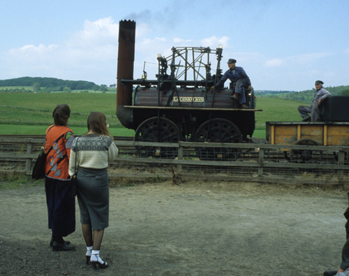
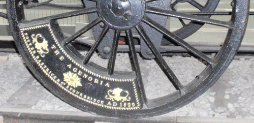
The Great Western Railway was one of the first to have a livery, and Isambard Kingdom Brunel also distinguished his railway by having a broad gauge, of seven feet. Though he was well known as an engineer and a builder of bridges and iron ships, he was pleased to buy two steam locomotives from George Stephenson, who is considered by many to be the father of the modern railway for his 1829 “Rocket.”
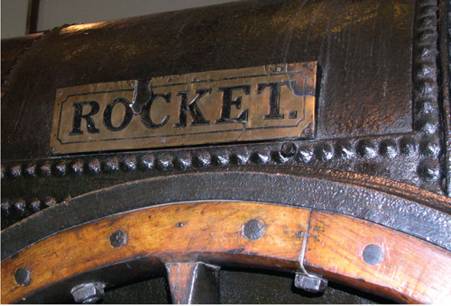
The brass nameplate shows a strong hand-wrought letter with backward-only serifs on the upright of the K and reinforced bracketing on the serifs of E and T. Otherwise, it is an early form of the type later known as Clarendon.
The Purpose Of Clarendon Types
Clarendon was first introduced for emphasis, a precursor of bold as a related face in a family. The idea of a boldface directly related to a roman arose with the Linotype machine in 1895, where bold was offered as an alternative to italic in two-matrix machines, but in the 20th century, extended typeface families that included bolds and semi-bolds became commonplace.
Before the introduction of Clarendon as a text face, it could be seen as a display type, for example in Figgins’ two-line Pica in shade, from about 1817. It was copyrighted by Robert Besley of London’s Fann Street Foundry in 1845, and as soon as the copyright lapsed three years later, it was widely copied. Railway timetables, newspaper headings, dictionaries, guidebooks, textbooks and other places that required spot emphasis were its preferred venues at first.
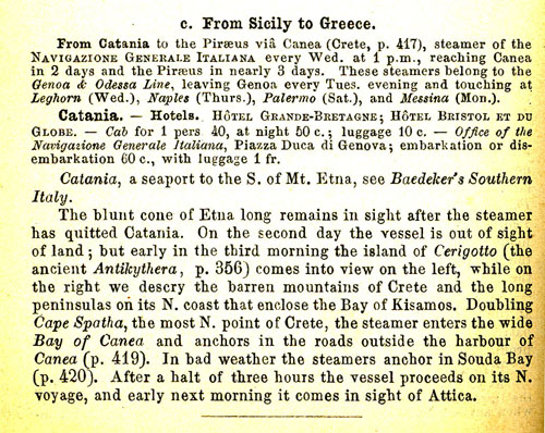
In essence, Clarendon is a condensed slab-serif letterform (known as Egyptian in its earliest lead incarnations), with brackets on the serifs.
Specimen Texts
Images of railway trains frequent the Fann Street Foundry’s 1844 specimen (which still bears the name of Thorowgood & Co). They feature on sans-serif, bold and even Tuscan display types. One of my favorite pages advertises the speed of the new mode of transport:
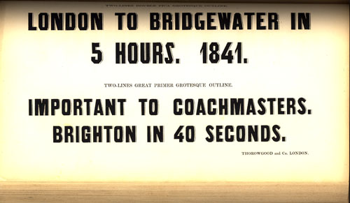
The typeface is a condensed sans serif with a slight shadow on the right, suggesting movement. (Isambard Kingdom Brunel built the first Bridgwater station in 1841 on his Great Western Line.)

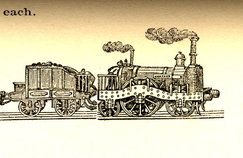
Cuts of trains that could be pieced together by printers were also made by Thorowgood for use on posters. An enlargement of the largest size (four lines pica, or two thirds of an inch high) shows a locomotive of the “Firefly” class, the Centaur (labeled in grotesque, or sans serif), which was also built in 1841 and ran on the Great Western Railway.
Fellow Travellers
The Rocket ran on the Liverpool and Manchester railway. For its 150th anniversary, a replica coach was created (now in the Railway Museum, York) along the lines of a stagecoach body, with the word “Traveller” in silver slab serif, to which an elegant two-tone shadow in blue and black (like daintily made-up eyes) has been added.
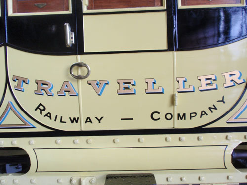
Such illusionistic shadows became a staple of the 19th-century sign-painter’s art, and many superb examples are found on surviving coaches from the time.

The North Star was built by Stephenson around 1838, and a rubbing of its brass nameplate shows a bold slab serif with brackets. The style, which became the basis of the Great Western Railway style for the next century is “exciting and has a solid magnificence,” according to Patricia Davey in her article “Locomotive Lettering” (Typographica 13, p. 12).
Kidding Around
Alphabets of things were a popular subject for children’s books in the 19th century. The Great Western Railway is depicted in Cousin Chatterbox’s Railway Alphabet (London, Dean & Son, 1854), drawn by Freeman DeLaMotte.
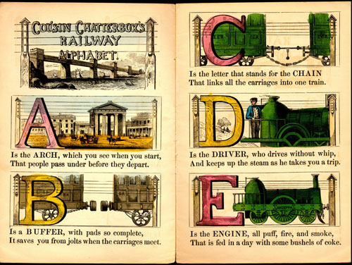
While the vehicles are labelled in plain grotesque (or square sans-serif) lettering, the alphabet book uses an elementary Clarendon form, suited to the subject. At the outset — “A is the ARCH — we see the Doric entrance to Euston station from 1837 (no longer extant), which was one of the first recreations of monumental Graeco-Roman architecture in Britain after its designer Philip Hardwick visited Italy. The engine shown is the “Mazeppa” (a name popularized by Byron’s 1819 epic poem). Euston was opened as the base for the London and Birmingham Railway in 1838.
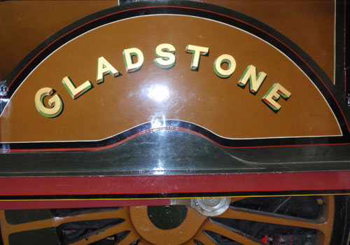
The Gladstone was built for the Brighton and South Coast railway in 1882. The sans-serif lettering floats off the surface with its multicolored 3-D effect as well as a double shadow. The red of the body detail is cleverly echoed in the highlights of the letterform. These illusionistic effects were employed throughout the British railways in the late-Victorian period.
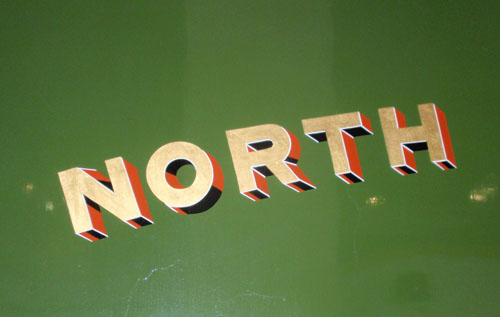
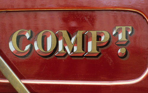
Here are some more examples from London and North-Eastern Railways and from London Midland and Scottish railways of floating sans-serif capitals:
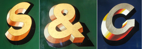
A century later, locomotive lettering had evolved with the times. The A4 locomotive, known to trainspotting youth as a Streak, in service on the East Coast route, was a magnificent Art Deco streamlined model, built in 1915. The first four Streaks were silver in color and went 500 miles a day. When I was a lad, the names Mallard, Falcon, Guillemot and Sir Nigel Gresley were magical to us, and we would interrupt our cricket game by the side of the track to gawk as the Flying Scotsman sped past at 100 mph. (These locomotives were mostly named after birds; Sir Nigel was the designer of this model.)
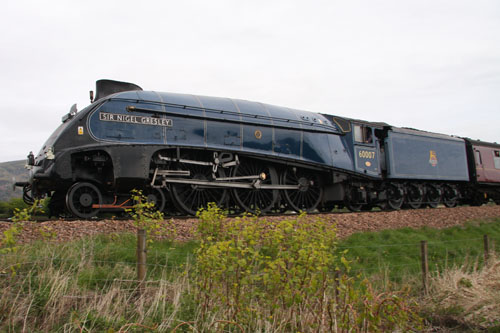
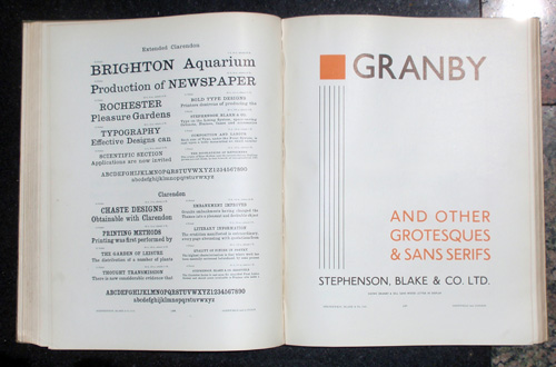
The LNER express trains, in service until 1963, were British racing green, although Mallard and Sir Nigel were blue. The lettering was akin to Gill Sans; indeed, Eric Gill was also inspired by locomotive lettering as a boy and was a pupil and flatmate of Edward Johnston, celebrated as designer of the London Underground railway’s proprietary typeface used in its signage. Gill Sans is now institutionalized as a British national letterform (seen for example in the typography of the BBC). A rival to Monotype’s Gill Sans face was made by Stephenson-Blake and called Granby. It actually leans more toward Johnston’s interpretation of humanist sans serif, a style he had invented.
Pressing On
One of the great inventions of the 19th century was the all-iron printing press. Ever since Johannes Gutenberg adapted a wooden screw-lever wine press to printing in the 1440s, printers had tried to improve the power of the machine. The first successful iron press was the one made in 1800 by Walker for the third Earl Stanhope, who generously did not patent it, so anyone could build a cast-iron press. It was a huge step forward in print production and quality. The Stanhopes had the maker’s name and “Stanhope Inv.” engraved in a modern roman letter on either side of the staple.
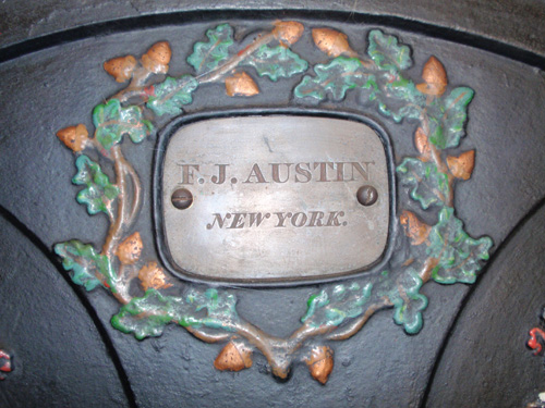
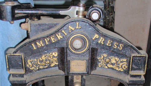
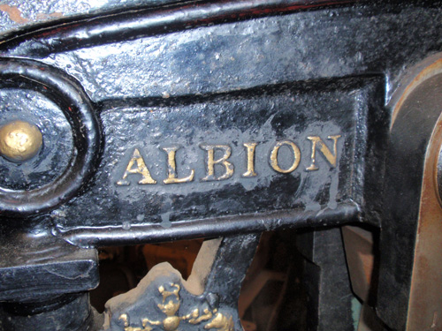
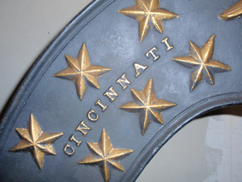
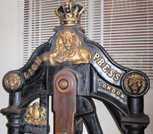
More improvements followed, the most famous being the Albion and Columbian, but many companies made machines incorporating their own patents to improve the screw action or the pressure. The “Son of Vulcan,” whom I alluded to earlier, collects cast-iron machinery — in particular, iron printing presses. A visit to his collection inspired me to think about the letterforms chosen by their makers to identify them ; quite a few of his machines are unique. Unlike other cast-iron machinery, such as engines, stoves and military equipment, for which sans-serif forms seem to be preferred (because dealing with the mould when casting is easy), two letterforms dominate printing press identities: modern face and Clarendon.
Stolid And Solid
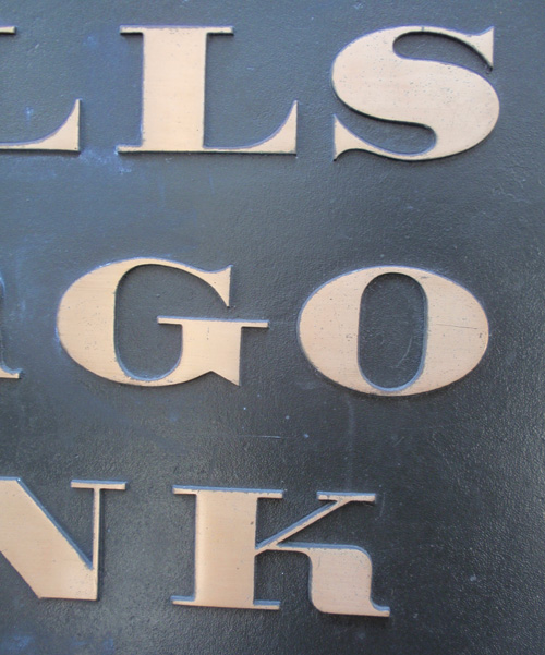
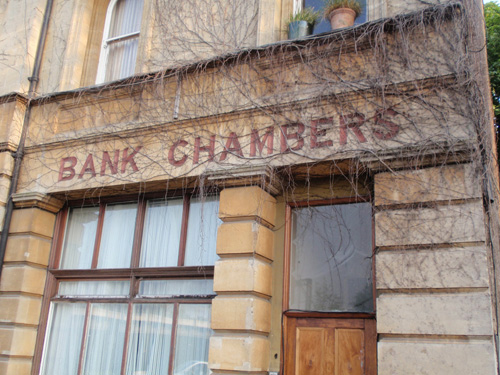
Speaking of banks, there is something suggestive of strength in the best bank typography. A bronze plaque on the old Wells Fargo building on Montgomery Street in San Francisco, undated, has a condensed bold modern letterform. It is hybrid of Ultra Bodoni and Engraver’s Bold, with a dash of Imre Reiner’s 1932 typeface Corvinus Fett in the K.
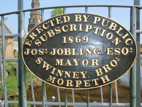
A cast-iron plaque from 1869 on an iron bridge in Morpeth, Northumberland, tells the story of the bridge in bold modern. Note the initial S in “Subscription,” “Josh” and “ESQ” have been turned upside down. There’s a folk quality to this (reminiscent of the Superman logo) that puts the weight at the top of the letter.
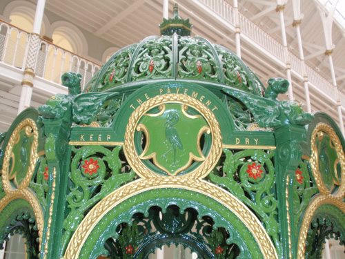
I’ve found many examples of Victorian cast-iron lettering buried in ornate structures, from bridges to manhole covers to drinking fountains to public toilets — the one for drinking fountains, seen in Edinburgh, asks you to “Keep the pavement dry” in a condensed, spaced gothic or sans serif.
Iron Ladies On The High Seas
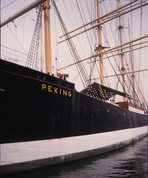
Ships are magnificent examples of machine-age artistry, and all of them have names. One of the last sailing ships with an iron hull, the four-masted windjammer Peking, was built in Germany around 1890.
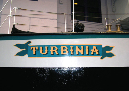
The Turbinia was built in 1894 as the first steam-turbine-powered ship and was by far the fastest ship in the world. Charles Parsons was its engineer. The sleek and elegant design was matched by a fanciful late-Victorian letterform for the name that has the strength of a sans serif with additional midriff bulges (popularized from the 1860s to ’70s). The Ionic serifs resemble a Stephenson-Blake type of the time called Flemish Expanded, but the visual effect, with simple drop shadow, is more akin to wood type of the period.
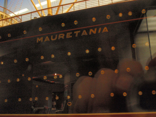
The RMS Mauretania was the sister ship of the more famous Lusitania. At the time of her launch, she was the heaviest and largest moving object on earth. The Mauretania held the record as the world’s fastest ship from her inaugural Atlantic crossing in 1907 and on for the next 22 years. She was built for Cunard at the Swan Hunter shipyard on the river Tyne, and, interestingly, the name of the ship contains a huge typo. The North African roman province is often spelled Mauritania, but having gone ahead with it, the directors decided that the alternative spelling was acceptable.
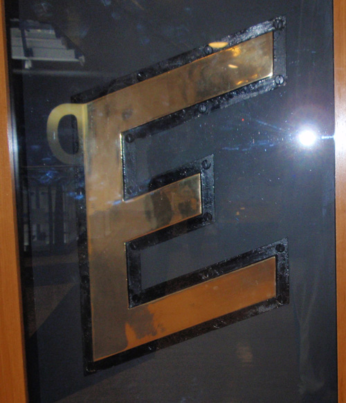
The brass letters used for the name of the ship were two feet square in rudimentary sans serif, but set at an angle to create a racy, more nautical italic. My photo above is of the model ship made by Swan Hunter for its board room, and the “E” is the original letter, saved when the ship was scrapped in 1935.
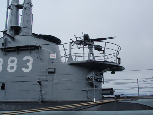
The U.S.S. Pampanito is a submarine built in New Hampshire in 1943 that saw active duty in the Pacific during World War II. The name is Spanish for “butterfish.” Typical of military machines, it has chamfered gothic letterforms — like on a rugby or American football jersey — suggestive of ruggedness.
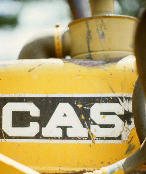
We would expect a bulldozer to have the same letterform. Indeed, here is a typical example from Laytonville, in Northern California:
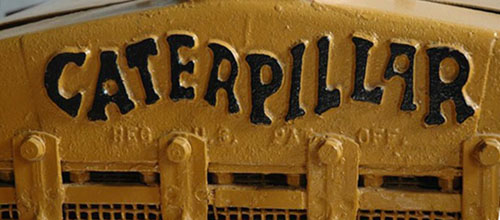
However, there’s always an exception to the rule: the original logo of Caterpillar reflected the sinuous delicate creature it is named after.
Consciously or unconsciously, typographers use types for graphic effect. Bold types are used for impact, but we increasingly see subtle differences between weights of type to articulate levels of meaning. The industrial-strength types I have been discussing seem like natural choices for cast-iron machinery that emerged during this period of technological change. Today, they are found in contexts where strength or solidity is needed. But there is always a parallel history to the one we write. Forays into Tuscan or the decorative shadow effects of the sign-painter’s palette show that, no matter how straightforward a letterform, there is always an urge to adorn and decorate.
Credits
All photos copyright 2012 by Alastair Johnston, except “Sir Nigel Gresley” by Gavin Cameron. Thanks to Ted Salkin for providing access to his collection of cast-iron printing presses. Trains photographed at Beamish Open-Air Industrial Museum, Durham, UK; The Science Museum, London; The Museum of Transport, Glasgow; and the National Railway Museum, York. Turbinia and Mauretania photographed at the Discovery Museum, Newcastle-on-Tyne. Fann Street Foundry 1844 specimen, Baedecker’s Greece, and Stephenson-Blake catalogue from the Poltroon Press collection. ‘Cousin Chatterbox’s Railway Alphabet’ courtesy of the Fox Collection of Children’s Books, San Francisco Public Library.
Further Reading
- What Font Should I Use? 5 Principles
- Khajag Apelian: Type Design Is Not Only About Drawing Letters
- Massive Collection of Nature Inspired Typography
- Out of This World Typography
- 55 Wonderful Free High-Quality Fonts To Jazz Up Your Designs


 Claim Your Free Spot!
 SurveyJS: White-Label Survey Solution for Your JS App


 Register Free Now
 Celebrating 10 million developers

