Why Won’t Helvetica Go Away?
Update: Hours after the publication of this article Indra Kupferschmid published an article in which she corrected some of the facts presented in the original article and provided an opposite view on the issue. We republished Indra’s article to correct the factual errors, with her permission of course. Make sure to check the corrections before reading this article.—Ed.
The other day someone sent me a link to a website with the preposterous title of “The 100 Best Typefaces of All Time”. Topping the chart was Helvetica, and that stirred my ire. I dismissed the list because it was based on marketing figures from one source, FontShop, coupled with the opinions of half a dozen mostly Berlin-based typographers, but I was still incensed.
When it comes to, say, boxers, you can handicap the various athletes in the ring and predict that Muhammad Ali would beat Jack Johnson or Jim Corbett and that, therefore, he is number one, but a lot of other factors come to bear on your decision: sentimentality, the fact that Ali is acknowledged (by people like me, with no real knowledge of the sport) to be “The Greatest”; he has name recognition, and so on. But how do you evaluate a typeface? Is it just based on its widespread use? Or its suitability to the subject at hand? Ease of reading? Familiarity?

Bust portrait of Muhammad Ali by Ira Rosenberg, from the World Journal Tribune. (Image: Library of Congress)
For Helvetica, an explanation of its history helps to explain its longevity. Most typeface designs are the result of fashion or changes in taste; some are technologically driven. When iron printing presses were introduced around 1800, sharper, crisper types such as Bodoni and Didot were created. When laser printers came along in the mid-1980s, with their bitmapped fonts, students in Holland began producing typefaces that reflected the quality of the poor printing. Letters in Studie (Eindhoven, Lecturis, 1983) shows examples by Jelle Bosma and Petr van Blokland designed on a 40-pixel grid. Emigré, an early digital type foundry, produced Oakland (1985) and other lo-res types for the market.
So, fashion and technology, which are ever evolving as they become obsolete, are as influential on type design and typography as on any other medium, from dressmaking to car design. When printing technology became so good that uniformly smooth, crisp faces were the norm, designers longed for the grit and noise found in old letterpress posters and started a fad for trashed and distressed faces. But like everything else that is fashionable, typefaces retire to await a future recall.
The art of reviving typefaces began in the Victorian era, and among the choices of contemporaries, the original Caslon is a model that has endured. In the 20th century, typeface revivals seemed to outstrip new designs. Production accelerated as two big companies, Linotype and Monotype, tussled in the field. The head of typeface development at the British Monotype Company, Stanley Morison, said, “Type today does not require inspiration so much as investigation.” He led the charge into the past with modern versions of the types Aldus (Bembo), Fournier, Bell, Walbaum and others. Linotype (under George W. Jones) countered with superior versions of Granjon (ironically named as it is the best Garamond copy of the metal era), Baskerville and Janson.
At that time, two sans-serif types introduced in the late 1920s dominated the market for advertising. These were Monotype Gill Sans and Futura, of the German Bauer foundry. Suddenly there was a rush to create, imitate or revive sans-serif types. The Berthold foundry of Berlin dusted off the matrices for its Akzidenz Grotesk (1898), while their rivals, the Haas Type Foundry of Basel, decided to rework Schelter Grotesk, which had been issued by the Leipziger Schelter & Giesecke foundry in 1880. This became Neue Haas Grotesk in 1957, which was then picked up by the Stempel foundry in Frankfurt. It wanted to identify the type with the emerging popularity of Swiss graphic design and chose the ancient Roman name of Switzerland, Helvetia, and so Helvetica was reborn in 1961.
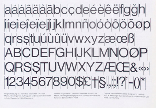
Max Meidinger’s original 1957 design of Helvetica (from the Haas Typefoundry brochure “From Helvetica to Haas Unica,” Münchenstein, ca 1979).
The reason for the popularity of Gill Sans and Futura was that they turned their back on these Grotesks of the 19th century, which were worn out. Eric Gill took a new approach: pen-made humanist calligraphy was the basis for his type (he had also worked on the drawings for the London Underground alphabet with his mentor, Edward Johnston). These letters made more coherent word shapes and were easier to read than Grotesks. But Gill’s type standardized the distinct curled-tail “l” and shed-roofed figure “1” of Johnston’s design, which led to confusion with the capital “I” (a problem in many sans serifs).
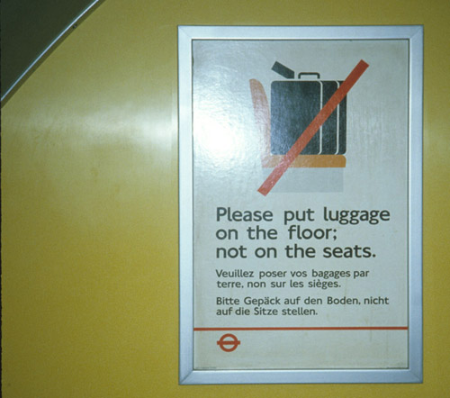
The third (digital) version of Edward Johnston’s proprietary London Underground typeface, photographed on the Piccadilly Line in 1983.
Paul Renner’s Futura was designed to reflect the new machine age, with simple geometric shapes, straight lines and circles that gave it a cool Art Deco elegance. Both types are now imbued with a lot of cultural baggage, so Gill suggests the British Broadcasting Corporation and Futura has become nostalgic shorthand for the era of streamlining.
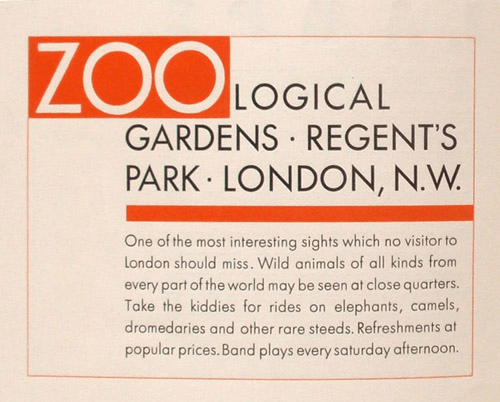
Paul Renner’s Futura Light, 1928, from a Bauer type foundry brochure (New York, ca 1930)
But in the 1930s, these two types were immensely popular in Europe and North America, and the other founders had to respond quickly. Returning to the 19th century should have been out of the question for the competition, except that the German foundries had been flattened in the Second World War and were slow to retool.
Helvetica became a national brand, an identity for the popular “Swiss style” of typography of Emil Ruder and Armin Hofmann, which quickly spread as their well-indoctrinated students took the new look back to Yale and other American schools. From BMW, Bayer and Lufthansa in Germany, the Helvetica look spread to Bank of America, Knoll, Panasonic, Target, Crate&Barrel, JC Penney, Mattel, American Airlines, Sears, Microsoft and other corporations.
In the late ’90s Microsoft was selling a million copies of Word each month and gave away 14 fonts with its program. Its knock-off of Helvetica is called Arial. Linotype had taken over Stempel, and then Haas, and so consolidated its ownership of Helvetica and many of the clones. The stark sans-serif look that had first symbolized revolution in the hands of Russian typographers in 1917 became institutionalized as the bland face of corporate smugness.
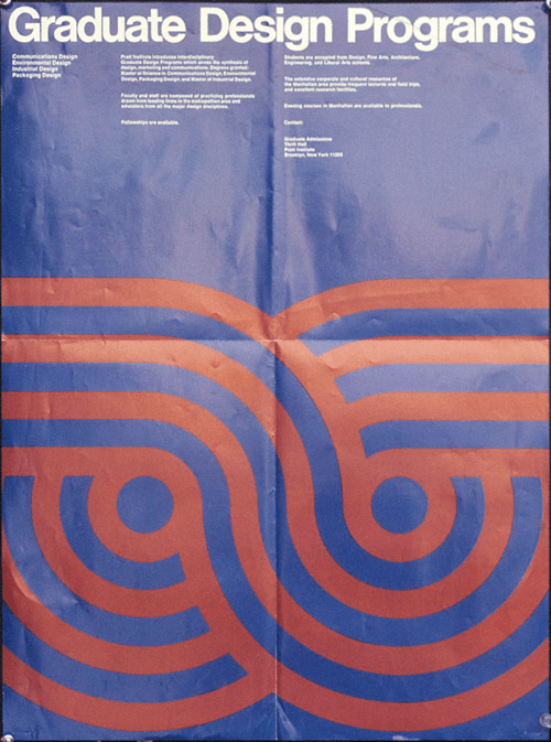
Swiss-style poster for the Pratt Institute, Brooklyn, New York, 1972. (Courtesy of Frances Butler)
As it spread over the graphic landscape like melted runny processed cheese, I suggested renaming it Velveetica. Its blandness and general horridness oozed out on all sides. It was neutral, but also tasteless and was taking over typography. Nothing could stop it as designers unquestioningly copied one another in adopting it. The idea that it was more modern than Gill Sans or Futura has more holes in it than Swiss cheese.
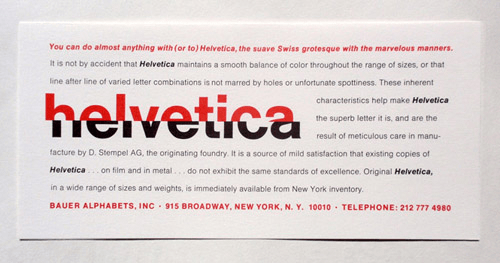
A card advertising Helvetica filmsetting (Bauer Alphabets, New York, no date)
After the adoption of the Swiss style internationally, another event caused the persistence of Helvetica: the arrival of the personal computer. Apple could fit only a few types into the memory of its LaserWriter printer driver. Times and Helvetica were decided by executive fiat (based on their popularity at the time); Symbol and Courier were required by the operating system. Then, a team of experts was called in to choose more types: Palatino, Zapf Chancery, Avant Garde, Bookman and Century Schoolbook were picked by committee. One of the committee, Sumner Stone, told me, “In retrospect they seem pretty strange and random. … Times and Helvetica were redrawn, and with Helvetica the narrow and oblique came free because it was just an algorithm.” With only garbage to pick from, there was a visual blight of Times, Helvetica and Palatino in the early days of “desktop publishing,” which lasted well beyond their sell-by date.
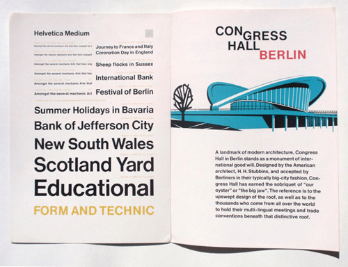
Helvetica brochure Frankfurt (D Stempel AG, no date)
Speaking of which, the US government (which uses Helvetica for tax forms and other official printed matter) specified it for “generic packaging” in (wouldn’t you guess?) 1984 (see top of page). Everyone blindly accepts Helvetica, most of them we assume because they follow leaders like lemmings, but why do they extoll its worth? Is it a great international hoodwinking conspiracy, like the Emperor’s New Clothes?
In 1993, Robert Norton, who was a Microsoft bagman, invited prominent people in the field of typography to contribute to a book entitled Types Best Remembered / Types Best Forgotten (London & Kirkland, Washington, Parsimony Press) and write about their favorite and least favorite typefaces.
Peter Karow (who created the Ikarus program for type digitization) wrote about Helvetica: how he had digitized it in various clones throughout the 1970s and 1980s as competing companies put out their own similar versions. It was his favorite, it seems, but with reservations. In 1993, he relates, Stefan Rögener told him that “90% of creative directors use Helvetica, Futura, Garamond and Baskerville. Give me a pistol!”
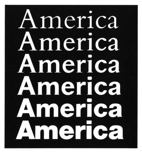
The Ikarus program allowed designers to alter their Bembo clone into a Helvetica clone, although why would they? (From “Ikarus for Typefaces in Digital Form” by Peter Karow, URW Unternehmensberatung Karow Rubow Weber GHBH, Hamburg, 1983)
I took the opportunity to name Helvetica my least favorite type and wrote a reasoned (I thought) explanation of why it is not a good typeface: “The letters are square and squat and don’t communicate with their neighbors. … There is more internal space in the counters than around the words, creating ugly and standoffish silhouettes.” The point I was making is that, to operate legibly, words have to have a visual balance between internal and external white space, a kind of aerodynamic flow. It’s a physical fact, and types like Syntax or Frutiger work far better than Helvetica, which remains self-enclosed and constipated-looking.
Legibility operates not at the level of characters but of ideational units. Adults read clusters of letters, such as “the,” as a single unit, or their brains group clusters of characters to speed comprehension. The better these units cohere, the more legible they will be (assuming that speed and comprehension are goals). Typefaces that have many characters that resemble one another (such as “a” “s” and “e” in Helvetica) impede the reader, as does the fact that the enclosed letter shapes prevent them from fusing to make more cohesive units. These are scientifically established aspects of letterform design and should take Helvetica out of the equation for anyone looking to create a legible message. Communication is a science and doesn’t really have much to do with aesthetics, other than the reader’s comfort via familiarity.
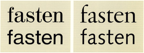
Static versus dynamic letterforms
In this illustration from “Syntax-Antiqua, eine serifenlose Linearschrift auf neuer Basis (Syntax, a Sans Serif on a New Basis)” (Gebrauchsgraphik, 1970), Erich Schulz-Anker (Manager of Typographic Development at D Stempel AG) contrasts the mechanical Didone-Helvetica development with a humanist line running from Garaldes (i.e. Sabon) to Syntax, designed by Hans Eduard Meier and released by Stempel in 1969. He contrasts them as “static” versus “dynamic” forms. I would further characterize them as illegible versus legible forms. See how the letters on the left stand apart and isolated from one another, while those in the dynamic group relate to their neighbors.
Of course, most lay people can’t tell one sans serif from another. When people say they prefer Helvetica to Arial because the latter is a bad copy, I ask if there’s a difference between a Big Mac and a Whopper, and, more to the point, would you honestly feed either to your kids?
Adrian Frutiger, “Mister Univers” himself, tried to improve on Helvetica with the Univer series, begun in 1954 (and he succeeded, causing the Helvetians to expand their family of weights in response), but then, in his maturer years, he turned his back on Univers to design the family that bears his own name (Frutiger, 1976). With the Internet, Helvetica has retrenched and, despite the Arial clone that mimics it (see “The Scourge of Arial” by Mark Simonson), gotten new legs as a font that stays the same cross-platform. If you use any Adobe product, you cannot avoid Helvetica.
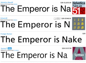
Comparison of four sans serifs from “My Fonts”
Everything about Helvetica is repellant: from its uptight aura to its smug, splendid isolation. How it persists in the face of such brilliant alternatives as Frutiger and Syntax defies logic.
Mike Parker, who oversaw production of Helvetica at Linotype, wrote, “In the sixties by cutting it for the Linotype we made Helvetica the Swiss sans serif of choice across most of the world.” But, he adds ruefully (in Types Best Forgotten), “Never again should we have to endure quite such dulling repetition of any single design.”
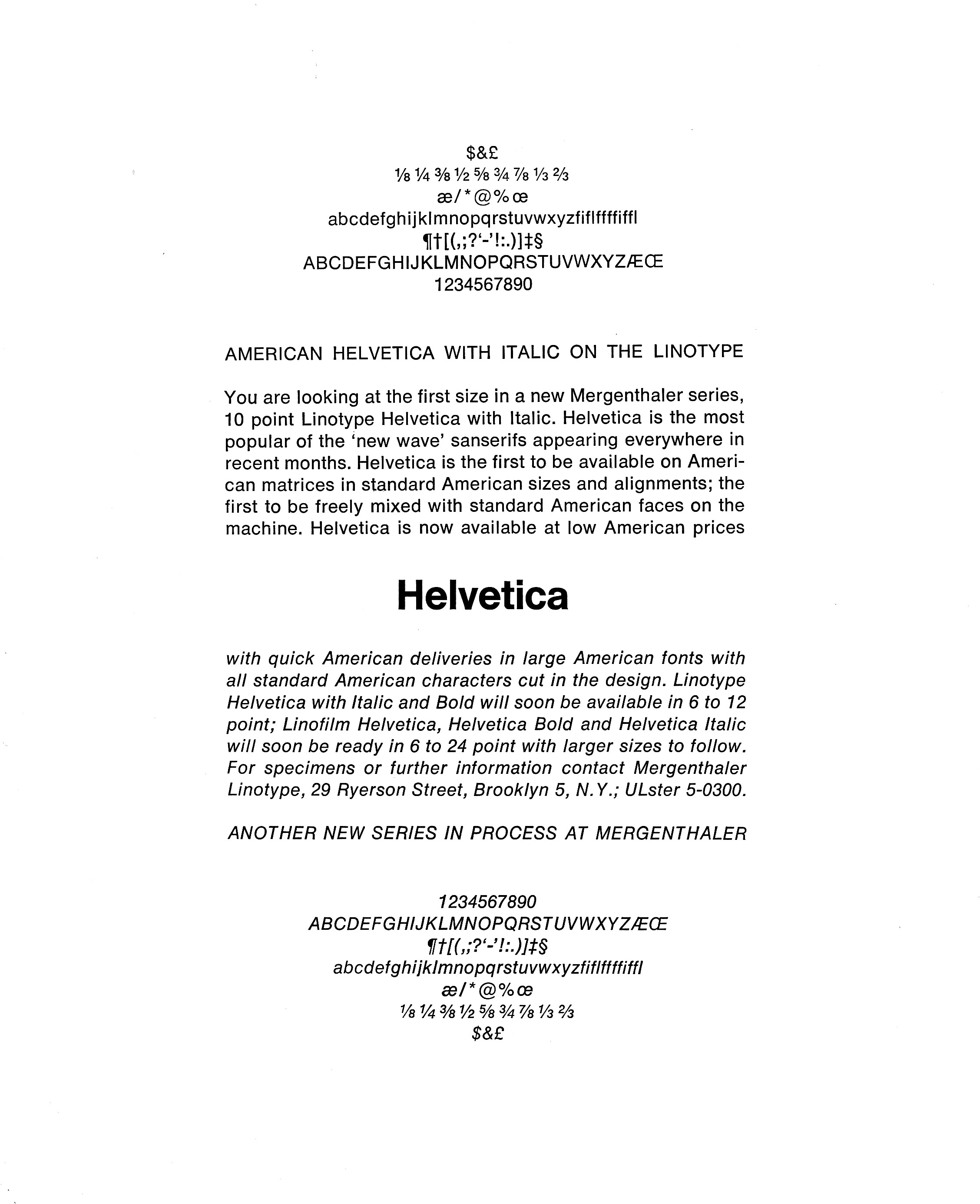
First showing of American Helvetica (Mergenthaler Linotype, New York, no date)
I sincerely believe that people (even designers) who say Helvetica is legible are simply confused. It’s pervasive, certainly. We see it everywhere — that’s why we think we can read Helvetica — but it is not nearly as legible as, say, Frutiger or Syntax, for the reasons I have stated above. Syntax is not merely a legible typeface: Syntax is beautiful, it’s sublime, it sings. Well, you argue, Helvetica is neutral. Yes, Helvetica is neutral, but it also symbolizes blandness and conformity and… well, sorry Swiss people, boredom.
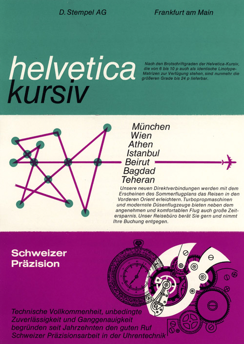
Helvetica-Kursiv flyer from D Stempel advertising Linotype-Matrizen in 6 to 10 point (Frankfurt, no date)
In 2007, Gary Hustwit made a documentary film about the typeface in which various talking heads exuded enthusiasm for the wretched mess that is Helvetica. The corporations have agreed, and the bland new world feared by Huxley, Orwell and other writers of the last century is one step nearer.
Further Reading
- Lessons From Swiss Style Graphic Design
- 80 Beautiful Typefaces For Professional Design
- The Best Free Fonts for Designers
- How To Choose The Right Face For A Beautiful Body


 See the full picture →
 SurveyJS: White-Label Survey Solution for Your JS App


 Celebrating 10 million developers


