Boost Your Mobile E-Commerce Sales With Mobile Design Patterns

Email Newsletter
Weekly tips on front-end & UX.
Trusted by 182,000+ folks.
 Custom Web Forms for Angular, React, & Vue. Your backend.
 Celebrating 10 million developers


People are increasingly using their smartphones as a replacement for desktop computers, even for activities such as shopping and purchasing. And as more people move away from the desktop and onto mobile-optimized websites to shop for products and services, website creators can use established design patterns to help kickstart a mobile e-commerce project.
Having a good mobile e-commerce experience matters a lot. In fact, recent research has found that people are 67% more likely to make a purchase if a website they’ve reached on their phone is smartphone-friendly.
The power of design patterns is that they show you how other designers have solved similar problems so that you are not always reinventing the wheel. They also enable you to design your website in a way that meets the expectations that people develop from the other websites they’ve used, and they encourage you to consider design approaches that you would not have thought of on your own.
In this article, which focuses on smartphones, not tablets, we’ll look at design patterns and approaches used for mobile e-commerce functionality, including the following:
- Home pages,
- Site-wide navigation,
- Suggested search,
- Search results,
- Search filtering and sorting,
- Product pages,
- Photo galleries,
- Shopping carts,
- Checking out with an account or as a guest,
- Forms.
All the examples in this article are drawn from mobile websites that run in smartphone browsers. Most are taken from large multi-department retailers because they have large product catalogs that require a thoughtful approach to features such as search and filtering and sorting of search results. There are also countless native apps for e-commerce, and many of these patterns can be applied to them as well.
Home Pages
When visited on mobile devices, home pages are often less about content and more about helping users find what they are looking for. Common patterns are simple single-column layouts for promotions and single-column lists of links to featured website areas or product categories. Keyword search is commonly included on home pages, as are links to store locators and registration forms for promotional emails and loyalty programs.
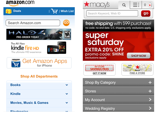
Amazon and Macy’s both use a mix of promotional elements and list menus.
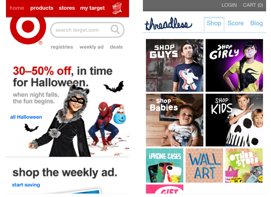
Target’s promotional content takes up more screen space than a simple list but makes a stronger visual impact. Threadless uses a dashboard pattern, which is more common in native apps than on e-commerce websites on mobile.
If shoppers are coming to your website to compare prices quickly, then a simple list pattern and search function are probably more desirable. If they are coming to explore promotions and sales, then the approach taken by Target may be more appropriate. To answer these questions, you’ll need to mine your analytics to get an idea of what consumers are doing on your website.
Site-Wide Navigation
Beyond using the home page as the main navigational hub, many websites also have navigation menus on most of their pages, usually in the header. This enables shoppers to easily get from one part of the website to another without having to return to the home page.
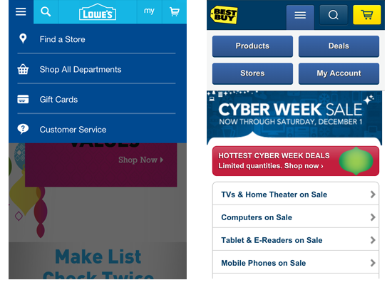
Lowe’s site-wide menu has icons for each option. Best Buy’s menu has a two-column layout for navigation and has buttons instead of list items. Lowe’s menu covers the page when it appears, while Best Buy’s pushes the page’s content down the screen.

Macy’s has a site-wide menu that contains submenu options. CVS has a two-column menu with an icon for each option. In both cases, the menu is displayed at the top of the page.
As you can see from the screenshots above, there are several ways to design a site-wide menu. Lowe’s design is simple, and the icons add a nice bit of visual polish. The fact that the rest of the page fades into the background when the user chooses to use the navigation helps users focus on their current tasks. CVS seems cluttered in comparison, with two columns of options, each item accompanied by an icon. CVS’ menu also places a lot of tap targets close to each other, which can present usability problems on touchscreens.
It’s interesting that large e-commerce websites usually don’t have many navigation options displayed at once. They try to balance the visual design of the navigation with the information architecture of your website, carefully considering the number of items that should be in the global navigation. Use website analytics to see which menu options shoppers click to help you determine what should be in the menu. Conducting A/B testing and usability tests of different designs to see whether one has too many options and overwhelms people is not just recommended but necessary to find the optimal solution — for your business and for your users.
Suggested Search
Suggested search, also known as type-ahead or autocomplete, displays potential results as soon as a shopper has typed in a few characters. For commonly searched terms, this can be a real convenience to shoppers, especially if the search term is long. One limitation of suggested search is that tapping a wrong character on a virtual keyboard is easy, which would change the suggested results. Showing common “correct” results instead might be useful. Also, consider using an improved Auto-Suggest pattern to reduce the amount of typing needed to enter queries, and utilizes slower mobile bandwidth in the most efficient manner.
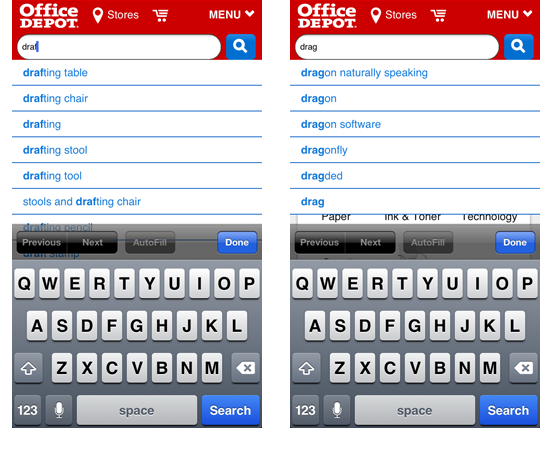
Typing “d-r-a-f” into the search box on Office Depot’s website brings several possible results. And mistyping “d-r-a-g” instead of “d-r-a-f” leads to unexpected results for someone who is trying to find drafting supplies. Tapping a letter adjacent to the intended one is a common problem on virtual keyboards.
While designers can’t do anything about people mistyping queries, they can ensure there are other ways to get to product pages from mistyped results, such as drill-down lists for product categories or a site-wide menu of top-level categories. Website managers can also fine-tune their search functionality by suggesting results for “draft” from queries typed as “dragt.” Your ability to do this will depend on the search engine technology you are using.
Search Results
Two primary patterns are used for search results on mobile e-commerce websites: table display and grid display. Tables show a thumbnail photo and some basic information such as product name and price in a compact row. Grids show larger images with less descriptive information. Some websites allow shoppers to switch between the two views.
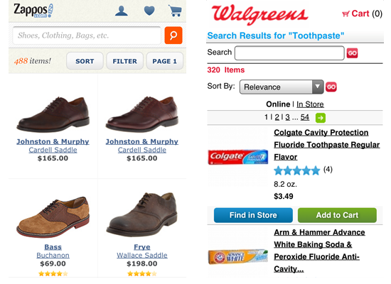
Zappos shows its search results in a grid to allow for larger photos of its products, a sensible choice in a market like shoe sales. Walgreens has a table that includes buttons for finding item in stores and adding items to a shopping cart.
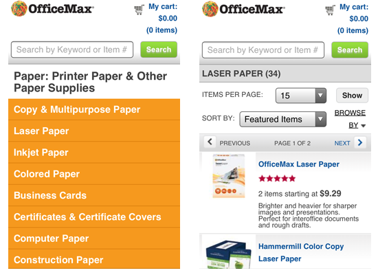
OfficeMax asks shoppers to select a subcategory for broad search terms like “Paper.” Once a subcategory has been selected, results are displayed as a table. Searches for terms like “Scissors,” which have fewer subcategories, takes shoppers directly to the table view of the results.
Having shoppers select a subcategory can be problematic if it’s not clear where a product fits in a complicated hierarchy. In the OfficeMax example above, someone looking for 8.5 × 11-inch paper for their home printer might not know whether to look in “Copy & multipurpose paper” or “Laser paper.” A better approach might be to list subcategories under search filters, where they can be presented in context with other filters, like “color” and “size.” Regular testing (every 4–6 weeks) with representative users and commonly searched-for terms and top-selling products could give you insight into which approach is better. A/B testing could also reveal whether one approach gets more people to a product page and leads to a higher conversion rate.
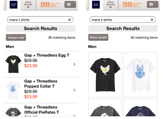
Visitors to Gap’s website see a table display by default, with the option to see a grid display. Notice that Gap also retains the search term in the keyword field.
Gap lets shoppers choose how to view search results, allowing them to switch from an easy-to-scan list to a view with larger photos. Gap could have retained some product information though — e.g. prices — in its grid display (as Zappo’s does). Details such as price and color make it easier for a shopper to determine which product they want to learn more about.
Retaining the term in the field also reminds shoppers what they searched for and lets them easily narrow the results by adding another word (like “red”) to the search term.
Searching Gap for “men’s tshirts” takes shoppers to a page with no results (not shown), and without linking to search results for “men’s t-shirts.” Gap could improve its search by adding a “Did you mean?”-type question to the results page. Google handles this scenario by listing “mens t shirts” as a suggested query and then presenting results for “men’s t-shirts” if that suggestion is ignored.
Sorting Results
Sorting results helps shoppers organize a large set of results along a continuum of values, usually numerical ones such as price and consumer rating. Common interface patterns for sorting are buttons and menus.
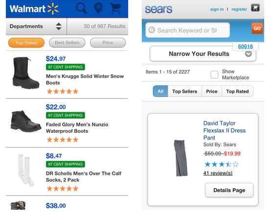
Walmart lets shoppers select one of three buttons to sort results. Sears uses a similar approach, but with a “segmented control”. JavaScript frameworks such as jQuery Mobile are making these app-like interface widgets more readily available to designers.
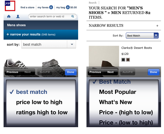
J.C. Penney allows for sorting through a menu that is slightly customized in style, while Eddie Bauer uses the browser’s default menu. Both trigger the browser’s native control for menus (in these examples, the iPhone picker).
The size and generous spacing between Walmart’s buttons make for better tap targets; although, to be fair, Walmart has only three options, while Sears has four. Sears’ inclusion of an “All” button allows shoppers to get back to the original results page if they don’t find what they want after having sorted. Using a menu is a quite safe choice because it is supported by modern mobile browsers and allows for longer lists of sorting options. However, it also takes a lot of valuable space. These are the types of design trade-offs that can be evaluated with regular testing.
Filtering Results
Filters enable shoppers to narrow their results based on one or more attributes, like color, brand and size. Filters are usually organized by type (called facets), with several values appearing under each facet (for example, color is a facet, and red is a facet value). Common interface patterns for displaying filtering options are menus, drop-down lists and accordion displays. Filtering can be applied when one or more values are selected from within a facet. While allowing a single search to include values from more than one facet is technically possible, it comes with a higher interaction cost and could lead to no results (for example, cross-training athletic shoes that cost less than $75).
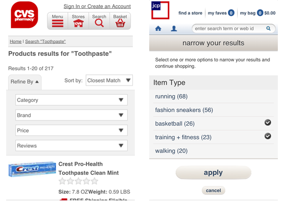
CVS uses menus in its “Refine” tab for filtering. Selecting a menu option will immediately filter the results. J.C. Penney offers a drop-down list for selecting filters and indicates the number of products that match a filter value. J.C. Penney also allows multiple values from a single facet to be selected on one screen, the trade-off being that the shopper has to tap the “Apply” button.
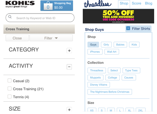
Kohl’s uses an accordion to expose a set of checkboxes for each filter type. Threadless exposes the values for all of its search facets as buttons. On both websites, selecting a single filter value will immediately filter the results.
Showing the number of items available under each facet value offers greater transparency into what shoppers will get with each selection. Threadless’ approach of showing all available facet values takes up the entire screen, but it offers consumers an at-a-glance view of all filtering choices available to them. Whether you take this approach or use an accordion like Kohl’s will likely depend on how many facet values are present for a given category of products. If your catalog has a high degree of variability in the number of facet values for each category, then you will need to experiment to find the right design. You could optimize the filtering interface for those product categories for which shoppers use filters the most.
Product Pages
Product pages are where e-commerce websites really showcase their products in detail. They are not a “pattern” in the true sense of the word, but rather a collection of patterns that include elements such as tabs, accordions and photo galleries. Two common approaches to product pages are one long page with all of a product’s information or a page with tabs or accordions to allow for progressive disclosure of information as shoppers need it.
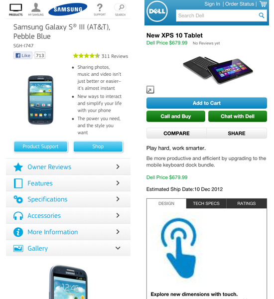
Samsung and Dell progressively disclose content on their product pages, which have a lot of information for shoppers. Samsung uses accordions to expose chunks of information, while Dell uses tabs.
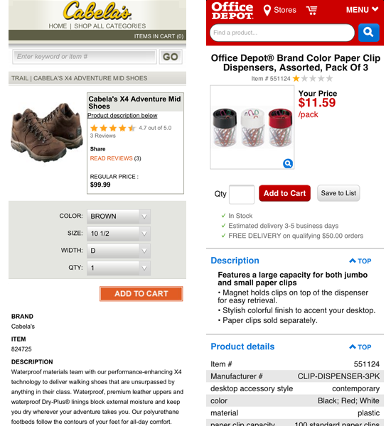
Cabela’s and Office Depot both use a single long page to display product information. This approach requires more swiping up and down to get to information, but it frees shoppers from having to work with small tabs or manipulate accordion headers. Your choice will depend on the amount of information associated with a product and how the information can be broken down into logical sections.
Long product pages require more scrolling than pages broken into manageable chunks with tabs or accordions. They also require shoppers to put more effort into finding the specific information they are seeking. In my own usability testing, I’ve heard people express preferences for both approaches, but they seem to have an easier time working with a page broken into logical chunks. If you take this approach, make sure any content not initially displayed renders quickly when the shopper taps on the tab or accordion.
The obvious way to accomplish this is to load all of the page’s content at once so that the hidden content appears almost instantly. This approach has an advantage for when the user’s network connection drops while they are switching between sections. The big downside is that all product information has to be downloaded, whether it is actually viewed or not; this adds more load to your servers and uses more of the shopper’s data plan, which could be metered.
Photo Galleries
Photo galleries are particularly critical in e-commerce industries such as apparel and consumer electronics. You might not need to see a wrench from three different angles when shopping at Home Depot, but more images are better when looking for clothes, shoes or a high-end smartphone or tablet. A few commonly used patterns are the swipeable gallery, “double-tap to zoom”, and thumbnails for selecting photos.
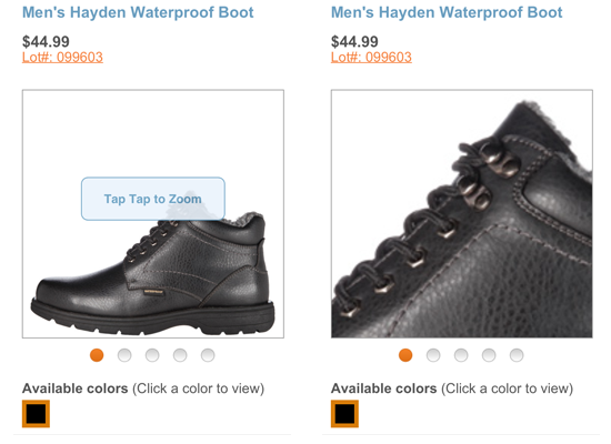
Payless uses a swipeable gallery to show its products from different angles. Users can also double-tap to zoom in to see details like stitching and eyelets.
Payless wisely keeps its “Tap tap to zoom” call-out on the screen for several seconds, giving the shopper time to understand how to navigate the page and still notice it. The ability to zoom in to a photo to view a product’s details is critical for apparel and shoes.
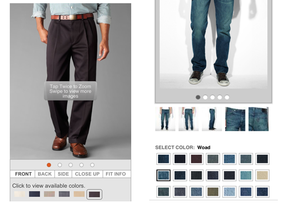
Dockers (above left) has a swipeable photo gallery, with double-tap to zoom in to details, and shoppers can see a product in different colors. Levi’s (above right) takes a similar approach, with the addition of thumbnails to indicate the photo angles in the gallery. Selecting a new color on Dockers’ website causes a full-page refresh, while Levi’s does not.
Levi’s keeps most of the page from refreshing when the shopper changes colors, which at first seems like a better user experience. But, from a brief review of both websites on the same date and at the same time of day, Dockers’ full-page refreshes appeared to run faster from the time I tapped a color swatch to the moment the page with the new photo appeared. Levi’s slowness could have been caused by the five thumbnails needing to be refreshed, in addition to the main photo, or other unseen factors, such as a heavy traffic load. Each approach has its trade-offs.
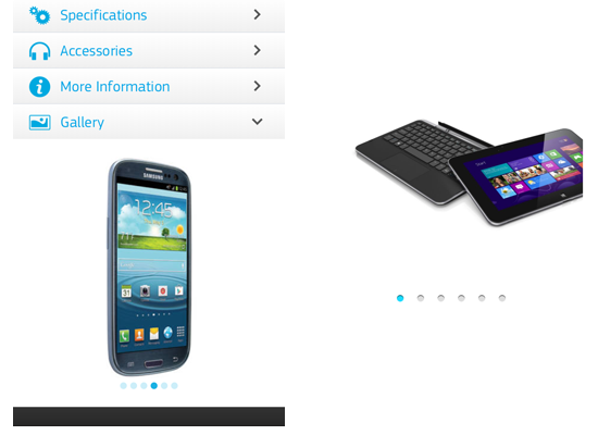
Samsung (above left) and Dell (above right) both use swipeable photo galleries for their products. Samsung incorporates the gallery into an accordion on its product page, while Dell uses a separate page.
Samsung’s approach seems more user-friendly because it has fewer pages to navigate. Both Samsung and Dell go with large high-resolution photos, because apparently image quality is critical when looking at expensive products. One advantage to Dell’s approach is that it allows shoppers to focus on the photos themselves without any distracting page content.
Shopping Carts
Shopping carts usually display products using a table pattern. Besides displaying the contents to be purchased, they also offer additional functionality, such as the ability to save an order, to save a product to a favorites or wish list, to remove products or update quantities, to choose shipping or in-store pickup, to apply promotional or coupon codes, and to check out. Once a product has been added, a shopping cart is commonly reached through an icon in the website’s header or an option in the global navigation menu.
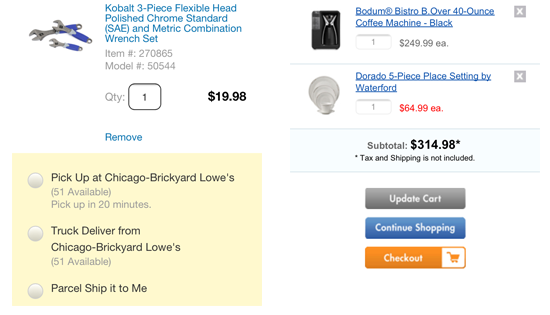
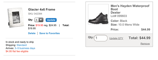
Each table row in the Lowe’s shopping cart (above left) lets the user remove the corresponding product from their cart, and it includes options for shipping or in-store pickup. Bed Bath & Beyond (above right) also allows items to be removed; product quantities may be changed for each item in the table, and a single button farther down updates the page.
Crate & Barrel (above left) has table rows that allow users to remove products, save to favorites and update quantities. Each row also includes shipping information such as cost and delivery time. Payless (above right) also allows consumers to update quantities and remove items; its cart also offers a choice of delivery options, including having the product sent to a Payless store (not shown).
Shopping carts should provide maximum utility because shoppers are close to the final point of purchase. Allowing shoppers to change quantities, remove items and apply promotional or coupon codes without having to go to another page is critical to getting them through the purchasing funnel quickly. If you feel this adds too much content to the page, you can use progressive disclosure to hide some content (such as promo code fields) behind accordions until it is needed.
Checkout
Checkout is more of a process than a pattern, although form patterns can be applied to checkout flows. Many e-commerce websites allow customers who use their websites on mobile to check out with an existing account or as a guest. For people who already have an account, the checkout process is greatly streamlined by using existing payment and shipping information.
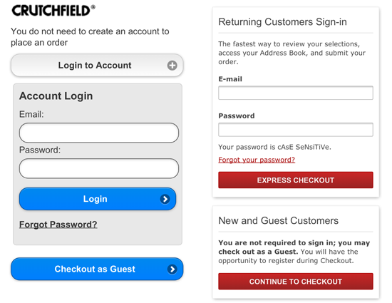
Crutchfield and Nordstrom both allow customers to check out as guests or by using their existing account. Both allow mobile shoppers who have checked out as guests to create an account after placing their order, and both support password resetting.
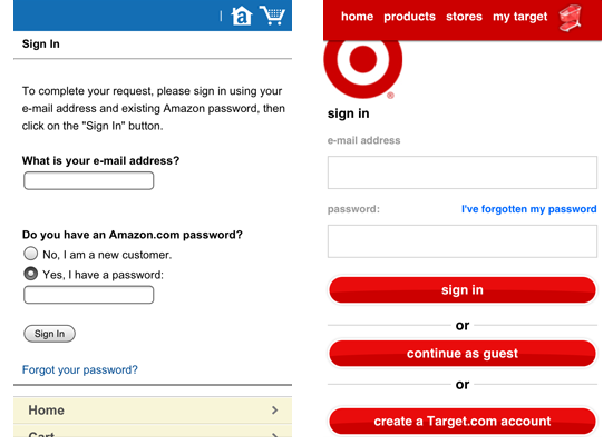
Amazon asks for an email address on the first page of the checkout, whether the shopper has an account or is checking out as a guest. The experience is very much the same like for users of the website on desktop. Target offers options on the mobile website to sign in with an account, to check out as a guest or to create an account. Both support password resetting.
Allowing customers to either sign in or check out as a guest and to reset their password is a must for mobile e-commerce websites. Also, consider inviting shoppers to create an account on their phone after placing their order, because they have already given you enough information (except for a password) to do so. This could make guests more likely to create an account because the effort should be minimal at this point.
The “Create a Target.com account” button could lead to some abandoned carts if shoppers go down that path and decide it’s too much effort. Confirming the order first and then inviting registration on the invoice page might be better. Limiting the initial checkout screen to two choices could improve conversions because the shopper will have fewer decisions to make while working on a small screen. Fewer choices in critical tasks such as check out usually works better.
Forms
Forms are most commonly used in mobile e-commerce for searching, checking out, registering, and entering coupon and promotional codes. Be aware of a few good practices when designing forms for the small screen:
- Place form labels above input fields so that they don’t shift off screen when the user zooms into the input.
- Use HTML5 input types to display the appropriate keyboard for the field being used. For email addresses, use
type="email". For numeric fields, like ZIP codes, usetype="number"ortype="tel"(the latter will display a numeric keypad with larger buttons). - Make fields mandatory only when absolutely necessary. This will reduce friction in getting customers through the checkout process.
The best way to handle forms on a smartphone is to use as few of them as possible. You can use geo-location to suggest the shopper’s ZIP code, and you can allow customers to check out using the account information they entered earlier when using your site. Remember that the best form is the one the shopper never has to complete.

CVS (above left) doesn’t bring up a numeric keyboard when the user taps the ZIP code field on the checkout page. This requires one unnecessary tap from the shopper to get the correct keyboard. CVS also aligns labels to the left of form fields, where they could get pushed off screen if the user zooms into a field. Crate & Barrel (above right) has a much more mobile-friendly form. It brings up the large numeric keypad when someone taps the ZIP code field. It also top-aligns form labels so that they don’t slide off the page.
Remember that forms are how shoppers complete their transactions on websites. Pay special attention to them, and do everything you can to reduce the interaction cost of completing them. Sometimes it might even mean trying out something entirely different. For example, Typeform recently suggested a new kind of experience for more responsive, simple and user-friendly Web forms. The idea is to ask just one question at a time, but display it prominently, allowing users to type the hotkeys when filling in the form. This is not the option that would work in every situation, but for some forms it might be quite helpful.
Conclusion
With the increasing importance of mobile e-commerce as a source of revenue to retailers, mobile-optimized websites are offering many of the features that shoppers want and expect based on their desktop shopping experiences. And as the research by Sterling Brands and SmithGeiger shows, mobile consumers are more willing to purchase when the website is mobile-friendly.
By using existing design patterns, you can begin to explore different options to more quickly get your e-commerce website ready for the small screen. But don’t stop with existing patterns; use them as a jumping-off point to explore a design and to help you consider options you might not have thought of. And as browser capabilities increase, consider bringing interface design and interaction patterns from native apps into your browser-based smartphone shopping experience.
Resources
- “UI Patterns for iOS, Android and More,” Theresa Neil, Mobile Design Pattern Gallery
- Designing Mobile Interfaces: Patterns for Interaction Design, Steven Hoober and Eric Berkman
- “Design Patterns for Mobile Faceted Search: Part 1,” Greg Nudelman, UX Matters
- “Design Patterns for Mobile Faceted Search: Part 2,” Greg Nudelman, UX Matters
- Search Patterns: Design for Discovery, Peter Morville and Jeffery Callender
- “The Ultimate Guide to A/B Testing,” Paras Chopra, Smashing Magazine
- “Better Mobile Form Design,” Luke Wroblewski
- “A Form of Madness,” Mark Pilgrim, Dive Into HTML5
Further Reading
- Mobile Design Pattern: Inventory-Based Discrete Slider
- UI Patterns For Mobile Apps: Search, Sort And Filter
- Smart Responsive Design Patterns
- The Thumb Zone: Designing For Mobile Users
 (al, mrn)

