CSS Baseline: The Good, The Bad And The Ugly
Vertical rhythm is clearly an important part of Web design, yet on the subject of baseline, our community seems divided and there is no consensus as to how it fits in — if at all — with our growing and evolving toolkit for designing online.
This may be due to a lack of understanding and appreciation of the benefits that follow from a baseline grid, but it is more likely because baseline is notoriously difficult to get right, and no one yet holds the blueprint to its successful implementation.
Some even argue baseline is redundant online, as typographic terminology and behavior on the Web follow different rules than those used in print, the frustrating discrepancy between line-height and leading being the most obvious example.
For now, however, let’s assume baseline is, to some degree at least, a useful tool for Web designers. What exactly is it, what tools do we have at our disposal in order to execute it, and, crucially, is it worth the hassle?
Vertical Rhythm And Pattern Recognition
Before tackling the mathematical, potentially pixel-nudging implementation of baseline alignment, it’s a good idea to get an understanding of its parent principle: vertical rhythm. By understanding the why of the baseline, we’ll be better equipped and more motivated to come to grips with the sometimes tedious and obsessive how.
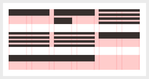
Vertical rhythm, in simplest terms, concerns the structural height and spacing of vertically stacked elements, perhaps most commonly the padding, margins and line height. Just like a horizontal grid achieves harmony by restricting the layout to a set of predefined unit sizes, the vertical rhythm (or grid, if you like) solidifies the structure by offering consistent, predictable measures as the user scrolls down the content.
Why is vertical rhythm important? Well, it has to do with how our mind works and how we use pattern recognition to decipher the world around us. Without going into the subject at length (other people much smarter than me would be more suited to that task), one can say that pattern recognition allows the human brain to store similar or identical impressions (such as primary shapes or colors) in a pattern library and retrieve them for quick analysis of new stimuli. This is the reason why we don’t look at individual letters when reading, but instead recognize whole words at a time (by pulling previous instances of the same pattern from our memory bank). It’s also the reason why we instantly recognize the letters themselves (“A,” “B,” “C,” etc.), even if the font, size and color vary — the basic shapes are stored in our pattern library.
Now it follows that any stimuli that doesn’t match any of your existing pattern records will prompt a new entry in the memory bank, which, in turn, requires more brain processing power — and that’s where the importance of design structure and grids, whether horizontal or vertical, comes in. Imagine a simple layout with a consistent paragraph spacing of X. Having analyzed the first space, your brain will instantly recognize all other identical spaces as part of the same pattern. If, on the other hand, the same layout uses different spacing between each element, the reader’s brain would have to analyze all individual spaces in order to understand their meaning. In other words: the more different shapes there are for the brain to analyze, the longer it’s going to take.
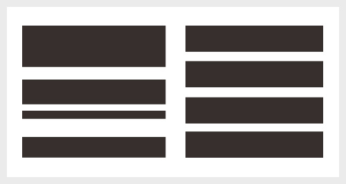
As any irregularity in a structure will break the automatic flow of pattern recognition (thus wasting brain activity that could otherwise have been used on good content), a regular, consistent and predictable structure will, naturally, aid the legibility and cognitive interpretation of your design. Establishing a solid baseline grid is a great method to achieve just that.
Furthermore, utilizing a consistent system in which every vertical (and horizontal) space or element derives from a predetermined unit size not only eliminates arbitrary inconsistencies, but also makes the designer’s job easier by basing structural decisions on an overarching framework. Establishing a standard where, for example, headers always have two baselines of white space below them, and the padding of every box always equals three baselines, adds logic to our layouts and makes them easier not only to design, but also to build and, most importantly, digest.
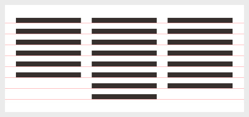
Now, if vertical rhythm seem like an abstract concept, the second benefit of baseline — horizontal alignment across multiple columns — should be easier to grasp. Most commonly seen in print design, particularly magazines and newspapers that frequently use multi-column layouts, the baseline alignment of adjacent paragraphs (or headers) is delightfully calm when done right, and annoyingly disruptive when implemented badly or not at all. The quiet order arriving from horizontal alignment exhibits a visual confidence, an invisible scaffolding that holds everything in place and reassures the readers at a subconscious level. A book with every line on a left hand page aligning with their counterparts on the right simply feels trustworthy; a book where the lines don’t match up at all somewhat less so.
The Trouble With line-height
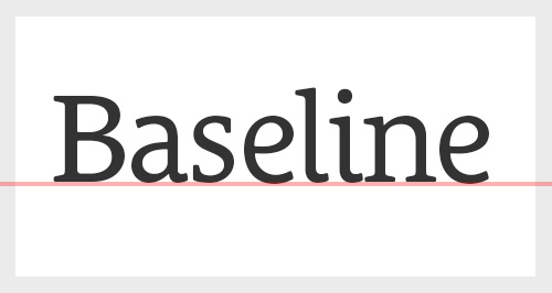
Traditionally, the baseline is the invisible line upon which most letters “sit,” and the distance between each baseline forms the basis of the baseline grid, which, as we just discussed, aids not only the vertical rhythm but also the horizontal alignment of elements in adjacent columns. Having defined a baseline grid, what follows is the forced alignment of all other elements, ensuring that any line of text, any border, any image or boxed element will always match up and adhere to the same vertical structure.
The trouble is that where tools like InDesign let you do this by clicking a button (literally switching the grid on and off) and allow you to easily resize shapes to fit, when it comes to CSS, there’s no other way to do it than meticulous restriction and monitoring of line height, padding, margin, size — anything that may affect the total height of an object.
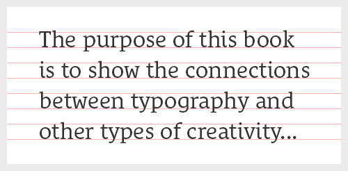
To make matters worse, the CSS line-height property doesn’t have an inherent concept of baseline, and each line of text is placed roughly in the middle of the element’s total height. This means that perfectly aligning the actual base of your text (which is to say the baseline) across different styles and fonts requires further manual, time-consuming tweaking and pixel nudging.
So how does one go about implementing CSS baseline? Well, due to the lack of a native baseline syntax, snap-in-place or browser functionality to force vertical alignment, we’re left to experiment. But let’s start with the basics.
The Good: Basic CSS Baseline
To date, at least as far as I’m aware, no consensus on a right way to do CSS baseline has formed. Some people are happy as long as the line height and spacing follow a set of guiding rules, others are more obsessed and meticulous — for better or for worse — and are not satisfied until every line of text sits beautifully on the baseline, and images, borders, boxes and other elements perfectly align to the same grid. The good news for all of us, however, is that basic CSS baseline really isn’t that hard at all. By making a few design decisions up front (and sticking to them), all it takes is a bit of elementary math.
To define your baseline, it’s a good idea to start with the smallest text size you’ll be using, in most cases your body text, and work upwards from there. In my examples below, I’m using 14 pixel font-size on a 22 pixel line-height, which means 22 pixels is my baseline. This definition has the consequence that all line-heights and the total height (including borders, padding and margin) of all elements must be a multiple of 22 pixels, like so:
h1 {
   font-size: 40px;
   line-height: 44px;
   margin-bottom: 22px;
}
p {
   font-size: 14px;
   line-height: 22px;
   margin-bottom: 22px;
}
Now defining our line-height and font-size in pixels is contentious at best, so in the name of scalability let’s convert them both to ems. Doing so makes the code a little harder to scan, but the math is fairly simple — just remember to recalculate the line-height if you change the font-size!
h1 {
   font-size: 2.5em; /* = 40px/16px */
   line-height: 1.1em; /* = 44px/40px */
   margin-bottom: 22px;
}
p {
   font-size: 0.875em; /* 16px is the default em size */
   line-height: 1.5714285714285714em; /* = 22px/14px */
   margin-bottom: 22px;
}
Note that I will invariably be referring to font-size and line-height in pixels throughout this article, as this will indicate more clearly the “physical” sizes and proportions in the examples given. All code, however, will stick to ems.
Utilizing a visible grid (many people use a background PNG or GIF, others use tools like Baseliner), we can put this to the test and monitor the alignment of all our styles as we go along. At this point, we may find that the lines of text don’t “sit” on the baseline, but rather float in between the gridlines. That’s nothing to worry about at this stage — we can simply offset our background image or add some arbitrary padding to the top of our body to fix it.
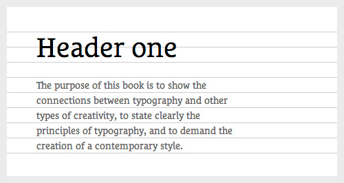
So far so good, but our code is still extremely basic. What happens when we include more pizzazz — for example a top border — to our elements? Naturally, the numbers have to be adjusted to incorporate the height of the border to ensure that the total height of the object adds up to a multiple of the baseline.
h1 {
   border-top: 3px;
   padding-top: 22px;
   margin-bottom: 19px; /* 22px-3px */
}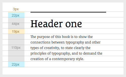
border-top and the 19 pixel margin-bottom adds up to our baseline of 22 pixels.Using Sass Or REM
Although it’s not exactly rocket science, getting the numbers to add up when working on complex websites can be a challenge, especially when using relative units. If you’re in a position to sacrifice the scalability of ems and stick to pixels, however, frameworks like Sass can take a some of the sting out of it. With Sass we can define the baseline as a variable ($baseline, in my example) and use simple equations to define multiples of this, making the whole process a lot simpler and the CSS much easier to scan. Should you want to change your baseline halfway through the process, you only have to do it one place. Although my example below concerns Sass, the same principle would apply when using rems — defining the baseline in one place makes it easier to implement across your code.
$baseline: 22px;

.box {
   padding-top: 3px;
   height: $baseline*15;
}
h1 {
   font-size: 40px;
   line-height: $baseline*2;
   margin-bottom: $baseline;
}
p {
   font-size: 16px;
   line-height: $baseline;
   margin-bottom: $baseline;
}
Using JavaScript For Images And Complex Layouts
Applying a baseline to a simple typographic layout is, well, rather simple. But we must also ensure other elements, including images, align to the grid. For containers, buttons, dividers, etc., this is a matter of restricting, by means of CSS, any unit to a multiple of the baseline. Images, on the other hand, rarely adhere to this restriction and are often served at a range of arbitrary heights, and in such cases a little bit of JavaScript can make our lives easier. I won’t go into the detail here, but both the jQuery plugin Baseline.js and this article on vertical rhythm by Matthew Wilcox are worth looking into. If you work on more complex layouts, you might want to check out FtColumnflow — a polyfill that “fixes the inadequacies of CSS column layouts.” It’s extensively used on the Financial Times Web app and may well be of use if you’re looking for something a bit more robust.
And that’s it for the basics. By making sure our line heights, paddings, margins, heights — everything — always add up to a multiple of our baseline, we can rest assured the integrity of our vertical rhythm remains unscathed. Simple, right?
Of course, you wouldn’t be reading this article if there wasn’t more to it…
The Bad: Improvising For Variety
The bad news is this. As much as designers thrive in restricted environments, sometimes a 22 pixel baseline can feel more like a frustrating barrier than a helpful constraint. For example, following the golden ratio, a paragraph body size of 16 pixels infers a paragraph header at around 26 pixels (though the below may apply to anything above 20 pixels, depending on the font). Keeping our baseline of 22 pixels, you may find that a single baseline is too tight a line height for comfortable reading, yet a double baseline (44 pixels) is too wide. Of course, arguably this only becomes a problem if the h2 runs onto two lines, and in theory one could get away with assuming the column width was big enough for that never to happen. Ahem. In theory.
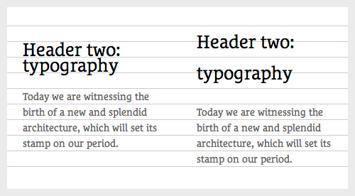
h2 at an awkwardly small or large line-height.If there was such a thing as snap-in-place, this wouldn’t be an issue, as we could simply choose not to apply our baseline to our h2 and watch in wonder as the the following paragraphs magically slotted back into place. But alas, no such sorcery is currently available and we’re forced to think pragmatically to come up with a solution.
At the start of this article I recommended defining your baseline from the line-height of your smallest text element, like the body text. As we’ve just seen, however, a fixed, minimum unit of 22 pixels (or whatever your body line-height may be) can make for awkward line heights for certain font sizes. But what if we were to halve our original baseline? Our body text would now technically have a line-height of two baselines, but that’s only semantics. In most cases, the resulting possibilities of variation and typographical freedom are worth it. Using the golden ratio to quickly define a few header sizes (rounded up or down to make our ems neater), we can easily see that a comfortable line-height is available at every increment: 16px/22px, 28px/33px, 40px/44px, etc.
h1 {
   font-size: 2.5em;
   line-height: 1.1em;
   margin-bottom: 22px;
}
h2 {
   font-size: 1.625em; /* 26px/16px */
   line-height: 1.2692307692307692em; /* 33px/26px */
   margin-bottom: 11px;
}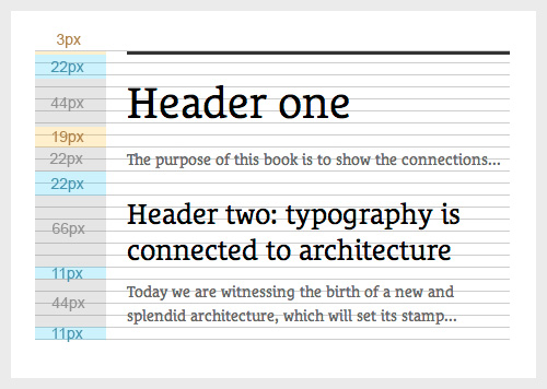
h1, h2, and p all aligning to the baseline grid.The Ugly: Offsetting Type
Before I go any further, let me be the first to acknowledge that the following is completely experimental and some of you may even call it bad practice. If you’re willing to humor me, however, keep reading even as it gets ugly. Well, ugly from a “clean code” point of view. From a design point of view, it might get very pretty indeed.
Between the basics and a bit of pragmatic (but optional) improvisation to increase variety, we now have the knowledge and tools to improve the vertical rhythm of most layouts. But the baseline? Not quite. As mentioned before, the way CSS line-height is calculated means the characters are positioned roughly at the vertical center of the line height, rather than sitting neatly on the baseline of it with descenders protruding (like in InDesign or Quark). Many of you will rightly point out that this is what’s supposed to happen. This is how CSS line-height works, and there’s nothing we can do about it. That’s true. But our eyes don’t know CSS semantics. Our eyes are not trained to follow the x-axis center of characters when scanning lines of text — they’re trained to follow the baseline, the bottom of the characters, and when two adjacent lines are misaligned the readability suffers.
Take a look at the following example:
h1 {
   font-size: 2.5em;
   line-height: 1.1em;
   margin-bottom: 22px;
}
h2 {
   font-size: 1.625em; /* 26px/16px */
   line-height: 1.2692307692307692em; /* 33px/26px */
   margin-bottom: 11px;
}
p {
   font-size: 0.875em;
   line-height: 1.5714285714285714em;
   margin-bottom: 11px;
}
p.intro {
   font-size: 1.125em; /* 18px/16px */
   line-height: 1.22222222em; /* 22px/16px */
   margin-bottom: 22px;
}
Placed in adjacent columns, even thought the baseline has been applied correctly to the intro paragraph, the base of the letters won’t line up to those of the main paragraph because of the font’s calculated line-height position.
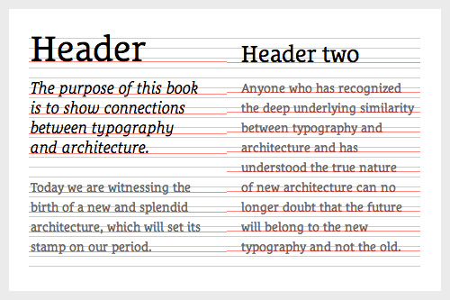
line-height makes alignment across adjacent columns inaccurate.Now this is where it gets ugly. In order to accurately align the base of all lines of text across all columns (which, of course, is one of the main points of having a baseline grid to start with), we have to offset the type manually. A simple way to do this is to add padding-top until the characters rest on the baseline and adjust the margin-bottom to reflect the offset.
h1 {
   font-size: 2.5em;
   line-height: 1.1em;
   padding-top: Xpx; /* This requires trial and error, as X depends on your font and line-height */
   margin-bottom: 22px-Xpx;
}
h2 {
   font-size: 1.625em; /* 26px/16px */
   line-height: 1.2692307692307692em; /* 33px/26px */
   padding-top: Xpx;
   margin-bottom: 11px-Xpx;
}
p {
   font-size: 0.875em;
   line-height: 1.5714285714285714em;
   padding-top: Xpx;
   margin-bottom: 11px-Xpx;
}
p.intro {
   font-size: 1.125em; /* 18px */
   line-height: 1.22222222em; /* 22px */
   padding-top: Xpx;
   margin-bottom: 11px-Xpx;
}
Messy? Perhaps. Tedious? Indeed. But very gratifying and wonderful at the same time. There’s nothing quite like turning on the baseline overlay on a complex layout to reveal the magic that is perfectly aligned typography.
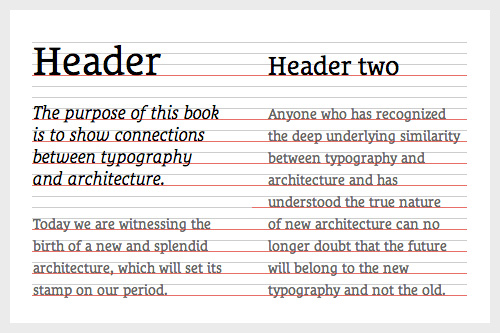
Phew. If you’re still with me you’re probably either a masochist or have an unhealthy obsession with detail — either way I congratulate you, as your baseline is no doubt as solid as a brick outhouse.
Is It Worth It?
So there we have it. Basic CSS baseline is relatively easy and requires no more than a little math and organization to improve your layout. At the other end of the scale, we can manually adjust padding and margins to mimic the more sophisticated baseline of print design, a notion that will no doubt bring scowls to the faces of CSS purists. The real question, of course, is whether the visual benefits from manually offsetting type are worth it. In some cases, for example design-led campaigns and microsites, it could well be.
In others, particularly larger, more complex websites (your project managers will be scratching their heads wondering why it takes you so long to build the initial template) or collaborative projects with several developers working on the same code, well, it probably isn’t. Let’s face it — what we’re talking about in the most extreme examples not only adds manual labor, but also makes the code more intricate and harder to maintain. It will even affect the load time of your website if applied on a large enough project.
But consider this: just a few years ago, less-than-favorable techniques like “sliding doors” were advocated by industry leaders to hack attributes that CSS3 has now made commonplace. Were rounded corners really worth using two divs instead of one? Well, obviously, to some people they were — yet others may have considered them a waste of time, resulting in bad practice and semantically flawed code. But the point to take away is this: if no one experimented with such labor- and code-intensive techniques, we probably wouldn’t have native syntax for this technique today.
Experimentation, bad practice, hacks, ugly code — whatever we call it — has pushed, and continues to push, our syntax forward, reinventing the tools we will use to create and publish the next generation of online content. To echo Mark Boulton, “How cool would it be for CSS to be able to give you pain-free baseline grid?” Whatever your level of obsessiveness — whether your characters sit neatly upon their baselines or float in between them — vertical rhythm is always an important consideration, and following any of the approaches outlined in this article should result in a satisfactory baseline grid.
There will, of course, still be cases where the restrictions feel too impeding, and sometimes elements like captions, navigation or list items don’t seem to sit right in your predefined structure. In those cases, it’s worth remembering that a few compromises are not the end of the world. Some designers, including the eminent Khoi Vinh, argue that baseline is most important in the context of the main body of your content, and peripheral elements may break the baseline without breaking the layout.
Hopefully the understanding that there’s no right or wrong way of approaching baseline will incite further experimentation on your part, and I encourage anyone with a typographical affection to contribute to the ongoing process of making vertical rhythm an equal priority to horizontal grids in the future of Web design.
Good luck!
Resources
- Setting Type on the Web to a Baseline Grid, Wilson Miner
- The relevance of the baseline grid, Elliot Jay Stocks
- Baseline Framework
- Technical Web Typography: Guidelines and Techniques, Harry Roberts
- More Perfect Typography, Tim Brown
Further Reading
- The Perfect Paragraph
- Applying Macrotypography For A More Readable Web Page
- Balancing Line Length And Font Size In RWD
- The Future Of CSS Typography


 See the full picture →
 SurveyJS: White-Label Survey Solution for Your JS App

 Celebrating 10 million developers


