Structural Semantics: The Importance Of HTML5 Sectioning Elements

Email Newsletter
Weekly tips on front-end & UX.
Trusted by 182,000+ folks.
 Register for Free

 Custom Web Forms for Angular, React, & Vue. Your backend.
 Celebrating 10 million developers
Whatever you call them — blocks, boxes, areas, regions — we’ve been dividing our Web pages into visible sections for well over a decade. The problem is, we’ve never had the right tools to do so. While our interfaces look all the world like grids, the underlying structure has been cobbled together from numbered headings and unsemantic helper elements; an unbridled stream of content at odds with its own box-like appearance.
Because we can make our <div>
Now that HTML5 has finally made sectioning elements available, many of us greet them with great reluctance. Why? Partly, because we’re a community which is deceptively resistant to change, but also because of some perceived discrepancies regarding advice in the specification. In truth, the advice is sound and the algorithm for sectioning is actually easier to use than previous implementations. Some developers are just very married to their old workflow, and they think you should be too. There’s no good reason why.
Make no mistake: Sectioning elements help you improve document structure, and they’re in the spec’ to stay. Once and for all, I will be exploring the problems these elements solve, the opportunities they offer and their important but misunderstood contribution to the semantic Web. If you’re unfamiliar with the concept of the “semantic Web,” this video is a great introduction.
Making Websites
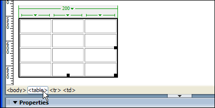
My introduction to Web design was via a university course module called something like “2.1: Dreamweaver,” and I recall my first website well. I remember my deliberately garish choice of Web-safe colors. I remember it looking right only in Netscape Navigator. Most of all, I remember hours of frustration from tugging at the perimeter of a visual layout tool named “table.” I had no idea at the time that this layout tool represented a type of annotation called an HTML tag. Furthermore, no one told me that this annotation invited my patchwork of primary colors and compressed JPEGs to be computed as a sort of demented Excel spreadsheet. In other words, I had no idea I was doing it wrong.
“The fundamental failure of most graphic, product, architectural, and even urban design is its insistence on serving the God of Looking-Good rather than the God of Being-Good.”
Macromedia’s Dreamweaver didn’t make the creation of valid documents impossible, but it was one of a number of emerging GUI editors that pandered to our desire for visual expression more than it encouraged informational clarity. Dreamweaver, and other editors classified under the misnomer “WYSIWYG,” helped transform a standardized information system into a home for graphic design and enabled a legion of insufferable Nathan Barleys to flypost the World Wide Web with their vapid eye candy. I was one of many.
Web Standards
By the time I made my first website, the Web standards movement, promoting compliance, uniformity and inclusion, was burgeoning. I just wasn’t aware of it until much later. I didn’t have to be: Agency-based Web design was still mainly graphic design with a reluctant programming department clumsily bolted on. If you’re doubtful of the grip that this culture has had on the World Wide Web, look no further than the fact it took until 2010 (2010!) for us to concede that Web browsers are not really made of paper.
When I finally became familiar with Web standards and the practice of “doing things right,” it was as someone who still worked primarily as a visual designer. Inevitably, my first forays into standards-based design revolved around mastering “CSS layout,” the practice of visually arranging content without relying on the semantically incorrect <table><div>
As I shall demonstrate, the <div>
The Problem With <div>
Every day, thousands of Web developers invoke the almighty <div><div><div>
Consider the following example:
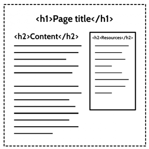
In this basic layout, I have included a body of text and an adjacent “sidebar.” To make it absolutely clear to the reader that the sidebar is tangential and does not belong to the main content, I’ve drawn a fat line around it using the border property. For those of you screaming, “That sidebar heading should be an <h3>!”, I’ll get to that shortly. All of my design decisions (the adjacent position, the border and the reduced font size) are facilitated by CSS alone. So, when I take the CSS away, I get this:
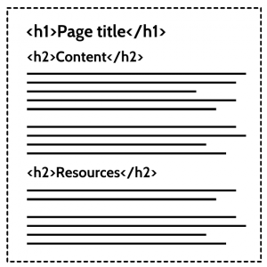
Not only is switching off CSS the quickest way to make a Web page responsive, but it’s a great way to see how HTML4 documents (which lack sectioning elements) are actually computed. In this case, our so-called “sidebar” is revealed to be just another raft of information in the linear flow of the document.
Why Is This So?
The reason for this is that the <div><div>
For reasons of clarity, let’s look at a further example using a snippet of HTML:
<div class="parent">
   <h2>Heading</h2>
   <p>Some content...</p>
      <div class="child">
         <h2>Another heading</h2>
         <p>Some other content...</p>
      </div>
   </div>
I’ve done something slightly different here by entering the two <div>div.child tag belongs to div.parent. We can certainly make it look that way with CSS, anyway. However, <div><div>
<h2>Heading</h2>
   <p>Some content...</p>
   <h2>Another heading</h2>
   <p>Some other content...</p>
As HTML coders interested in sound structure, we should be interested that the above reduction — which omits all meaningless elements — is what we’ve actually made, and it’s not what we set out to do: By not really belonging to “parent,” “child” has a different contextual status in the document than intended.
Heading Levels Don’t Really Help
It’s popular to believe that replacing the second <h2><h3>
- A Heading (
h2)- Another Heading (
h3)
- Another Heading (
This solution certainly seems more purposeful, but is it the right decision? Should the second heading be a subheading within the same topic (an <h3><h2>
Lets have a look at the homepage of accessibility experts The Paciello Group. Naturally, it’s a highly accessible and pretty well organized site, but could the structure be improved with HTML5 sections? You’ll notice their use of a <div><h2><div><h2><h3>
- Mike Paciello (h2)
- Contact Us Now (h3)
Wait … so, “Contact Us Now” is a subtopic belonging to the larger theme of “Mike Paciello”. Can that be right? It certainly doesn’t look this way in the visual layout. It’s worth noting at this point that the <div><h2>class=“region”. Ironically, if this <div><section><section><div>
Okay, so that’s a weird one, but the situation only gets more confusing when we start to include items for which headings aren’t really even appropriate. Take this further example:
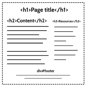
In my HTML4 page, I have an <h1><h2><h3><div>div#footer resting at the foot of the document for copyright information and other such necessary evils. (It has to be a <div><footer>
Whose Footer Is This?
Most of us, based on appearances, would agree that the footer must belong to the document. That is what we’ve learned to expect. To the unsighted, it is a different story: Because there is no new introductory heading between the sidebar <h3><h2>
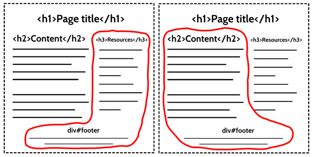
The only decent chance we have of understanding the intended structure of the page is by inferring it from a reading of the content. Remembering that the whole point of a “markup language” is to make the structure of information easier to follow, I may as well have chucked the HTML and written my Web page on the back of a napkin.
Some accessibility gurus would suggest that you use a remedial <h2>#footer and bring it back in line, marking up the end of the sidebar like so:
h1(page)h2(main)h3(sidebar)
h2(footer)
This kind of works as a hack, but it’s not really sound. Do you really want to make a big announcement of the footer — an announcement as big and bold as the one used to summon the main content, not to mention bolder than the sidebar? No. If our Web page were a film, the footer wouldn’t be the titles — it would be the credits. In HTML5, the <footer>
The closest thing we have to a “system” for structuring documents properly in HTML4 is numbered headings. Not only does this lead to ambiguity, as explained, but in practice we don’t really even use headings to define structure. We use <div>
The loose coupling between headings and <div>
“The HTML4 spec is very imprecise on what is a section and how its scope is defined. Automatic generation of outlines is important, especially for assistive technology, that are likely to adapt the way they present information to the users according to the structure of the document. HTML5 removes the need for <div> elements from the outlining algorithm by introducing a new element, <section>, the HTML Section Element.”
Sectioning
Aware of our desire for legitimate elements to create computable sections, HTML5 offers <section><article><aside><nav>
Multiple-choice answers:
- 1
- 2
- 3
- 4
The correct answer is (b), 2. We have included just one of HTML5’s new sectioning elements in the form of an <aside><footer><header><body>
Some of you may have missed the clue earlier in this article and thought that <header><footer>
- 4.4 Sections
- 4.4.1
body - 4.4.2
nav - 4.4.3
article - 4.4.4
aside - 4.4.5
h1,h2,h3,h4,h5andh6 - 4.4.6
hgroup - 4.4.7
header - 4.4.8
footer - 4.4.9
address
- 4.4.1
You’d be forgiven for thinking that anything in this list qualifies as a sectioning element, absurd as some of them (<address>
Despite these ambiguities in the spec’ itself, as well as in the surrounding publicity for HTML5, sectioning in practice just works. The following three axioms are probably all you’ll need to understand the algorithm:
<body>is the first section;<article>,<section>,<nav>and<aside>make subsections;- Subsections may contain more sections (subsections)
Aside from a few trifling details, that’s it. In a little while I’ll cover the completely unnecessary worry that is had over headings combined with sections. For now, let’s take another look at that example from before about footer ownership. This time, I’ll make a few HTML5 substitutions:
Note the lack of illustrated headings. Wherever a section is opened, it assumes responsibility for nesting: The heading type is unimportant. More on this soon …
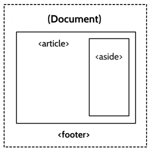
The outline for this example looks like this:
- Document
- Article
- Aside
Now that we’ve implemented sections, the boundaries are clear. Our document contains an article, which, in turn, contains an aside. There are three sections, each belonging to the last, and the depth of each section is reflected in the outline. Importantly, because sectioning elements wrap their contents, we know perfectly well where they end, as well as where they begin. And yes — screen readers like JAWS actually announce the end of sections like these! We know what content belongs to what, which makes deducing the purpose of the footer much easier. Because it exists outside the bounds of both the <article><aside>
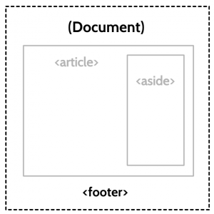
The power of sectioning lies in its ability to prescribe clearly defined boundaries, resulting in a more modular document hierarchy. The footer unequivocally belongs within the immediate scope of the highest-level section, giving assistive technologies and indexing parsers a good idea of its scope, which helps to make sense of the page’s overall structure.
Headings And Accessibility
When Sir Tim Berners-Lee conceived the <section>
“I would in fact prefer, instead of <h1>, <h2> etc for headings [those come from the AAP DTD] to have a nestable <section>..</section> element, and a generic <h>..</h> which at any level within the sections would produce the required level of heading.”
Why is this preferable? Determining heading level systemically, based on nesting level, is much more dependable because it removes a layer of decision-making: By “producing” the required heading level automatically, we no longer have to decide separately which numbered heading we should include. It effectively prevents us from choosing the wrong heading level, which would be bad for parsable structure. A subsection must be subject to its parent section. Because this relationship between sections determines “level,” numbered headings are made redundant — hence, the proposed <h>
A Lot Of Fuss Over Nothing
Now, this is the supposedly tricky part; the part that causes all the consternation and gnashing of teeth. This is the part that caused Luke Stevens to write this diatribe, and prompted Roger Johansson into a state of uncharacteristic apoplexy, asking, “are you confused too?”. Ready?
In the WHATWG specification (in the same place where <footer>
It certainly confused me, so I spoke with HTML Editor, Ian Hickson. He explained the outline to me in detail and I’m convinced it is perfectly robust. I’m going to do my best to explain it to you here.
Okay. As it turns out, we didn’t get the generic <h><h>
<h4>Page heading</h4>
<p>Introductory paragraph...</p>
<section>
    <h3>Section heading</h3>
    <p>some content...</p>
    <h2>Subheading</h2>
    <p>content following subheading...</p>
    <section>
        <h1>Sub-subheading</h1>
        <p>content two levels deep...</p>
    </section>
</section>
<h5>Another heading</h5>
<p>Continued content...</p>
Our heading levels are all over the place. This is not recommended by the specification, but it helps demonstrate just how robust the HTML5 outlining algorithm really is. If we replace all the headings that open sections with a generic (“wildcard”, if you prefer) <h>
<h>Page heading</h>
<p>Introductory paragraph...</p>
<section>
    <h>Section heading</h>
    <p>some content...</p>
    <h2>Subheading</h2>
    <p>content following subheading...</p>
    <section>
        <h>Sub-subheading</h>
        <p>content two levels deep...</p>
    </section>
</section>
<h5>Another heading</h5>
<p>Continued content...</p>
It’s important to note that the only errors revealed in the computed outline are ones relating to badly ordered numbered headings within the same section. In the original example, you’ll see that I’ve followed an <h3><h2><h2><section>
Well, how about that? If you’re not convinced, go ahead and paste my example into the test outliner and play around. It works just fine. In fact, it’s really difficult to break.
If you think there is a benefit to screen reader users, you may wish to adhere to the second of the two clauses from the specification and incorporate numbered headings that reflect nesting level. As demonstrated, this will have no effect on the outline, but since heading level (“Heading Level 2 - The Importance Of Sections”) is announced, it gives a clearer impression of structure to those who can’t see boxes inside boxes.
The assertation that heading levels are perpetually indispensable to screen reader users comes under pressure when you consider advancements being made by screen reader vendors. Screen readers like JAWS mark the territory of sections more clearly than headings, by announcing the beginnings and ends of sections and the thematic regions they represent (“Article End!”). From this perspective, using more than one <h1>
The approach you choose is yours to make; just employ some common sense and consistency. Bear in mind, though, that not all screen readers are able to announce the bounds of sectioned content. In these cases, there are measures you can take …
ARIA Enhancement
Transition to an HTML5 document structure is made smoother by incorporating some ARIA landmark roles, which are both relatively well supported and somewhat analogous to the section-based navigation we should expect later. ARIA offers many more accessibility-specific features than baseline HTML5 could ever withstand; so, including “bolt-on” ARIA enhancements is certainly polite. However, regarding ARIA roles as a substitute for semantic HTML would be a grave misconception.
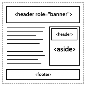
Landmark roles, such as role=“contentinfo” and role=“banner”, address accessibility only — not data mining — and each may be used only once per document. They are essentially shortcuts to parts of the page. HTML elements are more like building blocks, which are used in a repeated and modular fashion. So, while you can assist accessibility by placing role=”banner” into the <header><header>
Are Sections The New <div>s?
This is a common misconception.
If it wasn’t clear already, it should be clear to you now that <div>
If the new <section><div><div><div><div>
For instance, you shouldn’t employ sections as box-model controlling measures like this…
<section class="outer">
      <section class="inner">
         <h1>Section title</h1>
      </section>
   </section>
… because there’s nothing that the outer section does that the inner section doesn’t. We’ve created two sections for one piece of content. A quick run through our outliner throws the “Untitled Section” warning:
- [Untitled Section]
- Section title
The brilliance of <div>
<section>
<div>
<h1>Section title</h1>
</div>
</section>… averts disaster and results in this unsullied, if simplistic, outline:
- Section title
Sections And Semantics
A lot of developers have trouble with the word “semantic.” You might even say that they don’t know what the word means, which (if you are familiar with the term) makes an interesting paradox. For instance, when Jeffrey Zeldman advocates for the “semantic” application of the id attribute, he’s kind of missing the point. The main purpose of semantic HTML is for the automated extraction of meaning from content. Applying a private, non-standard id to a <div>
Sections are often characterized as the “semantic” equivalent of <div><address><address>
Sectioning elements are not so much semantic as syntactic. All <section>
Microdata
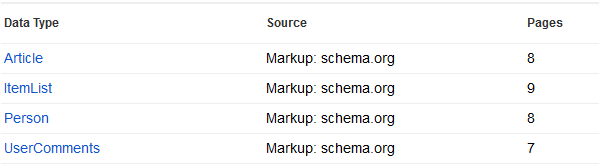
Efficient, syntactically sound data structures are worthless if they are semantically lacking. Fortunately, HTML5 has both angles covered and provides a mechanism for attaching semantic meta data, called “microdata,” to our structured content. Using microdata, and by consulting schema.org, you can define a page’s content as anything from a scholarly article to an exercise regimen. Unlike classes and IDs, this is information that can actually be interpreted usefully.
Conclusion
HTML isn’t just an SDK or a Graphic Designer’s palette. It is a metalanguage, a language that tells you special information about information. Sometimes we — or, more precisely, the parsers we employ — benefit from added information about the subject, timing, origin or popularity of content. This is what APIs such as microdata and RDFa are for. Other times, the context, hierarchy, relative importance and codependence of the information are what need to be determined. This is where appropriate syntax, facilitated by sectioning elements, can be employed.
Some people will tell you not to bother with sectioning. They say that it’s hard work or that it doesn’t make sense. This is hokum. Sure, if you’re lazy, don’t bother with sectioning, but don’t pretend you’re doing it on principle. Using sections demonstrably enhances HTML structure without breaking accessibility. We’ve covered this.
Still, there will always be people who will attack this aspect of the specification. Perhaps we’ll enjoy some of these objections in the comments:
- They will point to bad implementations by specific vendors: These are bugs and bugs get fixed!
- They will cite the actions of large websites who don’t use sectioning elements: Just because large sites haven’t implemented sections doesn’t mean they wouldn’t like to. Since when does big mean ‘right’ anyway?
- They will flood you with examples of developers implementing sections badly: Some developers do stupid things and their misuse of HTML doesn’t stop at sections. I include myself here, by the way.
- They will present you with anecdotal evidence about user behavior within specific groups: It is expensive and impractical to address problems on a case-by-case basis. Fragmentation and complexity would also be inevitable: a loss for the majority of users.
I don’t think anyone would advocate making badly structured Web documents any more than they’d suggest building a house by stuffing a bag full of bricks and throwing it into a ravine. The case has been made and the specification bears it out: Sections aren’t just good for document structure — they finally make proper structure attainable. Some browsers and screen readers have some catching up to do, that’s for sure, but the situation is improving rapidly. Any kind of change is a little turbulent, but this kind is worth it.
Further Reading
- Coding An HTML 5 Layout From Scratch
- Sexy New HTML5 Semantics
- Learning to Love HTML5
- HTML 5 Cheat Sheet (PDF)


