Building A Better Responsive Website

Email Newsletter
Weekly tips on front-end & UX.
Trusted by 182,000+ folks.


 Custom Web Forms for Angular, React, & Vue. Your backend.
 Celebrating 10 million developers
Earlier this year, I was in the beginning stages of a redesign for our company’s website. We had already been planning to use a straightforward responsive approach to Web design, which is our preferred solution for multi-device support. After hearing some frank discussions at An Event Apart conference in Boston about the limitations and challenges of responsive Web design, I realized that our solution needed a bit of adjustment.
Thankfully, the project before us was the ideal opportunity to experiment and push ourselves to improve our responsive workflow. In this article, I will detail the process we took, including some of the changes we made along the way, as we worked to build a better responsive website.
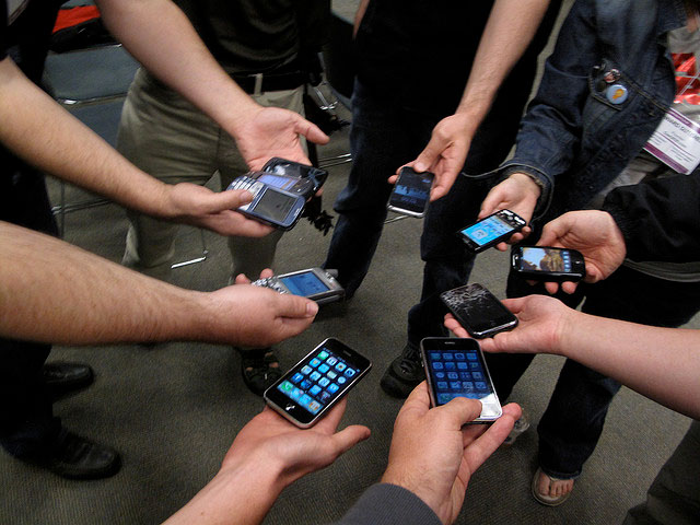
The variety of devices being used to access our websites is more diverse than ever. (Image: Blake Patterson)
Defining Our Goals
The first step in our project was to make a list of the benefits and drawbacks to the responsive approach we had been using. Our list looked like this:
Benefits
- A single website to build, maintain and promote.
- Support for a variety of screen sizes, not just the extreme cases of large desktop monitors and small handheld devices.
- Future-friendly, because the layout will reflow based on screen size and not just the size of today’s popular devices.
Drawbacks
- Content meant only for large-screen devices is often delivered to small screens and simply “turned off” with CSS media queries, creating unnecessary downloads.
- Because the markup is a one-size-fits-all solution, we are unable to change the source order of that markup (or eliminate unnecessary elements from the markup completely) based on the device or screen size.
What you will likely notice here is that the drawbacks we identified with a responsive approach are areas where a mobile-only solution excels. We wanted the best of both worlds for our new website — the advantages that a responsive approach and a mobile-specific solution have to offer.
Starting With Content
One of the common differences between a responsive design and a dedicated or mobile-only design is in the content or features that are delivered to the browser. A mobile-specific website often features only a subset of content found on the “normal” version of the website. This is one of the ongoing debates about the two approaches, and proponents of mobile-only websites often argue that mobile users want access only to content that is “important” to them.
The problem with this line of thinking is that what is “important” to a user — any user — changes according to their situation. Eliminating access to content based solely on the device someone is using is sure to alienate and frustrate anyone who doesn’t fit into the ideal scenario that you envisioned when you decided what to include in and what to eliminate from your mobile website.
Our belief has always been that all users should have access to all of the content that the website has to offer, but we wanted to make sure this was indeed the right answer for our website and our users. To help us determine the right approach, we turned to our analytics and found no discernible difference between the type of content requested by our mobile visitors and by our visitors on non-mobile devices. Content that was popular for desktop users was similarly popular for mobile visitors.
Additionally, we sat down and spoke with some of our current clients, who represent a large part of our website’s audience, and asked them some questions, including “What content are you coming to our website for when on a desktop computer?” and “How about on a tablet or a phone?” The interviews were obviously more in depth than this, but you can see what we were asking. Once again, we found that the content they were seeking was the same, regardless of the device they were using.
Data Dictates Direction
The findings from our research reinforced our belief that a responsive approach, which provides access to the same content across all devices, was the right choice for our website. This research also enabled us to determine what content on our website was not being accessed at all. When we discovered pages that were not being used by our audience, we cut them from our site map. Similarly, content that was most popular was treated appropriately in our content hierarchy and our layout plans for the redesign.
By starting the project by looking at our content and gathering data on what was important to our audience and what was not, we were able to move into the design phase with an informed plan for what content our website’s design needed to support.
Designing To The Extremes
I have heard the arguments for designing in the browser, and I appreciate many of the benefits this approach brings. That being said, having tried designing in the browser on a number of occasions, I have found that my own design workflow is simply better suited to starting in Photoshop. In no way do I think this is the right decision for everyone, but it is the right decision for me, and it is how I began this design.
For responsive designs, I use a method that I refer to as “designing to the extremes.” I start by designing the desktop version of the website. In this version, I work out the design’s typography, tone and overall visual direction — as well as the layout for the large screen view of the website. Once I am happy with this version of the design, I work on the small screen or “mobile” version of the website, using the same visual direction, but adjusting the layout as appropriate for the smaller screen.
At the end of this process, I have visual examples of the two layouts of the website that will vary the greatest — the biggest and the smallest screen versions of the design. These two examples will guide me as I begin the website’s front-end development.
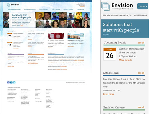
The “extreme” versions of the new website design
Mobile First
The “mobile-first” approach to responsive design is not a new idea. This method, whereby you build the mobile experience and layout of a website first and then use media queries to adjust and add to that layout as the screen size grows, has been considered a best practice in responsive Web design for some time now. While not a new approach, it is still an important one, and coupled with our plan to “start with the content,” it helped us to address one of the shortcomings that we identified in our responsive projects — the problem of delivering unnecessary content.
By starting with content, we ensured that all of our website’s content was relevant and appropriate to all users, mobile or otherwise. This meant that we didn’t have to worry about delivering large amounts of content in the markup only to have to hide it visually with CSS. The mobile-first approach meant that images would be delivered only to devices they are intended for. For instance, our new design called for a background graphic of a watercolor texture.
The image, which is quite large, is intended to be a part of the design only on larger screens (660 pixels and up). Because our CSS starts with the mobile design first, this large graphic is never sent to small-screen devices because the media query that loads the image is activated only by larger screens. That media query, which applies the background to our html element, looks like this:
@media only screen and (min-width: 660px) {
   html {
   background: url(/images/bg-watercolor.jpg) no-repeat fixed center top;
   }
}
In addition to adding that background image, this media query that is triggered at 660 pixels also introduces a number of other layout changes to the website, transitioning from what we consider the small-screen layout to what will become the various larger-screen versions.
Building To The Design, Not To Devices
When we began using responsive design in our Web projects, we focused on known devices and screen sizes, and our media queries often reflected those known devices (iPhones, iPads in both portrait and landscape orientation, laptops, widescreen desktops, etc.). Over time, we found that this was not the best approach because it only addressed the devices and screen sizes that were popular today and not those that may come in future. One of the strengths of responsive Web design is its future-friendly aspect. So, to fully realize that strength, we moved away from building to devices, instead allowing the design to dictate our media query breakpoints.
The mobile-first method established the baseline for our website’s CSS. With that in place, we launched the website in a browser and scaled it to the smallest size of our layout (we set a minimum width of 320 pixels in the CSS). Slowly, we increased the size of our browser window to see how the layout responded. As the browser window widened, we noticed that the layout began to feel strained. It was at these points that we would need to establish a new media query to adjust the layout.
To help us with this approach, we created a graphic and set it as the background of our desktop. With vertical lines showing us a width of 320 pixels (our smallest size) and then a break at every hundred pixels starting with 400, we used this as a guide as we scaled the browser window to determine where the design started to break down, and then used those approximate pixel values in the resulting media queries that we added to the CSS.

This desktop background can be used to help determine the breakpoints needed for a responsive design.
This approach of adding media queries based on the needs of the design, rather than on known device sizes, enables a website to better respond to a wider range of screen sizes. It does, however, end up filling the CSS file with more media queries than if you were using device-specific breakpoints. Still, while the number of media queries is higher, the queries themselves tend to be very small because you are making few changes with each one, rather than making the sweeping changes normally needed for device-specific media queries.
One area of our website where this increase in media queries is evident is the navigation.
Responsive Navigation
Handling navigation is one of the most challenging aspects of responsive design. For our website, we essentially have four main areas of navigation.
- Primary navigation;
- What we call the “help navigation,” which links to various portals and services that our clients use;
- Footer navigation;
- Section-specific navigation, which is presented on subpages of the website (for the larger-screen layouts) in the left-hand column.
Because our CSS is mobile-first, one of the first things we did was to establish the navigation for our small-screen layout. This meant turning off the display of all of the navigation sections except for the primary navigation.
#helpNav, .subNav, footer nav {
   display: none;
}
Now, I said earlier that our goal was not to deliver content to devices only then to “turn it off.” That was indeed the goal, but with our navigation, we had to accept that this was how we needed to do it. We weren’t able to find another, simple yet maintainable, solution. Luckily, the content we are delivering and not displaying turns out to be only a few lists, so the impact on downloading for visitors is minimal.
The help navigation is the one area of the website that has been considered to be not relevant to most users, because these links and portals are intended only for desktop users. Now that’s a big assumption and a bold statement. The rationale behind this was that the portals themselves, which are all third-party applications over which we have no control, are not optimized for very small-screen mobile devices, and the services they offer are geared to supporting corporate clients with large screens on desktops.
This situation informed our decision to remove that section from the small-screen version and in the months that the site has been live we received no comments or complaints from our user base regarding that decision. For the other two navigation areas, our subpage section navigation and our footer navigation, this content is presented as part of the primary navigation for small-screen devices. This is why we turn off these three areas by default.
Later, as the screen size increases and we get past the 660-pixel point where the larger-screen design begins to show, we will style these navigation areas as needed.
Here is the CSS for our help navigation:
#helpNav {
   display: block;
   position: absolute;
   top: 1px;
   right: 0px;
   width: 100%;
   text-align: right;
}

#helpNav ul {
   padding-left: 10px;
}

#helpNav li {
   display: inline;
   padding-right: 6px;
   padding-left: 6px;
   background-color: #2f6a98;
}

#helpNav a {
   font-size: 12px;
   padding: 0 6px;
   color: #FFF;
   border-radius: 20px;
}

#helpNav a:hover {
   background-color: #f66606;
}
And our subpage navigation areas:
.subNav {
   display: block;
   width: 25%;
   float: left;
}

.subNav h4 {
   padding-bottom: 8px
}

.subNav ul {
   list-style: disc;
   color: #c65204;
   padding: 0 0 20px 20px;
}

.subNav li {
   padding-bottom: 14px;
}

.subNav a {
   color: #186483;
   font-size: 21px;
   font-family: 'RokkittRegular', Times, "Times New Roman", serif;
   line-height: 1;
}
Finally, our footer navigation:
footer nav {
   display: block;
   margin-top: 40px;
}

footer nav ul {
   list-style: none;
}

footer nav li {
   padding-bottom: 24px;
   width: 19%;
   padding: 0 5% 20px 0;
   float: left;
}

.innerNav li {
   width: 100%;
   float: none;
   padding-bottom: 4px;
}

footer nav a {
   color: #575454;
   font-size: 12px;
}

.innerNav a {
   font-weight: normal;
}
Pixels Vs. Ems
You will notice that we have used pixel values in our media queries. Using pixel-based media queries is how we, like many front-end developers, began implementing responsive design, and we have maintained the practice as part of our responsive workflow. In the spirit of “building a better responsive website,” though, I’ll point out an article on proportional media queries using ems that was brought to our attention during the editing of this piece. Essentially, to improve the appearance of the site when zoomed in, it’s highly recommended to convert px-media queries into em-media queries by dividing all pixel values by the body font-size.
This wonderful article has caused us to rethink our pixel-based approach to media queries, and it is another example of how we continue to refine our responsive approach. While we did not use ems in our media queries in this particular project, we are experimenting with them now, and the approach is worth mentioning here.
Primary Navigation
Our primary navigation is presented on wide screens as a horizontal row across the top of the layout. On small screens, this primary navigation structure changes so that there is a large “Menu” button at the top of each page that links to the navigation at the bottom of the page. To accomplish this, we added a link with an ID of menuLink and a class of tabButton in the header, which is near the start of the markup. We then placed a division with an ID of mainNav at the very end of the markup. Inside that division is our main navigation, which is simply an unordered list with a number of other unordered lists inside it for the subpage section menus. We also have another anchor with an ID of toTop, which acts as a link back to the top of the page.

The small-screen layout presents a “Menu” button at the very top of the layout.
Continuing our mobile-first approach, we styled the menu link at the top of the small-screen layout to look like a button.
#menuLink a {
   float: right;
   margin: -56px 8px 0 0;
}

.tabButton a {
   color: #FFF;
   font-family: 'RokkittRegular', Times, "Times New Roman", serif;
   font-size: 20px;
   background-color: #45829b;
   padding: 10px 12px;
   border-radius: 10px;
}

.tabButton a:hover {
   background-color: #f66606;
}
Our main navigation menu is set to its small-screen display:
#mainNav {
   margin-top: 30px;
   width: 100%;
}

#mainNav #toTop a {
   float: right;
   margin: 0 8px 0 0;
   font-size: 20px;
}

#mainNav nav {
   padding-top: 80px;
}

#mainNav ul {
   list-style: none;
}

#mainNav li {
   background: #45829b;
   border-bottom: 1px solid #abc7d2;
   padding: 4px 10px 4px 15px;
}

#mainNav li:hover {
   background-color: #f66606;
}

#mainNav a {
   font-size: 24px;
   color: #FFF;
   font-family: 'RokkittRegular', Times, "Times New Roman", serif;
}
Our website’s primary navigation as presented for small-screen layouts
Our submenus, which are set not to display initially, we can now display as the page requires. Each of these submenus has a unique ID, such as servicesTab, and each section of the website has a class applied to the body tag. The class for the “Company” section is companyPage. We use this class to set styles for that entire section of the website. We use the class of the submenu sections to turn on the submenus as needed when a section is active.
.companyPage #companyTab ul,
.newsPage #newsTab ul,
.contactPage #contactTab ul,
.servicesPage #servicesTab ul {
   display: block;
}
The subpage navigation displayed for the small-screen layout
Getting Larger
As the larger-screen layouts kick in — once again with the media query for 660 pixels and above — we dramatically change the primary navigation’s layout. First, we turn off the display of the menuLink and toTop buttons because they are no longer needed:
#menuLink a, #toTop a {
   display: none;
}
Next, we style the mainNav horizontally across the top of the page to achieve the larger-screen design:
#mainNav {
   position: absolute;
   top: 92px;
   margin: 18px 2% 0 2%;
   width: 96%;
   text-align: center;
}

#mainNav nav {
   padding: 5px 0;
   border-top: 1px solid #bacfd7;
   border-bottom: 1px solid #bacfd7;
}

#mainNav li {
   background: none;
   display: inline;
   border-bottom: 0;
   border-right: 1px solid #bebebe;
   padding: 0 6px 0 8px;
   margin: 4px 0;
}

#mainNav a {
   font-size: 16px;
   color: #45829b;
}

#mainNav a:hover {
   color: #f66606;
}
These styles set the look of our primary navigation. But to build to the design, instead of to the device, we will need to make small adjustments as the screen size grows. Our primary navigation’s font has eight different sizes in total for the larger-screen layouts, changing as the screen grows and as we have more room to work with. Figuring out how best to display this navigation so that it is both easy to use and visually attractive was one of the challenges we faced while working with this responsive design.
Initially, our font size is set to 16 pixels. Once we hit 767 pixels in width, we bump that to 18 pixels.
@media only screen and (min-width : 767px) {
   #mainNav a {
      font-size: 18px;
   }
}
We continue this pattern a number of times, increasing the font size finally to 27 pixels as the website reaches its largest size. In this way, the website’s navigation truly responds best to the design and to the screen being used to view that design.
Getting Help From The CMS
Our preferred CMS is ExpressionEngine, and the specifics of this next portion of the article refer to that platform, but the general idea of what we accomplished with ExpressionEngine could undoubtedly be applied to other popular CMS platforms as well.
One of the biggest drawbacks to the responsive approach is that you cannot deliver different markup or a different source order to different devices. This drawback is what we wanted to overcome with our CMS. During our experimentation and research, we stumbled upon an article titled “Going Truly Adaptive With ExpressionEngine.” Using the approach detailed in this article, we were able to use a device-detection script to set a variable in the system of either mobile or full. We could then conditionally load markup into our website based on which of these variables was met.
By going further and using the device detection, we were able to make other very small changes to further improve the mobile experience. To us, this was kind of like progressive enhancement, where we created a quality solution and then tried to take it further to deliver a slightly more optimized experience. Make sure to read Chris Coyier’s similar view on combining RWD and mobile templates in which he argues about mixing and matching a variety of techniques for your mobile strategy.
Starting Small
You could certainly use these variables to deliver completely different markup and source orders to different devices, but our initial approach was a little less extreme. Because we had already decided that all versions of our website would have access to all content, we initially used this variable method to make slight adjustments to how much of that content would be delivered. For instance, on our website’s home page, we show teasers for a variety of content found within the website. For the “Culture” and “Project Spotlight” sections, an image accompanies each post.
The images are a nice-to-have addition but certainly not critical, so we do not deliver these images to mobile users at all. Now, I do not mean that we use CSS to turn off their display, which would cause the data to get delivered to the browser anyway; instead, we use the variables we have established to omit the images from the markup unless they need to be shown.

The teaser images are nice to have, but not critical to the content or layout.
The syntax is quite easy. Once you have established your variables — which the aforementioned article explains how to do easily by adding a little script to the system’s config.php file — you can use those variables like an if statement.
{if global:site_version=='full'}<img src="{teaser-image}" alt="{title}" />{/if}{if global:site_version=='mobile'} {title}{/if}This is ExpressionEngine syntax, but you should be able to read this and easily see what is happening. If the full variable is met, then we deliver the teaser-image from that article’s entry in the database. If the mobile variable is met instead, then we deliver the title of the article.
We use this same approach for the home page’s “News” and “Blog” sections, delivering three short teasers if the full variable is met and only one if the mobile one is. That syntax looks like this:
{exp:channel:entries channel="news" {if global:site_version=='full'}limit="3"{/if}{if global:site_version=='mobile'}limit="1"{/if}}Here you see that we are accessing the ExpressionEngine channel named news. We use our variable to determine how many recent entries will be displayed from that channel, using the limit parameter.
#mainNav {
   position: absolute;
   top: 92px;
   margin: 18px 2% 0 2%;
   width: 96%;
   text-align: center;
}

#mainNav nav {
   padding: 5px 0;
   border-top: 1px solid #bacfd7;
   border-bottom: 1px solid #bacfd7;
}

#mainNav li {
   background: none;
   display: inline;
   border-bottom: 0;
   border-right: 1px solid #bebebe;
   padding: 0 6px 0 8px;
   margin: 4px 0;
}

#mainNav a {
   font-size: 16px;
   color: #45829b;
}

#mainNav a:hover {
   color: #f66606;
}
These styles set the look of our primary navigation. But to build to the design, instead of to the device, we will need to make small adjustments as the screen size grows. Our primary navigation’s font has eight different sizes in total for the larger-screen layouts, changing as the screen grows and as we have more room to work with. Figuring out how best to display this navigation so that it is both easy to use and visually attractive was one of the challenges we faced while working with this responsive design.
Initially, our font size is set to 16 pixels. Once we hit 767 pixels in width, we bump that to 18 pixels.
@media only screen and (min-width : 767px) {
   #mainNav a {
      font-size: 18px;
   }
}
We continue this pattern a number of times, increasing the font size finally to 27 pixels as the website reaches its largest size. In this way, the website’s navigation truly responds best to the design and to the screen being used to view that design.
Taking It A Step Further
In the website’s “Culture” section, we publish articles that are often accompanied by a number of images. Unlike the teaser images on the website’s home page, the images in the articles themselves are critical to that content, because they help to carry or reinforce the article’s point. Now, while the images are important, they are also quite large — each one is 650 pixels wide, and most articles include at least three images and as many as ten. Because mobile devices will show the images at about half their original size, the downloads for the full-sized images would be quite substantial. To address this, we once again turned to our device detection and variables.
For each article, we produce two sets of images: one full sized at 650 pixels wide and a second set at almost half that size. We then use the variables in our article (but first we need to allow ExpressionEngine code in our page’s template), and we include the markup for both sets of images — but only one set is ever delivered to the browser. Mobile devices get the smaller images, while everything else gets the normal set.
We take a similar approach with the home page’s large billboard area. These rotating banner messages and images are used to promote important items, such as upcoming events, new services and announcements, in a bigger way than we do in the other areas of the home page. The billboard is another nice-to-have element that is intended for large displays only. Once again, we use the variables to deliver the main billboard division, as well as the JavaScript that runs it, to appropriate devices — effectively enabling us to send different markup to different devices and eliminating yet another of the drawbacks that we identified at the start of this project.
Through a mobile-first approach and with our CMS’ help, we are able to deliver our home page to desktop users at 738.3 KB and dramatically reduce that to only 174.4 KB for mobile users.
Fallback Plans
One of the questions that has always bothered me about a mobile-only approach and device detection is, What happens if that detection fails? Is the “normal” version of the website delivered to the mobile device, thereby rendering your carefully designed mobile experience null and void? This possibility is one of the main reasons why I have avoided a mobile-only solution that uses device detection in the past.
For our new responsive workflow, we are using device detection, but our process has equipped us with excellent fallbacks in case that detection fails for some reason. Because we are using a responsive approach, even if the full version get delivered to a mobile browser, the layout will be suited to that device because our CSS will adjust the website’s layout accordingly.
Additionally, because we went with a mobile-first build, items not intended for small screens, such as the giant background graphic mentioned above, do not get delivered either. The only thing that will fail is what we have done with our device detection-generated variables. If the worst-case scenario happens and our detection fails, then the mobile version would simply get a few extra images or a little markup or JavaScript that it does not need. The experience would still be suited to mobile. Not bad at all for a “worst-case scenario.”
Progress, Not Perfection
A few years ago, a client said something to me that has stuck with me to this day. Talking about his website, he said:
"Don’t worry about making my website perfect. Just work on making it better. If we’re constantly making it better, we’re going in the right direction."
This idea has guided me over the years and reminded me never to dismiss a better solution simply because it is not perfect.
I know this is not a perfect solution, and I am OK with that because it is an improvement to our previous responsive workflow. It has helped us overcome some obstacles that we identified, and we can now bring those improvements to other projects we are working on. Yes, there are still many issues that we have yet to effectively address, such as the delivery of higher-quality images to HD displays as well as the use of em-based media queries referred to earlier in this piece, but we are moving in the right direction for this project and for others.
Who knows? Maybe someday someone will build a “perfect website.” In the meantime, we will focus on progress, not perfection, as we continue to make small improvements along the way, working to build a better responsive website.
What Do You Think?
How do you build responsive websites? Do you use feature detection or device detection? When would you recommend using one or another? We are looking forward to your comments!
Further Reading
- Responsive Web Design: What It Is And How To Use It
- Responsive Web Design Techniques, Tools and Strategies
- The State Of Responsive Web Design
- Design Process In The Responsive Age
- Techniques For Gracefully Degrading Media Queries
 (al, mrn)

