Logical Breakpoints For Responsive Design

Email Newsletter
Weekly tips on front-end & UX.
Trusted by 182,000+ folks.


 Celebrating 10 million developers
 Custom Web Forms for Angular, React, & Vue. Your backend.
There are several tactics for deciding where to put breakpoints in a responsive design. There is the rusty idea that they should be based on common screen sizes, but this doesn’t scale well. There are no “common” screen sizes. Another popular tactic is to create a breakpoint wherever the layout breaks.

This sounds much better. But it still leaves us with the question, How do you determine whether the layout is broken? One logical answer is to look at classic readability theory and to define our breakpoints based on that.
What Do The Books Say?
According to Robert Bringhurst, “Anything from 45 to 75 characters is widely regarded as a satisfactory length of line for a single-column page set in a serifed text face in a text size.” And Josef Müller-Brockmann writes that, “A column is easy to read if it’s wide enough to accommodate an average of 10 words per line.” A few variables determine the exact number of characters or words, but this is the basic theory: If you start with a small screen and you grow it, every time the width of the main content grows wider than either 75 characters or 10 words, something should happen. Simply said, these are your breakpoints.
Variables That Define The Ideal Measure
Many variables define an ideal measure. For instance, the German language has longer words than English, which could very well result in a wider column. Yes, you read that correctly: you could have different grids based on the languages for international websites. Font, font size, contrast ratio with the background, leading, kerning, type of text, etc. — all of these could result in different lengths of line.
Most importantly, the insights and experience of the designer are a major influence on the measure. You might very well decide that a measure between 75 and 90 characters is ideal. But I am not a designer, and I’m not a typographer, so I’ll just stick to the theory that I find in the books I read. Talented people who know what they’re doing are, of course, invited to play with the theory.
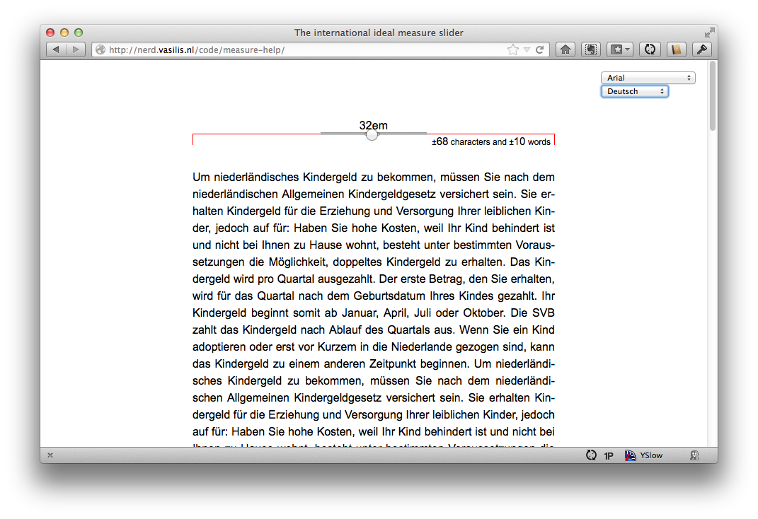
I created this simple international measure slider to give you an idea of how wide a measure can be. (Yes, I know, it’s weird.) This little tool looks only at language and font family, but you’ll see that these two variables alone can lead to some extreme results. Just compare German or Polish with English or, even better, German set in Verdana with English set in Georgia. The difference is huge: 10 German words set in Verdana can be 38.5 ems wide, while 10 English words set in Georgia are just 22 ems wide. In most default browser settings, that would be 616 pixels versus 352 pixels. You see, these two simple factors should have a major impact on the grid.
A good measure is essential for articles. I know that the Web is not just articles. You could very well be working on a Web app with very little text to read. But even then, starting with the measure when defining breakpoints might be a good idea.
Our Example
As an example, I’ll be using a simple blog post. It’s a structured but simple article, with some common semantic elements in it. These elements are not necessary to define the breakpoints, but I think they might help; typography can be a logical starting point. I’ve left out the header and logo — let’s concentrate on the content first.
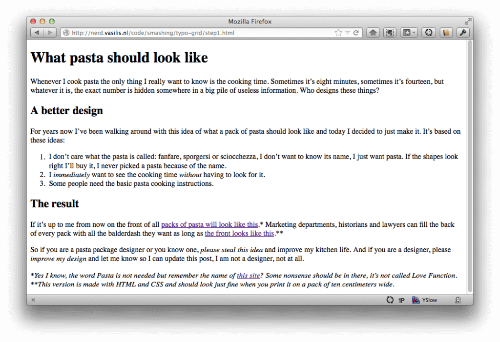
Of course, if you open this unstyled article in a browser, it will look ugly. There is no styling except for the default styling that the browser uses for the elements in the article. The text is as wide as the browser, which is probably too wide on a desktop. This could very well be what someone on IE 6 sees — a somewhat accessible article with rudimentary styling.
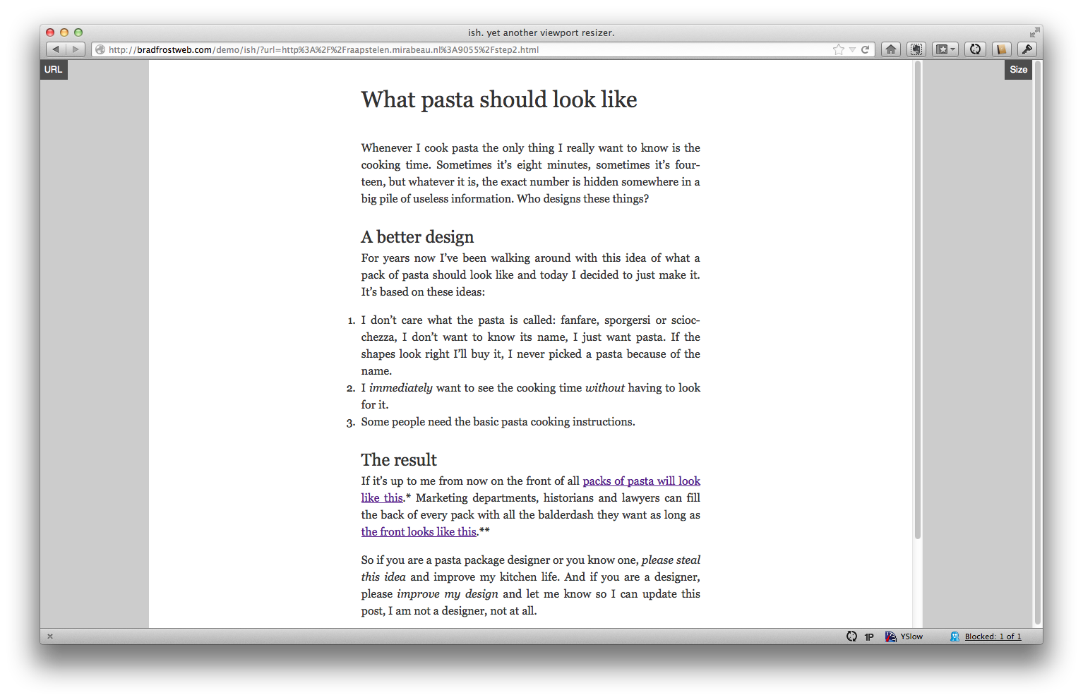
By adding just some basic typographic styling and a max-width attribute, the article immediately looks much better. This page can now serve as a starting point to define all of the different responsive grids. This single column probably needs some adjustment for small screens, and on wider screens we should probably add some columns, either to make things prettier or to show more information such as navigation or asides.
Logical Breakpoints
I never paid attention in maths class before dropping out of high school a long time ago, so I’ll stick to a very simple grid that even I understand. Smarter people could probably use these same ideas for more complex grid systems. This article is about defining breakpoints; what you do with them is entirely up to you.
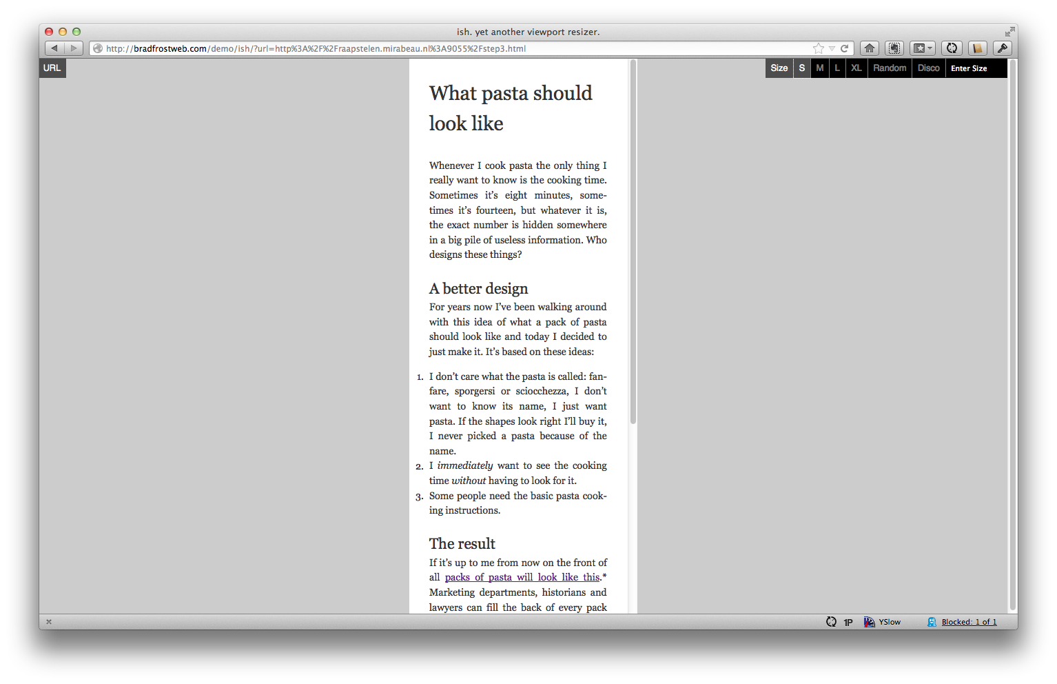
Small Screens
I’ll start with the small screen. One theory of Oliver Reichenstein, a theory I really like, is that font size doesn’t depend on screen size; it depends on the distance between our eyes and the device we’re using. We tend to hold our phones closer to our head than our laptops, so this might warrant smaller fonts. The other theory of Robert Bringhurst, as explained above, is that an ideal measure should probably not be smaller than 45 characters. In our case, where we use a 16-pixel Georgia as the default font size, this would result in a slightly smaller font size. Both theories are fine, and they both tell us to reduce the font size on small screens. So, all of the code we’d need for small screens is this:
@media (max-width: 22em) {
   body {
      font-size: .9em;
      padding: 0 1.5em;
    }
}
This says that whenever the measure is smaller than 45 characters (according to our tool), show a smaller font size. I also reduced the padding on the body to create a bit more space for the content. See the example right here.
Big Screens
Sometimes, a single column is enough. Content-focused websites, such as blogs, could very well do with a one-column layout. But multiple columns on big screens are actually a good idea in many situations. You might want to show some navigation, or perhaps you’ve found some widgets that actually make sense. You could very well choose to show these next to the main content.
But you could do other things as well. For instance, right at the point where there is room for an extra column, we could play with the layout of our article. I added a 33%-wide column to the left, filled with the heading and the first paragraph of the article. Other elements, such as block quotes and images, could fill this gap as well.
The code gets a bit more complex here. And this is definitely not the only way, or the most maintainable way, to create a layout like this. But this is how I did it.
@media (min-width: 34em) {
   body {
      max-width: 51em;
   }

   article {
      width: 66.66666%;
      margin: 0 0 0 33.333333%;
   }

   h1, h1 + p {
      margin: 1em 0 1em -50%;
   }

/* And some font-size adjustments */
}
When the screen is wider than 34 ems (30 ems for the content and 4 ems for the margin), the maximum width of the body is increased to 51 ems: 34 + (34 ÷ 2). The article should now be two thirds of the total width, and the new column on the left should be one third. The h1 and p right after it should have a negative margin of one half the width of the content. This is where I really cursed myself for not paying attention in maths class!
Even Bigger Screens
We could add a third column, and a fourth and a fifth. We could also decide that we’re done. It all depends on the content. We could use that space to show some images or some relevant content. It’s really up to you and depends on the thing you’re creating. In our case, we could show the footnote to the right of the content. Now, stop laughing! I told you, I am not a designer! Here is the code for that work of art:
@media (min-width: 51em) {
   body {
      max-width: 68em;
   }

   article {
      width: 50%;
      margin: 0 25%;
      position: relative;
   }

   h1, h1 + p {
      margin: 1em 0 1em -50%;
   }

   .sidenote {
      position: absolute;
      right: -50%;
      width: calc(50% - 2em);
      font-size: .9em;
   }
}
The article is now 50% wide and has 25% of margin to the left and to the right. The side note is placed 50% to the right, outside of the content. It is 50% wide, minus 2 ems for good looks. The code for the h1 and p did not change. Note that calc does not yet work in all browsers, so a fallback is needed. The real code for the width bit looks like this:
width: 45%;
width: -webkit-calc(50% - 2em);
width: -moz-calc(50% - 2em);
width: -ms-calc(50% - 2em);
width: -o-calc(50% - 2em);
width: calc(50% - 2em);
Yes, I know that not all of these prefixes are necessary, but I prefer to use them all, always. The other option is to remember by heart which CSS feature is supported by which browser, with or without prefixes. If I understand the cascade correctly, this is perfectly harmless. And besides, it looks good. I can clearly see that cool stuff is going on in this part of my style sheet by the pattern that it generates.
So, this is it. Here we have a responsive website, based on font size and measure. The breakpoints are based on a logical unit, not on some random units like the screen sizes of devices that are in vogue right now. This scales — into the future and in the browsers of your users. Because everything is based on font size, it all responds to the preferences of the person visiting your website. The layout does not break when the font size of the browser is increased. On the contrary.
Breakpoints are not based on some random units like the screen sizes of devices.
Technically
When we started with responsive design a few years ago, we created a desktop website first and then added media queries for smaller screens, overwriting the styles for the desktop version. We found out that that’s not the right way to work. We all know by now that the best way to set up CSS is by starting with a small screen first. After all, growing is easy — trees grow, babies grow — and shrinking is hard. Ever tried to compress a car? It’s possible to a certain extent, but also very hard.
In most cases, starting with a small screen is a logical thing to do. As we make things bigger, we only need to add some media queries every now and then to adjust the layout for bigger screens. But I think it’s not really about small screens — it’s about defaults.
Defaults First
The first thing we need to define is not necessarily the styles for a small screen, but the defaults: the styles that are used throughout the website, regardless of screen size. These are things like the relationships between font sizes, white space and brand-related styles like borders and backgrounds. These styles should not be inside a media query because they are used everywhere. What we want to define in media queries are the exceptions (like a smaller font size) or additions (like grids) to these basic styles.
This could very well mean that we have to use a media query for small screens only if a certain element behaves differently. When you think about it, this happens a lot: page headers, navigation and other complex components are often radically different on small screens. It makes sense to put the code for these components in a @media (max-width) query, as I did in the example, because it’s an exception to the default.
Some Final Details
The example I showed you is very basic, and I did not explain many details. Two of them are rather important, so I’ll add them here. One is about using ems for media queries, and the other is about breakpoints.
Break Ranges
There has been some discussion lately about the term “breakpoints.” Mark Boulton and Ben Callahan think we should call them “optimization points,” and Jeremy Keith distinguishes between breakpoints and “tweakpoints.” In this article, I’ve been focusing on breakpoints — i.e. major changes in the layout when the content asks for more or less space. And now I introduce yet another term: break ranges.
We use the term “breakpoints” for media queries that make the layout completely different. We tend to use them as direct changes: when a layout reaches its maximum width, we immediately switch to the next layout. Waiting a while and adding some white space first before switching is often better. For instance, the switch between the one- and two-column layouts results in a rather small main column. Instead of switching at the exact moment that the content reaches its maximum width, we could just wait a while, as I did here. This is a very simple trick to never break the layout.
Ems In Media Queries
Using ems in media queries can be weird. You might assume that they respond to the font size specified in the CSS, but they don’t. They react to the font size of the browser that the visitor is using. This is actually logical when you think about it. If they reacted to the font size in the CSS, you could actually disable a media query from within a media query by increasing the font size. This piece of code would create an endless loop:
html {
   font-size: 100%;
}

@media (min-width: 20em) {
   html {
      font-size: 200%;
   }
}
If the media query reacted to the font size defined in the style sheet, then what would happen as we slowly increased the width of the browser? As soon as the screen got wider than 20 ems, the font size would grow twice as big. This means that the width of the page would now be 10 ems, which would mean that the browser should now ignore the media query. This would result in the smaller font size, which would immediately trigger the media query again. That’s an endless loop.
But it’s logical not only from a technical perspective, but from the user’s perspective: If the user prefers a bigger font, then the layout would always be optimized in a way that’s relative to the font size. And that’s what we’ve been doing here all along. At the same time, it can also become a pretty big mess for people like me who should have paid attention in high school: The ems that the media query uses could have a completely different size than the ems inside it. This is complex. If you want to learn more about this, definitely read Lyza Gardner’s classic article on the subject, “The Ems Have It: Proportional Media Queries FTW!.”
One thing that really bugs me is that we need a silly tool to estimate the number of characters on a line. WebKit has only now implemented the “ch” unit into its nightly builds; it will probably take some time before we can actively use it. One ch is the actual width of the 0 (zero) of the font in use. It sounds like an incredibly useful unit for responsive design, but I’m not sure how it will work with media queries. We’ll see.
Conclusion
In an ideal situation, the different grids for the various screen sizes would be defined by the content alone. There are, of course, situations in which other elements, such as banners, would more heavily define the width of the content. Even in these situations, readability theory might help; you could increase or decrease the font size of the body copy in order to stay within the margins of an ideal line width. Just don’t make the text too small — people want to read it.
Fortunately, in most other situations, classic typographic theory can help you determine the right breakpoints for your responsive website. You could even go so far as to create different layouts for different languages. When you’re working on large international websites, this might actually be a good idea. Most importantly, use the theory in this article to better design your content for all different screen sizes, on both current and future gadgets. The example I’ve shown uses a very simple grid, but in combination with more complex grids, this theory can help to create wonderful, and logical, websites.
Further Reading
- Responsive Image Breakpoints Generator, A New Open Source Tool
- Breakpoints And The Future Of Websites
- Automatically Art-Directed Responsive Images? Here You Go.
- Looking Beyond Common Media Query Breakpoints
 (al, mrn)

