Mastering Real-World Constraints (A Case Study)
As UI designers, we’re always interested in learning, reading user research, understanding best practices and keeping up to date on all the latest approaches and tactics for building websites and applications.
One of the most exciting concepts we’ve started to apply to our thinking is the mobile-first approach, famously pioneered by designer Luke Wroblewski on his blog and then in his subsequent book. Generally, this approach provides a healthy way to gain focus, cut the fat and get to the heart of what’s important — for both content and interaction.
But what happens if you have an existing site or app that was built for desktop without a responsive or mobile strategy in mind? And more specifically, what if you, like us, don’t have the resources, time, or budget to start over from scratch in the near term? Despite being a design shop, we at Fresh Tilled Soil found ourselves in this very position. This is how we addressed it.
The Challenge
As a Web and mobile app UI design firm, we couldn’t very well ignore the problem for much longer and let prospective clients pinch, zoom, and squint on their phones to assess whether we were the right agency for them — particularly when we offer mobile Web and native app design services!
So what to do? A design firm offering mobile and responsive design solutions should certainly practice what it preaches - especially with the data showing an increasing number of visitors accessing our site from their smartphones. Because we wanted to share the same information regardless of device type and maintain a single codebase, a responsive approach was the best solution.
Though our resources were limited, we were fortunate enough to have several team members with a limited window of upcoming availability. We quickly assembled a small team with the goal of rapidly making our entire website truly responsive (though keeping a particular eye on our iPhone and Android users). Based on our analytics reports, these devices were by far the most popular among viewers of our site.
Our research showed us that 51% of mobile visits were on iPhones, 40% were on iPads and the remaining 9% was broken up between various Android smartphones and tablets. However, we felt that a truly responsive solution where each of our layouts was fluid made for a better solution than just targeting specific devices.
How To Begin
- Identify Key Layouts to Address. As a group, we discussed what mattered most from a prospective client’s point of view, then identified which layouts would need custom design and which could be handled directly in the code.
- Focus On Screen Size Beyond Just Specific Devices. Once the custom layouts were designed and coded, we identified organic breakpoints between mobile and desktop for further refinement.
- Account For New Device Capabilities. We updated graphics to support the higher resolution associated with retina displays.
- Design and Code in Parallel. While the designers got to work on the custom layouts, developers began adapting the website to small screens, converting fixed widths to percentage-based. A designer and developer then worked side-by-side to further refine the typography, navigation and layouts in code, making improvements in real time.
Our Process In Action
1. Streamline The Navigation
Consider the limited real estate of a mobile screen and examine ways to simplify layouts.
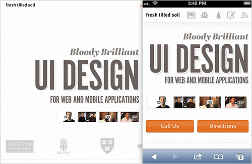
In designing for the mobile experience, the first decision we made was to simplify the navigation to a series of icons that represented each of the sections. We removed the large background image of our handsome CEO, Richard Banfield, and focused on making it easy to see the positioning statement and start any of the videos.
2. Identify Device-specific Use Cases
Think about what visitors want most from your mobile website and consider how to make it easy for them to access.
We thought it was important for clients who were visiting us for the first time to be able to easily contact us or access a map to our location. By envisioning this from the user’s perspective, we decided this content was important enough to be in a prominent location on mobile devices. Simply showing this section when the device screen width implied a mobile resolution and setting it to not display on larger screens was enough to do the trick.

Contact information and directions were made more prominent in the layout for small screens, to assist clients who are visiting for the first time.
3. Simplify Existing Functionality
Make sure your interactions work smoothly on smaller screens and retain their context.
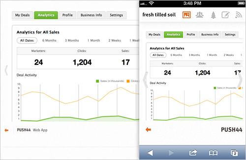
The portfolio section was simplified on smaller devices to only showcase six projects, and the portfolio detail images now appear above the thumbnails rather than over them to keep the context of the portfolio section.

Interactions were simplified to make sure they would work smoothly on smaller screens.
4. Rethink Potentially Awkward Interactions
If something requires a custom design approach, invest the time to truly optimize it.
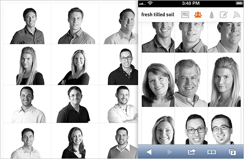
Some UI choices that make great sense on a desktop simply fall flat on a mobile screen. On the desktop version of our website, the team bios slide into view above a grid of team members, with each person’s details appearing to the left of a larger head shot. Knowing that these biography layouts would probably have to anchor and jump much higher than the grid and would then require quite a bit of scrolling to read the bio, we came up with an altered design treatment that resembles a modal overlay.

UI approaches that didn’t work well on small screens were given a different design treatment.
It was important to identify that the team section would need custom design early in the process so we could get started designing, testing and iterating. We used a div that slides up from the bottom of the page, covering about 90% of it. The bios were then shortened in length so that each bio could be presented without scrolling in both the portrait and landscape orientations on our target devices.
5. Use Tried-and-true Responsive Patterns
Not every layout needs to be re-designed for a smaller screen. Sometimes making columns stack and letting their widths fit the screen is the optimal treatment.
On our website, not all sections required custom treatments for smaller screens. Below the team area, the “Habitat” (article, workshops and events) section implements a more straightforward responsive approach in which the two-column layout simply stacks vertically. The detail pages for each of those items also use a similar stacking approach, and we made sure the option to register for a workshop was in a prominent location.
6. Removing Unnecessary Elements
Always consider simplifying. If something on your desktop website doesn’t apply to a mobile context, then maybe you can remove it. If you find it’s an improvement, then consider ways to simplify the desktop layout as well.
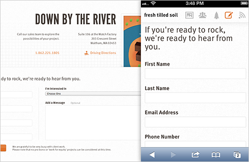
Toward the bottom of the page, our contact section was greatly simplified to only include a mobile-friendly contact form for prospective clients to get in touch. Since we already feature the “call us” and “directions” buttons at the top of the website, we were able to remove the address and map from this section.

The contact section was simplified to remove duplicate elements.
Lessons Learned
- Make informed decisions. By making the website structure fluid, by testing and by identifying which sections could be reordered or re-structured to optimize for mobile, our small internal team was able to get started immediately and move quickly.
- Teamwork is key. Everyone was able to present their case for what to add, remove or change, as long as it came from a place of putting the user’s goals first.
- Don’t over-formalize the process. As with many design projects, quick sketches and white-boarding sessions, followed by small changes to design comps and actual code, brought the bigger picture into focus without us getting too carried away with an overly formal process.
- Understand what devices your audience is using, but take a fully responsive approach. Lead Designer Alex Sylvia says, “We were conscious to test on the devices our clients were using, but we also wanted the design to react organically. The only way to discover that was to interact with the site at various sizes.” By using this approach while also testing on devices we knew our audience was using based on analytics, we got the best of both worlds.
- Use the best technology for the job. One of our senior UI designers, Alec Harrison, quickly spun out design comps for the team member treatment, using LiveView to immediately showcase the comps on his iPhone. This provided the right context for improving the design.
- Collaboration is key. Rather than designing independently, collaborating with a developer to make design decisions directly in code helped us reach an organic solution. Our lead developer, Sarah Canieso, had this to say about the process: “This project reiterated for me that responsive projects are very much a collaboration of design and code. It was a balance between the visual — where the design changed at different breakpoints — and maintaining functionality that would provide a good user experience across devices.”
The Impact
Since launching the responsive version of our website, we’ve noticed the following improvements in mobile user behavior:
- A 17% reduction in our bounce rate.
- An increase of time spent on our website — up to 3 minutes from just 40 seconds.
Additionally, we’ve received several compliments from prospective clients who have accessed our website for the first time using their phone.
While a mobile-first approach gets to the heart of simplifying a site or interface for all resolutions, large and small, that just is not always possible. In a crunch, we feel the process we undertook helped greatly improve our site on smaller devices. And in the process, it made us even more knowledgeable about supporting various devices with a single codebase.
Further Reading
- Responsive Web Design: What It Is And How To Use It
- Responsive Web Design Techniques, Tools and Strategies
- The State Of Responsive Web Design
- Design Process In The Responsive Age


 See the full picture →
 Celebrating 10 million developers


 SurveyJS: White-Label Survey Solution for Your JS App

