How To Make Your Websites Faster On Mobile Devices

Email Newsletter
Weekly tips on front-end & UX.
Trusted by 182,000+ folks.
 Claim Your Free Spot!

 Celebrating 10 million developers
 SurveyJS: White-Label Survey Solution for Your JS App
 Register Free Now
A recent study (PDF) found that more than 80% of people are disappointed with the experience of browsing Web on mobile devices and would use their smartphones more if the browsing experience improved.
This isn’t surprising when 64% of smartphone users expect websites to load in 4 seconds or less, while the average website takes more than twice that amount, at 9 seconds. This article explains techniques you can use to make your websites faster on mobile devices.
Download Speeds For Mobile Users
Let’s start by looking at what influences the loading speed of a website on a smartphone.
The most obvious factor is the connection speeds of smartphones. In the best-case scenario, mobile users connect to the Internet over 3G and 4G networks, with 4G networks being faster. In the US, 57% of users are on 3G, and 27% are on 4G. In Canada, 4G penetration is even lower. In the UK, 4G only recently became available.

User experience on mobile devices usually has room for improvement. (Image: Phil Campbell)
According to a study by PCWorld, the average download speed for 3G networks in the US is 2 Mbps, and 6.2 Mbps for 4G networks. A study by Ofcom found that the average download speed for 3G in the UK to be 2.1 Mbps. Outside of North America and Europe, connection speeds are generally slower. Because 1 Mbps equals 122 KB/s (or 0.12 MB/s), this translates into the following:
- 244 KB/s on average for 3G users (0.24 MB/s),
- 756 KB/s on average for 4G users (0.76 MB/s).
If you multiply that by the 4 seconds that mobile users are expecting to wait, this means the website could be a maximum of 1 MB for 3G users and 3 MB for 4G users.
However, download speed is not the bottleneck. The bottleneck is the network latency, smartphone’s memory and CPU. Even if the phone can download 1 MB in 4 seconds, the website will take longer to load because the phone needs to receive and process the code and images.
On a desktop, only 20% of the time it takes to display a Web page comes from downloading files. The rest of the time is spent processing HTTP requests and loading style sheets, script files and images. It takes even longer on a smartphone because its CPU, memory and cache size are much smaller than a desktop’s.
How To Minimize Loading Time
Having a fast website is all about making the hard decisions and getting rid of what’s not at the core of your experience. If it doesn’t add a lot of value, remove it. This is true for all phases of the development process, but especially so for planning and coding.
- Reduce Dependencies. Fewer files to download means fewer HTTP requests and faster loading times.
- Reduce Image Dimensions. On top of the extra download time, precious processing power and memory are used to resize high-resolution images.
- Reduce Client-Side Processing. Rethinking the use of JavaScript and keeping it to a minimum are best.
How To Reduce Dependencies
Load Images Through CSS
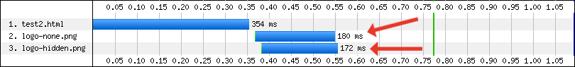
If you want to hide content images from mobile users, relying on display: none or visibility: hidden won’t prevent them from being downloaded. We tested the following code:
<div style="display:none;">
   <img src="logo-none.png" />
</div>

<div style="visibility:hidden;">
   <img src="logo-hidden.png" />
</div>
You can see in the two waterfall charts below how content images set to display: none or visibility: hidden are still downloaded.
Waterfall chart for display: none and visibility: hidden on an iPhone 4, iOS 5.0.
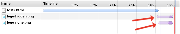
Waterfall chart for display: none and visibility: hidden on a Nexus S.
Instead, load them as background images in CSS, and use media queries to conditionally hide them. The basis for this technique was originally tested by Jason Grigsby and expanded upon by Tim Kadlec. A variant is used on Amazon’s separate mobile pages to conditionally load device-specific images.
<meta name="viewport" content="width=device-width">

<style>
@media (max-width:600px) {
   .image {
      display:none;
   }
}
@media (min-width:601px) {
   .image {
      background-image: url(image1.jpg);
   }
}
</style>

<div class="image"></div>
You can see in the two waterfall charts below that the image isn’t loaded:
Waterfall chart for an iPhone 4, iOS 5.0.

Waterfall chart for a Nexus S.
Keep External Style Sheets To A Minimum
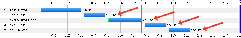
If you’ve been using separate style sheets for each break point, you may want to rethink this. We tested the following code:
<link href="extra-small.css" rel="stylesheet" media="screen and (max-width: 390px)" />
<link href="small.css" rel="stylesheet" media="screen and (min-width: 391px) and (max-width: 500px)" />
<link href="medium.css" rel="stylesheet" media="screen and (min-width: 501px) and (max-width: 767px)" />
<link href="large.css" rel="stylesheet" media="screen and (min-width: 768px)" />
You can see that all four style sheets are downloaded in portrait mode:
Waterfall chart for media queries on an iPhone 4, iOS 5.0.
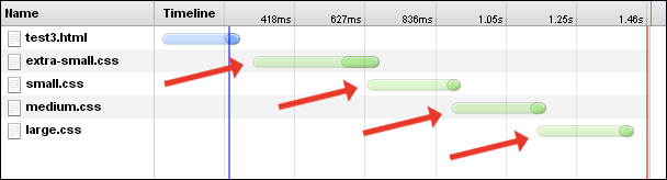
Waterfall chart for media queries on a Nexus S.
Because they’re all being downloaded anyway, you might as well combine them all into a single file and reduce the number of HTTP requests. Alternatively, you could rely on server-side functions to dynamically insert the correct style sheet based on the device (a method used on the responsive WordPress.com).
A different approach would be to use inline styles. Amazon’s separate mobile product pages have one external 6 KB style sheet, along with some inline styles. This results in a single additional HTTP request to download all page styles. Amazon’s desktop version isn’t as efficient, with nine external style sheets, totalling 40 KB combined.
CSS3 Instead Of Images
Rounded corners, drop shadows, gradient fills, and so on — these styling features can be used instead of images, reducing the number of HTTP requests and speeding up loading time.
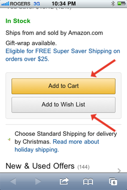
Amazon’s buttons are created using CSS3; no images are used.
Although CSS3 can reduce HTTP requests, it adds to the processing load. We created a series of simple HTML files, each containing one basic CSS3 styling feature. You can see from the chart below that the effect on loading time is minimal but should still be considered. Notice how the box-shadow effect has the biggest impact on loading time.
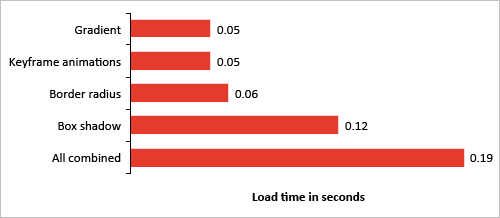
Loading times for CSS3 styling features on an iPhone 4, iOS 5.0.
Data URI Instead Of Images Or Web Font Files
The data URI scheme is a way to embed data into HTML or CSS without using any external resources. It can be used to embed anything onto a Web page, with the most common usage being to embed images and Web font files. Its primary benefit is to reduce the number of HTTP requests.
The way it works is simple. Instead of referencing an external image file, you would embed the base64-encoded data directly into the HTML or CSS, using the following format:
data:[MIME-type][;charset=encoding][;base64],[data]For example, the following shortcut icon is generated by a data URI:

Here’s the code:
<img alt="" src="data:image/png;base64,iVBORw0KGgoAAAANSUhEUgAAABAAAAAQCAIAAACQkWg2AAACI0lEQVQoz2P48/bFX1Tw58vn3/dv/rp56dfD238+vocIfl029UOC3dsgS4Y/nz4gq/794sm3VbO+zmr/MqX+S1/l597yb2vn/rpx6VN14od4+3cBRgx/vn9F1vB9/+bPPeVfJlZ/6S793JwDVPcxL/BjQeiHFNf3cbbvgw0Z4JZCwM/Lpz81Zn2qS/1Ul/apOv5jUfiHbP8PSc7vY23fh5m+C9JjALoVzQ8/zx7+0lH4IcvnQ4bXhwzPD8muINXhZu+C9N/56zB8mdr49/cfdH9/fPdj36bPLbkgpYH670KNQaoDdV47aTK8j7H+tmXpX6zg95+f545+7ix656PxzlP5jaf2c2M1hvcRZu8jzb4umfrn6xfs2v78+XFkx9sI2+fass8N1Rje+eu/dtR+YaD0Jj70296df3/+xKrr593bL91tnmnJMbwwVXtuoAbU+kxD5pmu4pvYkK9rVvz58B5Tz7dd257pKDAAlT43giEDFZA2NclXAe5fN60DOgZFx48fb6ICGRCqIchY/bmhKkibivinOdPRLPnQ1cwAUqGrCFQBVIes7ZmmzEtni9+vXiFr+DR9IsMzHfnXIV5vs5OeqUs/05B+rqcIdBhQ81M1yRfW+r+fPUHRMLWfAejir+tWATlf1ix/HR34wlL3ub7Scx2F56Yan6ZPQnPS+6oihlc+Tr/fv4OG+Levv+7d+X700PeDe3/dv4um+tfjhy9drQDa2DKqOJhVKgAAAABJRU5ErkJggg==" />The WordPress.com responsive website embeds both images and fonts. The Boston Globe’s responsive website, which loads in just over 4 seconds on a smartphone, also embeds data.

Nearly all graphics and Web fonts on Wordpress.com are from data URIs.
Because of the way browsers load data URIs, they could end up taking longer to load than using external image or font files. Testing and comparing the two methods is important to see whether it’s worthwhile.
Inline Scalable Vector Graphics (SVG) Instead Of Images
Much like data URIs, scalable vector graphics (SVG) can be embedded onto a page to reduce the number of HTTP requests. For example, the following image is an inline SVG:
Here’s the code:
<svg version="1.1" id="drop" x="0px" y="0px"
   width="17.812px" height="28.664px"
   viewBox="296.641 381.688 17.812 28.664"
   enable-background="new 296.641 381.688 17.812 28.664"
   xml:space="preserve">
<path fill="#EE1C4E" d="M314.428,401.082c-0.443-5.489-5.146-9.522-7
.52-14.186c-0.816-1.597-1.352-5.208-1.352-5.208 s-0.555,3.792-1.388
,5.425c-2.233,4.371-7.127,8.999-7.507,14.047c-0.36,4.794,4.101,9.191
,8.896,9.191 C310.49,410.354,314.816,405.941,314.428,401.082z"/>
</svg>
SVG files can be created with a vector graphics editor, such as Adobe Illustrator. Once created, open the file in a text editor and drop it into the code (minus any unnecessary meta data).
The above code will work in an HTML file, but won’t work in a style sheet. To embed an SVG file in a style sheet, first convert it to a data URI. To do this, grab the SVG code from the text editor (be sure to include the meta data), encode it in base64, and then embed it using the following format:
data:image/svg+xml[;base64],[data]Here’s the code:
background-image:url(data:image/svg+xml;base64,PD94bWwgdmVyc2lvbj0i
MS4wIiBlbmNvZGluZz0idXRmLTgiPz4NCjwhLS0gR2VuZXJhdG9yOiBBZG9iZSBJbGx
1c3RyYXRvciAxNS4xLjAsIFNWRyBFeHBvcnQgUGx1Zy1JbiAuIFNWRyBWZXJzaW9uOi
A2LjAwIEJ1aWxkIDApICAtLT4NCjwhRE9DVFlQRSBzdmcgUFVCTElDICItLy9XM0MvL
0RURCBTVkcgMS4xLy9FTiIgImh0dHA6Ly93d3cudzMub3JnL0dyYXBoaWNzL1NWRy8x
LjEvRFREL3N2ZzExLmR0ZCI+DQo8c3ZnIHZlcnNpb249IjEuMSIgaWQ9IkxheWVyXzE
iIHhtbG5zPSJodHRwOi8vd3d3LnczLm9yZy8yMDAwL3N2ZyIgeG1sbnM6eGxpbms9Im
h0dHA6Ly93d3cudzMub3JnLzE5OTkveGxpbmsiIHg9IjBweCIgeT0iMHB4Ig0KCSB3a
WR0aD0iMTcuODEycHgiIGhlaWdodD0iMjguNjY0cHgiIHZpZXdCb3g9IjI5Ni42NDEg
MzgxLjY4OCAxNy44MTIgMjguNjY0Ig0KCSBlbmFibGUtYmFja2dyb3VuZD0ibmV3IDI
5Ni42NDEgMzgxLjY4OCAxNy44MTIgMjguNjY0IiB4bWw6c3BhY2U9InByZXNlcnZlIj
4NCjxwYXRoIGZpbGw9IiNFRTFDNEUiIGQ9Ik0zMTQuNDI4LDQwMS4wODJjLTAuNDQzL
TUuNDg5LTUuMTQ2LTkuNTIyLTcuNTItMTQuMTg2Yy0wLjgxNi0xLjU5Ny0xLjM1Mi01
LjIwOC0xLjM1Mi01LjIwOA0KCXMtMC41NTUsMy43OTItMS4zODgsNS40MjVjLTIuMjM
zLDQuMzcxLTcuMTI3LDguOTk5LTcuNTA3LDE0LjA0N2MtMC4zNiw0Ljc5NCw0LjEwMS
w5LjE5MSw4Ljg5Niw5LjE5MQ0KCUMzMTAuNDksNDEwLjM1NCwzMTQuODE2LDQwNS45N
DEsMzE0LjQyOCw0MDEuMDgyeiIvPg0KPC9zdmc+DQo=);
Test this method and compare with external image files to make sure it actually is faster.
Image Sprites
The idea behind sprites is to combine commonly used images into a single image file, reducing the number of HTTP requests. For example, if you combine four images into a single sprite, you’re theoretically reducing HTTP requests from four to one. The required image is then displayed by using the CSS background-position property.
One of Amazon’s image sprites
Amazon has multiple sprites, some with duplicated images.
Font Icons
Font icons are fonts consisting of symbols and glyphs (like Wingdings or Webdings), and can be used instead of loading an image file. For example, the following icon is not an image, but rather the letter “H” from Wingdings:
H
Although Wingdings and Webdings are a bit cheesy, other more professional Web fonts are available that can be loaded through the @font-face rule.
This technique can be used in the same way as image sprites to reduce HTTP requests. By combining multiple icons into a single Web font, the number of HTTP requests for all icons can be reduced to one. If the Web font is embedded using a data URI (as described above), HTTP requests could be reduced to zero.
This is exactly what Wordpress.com does. Here’s the Web font embedded in its style sheet:

Wordpress.com’s font icons
Wordpress.com has access to all of these icons without having to make any extra HTTP requests, because the icons are part of a Web font embedded in WordPress’ style sheet as a data URI.
As an bonus, font icons can be animated using CSS3 keyframe animation (which would be useful for “loading” icons).
The primary downside of CSS sprites is that they can only be one solid color. Amazon’s image sprites include multi-colored icons, which is why it couldn’t use this technique.
Tools such as IcoMoon make it easy to build a custom Web font. All that’s needed is the SVG file for each of the icons.
Avoid Inline Frames
Each inline frame (iframe) results in one more HTTP request, in addition to any dependencies within the iframe. Here’s a quick test we did, comparing inline text with a single iframe containing text only.

Loading times for CSS3 styling features on an iPhone 4, iOS 5.0.
Having a single iframe added nearly 0.20 seconds to the loading time. To keep the website fast, it’s best not to use them.
Code For Mobile-First
Going mobile-first also applies to front-end development.
By coding for mobile users first and then progressively enhancing for tablets and desktops, unnecessary dependencies are reduced. Compare this to coding for desktop first, where heavy components are loaded by default and then hidden for small screens (known as “graceful degradation”).
Here’s an example of coding for desktop first:
<style>
.image {
   background-image: url(image1.jpg);
}

@media (max-width:390px) {
   .image {
      display: none;
   }
}
</style>

<div class="image"></div>
In the above code, the default is to display the image, which is then overruled for mobile devices with the media query.
Here’s an example of coding for mobile first:
<style>
@media (min-width:391px) {
   .image {
      background-image: url(image1.jpg);
   }
}
</style>

<div class="image"></div>
By default, the image isn’t displayed, while wider screens are progressively enhanced using a media query.
Split Content Onto Multiple Pages (Separate Mobile Websites)
Keep your core content on the page, while linking to secondary content. This will reduce the payload of the HTML and prevent any associated dependencies from being downloaded.
Amazon’s mobile product pages have generic product information, while providing links to “Customer Reviews,” “Description & Details” and “New & Used Offers.” This eliminates HTTP requests for three images, while the HTML’s size is reduced by 45 KB.
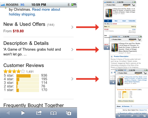
Amazon splits content onto multiple pages to reduce loading time.
Keep Redirects To A Minimum (Separate Mobile Websites)
Amazon has a single redirect taking the visitor to the separate mobile page, resulting in a 0.4 second delay. Compare that with Dell’s website, which has two redirects, resulting in a 1.2 second delay.
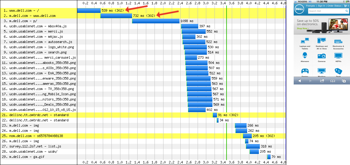
Waterfall chart for Dell’s website on an iPhone 4, iOS 5.0.
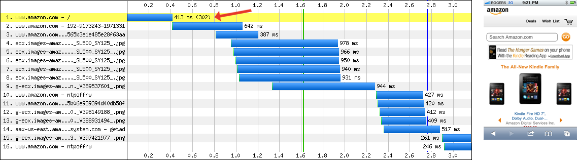
Waterfall chart for Amazon’s website on an iPhone 4, iOS 5.0.
How To Reduce Image Dimensions
Responsive Images
The idea behind responsive images is to have the visitor download only those images that are best suited to their device. In the case of smartphones, this would be lower-resolution images that can be quickly downloaded and rendered.
Amazon’s separate mobile product pages use a responsive-images technique that assigns a particular background image to a div according to media-query matches. Here’s Amazon’s code:
<!-- // This meta viewport is inserted for iPhones // -->
<meta name="viewport" content="width=device-width,user-scalable=no,initial-scale=1.0,maximum-scale=1.0">

<!-- // This meta viewport is inserted for the Nexus S // -->
<meta name="viewport" content="width=device-width">

<style>
@media (max-width:390px) {
   #image-container {
      max-width: 109px;
   }
   .image {
      background-image: url(image1.jpg);
   }
}
@media (max-width:390px) and (-webkit-min-device-pixel-ratio:1.5) {
   .image {
      background-image: url(image2.jpg);
   }
}
@media (max-width:390px) and (-webkit-min-device-pixel-ratio:2) {
   .image {
      background-image: url(image3.jpg);
   }
}
@media (min-width:391px) and (max-width:500px) {
   #image-container {
      max-width: 121px;
   }
   .image {
      background-image: url(image4.jpg);
   }
}
@media (min-width:391px) and (max-width:500px) and (-webkit-min-device-pixel-ratio:1.5) {
   .image {
      background-image: url(image5.jpg);
   }
}
@media (min-width:391px) and (max-width:500px) and (-webkit-min-device-pixel-ratio:2) {
   .image {
      background-image: url(image6.jpg);
   }
}
@media (min-width: 501px) and (max-width: 767px) {
   #image-container {
      max-width: 182px;
   }
   .image {
      background-image: url(image5.jpg);
   }
}
@media (min-width: 501px) and (max-width: 767px) and (-webkit-min-device-pixel-ratio:1.5) {
   .image {
      background-image: url(image7.jpg);
   }
}
@media (min-width: 501px) and (max-width: 767px) and (-webkit-min-device-pixel-ratio:2) {
   .image {
      background-image: url(image8.jpg);
   }
}
@media (min-width:768px) {
   #image-container {
      max-width: 303px;
   }
   .image {
      background-image: url(image8.jpg);
   }
}
@media (min-width:768px) and (-webkit-min-device-pixel-ratio:1.5) {
   .image {
      background-image: url(image8.jpg);
   }
}
@media (min-width:768px) and (-webkit-min-device-pixel-ratio:2) {
   .image {
      background-image: url(image8.jpg);
   }
}
</style>

<div id="image-container">
   <div class="image">
      <img src="image1.jpg" />
   </div>
</div>
Even though Amazon has a total of eight product images in its inline styles, only two are downloaded by an iPhone 4 or Nexus S in portrait mode.
A different data-fullsrc responsive-images technique is used on the Boston Globe’s responsive website. It’s a combination of markup, JavaScript and a server-side redirect rule:
<img alt="" src="mobile-size.r.jpg" data-fullsrc="desktop-size.jpg" />The src is the mobile-sized image, ensuring that the website defaults to the smaller version (mobile-first), while the data-fullsrc is the full-sized image. JavaScript is used to detect the device’s screen size, which is written to a cookie. For large screen sizes, JavaScript swaps the smaller src image with the higher-resolution data-fullsrc image. The server also uses Apache rewrite rules to check for .r. in the image file’s name and displays a spacer GIF, instead of the smaller mobile image (thus preventing the mobile-sized image from being downloaded by desktops).
Microsoft’s responsive website uses Scott Jehl’s Picturefill technique:
<div data-picture data-alt="Alternate text here">
   <div data-src="image1.png"></div>
   <div data-src="image2.png" data-media="(min-device-pixel-ratio: 2.0)"></div>
   <div data-src="image3.png" data-media="(max-width: 539px)"></div>
   <div data-src="image4.png" data-media="(max-width: 539px) and (min-device-pixel-ratio: 2.0)"></div>

   <noscript><img src="image1.png" alt="Alternate text here" /></noscript>
</div>
Note: In the above snippet, data-picture=“” should be data-picture, without the =“”. (The =“” characters are automatically inserted by Smashing Magazine’s WYSIWYG editor.)
With this technique, JavaScript sweeps through the page’s code and finds the divs with the data-picture attribute. It then inserts a new img tag based on the data-media attribute.
The main benefits of these responsive-image techniques are:
- Small screens download low-resolution images, while large screens download high-resolution images;
- Only the required images are downloaded, while unneeded images aren’t loaded in the background.
There are a variety of other techniques for implementing responsive images. Check out these resources for more details:
- “Responsive IMGs,” Jason Grigsby, Cloud Four Blog A three-part series on responsive images.
- “Which Responsive Images Solution Should You Use?,” Chris Coyier, CSS-Tricks
How To Reduce Client-Side Processing
Keep JavaScript To A Minimum
With JavaScript disabled in Chrome, Starbucks’ responsive website takes 3.53 seconds to load on a good broadband connection on desktop. With JavaScript enabled, it takes 4.73 seconds, a 34% increase. JavaScript’s impact on loading time would be even greater on a smartphone because of the device’s smaller CPU, memory and cache size. As a general rule, rethink whether to use JavaScript, and keep it to a minimum.
A good example of spartan JavaScript is the BBC’s mobile website. The website doesn’t use external JavaScript files — it’s all inline. The inline script is limited to a few lines and doesn’t have a significant impact on memory, with the HTML file and all inline JavaScript taking 0.78 seconds to load.
Much like the BBC, Amazon’s mobile product pages don’t have external JavaScript files, instead using minimal inline scripts. The HTML file and all inline JavaScript take 0.75 seconds to load.
IKEA and Kmart’s mobile websites use jQuery Mobile, a lighter version of the full jQuery JavaScript framework. (Please note that jQuery is not a lighter alternative, and is in fact an addition to the jQuery base.) Both of these websites load in under 4 seconds on an iPhone 4.
Before using a JavaScript framework, consider whether it’s really necessary. In some cases, using small bits of JavaScript is more efficient than initiating calls to a framework.
Avoid Widgets
Widgets can have a surprisingly catastrophic impact on real loading time. To verify this, we created a series of simple HTML files, each containing the default embedding code for one widget. You can see in the results below how bad it gets. Note that this isn’t a perfect test because these are controlled experiments in a simulated environment, but it’s interesting nonetheless.
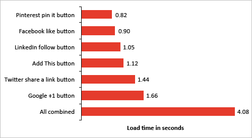
Loading times for widgets on an iPhone 4, iOS 5.0.
Combining them all on a single page results in a whopping four-second loading time for the widgets alone.
Server-Side Techniques
In addition to optimizing the front end, server-side techniques can also be used to speed up loading times. These techniques are worth looking into, but won’t be covered in this article:
- Cache HTTP redirects to speed up repeat visits;
- Merge HTTP redirect chains to reduce the number of redirects;
- Use HTTP compression to reduce the number of bytes (Gzip or DEFLATE).
Testing Performance On Mobile Devices
Because of the unpredictability of mobile devices, testing performance on multiple devices is important. Here are some free performance-testing tools:
- Mobitest, Akamai Generate waterfall charts and HAR files for the iPhone 4 iOS 5.0, iPhone 3G and Nexus S. Note that test results for the Nexus S were inconsistent with our own internal testing. Our server-access logs showed fewer HTTP requests when we tested on actual Android 2.x devices.
- “Network Panel,” Chrome Developer Tools Generate waterfall charts and HAR files from the Chrome browser. Go to
Settings → Overridesto switch the user agent to an iPhone (iOS 4 or 5), Nexus S, Galaxy Nexus, BlackBerry 9900, BlackBerry BB10 or Nokia N9.
Conclusion
To meet the high expectations of mobile users, you need a mobile-optimized website that loads in 4 seconds or less. The best way to hit that magic 4-second mark is to minimize the processing load on smartphones by reducing JavaScript and by optimizing the HTML, CSS and images.
Using the techniques above, you will be well on your way to building a snappy mobile Web experience!
Do you have anything to add? Let us know in the comments.
Further Reading
- Front-End Performance Checklist 2017
- Getting Ready For HTTP/2
- Everything You Need To Know About AMP
- The (Not So) Secret Powers Of The Mobile Browser
 (al, mrn)

