Improve Mobile Support With Server-Side-Enhanced Responsive Design

Email Newsletter
Weekly tips on front-end & UX.
Trusted by 182,000+ folks.
 Register for Free
 Custom Web Forms for Angular, React, & Vue. Your backend.


 Celebrating 10 million developers
In many ways, responsive Web design deserves a big share of the honor for making the Web more usable on non-desktop devices. This trend of letting the browser determine more about how a Web page should be displayed makes sense, especially now that mobile browsers are slightly more trustworthy than in the old days of mobile.
However, a responsive website is not automatically a mobile-friendly website. Amid the buzz of trendy Web development techniques, the good ol’ Web server doesn’t get the spotlight it deserves. Modern Web development should be about finding the right balance between server-side and client-side implementation.
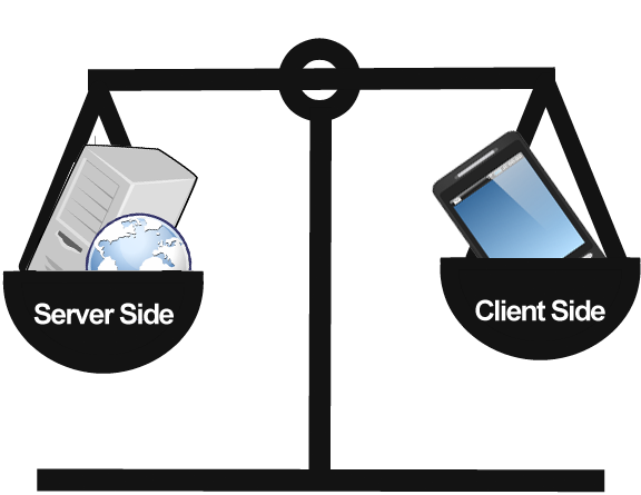
Find the right mix of client-side and server-side logic for adaptive Web design.
There is no one right answer to what should be done on the server and what should be done on the client side. That depends on the website in question. It is clear, however, that an either/or approach would fail to meet expectations. I will use a real-life project that my company is working on, with real requirements and pain points, as a reference. We are taking a pragmatic approach to the Web, starting with a blank sheet of paper to find the best solutions for both the technical and business requirements.
The Starting Point
Our client in this project is a large global news provider. Mobile is obviously crucial to it, because a large proportion of its audience doesn’t have access to a desktop device. Nevertheless, desktop access is just as important, and the solution needs to account for both.
Like many “forward-leaning” Web projects today, a general requirement was to consider mobile first, from both a technical and business perspective. That means HTML5 and RWD (in its broadest sense), for starters. At the same time, because the client was a global content distributor, having tools that could handle less-capable browsers and devices (ones that don’t support the principles of RWD and HTML5) well was essential.
The real challenge in this project was to make the most of RWD techniques, but also to address some of the challenges of RWD from a mobile perspective. This is where the server-side part comes into the picture. Doing as much optimization on the server side as possible makes sense, to relieve the client of data transferring and the execution of logic in the browser.
The main reason for doing this is performance. Most of the time taken by a page to load is caused by the browser trying to make sense of the data being received. Being slow has a cost, and every millisecond counts, regardless of the business model. Especially for big websites like our client’s, the cost of poor performance adds up to significant numbers. Even if you have many great polyfills that provide shims, with fallbacks for missing functionality in browsers, favoring speed, performance and maintainability over polyfills makes sense.
Another point in favor of server-side device detection is its support of different business models and other business requirements. Advertising and other third-party content is one example that is much discussed, but other requirements need to be met, such as customized experiences for specific devices, like the iPad.
With these considerations in mind, here are some of the requirements identified in our reference project:
- No black box magic. The client needed to be able to control the full value chain.
- Effortlessly integrated into the editorial process and CMS. Mobile had to be a part of the daily routine.
- Fast page loading, to minimize data transfer and rendering time.
- Easy for Web developers to use, regardless of the technology, to enable innovation and free thinking.
- Support of business requirements, such as targeted business models and advertising and customized experiences for specific devices.
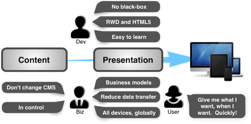
A summary of our requirements, which I believe are pretty standard for most current mobile-oriented Web projects. (Image: WPZOOM)
The Approach
The logical way to approach this is to find a way to combine the best of RWD and client-side techniques with server-side functionality based on device detection. This is sometimes called RESS (responsive Web design with server-side components). The purpose of RESS is to do the heavy lifting on the server, making work easier for the browser, but also providing enough flexibility to meet any business requirements as described above. However, both RWD and RESS are parts of a bigger picture, sometimes referred to as adaptive design.
Making the design adaptive, throughout the value chain, is our goal. Presenting content in a browser is only a part of the story. A lot of stuff happens to the content before it reaches the browser.
From a developer’s perspective, there are no real best practices or dedicated tools for these kinds of requirements. The wheel has to be invented — or at least developers have to be helped to decide which wheel to use when, and how to mount it to different vehicles.
We decided to address the lack of tools. Even if there are some emerging best practices for RWD and good ol’ device-detection software, there are no good tools for combining the two to address the current needs when developing for the ubiquitous Web.
During our project, we identified five areas where the server’s side could be put to work to enhance client-side techniques.
1. Use Your CMS
But first, the obvious. The most important server-side component is the content management system (CMS).
If you look back a couple of years, mobile Web development was done by mobile specialists who performed their magic. This is not the case anymore. Web design and development is now driven by Web developers, usually working within, or at least connected to, the client’s organization. This is important to note, because this rules out the traditional approach to mobile Web design, whereby a magic mobile-platform proxy black box produces the mobile website. These platforms are usually based on some sort of proprietary XML format, screen scraping or other custom stuff that has to be learned.
We’re going mobile, but we are not replacing our CMS.
Another reason why a mobile publishing platform is not an option is that it would interfere with the editorial process. Being in control of the content and its behavior is important. So, the CMS is key. Managing all online entities, mobile, desktop, TV and so on from the current CMS makes sense, but going mobile must not require the content owner to change their CMS.
A side effect of making mobile an integral part of content publishing, which was important for this project, is that the Web developers, those working with the presentation of content, are able to effortlessly account for mobile. Mobile becomes a natural part of their work.
The best way to utilize the presentation layer in the CMS and to power-charge it is to tackle a range of devices, operating systems, browsers and interaction models. This is what’s so great about RWD. You can apply the technique on top of any CMS. RWD should be the default baseline of all Web projects. RWD restores fluidity to the Web. For websites that display mostly text and little fancy stuff, it might even be enough to serve the purpose alone.
Because the CMS might be just as important as the browser in creating an adaptive website, the server-side components must also be capable of enhancing the CMS. This happens to be true of the next four server-side techniques we’ll look at.
2. Use A Device-Description Repository
In my own experience, avoiding the need for some sort of server-side device detection has proven difficult. A few tools are available for device detection. The WURFL-powered device-detection repository (DDR) provided by ScientiaMobile has been around the longest and is the basis for much of the server-side optimization in our project. However, even though ScientiaMobile provides an API to the WURFL database, we needed more flexibility and, so, built a RESTful API on top of it.
The device database can then be queried like this:
GET https://example.com/ddr/c/<WURFL capability here>And the answer is returned in JSON format (asking for the device model):
HTTP/1.1 200 OK
Content-Type: application/json

{"model_name":"iPhone"}
With this simple API, device detection can easily be used directly from the browser, using AJAX, or from the server-side programming language. Moreover, it can easily be used with popular feature-detection frameworks such as Modernizr.
The nice thing about doing this server side is that the same information is available both client side and server side (including the CMS). Furthermore, it also provides a way to store “tacit knowledge,” defining how the client should tackle certain aspects of the website. Tacit knowledge can be stored as custom capabilities and accessed the same way as any standard WURFL capability. The service is accompanied by a JavaScript library that appends additional client-side detected data. This helps the service make sense of a request when traditional analysis of the HTTP header is insufficient.
Today, the type of markup is not important, and most of the adaptation has moved into the CSS, JavaScript and images. In general, there is no need to serve any markup other than plain HTML5. The only exception is certain markets around the world in which feature phones, rather than smart devices, are dominant. In these cases, we need enough flexibility to handle these devices by serving a particular markup such as XHTML MP. The device-detection service will provide that.
A Note On Caching And CDNs
As traffic from mobile devices increases rapidly, caching and content delivery networks (CDN) become keys part of the value chain. Adapting the markup to each device type or user agent would lead to “cache pollution,” which basically means that the cache is too big to make any difference. Keeping the markup of a page as static as possible across devices is key. As mentioned, most optimization in modern browsers happens in CSS and JavaScript. Cache pollution is a relevant issue for those resources, too, but less critical because CSS and JavaScript are easier to cache in the browser and are also typically generic to the website (i.e. the whole website uses the same CSS, so the file needs to be cached only once to be served to all pages on the website).
3. Execute CSS Media Queries Server-Side
Media queries in CSS are one of the key parts of RWD. They are also one of the page resources with the most overhead when it comes to excess data downloaded. A mobile phone will download and process styles meant for desktop devices, which can have a detrimental impact on speed and user experience. Of course, well-designed CSS will minimize the issue, but more can be done to reduce CSS overhead.
For this project, we decided to do two things:
- Execute media queries server side, based on what we know about the client, using the DDR.
- Take it a step further by turning the device’s capabilities into media features.
To illustrate the first point, styles in the following media query would not be served to an iPhone because the viewport would never be as wide as 1200 pixels.
@media screen and (min-width: 1200px) {
    /* styles here */
}
This requires a slightly different way of thinking and must, of course, be used with caution because breakpoints might never reach the client. Hence, CSS architecture is important.
The second illustrates the more powerful side of this, where device capabilities become media features:
@media screen and (pointing-method: touchscreen) {
    .button{
        padding:1em;
    }
}
The above adds some extra padding to buttons to make them easily touchable on touchscreens. Another, perhaps more useful, example is the handling of fonts in CSS:
@media screen and (font-face: true) {
    @font-face {
      font-family: 'Rambla';
      font-style: normal;
      font-weight: 400;
      src: local('Rambla'), local('Rambla-Regular'), url(https://themes.googleusercontent.com/static/fonts/rambla/v1/4oKK3Z-EimNu4ISiv21vMuvvDin1pK8aKteLpeZ5c0A.woff) format('woff');
    }
}
Thus, all capabilities defined in WURFL are available for querying. Custom capabilities can also be added to the system to be made available as media features, too. Again, it’s a different way of thinking about styling. But it’s very powerful, especially for handling browser bugs, “undetectables” and “false positives” from feature detection (which are pretty annoying when they happen), and third-party content. Tests we performed indicated that up to two thirds of the data could be saved using this technique.
To comply with the requirements of the project, we decided to implement it in the markup like this:
<link
href="https://example1.com/css/https://example2.com/path/style.css"
rel="stylesheet"
type="text/css" />
In this snippet, the service executing the media queries lives at https://example1.com/css/, and proxies the CSS located at https://example2.com/path/style.css, and then executes, caches and returns the CSS needed by the client.
4. Optimizing Images
Image optimization has been a hot potato lately. Until standards and support are established, and given that polyfills are not an option, the best way to optimize images is still to resize and prepare them server side.
The principle of image resizing is similar to CSS and has been proven to work with TinySrc (now Sencha.io):
<img src="https://example.com/img/https://farm9.staticflickr.com/8154/7705240114_fdc69e5882_k_d.jpg" alt="Butterfly" />In this example, the service will download and resize the image according to the screen size of the requesting device, and then cache and serve it to the client.
Being able to specify a size is also handy:
<img src="https://example.com/img/px_320/https://farm9.staticflickr.com/8154/7705240114_fdc69e5882_k_d.jpg" alt="Butterfly" />But this is not very responsive. This is one of those times when we need to combine client-side feature detection with server-side logic.
Below is an example of a JavaScript add-on defining different breakpoints and communicating this to the server through a cookie.
if (vpw >= 1024) {
    vpw = 1024; //viewport
    bp = "w"; //breakpoint for current viewport
} else if (vpw >= 768) {
    bp = "m";
} else {
    bp = "n";
}
Then, we instruct the resizing service to behave differently according to the current breakpoint. In the image URL in our markup, we state that for breakpoint w, we want an image scaled to 80% of the viewport’s width. For breakpoints m and n, the values are 60 and 40%, respectively.
<img src="https://example1.com/img/vpw_768/bp_m/pc/w_80/m_60/n_40/https://farm9.staticflickr.com/8154/7705240114_fdc69e5882_k_d.jpg" alt="Butterfly" />High-DPI screens are also supported through the @ notation:
<img src="https://example.com/img/px_300/@_2/https://farm9.staticflickr.com/8154/7705240114_fdc69e5882_k_d.jpg" alt="Butterfly"/>As noted by Daan Jobsis, a high-resolution image does not necessarily entail a ton of data, because the image could be compressed much more than a low-resolution image without a visible loss in quality.
5. Pre-Processing And Intelligent Caching
When addressing these issues, we noted that some tasks are “compile time” and others are “runtime.” Runtime tasks typically perform device detection on the server side to optimize something for a particular device or browser’s capability. Compile-time optimization handles the preprocessing of images, the minification of JavaScript, the preprocessing of Sass and LESS and so on. This can easily be implemented as Git hooks. It enables an alternative workflow for Web developers, which might be more relevant for some, depending on the server’s configuration and architecture.
By using Git, the CSS, JavaScript and images (and even the page itself) can be pushed to a host (e.g. static.example.com) where static content would be served from. The static resources would, of course, be optimized runtime as well to enable the server-side media queries and image resizing. This way, the extra roundtrip for fetching the resource, as described above, is avoided, too.
This approach might seem to be a trivial detail at first, but if you think of it like a CDN or a cache for static content, it becomes very powerful. Suddenly, the cache becomes intelligent. You can perform tasks when pushing to the cache (compile time) and also do runtime optimization for the device or browser.
The Findings
To illustrate the findings, I have made a demo based on one of the examples that comes with Twitter Bootstrap and that puts the server-side components to work. The demo is very simple, and much more adaption of Bootstrap should be done, but it illustrates the findings well.
The diagram below shows the distribution of different content types tested in a desktop browser and on an iPhone with Safari. The most obvious difference is the savings we get when optimizing images.
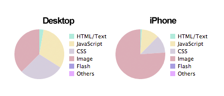
Distribution of content types
Faster And Leaner
The overall result is that we can definitely save time and money by letting the server help the client with adapting the content and presentation:
| Desktop | iPhone | |
|---|---|---|
| Page size | 927.1 KB | 338.8 KB |
| Rendering time (onload) | 6.6 seconds | 4.64 seconds |
The page for an iPhone is only 37% of the total page weight of a desktop client. The page also loads faster on the iPhone. It is not the fastest page to begin with, but a 30% increase in speed is a good start.
Yes, many factors come into play that can influence the tests’ results, but the tests prove that knowing who you are talking to at the other end pays off.
With this approach, we think we have been successful in designing a system that solves the current issues involved in getting the Web to work on different devices as well as in providing Web developers with useful tools to support their goals. The server can definitely improve the performance of RWD and other client-side techniques on mobile devices!
As standards emerge and as devices and networks improve, some issues will disappear, but new ones will pop up as the Web becomes more diverse. Handling diversity is a question not so much of whether to do things server side or client side, but of how to make the whole value chain as intelligent and adaptable as possible to prepare for the unknown — all the way from creating the content to caching to rendering in the browser.
During the project, we became so excited by the results and possibilites that we decided to make the tools available to Web developers out there. Because the project is still ongoing, we haven’t launched yet, but if you think the approach described here is worth a try, you can sign up at WhateverWeb to get early access. (It’s free, but we’d just like you to tell us what you think.)
Further Reading
- Server-Side Device Detection With JavaScript
- Building A Better Responsive Website
- Responsible Considerations For Responsive Web Design
- Losing Users If Responsive Web Design Is Your Only Strategy
- How To Provide The Greatest Mobile User Experience Possible
 (al, ea, mrn)

