The Art And Craft Of Arabic Type Design
Email Newsletter
Weekly tips on front-end & UX.
Trusted by 182,000+ folks.
 Register for Free


 Custom Web Forms for Angular, React, & Vue. Your backend.
 Celebrating 10 million developers
The beauty of typography has no borders. While many of us work with the familiar Latin alphabet, international projects usually require quite extensive knowledge of less familiar writing systems from around the world. The aesthetics and structure of such designs can be strongly related to the shape and legibility of the letterforms, so learning about international writing systems will certainly help you to create more attractive and engaging Web designs.
Today we’ll explore the art and craft of Arabic typography with Dr. Nadine Chahine, who lives in Bad Homburg, Germany. She is an Arabic Specialist at Monotype GmbH and is an award-winning type designer who has created typefaces that are being sold worldwide.
Q: Where does your love of typography come from?

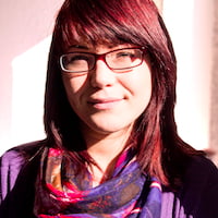
Nadine Chahine
Nadine: It’s something I discovered during my graphic design education. I was fascinated by the contrast of the black and white, and the tension between angles and curves. Type is a design ingredient of immense power and it feeds into our collective memory. Its expressive power, its ability to convey both mood and identity, and the many different forms that it can take lead to a very rich field to play in. It is one that is dangerously addictive. The more one learns about type, the more drawn in one is. Very willingly, of course!
Q: How did you come to design type?
Nadine: I started playing around with type in the second year of the graphic design course, and got into things in earnest in the final year. It was then that I decided that I want to pursue this as a career and joined the MA course at The University of Reading, UK. The course really put me on the right career track and provided the kind of educational setting that supported both practical and theoretical typographic explorations. It’s been 15 years now since I drew my first letters, and I still wake up every day with the desire to draw some more.
Q: According to your blog, you joined Monotype in 2005 (known as “Linotype” at the time). Can you summarize your current role at the company?
Nadine: I am the Arabic Specialist for Monotype (as we have rebranded in March 2013). I am responsible for our Arabic projects, and that involves designing typefaces for the library and custom ones for our clients. I am also involved when externals design for us. Last year we collaborated with the MIT Age Lab on legibility research into the effect of typeface style on driver distraction, and I was part of the team. As it is exactly aligned with the PhD research that I completed in October, I’m very happy that I am now involved in legibility research as well as in type design.
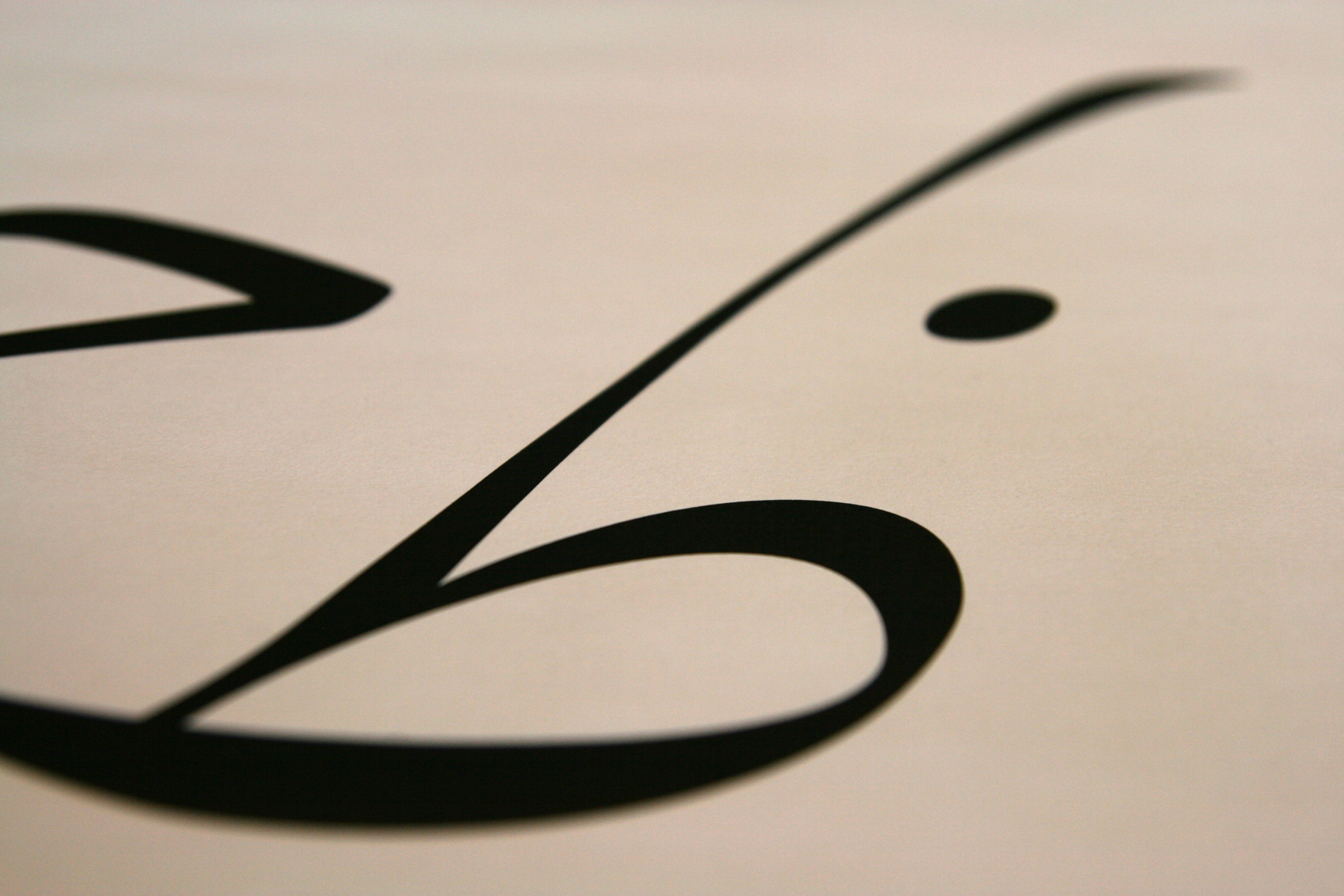
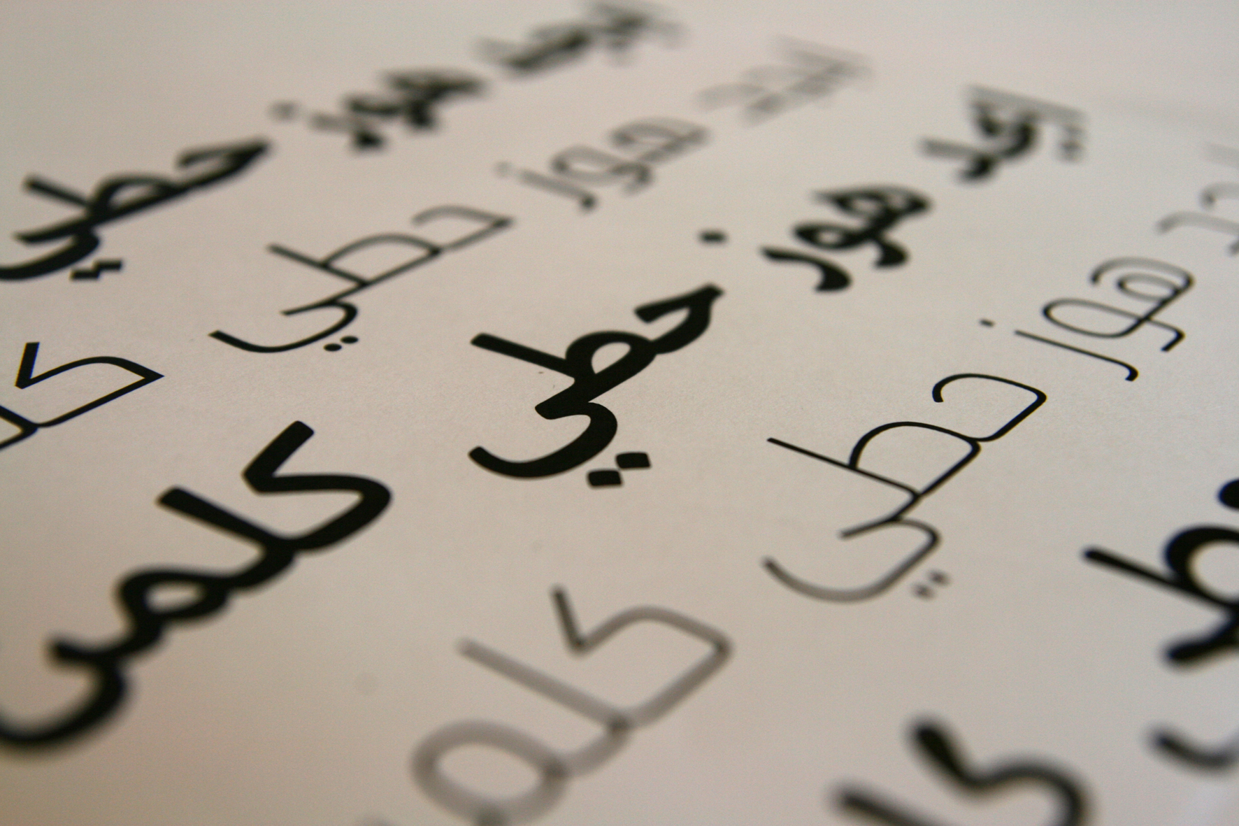
Closeup of the early sketches of Zapfino Arabic.
Q: What is the biggest challenge in designing an Arabic typeface?
Nadine: There are design challenges in drawing letterforms that, when put together, appear as one continuous pen stroke. There are also challenges that are more existential in nature, such as the face of modern Arabic typography and how closely tied it is to calligraphic references. We have so few well-designed typefaces that it is often the case that the typeface one is working on presents a design problem that has never been addressed to date. There is also a lot of freedom in that, so it’s not too daunting.
Q: How do you design? What does your design process look like?
Nadine: It starts with a vague idea that I try to formulate on paper or, usually, on computer. It takes a while for what I draw to match what I want the typeface to do. That usually involves generating many versions of the font, testing it out in sample texts, making modifications, and repeating the process until the typeface becomes itself. I know that sounds a bit funny, but a typeface goes through adolescence and eventually grows into the best that it can possibly be.
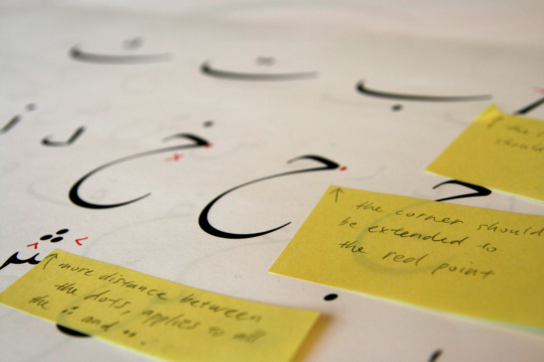
Hermann Zapf’s corrections to Zapfino Arabic.
Q: From the initial idea to the finished product, how long does it take for a new typeface to be born?
Nadine: Sometimes it takes years and sometimes it is a matter of weeks. Some designs are simply more complex and need a long time to mature. Others are straightforward, and if you’ve designed in that style before and the client is in a hurry, they can be finished quite quickly. It used to take much longer when I first started out. Every time I made a few changes, I’d need to test immediately, and then would agonize endlessly over which version is better. These days it is, of course, easier, and the ability to control a curve gets better with practice. There are still styles that are hard to design and require a lot of effort. The more complex and organic the curve, the more attention it requires.
Q: Frutiger Arabic, Neue Helvetica Arabic, Univers Next Arabic, Palatino and Palatino Sans Arabic, Koufiya, Janna, Badiya, or BigVesta Arabic. Do you have a personal favorite?
Nadine: Koufiya is special because I drew both the Latin and Arabic, and the concept is fully mine. Some of my typefaces I prefer to others, but I try not to tell. :-)
Q: Where do you get your inspiration from?
Nadine: It is always the streets of Beirut. Not the way my city is now, but how I wish it to be. When I studied graphic design in Beirut, I was always frustrated by the low quality of available Arabic fonts. It felt as if this is a reflection of a much larger state of being, of everything that is not OK in our part of the world. And that was a state of affairs that was intolerable, and so I set about trying to make my environment look better, one letter at a time.
Simulation of how the eye moves across a line of text and the pattern of fixations.
Q: What is your favorite part about designing type? Do you also have a least favorite part?
Nadine: There is an “A-ha” moment, when all the pieces suddenly fit together. That is the most gratifying moment, when the vague idea suddenly becomes a reality. For the least favorite, it’s designing the numerals. That is my punishment.
Q: In your opinion, what makes a great typeface?
Nadine: A typeface has a function, and the greatness lies in the balance of achieving that function with the pure aesthetic value of the curves themselves. Adrian Frutiger wrote that a typeface is like a beautiful group of people, rather than a group of beautiful people. He has designed some of the greatest typefaces that we know, and very likely redefined what a sans-serif typeface is supposed to look like. When you see his work, the kind of designs that are meant to become part of our lives, the curves that he draws, the elegance of movement and interplay of black and white, you know that you are in the presence of greatness.
Q: What are you working on at the moment?
Nadine: Zapfino Arabic! It’s the most challenging typeface that I have ever tackled. Both exciting and scary!
Q: What have been your biggest achievements so far?
Nadine: There are the design collaborations with Adrian Frutiger, Professor Hermann Zapf and Gerard Unger, and the design awards. The typefaces, of course, are my babies, but I am especially happy with my PhD. I did my research on the side of a very busy work schedule. It took five years of working six days a week and barely any holidays to get it done, and I still cannot believe that I managed it!
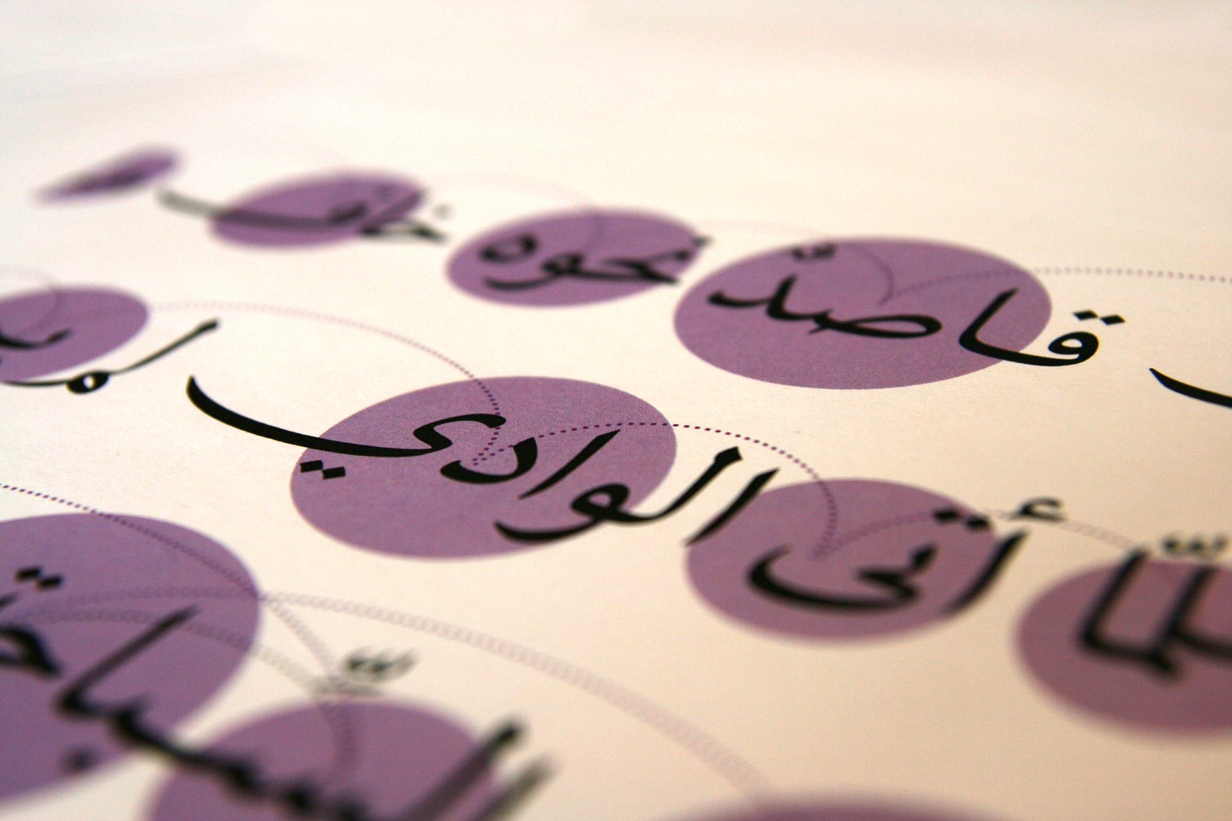
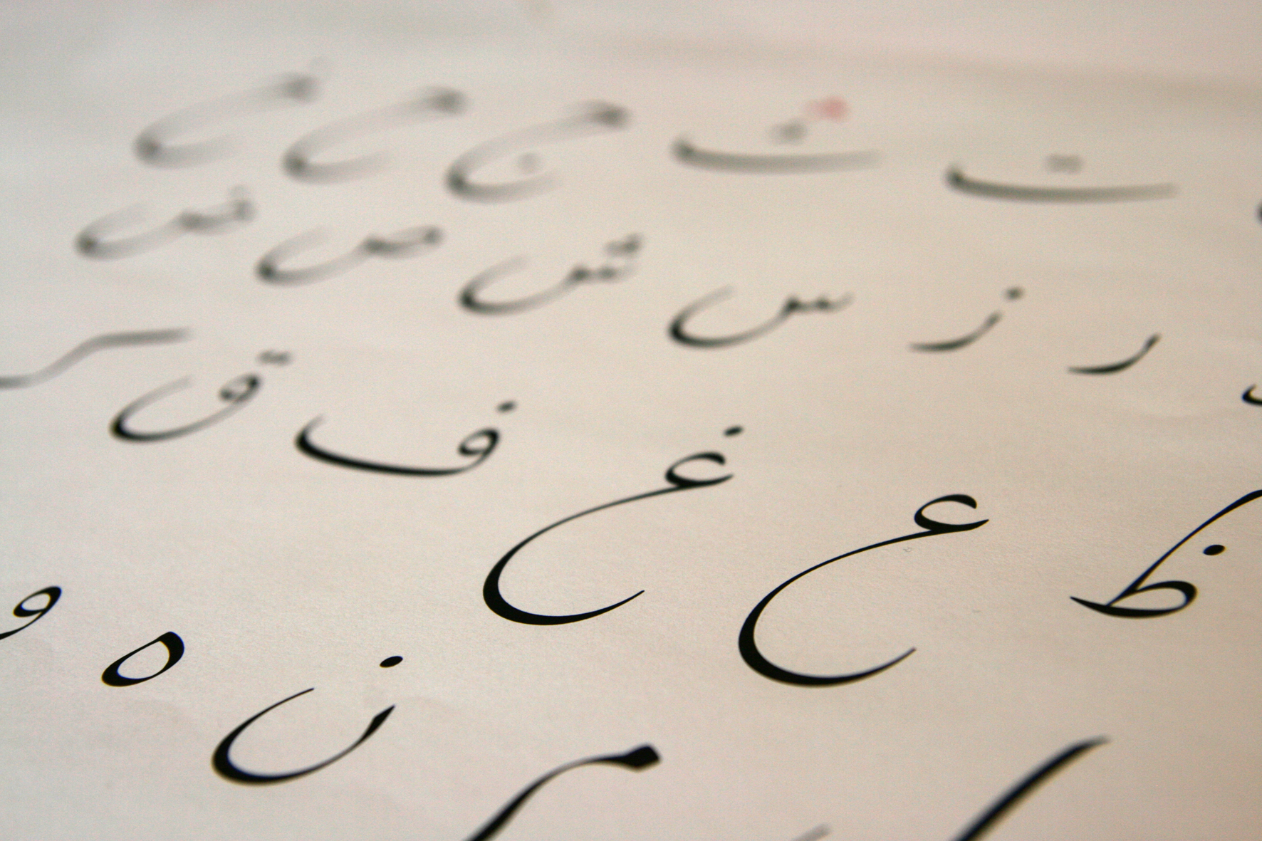
Specimens of Nadine’s typefaces.
Q: Arabic Web fonts are still at a disadvantage because some typefaces do not display correctly in certain browsers and devices. Why is this the case? What needs to happen for this to change?
Nadine: Current desktop browser support has resolved this problem, but we still need the public to upgrade to the latest versions. The devices are a different story and still far from where we need them to be.
Q: We recently ran an article on Helvetica on Smashing Magazine. As the creator of Neue Helvetica Arabic, what is your opinion on the issue?
Nadine: Helvetica is a divisive typeface and passions run high when discussing it, as you can see in the comments. The important thing to keep in mind is, Helvetica came to light in a set of circumstances that might never repeat. In other words, the stars were aligned and this propelled it to the place it is now. I’m not sure we will ever have a typeface that comes close to what Helvetica is. This has to do not with the design of the typeface, but with the role that this typeface played in our lives 50 years ago and has played till today.
Gebran2005, designed for An-Nahar newspaper in Lebanon.
Q: How do you see the type industry evolving in the next 10 years?
Nadine: There is a very big push today in the direction of non-Latin type design. I expect this to continue to grow, and I do hope that we evolve into a more global approach to the design of letterforms and visual communication.
Q: What advice would you give to young readers out there who are interested in becoming type designers?
Nadine: Get into it! It is a very fulfilling design practice, and one that is highly addictive and enjoyable. My advice would be to attend one of the many type design conferences that take place regularly and to talk to other designers to see what the work is actually like. There are many resources online about type design, and starting there to get an overview is also helpful.
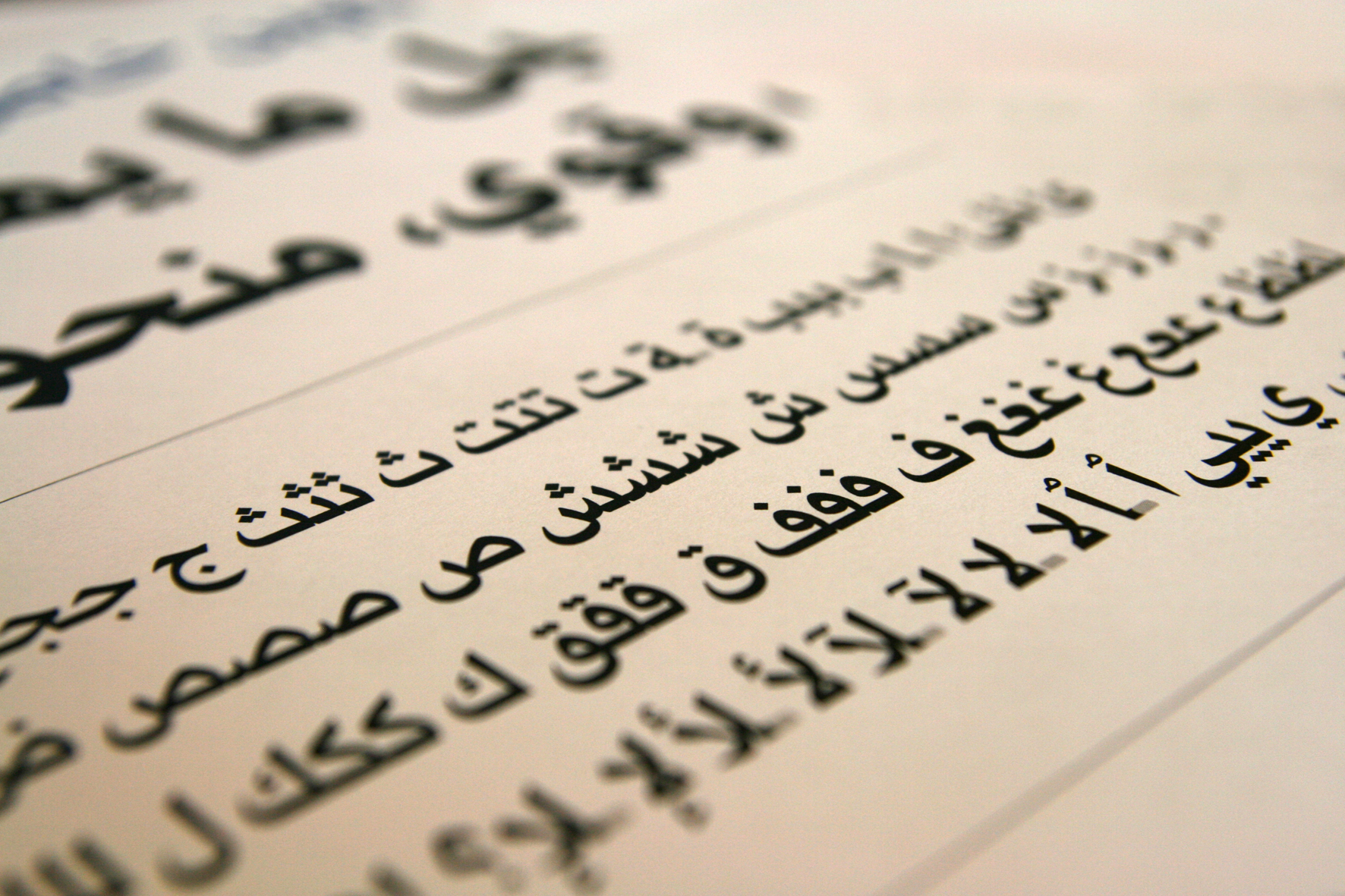
Early sketches of Zapfino Arabic.
Q: How can readers find out what conferences you’ll be speaking at or attending, and workshops you’ll be organizing throughout 2013?
I usually mention these on Twitter, and sometimes on Facebook and my blog.
Thank you for your time, Nadine! We sincerely appreciate it.
Note: All typefaces included this article were designed by Dr. Nadine Chahine herself.
Further Reading
- “Type Design Is Not Only About Drawing Letters”
- A Type Design Brief: What Is In It, And Why Does It Matter?
- Showcase Of Web Design In The Arab World
- Writing Systems And Calligraphy Of The World


