Making Sense Of Type Classification (Part 1)

Email Newsletter
Weekly tips on front-end & UX.
Trusted by 182,000+ folks.
 Register for Free
 Custom Web Forms for Angular, React, & Vue. Your backend.
 Celebrating 10 million developers

In my previous article on Smashing Magazine Understanding the Difference Between Typography and Lettering, I wrote about how understanding type terminology can help us better appreciate the arts of typography and lettering. This article again deals with terminology, probably more specifically than most designers are used to, and the title gets to the heart of what I’m communicating in this article.
Why Classify Type?
There’s a certain intellectual delight in knowledge, particularly knowledge about one’s field of work and study. More importantly, perhaps, there is a way in which seemingly impractical knowledge of one’s profession lends more credence to the designer. That being said, what you’ll read here is by no means impractical. It really comes down to solid design choices.

A good grasp of type history will help you avoid typographic anachronisms, which, although often lost on the general public, do not escape the notice of many designers, as demonstrated in Mark Simonson’s article on the 2012 Oscar winner for Best Picture, “The Artist,” and his other typographic scrutinies of popular movies and media.
It’s not exclusively about the history of type, however. Type classification is also helpful in pairing typefaces for projects, sometimes based on historical proximity but also by noting similar features that unify the typefaces, such as axis or x-height. In some cases, by finding enough disparity in the small features, very different typefaces become complementary.
Most importantly, perhaps, this article will not only familiarize you with general type history and commonly used terminology, but also help you learn to look for and recognize important characteristics of type and the inexhaustible minutiae that make typefaces unique, as well as arm you with useful descriptors of type styles.
Type Classification Systems
Over the past century, quite a few classification systems have been proposed. Most are generally believed to be subjective and incomplete, and many of them use the same terms for similar but slightly different classes. The impossibility of a truly complete classification system has led many people to dismiss any attempt to classify typefaces — there are simply too many variables to make anything close to a practical, comprehensive system. Essentially, classification describes typefaces; it does not define them. It’s not inflexible, and is more of an aid than a rule. However, for the reasons given above, I believe there is value to be found in it. Below are a few examples.
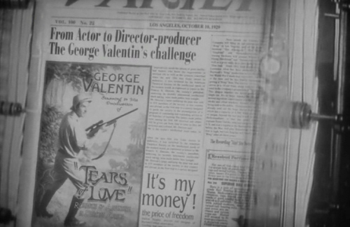
Sets film in 1920’s uses typeface from 1975.
The primary “official” classification system currently is the Vox-ATypI system. Originally put together in 1954 by Maxmilien Vox, it was adopted in 1962 by the Association Typographique Internationale (ATypI), which made a minor change at the 2010 conference (appropriately, held in Dublin) to include Gaelic as an extra category. It classifies typefaces in 11 general categories, with some subdivision. Its Wikipedia article provides an excellent overview.
The British Standards Classification of Typefaces, adopted in 1967, is also based on Vox’s original classification. It is slightly simplified and has remained essentially unchanged since its adoption.
Bringhurst, in his Elements of Typographic Style — perhaps the standard in typographic textbooks today — categorizes typefaces loosely after periods of art history; for example, Baroque, Rococo, Romantic, etc. A book designer himself, Bringhurst focuses on text typefaces and practically ignores display type.
Others are much more general. An early system by French typographer Francis Thibaudeau, which provided the base for Vox’s later more thorough classification, includes four broad categories: Antiques (sans serifs), Égyptiennes (slab serifs), Didots and Elzévirs (faces with triangular serifs).
Gerrit Noordzij, while at the Royal Academy of Fine Arts in the Hague, held that typography was essentially an extension of handwriting, teaching typography using loose categories of letters that might be written with a broad-nib or pointed-nib pen, as well as interrupted or uninterrupted strokes, with varieties of both serifs and sans falling into each category.
These are just a few of the ways people have classified type over the years. In this two-part article, I will condense the various methods slightly and present what is at the very least generally accepted as legitimate (as there will always be a few out there who refuse to give up a particularly unusual classification method, or who decry any method at all).
Classifying Serif Typefaces
In part 1 here, we’ll cover serif styles, following the natural progression of type history, and thus move into sans and other categories in part 2.
Humanist
Starting off, naturally, at the beginning of type history, we’re in the middle 1400s, during the Renaissance. The movement, led by Italian cultural hubs such as Florence and Venice, was drawing Europe away from medieval practices, and typography was one part of that. Rather than using the blackletter, or Fraktur type, that Gutenberg used, printers began to create type mimicking the Latin writing hand of the philosophers and scribes of the time, beginning around 1465.
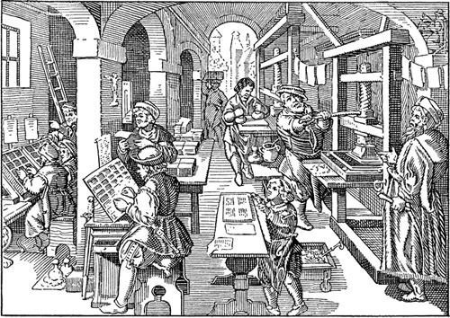
A 1905 textbook illustration of Renaissance printers
These typefaces are variously called Humanist or Venetian due to the zeitgeist and geography of the Renaissance. A number of distinct characteristics define Humanist typefaces.
Primarily, Humanist faces were very calligraphic in nature, and one way this manifested itself was in the strong axis, most apparent in the bowls of characters and the lowercase “o,” a characteristic borrowed from the angle at which a right-handed writer holds a pen. Another interesting way this showed itself was in the notably angled crossbar on the lowercase “e.” Other calligraphic influences are clear, such as inconsistencies in stroke weight and the way serifs are formed.
Other defining characteristics include a small x-height and a lower contrast between thick and thin strokes.
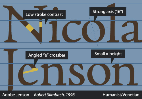
Not all Humanist typefaces are from the Renaissance era, however; many Humanist revivals have been created in more recent years, such as Centaur (1914) and Adobe Jenson (1996). Adobe Jenson, used in the specimen above, is based on the work of Renaissance printer Nicolas Jenson, a prominent printer and type designer who moved from his native France to Venice and contributed significantly to print and design history. There are even Humanist sans faces, but we’ll get to those in part 2. Although an influential period in type history, the Humanist era served primarily as a transition to newer styles of typefaces and was relatively brief.
Other examples of Humanist typefaces include Guardi, Arno, ITC Berkeley and Stempel Schneidler.
Garalde
In the Old-Style faces, often called Garaldes, we see type really beginning to come into its own. I call them Garaldes here because the term “Old Style” is at times used to include Humanist, Garalde and Transitional typefaces; simply calling this group “Garalde” helps to retain its identity.
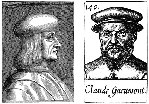
Aldus Manutius and Claude Garamont
This period in type history lasts from the late-15th century all the way until the early 1700s, and the type created in this period has shown remarkable longevity. “Garalde” itself is a hybrid term borrowed from the names of two notable type designers of the era, French punchcutter Claude Garamont and the Venetian Aldus Manutius. The category is occasionally called “Aldine” after Manutius.
There are many similarities to the Humanist faces, but things are moving in a particular direction, as we’ll see with the consecutive categories of Transitional and Didone. You can see the type designers treating type as different from the written word, losing some of the idiosyncrasies of handwriting that the Humanist designers retained, while carrying over others. The axis of the stress straightens, and while it still has an angle, it is subtler. The serifs become more carefully formed, and characters are designed more proportionately. One of the most obvious differences is the crossbar of the lowercase “e,” which, while remaining angled in the Humanist typefaces, drops to a horizontal position in the Garaldes. Also, the difference between heavy and light stroke weights increased, and everything became more precise, perhaps due to the progress in technical aspects of making type.
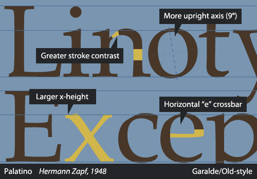
A huge amount of type was created in this era, and much of it is commonly used today, either digitized versions or new revivals. Common examples of the Garalde faces include Caslon, Sabon, Palatino, Galliard and Janson — not to be confused with Jenson, the Humanist typeface. In fact, Janson, named after Dutch punchcutter Anton Janson, is now thought to be the work of Miklós Kis, a Hungarian, produced during an apprenticeship in Amsterdam.
Transitional
Work was begun on the first Transitional typeface in 1692, long before people had left behind making Garaldes. In fact, William Caslon was creating typefaces based on Old-Style Dutch type as late as the 1720s. Because this part of type history is also significant, many have asserted that “Transitional” is an inadequate name for it, and this category may also be termed Neoclassical or Realist.
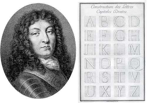
Louis XIV and the Romain du Roi
In the late-17th century, Louis XIV, as part of a general renovation of France’s Imprimerie Royale (the governmental printing works), commissioned the French Academy of Sciences to create a new typeface. The Romain du Roi — literally the “King’s Roman” — was designed using a strict grid, and its development was an arduous process, involving a committee that included a mathematician and an engineer. Although commissioned in 1692, the entire family of 86 fonts was not completed until 1745.
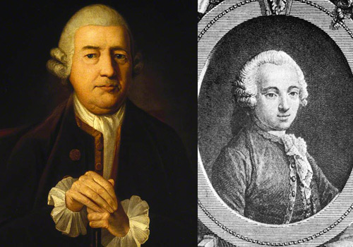
John Baskerville (left) and Pierre Simon Fournier (right)
Two of the biggest names in type during this period were John Baskerville and Pierre Simon Fournier. Baskerville, an entrepreneur who dabbled in multiple businesses, developed quite an interest in printing and eventually designed his own type in order to improve on Caslon’s work. This did not please most of the printing world at the time, and Baskerville endured harsh criticism, despite having such luminaries as Benjamin Franklin as friends and advocates of his work. You may have read of the humorous encounter in which Franklin outwitted a critic of Baskerville. Numerous revivals, both metal and digital type, that draw on Baskerville have been made.
Fournier was among the printers who praised Baskerville’s type, reserving particularly high compliments for his italics. Fournier was highly respected in his lifetime, and despite having consulted royalty both within France and internationally on type design and having established printing houses, Fournier is primarily remembered today for introducing the point system as a way to measure type sizes. Pierre Fournier, uncannily sharing a name with an acclaimed 20th-century cellist, also had an interest in music and developed a new style of typography for musical notation.
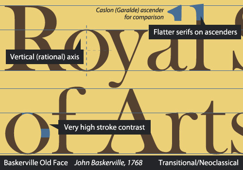
In the Transitionals (or Neoclassicals), we see certain trends continuing. The axis is now nearly, if not completely, vertical. The weight difference between the thickest and thinnest points is now exaggerated. The serifs are less bracketed and flatten out. Details become very refined.
Eric Gill’s Joanna, Melior, Clearface and Mrs. Eaves — a Baskerville revival named after Sarah Eaves, Baskerville’s wife — all fall into this category.
Didone
As strange as it seems, what we call modern typefaces first appeared in the second half of the 1700s. Therefore, I will call them by their less absurd name — and who can argue that saying “Didone” is not more fun than saying simply “Modern”? Bringhurst terms them Romantics.
Through the 18th and 19th centuries, France witnessed a small printing dynasty in the Didot family. Over multiple generations, the family made major contributions to printing. One of the most remarkable members was Firmin Didot, who, with Giambattista Bodoni, ushered in and now acts as a namesake for this part of type history.
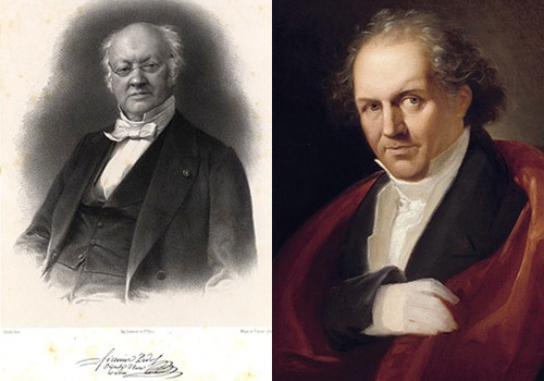
Firmin Didot (left) and Giambattista Bodoni (right)
In large part inspired by Baskerville, Didot and Bodoni pushed the limits of type design. They explored a similar style and were both meticulous craftsmen, consequently igniting a fierce rivalry. Bodoni (1740–1813) gave himself entirely to his craft. He was renowned for the beauty of his type specimens, and, a technically brilliant punchcutter himself, he designed some 298 typefaces. Didot (1764–1836), on the other hand, retired in 1827 to pursue political office and literature in his later years, writing tragedies and literary critiques.
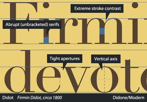
If Baskerville’s stroke contrast was exaggerated, then the Didones’ are in the extreme. The heavy strokes are very heavy, and the light are a hairline. The stress is again completely vertical, and the apertures — places where the character opens — are generally very tight. Combined, these make for a very awkward visual rhythm, and Didones are always a poor choice for chunks of text. Rather, they work best at large sizes, as titling and display type, because the features emphasize the elegance of individual characters and do not blend well. Adobe’s New Caledonia, which softens some extremes and thus works for longer bits of text, is a possible exception.
Aside from the obvious Bodoni and Didot faces, in their dozens of variants from nearly every foundry, Basilia, Aviano, Walbaum, Ambroise and Scotch Roman are exemplary moderns.
Slab Serif
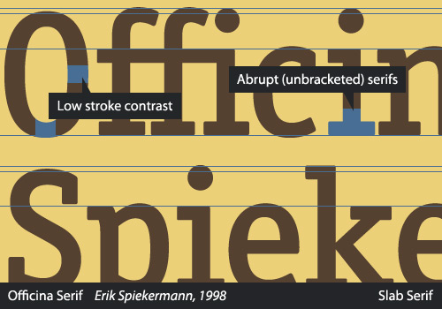
This article wouldn’t be complete without a mention of slab serifs. These are among the easiest to identify because of their very obvious appearance. Originally created for advertising, posters and other large media, slab serifs, alternatively called “Mechanicals” (in VOX-ATypI) and “Égyptiennes” (by Thibaudeau), were the first types expressly designed as display type. Vincent Figgins is credited with the first slab serifs, the earliest specimen dating to 1815, and his work inspired a diversity of critiques variously commending and lambasting the new style.
Abrupt serifs, usually in heavy weights, and a no-nonsense attitude are the trademarks of this style.
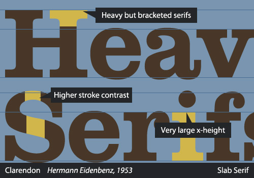
Clarendons, a notable offshoot of the original slab serifs, are a slightly tamed slab style, often in less extreme weights and using bracketed serifs. They have a lighter, friendlier character than the Neo-Grotesque slabs (i.e. those with unbracketed serifs and geometric construction).
H&FJ’s Sentinel (2009) and David Berlow’s Belizio (1998) are examples of recent Clarendons.
And That’s It… For Now
If you have made it this far in the article, congratulations! You are now in possession of a solid basic understanding of type classification, at least as far as serif typefaces take you, and you are able to recognize the important distinguishing features that make typefaces unique. Following the line of type history, we’re now in the middle of the 19th century, and we have the entirety of sans serifs and some discussion of display faces ahead of us. We’re really only halfway through, so if you’ve enjoyed it, you can look forward to part 2!
For now, here’s a little exercise to test your comprehension of what we’ve covered in this article so far. Take a look at these specimens and comment on how you’d classify them. Keep in mind that classification is an aid, rather than a hard and fast system, so don’t be shy — let us know where you’d place these typefaces!
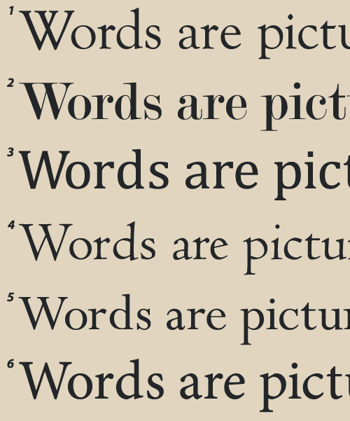
Identify each typeface by its number (1 to 6) if you are classifying it in the comments. Extra points if you can identify the individual typefaces! I’ll be joining the discussion with the answers later, although I am sure you’ll have figured them out soon.
Further Reading
- Beautiful Handwriting, Lettering and Calligraphy
- The Art Of Hand Lettering
- Respect Thy Typography
- Breathtaking Typographic Posters


