Beyond The Button: Embracing The Gesture-Driven Interface

Email Newsletter
Weekly tips on front-end & UX.
Trusted by 182,000+ folks.


 Custom Web Forms for Angular, React, & Vue. Your backend.
 Celebrating 10 million developers
As a mobile UI or UX designer, you probably remember the launch of Apple’s first iPhone as if it was yesterday. Among other things, it introduced a completely touchscreen-centered interaction to a individual’s most private and personal device. It was a game-changer.
Today, kids grow up with touchscreen experiences like it’s the most natural thing. Parents are amazed by how fast their children understand how a tablet or smartphone works. This shows that touch and gesture interactions have a lot of potential to make mobile experiences easier and more fun to use.
Challenging Bars And Buttons
The introduction of “Human Interface Guidelines” and Apple’s App Review Board had a great impact on the quality of mobile applications. It helped a lot of designers and developers understand the core mobile UI elements and interactions. One of Apple’s popular suggestions, for instance, is to use UITabBar and UINavigationBar components — a guideline that many of us have followed, including me.
In fact, if you can honestly say that the first iPhone application you designed didn’t have any top or bottom bar elements, get in touch and send over a screenshot. I will buy you a beer and gladly tweet that you were ahead of your time.
My issue with the top and bottom bars is that they fill almost 20% of the screen. When designing for a tiny canvas, we should use every available pixel to focus on the content. In the end, that’s what really matters.
In this innovative industry, mobile designers need some time to explore how to design more creative and original interfaces. Add to that Apple’s frustrating rejection of apps that “think outside the box,” it is no surprise that experimental UI and UX designs such as Clear and Rise took a while to see the light of day. But they are here now. And while they might be quite extreme and focused on high-brow users and early adopters, they show us the great creative potential of gesture-driven interfaces.
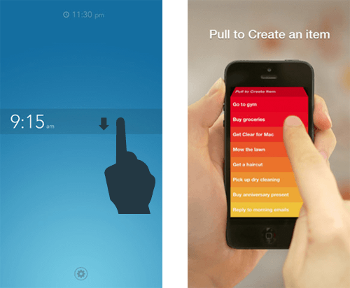
Pulling to refresh feels very intuitive.
The Power Of Gesture-Driven Interfaces
For over two years now, I’ve been exploring the ways in which gestures add value to the user experience of a mobile application. The most important criterion for me is that these interactions feel very intuitive. This is why creative interactions such as Loren Brichter’s “Pull to Refresh” have become a standard in no time. Brichter’s interaction, introduced in Tweetie for iPhone, feels so intuitive that countless list-based applications suddenly adopted the gesture upon its appearance.
Removing UI Clutter
A great way to start designing a more gesture-driven interface is to use your main screen only as a viewport to the main content. Don’t feel obliged to make important navigation always visible on the main screen. Rather, consider giving it a place of its own. Speaking in terms of a virtual 2-D or 3-D environment, you could design the navigation somewhere next to, below, behind, in front of, above or hidden on top of the main view. A dragging or swiping gesture is a great way to lead the user to this UI element. It’s up to you to define and design the app.
What I like about Facebook and Gmail on iOS, for instance, is their implementation of a “side-swiping” menu. This trending UI concept is very easy to use. Users swipe the viewport to the right to reveal navigation elements. Not only does this make the app very content-focused, but accessing any section of the application takes only two to three touch interactions. A lot of apps do far worse than that!
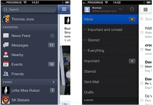
Facebook and Gmail’s side-swiping menu
In addition to the UI navigation, your app probably also supports contextual interactions, too. Adding the same two or three buttons below every content item will certainly clutter the UI! While buttons might seem to be useful triggers, gestures have great potential to make interaction with content more intuitive and fun. Don’t hesitate to integrate simple gestures such as tapping, double-tapping and tapping-and-holding to trigger important interactions. Instagram supports a simple double-tap to perform one of its key features, liking and unliking a content item. I would not be surprised to see other apps integrate this shortcut in the near future.
An Interface That Fits
When designing an innovative mobile product, predicting user behavior can be very difficult. When we worked with Belgium’s Public Radio, my team really struggled with the UI balance between music visualization and real-time news. The sheer number of contextual scenarios and preferences made it very hard to come up with the perfect UI. So, we decided to integrate a simple dragging gesture to enable users to adjust the balance themselves.
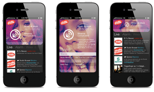
By dragging, users can balance music-related content and live news.
This gesture adds a creative contextual dimension to the application. The dragging gesture does not take the user from one section (news or music) to another. Rather, it enables the user to focus on the type of content they are most interested in, without missing out on the other.
Think In Terms Of Time, Dimension And Animation
What action is triggered when the user taps an item? And how do you visualize that it has actually happened? How fast does a particular UI element animate into the viewport? Does it automatically go off-screen after five seconds of no interaction?
The rise of touch and gesture-driven devices dramatically changes the way we design interaction. Instead of thinking in terms of screens and pages, we are thinking more in terms of time, dimension and animation. You’ve probably noticed that fine-tuning user interactions and demonstrating them to colleagues and clients with static wireframe screenshots is not easy. You don’t fully see, understand and feel what will happen when you touch, hold, drag and swipe items.
Certain prototyping tools, including Pop and Invision, can help bring wireframes to life. They are very useful for testing an application’s flow and for pinpointing where and when a user might get stuck. Your application has a lot more going on than simple back-and-forth navigation, so you need to detect interface bugs and potential sources of confusion as soon as possible. You wouldn’t want your development team to point them out to you now, would you?
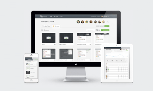
Invision enables you to import and link your digital wireframes.
To be more innovative and experimental, get together with your client first and explain that a traditional wireframe is not the UX deliverable that they need. Show the value of interactive wireframes and encourage them to include this in the process. It might increase the timeline and budget, but if they are expecting you to go the extra mile, it shouldn’t be a problem.
I even offer to produce a conceptual interface video for my clients as well, because once they’ve worked with the interactive wireframes and sorted out the details, my clients will often need something sexier to present to their internal stakeholders.
The Learning Curve
When designing gesture-based interactions, be aware that every time you remove UI clutter, the application’s learning curve goes up. Without visual cues, users could get confused about how to interact with the application. A bit of exploration is no problem, but users should know where to begin. Many apps show a UI walkthrough when first launched, and I agree with Max Rudberg that walkthroughs should explain only the most important interactions. Don’t explain everything at once. If it’s too explicit and long, users will skip it.
Why not challenge yourself and gradually introduce creative UI hints as the user uses the application? This pattern is often referred to as progressive disclosure and is a great way to show only the information that is relevant to the user’s current activity. YouTube’s Capture application, for instance, tells the user to rotate the device to landscape orientation just as the user is about to open the camera for the first time.
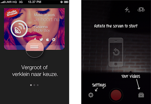
Fight the learning curve with a UI walkthrough and/or visual hints.
Adding visual cues to the UI is not the only option. In the Sparrow app, the search bar appears for a few seconds, before animating upwards and going off screen, a subtle way to say that it’s waiting to be pulled down.
Stop Talking, Start Making
The iPhone ushered in a revolution in interactive communication. Only five years later, touchscreen devices are all around us, and interaction designers are redefining the ways people use digital content.
We need to explore and understand the potential of touch and gesture-based interfaces and start thinking more in terms of time, dimension and animation. As demonstrated by several innovative applications, gestures are a great way to make an app more content-focused, original and fun. And many gesture-based interactions that seem too experimental at first come to be seen as very intuitive.
For a complete overview of the opportunities for gestures on all major mobile platforms, check out Luke Wroblewski’s “Touch Gesture Reference Overview.” I hope you’re inspired to explore gesture-based interaction and intensify your adventures in mobile interfaces. Don’t be afraid to go the extra mile. With interactive wireframes, you can iterate your way to the best possible experience. So, let’s stop talking and start making.
Further Reading
- To Use Or Not To Use: Touch Gesture Controls For Mobile Interfaces
- In-App Gestures And Mobile App User Experience
- Browser Input Events: Can We Do Better Than The Click?
- What Sci-Fi Tells Interaction Designers About Gestural Interfaces


