How To Avoid Duplicate Downloads In Responsive Images

Email Newsletter
Weekly tips on front-end & UX.
Trusted by 182,000+ folks.
 Celebrating 10 million developers

 Custom Web Forms for Angular, React, & Vue. Your backend.

The
The <picture> element is a new addition to HTML5 that’s being championed by the W3C’s Responsive Images Community Group (RICG). It is intended to provide a declarative, markup-based solution to enable responsive images without the need of JavaScript libraries or complicated server-side detection.
The <picture> element supports a number of different types of fallback content, but the current implementation of these fallbacks is problematic. In this article, we’ll explore how the fallbacks work, how they fail and what can be done about it.
The <picture> Element And Fallback Content
Like <video> and <audio>, <picture> uses <source> elements to provide a set of images that the browser can choose from. The <source> elements may optionally contain type and media attributes to let the browser know the file type and media type of the source, respectively. Given the information in the attributes, the browser should render the first <source> with a supported file type and matching media query. For example:
<picture>
    <source src="landscape.webp" type="image/webp" media="screen and (min-width: 20em) and (orientation: landscape)" />
    <source src="landscape.jpg" type="image/jpg" media="screen and (min-width: 20em) and (orientation: landscape)" />
    <source src="portrait.webp" type="image/webp" media="screen and (max-width: 20em) and (orientation: portrait)" />
    <source src="portrait.jpg" type="image/jpg" media="screen and (max-width: 20em) and (orientation: portrait)" />
</picture>
For situations in which a browser doesn’t know how to deal with <picture> (or <video> or <audio>) or cannot render any of the <source> elements, a developer can include fallback content. This fallback content is often either an image or descriptive text; if the fallback content is an <img>, then a further fallback is provided in the alt attribute (or longdesc), as normal.
<picture>
    <source type="image/webp" src="image.webp" />
    <source type="image/vnd.ms-photo" src="image.jxr" />
    <img src="fallback.jpg" alt="fancy pants">
</picture>
The <picture> element differs from <video> and <audio> in that it also allows srcset. The srcset attribute enables a developer to specify different images based on a device’s pixel density. When creating a responsive image using both <picture> and srcset, we might expect something like the following:
<picture>
    <source srcset="big.jpg 1x, big-2x.jpg 2x, big-3x.jpg 3x" type="image/jpeg" media="(min-width: 40em)" />
    <source srcset="med.jpg 1x, med-2x.jpg 2x, med-3x.jpg 3x" type="image/jpeg" />
    <img src="fallback.jpg" alt="fancy pants" />
</picture>
The idea behind a <picture> example like this is that exactly one image should be downloaded, according to the user’s context:
- Users with
<picture>support and a viewport at least 40 ems wide should get thebigimage. - Users with
<picture>support and a viewport narrower than 40 ems should get themedimage. - Users without
<picture>support should get the fallback image.
If the browser chooses to display the big or med source, it can choose an image at an appropriate resolution based on the srcset attribute:
- A browser on a low-resolution device (such as an iMac) should show the
1ximage. - A browser on a higher-resolution device (such as an iPhone with a Retina display) should show the
2ximage. - A browser on a next-generation device with even higher resolution should show the
3ximage.
The benefit to the user is that only one image file is downloaded, regardless of feature support, viewport dimensions or screen density.
The <picture> element also has the ability to use non-image fallbacks, which should be great for accessibility: if no image can be displayed or if a user needs a description of an image, then a <p> or <span> or <table> or any other element may be included as a fallback. This allows for more robust and content-appropriate fallbacks than a simple alt attribute.
The Fallback Problem
Right now, the <picture> element is not supported in any shipped browsers. Developers who want to use <picture> can use Scott Jehl’s Picturefill polyfill. Also, Yoav Weiss has created a Chromium-based prototype reference implementation that has partial support for <picture>. This Chromium build not only shows that browser support for <picture> is technically possible, but also enables us to check functionality and behavior against our expectations.
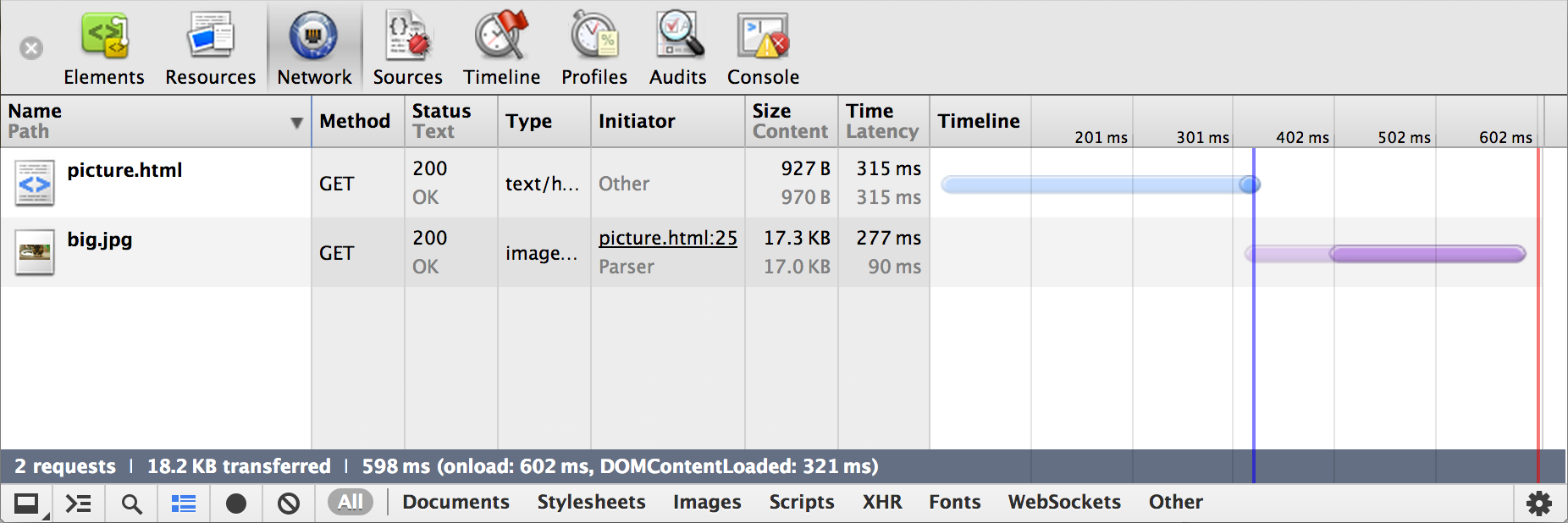
When testing examples like the above in his Chromium build, Yoav spotted a problem: even though <picture> is supported, and even though one of the first two <source> elements was being loaded, the fallback <img> was also loaded. Two images were being downloaded, even though only one was being used.
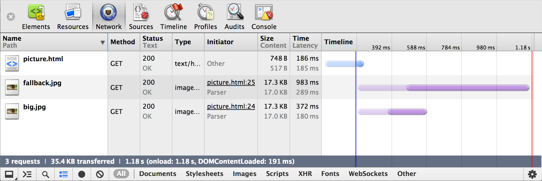
This happens because browsers “look ahead” as HTML is being downloaded and immediately start downloading images. As Yoav explains:
"When the parser encounters an img tag it creates an HTMLImageElement node and adds its attributes to it. When the attributes are added, the node is not aware of its parents, and when an ‘src’ attribute is added, an image download is immediately triggered."
This kind of “look ahead” parsing works great most of the time because the browser can start downloading images even before it has finished downloading all of the HTML. But in cases where an img element is a child of <picture> (or <video> or <audio>), the browser wouldn’t (currently) care about the parent element: it would just see an img and start downloading. The problem also occurs if we forget about the parent element and just consider an <img> that has both the src and srcset attributes: the parser would download the src image before choosing and downloading a resource from srcset.
<picture>
    <source srcset="big.jpg 1x, big-2x.jpg 2x, big-3x.jpg 3x" media="(min-width: 40em)" />
    <source srcset="med.jpg 1x, med-2x.jpg 2x, med-3x.jpg 3x" />
    <img src="fallback.jpg" alt="fancy pants" />
    <!-- fallback.jpg is *always* downloaded -->
</picture>

<img src="fallback.jpg" srcset="med.jpg 1x, med-2x.jpg 2x, med-3x.jpg 3x" alt="fancy pants" />
<!-- fallback.jpg is *always* downloaded -->

<video>
    <source src="video.mp4" type="video/mp4" />
    <source src="video.webm" type="video/webm" />
    <source src="video.ogv" type="video/ogg" />
    <img src="fallback.jpg" alt="fancy pants" />
    <!-- fallback.jpg is *always* downloaded -->
</video>
In all of these cases, we would have multiple images being downloaded instead of just the one being displayed. But who cares? Well, your users who are downloading extra content and wasting time and money would care, especially the ones with bandwidth caps and slow connections. And maybe you, too, if you’re paying for the bandwidth you serve.
A Potential Solution
This problem needs both short- and long-term solutions.
In the long term, we need to make sure that browser implementations of <picture> (and <video> and <audio>) can overcome this bug. For example, Robin Berjon has suggested that it might be possible to treat the contents of <picture> as inert, like the contents of <template>, and to use the Shadow DOM (see, for example, “HTML5’s New Template Tag: Standardizing Client-Side Templating”). Yoav has suggested using an attribute on <img> to indicate that the browser should wait to download the src.
While changing the way the parser works is technically possible, it would make the implementation more complicated. Changing the parser could also affect JavaScript code and libraries that assume a download has been triggered as soon as a src attribute is added to an <img>. These long-term changes would require cooperation from browser vendors, JavaScript library creators and developers.
In the short term, we need a working solution that avoids wasted bandwidth when experimenting with <picture> and srcset, and when using <video> and <audio> with <img> fallbacks. Because of the difficulty and time involved in updating specifications and browsers, a short-term solution would need to rely on existing tools and browser behaviors.
So, what is currently available to us that solves this in the short term? Our old friends <object> and <embed>, both of which can be used to display images. If you load an image using these tags, it will display properly in the appropriate fallback conditions, but it won’t otherwise be downloaded.
Different browsers behave differently according to whether we use <object>, <embed> or both. To find the best solution, I tested (using a slightly modified version of this gist) in:
- Android browser 528.5+/4.0/525.20.1 on Android 1.6 (using a virtualized Sony Xperia X10 on BrowserStack)
- Android browser 533.1⁄4.0/533.1 on Android 2.3.3 (using a virtualized Samsung Galaxy S II on BrowserStack)
- Android browser 534.30⁄4.0/534.30 on Android 4.2 (using a virtualized LG Nexus 4 on BrowserStack)
- Chrome 25.0.1364.160 on OS X 10.8.2
- Chromium 25.0.1336.0 (169465) (RICG Build) on OS X 10.8.2
- Firefox 19.0.2 on OS X 10.8.2
- Internet Explorer 6.0.3790.1830 on Windows XP (using BrowserStack)
- Internet Explorer 7.0.5730.13 on Windows XP (using BrowserStack)
- Internet Explorer 8.0.6001.19222 on Windows 7 (using BrowserStack)
- Internet Explorer 9.0.8112.16421 on Windows 7 (using BrowserStack)
- Internet Explorer 10.0.9200.16384 (desktop) on Windows 8 (using BrowserStack)
- Opera 12.14 build 1738 on OS X 10.8.2
- Opera Mobile 9.80⁄2.11.355⁄12.10 on Android 2.3.7 (using a virtualized Samsung Galaxy Tab 10.1 on Opera Mobile Emulator for Mac)
- Safari 6.0.2 (8536.26.17) on OS X 10.8.2
- Safari (Mobile) 536.26⁄6.0/10B144/8536.25 on iOS 6.1 (10B144) (using an iPhone 4)
- Safari (Mobile) 536.26⁄6.0/10B144/8536.25 on iOS 6.1 (10B141) (using an iPad 2)
I ran five tests:
<picture>falls back to<object><picture>falls back to<embed><picture>falls back to<object>, which falls back to<embed><picture>falls back to<object>, which falls back to<img><picture>falls back to<img>
I found the following support:
What the user sees
| Test 1 | Test 2 | Test 3 | Test 4 | Test 5 | |
|---|---|---|---|---|---|
| Android 1.6 | fallback image | fallback image | fallback image | fallback image | fallback image |
| Android 2.3 | fallback image | fallback image | fallback image | fallback image | fallback image |
| Android 4.2 | fallback image | fallback image | fallback image | fallback image | fallback image |
| Chrome 25 | fallback image | fallback image | fallback image | fallback image | fallback image |
| Chromium 25 (RICG) | picture/source image | picture/source image | picture/source image | picture/source image | picture/source image |
| Firefox 19 | fallback image | fallback image | fallback image | fallback image | fallback image |
| IE 6 | no image | no image | no image | no image | fallback image |
| IE 7 | no image | no image | no image | no image | fallback image |
| IE 8 | fallback image | no image | fallback image | fallback image | fallback image |
| IE 9 | fallback image | fallback image (cropped and scrollable) | fallback image | fallback image | fallback image |
| IE 10 | fallback image | fallback image (cropped and scrollable) | fallback image | fallback image | fallback image |
| Opera 12.1 | fallback image | fallback image | fallback image | fallback image | fallback image |
| Opera Mobile 12.1 | fallback image | fallback image | fallback image | fallback image | fallback image |
| Safari 6 | fallback image | fallback image | fallback image | fallback image | fallback image |
| Safari iOS 6 (iPad) | fallback image | fallback image | fallback image | fallback image | fallback image |
| Safari iOS 6 (iPhone) | fallback image | fallback image | fallback image | fallback image | fallback image |
| Test 1 | Test 2 | Test 3 | Test 4 | Test 5 | |
|---|---|---|---|---|---|
| Android 1.6 | 1 GET | 1 GET | 1 GET | 2 GETs | 1 GET |
| Android 2.3 | 1 GET | 1 GET | 1 GET | 2 GETs | 1 GET |
| Android 4.2 | 1 GET | 1 GET | 1 GET | 2 GETs | 1 GET |
| Chrome 25 | 1 GET | 1 GET | 1 GET | 2 GETs | 1 GET |
| Chromium 25 (RICG) | 1 GET | 1 GET | 1 GET | 2 GETs | 2 GETs |
| Firefox 19 | 1 GET | 1 GET | 2 GETs | 2 GETs | 1 GET |
| IE 6 | 1 GET | none | 1 GET | 1 GET | 1 GET |
| IE 7 | 1 GET | none | 1 GET | 1 GET | 1 GET |
| IE 8 | 1 GET | none | 1 GET | 1 GET | 1 GET |
| IE 9 | 1 HEAD, 1 GET | 1 GET | 1 HEAD, 1 GET | 1 HEAD, 2 GETs | 1 GET |
| IE 10 | 1 HEAD, 1 GET | 1 GET | 1 HEAD, 1 GET | 1 HEAD, 2 GETs | 1 GET |
| Opera 12.1 | 1 GET | 1 GET | 1 GET | 2 GETs | 1 GET |
| Opera Mobile 12.1 | 1 GET | 1 GET | 1 GET | 2 GETs | 1 GET |
| Safari 6 | 1 GET | 1 GET | 1 GET | 2 GETs | 1 GET |
| Safari iOS 6 (iPad) | 1 GET | 1 GET | 1 GET | 2 GETs | 1 GET |
| Safari iOS 6 (iPhone) | 1 GET | 1 GET | 1 GET | 2 GETs | 1 GET |
| Test 1 | Test 2 | Test 3 | Test 4 | Test 5 | |
|---|---|---|---|---|---|
| Android 1.6 | yes | yes | yes | yes | yes |
| Android 2.3 | yes | yes | yes | yes | yes |
| Android 4.2 | yes | yes | yes | yes | yes |
| Chrome 25 | no | no | no | no | yes |
| Chromium 25 (RICG) | no | no | no | no | no |
| Firefox 19 | yes | yes | yes | yes | yes |
| IE 6 | no | no | no | no | yes |
| IE 7 | no | no | no | no | yes |
| IE 8 | yes | no | yes | yes | yes |
| IE 9 | yes | yes | yes | yes | yes |
| IE 10 | yes | yes | yes | yes | yes |
| Opera 12.1 | yes | yes | yes | yes | yes |
| Opera Mobile 12.1 | yes | no | yes | yes | yes |
| Safari 6 | no | no | no | no | yes |
| Safari iOS 6 (iPad) | no | no | no | no | yes |
| Safari iOS 6 (iPhone) | no | no | no | no | yes |
Making Sure The Content Is Accessible
Although the specifics of how to provide fallback content for <picture> are still being debated (see also this thread), I wanted to test how Apple’s VoiceOver performed with different elements. For these experiments, I checked whether VoiceOver read alt attributes in various places, as well as fallback <span> elements. Unfortunately, I wasn’t able to test using other screen readers or assistive technology, although I’d love to hear about your experiences.
Read by VoiceOver
alt on picture | alt on source (picture → source) | alt on object (picture → object) | alt on embed (picture → embed) | alt on embed (picture → object → embed) | |
|---|---|---|---|---|---|
| Chrome 25 | no | no | yes | yes | no |
| Chromium 25 (RICG) | yes | no | no | no | no |
| Firefox 19 | no | no | yes | yes | no |
| Opera 12.1 | no | no | no | no | no |
| Safari 6 | no | no | yes | yes | no |
| Safari iOS 6 (iPad) | no | no | yes | yes | no |
| Safari iOS 6 (iPhone) | no | no | yes | yes | no |
alt on img (picture → object → img) | alt on img (picture → img) | span (picture → span) | span (picture → object → span) | |
|---|---|---|---|---|
| Chrome 25 | no | yes | yes | no |
| Chromium 25 (RICG) | no | no | no | no |
| Firefox 19 | no | yes | yes | no |
| Opera 12.1 | no | no | yes | no |
| Safari 6 | no | yes | yes | no |
| Safari iOS 6 (iPad) | no | yes | yes | no |
| Safari iOS 6 (iPhone) | no | yes | yes | no |
Bulletproof Syntax
Based on these data, I’ve come up with the following “bulletproof” solution:
<picture alt="fancy pants">
    <!-- loaded by browsers that support picture and that support one of the sources -->
    <source srcset="big.jpg 1x, big-2x.jpg 2x, big-3x.jpg" type="image/jpeg" media="(min-width: 40em)" />
    <source srcset="med.jpg 1x, med-2x.jpg 2x, big-3x.jpg" type="image/jpeg" />

    <!-- loaded by IE 8+, non-IE browsers that don’t support picture, and browsers that support picture but cannot find an appropriate source -->
    <![if gte IE 8]>
    <object data="fallback.jpg" type="image/jpeg"></object>
    <span class="fake-alt">fancy pants</span>
    <![endif]>

    <!-- loaded by IE 6 and 7 -->
    <!--[if lt IE 8]>
    <img src="fallback.jpg" alt="fancy pants" />
    <![endif]-->
</picture>

.fake-alt {
    border: 0;
    clip: rect(0 0 0 0);
    height: 1px;
    margin: -1px;
    overflow: hidden;
    padding: 0;
    position: absolute;
    width: 1px;
}
Here we have a <picture> element, two sources to choose from for browsers that support <picture>, a fallback for most other browsers using <object> and a <span> (see note just below), and a separate <img> fallback for IE 7 and below. The empty alt prevents the actual image from being announced to screen readers, and the <span> is hidden using CSS (which is equivalent to HTML5 Boilerplate’s .visuallyhidden class) but still available to screen readers. The <embed> element is not needed.
(Note: The use of the <span> as a fake alt is necessary so that VoiceOver reads the text in Opera. Even though Opera has a relatively small footprint, and even though it’s in the process of being switched to WebKit, I still think it’s worth our consideration. However, if you don’t care about supporting that particular browser, you could get rid of the <span> and use an alt on the <object> instead (even though that isn’t strictly allowed by the specification). This is assuming that the <span> and alt have the same content. If you have a richer fallback element, such as a <table>, using both it and a non-empty alt attribute might be desirable.)
A similar solution should also work with <audio>, although <img> fallbacks for that element are, admittedly, rare. When dealing with <video>, the problem goes away if our fallback image is the same as our poster image. If these may be the same, then the “bulletproof” syntax for <video> would be this:
<video poster="fallback.jpg">
    <!-- loaded by browsers that support video and that support one of the sources -->
    <source src="video.mp4" type="video/mp4" />
    <source src="video.webm" type="video/webm" />
    <source src="video.ogv" type="video/ogg" />

    <!-- loaded by browsers that don't support video, and browsers that support video but cannot find an appropriate source -->
    <img src="fallback.jpg" alt="fancy pants" />
</video>
However, if your <video> needs a separate fallback and poster image, then you might want to consider using the same structure as the <picture> solution above.
Note that <video> and <audio> don’t have alt attributes, and even if you add them, they will be ignored by VoiceOver. For accessible video, you might want to look into the work being done with Web Video Text Tracks (WebVTT).
Unfortunately, extensive testing with <video> and <audio> elements is beyond the scope of this article, so let us know in the comments if you find anything interesting with these.
How Good (Or Bad) Is This Solution?
Let’s get the bad out of the way first, shall we? This solution is hacky. It’s obviously not workable as a real, long-term solution. It is crazy verbose; no one in their right mind wants to code all of this just to put an image on a page.
Also, semantically, we really should use an <img> element to display an image, not an <object>. That’s what <img> is for.
And there are some practical issues:
- Chrome and Safari won’t show proper context menus for the images, meaning that users won’t be able to open or save them easily.
- IE 9 and 10 send an extra HEAD request along with the GET request.
- Using a
<span>as a fakealtis pretty sketchy, and although it worked for my tests in VoiceOver, it could potentially cause other accessibility problems.
All that being said, as a short-term solution, it’s not too bad. We get these benefits:
- A visible image in every browser is tested (
<picture>and<source>when supported, and the fallback otherwise). - Only one HTTP GET request in every browser is tested (and the extra
HEADrequest and response in IE are tiny). - VoiceOver is supported (and is hopefully supported with other screen readers).
The semantics of the solution, while not ideal, are not horrible either: the HTML5 specification states that an <object> “element can represent an external resource, which, depending on the type of the resource, will either be treated as an image, as a nested browsing context, or as an external resource to be processed by a plugin” (emphasis mine).
And although the <span> is not as nice as a real alt attribute, using a visually hidden element for accessibility is not uncommon. Consider, for example, “Skip to content” links that are visibly hidden but available to screen readers.
Next Steps
The best part about this solution, though, is that it highlights how bad the current situation is. This is a real problem, and it deserves a better solution than the monstrosity I’ve proposed.
We need discussion and participation from both developers and browser vendors on this. Getting support from browser makers is crucial; a specification can be written for any old thing, but it doesn’t become real until it is implemented in browsers. Support from developers is needed to make sure that the solution is good enough to get used in the real world. This consensus-based approach is what was used to add the <main> element to the specification recently; Steve Faulkner discusses this process a bit in his excellent interview with HTML5 Doctor.
If you’re interested in helping to solve this problem, please consider joining the discussion:
- Join the RICG, and participate in the #respimg IRC channel and the public-respimg mailing list
- Check out the RICG on GitHub, and consider adding your voice to the discussion on this issue.
- Join the W3C public-html mailing list and the WHATWG mailing list to follow and contribute to discussions about the specifications.
- Help fix problems with current implementations by reviewing, patching, commenting on and filing bugs for WebKit, Mozilla and Internet Explorer.
The next step towards a long-term solution is to achieve consensus among developers and browser vendors on how this should work. Don’t get left out of the conversation.
Thanks to fellow RICG members Yoav Weiss, Marcos Cáceres and Mat Marquis for providing feedback on this article.
Further Reading
- One Solution To Responsive Images
- Simple Responsive Images With CSS Background Images
- How To Solve Adaptive Images In Responsive Web Design
- Responsive Images In WordPress With Art Direction
 (al, mrn)

