How To Provide The Greatest Mobile User Experience Possible

Email Newsletter
Weekly tips on front-end & UX.
Trusted by 182,000+ folks.
 Register for Free


 Celebrating 10 million developers
 Custom Web Forms for Angular, React, & Vue. Your backend.
Now and again, I hit the swimming pool. It’s a good way to exercise, but also to relax after a long day in front of my PC. I can do quite a few laps in my front crawl, but only because I don’t use my legs much. I kick steadily to ensure that my legs stay lifted and don’t slow me down. I don’t use my legs much for forward propulsion.
An instructor once explained to me that legs can definitely help with propulsion in the front crawl, but only at the cost of much higher energy consumption.
He also explained that champions use their legs a lot. Their hearts are powerful, and they can happily sacrifice the extra effort for the small yet significant gain in speed. People with modest competitive ambitions are typically better off with moderate leg usage.
Does this relate to mobile Web development, responsive Web design and server-side device detection?
The analogy is a stretch, but yes, it does. As the inventor of WURFL, I used to live in a world where mobile devices were so limited in capabilities that there was no way a commercial website and its corresponding mobile website could be supported through a unique set of HTML pages without the support of some server-side logic. Strategies to detect and tweak content for mobile devices varied from simple detection scripts to the adoption of full-fledged device description repositories (DDR) such as WURFL.
Today, things have, to a large extent, changed. Many still have a feature phone, but the majority of users who care about accessing the Internet from their mobile devices will have a smartphone. A 2013 smartphone means the following: a quite fast connection, a great WebKit-based browser, a 320-pixel wide (or wider) touchscreen and a great operating system that allows for the installation of apps.
This evolution has turned the mobile Web into a swimming pool available to every Web designer. Programming strategies such as progressive enhancement (PE) and responsive Web design (RWD) enable everyone to make their full websites usable enough on smartphones from a single set of HTML pages — i.e. with no need for server-side device detection. This is awesome. Webmasters can now make their websites more mobile-friendly without introducing a significant amount of extra complexity. Yet, just like in my initial analogy, the saving is only achieved at the cost of sacrificing certain aspects of the mobile UX that “champions” would not be OK with sacrificing.
In a previous article by Ronan Cremin and me, “Server-Side Device Detection: History, Benefits and How-To,” we explored the different aspects of client-side approaches versus server-side approaches, and we concluded that server-side strategies still offer a lot to mobile Web developers. I won’t repeat it here; rather, I will go one step further and explain how the two worlds can happily coexist for everyone’s benefit.
Client-Side Vs. Server-Side: A False Dichotomy
Most IT people are familiar with the saying, “When all you have is a hammer, every problem looks like a nail.” This is perfectly applicable to mobile development, where, in my experience, developers with a JavaScript and CSS background tend to favor client-side solutions to the problem of device diversity, while developers with traditional system development skills find server-side approaches more natural.
Unsurprisingly, there are pros and cons to both approaches, and, more importantly, the two approaches are not mutually exclusive and can be made to work together. After all, for any organization that offers a website, the ultimate purpose is to create the greatest user experience possible for its users within the constraints of the project’s timeline and budget.
Best Of Both Worlds
When it comes to building a strategy for a website that is friendly to mobile users, there is a whole range of possibilities. At one extreme, a designer might adopt a purely responsive website because they cannot afford to maintain a server-side detection component (or simply because they do not find enough value in the extra complexity). At the other extreme are large companies whose websites (and mobile websites) address particular quirks of popular devices. This approach requires an investment and dedicated team so large that typically only major Internet companies (think Facebook, Yahoo and Google) would go for it.
Most other companies will find the optimum point somewhere between the two extremes by segmenting the world of connected users in ways that make the most sense in their markets. Such segmentation will need to rely on some form of server-side detection.
One way to put it is that one should adopt a “best of both worlds” hybrid approach. In this article, I will show an example of this.
Every software project is one-off. The Web is no exception. Nor is mobile Web development, where the super-rapid progress of mobile devices is constantly turning best practices into moving targets. For this article, I figured that nothing could make the point better than a real example with real code.
My example is a cross-browser and cross-device slideshow. I will show how server-side and client-side detection can be made to work together to deliver a great UX on a variety of clients.
Segmentation (Good Ol’ Divide And Conquer)
The slideshow will be made available to the following classes of HTTP clients:
- non-smartphones (or feature phones),
- smartphones,
- tablets and desktops.
I have always called these “segments,” and I have referred to the splitting up into segments as “segmentation.” The key point is that each segment will be provided with a fundamentally different UI structure. Such segmentation will be supported through server-side detection.
Within each segment, there will still be space for further optimization of the UX. Such optimizations will happen with RWD and device detection. Notably, this approach will be used to obtain pictures in different sizes and to address the bandwidth problem, particularly for mobile devices.
Let’s start by sketching the different UIs for the different classes of HTTP clients (i.e. segments).
Non-Smartphones
Non-smartphones are commonly referred to as feature phones in the industry. There is no standard definition of what a smartphone is, but a device that possesses the following features would likely be called a smartphone by most:
- touchscreen;
- a screen that is 240-pixels wide or wider;
- Android 2.2, iOS, Windows Phone 7.5 or higher, RIM OS 7 or higher, Symbian Belle or higher, Nokia N9 WebKit-based browser;
- not a tablet.
This is a totally arbitrary definition, but good enough for the purpose of this article.
Devices that do not support one or more of the above features will be considered feature phones.
Because no assumption can be made for non-smartphones, we will assume a small screen, no touchscreen and limited bandwidth (which entails the need to minimize the number of HTTP requests required to download all of the content).
Please note that the lack of a touchscreen might require users to click the “down” button multiple times to get to the icon they wish to select.
The following wireframe nicely illustrates what we are getting at:
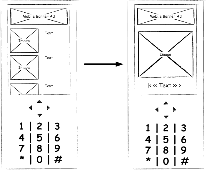
Feature phones (i.e. non-smartphones) have relatively small screens (typically narrower than 240 pixels). The presence of a touchscreen should not be assumed for devices in this segment.
Smartphones
Smartphones have a large screen, and users don’t have to click their way through icons to get to the one they want. They simply touch it. Because of this, a UI such as the following is better suited to them:
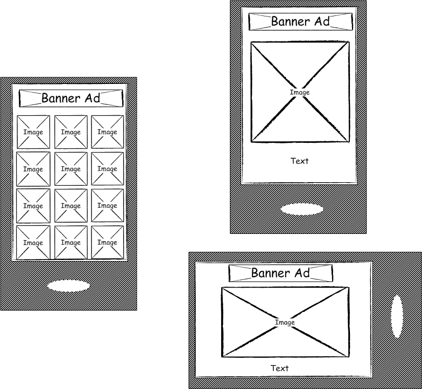
Smartphones have large screens (240 pixels or wider). The presence of a touchscreen and of basic media queries for changes in orientation may be safely assumed.
Tablets And Desktops
In the case of tablet and desktop browsers, we can safely assume that a large screen is available. In this case, consolidating the two views (i.e. the navigation and the actual picture) into a single screen makes sense:
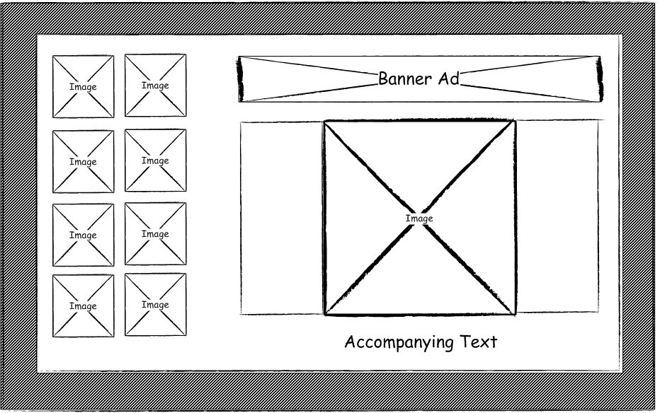
A screen 700 pixels wide (or wider) may be assumed.
Of course, I created a single segment for tablets and desktops for illustrative purposes, but a real project might segment differently, based on the business model of the organization and the traffic it sees from different classes of devices.
Recommended reading: Are You Loosing Traffic By Poor Website Performance?
Before delving into the code to implement this, I should discuss a few aspects of mobile development.
Important Note About Mobile Bandwidth: Speed Isn’t Everything
US carriers (i.e. network operators) boast in their advertising about their increasingly faster 4G networks and the blazing download speeds that their customers can get. My experience (and the experience of others) is that those figures are sometimes truthful under good network conditions, as in the case of a large single download or of video streaming. In practice, things are a bit more complicated. The overhead of establishing an HTTP connection in mobile is high.
Many browsers and devices open only one or two concurrent connections with the server (partly because of what the HTTP specification says, and partly because of hardware limitations). Keep-alives cannot be assumed to always work as one would expect in mobile, because of strategies that the devices follow to save battery power.
Recommended reading: Losing Users If Responsive Web Design Is Your Only Strategy
The problem is at the lower levels and is rooted in the fact that mobile networks and TCP/IP were not built to play well together to begin with.
Techniques such as “domain sharding” (i.e. fooling the browser into believing it’s talking to different servers) help to increase the number of concurrent connections. However, if you want to increase the download speed (both real and perceived) of a website, limiting the overall number of HTTP connections is your best bet.
May Your Days Be Merry And Your URLs Unique
People share links on Twitter, Facebook, Google+ and a lot of other services these days. This is good, but it has also exposed a shortcoming with a popular approach to managing the mobile channel — i.e. creating a separate mobile website (with separate URLs to the mobile view of the content). In short, a user will share https://m.coolsite.com on Twitter, and users on desktops and tablets will be offered a sucky UI. Having https://www.coolsite.com serve both the Web and mobile experience would effectively solve the problem.
As my last article explains, there are ways to have a single URL “multi-serve” content for different media. Of course, this requires a bit more design and work from the service architect as compared to purely client-side approaches.
In the case of PE and RWD, the “uniqueness” of the URL comes free of charge. In the case of server-side detection, a strategy to multi-serve content from a unique URL needs to be designed into the system. We will see one way to achieve this in the code discussed further down.
Content = Content + Presentation? A Little (But Important) Aside
Ethan Marcotte, arguably the inventor of RWD, correctly identifies the URL issue in his book Responsive Web Design:
"I do think fragmenting our content across different “device-optimized” experiences is a losing proposition, or at least an unsustainable one."
This sentence has been quoted endlessly, and it seems hard to disagree with. Yet, it contains an ambiguity that makes it very debatable, to say the least. What Ethan calls “content” has historically been referred to as “presentation” by most. In fact, I could easily argue that separation of content and presentation is the foundation of a plethora of Web programming frameworks, such as model-view-controller (MVC).
While I am aware that designers will argue that the difference between content and presentation is blurry (advertising is the best example of this), such a differentiation has been very helpful to Web programmers in multiple ways over the past 15 years. In general, professionals are much better off preserving this separation, rather than blurring the difference between the two.
Software architects should obviously not fragment the content managed by their system. At the same time, they should be ready to multi-serve the presentation of the same data to users of different media and different devices in the name of an optimal UX. I would go so far as to argue that PE and RWD are also about providing multiple presentations of the same content, inasmuch as the clever use of grids and media queries allows developers to confine the “multi-serving framework” to a single page.
End of the aside.
Getting back to URL uniqueness, it is obvious that, in the case of server-side detection, a URL strategy must be designed with extra use of resources. Of course, webmasters have managed similar issues all their careers. Internationalizing a website presents the same challenges: one could have content served in multiple languages from the same URL (or even JSP or PHP page) or simply provide sibling websites, one for each supported language. Support for the potential lack of JavaScript presents a similar issue, as does the fact that an international content provider may wish to offer different (i.e. more relevant) content to visitors from different geographic regions, even where the language is the same. Supporting this means extra effort and cost. Typically, after the cost versus benefit equation is solved, some companies will go for the benefit in spite of the cost.
After so many words, let us see how the following code implements everything we’ve illustrated above.
The Code
Everything that has been discussed so far is illustrated in practice with a self-contained example that I built (along with my friend Steve Kamerman, COO at ScientiaMobile) to reinforce the points in this article. Be aware that, for the sake of clarity, the example hardwires many of the resources that would normally be isolated in separate databases or configuration elements.
Here is a list of the main components in the code:
- a DDR;
- an MVC framework;
- a controller with the segmentation logic;
- a server-side image-resizing framework;
- the views — feature phone, smartphone and tablet/desktop, in our case.
Let’s discuss each of them.
Device Description Repository
A DDR is a software framework that enables an application to associate an HTTP request with the properties of the client (Web browser, mobile device, Internet-enabled wristwatch, etc.). In our example, I will be using ScientiaMobile’s DDR, WURFL Cloud, because it’s the easiest to install on all platforms and also comes with a free offering for those who want to play around with it.
Of course, any other DDR could be used in place of WURFL Cloud, including AGPL-licensed WURFL or other open-source frameworks based on user-agent string analysis through regular expressions.
For the purpose of this article, here is the core bit of code that explains how to use the DDR (in the index.php file):
:
require_once dirname(__FILE__).'/lib/WurflCloudClient/Client/Client.php';
  :

// Disable caching for testing
$cache_enabled = false;

$wurfl_config = new WurflCloud_Client_Config();
$wurfl_config->api_key = 'XXXXX:YYYYYYYYYYYYYYYYYYYYYYYYYYY';
  :
if ($cache_enabled) {
  $wurfl = new WurflCloud_Client_Client($wurfl_config);
} else {
  $wurfl = new WurflCloud_Client_Client($wurfl_config, new WurflCloud_Cache_Null());
  header("Cache-Control: no-cache, must-revalidate");
  header("Expires: Sat, 26 Jul 1997 05:00:00 GMT");
}
$wurfl->detectDevice();
Note: The cache is disabled because this is handy for testing purposes. But you’ll want to enable it on a production website, or else every HTTP request from your users will be a request to the cloud.
Once this code has run, you will be able to look up device capabilities on your server, without any need to interact with the client through JavaScript or the like, as simply as this:
$wurfl->getDeviceCapability('is_tablet')
All of the magic of looking up the HTTP request and recovering a profile for the device is happening under the hood.
Model-View-Controller Framework
MVC is a popular programming pattern among Java developers that over the years has made inroads among programmers of other languages (including PHP). In short, the MVC framework analyzes an incoming HTTP request and “dispatches” the actual handling to a different PHP page that has been deemed to be more apt for the job. In our case, the framework will route the HTTP request to the PHP page that would implement the best UI for that “segment.”
For the record, the MVC framework we’re using in our example is homemade, but Steve explains that it was inspired by a micro-framework named Silex.
The framework itself is implemented in the lib/SimpleApp.php file:
require_once dirname(__FILE__).'/lib/SimpleApp.php';
  :
$app = new SimpleApp();
Once the MVC framework is included, dispatching an HTTP request to the right view (see below) is as simple as this:
$app->render('image/smartphone.php', $view_data);
The interesting part is that the URL will not be affected by this. Users will only see the index.php page that responded to the request. This effectively solves the problem of URL uniqueness that we discussed above.
Controller
The controller (the “C” in MVC) is in charge of segmentation (i.e. deciding the view to which a certain HTTP client should be directed based on its profile). Here is the core of the controller (in index.php):
if ($wurfl->getDeviceCapability('is_smartphone')) {
  $app->render('index/smartphone.php', $view_data);
} else if ($wurfl->getDeviceCapability('is_mobile')
&& !$wurfl->getDeviceCapability('is_tablet')) {
  $app->render('index/featurephone.php', $view_data);
} else {
  $app->render('index/desktop.php', $view_data);
}
In light of what we have explained, this part should be rather self-explanatory: smartphone.php handles smartphones, featurephone.php handles feature phones, and everything else (including tablets) is handled by desktop.php. There are actually two sets of views, one that manages the discovery page (i.e. the thumbnails with pictures) and one that represents the single picture.
The is_smartphone capability is a so-called “virtual capability” — i.e. a computed property that relies on other capabilities and that represents ScientiaMobile’s understanding of what a smartphone is. A lot of people find this handy. Of course, nothing prevents a WURFL user from choosing the capabilities and rolling a particular segmentation that make the most sense for their business model.
Image Resizing (RESS)
RESS stands for “responsive images and server-side components,” making it the most screwed-up abbreviation I have ever seen in my life. Because it is now common, though, I will use it, too. The premise of RESS is fairly reasonable: RWD is cool, but sending 500 KB pictures to a mobile device is not a good idea for a variety of reasons. This is why even the most inveterate RWD promoters will concede that resizing pictures on the server in order to speed up downloading and rendering on mobile devices is still a good idea. Of course, CSS and JavaScript files are also resources that you’ll want to make as light as possible. These also fall under the RESS umbrella.
Users of WURFL Cloud also have access to a service called Image Resizer. In short, Image Resizer enables you to create a URL that piggybacks the following bits onto itself:
- the URL of the original picture,
- a combination of parameters that specify how the picture should be resized and manipulated.
Requesting the URL will result in a picture with the desired features being obtained. For the record, other services of this kind are around, such as Sencha.io Src and the up-and-coming WhateverWeb, which promises to go beyond simple image resizing. Call me a romantic, but I prefer that we eat our own dog food for this example.
A photographer also graciously gave me some pictures of Chicago for this article, which I’ve hosted at https://www.scientiamobile.com/ (i.e. in a place where Image Resizer can pick them up):
Let’s see how Image Resizer is used in practice (see views/index/smartphone.php):
// Compute the size of the image thumbnails
$thumb_width = 95;
$thumb_height = 95;
$rszr_tumbnail = "https://rszr1.wurflcloud.com/234341/w_$thumb_width/
                  h_$thumb_height/m_cropbox/";
  :
<div style="width: 100%; float: left; margin: 5px;">
  <?php foreach ($images as $id => $image) { ?>
   <div style="float: left; margin: 5px;">
      <a href="<?php echo $app->getUriPrefix().'/image/'.$id; ?>">
        :
       <img alt="" src="<?php echo $rszr_tumbnail.$image['src']; ?>" />
      </a>
    </div>
  <?php } ?>
</div>
This will generate markup like the following snippet:
<div style="float: left; margin: 5px;"><a href="/smash/image/1"><img alt="" src="https://rszr1.wurflcloud.com/234341/w_95/ h_95/m_cropbox/https://cto.scientiamobile.com/chicago/chicago2.jpg" /></a></div>
In reality, I’ve cheated a bit. I cut some interesting bits from the code above. In particular, I’ve removed a trick to use a really important technique called the data URI scheme, which enables developers to nest pictures in the HTML itself in the form of ASCII Base64 garbage. As you can imagine, not all devices support the feature (although smartphones usually do). This is where WURFL’s image_inlining capability, along with the ability of the image resizer to provide the picture already in Base64 format, comes in handy. The image_inlining will tell you whether the data URI scheme is supported:
$image_inlining = $wurfl->getDeviceCapability('image_inlining');
if ($image_inlining) {
  $rszr_tumbnail = "https://rszr1.wurflcloud.com/234341/w_$thumb_width/
                         h_$thumb_height/m_cropbox/in_true/"; } else {
  $rszr_tumbnail = "https://rszr1.wurflcloud.com/234341/w_$thumb_width/
                         h_$thumb_height/m_cropbox/";
}
  :
<div style="width: 100%; float: left; margin: 5px;"<
<?php foreach ($images as $id => $image) { ?>
  <div style="float: left; margin: 5px;">
    <a href="<?php echo $app->getUriPrefix().'/image/'.$id; ?>">
    <?php if ($image_inlining) { ?>
      <img alt="" src="<?php echo file_get_contents($rszr_tumbnail.$image['src']); ?>"/>
    <?php } else { ?>
      <img alt="" src="<?php echo $rszr_tumbnail.$image['src'];?>"/>
    <?php } ?>
  </a></div>
<?php } ?>
</div>
In the case of a device that supports image inlining, the code above will produce the following:
<div style="float: left; margin: 5px;">
<a href="/smash/image/1"> <img alt="" src="data:image/jpeg;base64,/9j/4AAQSkZJRgABAQAAAQABAAD//gA7Q1JFQVRPUjogZ2QtanBlZ..
  :
AUhMQYSQVEHYXETIjKBCBRCkaGxwQkjM1LwFWJy0QoWJDThJfEXGBkaJicoKSo1Njc4OTpDREVGR0hJSlN
   :
cH14z9RXHTc6jb6dWdM3GmrdT//Z" /> </a>
</div>
As we discussed earlier, this is particularly crucial because of the importance of minimizing the number of HTTP requests demanded by a mobile device to download a page, an aspect that is simply not worth optimizing in classic Web programming: too much extra work for way too little gain.
Of course, the data URI scheme will greatly increase the perceived download speed on smartphones and non-smartphones alike.
The Views: Feature Phone, Smartphone And Desktop/Tablet
The three segments we initially defined map one to one with our three views (feature phone, smartphone and tablet/desktop), according to the MVC paradigm. Each view offers a user experience that is best suited to the respective class of devices and browsers.
It goes without saying that adopters of a DDR still retain control over the UX of a deployed application simply by configuring a device to access a given view (for example, by downgrading a misbehaving smartphone to the feature-phone view).
The feature-phone view is particularly interesting because you’ll want to serve XHTML Mobile Profile (XHTML MP) as a markup to those devices. Developers who approach mobile today might get away with ignoring XHTML MP, but for years XHTML MP has been the standard mobile Web markup. Still today, smartphones will immediately recognize a website created in XHTML MP as being a mobile website, even when no viewport meta tag is available. Be aware that XHTML MP is typically better served with a different MIME type than text/html.
Note: Covering XHTML MP is beyond the scope of this article. If you are curious about the world of mobile programming on feature phones, my document “Global Authoring Practices for the Mobile Web” enjoyed some popularity for some time. Most people find it very informative still today.
The following screenshots visualize what the different UIs mean in practice:

The view on feature phones.

The view on smartphones.
The view on tablets and desktop. Above: The page on an iPad.
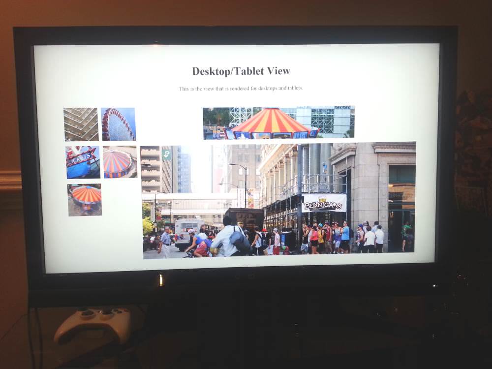
Here is the same page on the Xbox 360 (IE 10).
Of course, this example is just a proof of concept. Nothing prevents a programmer from making the desktop view even more responsive than it already is, or from adopting something like the good PhotoSwipe to provide interactive slideshows on smartphones and tablets (but not on older phones, where they would be unlikely to work). Divide and conquer.
Conclusion
Purely client-side approaches such as RWD and PE can make Web pages accessible on smartphones. For companies and organizations, this means that supporting mobile devices could be cheaper now than it was a couple of years back. Yet, these savings come at the cost of sacrificing certain aspects of a full-fledged cross-channel Web offering.
Large organizations may still want to adopt server-side device detection in some form to deliver a great UX to everyone who accesses their websites. While RWD and PE strategies can (and should) be adopted by companies, a hybrid client- and server-side approach is the most likely to deliver a great service to desktop, tablet and mobile users alike.
We’ve discussed an instance of such a hybrid approach by showing how segmentation, server-side resized images and the data URI scheme are key components to a great user experience across devices and browsers.
Have a look at the demo app, or download the full source code.
Further Reading
- The Ultimate Guide To Push Notifications For Developers
- A Complete Guide To Mobile App Marketing
- A Comprehensive Checklist For Running Design Workshops
- What Is Design Thinking?
 (al, ea, mrn)

