Typographic Design Patterns And Current Practices (2013 Edition)

Email Newsletter
Weekly tips on front-end & UX.
Trusted by 182,000+ folks.

 Custom Web Forms for Angular, React, & Vue. Your backend.

 Celebrating 10 million developers
Good typography has always been a defining aspect of effective Web design, and this holds true especially for websites in which the emphasis is on presenting a large amount of content — specifically, articles, news and stories. Whether for a magazine or international newspaper, the designer of any website that distributes a lot of content has always had to consider typographic details as seriously and thoroughly as a print designer would.
In 2009, we conducted a survey of then current typographic practices. Since then, responsive design techniques have clearly gained momentum and established their place in the landscape of CSS layout. With the advent of mobile, new modes of browsing websites and reading text have emerged.
Online publications have had to reevaluate how their content is presented on mobile devices. Web typography is as rich, versatile and accessible as ever before. Yet new opportunities introduce new complexity; and with new implementation challenges, we are all spurred to reconsider our practices.
Now, three years later, we’ve reviewed the original study and explored how Web typography has changed over these years. We spent countless hours between February and April of this year collecting new data and exploring common developments and trends in Web typography.
How Did We Conduct The Study?
We have compiled relevant data from over 50 well-respected websites to address these questions. For this study, we selected a wide variety of international newspapers, magazines and blogs, all of whose typographic choices should have been carefully and thoroughly weighed. We chose publications and organizations that have a very large readership (such as The Boston Globe and The Financial Times) as well as specialized magazines with smaller yet often more demanding readerships (such as A List Apart and UX Booth).
These websites focus primarily on text-based content rather than on generic environments such as Instapaper and Readability. As such, they need to be highly legible in order to ensure that users continue visiting and reading on their websites. Because readability of content is (or rather should be) the main design goal of these publications, the techniques they follow could be considered good practices. However, the results presented in this study should be taken with a grain of salt.
Issues We Were Interested In
The questions asked in our first study nearly four year ago remain relevant but need to be complemented by questions about the challenges of mobile devices. How widely has responsive design been adopted by publications, if at all? Has there been any change in the typographic choices of big and small publications? How many weights of a large font family should we deliver to mobile devices? How large should the font size of body copy be? How should the font size change on a responsive website? Optimizing readability could require changing the font’s style, size and spacing according to the viewport’s width and height.
The second article in this series will address the growing diversity of eBook readers and mobile apps whose purpose is to give users a pleasant, improved or enhanced reading experience — from desktop readers down to smartphone readers. We were curious about the specifics of design and typographic choices that make reading articles in these applications more pleasing than reading on the original websites.
Note: For the sake of continuity, we have stayed close to the format of the original study from 2009. This article is meant to update the data, and hopefully detect new trends and reach new conclusions.
Typography In Online Publications
After carefully analyzing the style sheets in the publications in this study, we compiled a comprehensive spreadsheet of typographic points and collected the relevant data. You can view a spreadsheet of the raw data, which contains more data than was pertinent to this article.
Not limiting ourselves to the questions in the original study, we will broach issues that have arisen since then as a result of responsive design techniques, and we’ll examine whether such techniques are being applied at all. This led us to the following questions:
- How popular are serif and sans-serif typefaces in body copy and headlines?
- Which fonts are used most frequently?
- What is the average font size (on narrow, mid-sized and large screens)?
- What is the average ratio of the font sizes of headlines to the font sizes of body copy?
- What is the average line height of body copy?
- What is the average ratio of line height to font size in body copy?
- What is the average ratio of line height to line length in body copy?
- What is the average amount of space between paragraphs?
- What is the average ratio of paragraph spacing to line height in body copy?
- How are links styled?
- How many characters per line are common in body copy?
- How often are links underlined?
- How often are font fallbacks used?
- How often are responsive design techniques implemented?
- Which ratios of display sizes are discernible?
- How do websites deal with the performance of Web fonts?
To answer these questions, we collected more than 40 data points, all of which can be found in the aforementioned spreadsheet. We can extract several rules of thumb from this data. We wouldn’t recommend acting on the data from this study blindly; the statistical data, however, will no doubt yield useful insights.
Popular Serif And Sans-Serif Fonts
“Which typeface to use?” Obviously, this is one of the most important questions a designer has to answer when considering Web typography. The typeface will set the tone for the entire website, and a poor choice could send the wrong message or thwart the intended atmosphere. The argument for either serif or sans-serif hasn’t been won yet. Interestingly, looking back to the results of the 2009 study, sans-serif typefaces seemed to be more popular in body copy and headlines. The last four years have seen a tiny shift away from that.
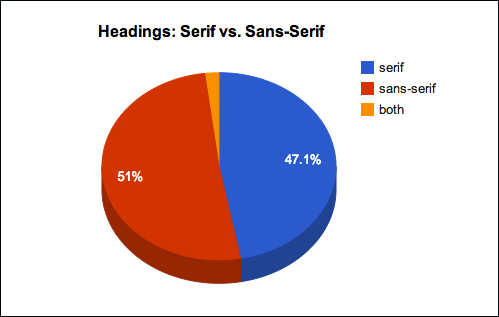
Serif and sans-serif are almost equally popular in headlines.
The motivations of designers likely haven’t changed much. Serif fonts apparently stand out in headlines, but arguments have been made for serifs’ ability to guide the reader and for its readable structure in body copy as well. Still, contrasting a serif body with a sans-serif headline or vice versa can improve the overall visual appeal and readability of a website.
The data suggests that serifs have gained in popularity in recent years, leading almost to a reversal in common usage in the last four years, at least where body copy is concerned.
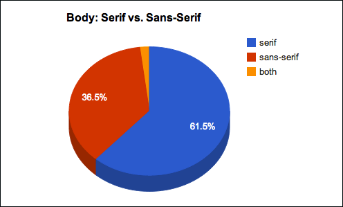
Serifs have strongly gained in popularity in body copy.
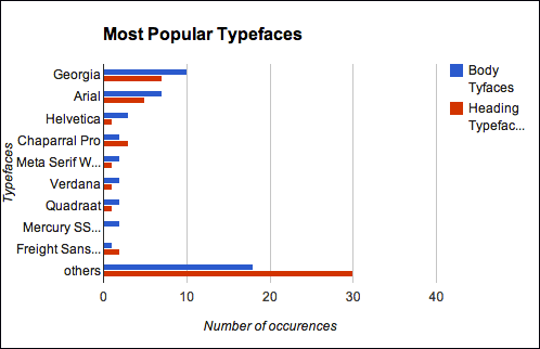
- Half of the websites analyzed use serifs in their headlines, the other half sans-serifs. The two most popular typefaces are Georgia — used on such websites as The Guardian and the Financial Times — and Arial — found on Zeit.de and the BBC’s website.
- Only 37% use a sans-serif typeface for body copy.
- The most popular serif typefaces for headlines are Georgia (14%) and Chaparral Pro (6%).
- The most popular serif typefaces for body copy are Georgia (20%) and Chaparral Pro (4%).
- The most popular sans-serif typefaces for headlines are Arial (10%) and Freight Sans Pro (4%).
- The most popular sans-serif typefaces for body copy are Arial (14%) and Helvetica (6%).
- However, 66% of headline typefaces and 39% of body copy typefaces are found in only one instance.
So, in summary we can state that nearly two thirds of the websites analyzed use serifs for body copy, and Georgia and Arial are still the most common primary typefaces. However, our most surprising find is that a majority of websites use non-standard fonts as their primary typeface — 39% of body copy and 66% of headlines. This development is truly interesting, because it shows that typography has become an important element in establishing brand identity and character. These numbers indicate growing typographic diversity on the Web — which we should probably expect anyway.
A majority of websites use non-standard fonts as their primary typeface.
The growth of “bulletproof” font-delivery services such as Typekit and Fontdeck likely explains the increasing variety of primary typefaces. Fallback typefaces are predominantly standard core Web fonts. Times, Times New Roman, Georgia, Helvetica and Arial are most often used in CSS font stacks. Mobile platform fonts such as Droid Sans, Palatino and Cambria are almost never used.
Ironically, a consequence of the resurgence in serif typefaces is that Times and Times New Roman, which had almost been written off as too old-fashioned in the last study, have made kind of a comeback as the two most popular fallbacks. Roughly 11% of headline and body copy fallbacks have Times, and another 11% have Times New Roman.
There is much literature on typography in Web design, most of which discusses the applications of serif or sans-serif typefaces. Increasingly, the argument for better readability combined with artistic value supports a judicious use of both styles. Douglas Bonneville discusses the benefits and best practices of combining serifs and sans-serifs, and Simon Pascal Klein discusses the intricacies of font families and makes further typographic considerations in his article “Achieving Good Legibility and Readability on the Web.”
The Great Discontent combines both the Stratum and Meta Serif Web Pro fonts to generate a dynamic yet respectable feel.
Compared to the previous study’s results, Verdana and Lucida Grande are the big losers. Verdana is used only twice as a primary font, and neither is used more than once as a fallback font. Chaparral Pro and Helvetica have risen in prominence. The increasing diversity and individuality in design is due to both the increased use of font foundries and the wider range of Web fonts.
One discovery of the previous study, that “alternative” fonts are more common among headline typefaces, is still proving accurate. No doubt, the general belief that experimentation is best applied to small details still stands. The look and feel of a page can be adjusted just enough by changes to the font family of headings, rather than by drastic changes to body copy. However, the overall use of alternative fonts for body copy has increased dramatically, creating a much richer and more diverse typographic landscape on the Web.
Light Or Dark Background?
The previous study concluded that a large majority of websites favored dark on light color schemes. Not much has changed, although the websites surveyed this time are more varied in their light background tones.
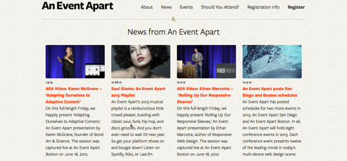
An Event Apart demonstrates the readability of a subdued color scheme.
Several websites have a less aggressive contrast of an off-white or even beige background with dark-gray text. The off-white is often chosen to lower contrast. The designers in this case have clearly opted for a comfortable, lengthy reading experience.
Black text on a white background is a common pattern for body copy. The contrast is easy on the eyes and is, at least among these websites, the status quo.
Average Font Size For Headlines
Generally, the font size of headlines is chosen according to the typeface of the body copy. Still, it’s interesting to see what common ranges designers prefer for body copy and headlines. In this study, the headlines for large display sizes average at roughly 38 pixels. Of course, we made sure that the text always displayed at the actual size, without any zoom.
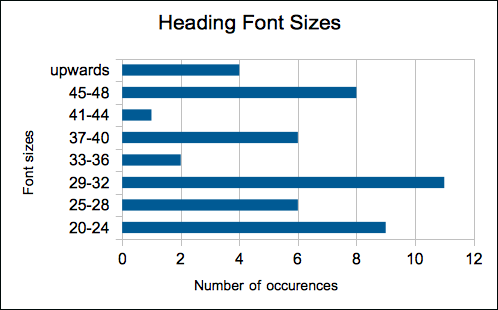
The most popular sizes range from 20 to 32 pixels.
You can easily notice the increase in font size since the last study. Not only did the average increase by more than 10 pixels (!), but the range of headline sizes starts further up, at 20 pixels, and tops out at an impressive 212 pixels in the case of The Great Discontent. This publication is an exception, with its magazine-like headlines and smaller font sizes for headings.
We’re going further up. The Great Discontent shows an impressive 212 pixels font size.
Average Font Size For Body Copy
With readability as the determining criterion, the average pixel size of body copy has increased in four years as well. Back then, most of the websites were between 12 and 14 pixels in font size. Now, 14 pixels is as popular as 16 pixels; each is used on 13 websites.
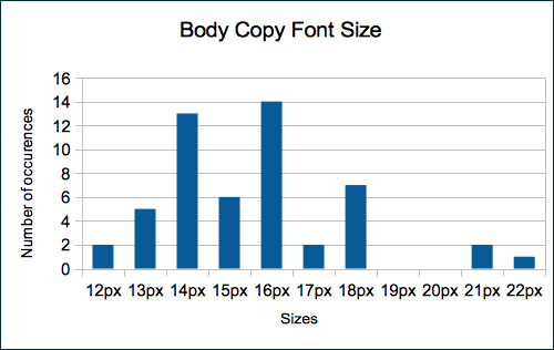
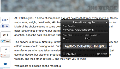
14 pixels is also The Verge’s font size. While some websites offset the first paragraph of an article with a larger font size, many, like The Verge, follow a uniform size.
Ratio Of Headline to Body Font Size
We’ve updated our rule of thumb based on the current average ratio between headline and body font size. Don’t follow this rule blindly; rather, just keep it in mind as you make decisions in your projects.
Headline ÷ Body Copy = 2.5
According to our study, on average, the ratio between the headline and the body copy is around 2.5. The traditional scale (6, 7, 8, 9, 10, 11, 12, 14, 16, 18, 21, 24, 36, 48, 60, 72) and the Fibonacci sequence (16, 24, 40, 64, 104) are still relevant, of course, and represent a more naturalistic approach. The golden ratio (1.618) might also yield an organic effect, too.
Optimal Line Height For Body Copy
Leading (or line-height in CSS) will always depend on your font size and measure (or line length). But in general, the longer the measure, the longer the leading should be. Therefore, presenting a chart of the most popular leading values in pixel units wouldn’t make sense here. More appropriate for you would be to use a relative unit, such as an em or percentage value, that determines the ratio between leading and measure and between leading and font size.
This latest study reveals the following:
- line height (pixels) ÷ body copy font size (pixels) = 1.46. Classic typography books recommend 1.5, a value backed up by this and our last study. Very few websites use anything less than that. The number of websites that go above 1.48 decreases as you get further from this value.
- line length (pixels) ÷ line height (pixels) = 24.9. The average line length (570 pixels, excluding margins and padding) has grown comparatively less than font size and line height have since 2009 (the latter averaging 22.9 pixels). The average line lengthened by approximatively 5% (from 538,64 pixels in 2009), while the average line height has increased from 12 pixels in 2009 to 13 pixels in 2013.
- space between paragraphs (pixels) ÷ line height (pixels) = 1.39. In the first study, it turned out that paragraph spacing (i.e. the space between the last line of one paragraph and the first line of the next) rarely equaled the leading (which would be the main characteristic of a perfect vertical rhythm). According to our results, paragraph spacing is around 1.39 × the paragraph leading. Paragraphs are more clearly delineated with this increased ratio, thus increasing readability.
Multiplying the value of your body’s font size by 1.46 would give you the optimal line height, which you could then adapt to your font style. Multiplying this new value by 24.9 should give you the optimal line length. Note that the layout would also need gutters, margins and padding to let the body copy breathe.
Characters Per Line
As explained by Robert Bringhurst, the classic rules of Web typography dictate that the optimal number of characters per line is 55 to 75. Our data shows that at their actual size (i.e. with no zoom and at the default font size), most websites average 83.9 characters per line at a widescreen resolution (in our case, a browser width of 1100 pixels).
While this average fluctuates quite significantly when the browser is at various other widths — between 83 and 86 characters per line at display widths of 700, 950 and 1600 pixels — only in smaller views of 500 pixels this average comes close to the classic rule. At that width, the average lies around 77 characters per line.
This is most likely the result of an attempt among designers to balance the font size with the amount of text displayed on narrow screens. With more characters displayed per line, the font size would have to become small, making the reading experience a bit more difficult on the eyes.
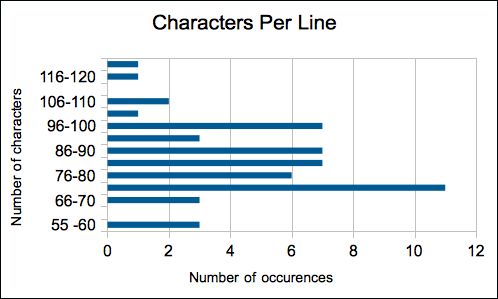
The highest number is, of course, much higher, but in general most designers stay in the range of 75 to 90 characters. In the most extreme cases, SB Nation has 55 characters per line, and Polygon averages 118 for the introductory paragraph. A more exact average could be derived by averaging several lines. But such an in-depth analysis probably would not vary greatly from the average that we calculated here. Still, the discrepancy between the number of characters at different widths is peculiar.
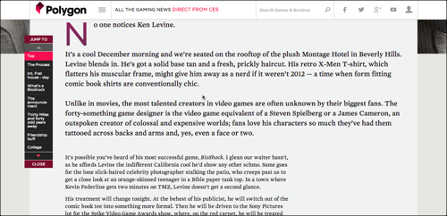
Polygon displays more characters per line in the introductory paragraph than in the rest of the article. However, the font size of that paragraph is larger as well.
Web Typography And Responsive Design
A burning issue we wanted to explore was the impact of of responsive design in Web typography today. The results were surprising: 22 out of 52 (i.e. 42%) of the websites we analyzed show (minor or major) changes when the browser size changes. Considering that responsive design has been around for two years, that number is quite impressive. We calculated the number of characters per line, the body font size and the headline font size at five browser widths (and experimented with the height as well): 500, 700, 950, 1100 and 1600 pixels. The font sizes for those three metrics do not differ greatly across the screen sizes — except at the 500-pixel view.
Unexpected, though, were the visual changes that occurred as we resized the browser. Changes in layout, image scaling, content and font size were evident to varying degrees on 22 websites. The changes are as minimal as images being scaled down to suit the display width. In some cases, however, the websites display other minor and expected changes. At the 500-pixel view, for example, the menu is often replaced by an icon; design components are moved from a multi-column layout to a single column; and both images and fonts are scaled.
No sign of responsive design was evident on 30 websites, including major publications such as The Financial Times and The Economist. At least some, if not all, of these websites seem to opt for a separate mobile website or application. The Financial Times immediately invites mobile visitors to use its FT app. At the moment, large online publications seem to prefer to invest in an app than in responsive design. If this trend continues, then the question becomes, how much will users be annoyed by being prompted to download an app for every single publication they’re interested in.
Despite this, we were happy to find that the layouts of the large majority of websites do not break when being zoomed in.
Some Numbers On The Implementation Of Responsive Design
42% of websites implement responsive design changes, including for layout, image scale, content and font size.
At a display width of 500 pixels:
- Average line height: 28 pixels
- Average font size of body: 15 pixels
- Average number of characters per line: 77
At a display width of 700 pixels:
- Average font size of headlines: 36 pixels
- Average font size of body: 15.6 pixels
- Average number of characters per line: 82.7
At a display width of 950 pixels:
- Average font size of headlines: 37.9 pixels
- Average font size of body: 16.1 pixels
- Average number of characters per line: 84.8
At a display width of 1600 pixels:
- Average font size of headlines: 40.7 pixels
- Average font size of body: 16.2 pixels
- Average number of characters per line: 86.8
These averages might be somewhat skewed because of the mixture of responsive and non-responsive websites. But they show how little the body font size and characters per line change over varying widths. The only exception is the 500-pixel width, which have a lower number of characters per line.
Performance Considerations
While embedded fonts are slowly becoming a de facto standard in Web design, they also introduce overhead in performance because, well, they have to be loaded. Chris Coyier recently discussed the idea of loading Web fonts only on large screens to avoid the performance hit. You could also load Web fonts into AppCache or LocalStorage first and show them on subsequent page loads.
Moreover, you could use Google’s WebFont Loader to ensure that the content is displayed in fallback fonts even before the Web fonts have loaded, and then switch to the Web fonts once they have completely loaded (this is what we’re implementing in this very moment).
Our study shows that Web fonts are indeed a heavy bottleneck in performance, with 5.7 font files being loaded on average, totalling an average of 133.5 KB of extra bandwidth. In cases such as a page being loaded on a slow mobile connection, the user would initially see no text other than the underlining of links (apparently due to the use of the border-bottom property). Only once the fonts have loaded would the text be visible — and even then, elements would appear one by one (headings, then subheadings, then body copy). We can avoid this suboptimal experience by properly adjusting the CSS font stack, as Richard Rutter explains in his talk “Responsive Web Fonts”.
Other Findings
- 45% of websites underline the links in body copy. The others do so only on hover or not at all.
- 71% of websites highlight links with color. The rest do not or only on hover.
- 99% of websites left-align text.
- No website uses hyphenation.
- 84% of websites use the same fonts in the print and standard style sheets.
- The loading weight of home pages averages around 1.346 MB. Article pages are marginally less, at around 1.146 MB.
- The websites average 119 HTTP requests!
Conclusion
This study has revealed a set of common practices in Web typography. These results should not be interpreted as law. They should not be interpreted as “best” practices; rather, just as rough guidelines that we encountered in current Web design.
For example, the performance hit introduced by Web fonts and the (huge) number of HTTP requests should be reduced as far as it’s possible, while the content-out approach in responsive design would dictate how the font size would need to adjust depending on the settings in which it’s used. These findings are no doubt just a snapshot of current trends and may very well be outdated in a year’s time.
- Serif fonts are more popular than sans-serifs for both headlines and body copy. There is, however, a trend to mix sans-serifs and serifs to contrasting effect.
- The most common fonts for headlines are Georgia, Arial and Chaparral Pro. But the majority of websites are individualized and use less common fonts.
- The most common fonts for body copy are Georgia, Arial and Helvetica. But, again, the majority of websites are individualized and use less common fonts.
- The most popular font size for headlines is between 29 and 32 pixels.
- The most popular font size for body copy is between 14 and 16 pixels.
- headline font size ÷ body copy font size = 2.4
- line height (pixels) ÷ body copy font size (pixels) = 1.47
- line length (pixels) ÷ line height (pixels) = 24.8
- space between paragraphs (pixels) ÷ line height (pixels) = 1.43
- The optimal number of characters per line is between 55 and 75, but 75 to 90 is more popular.
- Body text is left-aligned. Hyphenation is not used at line endings. And links are underlined and/or highlighted with bold or color, sometimes only on hover.
- Mobile devices are mostly adapted to via responsive design, although some publications opt for a dedicated app.
The decision of whether to modify any typographic element always lies with the designer. Most of the results shown in these websites are likely the outcome of much trial and error. When designing a new website, you might want to stay close to these parameters, but with adjustments to suit your layout. Feel free to review the study’s spreadsheet for the raw data.
As we mentioned at the beginning, the second article in this series will deal with the intricacies of eBook readers and mobile apps. We don’t necessarily expect very different results. However, apps do offer more interactivity to the user. It will be interesting to see how much developers take advantage of the range of possibilities in mobile apps. Because there is not yet an inordinate number of readers on the market, we’ll accumulate data on as many readers as possible.
More Studies On Smashing Magazine?
Interested in more studies? Let us know what you’re interested in, and we’ll see what we can do!
What kind of studies would you like to see on Smashing Magazine?
Further Reading
- How To Choose The Right Face For A Beautiful Body
- How To Choose A Typeface — A Step-By-Step Guide!
- 16 Pixels: For Body Copy. Anything Less Is A Costly Mistake
- Best Practices of Combining Typefaces
 (al, mrn)

