Facing The Challenge: Building A Responsive Web Application

Email Newsletter
Weekly tips on front-end & UX.
Trusted by 182,000+ folks.


 Celebrating 10 million developers
 Custom Web Forms for Angular, React, & Vue. Your backend.

We are talking and reading a lot about responsive Web design (RWD) these days, but very little attention is given to Web applications. Admittedly, RWD still has to be ironed out. But many of us believe it to be a strong concept, and it is here to stay. So, why don’t we extend this topic to HTML5-powered applications? Because responsive Web applications (RWAs) are both a huge opportunity and a big challenge, I wanted to dive in.
Building a RWA is more feasible than you might think. In this article, we will explore ideas and solutions. In the first part, we will set up some important concepts. We will build on these in the second part to actually develop a RWA, and then explore how scalable and portable this approach is.
Part 1: Becoming Responsible
Some Lessons Learned
It’s not easy to admit, but recently it has become more and more apparent that we don’t know many things about users of our websites. Varying screen sizes, device features and input mechanisms are pretty much RWD’s reasons for existence.
From the lessons we’ve learned so far, we mustn’t assume too much. For instance, a small screen is not necessarily a touch device. A mobile device could be over 1280 pixels wide. And a desktop could have a slow connection. We just don’t know. And that’s fine. This means we can focus on these things separately without making assumptions: that’s what responsiveness is all about.
Progressive Enhancement
The “JavaScript-enabled” debate is so ’90s. We need to optimize for accessibility and indexability (i.e. SEO) anyway. Claiming that JavaScript is required for Web apps and, thus, that there is no real need to pre-render HTML is fair (because SEO is usually not or less important for apps). But because we are going responsive, we will inherently pay a lot attention to mobile and, thus, to performance as well. This is why we are betting heavily on progressive enhancement.
Responsive Web Design
RWD has mostly to do with not knowing the screen’s width. We have multiple tools to work with, such as media queries, relative units and responsive images. No matter how wonderful RWD is conceptually, some technical issues still need to be solved.

Not many big websites have gone truly responsive since The Boston Globe. (Image credits: Antoine Lefeuvre)
Client-Side Solutions
In the end, RWD is mostly about client-side solutions. Assuming that the server basically sends the same initial document and resources (images, CSS and JavaScript) to every device, any responsive measures will be taken on the client, such as:
- applying specific styles through media queries;
- using (i.e. polyfilling)
<picture>or@srcsetto get responsive images; - loading additional content.
Some of the issues surrounding RWD today are the following:
- Responsive images haven’t been standardized.
- Devices still load the CSS behind media queries that they never use.
- We lack (browser-supported) responsive layout systems (think flexbox, grid, regions, template).
- We lack element queries.
Server-Side Solutions: Responsive Content
Imagine that these challenges (such as images not being responsive and CSS loading unnecessarily) were solved on all devices and in all browsers, and that we didn’t have to resort to hacks or polyfills in the client. This would transfer some of the load from the client to the server (for instance, the CMS would have more control over responsive images).
But we would still face the issue of responsive content. Although many believe that the constraints of mobile help us to focus, to write better content and to build better designs, sometimes it’s simply not enough. This is where server-side solutions such as RESS and HTTP Client Hints come in. Basically, by knowing the device’s constraints and features up front, we can serve a different and optimized template to it.
Assuming we want to COPE, DRY and KISS and stuff, I think it comes down to where you want to draw the line here: the more important that performance and content tailored to each device is, the more necessary server-side assistance becomes. But we also have to bet on user-agent detection and on content negation. I’d say that this is a big threshold, but your mileage may vary. In any case, I can see content-focused websites getting there sooner than Web apps.
Having said that, I am focusing on RWAs in this article without resorting to server-side solutions.
Responsive Behavior
RWD is clearly about layout and design, but we will also have to focus on responsive behavior. It is what makes applications different from websites. Fluid grids and responsive images are great, but once we start talking about Web applications, we also have to be responsive in loading modules according to screen size or device capability (i.e. pretty much media queries for JavaScript).
For instance, an application might require GPS to be usable. Or it might contain a large interactive table that just doesn’t cut it on a small screen. And we simply can’t set display: none on all of these things, nor can we build everything twice.
We clearly need more.
Part 2: Building RWAs
To quickly recap, our fundamental concepts are:
- progressive enhancement,
- responsive design,
- responsive behavior.
Fully armed, we will now look into a way to build responsive, context-aware applications. We’ll do this by declaratively specifying modules, conditions for loading modules, and extended modules or variants, based on feature detection and media queries. Then, we’ll dig deeper into the mechanics of dependency injection to see how all of this can be implemented.
Declarative Module Injection
We’ll start off by applying the concepts of progressive enhancement and mobile first, and create a common set of HTML, CSS and JavaScript for all devices. Later, we’ll progressively enhance the application based on content, screen size, device features, etc. The foundation is always plain HTML. Consider this fragment:
<div data-module="myModule">
    <p>Pre-rendered content</p>
</div>
Let’s assume we have some logic to query the data-module attribute in our document, to load up the referenced application module (myModule) and then to attach it to that element. Basically, we would be adding behavior that targets a particular fragment in the document.
This is our first step in making a Web application responsive: progressive module injection. Also, note that we could easily attach multiple modules to a single page in this way.
Conditional Module Injection
Sometimes we want to load a module only if a certain condition is met — for instance, when the device has a particular feature, such as touch or GPS:
<div data-module="find/my/dog" data-condition="gps">
    <p>Pre-rendered fallback content if GPS is unavailable.</p>
</div>
This will load the find/my/dog module only if the geolocation API is available.
Note: For the smallest footprint possible, we’ll simply use our own feature detection for now. (Really, we’re just checking for ‘geolocation’ in navigator.) Later, we might need more robust detection and so delegate this task to a tool such as Modernizr or Has.js (and possibly PhoneGap in hybrid mode).
Extended Module Injection
What if we want to load variants of a module based on media queries? Take this syntax:
<div data-module="myModule" data-variant="large">
    <p>Pre-rendered content</p>
</div>
This will load myModule on small screens and myModule/large on large screens.
For brevity, this single attribute contains the condition and the location of the variant (by convention). Programmatically, you could go mobile first and have the latter extend from the former (or separated modules, or even the other way around). This can be decided case by case.
Media Queries
Of course, we couldn’t call this responsive if it wasn’t actually driven by media queries. Consider this CSS:
@media all and (min-width: 45em) {
  body:after {
    content: 'large';
    display: none;
  }
}
Then, from JavaScript this value can be read:
var size = window.getComputedStyle(document.body,':after').getPropertyValue('content');
And this is why we can decide to load the myModule/large module from the last example if size === “large”, and load myModule otherwise. Being able to conditionally not load a module at all is useful, too:
<div data-module="myModule" data-condition="!small">
    <p>Pre-rendered content</p>
</div>
There might be cases for media queries inside module declarations:
<div data-module="myModule" data-matchMedia="min-width: 800px">
    <p>Pre-rendered content</p>
</div>
Here we can use the window.matchMedia() API (a polyfill is available). I normally wouldn’t recommend doing this because it’s not very maintainable. Following breakpoints as set in CSS seems logical (because page layout probably dictates which modules to show or hide anyway). But obviously it depends on the situation. Targeted element queries may also prove useful:
<div data-module="myModule" data-matchMediaElement="(min-width: 600px)"></div>
Please note that the names of the attributes used here represent only an example, a basic implementation. They’re supposed to clarify the idea. In a real-world scenario, it might be wise to, for example, namespace the attributes, to allow for multiple modules and/or conditions, and so on.
Device Orientation
Take special care with device orientation. We don’t want to load a different module when the device is rotated. So, the module itself should be responsive, and the page’s layout might need to accommodate for this.
Connecting The Dots
The concept of responsive behavior allows for a great deal of flexibility in how applications are designed and built. We will now look into where those “modules” come in, how they relate to application structure, and how this module injection might actually work.
Applications And Modules
We can think of a client-side application as a group of application modules that are built with low-level modules. As an example, we might have User and Message models and a MessageDetail view to compose an Inbox application module, which is part of an entire email client application. The details of implementation, such as the module format to be used (for example, AMD, CommonJS or the “revealing module” pattern), are not important here. Also, defining things this way doesn’t mean we can’t have a bunch of mini-apps on a single page. On the other hand, I have found this approach to scale well to applications of any size.
A Common Scenario
An approach I see a lot is to put something like <div id="container"> in the HTML, and then load a bunch of JavaScript that uses that element as a hook to append layouts or views. For a single application on a single page, this works fine, but in my experience it doesn’t scale well:
- Application modules are not very reusable because they rely on a particular element to be present.
- When multiple applications or application modules are to be instantiated on a single page, they all need their own particular element, further increasing complexity.
To solve these issues, instead of letting application modules control themselves, what about making them more reusable by providing the element they should attach to? Additionally, we don’t need to know which modules must be loaded up front; we will do that dynamically. Let’s see how things come together using powerful patterns such as Dependency Injection (DI) and Inversion of Control (IOC).
Dependency Injection
You might have wondered how myModule actually gets loaded and instantiated.
Loading the dependency is pretty easy. For instance, take the string from the data-module attribute (myModule), and have a module loader fetch the myModule.js script.
Let’s assume we are using AMD or CommonJS (either of which I highly recommended) and that the module exports something (say, its public API). Let’s also assume that this is some kind of constructor that can be instantiated. We don’t know how to instantiate it because we don’t know exactly what it is up front. Should we instantiate it using new? What arguments should be passed? Is it a native JavaScript constructor function or a Backbone view or something completely different? Can we make sure the module attaches itself to the DOM element that we provide it with?
We have a couple of possible approaches here. A simple one is to always expect the same exported value — such as a Backbone view. It’s simple but might be enough. It would come down to this (using AMD and a Backbone view):
var moduleNode = document.querySelector('[data-module]'),
    moduleName = node.getAttribute('data-module');

require([moduleName], function(MyBackBoneView) {
    new MyBackBoneView({
        el: moduleNode
    });
})
That’s the gist of it. It works fine, but there are even better ways to apply this pattern of dependency injection.
IOC Containers
Let’s take a library such as the excellent wire.js library by cujoJS. An important concept in wire.js is “wire specs,” which essentially are IOC containers. It performs the actual instantiation of the application modules based on a declarative specification. Going this route, the data-module should reference a wire spec (instead of a module) that describes what module to load and how to instantiate it, allowing for practically any type of module. Now, all we need to do is pass the reference to the spec and the viewNode to wire.js. We can simply define this:
wire([specName, { viewNode: moduleNode }]);
Much better. We let wire.js do all of the hard work. Besides, wire has a ton of other features.
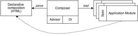
In summary, we can say that our declarative composition in HTML (<div data-module="">) is parsed by the composer, and consults the advisor about whether the module should be loaded (data-condition) and which module to load (data-module or data-variant), so that the dependency injector (DI, wire.js) can load and apply the correct spec and application module:
Detections for screen size and device features that are used to build responsive applications are sometimes implemented deep inside application logic. This responsibility should be laid elsewhere, decoupled more from the particular applications. We are already doing our (responsive) layout composition with HTML and CSS, so responsive applications fit in naturally. You could think of the HTML as an IOC container to compose applications.
You might not like to put (even) more information in the HTML. And honestly, I don’t like it at all. But it’s the price to pay for optimized performance when scaling up. Otherwise, we would have to make another request to find out whether and which module to load, which defeats the purpose.
Wrapping Up
I think the combination of declarative application composition, responsive module loading and module extension opens up a boatload of options. It gives you a lot of freedom to implement application modules the way you want, while supporting a high level of performance, maintainability and software design.
Performance And Build
Sometimes RWD actually decreases the performance of a website when implemented superficially (such as by simply adding some media queries or extra JavaScript). But for RWA, performance is actually what drives the responsive injection of modules or variants of modules. In the spirit of mobile first, load only what is required (and enhance from there).
Looking at the build process to minify and optimize applications, we can see that the challenge lies in finding the right approach to optimize either for a single application or for reusable application modules across multiple pages or contexts. In the former case, concatenating all resources into a single JavaScript file is probably best. In the latter case, concatenating resources into a separate shared core file and then packaging application modules into separate files is a sound approach.
A Scalable Approach
Responsive behavior and complete RWAs are powerful in a lot of scenarios, and they can be implemented using various patterns. We have only scratched the surface. But technically and conceptually, the approach is highly scalable. Let’s look at some example scenarios and patterns:
- Sprinkle bits of behavior onto static content websites.
- Serve widgets in a portal-like environment (think a dashboard, iGoogle or Netvibes). Load a single widget on a small screen, and enable more as screen resolution allows.
- Compose context-aware applications in HTML using reusable and responsive application modules.
In general, the point is to maximize portability and reach by building on proven concepts to run applications on multiple platforms and environments.
Future-Proof And Portable
Some of the major advantages of building applications in HTML5 is that they’re future-proof and portable. Write HTML5 today and your efforts won’t be obsolete tomorrow. The list of platforms and environments where HTML5-powered applications run keeps growing rapidly:
- As regular Web applications in browsers;
- As hybrid applications on mobile platforms, powered by Apache Cordova (see note below):
- iOS,
- Android,
- Windows Phone,
- BlackBerry;
- As Open Web Apps (OWA), currently only in Firefox OS;
- As desktop applications (such as those packaged by the Sencha Desktop Packager):
- Windows,
- OS X,
- Linux.
Note: Tools such as Adobe PhoneGap Build, IBM Worklight and Telerik’s Icenium all use Apache Cordova APIs to access native device functionality.
Demo
You might want to dive into some code or see things in action. That’s why I created a responsive Web apps repository on GitHub, which also serves as a working demo.
Conclusion
Honestly, not many big websites (let alone true Web applications) have gone truly responsive since The Boston Globe. However, looking at deciding factors such as cost, distribution, reach, portability and auto-updating, RWAs are both a huge opportunity and a big challenge. It’s only a matter of time before they become much more mainstream.
We are still looking for ways to get there, and we’ve covered just one approach to building RWAs here. In any case, declarative composition for responsive applications is quite powerful and could serve as a solid starting point.
Further Reading
- A Beginner’s Guide To Progressive Web Apps
- Creating A Complete Web App In Foundation For Apps
- Frizz-Free JavaScript With ConditionerJS
- A Responsive Material Design App With Polymer Starter Kit
 (al, ea, mrn)

