When Editors Design – Controlling Presentation In Structured Content

Email Newsletter
Weekly tips on front-end & UX.
Trusted by 182,000+ folks.


 Custom Web Forms for Angular, React, & Vue. Your backend.
 Celebrating 10 million developers
Thanks to the skyrocketing popularity of mobile devices, a new generation of designers and CMS developers has found the religion of Structured Content. Once the domain of semantic markup purists and information architects, structured content models are at the heart of most multi-channel and multi-device Web projects.

At Lullabot, we often work with media, publishing and enterprise clients. Those businesses produce so much content and manage so many publishing channels that keeping presentation and design-specific markup out of their content is an absolute requirement. Unfortunately, this doesn’t mean that editors and writers are content with rigid, predictable designs for the material they publish.
This challenging requirement — providing editors and writers with more control over the presentation of their content — is where many well-intentioned content models break down. In this article, I’ll share five techniques we’ve used on recent projects to solve these problems. These approaches work particularly well in Drupal but can be used any time that editors need more control over design.
The Easy (But Problematic) Answers
Sadly, a common response in projects on a deadline is to give up on well-structured, reusable content. If the editors want control, let them jam HTML blobs into their stories — they can sort out the details!
To avoid that chaos, some teams go to the opposite extreme. They pile dozens of custom fields onto each content type to capture every possible presentation option, or they give editors a menu of carefully tailored visual templates to choose from for each post. For indexes and landing pages, these teams often build visual layout tools to manage the position and visual style of each post, duplicating familiar page-layout mechanisms.
Both of these extremes can make cross-channel reuse more difficult because they all treat design-dependent information as an integral part of the content. In addition, they often confuse content creators with monstrously complicated input forms, and they force writers and editors to play the role of visual designers. This last point is a big one for fast-moving news organizations: Every minute an editor spends managing presentational tweaks is one they can’t spend on critical stories.
Principles That Work
Working with our clients and talking to other experts, we’ve identified a handful of useful tactics that will take the edge off these problems. They won’t solve every problem, but they address these issues without crippling editorial control or compromising our structured-content ideals.
Use Grouping And Priority, Not Manual Layout
When we started talking to the editorial team at a major news website, we learned that they wanted to control where articles appeared on the home page — and all of the website’s topical landing pages as well. When we dug deeper and presented simple prototypes, however, we discovered that they meant something different. What the editors really needed were ways to prioritize and organize content on the home page. On their old website, direct manipulation of each page’s layout was the only tool they had, and they were afraid to lose it.
Instead of building complex layout tools or tossing them into a tangle of raw HTML, we built three complementary tools: a simple “Priority” field for each article, several sets of issue- and section-related tags to organize content, and a set of reusable queues, such as “Breaking news” and “Front-page slideshow.” This allowed writers and editors to make simple decisions about each article, like setting the priority of a post to “Major news” or assigning it to the “Politics” section. Editors were given permission to manage the special-purposes queues.
The website draws on these different collections in a variety of ways. News tickers can display headlines of breaking stories across the top of every page, the home page can divide news by issue, and topical landing pages can display the most important stories first. On timeline-oriented archive pages, the “Priority” field can be used to emphasize rather than reorder important articles. All of the results are based on simple filtering and sorting rules, and editors are given control of the “levers” that drive those designs, but they never interact directly with the layout.
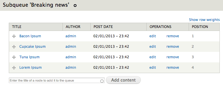
The Nodequeue module for Drupal lets editors control multiple curated lists of content for use on complex landing pages. (Large view)
The advantage of this arm’s-length approach to editorial control is subtle but important. Editorial choices about priority and purpose can carry meaning even when the stories aren’t featured on the home page. Responsive designs can easily translate these collections to vertically stacked layouts, and dedicated mobile apps can push alerts on breaking stories to users. Even when new designs eliminate or add new page regions, the meaningful data in each article will still retain its value.
Capture Emphasis Rather Than Appearance
This same design team wanted to keep the website fresh by providing several templates for each type of article. Naturally, the editors wanted to choose the precise design template used for each post. Giving them a drop-down menu to switch between templates was easy with our preferred CMS, but the list of choices only made sense for the desktop design. Tightly coupling that design choice to each article raised some troubling issues: Content feeds for partners and the client’s own mobile apps would be using completely different visual designs. Would the layout choices made by editors be respected there?
The solution was simpler than we expected. We presented the editors with a simple drop-down list, which, instead of offering a selection of templates, gives them a choice of article elements to prioritize. Stories with a particularly dramatic visual component might receive the “Image” or “Video” emphasis, lightweight stories meant to spark discussion would get the “Community” emphasis, and so on.
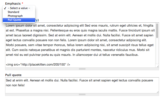
A simple content type that gives editors a choice of fields to emphasize. (Large view)
Why does this distinction matter? First, it becomes much easier to preserve emphasis when the content moves from one publication channel to the next. Custom-tailored HTML can be generated when the story is sent via email; simple CSS rules can be used to vary the article’s appearance in a responsive Web design; and a content syndication API passes along the emphasis information without assumption. In addition, emphasis will evolve more gracefully than explicit layout decisions. As the primary website’s appearance changes (and visual templates come and go), designers can decide how to best communicate the emphasis that the editors have chosen.
Use Embedding Codes To Complement Chunky Fields
Life gets pretty complicated when videos, slideshows, dynamic widgets and other complex media are used in a piece of content. If the precise position of these embedded elements isn’t important, then we use custom fields to indicate the fact that they’re related to the article, and let design templates handle the rest. Editors enter the key information that’s needed (the URL of a YouTube video and the desired size, for example, or the unique ID of a related piece of content). Then, theming and templating functions control how the custom fields are displayed.
In a recent corporate intranet project, however, that relationship approach wasn’t enough. The company’s HR team needed to embed rich media and widgets, such as insurance calculators, into policy documents for their employees. These embedded elements were part of the narrative flow of the articles and couldn’t simply be listed as “Related resources.”
Rather than throwing up our hands and letting them paste chunks of raw HTML, we used custom placeholder tags, like [slideshow:2], inside the body copy. When the content is displayed, output filters replace those placeholders with the rich content. Content editors never have to deal with the complexities of iframe-based embedding codes or third-party JavaScript snippets, and changes to the design or CMS platform become much easier. When those complex widgets inevitably change, the placeholders in each article remain the same; only the centralized code for replacing them needs to be updated.
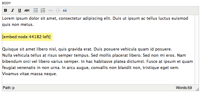
Shortcodes and placeholders can be used to embed rich media without manual markup. (Large view)
In WordPress, this style of placeholder replacement can be implemented using custom shortcodes. Smashing Magazine covered this approach last year, and the Post Snippets plugin allows you to set them up without writing custom code. In Drupal, a number of modules, including Token Insert Entity and Custom Tokens, do the same thing.
Put The WYSIWYG Editor On A Diet
WYSIWYG editors are popular, with good reason. They simplify editing, prevent most simple HTML errors and give authors a quick idea of how text will look when published. In a world of multi-channel publishing and complex designs, though, WYSIWYG editors carry significant drawbacks. They work fine for simple markup, such as emphasis, block quotes and bullet lists, and they help with attribute-rich elements such as images. However, they often add complexity when editors have to input specific structured HTML to match a website’s design.
On the corporate intranet mentioned earlier, content editors faced this problem in a big way. Common article elements such as call-out warnings and captioned images were too complex for the WYSIWYG editor’s built-in array of buttons and styles. Conscientious editors tried to duplicate the precise markup used by the website’s CSS but often made errors. Others gave up and tried to duplicate the appearance of those styles with the WYSIWYG editor’s table, font-color and image-embedding tools.
The underlying problem is simple: Most WYSIWYG tools are configured as training wheels for HTML. What most content editors really need are shortcuts for the semantic markup patterns that are specific to their websites. Rather than activating editor buttons for every HTML tag, we stripped the list of built-in features down to a bare minimum: links, lists, emphasis tags, heading tags and similarly unambiguous markup elements. Then, we identified common patterns in the website’s HTML and turned them into custom plugins for the WYSIWYG editor.
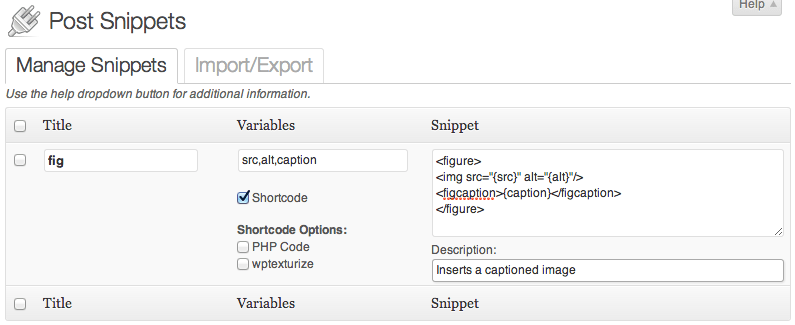
The Post Snippets plugin for WordPress simplifies complex markup, such as for captioned figures. (Large view)
One simple example is a button that inserts an attributed quotation, complete with the author’s name and a link to the article it appears in. The initial version inserted the markup with placeholder text for writers to change themselves. Subsequent refinements added a popup editing window with fill-in-the-blank fields for the quote, attribution and link. Capturing that design element in a single-click button made it simpler for content authors, and it ensured that the same semantic structure was used across the website.
The best news is that standard WYSIWYG editors for most CMSes are extremely customizable. With a few lines of PHP, administrators can strip unwanted options from WordPress’ WYSIWYG editor; define new buttons that insert custom markup structure; and add style options that apply website-specific CSS rules for editors. Drupal’s popular WYSIWYG API module offers similar flexibility: Options may be removed, new buttons and drop-downs added, and house styles applied without throwing content authors into the deep end of HTML.
Don’t Sweat The Oddball Pages
After all this talk about avoiding raw HTML markup, it’s easy to believe that everything on the website would be carefully planned, modeled and templated. Sadly, almost every website has a number of exceptions that refuse to fit the platonic ideal of structured content. Infrequently updated edge cases — such as terms of service, frequently asked questions and temporary landing pages for marketing campaigns — all tend to break the mold.
One of our client’s websites had several dozen pages like that. We’d used many of the techniques above to streamline their blog posts, news articles, celebrity biographies and photo galleries to good effect. Still, a frustrating mix of exceptions remained on the table. Creating dedicated content types to model the structure of each special case felt like a poor investment: Those pages were seldom reused, and once created, they rarely changed.
Rather than twist the more common content types to fit those uncommon (and often unpredictable) needs, we carved out a compromise: the generic “Blob” content type. It offers a simple title and a classic HTML blob field. Editors and marketing team members could insert arbitrary markup, even attaching custom CSS and JavaScript if necessary.
Isolating these uncommon but inevitable blobs protects your long-lived content assets from messy hacks. Ensuring that everything doesn’t eventually become a special case is also important. In the organization above, only a small number of users were given access to the “Blob” content type. A senior editor also kept a close watch to ensure that any common patterns eventually became dedicated, cleanly modeled content types.
Putting The Pieces Together
Taken together, the following set of techniques has served us well in a number of large thorny projects:
- Allow editors to decide about prioritization and emphasis, rather than about explicit visual styling and positioning. This makes cross-channel reuse much easier and allows a website or app’s design system to do its job.
- Complement structured fields with embedding tags when rich content is part of an article’s narrative flow. This enables editors to reuse content more efficiently across the website and to avoid ugly HTML blobs in body text.
- Pare down the HTML features of the WYSIWYG editor. Configure the editor and leverage CMS add-ons to give content creators shortcuts to the website’s commonly used markup patterns.
- Finally, use a dedicated “grab bag” content type when oddball pages need special handling. This will keep the core content types clean and structured, while still accounting for one-off blobs of markup.
Obviously, these approaches won’t solve all of the crazy collisions between structured content and editorial design tweaks. Each website brings unique challenges, and the needs of each content team ensure that we’ll never run out of new requirements. They’re a strong starting point and can quickly be implemented in most modern CMSes. If you have any war stories or useful solutions to similar problems, speak up!
Source of image on front page: opensourceway
Further Reading
- The Role Of Design In The Kingdom Of Content
- Content Strategy: Optimizing Your Efforts For Success
- Content: A Blessing, A Bubble, A Burden
- Design Mock-Ups Need Dynamic Content
 (al, ea, mrn)

