A Common Misconception About Designing With Data

Email Newsletter
Weekly tips on front-end & UX.
Trusted by 182,000+ folks.
 Register for Free

 Custom Web Forms for Angular, React, & Vue. Your backend.
 Celebrating 10 million developers
Too often when working in information design, you’ll hear the request, “Can you make the data look cool?” “Cool” is a rather ambiguous term, and means different things to different people. Unfortunately, when working with data, the term “cool” is often directly juxtaposed with common charts like line, bar and pie, which are often relegated to the backbench, and written off as “boring.”
The emphasis on the instant visual appeal of an infographic over the clarity of the presentation of data is a troubling trend that plagues the modern incarnation of the infographic.
Data Visualization And The “Cool” Factor
"The important criterion for a graph is not simply how fast we can see a result; rather it is whether through the use of the graph we can see something that would have been harder to see otherwise or that could not have been seen at all." – William Cleveland, Web Application Design Handbook
When presenting data visually, our main aim should be to look for ways to effectively communicate the stories hidden in the depths of the spreadsheet. Data visualization grants a means for discovery. It frees the data from the confines of its tabulated raw format and provides a way for the viewer to see trends, gather insights and understand complex stories without the need for words.
However, the average infographic that you’ll likely come across online today focuses more on the overall aesthetic of the piece, the “cool” factor, than on the data itself. “Info-posters” that are heavily illustrated and have a low information-to-pixel density currently dominate the infographic landscape, many of which dumb down data and spoon-feed the audience a choice set of factoids for easy digestion of the chosen topic.
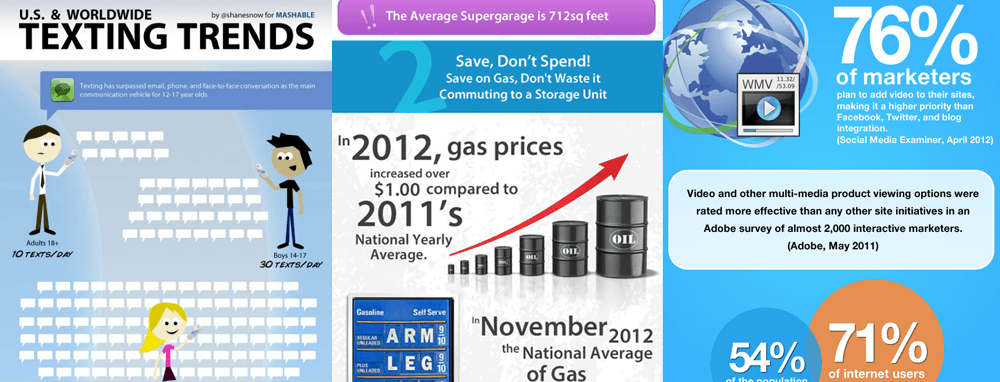
In an effort to make the data appear more interesting, some infographics use design elements to distract the viewer. Large view.
In striving to achieve coolness, the examples above forgo the integrity of the data and, hence, the main function of the infographic. The design, rather than clarifying the data, actually distracts the audience from the information presented, encouraging them to engage with the visual elements rather than with the data itself.
Data Vs. Design?
Now, that’s not to say that being informative and beautiful are mutually exclusive. There are many wonderful examples of data being presented in an efficient, effective and visually stunning way. But the beauty of most of them lies in their simplicity.
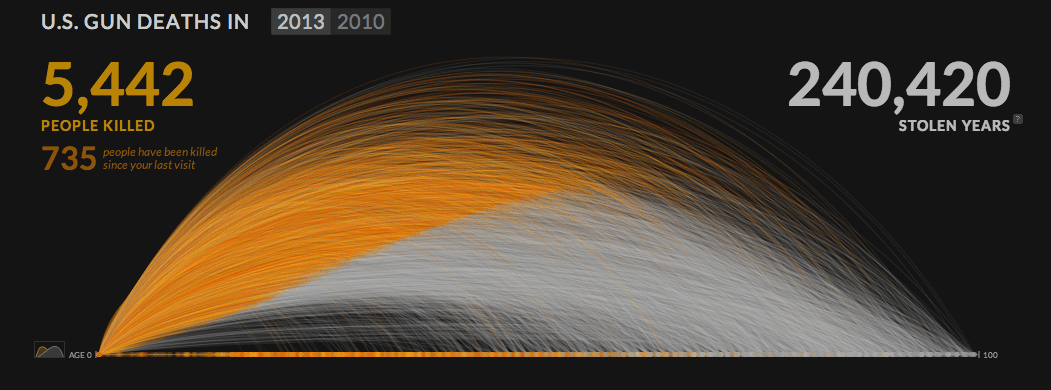
“US Gun Deaths” by Periscopic. Large view.
The most effective infographics and visualizations present data as clearly and concisely as possible, free from most distractions and embellishments — the emphasis being not on making the data look cool, but on ensuring that the data’s story is clearly communicated.
Decisions made during the design process will either help or hinder the viewer’s comprehension of the subject matter. So, although it is often said that the type of data will determine the type of visualization, design choices involving color, shape, layout and typography are also extremely important and will affect the ease with which the information can be understood. For example, color can highlight key insights, size can demonstrate change, and proximity can imply correlation.
A common misconception is that the audience will be interested in your data only if it looks exciting and is broken down into bite-sized chunks. In reality, you don’t need to dress up the data to make it more interesting. The information in the graphic, or the story you’re revealing, will ultimately determine the appeal of the piece, not the fancy illustrations. As Brian Suda puts it in his book Designing With Data, “Graphic design is not a panacea for bad copy, poor layout or misleading statistics”.
Bar Charts Are Your Friend, Not Your Enemy
When the focus is on communicating data effectively, common chart types should not be dismissed as boring alternatives, and you certainly shouldn’t be afraid to use them when telling stories with data.
News organizations such as The New York Times and The Guardian rely heavily on these common chart types, because simplicity and efficiency will often trump novelty in conveying complex information to a wide audience.
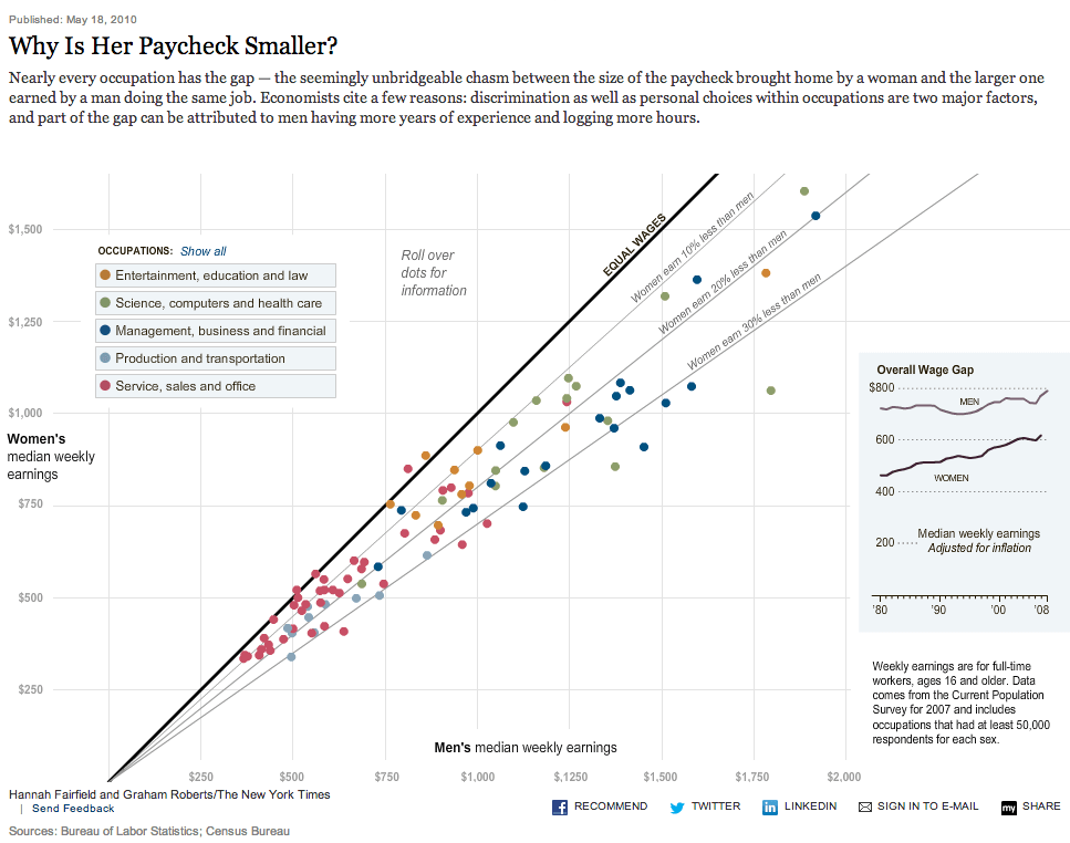
“Why Is Her Paycheck Smaller?” by The New York Times. Large view.
Charts such as line, bar and pie have been in constant use since the 18th century for good reason. How information is displayed and organized in these charts appeals directly to the intrinsic way in which humans perceive things. According to the Gestalt laws of perception, the human brain automatically organizes and groups the things it sees by proximity, similarity, continuity and symmetry.
Designing with data in a way that supports these relationships (for example, by using color to show similarity, or by using a connecting line to imply continuity) makes it easier for viewers to understand what the data is showing and to draw certain conclusions that would be a lot harder to come to had the data been merely displayed in tabular format.
According to Andy Kirk in his book Data Visualization: A Successful Design Process, by presenting data in a visually effective way, you “move from just looking at the data, to actually seeing it.”
In Practice
The following “infographic” was probably the unfortunate result of a designer being asked to make the data look cool — a predicament I can certainly sympathize with, having been given the exact same creative direction in a number of projects. On more than one occasion, I have been explicitly asked not to use bar or line charts and been told that I simply needed to “jazz up the data,” much to my concern.
The presentation of the information below certainly is unique, and effort has been exerted to make the information look interesting. The graphic fails, however, in actually conveying information.
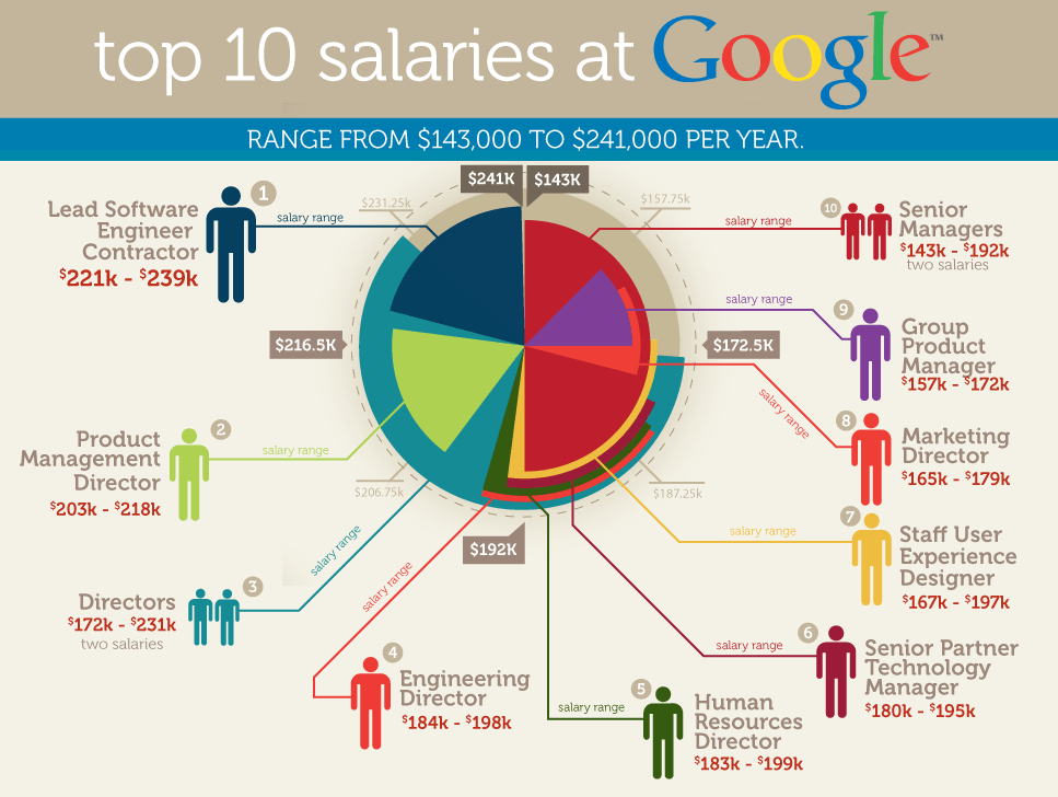
“Top 10 Salaries at Google”: Making the data appear more interesting does not necessarily make it any easier to understand. Large view.
This graphic’s primary purpose should have been to present the data in a format that is easier to read than a table.
In this instance, however, the table functions more efficiently than the graphic as a way to explore the data. If the salary range for each job was not present in the graphic, it would be nigh impossible to read. The pie-chart format adopted here actually obscures the data, rather than makes it accessible. Additionally, the colors are somewhat confusing; the radius of the pie slices are meaningless; and the number and size of the people figures don’t seem to correspond to anything.
(Update:The number of people figures in fact relate to whether that role involves two salaries. The double-salary category is in itself problematic, as it’s not completely clear whether those salary ranges relate to one salary or the sum of both salaries for that role. Additionally, the usage of multiple people figures to illustrate the double-salary point is also misleading. At first glance, this particular use of iconography could imply the number of people associated with that role, rather than its intended use of demonstrating number of salaries per role. Perhaps a different icon to represent salary is needed in this instance.)
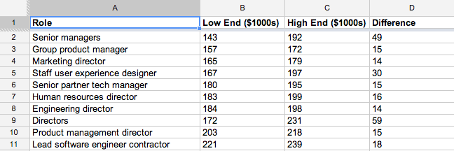
So, how could this be better visualized? Focusing first and foremost on the clarity of the data, I’ve explored just two possible ways in which this small data set could have been presented. I’m sure there are many, many more.
One possible alternative to the infographic above. Large view.
This first option gives the viewer a much clearer representation of the data. With the linear organization, the viewer can understand at a glance what the data is showing, without having to work too hard. In stark contrast to the original, this graph makes the data instantly accessible, allowing for easy comparison between the jobs.
The first complaint I would likely hear is that the graph has an abundance of empty space. This space, however, actually tells a big part of the story. On the one hand, we’re presenting a comparison of 10 jobs; on the other, we also want to highlight that these salaries are actually very high, and the white space reinforces that.
Alternatively, the data could be presented as a slope graph:
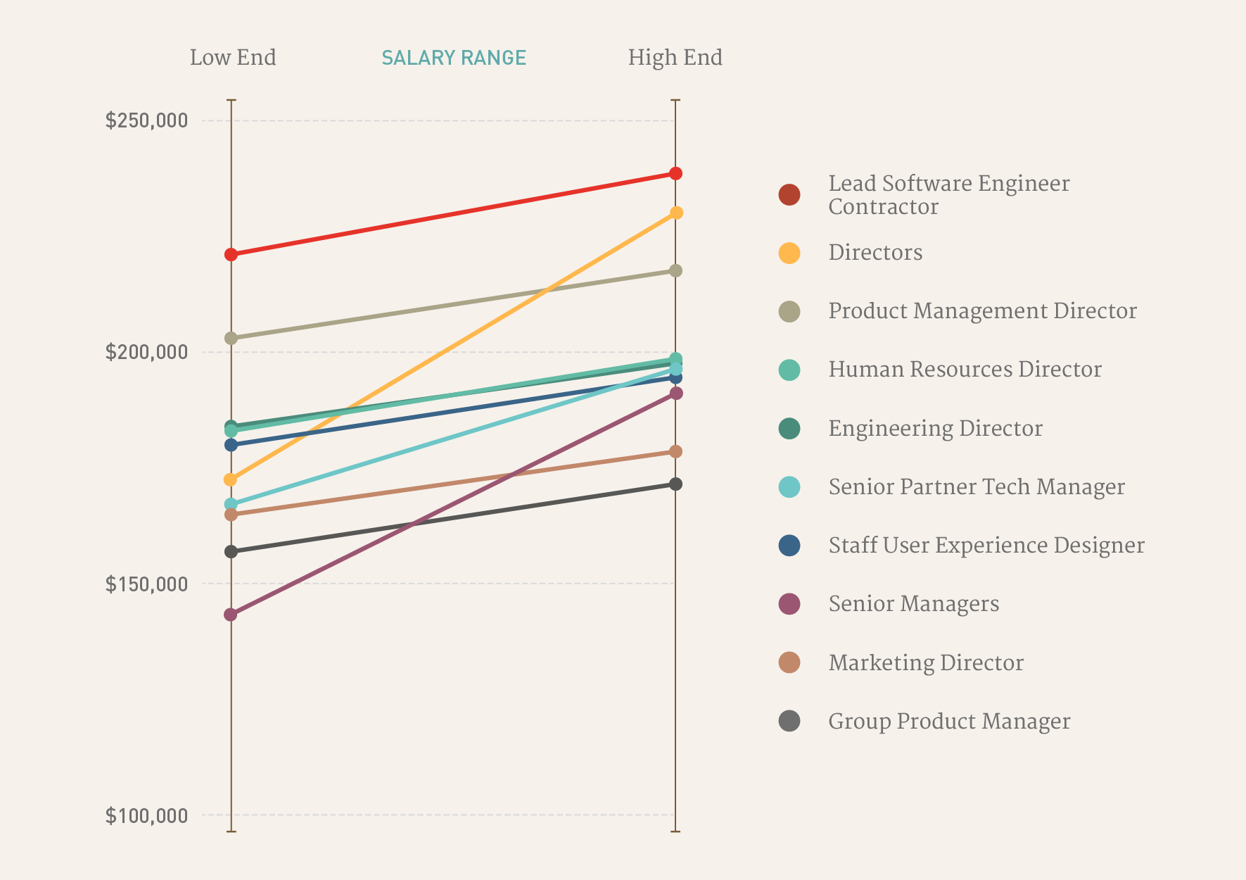
Any one data set can be presented in a number of ways. Large view.
Here, we’ve zoomed into a portion of the graph. On the left side, markers pinpoint the low end of the salary range; on the right, markers pinpoint the high end. This version more clearly highlights those jobs with the widest ranges in salary, and it shows us that different presentation methods can tell slightly different stories.
These two examples may not have the visual pizazz of the original, but unlike the original, the data and the story are easily accessible to the viewer and not hindered by the motivation to look cool.
The request to simply make data look interesting is all too common in information design, and it might seem innocent at first. But if you forgo the integrity of the data to achieve this goal, then you run the risk of turning your infographic into merely a graphic with information, and that’s a big difference.
All that glitters is not necessarily gold.
Further Reading
- The Do’s And Don’ts Of Infographic Design
- Diverse And Engaging Instances Of Interactive Infographic Design
- Fun With Physics In Data Visualization
- A Guide To Getting Data Visualization Right


