Simple Responsive Images With CSS Background Images

Email Newsletter
Weekly tips on front-end & UX.
Trusted by 182,000+ folks.

 Custom Web Forms for Angular, React, & Vue. Your backend.


 Celebrating 10 million developers
Editor’s Note: This article features just one of the many, suboptimal solutions for responsive images. We suggest that you review different approaches before choosing a particular responsive image solution, including these two: How To Avoid Duplicate Downloads In Responsive Images and Choosing A Responsive Image Solution.
With all the talk of new HTML5 standards such as the srcset attribute and <picture> element, as well as server-side techniques such as Responsive Web Design + Server Side Components (RESS), you’d be forgiven for concluding that simple, static websites can’t support responsive images today. That conclusion might be premature, however. In fact, there’s an easy, straightforward way to deliver responsive images that’s supported by all of today’s Web browsers: A CSS background image.
However, the approach has some limitations, and it doesn’t work in all cases. But if your requirements aren’t complicated, and if you’re willing to make an extra effort to ensure your images are accessible, CSS background images may be all you need.
In this article we’ll look at the CSS background approach in several steps:
- First, we’ll review the goals and requirements for responsive images.
- Then we’ll see how CSS media queries can help identify important characteristics of our users’ devices.
- We’ll explore the key CSS
background-imageproperty that lets us respond to those characteristics. - We’ll look at a strategy for optimizing the individual images that make up a responsive set.
- We’ll examine the limitations of this approach; in many cases there are simple techniques to overcome them.
- And finally, we’ll describe the problems with this approach for which there are no workarounds.
Note: This approach requires explicit control of your website’s style sheets as well as its HTML markup. If your website relies on a content management system (CMS), you might not have enough control over those aspects of the website.
The Need For A Responsive Background Image
Responsive images are an important component of responsive Web design (RWD), a design strategy developed by Ethan Marcotte to cope with the amazing popularity of mobile devices for viewing the Web. Ethan recognized that the previous best practice — developing separate websites for different types of devices — simply couldn’t cope with the astonishing variety of devices Web users might employ to access the websites we build.
RWD takes a completely different approach: create a single website but let that website recognize and respond to its context. If the user has a desktop browser with a wide screen, for example, allow the website content to spread across multiple columns. On a smartphone, however, rearrange the content to confine it to a single column.
In many cases, that’s where responsive design stops — simple adjustments to layout and presentation. If that’s all we consider, however, we’re not honoring the goal of responsive design, and we’re selling our users short.
Truly responding to users’ context requires a design that considers all aspects of the experience, and that often includes images. For a real life example, consider a website such as contfont.net. That single page website has one main image and a typical set of HTML, style sheets, fonts, and JavaScript files.
| Resource | Type | Compressed Size |
| Main page | HTML | 6 KB |
| Style sheet | CSS | 10 KB |
| Fonts | Web Font | 221 KB |
| Scripts | JavaScript | 21 KB |
| Supporting images | Image | 48 KB |
| Main site image | Image | ?? |
The website looks gorgeous on computers with super–high-resolution displays because it includes a high-resolution version of the main image. Delivering that image file doesn’t come cheap, though; its 1940 × 1229 pixels make the image 446 KB in size after compression.
The website could use that same image file for all users without compromising the visual experience. Web browsers on smaller devices such as smartphones would resize it to fit the display. While that approach would preserve the visual appeal of the website, the overall user experience would suffer significantly.
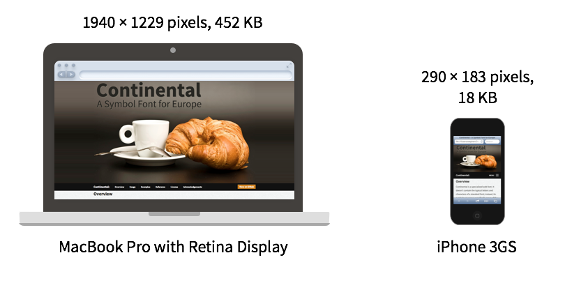
On an iPhone, a 290 × 183 pixel image that is 18 KB in size looks identical to the 452 KB, 1940 × 1229 pixel image on the MacBook Pro. Larger view.
What does that mean for a user browsing to the website on, say, an earlier generation smartphone? For that user, a 290 × 183 pixel image that is 18 KB in size looks identical to the larger version. Without a responsive image approach, the website would force the user to download an extra 429 KB of data that is completely wasted. This excess is not just academic; it has a substantial effect on the website’s load time. The smartphone user may be accessing the website over a typical 3G connection at 2 Mb/s. Failing to deliver a responsive image increases the load time from 1.3 seconds to 3 full seconds, significantly more than doubling it!

The full size image takes 3.0 seconds to load over a 3G network, compared to 1.3 seconds for a responsive image. Larger view.
The primary goal for a responsive image approach is simple: deliver only the pixels that the user’s device can actually use.
Identifying The User’s Context
If our websites are going to respond to our users’ context, we need a way to identify that context. Today, CSS offers the most effective way to distinguish different devices. CSS gives us the answers to two critical questions: what is the size of the user’s display? And does the display support Retina-style images?
The CSS tool that gives us this information is a media query. Media queries define a set of CSS style properties that apply only to devices with specific qualities. Originally, media queries were limited to media types. The CSS specification defines a large number of them including, for example braille (for braille tactile feedback devices), speech (for speech synthesizers), tty (for devices with only monospaced fonts, such as teletypes) and tv (for television-type devices with low resolution and no scrolling). Currently, the only two media types that most browsers support are print (for printed, paged material) and screen (for computer screens).
CSS3 expanded the use of media queries, however, by allowing style sheets to specify specific features of devices as well as the media type. And in the case of screen devices, the features can include many characteristics of the display, including its width, orientation, resolution and pixel ratio. Those features provide just the information we need to select an appropriate responsive image.
Here’s how media queries can help us solve the dilemma of the previous section. As an example, a 15-inch MacBook Pro has a screen width of 1440 pixels (ignoring for the moment the Retina display option). To identify styles that apply to screens of this size (and larger), we can write our style sheet as:
@media only screen and (min-width: 1440px) {
    /* styles for MacBook Pro-sized screens and larger */
}
Any styles defined in that block will only apply when the user accesses the Web page using a device with a screen size of 1440 pixels. There’s a catch, though. The media screen size doesn’t apply to the device’s hardware; rather, it applies to the Web browser’s viewport. The viewport is the size of the browser window after subtracting any browser chrome, such as toolbars.
Unless the user is browsing in full screen mode, the browser window will actually be somewhat less than 1440 pixels in width. For this more common case, therefore, we might want to rewrite the style sheet a bit. Perhaps 1200 pixels is more realistic.
@media only screen and (min-width: 1200px) {
    /* styles for wide screens */
}
The media query has two parts. The first part, only screen, indicates that the styles shouldn’t apply to printed copies of the page or other non-standard devices. (The only keyword doesn’t actually affect the media query; it’s there strictly for really old browsers that don’t support media features. Because those browsers don’t understand the only syntax, they’ll simply ignore the entire block of styles.) The second part of the query, min-width: 1200px, gives the minimum screen width at which the styles will be applied. The and that joins those parts means that both must be true for the styles to apply.
We can use a similar technique to define styles for portrait-mode smartphones.
@media only screen and (max-width: 320px) {
    /* styles for narrow screens */
}
In this case we can go ahead and use the actual device screen size in the query. Web browsers on smart phones are always full-screen width.
The min-width and max-width feature specifications make it easy to determine the width of the user’s device. Unfortunately, identifying a Retina display isn’t quite as straightforward. Different browsers use different syntaxes for this feature, so we must resort to vendor prefixes. To make things slightly worse, many versions of Firefox had a bug in their syntax, so we need to use both a fixed and a “broken” syntax for Mozilla browsers. As of now, the recommended query for Retina-quality displays looks like the following.
@media
only screen and (-webkit-min-device-pixel-ratio: 2),
only screen and (min--moz-device-pixel-ratio: 2),
only screen and (-moz-min-device-pixel-ratio: 2),
only screen and (-o-min-device-pixel-ratio: 2/1),
only screen and (min-device-pixel-ratio: 2),
only screen and (min-resolution: 192dpi),
only screen and (min-resolution: 2dppx) {
    /* styles for Retina-type displays */
}
Eventually browsers will all support the standard dots per pixel notation (dppx) and we can drop the vendor prefixes from our style sheets.
The CSS Background-Image Property
If CSS can reliably identify a user’s context, you might think it would be easy to support responsive images. One approach that might seem logical would be to set display: none for those images we don’t wish to download. Here’s an attempt based strictly on screen size. (We’re omitting Retina considerations for brevity.)
<!DOCTYPE html>
<html lang="en">
    <head>
        <meta charset="utf-8">
        <title></title>
        <style>
        img.smallscreen { display: none; }
        @media only screen and (max-width: 320px) {
            img {
                display: none;
            }
            img.smallscreen {
                display: inline;
            }
        }
        </style>
    </head>
    <body>
        <img src="largeimage.jpg">
        <img class="smallscreen" src="smallimage.jpg>
    </body>
</html>
The code above will display the correct image based on the screen size; however, the display: none property won’t actually prevent browsers from downloading the hidden images. Smartphone browsers will download the large image even though it’s never displayed. Unfortunately, this obvious approach doesn’t accomplish the main goal for responsive images.
The problem occurs because browsers handle the HTML separately from the CSS. The HTML markup requests two image files, so the browser dutifully fetches both. Afterwards, it parses the CSS styles only to discover that one of the images is not displayed, but by then it’s too late.
Our CSS media queries will only work if we can use them strictly for CSS properties and not HTML content. That may seem impossible, but it turns out that there is a sneaky way to only use CSS for imagery — the background-image property. Here’s how we do that:
- In the HTML markup, don’t include references to any image files. Instead simply use empty
<div>or<span>elements. - Place an image in the empty
<div>or<span>by setting itsbackground-imageproperty. - Use media queries to substitute the appropriate responsive images, depending on screen size and resolution.
Using these rules, we can modify the above example so that responsive images actually work correctly.
<!DOCTYPE html>
<html lang="en">
    <head>
        <meta charset="utf-8">
        <title></title>
        <style>
        #image {
            background-image: url(largeimage.jpg);
        }
        @media only screen and (max-width: 320px) {
            #image {
                background-image: url(smallimage.jpg);
            }
        }
        </style>
    </head>
    <body>
        <div id="image"></div>
    </body>
</html>
That, in a nutshell, is how to support responsive images with CSS background images. Any real application will require a bit more code (for example, we need some way to indicate the image size). The additional code, however, is standard CSS without any tricks.
Creating The Responsive Images
With an understanding of how to use responsive images, the next step is actually creating the image variations. The original source image should have the highest resolution possible, at least as high as the most detailed image your website will deliver. (In the case of contfont.net, the source image is 3888 × 2592 pixels.) Your graphics program of choice should be able to resize that source image to fit your website’s breakpoints.
As long as you’re working in your graphics program, be sure to optimize even the high-resolution images as much as possible, for example, by using the lowest quality setting feasible for the image. Even users on high-resolution displays will appreciate the faster page load time. If the image is in JPEG format, you can also enable the progressive option when you export it. This option lets the browser display a low-fidelity version of the image quickly while it continues to download the full image.
When it comes to the breakpoints themselves, you shouldn’t fall into the temptation of using the same breakpoints for your images as you’re using for the website’s layout. It’s rarely the case that the best layout breakpoints are also the best image breakpoints. Instead, optimize your image breakpoints for the image. Here’s a strategy I like for finding the optimum image sizes.
First determine the smallest resolution image that is practical for your website to deliver. In the case of contfont.net, the smallest practical viewport size is 320 pixels, corresponding to a non-Retina iPhone in portrait orientation. (Devices with smaller viewports exist, and are likely to exist in the future — smart watches, anyone? — but those devices aren’t likely to visit the website.) On the contfont.net website, a viewport size of 320 pixels leaves 290 pixels for the image width, so the lowest resolution image we need is 290 × 183 pixels. Have your graphics program resize the source image to that size.
Next create a simple test page for that image. Here’s the markup I use:
<!DOCTYPE html>
<html lang="en">
    <head>
        <meta charset="utf-8">
        <title></title>
    </head>
    <body>
        <img src="test.jpg" width="100%">
        <p>Window size: <span id="size"></span> pixels</p>
        <script>
        window.onresize = function() {
            document.getElementById("size").innerHTML = window.innerWidth;
        };
        </script>
    </body>
</html>
This page displays the test image and the current window size. Open it in your browser, and resize the browser window so that its width is about the size of your smallest breakpoint. Because the test image matches this width, it should look fine.
Now slowly resize your browser window by increasing its width. As the width grows, the browser will automatically interpolate and resize the image. As the amount of interpolation increases, the image quality suffers and, at some point, the image will look unacceptably poor. Note the screen width when that point occurs, as that screen width is your first breakpoint.

Resize your browser window until the width at which the image looks unacceptably poor. That screen width will be your breakpoint. Larger view.
When you’ve found the first breakpoint, use your graphics program to create a new test image at that size from the original source. Repeat the process with the new test image to find the next breakpoint, and continue until you’ve reached the maximum viewport width your website will support.
At this point you’ll have your image breakpoints and a set of images to match. For Retina displays, create additional images at double resolution. Here’s the full list of images for the contfont.net website:
| Image File | Resolution | Size (no compression) |
candc290.jpg | 290 × 183 | 19,378 Bytes |
candc290@2x.jpg | 290 × 183 (Retina) | 56,277 Bytes |
candc538.jpg | 538 × 341 | 52,914 Bytes |
candc538@2x.jpg | 538 × 341 (Retina) | 159,867 Bytes |
candc970.jpg | 970 × 614 | 132,766 Bytes |
candc970@2x.jpg | 970 × 614 (Retina) | 451,939 Bytes |
You can use this approach separately for each image on your website, as there’s no reason that all images have to use the same breakpoints. If your website has a lot of images, however, it might be more efficient to find some common breakpoints using a few of the website’s images and then repeat those breakpoints for all of the images on the website.
Overcoming Limitations
In the simplest cases, the steps above are all it takes to support responsive images. Of course, websites are rarely that simple, and, indeed, there are several steps we can take to improve the approach.
Making Images Accessible
The standard <img> tag supports an alt attribute that provides an alternative, textual description of the image. That description is important for accessible websites, as users with screen readers rely on the alt content to describe the image. CSS background images don’t have an <img> tag and thus no alt attribute, but we can still make them accessible to vision-impaired users. To do that, we add two additional attributes to our markup.
<div id="image" role="img" aria-label="Textual Description"></div>
The first extra attribute, role, lets screen readers know that the <div> is serving the role of an <img> tag, even though it’s not explicit in the markup. The second attribute, aria-label serves the same purpose as an alt attribute in an <img>. With those two additions, screen readers can announce to their users that the element is an image, and they will read the alternate text description that you’ve provided for that image.
Scaling Images In The Browser
There’s another helpful property of the <img> tag that our simple approach doesn’t support: automatic sizing and scaling by the browser. With a standard <img>, we can simply set the width as a percentage of the containing element and the browser automatically calculates the width and scales the height proportionally. For example, consider the fragment below displaying the image file image.jpg which has natural dimensions of 600 × 300 pixels.
<div style="width: 400px">
    <img src="image.jpg">
</div>
The browser automatically fits the image into the containing <div>, reducing its width from 600 to 400 pixels. It also preserves the image’s aspect ratio, scaling the image height from 300 to 200 pixels at the same time. The result is an undistorted image that fits perfectly on the page.
Thanks to an approach first described by Grady Kuhnline, we can achieve the same effect with a CSS background image for modern browsers. (Warning: The approach this subsection describes does not work in Internet Explorer version 8 and below, as those browsers don’t support the necessary CSS properties.)
The easiest part to tackle is scaling the width. As with the <img> tag we can set our element within a <div> of fixed width; we just have to explicitly indicate that the background should fill that <div>. The HTML markup doesn’t look very different.
<div style="width: 400px">
    <span id="image"></span>
</div>
We have to combine several CSS properties to set the width; let’s take them one at a time:
- Set the
displayproperty of the#imageelement toinline-block. Without this property, CSS will display the<span>element asinlineand we won’t be able to give it a width or (in a minute) a height. - Set the
widthof that element to100%so that our image fills the containing<div>. - Set the
font-sizeandline-heightproperties to0so that any contents within thespandon’t factor into its size. - Set the
vertical-alignproperty tomiddleto vertically center the image element in the containing<div>. - Set the
background-sizeproperty to100%so our image fills the image element. - Set the
background-positionproperty to50% 50%to align the background image within the image element. - Set the
background-repeatproperty tono-repeatto prevent the browser from tiling the image horizontally or vertically.
The resulting CSS sets the styles for the image element (the <span> element with an id of “image”).
#image {
    display: inline-block;
    width: 100%;
    font-size: 0;
    line-height: 0;
    vertical-align: middle;
    background-size: 100%;
    background-position: 50% 50%;
    background-repeat: no-repeat;
    background-image: url(image.jpg);
}
Those steps take care of giving the image a width, but we haven’t yet tackled the height. Nothing in the above markup or styles tells the browser the height of the image element. As a result, it will default to its natural height which is, alas, zero, as there is no actual content in the <span>. Fortunately, we can fix that with a few minor additions.
First we need to add an extra <span> element to our markup. This extra element is placed within the image element.
<div style="width: 400px">
    <span id="image">
        <span id="image-inner">
        </span>
    </span>
</div>
Now we define a few style properties for this inner <span>.
- Set its
displayproperty toblockso it will have a height and width. - Set its
heightto0since it doesn’t have any actual content. - Add a
padding-topproperty specifying a percentage equal to the height-to-width ratio of the image.
That last step is the key. Even though the <span> inherits no height from its content, padding-top forces the element to take up vertical space. Furthermore, the padding-top property accepts percentage values where the percentage is relative to the element’s width. Our image is 970 × 614 pixels, so the percentage value we use is (614 ÷ 970) × 100%, or 63.3%. Now the browser will ensure that our image maintains its aspect ratio as it’s scaled up or down.
#image-inner {
    display: block;
    height: 0;
    padding-top: 63.3%;
}
All Together Now
To see how all these components fit together, here is the code for the contfont.net website we’ve used as an example. First is the HTML markup that includes the main website image.
<div class="hero">
    <span id="cafe" role="img" aria-label="Coffee and croissant.">
        <span class="inner">
        </span>
    </span>
</div>
The style sheet defines properties that make the image scale proportionally.
.hero #cafe {
    width: 100%;
    display: inline-block;
    vertical-align: middle;
    font: 0/0 serif;
    text-shadow: none;
    color: transparent;
    background-size: 100%;
    background-position: 50% 50%;
    background-repeat: no-repeat;
}
.hero #cafe .inner {
    padding-top: 63.35%; /* height/width of image */
    display: block;
    height: 0;
}
And finally, a set of media queries pick the appropriate image file based on the user’s context. (The example below omits vendor prefixes for brevity.)
/* default screen, non-retina */
.hero #cafe { background-image: url("../img/candc970.jpg"); }

@media only screen and (max-width: 320px) {
    /* Small screen, non-retina */
    .hero #cafe { background-image: url("../img/candc290.jpg"); }
}
@media
only screen and (min-resolution: 2dppx) and (max-width: 320px) {
    /* Small screen, retina */
    .hero #cafe { background-image: url("../img/candc290@2x.jpg"); }
}
@media only screen and (min-width: 321px) and (max-width: 538px) {
    /* Medium screen, non-retina */
    .hero #cafe { background-image: url("../img/candc538.jpg"); }
}
@media
only screen and (min-resolution: 2dppx) and (min-width: 321px) and (max-width: 538px) {
    /* Medium screen, retina */
    .hero #cafe { background-image: url("../img/candc538@2x.jpg"); }
}
@media
only screen and (min-resolution: 2dppx) and (min-width: 539px) {
    /* Large screen, retina */
    .hero #cafe { background-image: url("../img/candc970@2x.jpg"); }
}
Potential Problems
CSS background images are a convenient way to deliver responsive images today, but the approach isn’t perfect. At a basic level, it violates one of the fundamental philosophies of modern Web standards — separating content from presentation. Advanced versions of the approach also suffer from browser compatibility concerns, and the approach doesn’t address some of the deeper problems with responsive images in general.
Separation Of Style And Content
CSS was developed specifically to separate style from content. On the modern web, HTML pages provide all of a website’s content, while style sheets only affect the presentation of that content. Style sheets should not define the content itself. Of course, the separation between style and content has already been breached somewhat with the CSS content-before and content-after properties, but those properties are typically used to enhance the presentation (for example, by adding an icon to an element).
Specifying primary website images with CSS is a different level entirely. By specifying primary content with CSS rather than HTML, we make our websites harder to troubleshoot, we make them more difficult to maintain and we create barriers for systems that might try to parse our websites automatically.
Unfortunately, there really is no getting around this problem. If strict separation of style and content is important to you, then you’ll have to consider alternative approaches for responsive images.
Browser Support For Scaled Images
As noted above, the enhancements we added to the basic approach for scaled images won’t work in Internet Explorer version 8 and below. Standardized approaches such as srcset may be backwards compatible with such browsers, but, of course, srcset itself isn’t available on any mainstream browser today.
If you need to support IE8 right now, you might consider creating a separate style sheet for IE8 that specifies fixed image sizes rather than scaling the images. Of course you’ll want to include that style sheet within an IE conditional comment so that other browsers won’t see it.
The Real Problem Of User Context
Perhaps the most fundamental problem with this approach is a problem with responsive images in general. We’re using screen width and pixel density to determine user context, but it’s not clear that such an approach is always appropriate. Consider, for example, a notebook user accessing the Web via a smartphone’s Wi-Fi hotspot.

That user’s Web browser will show all the characteristics of a high-density, wide-screen device, and a responsive website will delivery large, high-resolution images. Anything less will look poor on our user’s display, but these images may take a long time to load over a wireless network. They could significantly increase the website’s load time, and they may ultimately cost our user real money on their wireless bill. Given the choice, they might prefer lower resolution imagery.
It turns out that this problem is a really hard one to solve. Smart people in the Web community are definitely discussing it, but so far there has been little consensus on an practical solution. For now, CSS-based context discovery is the best technique available.
Acknowledgements
A special thanks to Grady Kuhnline for first describing how to style images that can scale proportionally. Also, the contfont.net website that this article uses as an example is available for reference on github.
Further Reading
- Automatically Art-Directed Responsive Images? Here You Go.
- Responsive Images Now Landed In WordPress Core
- Leaner Responsive Images With Client Hints
- Penpot’s Flex Layout: Building CSS Layouts In A Design Tool
 (cp, mrn)

