Tale Of A Top-10 App, Part 1: Idea And Design

Email Newsletter
Weekly tips on front-end & UX.
Trusted by 182,000+ folks.
 Register for Free
 Custom Web Forms for Angular, React, & Vue. Your backend.
 Celebrating 10 million developers


My name is Jeremy Olson. I’m a senior in college, living in Charlotte, North Carolina, and this is the story of how my little app beat Angry Birds.
I’m writing this because I believe we learn much more from success than from failure. It took Edison thousands of failed attempts to invent the electric light bulb, and it would be foolish for us to reinvent it based on trial and error, now that we have a working model.
We have many shining lights in the app industry. While I would love to claim that my success stems from my own genius, nothing could be further from the truth. By studying independent developers who have succeeded in the App Store again and again, I was able to learn the basic principles that I needed to succeed, and I hope this story will help others do the same.
A Big Idea
My first app, Grades, had everything going for it. The press loved it, users loved it, and Apple loved it. There was only one problem: It didn’t make any money. Sure, it generated a little cash, but despite all of the buzz, Grades was always limited by the tiny niche it served: college students who cared enough about their grades to faithfully track them throughout the semester.
Our first app, Grades, was a success for our reputation, not for our bank account. Large view.
If we were to continue making cheap apps, our next one had to be big. It had to appeal to almost anyone.
The solution came when Alex Marktl, founder of Sonico Mobile, approached us about partnering on an offline translation app. It was a proven market. Sonico’s app iTranslate had over 30 million users, and the market had an immense gap for an affordable translation app that worked without an Internet connection.
After seeing some user feedback for Sonico’s popular iTranslate app and researching the competition, we were pretty sure the market opportunity was huge. In addition, my four-person team is really passionate about education and language. The market was there, the opportunity was there, and the passion was there — a perfect fit.
A few Skype calls later, we had hashed out agreements and were ready to roll.
(Spoiler: It turns out that ideas matter a lot. Languages attracted a similar amount of press and buzz as Grades, but it made more money in one day than Grades made in two years!)
Defining The Dictionary
Although I was tempted to jump right into wireframing, we did some research up front to help us define the problems we were trying to solve.
Competitive Landscape
The App Store is great because it is one of the few markets in the world where you can so easily find valuable information about your potential competitors. They are just a search away. Looking at reviews, sales rankings and marketing materials of competing apps can give you great insight into the market. It is a great way to see the market for your app, how much people are willing to pay for it, what features to include, and a slew of other insights. Websites such as App Annie even enable you to analyze your competitors’ rankings over time.
We took about a dozen of the best competing apps and analyzed their strengths and weaknesses and how we could beat them. We found that, while a number of offline translation apps existed, they were poorly designed and cost a fortune. We knew we could do better.
User Experience Mapping
In defining the app, we focused on solving a few problems that people actually experience in their daily life, rather than just coming up with a list of cool features. To this end, we went through a little exercise that we call user experience mapping. This exercise generally takes a day or three. In it, we did the following:
- Analyze users’ daily experience without the app — i.e. identify the problems they currently face.
- Brainstorm ways that an ideal app could solve those problems.
- Choose which problems to focus on, and decide which features were feasible for the first release.
Step 1: Define Personas
As designers, we need to thoroughly empathize with our users and understand their current experiences and thought processes as much as possible. Going out and talking to people can yield a lot of great insight, but in this case we were were pretty familiar with the translation experience, so we didn’t feel the need to talk to potential users at this stage.
Instead, we went ahead and started brainstorming potential characteristics of our users.
We then chose characteristics of users who we really wanted to focus on, and turned them into personas.
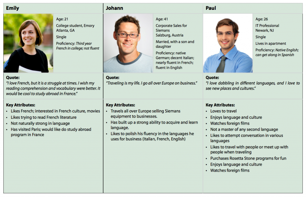
A persona is a fictitious person who embodies the characteristics of the target demographic. While personas aren’t real, they should be based on reality and should make the abstract idea of a “user” much more concrete. Without a human face, mapping out the user’s experience is hard.
So, Emily is a 21-year-old college student studying French at Emory University. She is not naturally gifted in language, but really likes French and tries to read French literature. She is looking forward to doing a study-abroad program in France.
We created three personas that encapsulate most of the key characteristics of our target market: Emily, the student; Johann, the European business traveler (it turns out that we nailed this: 70% of our sales ended up being from outside the US); and Paul, the IT guy who learns new languages as a hobby.
Step 2: Map the Personas’ Experience Without the App
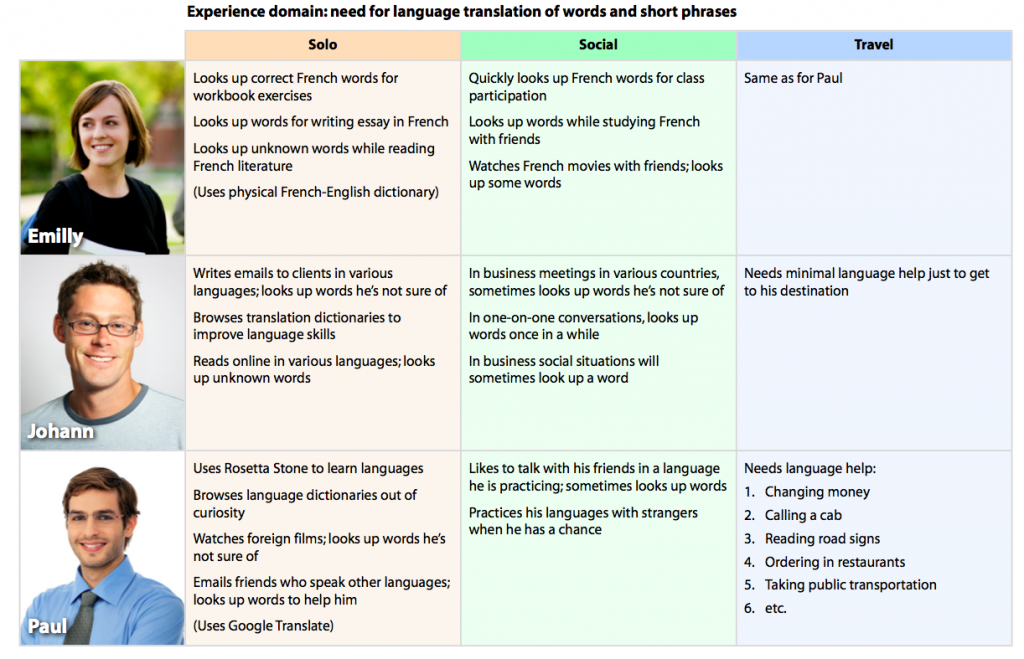
To map out users’ current predicament, we started by picking three key experiences related to translation — in this case, solo translation, social translation, and translation during travel.
We then brainstormed the activities and issues involved in these experiences that each persona might face. For example, in the solo category, Johann writes emails to clients in various languages and looks up the words he is not sure of.
Perform this exercise with people in the room who are similar to your personas. They will validate your insights and add to the brainstorming. If you don’t have that luxury, simply brainstorming and thinking through their possible experience is still a helpful exercise.
Step 3: Brainstorm the Ideal Assistance
After picturing our users’ lives, we brainstormed how the ideal app could solve their problems. We didn’t worry about viability, budget or timeline here; it’s all about coming up with really creative ideas to solve our users’ problems.
Step 4: Kill the Baby
This part is brutal. Having come up with a ton of cool ideas for features, we had to obliterate most of them. Good design is more about subtraction than addition. It’s all about finding the essential problems you want to solve and removing the features that are unrelated, inessential or unrealistic for the first version.
Polishing an app takes a ridiculous amount of time. So, if you start out with too broad a feature set, your app will lack focus and you will have no way to polish those features adequately.
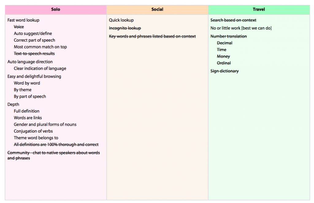
Mission accomplished. Now we had a tentative 1.0 definition. Now we knew what this app would be about. You can read more about our user experience mapping exercise on our blog.
The Definition
Based on the last exercise, we crafted a statement that defines the essence of the app:
"An offline translation dictionary that gives instant access to words and definitions at 99¢ for multiple language pairs."
This statement helped to focus our development process. It became a litmus test for any cool feature idea we came up with during development. If the feature didn’t support this statement, it didn’t belong in 1.0.
Sketching The Interactions
It was time to get down and dirty and start to shape our abstract ideas into a blueprint.
We started by sketching general ideas on how the various screens could flow together. These days, I mostly stick to sketches, and I use tools such as POP to share ideas with remote team members and clients. At the time, however, we were using OmniGraffle to create a rough prototype of the interactions.
Don’t Make Me Think
Our goal at this stage was to solve our users’ problems with an intuitive and easy to use interface. In essence, our job was to free users from having to think about the interface and instead to focus on the content.
This is a huge topic and Steve Krug literally wrote the book on it, so if you haven’t read Don’t Make Me Think, do so now. Seriously, it’s a great book.
Don’t Make Me Work
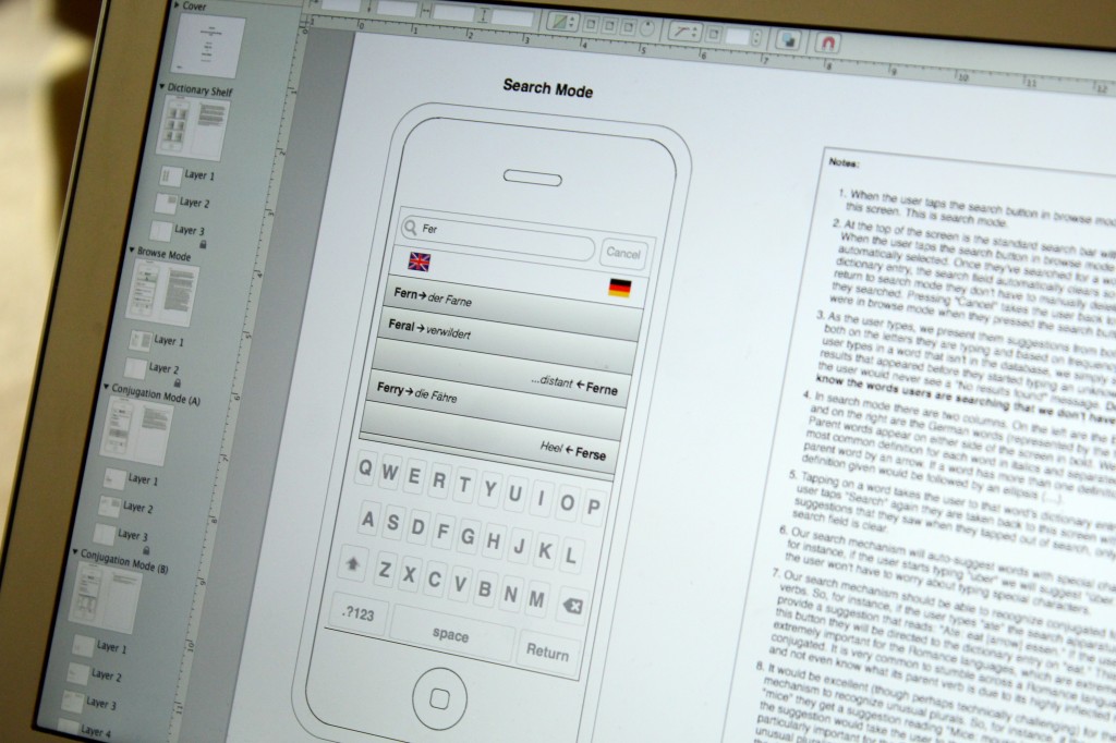
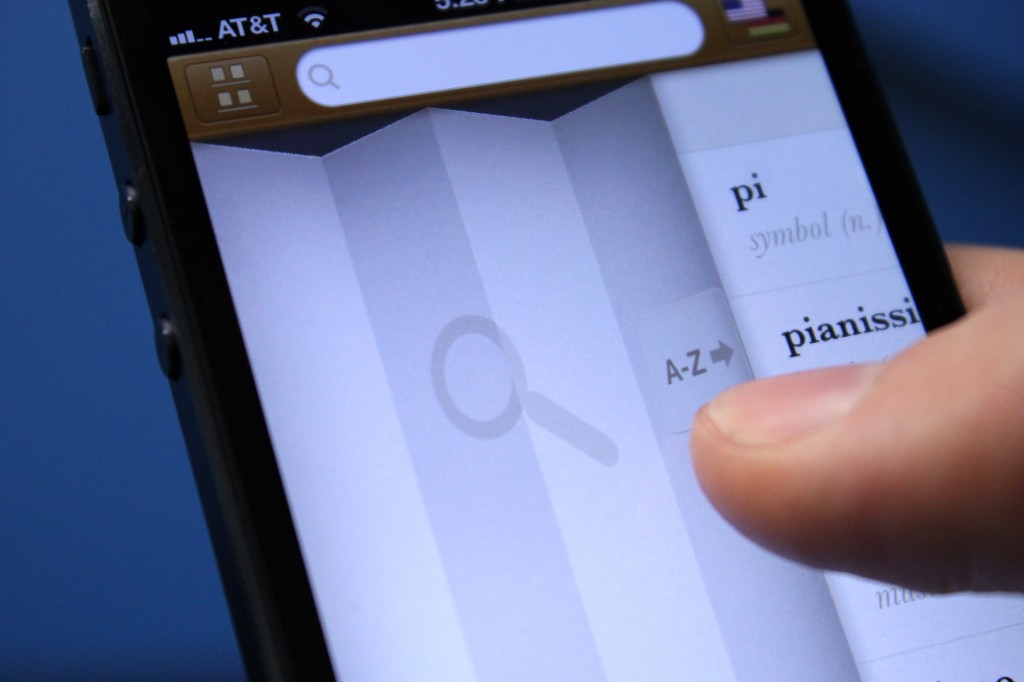
People don’t like to work, so I am always looking for ways to save them from unnecessary keystrokes, taps and irrelevant information. The OmniGraffle wireframe above illustrates how we tried to serve that goal. We wanted our word lookup to be the fastest available; so, instead of providing on-the-fly search suggestions like most apps, we provide on-the-fly translations to those suggestions. We also found a way to solve the language-switching problem of most apps by enabling users to type in either language and displaying the results for one language on the left and the other language on the right.
Think Like A Human
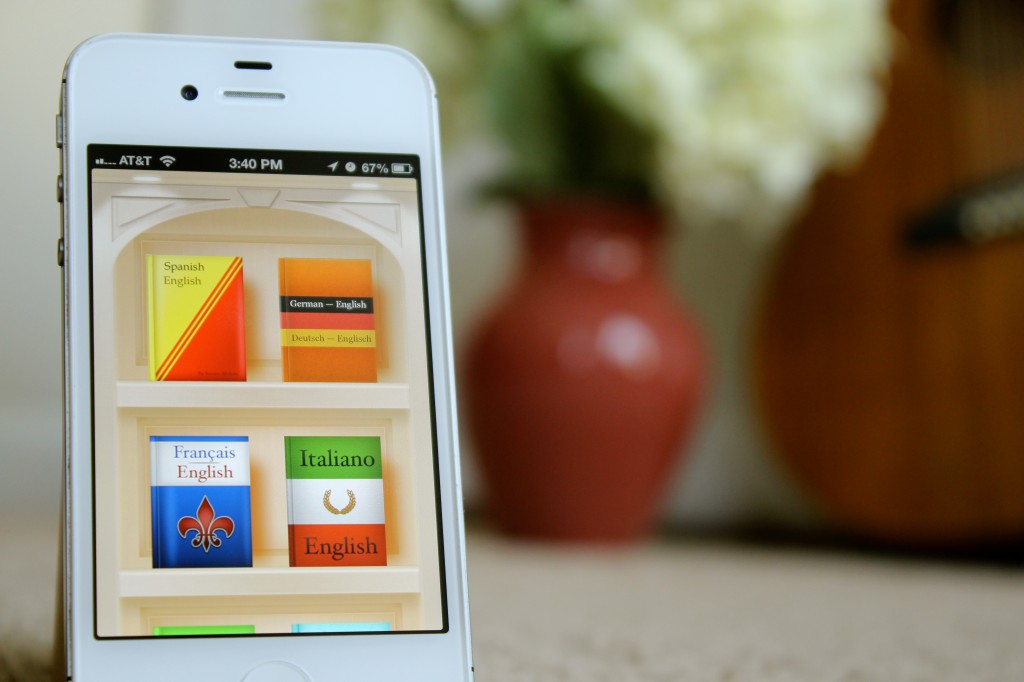
We wanted our dictionaries to feel physical. Large view.
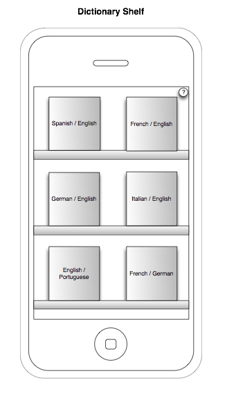
Because this is an offline translation app, we wanted to give users the strong impression that the dictionaries are on their phones. We wanted the dictionaries to feel not like some abstract database in the cloud, but rather like physical dictionaries that they can access anytime, anywhere. We used the metaphor of a shelf with books to quickly communicate this to users.
While touch interfaces have matured, and users no longer need interfaces to look like physical objects in order to relate to them, sometimes physical metaphors can set expectations and convey feelings that purely digital interfaces cannot.
Relentless Exploration
Note that these wireframes are ugly on purpose. This stage has nothing to do with visual design. We don’t jump right into Photoshop, because the ugly sketches help us to focus on the interaction problems and enable us to quickly explore hundreds of ideas.
Because sketching a rough idea takes only a few seconds, we go really crazy at this stage. The more ideas, the better. Leave no stone unturned to find the ideas worth pursuing.
Sometimes your first idea turns out to be the best, but the only way to prove that is to test all of the other ways of looking at the problem. I’ve gotten to meet the designers of some of my favorite apps, and one of the main commonalities among them is this: The secret to their amazing designs is a lot less about genius than about relentless exploration. They don’t stop once they’ve found a good solution. They keep going until they’ve exhausted the possibilities.
Of Photoshop And Xcode
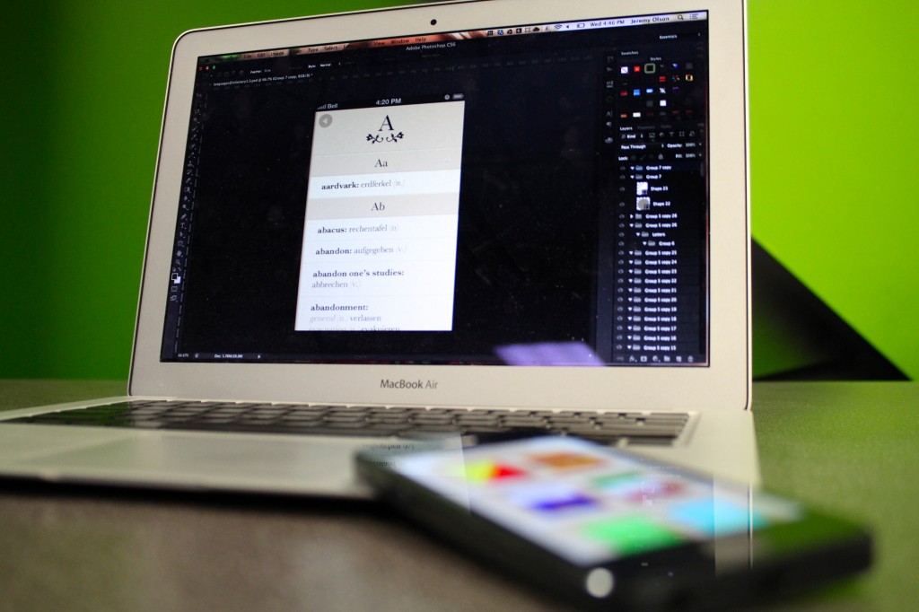
This is when things get really exciting. It’s when ideas start to become reality. This is the point when we design and code the actual elements that our users will touch.
Some people think this stage is just about making pretty graphics, but that mindset leads to mediocrity. This stage is all about polish on all levels: interaction, usability and visual. This is when a good app becomes great.
While we hoped that our sketches and wireframes would provide a good outline, upon seeing things visually and playing with an actual coded prototype, we realized that we sometimes got it all wrong. Also, when we are merely sketching, it is difficult to imagine the creative details that will take our app beyond being usable and into the realm of fun. Once we start working with visual metaphors, colors and textures, dreaming up fun details becomes much easier.
So, this is all about polish, polish, polish, and it is by far the most rewarding and time-consuming stage of app development.
Establishing The Theme
Some people hate skeuomorphism, probably because mimicking elements from the real world in our digital interfaces can easily lead to overdesigned visuals and inconsistent interactions. However, skeuomorphism can be useful, fun and powerful if wielded carefully and deliberately. In fact, every app that contains buttons has skeuomorphism because buttons are borrowed straight from the real world. When used correctly, skeuomorphism provides much needed affordances that help users instantly understand how an app works.
With that in mind, we knew from the outset that we wanted to use the metaphor of physical books to reinforce the concept that these dictionaries are stored on the phone itself.
When working on the theme for the app, we generally iterated like crazy on two or three of the main screens until we were convinced that a certain look would work really well for the whole app.
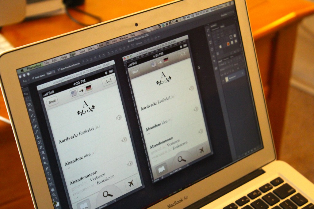
Given that we were working towards a book-like theme, we explored an elegant earth-toned theme that let the content and typography shine. We continued to refine the theme along the way.
Side note: While the next version of iOS — iOS 7 — will rid itself of Corinthian leather and other such ornamental UI, and the industry is certainly shifting away from realistic interfaces at the moment, the best designers don’t just follow trends. Trends are important, but we should consider all styles and techniques as tools in our toolbox and use them where they make sense. Granted, realistic UIs will probably look quite dated by the time iOS 7 arrives, but within a year or so, diversity in design styles will intensify as the novelty of iOS 7’s minimal aesthetic begins to wear off.
Delight Is In the Details
As we continued to flesh out all of the different screens, we looked for opportunities to delight our users with details that would make the app enjoyable to use. Part of this is just about making the app look nice, but you can also delight users by adding a fun transition, or make them laugh with some quirky copy, or save them work in surprising ways.
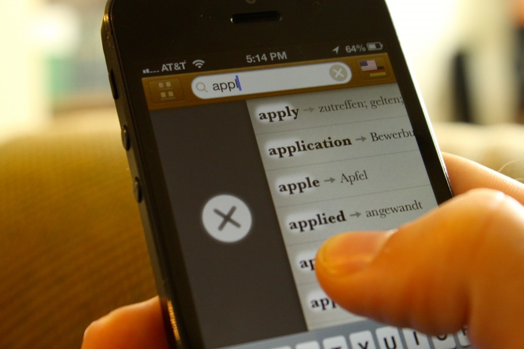
Take search:
The user can start searching by tapping the search bar. But reaching for that bar with a thumb can be a hassle, so we added the ability to swipe anywhere on the screen to unfold the search interface.
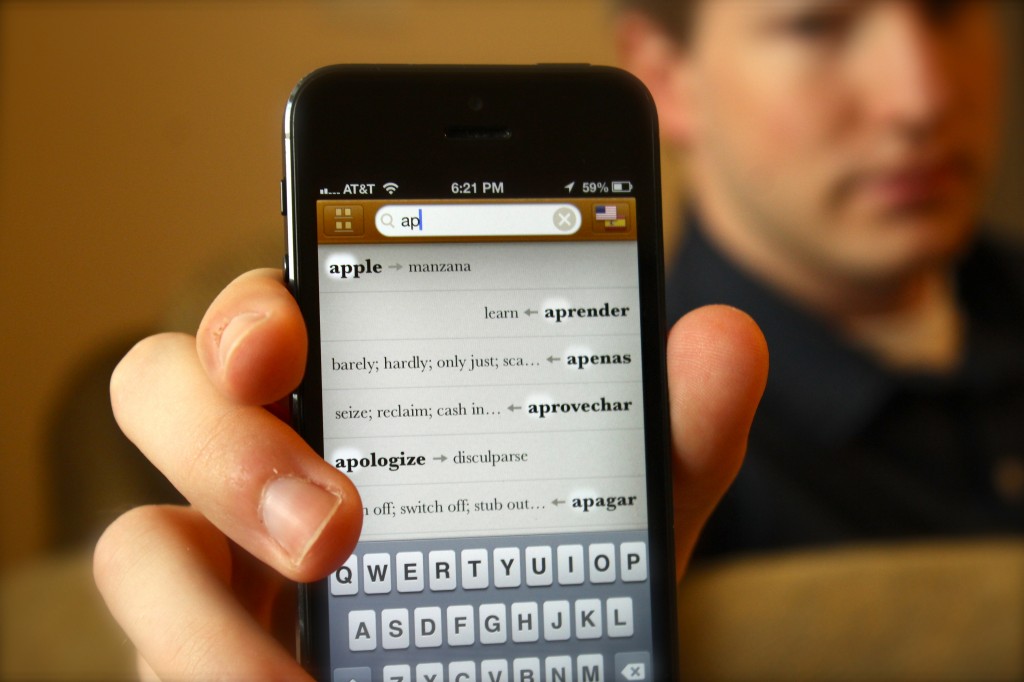
As the user types, the interface populates with suggested results and translations, highlighting the matching letters like a spotlight.
Folks who translate speech or passages of literature will look up a lot of words in rapid succession. We found that having to clear a search term by tapping the tiny “x” in the search field broke the flow and was physically strenuous, especially on the iPhone 5’s taller screen. So, we decided to let users swipe right to quickly clear a term — thus, allowing them to type a few letters, get the translation, and then swipe to begin typing another word all in a matter of seconds.
These kinds of details made all the difference when we were testing the app in the wild.
Designer And Programmer: Constant Collaboration
Please, please, do not hand a programmer your design assets and expect a job well done. Not only do designers need to continually stay involved to ensure that their designs are implemented well, but using coded prototypes and testing them on users will inform the design in ways you can’t imagine. I don’t care what kind of genius designer you are: There is no substitute for testing a design and iterating on it.
Testing coded software exposes blatant weaknesses in the design that you may have never considered and shines light on areas where details could be added to make the experience more enjoyable. Because of this, I ended up doing even more design iterations after we had a coded prototype than I did before.
Changes at this stage are costly but extremely necessary.
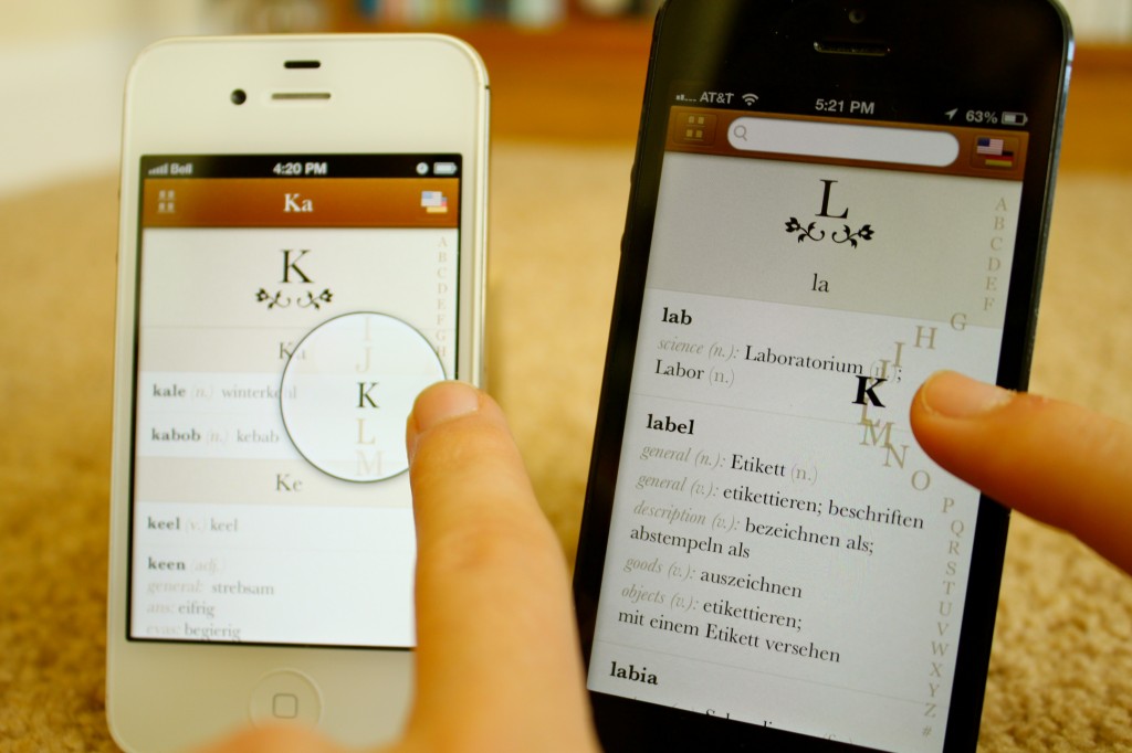
Programmers with a good design sense can also have great ideas. We wanted to make a better index. My mental model was some kind of magnifying glass. But Richard, Sonico’s programmer, had a better idea: Magnify the letters themselves around your finger as you move your finger.
Gesture Experiments
As we started to code our first prototype, Impending and Realmac Software launched an app named Clear. No buttons, just gestures. Love it or hate it, it made a statement. I had never seen such an exercise in minimalism in my life.
It was a beautiful thing, and it inspired me to find ways to use gestures to improve Languages.
My first experiment was extreme: to create a fully gesture-based interface.
We replaced buttons with gestures. Swipe one way to search, and the other way to view the index.
As much as we loved the minimalism, we realized that we needed to teach our users about the gestures.
We tried a number of approaches. But after doing a lot of usability testing, we realized that all of them had one major problem: Search, our most important feature, just wasn’t blatantly obvious.
So, we bit the bullet and used buttons and affordances where they make sense, but we retained a lot of the gestures and minimalism that we had gained through the experiments. The result was an app that is super-intuitive and simple for beginners, but full of gestures that make life easier for power users.
Testing
We made sure to get input on all aspects: usability, beauty, robustness. This included carrying out the following tasks:
- We observed friends, family and various strangers use the app. The key thing here is to propose tasks and ask questions about what they are thinking, but never to answer their questions. Probe into why they are confused about something, and let them figure it out for themselves. Watch for body language that indicates confusion or frustration, and note not only whether they were able to accomplish a task, but how effortless and enjoyable their experience was.
- We sought expert design reviews from top Apple designers, leading usability experts and fellow developers at conferences such as SxSW and WWDC.
- We posted screenshots to Dribbble to get feedback on visuals from leading designers around the world.
- We tested the app ourselves in real-world contexts using TestFlight.
- Finally, we thoroughly tested functionality and searched hundreds of words to catch bugs and ensure robustness and accuracy.
Icon
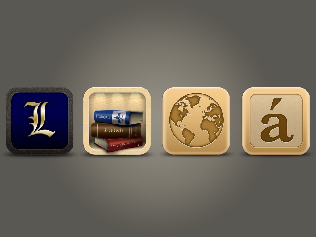
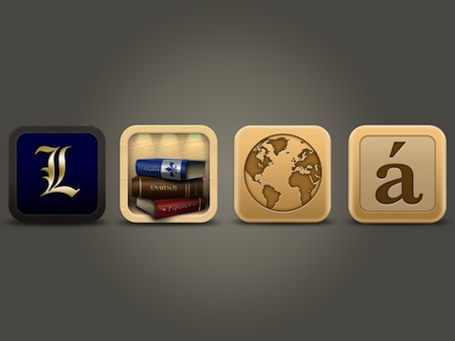
We tried a lot of ideas before settling on the icon on the far right. Large view.
An app’s icon means a lot. It is the first impression most users will get of an app, and we hope users will want to have it on their precious home screen.
The first iteration of the Languages icon (the royal “L”) was simple but didn’t communicate much.
After a lot of brainstorming, we incorporated the idea of physical dictionaries on a shelf, since that was a major theme of the app. The icon was beautiful, but we couldn’t make it work well enough at small sizes. Additionally, a top designer at Apple recommended that we not use books because the app isn’t about reading.
Nuts. We really liked that icon, but we had to go back to the drawing board to find an instantly recognizable symbol that communicated the idea of translation and that wasn’t overused. A globe works pretty well, but we ultimately chose the “a” with an accent mark because it is unique and definitely communicates the idea of a foreign language. We lived with it on our home screens for a while, and it grew on us. Having aced the test of time, the icon proved to be the winner.
Next Step: Launch
We’ve come along way and learned a few things.
After a year of blood, sweat and tears, the product was finally where we wanted it to be. It didn’t have every feature that we intended to put in 1.0, but the features it did have were super-polished and ready for primetime. It was time to launch. I’ll cover our marketing and launch in my next post, so stay tuned.
In Part 2, we’ll be look into the marketing and launch side after developing an app. It turns out that you don’t need a huge marketing budget to get into the top 10 in the App Store. Continue reading.
Further Reading
- How To Succeed With Your Mobile App
- Elements Of A Viral Launch Page
- Smart, Effective Strategies To Design Marketing Campaigns
- Key Ingredients To Make Your App Go Viral


