Automate Your Responsive Images With Mobify.js

Email Newsletter
Weekly tips on front-end & UX.
Trusted by 182,000+ folks.


 Celebrating 10 million developers
 Custom Web Forms for Angular, React, & Vue. Your backend.

Responsive images are one of the biggest sources of frustration in the Web development community. With good reason, too: The average size of pages has grown from 1 MB to a staggering 1.5 MB in the last year alone. Images account for more than 60% of that growth, and this percentage will only go up.

Much of that page weight could be reduced if images were conditionally optimized based on device width, pixel density and modern image formats (such as WebP). These reductions would result in faster loading times and in users who are more engaged and who would stick around longer. But the debate isn’t about whether to optimize images for different devices, but about how to go about doing so.
In an ideal world, we would continue using the img tag, and the browser would download exactly what it needs based on the width of the device and the layout of the page. However, no functionality like that currently exists. One way to get functionality similar to that would be to change the src attribute of img elements on the fly with JavaScript, but the lookahead pre-parser (or preloader) prevents this from being a viable option.
The first step to overcoming this problem is to create a markup-based solution that allows for alternate image sources to be delivered based on a device’s capabilities. This was solved with the introduction of the picture element, created by the W3C Responsive Images Community Group (although no browser currently implements it natively).
However, the picture element introduces a whole new problem: Developers must now generate a separate asset for every image at every breakpoint. What developers really need is a solution that automatically generates small images for small devices from a single high-resolution image. Ideally, this automated solution would make only one request per image and would be 100% semantic and backwards-compatible. The Image API in Mobify.js provides that solution.
The Element As The Upcoming Best Practice
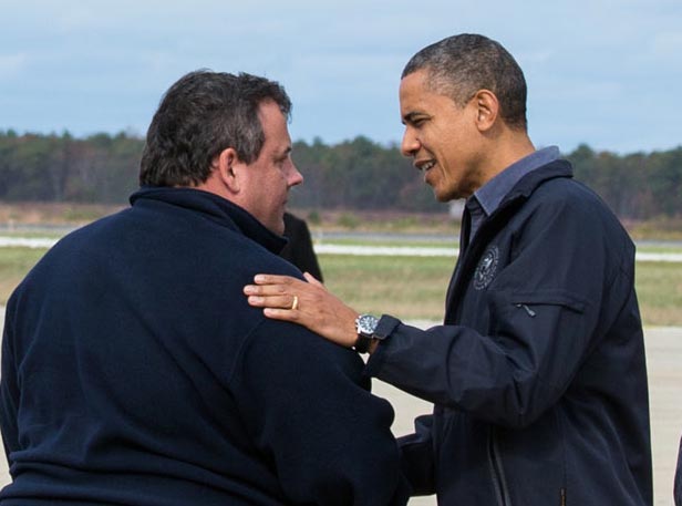
The picture element is currently the frontrunner to replace the img element because it enables developers to specify different images for different screen resolutions in order to solve the problem of both performance and art direction (although the new srcN proposal is worth looking into). The typical set-up involves defining breakpoints, generating images for each breakpoint and then writing the picture markup for the image. Let’s see how we can make the following image responsive using a workflow that includes the picture element:

We’ll use a baseline of 320, 512, 1024 and 2048 pixels.
First, we need to generate a copy of each image for those different resolutions, either by using a command-line interface (CLI) tool such as Image Optim or by saving them with Photoshop’s “Save for web” feature. Then, we would use the following markup:
<picture>
    <source src="responsive-obama-320.png">
    <source src="responsive-obama-512.png" media="(min-width: 512px)">
    <source src="responsive-obama-1024.png" media="(min-width: 1024px)">
    <source src="responsive-obama-2048.png" media="(min-width: 2048px)">
    <noscript><img src="responsive-obama-320.png"></noscript>
</picture>
One problem with this markup is that, in its current configuration, our image would not be optimized for mobile devices. Here is the same image scaled down to 320 pixels wide:
Identifying the people in this photo is difficult. To better cater to the smaller screen size, we need to use the power of art direction to crop this photo for small screens:
Because this file isn’t simply a scaled-down version of the original, the name of the file should be given a different structure (so, responsive-obama-mobile.png, instead of responsive-obama-320.png):
<picture>
    <source src="responsive-obama-mobile.png">
    <source src="responsive-obama-512.png" media="(min-width: 512px)">
    <source src="responsive-obama-1024.png" media="(min-width: 1024px)">
    <source src="responsive-obama-2048.png" media="(min-width: 2048px)">
    <noscript><img src="responsive-obama-512.png"></noscript>
</picture>
But what if we want to account for high-DPI (dots per inch) devices? The picture element’s specification has a srcset attribute that allows us to easily specify different images for different pixel ratios. Below is what our markup would look like if we used the picture element.
<picture>
    <source srcset="responsive-obama-mobile.png 1x, responsive-obama-mobile-2x.png 2x">
    <source srcset="responsive-obama-512.png 1x, responsive-obama-1024.png 2x" media="(min-width: 512px)">
    <source srcset="responsive-obama-1024.png 1x, responsive-obama-1024.png 2x" media="(min-width: 1024px)">
    <source srcset="responsive-obama-2048.png 1x, responsive-obama-4096.png 2x" media="(min-width: 2048px)">
    <noscript><img src="responsive-obama-512.png"></noscript>
</picture>
Here we have introduced a couple of new files (responsive-obama-mobile-2x.png and responsive-obama-4096.png) that must also be generated. At this point, we’ll have six different copies of the same image.
Let’s take this a step further. What if we want to conditionally load our images in a more modern format, such as WebP, according to whether the browser supports it? Suddenly, the total number of files we must generate increases from 6 to 12. Let’s be honest: No one wants to generate multiple versions of every image for various resolutions and have to constantly update those versions in the markup. We need automation!
The Ideal Responsive Image Workflow
The ideal workflow is one that allows developers to upload images in the highest resolution possible while still using the img element in such a way that it automatically resizes and compresses the images for different browsers. The img element is great because it is a simple tag for solving a simple problem: displaying images for users on the Web. Continuing to use this element in a way that is performant and backwards-compatible would be ideal. Then, when the need for art direction arises and scaling down images is not enough, we could use the picture element; the branching logic built into its syntax is perfect for that use case.
This ideal workflow is possible using the responsive Image API in Mobify.js. Mobify.js is an open-source library that improves responsive websites by providing responsive images, JavaScript and CSS optimization, adaptive templating and more. The Image API automatically resizes and compresses img and picture elements and, if needed, does it without changing a single line of markup in the back end. Simply upload your high-resolution assets and let the API take care of the rest.
Automatically Make Images Responsive Without Changing The Back End
The problem of responsive images is a hard one to solve because of the lookahead pre-parser, which prevents us from changing the src attribute of an img element on the fly with JavaScript in a performant way. The pre-parser is a feature of browsers that starts downloading resources as fast as possible by spawning a separate thread outside of the main rendering thread and whose only job is to locate resources and download them in parallel. The way the pre-parser works made a lot of sense prior to responsive design, but in our multi-device world, images in the markup are not necessarily the images we want users to download; thus, we need to start thinking of APIs that allow developers to control resource loading without sacrificing the benefits of the pre-parser. For more details on this subject, consider reading Steve Souders’ “I <3 Image Bytes.”
One way that many developers avoid the pre-parser is by manually changing the src attribute of each img into data-src, which tricks the pre-parser into not noticing those images, and then changing data-src back to src with JavaScript. With the Capturing API in Mobify.js, we can avoid this approach entirely, allowing us to be performant while remaining completely semantic (no <noscript> or data-src hacks needed). The Capturing technique stops the pre-parser from initially downloading the resources in the page, but it doesn’t prevent parallel downloads. Using Mobify.js’ Image API in conjunction with Capturing, we are able to have automatic responsive images with a single JavaScript tag.
Here is what the API call looks like:
Mobify.Capture.init(function(capture){
    var capturedDoc = capture.capturedDoc;
    var images = capturedDoc.querySelectorAll('img, picture');
    Mobify.ResizeImages.resize(images, capturedDoc)
    capture.renderCapturedDoc();
});
This takes any image on the page and rewrites the src to the following schema:
https://ir0.mobify.com/<format><quality>/<maximum width>/<maximum height>/<url>
For example, if this API was running on the latest version of Chrome for Android, with a screen 320 CSS pixels wide and a device pixel ratio of 2, then the following image…
<img src='cdn.mobify.com/mobifyjs/examples/assets/images/forest.jpg'>
… would be rewritten to this:
<img src='//ir0.mobify.com/webp/640/https://cdn.mobify.com/mobifyjs/examples/assets/images/forest.jpg'>
The image of the forest would be resized to 640 pixels wide, and, because Chrome supports WebP, we would take advantage of that in order to reduce the size of the image even further. After the first request, the image would be cached on Mobify’s CDN for the next time it is needed in that particular size and format. Because this image of the forest does not require any art direction, we can continue using the img element.
You can see an example of automatic image resizing for yourself. Feel free to open your Web inspector to confirm that the original images do not download!
Using this solution, we simplify our workflow. We only upload a high-resolution asset for each image, and then sit back and let the the API take care of resizing them automatically. No proxy in the middle, no changing of any attributes — just a single JavaScript snippet that is copied to the website. Go ahead and try it out by copying and pasting the following line of code at the top of your head element. (Please note that it must go before any other tag that loads an external resource.)
<script>!function(a,b,c,d,e){function g(a,c,d,e){var f=b.getElementsByTagName("script")[0];a.src=e,a.id=c,a.setAttribute("class",d),f.parentNode.insertBefore(a,f)}a.Mobify={points:[+new Date]};var f=/((; )|#|&|^)mobify=(d)/.exec(location.hash+"; "+b.cookie);if(f&&f[3]){if(!+f[3])return}else if(!c())return;b.write('<plaintext style="display:none">'),setTimeout(function(){var c=a.Mobify=a.Mobify||{};c.capturing=!0;var f=b.createElement("script"),h="mobify",i=function(){var c=new Date;c.setTime(c.getTime()+3e5),b.cookie="mobify=0; expires="+c.toGMTString()+"; path=/",a.location=a.location.href};f.onload=function(){if(e)if("string"==typeof e){var c=b.createElement("script");c.onerror=i,g(c,"main-executable",h,mainUrl)}else a.Mobify.mainExecutable=e.toString(),e()},f.onerror=i,g(f,"mobify-js",h,d)})}(window,document,function(){var a=/webkit|msies10|(firefox)[/s](d+)|(opera)[sS]*version[/s](d+)|3ds/i.exec(navigator.userAgent);return a?a[1]&&+a[2]<4?!1:a[3]&&+a[4]<11?!1:!0:!1},

// path to mobify.js
"//cdn.mobify.com/mobifyjs/build/mobify-2.0.1.min.js",

// calls to APIs go here
function() {
  var capturing = window.Mobify && window.Mobify.capturing || false;

  if (capturing) {
    Mobify.Capture.init(function(capture){
      var capturedDoc = capture.capturedDoc;

      var images = capturedDoc.querySelectorAll("img, picture");
      Mobify.ResizeImages.resize(images);

      // Render source DOM to document
      capture.renderCapturedDoc();
    });
  }
});
</script>
(Please note that this script does not have a single point of failure. If Mobify.js fails to load, then the script will opt out and your website will load as normal. If the image-resizing servers are down or if you are in a development environment and the images are not publicly accessible, then the original images will load.)
You can also make use of the full documentation. Browser support for the snippet above is as follows: All Webkit/Blink based browsers, Firefox 4+, Opera 11+, and Internet Explorer 10+.
Resizing img elements automatically is great for the majority of use cases. But, as demonstrated in the Obama example, art direction is necessary for certain types of images. How can we continue using the picture element for art direction without having to maintain six versions of the same image? The Image API will also resize picture elements, meaning that you can use the picture element for its greatest strength (art direction) and leave the resizing up to the API.
Resizing Elements
While automating the sizes of images for different browsers is possible, automating art direction is impossible. The picture element is the best possible solution for specifying different images at different breakpoints, due to the robust branching logic built into its defined syntax (although as mentioned before, srcN is a more recent proposal that offers very similar features). But, as mentioned, writing the markup for the picture element and creating six assets for each image gets very complicated:
<picture>
    <source srcset="responsive-obama-mobile.png 1x, responsive-obama-mobile-2x.png 2x">
    <source srcset="responsive-obama-512.png 1x, responsive-obama-1024.png 2x" media="(min-width: 512px)">
    <source srcset="responsive-obama-1024.png 1x, responsive-obama-1024.png 2x" media="(min-width: 1024px)">
    <source srcset="responsive-obama-2048.png 1x, responsive-obama-4096.png 2x" media="(min-width: 2048px)">
    <noscript><img src="responsive-obama-512.png"></noscript>
</picture>
When using the Image API in conjunction with the picture element, we can simplify the markup significantly:
<picture>
    <source src="responsive-obama-mobile.png">
    <source src="responsive-obama.png" media="(min-width: 512px)">
    <img src="responsive-obama.png">
</picture>
The source elements here will be automatically rewritten in the same way that the img elements were in the previous example. Also, note that the markup above does not require noscript to be used for the fallback image to prevent a second request, because Capturing allows you to keep the markup semantic.
Mobify.js also allows for a modified picture element, which is useful for explicitly defining how wide images should be at different breakpoints, instead of having to rely on the width of devices. For example, if you have an image that is half the width of a tablet’s window, then specifying the width of the image according to the maximum width of the browser would generate an image that is larger than necessary:
In this case, automatically specifying a width according to the browser’s width would create an unnecessarily large image.
To solve this problem, the Image API allows for alternate picture markup that enables us to override the width of each source element, instead of specifying a different src attribute for each breakpoint. For example, we could write an element like this:
<picture data-src="responsive-obama.png">
    <source src="responsive-obama-mobile.png">
    <source media="(min-width: 512px)">
    <source media="(min-width: 1024px)" data-width="512">
    <source media="(min-width: 2048px)" data-width="1024">
    <img src="responsive-obama.png">
</picture>
Notice the use of the data-src attribute on the picture element. This gives us a high-resolution original image as a starting point, which we can use to resize into assets for other breakpoints.
Let’s break down how this would actually work in the browser:
- If the browser is between 0 and 511 pixels wide (i.e. a smartphone), then use
responsive-obama-mobile.png(for the purpose of art direction). - If the browser is between 512 and 1023 pixels wide, then use
responsive-obama.png, becausesrcis not specified in thesourceelement corresponding to that media query. Automatically determine the width becausedata-widthisn’t specified. - If the browser is between 1024 and 2047 pixels wide, then use
responsive-obama.png, becausesrcis not specified in thesourceelement corresponding to that media query. Resize to 512 pixels wide, as specified in thedata-widthattribute. - If the browser is 2048 pixels or wider, then use
responsive-obama.png, becausesrcis not specified in thesourceelement corresponding to that media query. Resize to 1024 pixels wide, as specified in thedata-widthattribute. - If JavaScript isn’t supported, then fall back to the regular old
imgtag.
The Image API will run on each picture element, transforming the markup into this:
<picture data-src="https://cdn.mobify.com/mobifyjs/examples/assets/images/responsive-obama-mobile.jpg">
    <source src="//ir0.mobify.com/webp/400/https://cdn.mobify.com/mobifyjs/examples/assets/images/responsive-obama-mobile.jpg">
    <source src="//ir0.mobify.com/webp/400/https://cdn.mobify.com/mobifyjs/examples/assets/images/responsive-obama.jpg" media="(min-width: 512px)">
    <source src="//ir0.mobify.com/webp/512/https://cdn.mobify.com/mobifyjs/examples/assets/images/responsive-obama.jpg" media="(min-width: 1024px)" data-width="512">
    <source src="//ir0.mobify.com/webp/512/https://cdn.mobify.com/mobifyjs/examples/assets/images/responsive-obama.jpg" media="(min-width: 2048px)" data-width="1024">
    <img src="responsive-obama.jpg">
</picture>
The Picture polyfill (included in Mobify.js) would then run and select the appropriate image according to the media queries. It will also work well when browser vendors implement the picture element natively.
See a page that uses the modified picture element markup for yourself.
Using The Image API Without Capturing
One caveat with Capturing is that it requires the script to be inserted in the head element, which is a blocking JavaScript call that can delay the initial downloading of resources. The total length of delay on first load is approximately 0.5 seconds on a device with a 3G connection (i.e. including the DNS lookup and downloading and Capturing), less on 4G or Wi-Fi, and about 60 milliseconds on subsequent requests (since the library will have been cached). But the minor penalty is a small price to pay in exchange for being easy to use, backwards-compatible and semantic.
To use the Image API without Capturing to avoid the blocking JavaScript request, you need to change the src attribute of all of your img elements to x-src (you might also want to add the appropriate noscript tags if you’re concerned about browsers on which JavaScript has been disabled) and paste the following asynchronous script right before the closing head tag:
<script src="//cdn.mobify.com/mobifyjs/build/mobify-2.0.1.min.js">
<script>
    var intervalId = setInterval(function(){
        if (window.Mobify) {
            var images = document.querySelectorAll('img[x-src], picture');
            if (images.length > 0) {
                Mobify.ResizeImages.resize(images);
            }
            // When the document has finished loading, stop checking for new images
            if (Mobify.Utils.domIsReady()) {
                clearInterval(intervalId)
            }
        }
    }, 100);
</script>
This script will load Mobify.js asynchronously, and when finished loading, will start to loading the images as the document loads (it does not need to wait for the entire document to finish loading before kicking off image requests).
Using The Image API For Web Apps
If you are using a client-side JavaScript model-view-controller (MVC) framework, such as Backbone or AngularJS, you could still use Mobify.js’ Image API. First, include the Mobify.js library in your app:
<script src="//cdn.mobify.com/mobifyjs/build/mobify-2.0.1.min.js"></script>
Then, rewrite image URLs with the method outlined in Mobify.js’ documentation:
Mobify.ResizeImages.getImageUrl(url)
This method accepts an absolute URL and returns the URL to the resized image. The easiest way to pass images into this method is by creating a template helper (for example, {{image_resize ‘/obama.png’ }} in Handlebars.js) that executes the getImageUrl method in order to generate the image’s URL automatically.
Using Your Own Image-Resizing Back End
Images are resized through Mobify’s Performance Suite resizing servers, which provides support for automatic resizing, WebP, CDN caching and more. There is a default limit on how many images you can convert for free per month, but if you’re driving a large volume of traffic, then give Mobify a shout and we’ll find a way to help. The API also allows you to use a different image-resizing service, such as Sencha.io Src, or your own backend service.
How Can Browser Vendors Better Support Responsive Images?
The Webkit team has recently implemented the src-set attribute, and so will Blink and Gecko in the coming months. This is a huge step in the right direction, as it means that browser vendors are taking the responsive image problem seriously. However, it doesn’t solve the art direction problem, nor does it prevent the issue of needing to generate multiple assets at different resolutions.
The developer community recently got together to discuss the responsive image problem. One of the more interesting proposals discussed was Client Hints from Ilya Grigorik, which is a proposal that involves sending device properties such as DPR, width and height in the headers of each request. I like this solution, because it allows us to continue using the img tag as per usual, and only requires us to use the picture (or srcN) when we need branching logic to do art direction. Although valid concerns have been raised about adding additional HTTP headers and using content negotiation to solve this problem. More importantly, for established websites with thousands of images, it may not be so easy to route those images through a server that can resize using the headers provided by Client Hints. This could be solved by re-writing images at the web server level, or with a proxy, but both of those can be problematic to setup. In my opinion, this is something we should be able to handle on the client through greater control over resource loading.
If developers had greater control over resource loading, then responsive images would be a much simpler problem to tackle. The reason why so many responsive image solutions out there are proxy-based is because the images must be rewritten before the document arrives to the browser. This is to accommodate the pre-parser’s attempt to download images as quickly as possible. But proxies can be very problematic in their security and scalability and, really, if we had an easy way to interact with the pre-parser, then many proxy-based solutions would redundant.
How can we get greater control over resource loading while still getting all of the benefits from the pre-parser? The key thing here is that we do not want to simply turn off the pre-parser — its ability to download assets in parallel is a huge win and one of the biggest performance improvements introduced into browsers. (Please note that the Capturing API does not prevent parallel downloads.) One idea is to provide a beforeload event that fires before each resource on a page has loaded. This event is actually available when one uses Safari browser extensions, and in some browsers it is available in a very limited capacity. If we could use this event to control resource loading in a way that works with the pre-parsing thread, then Capturing would no longer be needed. Here is a basic example of how you might use the beforeload event, if it worked as described:
function rewriteImgs(event) {
    if (event.target === "IMG") {
        var img = event.target;
        img.src = "//ir0.mobify.com/" + screen.width + "/" + img.src;
    }
}
document.addEventListener("beforeload", rewriteImgs, true);
The key challenge is to somehow get the pre-parser to play nice with JavaScript that is executed in the main rendering loop. There is currently a new system being developed in browsers called the Service Worker, which is intended to allow developers to intercept network requests in order to help build web applications that work offline. However, the current implementation does not allow for intercepting requests on the initial load. This is because loading an external script which controls resource loading would have to block the loading of other resources — but I believe it could be modified to do so in a way that does not sacrifice performance through the use of inline scripts.
Conclusion
While there are many solutions to the problem of responsive images, the one that automates as much work as possible while still allowing for art direction will be the solution that drives the future of Web development. Consider using Mobify.js to automate responsive images today if you are after a solution that does the following:
- requires you to generate only one high-resolution image for each asset, letting the API take care of serving smaller images based on device conditions (width, WebP support, etc.);
- makes only one request per image;
- allows for 100% semantic and backwards-compatible markup that doesn’t require changes to your back end (if using Capturing);
- has a simplified
pictureelement that is automatically resized, so you can focus on using it only for art direction.
(Front page image credits: Creating High-Performance Mobile Websites)
Further Reading
- Simple Responsive Images With CSS Background Images
- How To Solve Adaptive Images In Responsive Web Design
- Automatically Art-Directed Responsive Images?
- Responsive Images In WordPress With Art Direction
 (al, ea, il, mrn)

